Using the Google Places API in Python

So I was interested in scraping data from the Google Places API recently. My motivation came from some criminology studies that examine the relationship between coffee shops and crime (Papachristos et al. 2011; Smith, 2014) under the auspices that coffee shops are a measure of gentrification. I am also interested in gaining information about other place characteristics as well, as whether a place has some sort of non-residential application (e.g. bus stop, gas station) they tend to have elevated amounts of crime compared to solely residential locations. (These are not per-se characteristics that make places criminogenic – they just influence the walking around population and thus make the baseline exposure of places greater because of more human interaction).

So here I will give an example of grabbing data from the Google Places API given a grid of locations from SPSS and exporting to an SPSS dataset. So first you need sign up for an API key with Google from the Google APIs console. This allows 1,000 queries per day. Here I will make an example of 6 cases, but again with just the base query rates you can submit up to 1,000 requests per day (and can get 100,000 by verifying your identity).

*Need UNICODE.
PRESERVE.
SET UNICODE=ON.

*Some example data.
DATA LIST FREE / ID Lat Lng.
BEGIN DATA
1   38.901989   -77.041921
2   38.901991   -77.036157
3   38.901993   -77.030393
4   38.906493   -77.041924
5   38.906495   -77.036159
6   38.906497   -77.030394
END DATA.
DATASET NAME Locations.

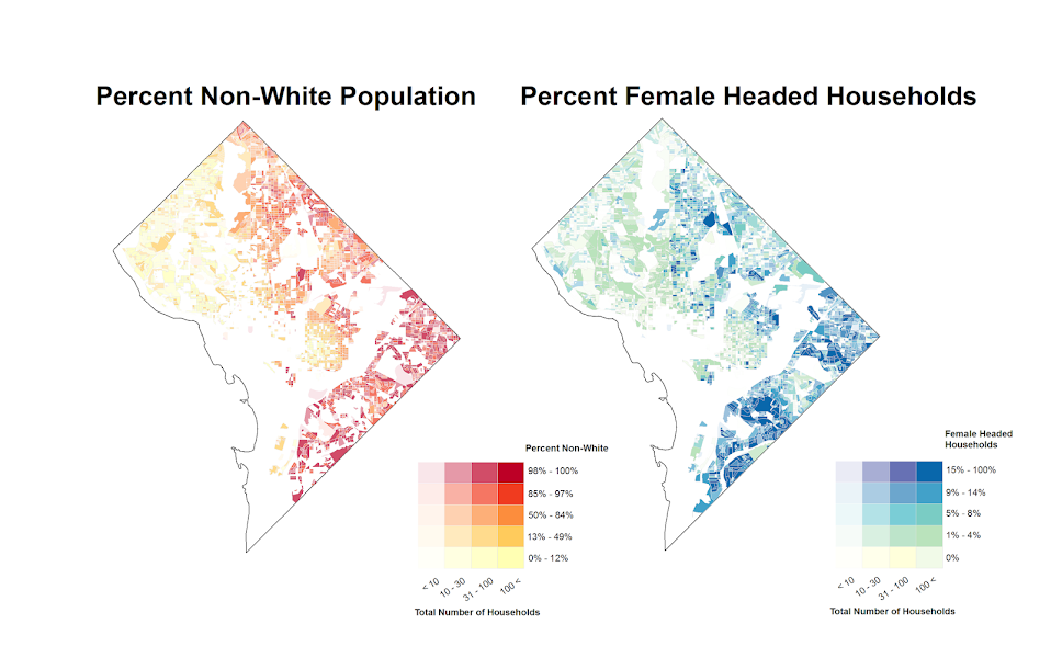
I typically don’t have SPSS in Unicode mode, but since Google will return some results in Unicode it is necessary to turn it on. After that I create a dataset with 6 locations in central D.C. These happen to be centroids from a regular grid I laid over the city with 500 meter square grid cells (and it only takes 800 and some cells to cover the city of D.C.).

Now google has a pretty good intro to get your feet wet, so here I will just show the helper functions I created to ease the task. The first function takes as input parameters latitude, longitude, a radius (in meters), a type field, and your key for the maps API. It then grabs the JSON you get as a response from that specific url, and then turns the JSON object into a nested list that can be traversed in python. You can check out from Google what other information is available, but the IterJson function is just a helper to takes specific results from GoogPlac and put them into a nicer array for me to use. Here I just grab the geographic coordinates, a place name, a reference string, and the address associated with the place.

*Functions to grab the necessary data from Google.
BEGIN PROGRAM.
import urllib, json

#Grabbing and parsing the JSON data
def GoogPlac(lat,lng,radius,types,key):
  #making the url
  AUTH_KEY = key
  LOCATION = str(lat) + "," + str(lng)
  RADIUS = radius
  TYPES = types
  MyUrl = ('https://maps.googleapis.com/maps/api/place/nearbysearch/json'
           '?location=%s'
           '&radius=%s'
           '&types=%s'
           '&sensor=false&key=%s') % (LOCATION, RADIUS, TYPES, AUTH_KEY)
  #grabbing the JSON result
  response = urllib.urlopen(MyUrl)
  jsonRaw = response.read()
  jsonData = json.loads(jsonRaw)
  return jsonData

#This is a helper to grab the Json data that I want in a list
def IterJson(place):
  x = [place['name'], place['reference'], place['geometry']['location']['lat'], 
         place['geometry']['location']['lng'], place['vicinity']]
  return x
END PROGRAM.

Now we can set up the parameters for the search in addition to the geographic coordinates. Here I make python objects specifying the search type cafe and my API key. I will pass a constant for the radius field of 375 meters – which will cause just a bit of overlap among my grid cells.

*Setting the parameters I will use in the query - type & my key.
BEGIN PROGRAM.
#necessary info for geocoding
MyKey = 'Your API Key Here!!!'
MyType = 'cafe'
END PROGRAM.

Now the magic happens; this code 1) declares a new dataset to place the results in, and then in python 2) grabs the current SPSS dataset, 3) sets the variables for the new dataset, 4) searches at each longitude value in the original dataset, and 5) appends cases to the new SPSS dataset for every location result returned for each initial longitude location. The nested loops are necessary as one location will return multiple places. (For those not using SPSS, the SPSS data here, alldata, is simply a list of namedTuple’s for each row of SPSS data. This code is basically amenable to whatever data structure you are working with, just loop through your grid of geographic coordinates and then append those results to whatever data structure you want.)

*Now querying google and placing the results into a new file.
DATASET DECLARE PlacesResults.
BEGIN PROGRAM.
#Grabbing SPSS data
import spss, spssdata
alldata = spssdata.Spssdata().fetchall()

#making an SPSS dataset to place the results into
spss.StartDataStep()
datasetObj = spss.Dataset(name='PlacesResults')
datasetObj.varlist.append('Id',0)
datasetObj.varlist.append('LatSearch',0)
datasetObj.varlist.append('LngSearch',0)
datasetObj.varlist.append('name',100)
datasetObj.varlist.append('reference',500)
datasetObj.varlist.append('LatRes',0)
datasetObj.varlist.append('LngRes',0)
datasetObj.varlist.append('vicinity',300)

#appending the data to the SPSS dataset
for case in alldata:
  search = GoogPlac(lat=case[1],lng=case[2],radius=375,types=MyType,key=MyKey) #grab data
  if search['status'] == 'OK':                                                 #loop through results
    for place in search['results']:
      x = IterJson(place)
      results = list(case) + x
      datasetObj.cases.append(results)                                         #appending data to SPSS dataset
spss.EndDataStep()
END PROGRAM.

Now we have the data in our PlacesResults SPSS dataset for further manipulation or whatever. One of comment on a prior post was basically "What is the point of SPSS, I can do all of this in Python". Well this is generally true – but I continue to do work in SPSS because it is much more convenient a tool for data management then Python (at least for myself, knowing SPSS really well and Python not so well). So here because we have slightly overlapping search radius’s, you will have duplicate results in your set. The following code in SPSS eliminates those duplicate results.

*************************************.
*Getting rid of duplicate results.
DATASET ACTIVATE PlacesResults.
SHOW N.
SORT CASES BY name vicinity LatRes LngRes Id.
MATCH FILES FILE = *
  /FIRST = Keep
  /BY name vicinity LatRes LngRes.
SELECT IF Keep = 1.
MATCH FILES FILE = * /DROP Keep.
EXECUTE.
SHOW N.
*************************************.

So now you can do the analysis with your results without having to worry about duplicates. If you don’t want to keep SPSS in Unicode mode, remember to restore your settings before you end your SPSS session.

*Restoring back to LOCAL mode.
DATASET CLOSE ALL.
NEW FILE.
RESTORE.

So, I have done all this, but I must admit that it appears to me that this act would violate the terms of service for using the Google Places API data (see 10.1.3 Restrictions against Data Export or Copying specifically), as this is creating a database of the cached results. But others like FloatingSheep do approximately the same type of requests (and obviously cache the data in a permanent database to make such maps). Maybe if someone from Google is listening they can let me know if I am violating the terms of service for doing such a non-commercial academic project.

I will update at a later point about the results of the cafes and crime at the micro place level in DC (as part of my dissertation). There actually is a set of sidewalk cafe’s From DC.gov and a quick look with one of the older files I have (downloaded in Oct-13) there are 452 listed cafes. The scraped data from google only totals 368 over the whole city – so it seems likely I am undercounting taking the data from Google – but further investigation will be needed.

Some more value-by-alpha maps for D.C. Census Blocks

I’ve made some more value-by-alpha maps for my dissertation for percent non-white population in comparison to percentage of female-headed households for Census blocks in 2010 in D.C. See my first post for some background. The choropleth classes for the percents are chosen according to quintiles of the distributions and the alpha classes are arbitrary (note the alpha class uses households as the baseline in both maps, even though percent non-white uses the population counts).

When making these maps I’ve found that the Color Brewer sequential styles that range two colors work out much better than those that span one color. What happens with the one color sequential themes is that the faded out colors end up being confounded with the lighter colors in the fully opaque ranges. When using the two sequential color schemes (here showing Yellow to Red and Yellow to Blue) it provides greater discrepancy between the classes.


I did not try out the black background for these maps (I thought perhaps it would be a bit jarring in the document have a swath of black stand out). The CUNY Center for Urban Research has some other example value-by-alpha maps for New York City elections in 2013. After some discussion with Steven Romalewski they decided they liked the white background better for there maps, and my quick attempts for these examples I think I agree.

Taking account of the baseline in kernel density maps using CrimeStat

When making kernel density maps sometimes the phenonema is heavily clustered in particular locations simply because the population at risk is uneven over the study space. xkcd puts this in a bit more of laymans terms than I do:

So how do we take into account the underlying population? It depends on the data, but if you actually have population at risk data as points we can make kernel density maps that are the ratio of the cases to the underlying total population. I will show how you can do this type of raster kernel density estimate in CrimeStat using some data on reported assaults and arrests from the city of Chicago.

To make the necessary smooth estimate of the proportions of arrests in CrimeStat you will need two seperate ones, the first primary file should be all arrests of interest, and the secondary file should be all of the incidents (so the arrests are a subset of all incidents). And of course both files need to have the geocoordinates already.

So CrimeStat has a nice GUI to make our KDE maps. So you will be greeted with the following screen after starting the CrimeStat program.

Now we can enter in our data. First click the Select Files button and then navigate to your data file. Here I saved the seperate files as DBFs, and for the primary file I use all of the arrests associated with an assault incident in Chicago in 2013.

Now that the file is loaded into CrimeStat, we need to specify what fields contain the spatial coordinates in the variables section. Then we set the appropriate options in the bottom panels. Here I am using projected coordinates in feet. I don’t specify a time unit so that option is superflous.

Now we can enter in our secondary file, which will be all of the assault incidents in Chicago in 2013. The Seconday File tab is in the set of minor tabs under the larger Data Setup tab (CrimeStat has an incredible number of routines, hence the many options). It is an equivalent workflow as to that of the primary file, import the spreadsheet, and define the fields.

Now we need to set up the reference grid to which we will write the raster output to. Still on the same Data Setup main tab, we then navigate to the Reference file minor tab. Here we specify a set of coordinates (in the particular projection of use) as a rectangle corresponding to the lower left and upper right corners. Then you can control how fine the grid is by specifying a larger number of columns. Here the cell sizes are 300 square feet. Note you can save the particular reference file for future use.

Now we can finally move onto estimating our kernel density map! Now navigate to the main Spatial Modeling I tab and navigate to the Interpolation I minor tab. To make a ratio of our two rasters (which will be the smoothed proportions of arrests). Here we choose the Dual KDE estimation, and specify the normal kernel. Typically for KDE maps the kernel makes very little difference, choosing an appropriate bandwidth impacts the look of the map to a much greater extent. I typically default to around 300 meters, but here I choose a smaller 500 foot bandwidth (we will see this is seriously undersmoothed – but I rather start with undersmoothed than oversmoothed).

The field Area units: points per ends up being superflous when specifying the ratio of the two densities. Clicking on the Save Result to button we can choose to save the output to various geographic data file formats (both vector and raster). Here I specify ArcGIS’s raster format.

Now we are ready to calculate the KDE raster. Simply click the Compute button at the bottom of CrimeStat, and be alittle patient with a dataset of this size (4,000 some arrests and over 17,500 total incidents). After that runs we can then import the rasters into your favorite GIS and make some maps.

You will notice when you first upload the raster there are several strange artifacts. This is a function of places with very few incidents have a low baseline with with to calculate the smoothed proportion of arrests. Unfortunately it appears CrimeStat specifies 0 where null data values should be (places with zero density in the denominator).

A quick fix to this problem though is to make a separate kernel density map of just the incidents and superimpose that on top of your smoothed arrests. Then you can make the zero density areas the same color as the background map so they are filtered out. Here I filter areas that have a incident density of less than <0.02 (these are absolute densities, so they sum to the total number of incidents used to calculate them to begin with).

So below are the final KDE maps. As you can see from all of them 500 feet is seriously undersmoothed, but the absolute densities of incidents and arrests (the two left most maps) appears to be highly correlated. If you look at the hit rate of arrests though in the right most map, the percent of arrests appear to be spatially random.

Other possibilities for similar analysis are say accidents involving injury or pedestrians where the baseline is all accidents, field stops that result in contraband recovery, or comparison of densities before and after an intervention (although here I may take the absolute difference as opposed to the ratio).

Of course this just scratches the surface of possible analysis. When the population at risk is not so conveniently labelled in the data set, such as coming from census geographies, one may consult the literature on dasymetric mapping (also see the head bang procedure in CrimeStat). Bivand et al. (2008) have an example of calculating the ratio raster along with some statistical tests, and the spatstat library has some more convenient functions to accomplish this and map the results (see the relrisk function). One can also estimate a logistic regression model with the spatial coordinates as non-linear predictors (e.g. using splines) and then plot the predicted probabilities for each grid cell.

I’m not sure of a quick global test of whether the proportion of arrests are random though. I thought off-hand you could use a spatial scan test for the case-control data (e.g. using SatScan or similar functions in the spatstat R library), although I’m not sure if that counts as quick.

Finding subgroups in a graph using NetworkX and SPSS

This is a task I’ve have to conduct under several guises in the past. Given a set of edges, reduce those edges into unique subgroups based on the transitive closure of those edges. That is, find a group in which all nodes can reach one another (via however many steps are necessary) but are completely separated from all other nodes.

This is steeped in some network language jargon, so I will give a few examples in data analysis where this might be useful:

  • Find cliques of offenders (that may resemble a gang) given a set of co-offenders in a police incident database.
  • Reduce a large set of items that appear together into smaller subsets. An example may be if you have a multiple response set with a very large number of possible choices. You may identify subgroups of items that occur together.
  • Given a set of linked near match names, reduce the database so all of those near match names share the same unique id.
  • For my dissertation I aggregate crime incidents to street midpoints and intersections. This creates some overlap or near overlap points (e.g. at T intersections). You might want to further aggregate points that are within a prespecified distance, but there may be multiple nodes all within a short distance. These create a string of networked locations that are probably not appropriate to simply aggregate – especially when they include a large number of locations.

One (typical) way to find the transitive closure is to represent your edges in a binary adjacency matrix and then take subsequent higher powers of that matrix until the diffusion ceases. This is difficult to impossible though with node lists of any substantial size. In this post what I will do is use the NetworkX python library, which contains a handy function named components.connected that solves this problem for me.

So first for illustration lets make a small edge list in SPSS.

DATA LIST FREE / A B.
BEGIN DATA
1 2
2 3
3 4
5 6
7 8
4 9
7 9
8 10
END DATA.
DATASET NAME Test.
FORMATS A B (F5.0).
EXECUTE.

Now using the functions described in this StackOverflow post, we will be able to turn a set of nested lists into a NetworkX object in python.

BEGIN PROGRAM.
import networkx 
from networkx.algorithms.components.connected import connected_components

def to_graph(l):
    G = networkx.Graph()
    for part in l:
        # each sublist is a bunch of nodes
        G.add_nodes_from(part)
        # it also imlies a number of edges:
        G.add_edges_from(to_edges(part))
    return G

def to_edges(l):
    """ 
        treat `l` as a Graph and returns it's edges 
        to_edges(['a','b','c','d']) -> [(a,b), (b,c),(c,d)]
    """
    it = iter(l)
    last = next(it)

    for current in it:
        yield last, current
        last = current    
END PROGRAM.

Now this python code 1) imports our edge list from the SPSS dataset and turn it into a networkx graph, 2) reduces the set of edges into connected components, 3) makes a new SPSS dataset where each row is a list of those subgraphs, and 4) makes a macro variable to identify the end variable name (for subsequent transformations).

DATASET DECLARE Int.
BEGIN PROGRAM.
#grab SPSS data
import spss, spssdata
alldata = spssdata.Spssdata().fetchall()

#turn SPSS data into graph
G = to_graph(alldata)
results = connected_components(G)
print results
ml = max(map(len,results))

#now make an SPSS dataset
spss.StartDataStep()
datasetObj = spss.Dataset(name='Int')
for i in range(ml):
  v = 'V' + str(i+1) 
  datasetObj.varlist.append(v,0)
for j in results:
  datasetObj.cases.append(j)
spss.EndDataStep()

#make a macro value to signify the last variable
macroValue=[]
macroName="!VEnd"
macroValue.append('V' + str(ml)) 
spss.SetMacroValue(macroName, macroValue)
END PROGRAM.

Now we can take that subgroup dataset, named Int, reshape it so all of the nodes are in one column and has a second column identifying the subgraph to which it belongs, and then merge this info back to the edge dataset named Test.

DATASET ACTIVATE Int.
COMPUTE Group = $casenum.
FORMATS Group (F5.0).
VARSTOCASES
  /MAKE A FROM V1 TO !VEnd.
FORMATS A (F5.0).
SORT CASES BY A.

DATASET ACTIVATE Test.
SORT CASES BY A.
MATCH FILES FILE = *
  /TABLE = 'Int'
  /BY A.
EXECUTE.

From here we can make some nice sociogram charts of our subgroups. SPSS’s layout.network is not very specific about the type of layout algorithm, but it does a good job here laying out a nice planar graph.

GGRAPH
  /GRAPHDATASET NAME="edges" DATASET = "Test" VARIABLES=A B Group
  /GRAPHDATASET NAME="nodes" DATASET = "Int" VARIABLES=A Group
  /GRAPHSPEC SOURCE=INLINE.
BEGIN GPL
 SOURCE: e=userSource(id("edges"))
 DATA: Ae=col(source(e), name("A"), unit.category())
 DATA: Be=col(source(e), name("B"), unit.category())
 DATA: Groupe=col(source(e), name("Group"), unit.category())
 SOURCE: n=userSource(id("nodes"))
 DATA: An=col(source(n), name("A"), unit.category())
 DATA: Groupn=col(source(n), name("Group"), unit.category())
 GUIDE: axis(dim(1), null())
 GUIDE: axis(dim(2), null())
 GUIDE: legend(aesthetic(aesthetic.color.interior), null())
 ELEMENT: edge(position(layout.network(node(An), from(Ae), to(Be))))
 ELEMENT: point(position(layout.network(node(An), from(Ae), to(Be))), color.interior(Groupn), size(size."14"), label(An))
END GPL.

At the end of the post I have some more code to illustrate this with a slightly larger random network of 300 potential nodes and 100 random edges. Again SPSS does quite a nice job of laying out the graph, and the colors by group reinforce that our solution is correct.

My most recent use application for this had a set of 2,000+ plus edges and this code returned the solution instantaneously. Definitely a speed improvement over taking powers of a binary adjacency matrix in MATRIX code.

I wanted to make this network graph using small multiples by group, but I can’t figure out the correct code for the faceting (example commented out at the end of the code snippet). So if anyone has an example of making an SPSS graph with small multiples let me know.

*Similar graphs for larger network.
DATASET CLOSE ALL.
INPUT PROGRAM.
COMPUTE #Nodes = 300.
LOOP #i = 1 TO 100.
  COMPUTE A = TRUNC(RV.UNIFORM(0,#Nodes+1)).
  COMPUTE B = TRUNC(RV.UNIFORM(0,#Nodes+1)).
  END CASE.
END LOOP.
END FILE.
END INPUT PROGRAM.
DATASET NAME Test.
FORMATS A B (F5.0).
EXECUTE.

DATASET DECLARE Int.
BEGIN PROGRAM.
#grab SPSS data
import spss, spssdata
alldata = spssdata.Spssdata().fetchall()

#turning SPSS data into NetworkX graph
#functions are already defined
G = to_graph(alldata)
results = connected_components(G)
ml = max(map(len,results))
print ml

#now make an SPSS dataset
spss.StartDataStep()
datasetObj = spss.Dataset(name='Int')
for i in range(ml):
  v = 'V' + str(i+1) 
  datasetObj.varlist.append(v,0)
for j in results:
  datasetObj.cases.append(j)
spss.EndDataStep()

#make a macro value to signify the last variable
macroValue=[]
macroName="!VEnd"
macroValue.append('V' + str(ml)) 
spss.SetMacroValue(macroName, macroValue)
END PROGRAM.

*Now merging groups back into original set.
DATASET ACTIVATE Int.
COMPUTE Group = $casenum.
FORMATS Group (F5.0).
VARSTOCASES
  /MAKE A FROM V1 TO !VEnd.
FORMATS A (F5.0).
SORT CASES BY A.

DATASET ACTIVATE Test.
SORT CASES BY A.
MATCH FILES FILE = *
  /TABLE = 'Int'
  /BY A.
EXECUTE.

GGRAPH
  /GRAPHDATASET NAME="edges" DATASET = "Test" VARIABLES=A B Group
  /GRAPHDATASET NAME="nodes" DATASET = "Int" VARIABLES=A Group
  /GRAPHSPEC SOURCE=INLINE.
BEGIN GPL
 SOURCE: e=userSource(id("edges"))
 DATA: Ae=col(source(e), name("A"), unit.category())
 DATA: Be=col(source(e), name("B"), unit.category())
 DATA: Groupe=col(source(e), name("Group"), unit.category())
 SOURCE: n=userSource(id("nodes"))
 DATA: An=col(source(n), name("A"), unit.category())
 DATA: Groupn=col(source(n), name("Group"), unit.category())
 GUIDE: axis(dim(1), null())
 GUIDE: axis(dim(2), null())
 GUIDE: legend(aesthetic(aesthetic.color.interior), null())
 ELEMENT: edge(position(layout.network(node(An), from(Ae), to(Be))))
 ELEMENT: point(position(layout.network(node(An), from(Ae), to(Be))), color.interior(Groupn), size(size."11"))
END GPL.

*This small multiple faceting is not working.
*Error is Groupe & Groupn are not same faceting structure.
 * GGRAPH
  /GRAPHDATASET NAME="edges" DATASET = "Test" VARIABLES=A B Group
  /GRAPHDATASET NAME="nodes" DATASET = "Int" VARIABLES=A Group
  /GRAPHSPEC SOURCE=INLINE.
 * BEGIN GPL
 SOURCE: e=userSource(id("edges"))
 DATA: Ae=col(source(e), name("A"), unit.category())
 DATA: Be=col(source(e), name("B"), unit.category())
 DATA: Groupe=col(source(e), name("Group"), unit.category())
 SOURCE: n=userSource(id("nodes"))
 DATA: An=col(source(n), name("A"), unit.category())
 DATA: Groupn=col(source(n), name("Group"), unit.category())
 GUIDE: axis(dim(1), null())
 GUIDE: axis(dim(2), null())
 GUIDE: legend(aesthetic(aesthetic.color.interior), null())
 ELEMENT: edge(position(layout.network(1*1*Groupe, node(An), from(Ae), to(Be))))
 ELEMENT: point(position(layout.network(1*1*Groupn, node(An), from(Ae), to(Be))), color.interior(Groupn), size(size."14"), label(An))
END GPL.

Plotting interactions and non-linear predictions

When interpreting regression model coefficients in which the predictions are non-linear in the original variables, such as when you have polynomial terms or interaction effects, it is much simpler to make plots of the predicted values and interpret those than it is to interpret the coefficients directly.

This came up in some discussion of interpreting polynomial terms on the SPSS list-serve recently, and the example I will use came from this CrossValidated question. So I figured a blog post showing how to do it in SPSS was warranted.

So to start off I will make some fake data to work with, note the highly non-linear function Y is of the covariates.

FILE HANDLE save /NAME = "!Your Handle Here!".
INPUT PROGRAM.
LOOP Id = 1 TO 3000.
END CASE.
END LOOP.
END FILE.
END INPUT PROGRAM.
VECTOR X(3).
LOOP #i = 1 TO 3.
  COMPUTE X(#i) = RV.NORMAL(0,1).
END LOOP.
COMPUTE Y = 5 + 0.6*(X1) + 0.2*(X2) + -3*(X3) + 
            0.38*(X1**2) + 0.15*(X2**2) + -0.1*(X3**2) +
            0.3*(X1*X2) + -0.1*(X2*X3) + RV.NORMAL(0,1).
COMPUTE X1SQ = X1**2.
COMPUTE X2SQ = X2**2.
COMPUTE X3SQ = X3**2.
COMPUTE X1X2 = X1*X2.
COMPUTE X2X3 = X2*X3.

Now I am going to use REGRESSION to estimate the model with all of the terms and save the model to an XML file (at the save handle location defined before I made the fake data). The point of saving the model estimates is to use it later on to score predictions to a new set of data.

REGRESSION
  /MISSING LISTWISE
  /STATISTICS COEFF OUTS R ANOVA
  /CRITERIA=PIN(.05) POUT(.10)
  /NOORIGIN 
  /DEPENDENT Y
  /METHOD=ENTER X1 X2 X3 X1SQ X2SQ X3SQ X1X2 X2X3
  /OUTFILE=MODEL('save\LinModel.xml').

For illustration of how informative the model coefficients are, below is an image of the table. Given the sample size of 3000 and the small amount of error I added the coefficients are very close the the simulated model.

Now tell me based on the table if X1 takes a value of -1 and X3 takes a value of 0, does a change in X2 from -1 to 0 result in a positive change to the outcome or a negative change in the outcome? If you can figure out the direction of the change how large is the effect? This information is not impossible to cull from the table, but do your readers a favor and spare them these mental calculus gymnastics and plot the effects!

To do that I am going to make a new set of data in regular intervals over the explanatory values of interest.

*Now making a new set of variables to score the model.
DATASET CLOSE ALL.
INPUT PROGRAM.
COMPUTE #dens = 10.
COMPUTE #min = -2.
COMPUTE #max = 2.
COMPUTE #step = (#max - #min)/#dens.
LOOP #x1 = 0 TO #dens.
  LOOP #x2 = 0 TO #dens.
    LOOP #x3 = 0 TO #dens.
      COMPUTE Id = #x2.
      COMPUTE X1 = #min + #step*#x1. 
      COMPUTE X2 = #min + #step*#x2.
      COMPUTE X3 = #min + #step*#x3.       
      END CASE.
    END LOOP.
  END LOOP.
END LOOP.
END FILE.
END INPUT PROGRAM.
COMPUTE X1SQ = X1**2.
COMPUTE X2SQ = X2**2.
COMPUTE X3SQ = X3**2.
COMPUTE X1X2 = X1*X2.
COMPUTE X2X3 = X2*X3.
EXECUTE.

Here I used the INPUT MODEL and loops to control the sampling of where the independent variables are located at. Now you can score the model using the MODEL HANDLE and the subsequent APPLYMODEL statements available for computation.

*Score the model.
MODEL HANDLE NAME=LinModel FILE='save\LinModel.xml'
  /OPTIONS MISSING=SUBSTITUTE.
COMPUTE StandardError=APPLYMODEL(LinModel, 'STDDEV').
COMPUTE PredictedValue=APPLYMODEL(LinModel, 'PREDICT').
EXECUTE.
MODEL CLOSE NAME=LinModel.
FORMATS X1 X2 X3 X1SQ X2SQ X3SQ X1X2 X2X3 (F3.1)
        PredictedValue (F2.0).

Now we have a set of predictions and standard errors for our model. Given the three way set of interactions what I do is make a plot that has X1 on the X axis, varying values of X2 as a set of individual lines (with the color of the line a continuous color ramp) and panelled by values of X3.

*Make predicted graph.
GGRAPH
  /GRAPHDATASET NAME="graphdataset" VARIABLES=X1 PredictedValue X2 X3 Id
    MISSING=LISTWISE REPORTMISSING=NO
  /GRAPHSPEC SOURCE=INLINE.
BEGIN GPL
  PAGE: begin(scale(800px,600px))
  SOURCE: s=userSource(id("graphdataset"))
  DATA: X1=col(source(s), name("X1"))
  DATA: PredictedValue=col(source(s), name("PredictedValue"))
  DATA: X2=col(source(s), name("X2"))
  DATA: X3=col(source(s), name("X3"), unit.category())
  DATA: Id=col(source(s), name("Id"), unit.category())
  COORD: rect(dim(1,2), wrap())
  GUIDE: axis(dim(1), label("X1"))
  GUIDE: axis(dim(2), label("PredictedValue"))
  GUIDE: axis(dim(3), label("X3"), opposite())
  GUIDE: legend(aesthetic(aesthetic.color.interior), label("X2"))
  SCALE: linear(aesthetic(aesthetic.color.interior), aestheticMinimum(color.green), 
         aestheticMaximum(color.purple))
  ELEMENT: line(position(X1*PredictedValue*X3), color.interior(X2), split(Id), 
           transparency(transparency."0.3"))
  PAGE: end()
END GPL.

So lets try to answer my original question now: if X1 takes a value of -1 and X3 takes a value of 0, does a change in X2 from -1 to 0 result in a positive change to the outcome or a negative change in the outcome?

Answer: The predicted value of Y at the covariate values of X1 = -1 and X3 = 0 can be seen in the middle row of panels, second in from the left. The predicted values appear to range between 5 and 6 for the given values of X2. Going up in value for X2 (from green to purple) results in a slight decrease in the predicted value, probably less than 1 in total.

Interpreting the equation more generally though, the values of X3 mainly serve as a change in intercept of the predicted values. The shape of the slopes only changes slightly between panels – but X3 acts a moderator – bringing the slopes closer together. X2 acts a moderator on X1 in most circumstances. The green lines tend to be lower than the purple lines when both X1 and X2 take positive values, but that isn’t the whole story. Describing X2 in terms of mediating or moderating X1 is insufficient here, as you can see when both take negative values the relationship is switched and causes decreases in values of Y. When both are positive, the relationship is moderated, and a smaller change in X1 results in a larger change in the predicted value.

Now, linear OLS regression models typically don’t have so many complicated interaction and polynomial terms. But other regression models that have a link functions (e.g. Logistic, Poisson) are non-linear in the parameters when taking the inverse of the function. So even if they don’t have interaction terms they are prime candidates for similar plots of predicted values with a set of different lines and panels for various values of other explanatory variables in the model. My generic experience is looking at odds ratios (or incident rate ratios) tends to give an overly dramatic representation of effects compared to these types of plots.

When interpreting different effects of changing the explanatory variables these graphs are definitely easier to see the marginal changes of interest than the original regression coefficients. Imagine if Y in this example are physical fitness test scores, and the X’s are time spent in various exercise routines. If you are a Phys. Ed. teacher, you may want to spend more time in one activity, but since time is zero-sum you have to take time away from another. In that case, looking at the original coefficients can be slightly misleading, as you can’t increase X1 by 1 without decreasing X2 or X3 by an equivalent amount.

In this situation, the optimal scenario would be having X3 as low as possible and X1 and X2 as high as possible. For scenarios in which X3 is positive though the predictions dip in the middle, so you are better off having more extreme values of X1 and X2 then you are of having them around 0 in those circumstances.

Using SPSS’s SIMPLAN to generate fake data

A while ago I had a post about generating fake data in SPSS. This is useful for conducting your own simulations, or as I mentioned in the prior post it is often useful when posting questions to discussion lists to have example data that demonstrates your problem.

As of SPSS version 21, it includes a new simulation procedure in which you can take a predictive model and simulate new outcomes (it is in base, so everyone has it if you have a version of SPSS 21 or later). You can also use it to create data from scratch, with unique distributions for each variable and have it conform to either an approximate correlation matrix or a contingency table. Below is an example set of syntax that creates a simulation plan using the SIMPLAN function.

FILE HANDLE save /NAME = "!your handle here!".
SIMPLAN CREATE 
  /SIMINPUT 
    INPUT = input1(FORMAT=F)
    TYPE = MANUAL 
    DISTRIBUTION = POISSON(MEAN=1.2)
  /SIMINPUT
    INPUT = input2 input3
    TYPE = MANUAL
    DISTRIBUTION = NORMAL(MEAN = 0 STDDEV = 1)
  /CORRELATIONS
    VARORDER = input1 input2 input3 
    CORRMATRIX = 1; 0.5, 1; 0.2 0.1 1
  /STOPCRITERIA MAXCASES=50000
  /PLAN FILE='save\test.splan'.

First I create a file handle named save that ends up being where I save the splan file. The SIMPLAN function is quite complex, but here is a quick rundown of what is going on in this particular statement:

  • On the SIMINPUT subcommand, you can specify a variable to create, its format and its marginal distribution. Note numeric formats on this command are a little different than typical, they are not of the form F3.0, but just take an input format type and then if you want decimals would be F,2 for two decimals.
  • I then have two separate SIMINPUT subcommands, the first specifies input1 as being distributed as Poisson with a mean of 1.2. The second specifies variables input2 and input3 as being normally distributed with a mean of zero and a standard deviation of 1.
  • The CORRELATIONS subcommand then lets you specify a set of approximate bivariate correlations for each of the variables.
  • The STOPCRITERIA subcommand then specifies that only 50,000 cases are generated.
  • The PLAN subcommand then specifies a file to save the simulation plan to.

Once you have the simulation plan created, you can then run the SIMRUN command to generate the data.

SIMRUN
 /PLAN FILE='save\test.splan'
 /CRITERIA  REPRESULTS=TRUE  SEED=10
 /PRINT ASSOCIATIONS=YES DESCRIPTIVES=YES
 /OUTFILE FILE=*.

Note in this code snippet I save the simulated data to the active dataset, which was a feature added as of V22. Otherwise you need to use DATASET DECLARE and the specify that file name on the OUTFILE command (or I presume save to a file).

Using the simulation builder is probably overkill for generating data for troubleshooting problems to the list-serve, although if you use its capabilities to mimic the current dataset it can be a quick way to generate fake data that you can upload to a public site without divulging confidential info. This is certainly just scratching the surface of what the simulation builder can do though. I’m hoping its functionality will be continually extended in the future, in particular more complicated transformations being allowed on the SIMPREP command I would like to see.

The mad scientist workflow: Some examples of using python and R within SPSS

I figured I would share some of the scripts I have been recently working on to produce a set of figures on a regular basis for reports. SPSS GGRAPH can not be directly parameterized within macro’s (at least without a lot of work – see a counter example of Marta Garcia-Granero’s macro for Kalbfleisch-Prentice 95%CI for survival), but can be called using python code. Jon Peck has some examples at the Developerworks blog, and here I will show some more! I am also going to show how to make some automated maps in R using the ggmap package, with which you can grab various basemap tiles from online and superimpose point data.

So lets provide some example data to work with.

DATA LIST FREE / Id (A1) Crime (A8) Hour (F2.0) Lon Lat (2F16.8). BEGIN DATA 1 Robbery 18 -74.00548939 41.92961837 2 Robbery 19 -73.96800055 41.93152595 3 Robbery 19 -74.00755075 41.92996862 4 Burglary 11 -74.01183343 41.92925202 5 Burglary 12 -74.00708100 41.93262613 6 Burglary 14 -74.00923393 41.92667552 7 Burglary 12 -74.00263453 41.93267197 END DATA. DATASET NAME Crimes.

And now let’s say you want to make a graph of the hours of the day that Robberies occur in. Many small to mid-range police departments have few serious crimes when examining over shorter time spans (like a week or a month). So one type of chart I like to use are histogram like dot plots. Here is an example for the entire dataset in question.

GGRAPH /GRAPHDATASET NAME="graphdataset" VARIABLES=Hour MISSING=LISTWISE REPORTMISSING=NO /GRAPHSPEC SOURCE=INLINE. BEGIN GPL PAGE: begin(scale(600px,300px)) SOURCE: s=userSource(id("graphdataset")) DATA: Hour=col(source(s), name("Hour")) TRANS: bottom=eval(0) TRANS: top=eval(10) TRANS: begin=eval(7) TRANS: end=eval(14.5) COORD: rect(dim(1,2)) GUIDE: axis(dim(1), label("Hour of Day"), delta(1)) GUIDE: axis(dim(2), null()) GUIDE: text.title(label("Crimes by Hour Reported")) SCALE: linear(dim(1), min(1), max(22.5)) SCALE: linear(dim(2), min(0), max(3)) ELEMENT: polygon(position(link.hull((begin+end)*(bottom+top))), color.interior(color.lightblue), transparency.interior(transparency."0.5"), transparency.exterior(transparency."1")) ELEMENT: point.dodge.asymmetric(position(bin.dot(Hour, dim(1), binWidth(1))), color.interior(color.darkgrey), size(size."30")) PAGE: end() END GPL.

One of the things I like to do though is to make charts for different subsets of the data. One way is to use FILTER to only plot a subset of the data, but a problem with this approach is the fixed aspects of the chart, like the title, do not change to reflect the current data. Here I will use FILTER in combination with a python BEGIN PROGRAM ... END PROGRAM block to grab the crime type to insert into the title of the graph.

COMPUTE Bur = (Crime = "Burglary"). FILTER BY Bur. BEGIN PROGRAM. import spss MyVars = [1] dataCursor=spss.Cursor(MyVars) MyData=dataCursor.fetchone() dataCursor.close() CrimeType = MyData[0].strip() print CrimeType END PROGRAM. FILTER OFF.

So when grabbing the SPSS case data, python respects the current FILTER on the dataset. First I set an array, MyVars, to grab the variables I want. Here I only want the Crime variable, which is the second variable in the dataset. Python’s arrays are indexed at zero, so I end up wanting the variable in the [1] position. Then SPSS has a set of functions to grab data out of the active dataset using spss.Cursor. What I do is use the fetchone() object property to only grab the first row of data, and assign it the name MyData. Then after closing the cursor using dataCursor.close(), I access the string that is in the first location in the array MyData and use the strip() property to clean up trailing blanks in the string (see this example on Stackoverflow for where this was handy). When running the above code you can see that it prints Burglary, even though the burglary cases are not the first ones in the dataset. Now we can extend this example to insert the chart title and submit the GGRAPH syntax.

FILTER BY Bur. BEGIN PROGRAM. import spss MyVars = [1] dataCursor=spss.Cursor(MyVars) MyData=dataCursor.fetchone() dataCursor.close() CrimeType = MyData[0].strip() spss.Submit(""" GGRAPH /GRAPHDATASET NAME="graphdataset" VARIABLES=Hour MISSING=LISTWISE REPORTMISSING=NO /GRAPHSPEC SOURCE=INLINE. BEGIN GPL PAGE: begin(scale(600px,300px)) SOURCE: s=userSource(id("graphdataset")) DATA: Hour=col(source(s), name("Hour")) TRANS: bottom=eval(0) TRANS: top=eval(10) TRANS: begin=eval(7) TRANS: end=eval(14.5) COORD: rect(dim(1,2)) GUIDE: axis(dim(1), label("Hour of Day"), delta(1)) GUIDE: axis(dim(2), null()) GUIDE: text.title(label("%s by Hour Reported")) SCALE: linear(dim(1), min(1), max(22.5)) SCALE: linear(dim(2), min(0), max(3)) ELEMENT: polygon(position(link.hull((begin+end)*(bottom+top))), color.interior(color.lightblue), transparency.interior(transparency."0.5"), transparency.exterior(transparency."1")) ELEMENT: point.dodge.asymmetric(position(bin.dot(Hour, dim(1), binWidth(1))), color.interior(color.darkgrey), size(size."30")) PAGE: end() END GPL. """ %(CrimeType)) END PROGRAM. FILTER OFF.

You can do this same process for calling R commands, as again grabbing the case data from SPSS respects the current FILTER or (TEMPORARY + SELECT IF). One favorite of mine recently is to make automated maps using the ggmap library. Grabbing the online tiles makes my job of making a nice background much easier. Here is an example of grabbing case data from SPSS and placing the locations on the map (note this is made up data, these aren’t actual crime locations in Kingston!)

FILTER BY Bur. BEGIN PROGRAM R. #using ggmap to make a basemap library(ggmap) loc <- c(left = -74.04, bottom = 41.91, right = -73.960, top = 41.948) KingstonBasemap <- get_map(location = loc, zoom = 14, maptype = "toner", source = "stamen") #setting styles for ggplot map axisStyle <- theme(axis.text.y=element_blank(),axis.text.x=element_blank(), axis.ticks=element_blank(),axis.title.x=element_blank(), axis.title.y=element_blank() ) titleStyle <- theme(plot.title = element_text(face="bold", size=25)) #now grabbing SPSS data casedata <- spssdata.GetDataFromSPSS(variables=c("Id","Crime","Lon","Lat")) TypeCrime <- as.character(casedata$Crime[1]) #grabs first case for chart title #Data to put on the map point <- geom_point(aes(x = Lon, y = Lat), data=casedata, shape=21, size = 9, fill = "Blue") labels <- geom_text(aes(x = Lon, y = Lat, label = as.character(Id)), data=casedata, hjust = -0.03, vjust = -0.8, size = 8, fontface=2, color="cornflowerblue" ) title <- labs(title=paste0(TypeCrime," cases in March")) #Putting all together CrimeMap <- ggmap(KingstonBasemap) + point + labels + axisStyle + titleStyle + title CrimeMap END PROGRAM. FILTER OFF.

To make the map look nice takes a bit of code, but all of the action with grabbing data from SPSS and setting the string I want to use in my chart title are in the two lines of code after the #now grabbing SPSS data comment. (Note I like using Stamen base maps as they allow one to grab non-square tiles. I typically like to use the terrain map – not because the terrain is necessary but just because I like the colors – but I’ve been having problems using the terrain tiles.)

Basically the set up I have now is to place some arbitrary code for graphs and maps in a separate syntax file. So all I need to do set the filter, use INSERT, and then turn the filter off. I can then add graphs for any subsets I am interested in. I have a separate look up table that stashes all the necessary metadata I want for use in the plots for whatever particular categories, which in addition to titles include other chart aesthetics like sizes for point elements or colors. In the future I will have to explore more options for using the SPLIT FILE facilities that both python and R offer when working with SPSS case data, but this is pretty simple and generalizes to non-overlapping groups as well.

The baseline in histograms & outliers

One of my current reads is Graphics of Large Datasets: Visualizing a Million (Unwin, Theus & Hofman, 2007). In one of the introductory chapters (I believe it was Theus) makes the point that for histograms with stretched out values it is very difficult to identify outliers in the tails (or really see the density at all).

Here is an example with the crime data for 21,506 street units I am using for my dissertation.

Now we know there likely are a few outliers based on SPSS drawing the chart axis to 300, but we can not see their location. The bar lengths are so tiny that they are indiscriminable from the outline of the chart. In very large datasets, the height of the bar is not even guaranteed to encompass one pixel on the screen (depending on the Y axis scale).

But most statistical packages draw the bars with outlines, so even if the height of the bar won’t necessarily have any pixels devoted to it, most histograms will still spare some ink to draw the outline. So I immediately thought an simple improvement to this same chart would be instead of anchoring the bins to the bottom of the chart, simply add a bit of buffer below the baseline so there is some whitespace between the histogram bars and the chart outline.

So now we can see that we have a lone outlier around 250 crimes on the street and no others within 100 crimes. The density taking into account the outline of the bar may be inaccurate in an absolute sense, but it is really an inconsequential error in terms of evaluating the shape of the distribution.

Clearly histograms are not the most appropriate tool for identifying outliers (e.g. a rug plot showing individual values below the axis would help), but this is a fairly simple change to make the typical histogram more informative. In SPSS you can simply edit the chart interactively to give the Y axis a buffer below the lowest value. The same advice applies to bar charts as well with low values in certain categories. Knowing the difference between very few and 0 is an important distinction both for histograms and bar charts.

Maybe histograms and bar charts should be drawn with this whitespace buffer by default.

A critique of slopegraphs

I’ve recently posted a pre-print of an article, A critique of slopegraphs, on SSRN. In the paper I provide a critique of the use of slopegraphs and present alternative graphics to use in their place, using the slopegraph displayed on the cover of Albert Cairo’s The Functional Art as motivation – below is my rendering of that slopegraph.

Initially I wanted to write a blog post about the topic – but I decided to give all of the examples and full discussion I wanted it would be far too long. So I ended up writing a (not so short) paper. Below is the abstract, and I will try to summarize it in a few quick points (but obviously I encourage you to read the full paper!)

Slopegraphs are a popular form of graphic depicting change along two independent axes by means of a connecting line. The critique here lists several reasons why interpreting the slopes may be misleading and suggests alternative plots depending on the goals of the visualization. Guidelines as to appropriate situations to use slopegraphs are discussed.

So the three main points I want to make are:

  • The slope is not the main value of interest in a slopegraph. The slope is itself an arbitrary function of how far away the axes are placed from one another.
  • Slopegraphs are poor for judging correlation and seeing a functional relationship between the two values. Scatterplots or just graphing the change directly are often better choices.
  • Slopegraphs are difficult to judge when the variance between axes changes (which produce either diverging or converging slopes) and when the relationship is negative (which produces many crossings in the slopes).

I’ve catalogued a collection of articles, examples and other critiques of slopegraphs at this location. Much of what I say is redundant with critiques of slopegraphs already posted in other blogs on the internet.

I’m pretty sure my criminal justice colleagues will not be interested in the content of the paper, so I may need to cold email someone to review it for me before I send it off. So if you have comments or a critique of the paper I would love to hear it!

Using Python to geocode data in SPSS

This is the first time since I’ve been using SPSS that I have regular access to Python and R programmability in all of the different places I use SPSS (home and multiple work computers). So I’ve been exploring more solutions to use these tools in regular data analysis and work-flows – of course to accomplish things that can not be done directly in native SPSS code.

The example I am going to show today is using geopy, a Python library that places several geocoding API’s all in a convenient set of scripts. So first once geopy is installed you can call Python code within SPSS by placing it within a BEGIN PROGRAM and END PROGRAM blocks. Here is an example modified from geopy’s tutorial.


BEGIN PROGRAM.
from geopy import geocoders
g = geocoders.GoogleV3()
place, (lat, lng) = g.geocode("135 Western Ave. Albany, NY")  
a = [place, lat, lng]
print a
END PROGRAM.

Now what we want to do is to geocode some address data that is currently stored in SPSS case data. So here is an example dataset with some addresses in Albany.


DATA LIST LIST ("|") / Address (A100).
BEGIN DATA
135 Western Ave. Albany, NY
Western Ave. and Quail St Albany, NY
325 Western Ave. Albany, NY
END DATA.
DATASET NAME Add.

Here I will use the handy SPSSINC TRANS function (provided when installing Python programmability – and as of SPSS 22 installed by default with SPSS) to return the geocoded coordinates using the Google API. The geocode function from geopy does not return the data in an array exactly how I want it, so what I do is create my own function, named g, and it coerces the individual objects (place, lat and lng) into an array and returns that.


BEGIN PROGRAM.
from geopy import geocoders
def g(a):
  g = geocoders.GoogleV3()
  place, (lat, lng) = g.geocode(a)
  return [place, lat, lng]
print g("135 Western Ave. Albany, NY")
END PROGRAM.

Now I can use the SPSSINC TRANS function to return the associated place string, as well as the latitude and longitude coordinates from Google.


SPSSINC TRANS RESULT=Place Lat Lng TYPE=100 0 0
  /FORMULA g(Address).

Pretty easy. Note that (I believe) the Google geocoding API has a limit of 2,500 cases – so don’t go submitting a million cases to be geocoded (use an offline solution for that). Also a mandatory mention should be made of the variable reliability of online geocoding services.