In (slight) defense of word clouds

Word cloud of the frequency of words in Dr. Seuss’s Cat in the Hat via Jason Davies D3.js app.

I try to view the practice of data visualization with an open mind. In particular, I like to think that there is rarely a strict dichotomy of good or bad visualizations (or synonymously maps). It is a continual gradation, but we can use knowledge of visual perception to guide us as to visualizations that will be better for communicating particular information. Here I want to spend a few minutes talking about word clouds, and provide some things that they do good along with the bad.

So first, I will be focusing solely on the presentation of data in the form of the word cloud. Jacob Harris has a wonderful rant about why he hates word clouds, and this is focused on the fact that many word clouds are devoid of real meaning. You can present meaningless content in any graphical form you want – so I will not discuss this further.

When we evaluate the utility of any particular graphic, one needs to be clear about the motivation for the graphic – what data the graphic is intended to display to its audience. With that goal in mind, then we can evaluate how well the graphic meets that goal. If the goal of a word cloud is intended as a graphical depiction of the entire distribution of words it is obviously inferior to a bar chart (or with a long tail a chart of the empirical CDF). The words in a word cloud tend to be all jumbled up and in no particular order, so it is difficult to see the distribution. If the goal is a quantitative estimate of the difference between two words, they also fail here because we know that area judgements are much more difficult than comparing lengths along an aligned axis. In addition, there is another confound in that the length of the word (or even particular letters with ascenders or descenders – depending on the font used) further confound the size differences between the words in the word cloud. That is, even if the font sizes are in the end the same, SomeReallyBigLongWord will appear larger in the graphic than a word such as tiny. Again bar charts are clearly superior for either of these tasks, and Marti Hearst has a nice PDF white paper discussing these short comings (via Stephen Few’s Perceptual Edge site), Whats up with Tag clounds. Also see Stephen Few’s critique of the use of packed circles in Tableu for a similar critique.

Given the shortcomings, there are two potential aspects of word clouds that I personally find appealing in terms of communicating information. They both have to do with focusing the attention on particular words, as opposed to focusing on the empirical distribution of words or on the size difference between the two words. The first aspect I would refer to the Stroop effect. Stroop’s experiment showed that reaction time for reading words that provided interfering mental stimulus slowed reaction time. Or more simply, it is easier to read red and blue than it is to read green and orange. So what does this have to do tag clouds? In tag clouds, the differentially sized words themselves are the data. There is no cognitive burden as in bar charts because one need not navigate between the label and the word.

The second aspect is related to the fact that in a particular graphic, there are certain elements that will dominate the readers attention. This is similar to creating a layering in a chart (that is often discussed in cartography), e.g. make elements you want to focus attention on in the chart come to the foreground, and other elements recede to the background. For one example Stephen Kosslyn argues that bar charts are preferable to Cleveland dot plots for presentations, as the bars have a higher visual recognition (e.g. stand out more or are more salient). Word clouds do this very well for the bigger words, while bar charts tend to be more appropriate for visualizing the entire distribution. That is the bigger words aren’t immediately more salient in the graph – the actual bars displaying the data are.

Based on these, I would suspect a user study of word clouds would outperform bar charts in the following aspects in terms of time taken to perform the task:

  • Return the top three words in the graph.
  • Given two particular words, which word is larger than the other word.

Or more simply, even though when evaluating areas we are not terribly effective at assigning areas, we can still rank order based on the size of the words. So in terms of rank order tasks I think word clouds will perform alright for simple comparisons. Given no time constraints, I would expect bar charts will always be more accurate, but depending on the nature of the task will take longer. For the top three words, if the chart is ordered one would need to read the top three and then reply. If the chart was unordered, one needs to take time to find them (this is where the interference and the Stroop effect comes into play). Most words clouds I see these top words are pretty much immediately recognizable, and so I suspect will be much faster for these tasks.

For the two particular words, I suspect it will boil down to in what format you can find the words the fastest. In the bar chart, you have to scan a list, whereas in a tag cloud it is unordered. With the exception of very tiny words in the word cloud, I bet you will find each word faster in a word cloud in most examples. (This is my guess, I know of no experiments confirming this specific scenario.)

So what does this mean in terms of visualizing data – either in the form of a tag/word cloud or a more typical form like a bar chart? For the bar chart, the bar is what is the most salient feature of the graph. If you want to draw more attention to the particular words, while still leaving the data intact, consider direct labels of the bars or maybe a more table like graphic. As always, if you can selectively filter out a larger amount of words, it will provide a simpler graphic to evaluate for the remaining items.

Can the tag cloud ever be a reasonable data visualization compared to a simple table or bar graph? I believe it can, but only if the typical layout algorithms are improved to incorporate ancillary information. Tag clouds are very similar to bin packing algorithms, and strike me as natively similar to force directed network layout algorithms (such as Dorling Cartograms). The layouts as used by Wordle or the Jason Davies implementation simply place the words by a convenient algorithm in a rank order importance. They pretty much just take the biggest word, place it, then go around in a circle to find a place for the next biggest word.

We can think of other ways to lay out the words though. CiteULike has a wonderful example where the words are laid out in alphabetical order, you can see my entire library tags here. Here is a screenshot of my tag library on the homepage, in which it is a smaller space, so they filter out the small tags:

The motivation for this is not to view the empirical distribution of the tags, but is for look up of particular tags. You can click on a tag and it brings up all of my entries in my library with that tag. If you don’t want to navigate to an additional site, simply take a look to the right aside of this WordPress template I use. There is a library of the tags I use on this site ordered alphabetically and filtered, but with the font sized in proportion to the amount of tags used in posts on this site. I find these uses of word clouds quite convenient, where I rather give priority to the words themselves, over specific quantitative estimates of the frequencies.

There are other potential ways to layout the words though that can hold other quantitative information. For instance, I could layout the tags in my CiteULike library according to shared articles. Coloring the words and the typical layouts in random order I find distracting, but given particular tasks (such as simple look up) I find they work just fine. Again because the focus is on the word, and not exact quantitative assessment of the magnitude (nor understanding of the overall distribution) I say tag clouds are better in this particular circumstance than a bar chart is. My arguments based on cognitive load and speed of surveying word clouds certainly does not make them appropriate for all data viz. tasks, but I believe it does for some.

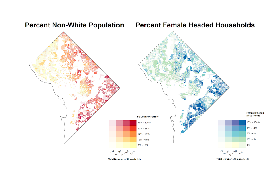
Some more value-by-alpha maps for D.C. Census Blocks

I’ve made some more value-by-alpha maps for my dissertation for percent non-white population in comparison to percentage of female-headed households for Census blocks in 2010 in D.C. See my first post for some background. The choropleth classes for the percents are chosen according to quintiles of the distributions and the alpha classes are arbitrary (note the alpha class uses households as the baseline in both maps, even though percent non-white uses the population counts).

When making these maps I’ve found that the Color Brewer sequential styles that range two colors work out much better than those that span one color. What happens with the one color sequential themes is that the faded out colors end up being confounded with the lighter colors in the fully opaque ranges. When using the two sequential color schemes (here showing Yellow to Red and Yellow to Blue) it provides greater discrepancy between the classes.


I did not try out the black background for these maps (I thought perhaps it would be a bit jarring in the document have a swath of black stand out). The CUNY Center for Urban Research has some other example value-by-alpha maps for New York City elections in 2013. After some discussion with Steven Romalewski they decided they liked the white background better for there maps, and my quick attempts for these examples I think I agree.

Finding subgroups in a graph using NetworkX and SPSS

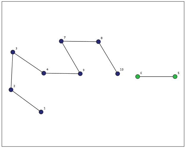
This is a task I’ve have to conduct under several guises in the past. Given a set of edges, reduce those edges into unique subgroups based on the transitive closure of those edges. That is, find a group in which all nodes can reach one another (via however many steps are necessary) but are completely separated from all other nodes.

This is steeped in some network language jargon, so I will give a few examples in data analysis where this might be useful:

  • Find cliques of offenders (that may resemble a gang) given a set of co-offenders in a police incident database.
  • Reduce a large set of items that appear together into smaller subsets. An example may be if you have a multiple response set with a very large number of possible choices. You may identify subgroups of items that occur together.
  • Given a set of linked near match names, reduce the database so all of those near match names share the same unique id.
  • For my dissertation I aggregate crime incidents to street midpoints and intersections. This creates some overlap or near overlap points (e.g. at T intersections). You might want to further aggregate points that are within a prespecified distance, but there may be multiple nodes all within a short distance. These create a string of networked locations that are probably not appropriate to simply aggregate – especially when they include a large number of locations.

One (typical) way to find the transitive closure is to represent your edges in a binary adjacency matrix and then take subsequent higher powers of that matrix until the diffusion ceases. This is difficult to impossible though with node lists of any substantial size. In this post what I will do is use the NetworkX python library, which contains a handy function named components.connected that solves this problem for me.

So first for illustration lets make a small edge list in SPSS.

DATA LIST FREE / A B.
BEGIN DATA
1 2
2 3
3 4
5 6
7 8
4 9
7 9
8 10
END DATA.
DATASET NAME Test.
FORMATS A B (F5.0).
EXECUTE.

Now using the functions described in this StackOverflow post, we will be able to turn a set of nested lists into a NetworkX object in python.

BEGIN PROGRAM.
import networkx 
from networkx.algorithms.components.connected import connected_components

def to_graph(l):
    G = networkx.Graph()
    for part in l:
        # each sublist is a bunch of nodes
        G.add_nodes_from(part)
        # it also imlies a number of edges:
        G.add_edges_from(to_edges(part))
    return G

def to_edges(l):
    """ 
        treat `l` as a Graph and returns it's edges 
        to_edges(['a','b','c','d']) -> [(a,b), (b,c),(c,d)]
    """
    it = iter(l)
    last = next(it)

    for current in it:
        yield last, current
        last = current    
END PROGRAM.

Now this python code 1) imports our edge list from the SPSS dataset and turn it into a networkx graph, 2) reduces the set of edges into connected components, 3) makes a new SPSS dataset where each row is a list of those subgraphs, and 4) makes a macro variable to identify the end variable name (for subsequent transformations).

DATASET DECLARE Int.
BEGIN PROGRAM.
#grab SPSS data
import spss, spssdata
alldata = spssdata.Spssdata().fetchall()

#turn SPSS data into graph
G = to_graph(alldata)
results = connected_components(G)
print results
ml = max(map(len,results))

#now make an SPSS dataset
spss.StartDataStep()
datasetObj = spss.Dataset(name='Int')
for i in range(ml):
  v = 'V' + str(i+1) 
  datasetObj.varlist.append(v,0)
for j in results:
  datasetObj.cases.append(j)
spss.EndDataStep()

#make a macro value to signify the last variable
macroValue=[]
macroName="!VEnd"
macroValue.append('V' + str(ml)) 
spss.SetMacroValue(macroName, macroValue)
END PROGRAM.

Now we can take that subgroup dataset, named Int, reshape it so all of the nodes are in one column and has a second column identifying the subgraph to which it belongs, and then merge this info back to the edge dataset named Test.

DATASET ACTIVATE Int.
COMPUTE Group = $casenum.
FORMATS Group (F5.0).
VARSTOCASES
  /MAKE A FROM V1 TO !VEnd.
FORMATS A (F5.0).
SORT CASES BY A.

DATASET ACTIVATE Test.
SORT CASES BY A.
MATCH FILES FILE = *
  /TABLE = 'Int'
  /BY A.
EXECUTE.

From here we can make some nice sociogram charts of our subgroups. SPSS’s layout.network is not very specific about the type of layout algorithm, but it does a good job here laying out a nice planar graph.

GGRAPH
  /GRAPHDATASET NAME="edges" DATASET = "Test" VARIABLES=A B Group
  /GRAPHDATASET NAME="nodes" DATASET = "Int" VARIABLES=A Group
  /GRAPHSPEC SOURCE=INLINE.
BEGIN GPL
 SOURCE: e=userSource(id("edges"))
 DATA: Ae=col(source(e), name("A"), unit.category())
 DATA: Be=col(source(e), name("B"), unit.category())
 DATA: Groupe=col(source(e), name("Group"), unit.category())
 SOURCE: n=userSource(id("nodes"))
 DATA: An=col(source(n), name("A"), unit.category())
 DATA: Groupn=col(source(n), name("Group"), unit.category())
 GUIDE: axis(dim(1), null())
 GUIDE: axis(dim(2), null())
 GUIDE: legend(aesthetic(aesthetic.color.interior), null())
 ELEMENT: edge(position(layout.network(node(An), from(Ae), to(Be))))
 ELEMENT: point(position(layout.network(node(An), from(Ae), to(Be))), color.interior(Groupn), size(size."14"), label(An))
END GPL.

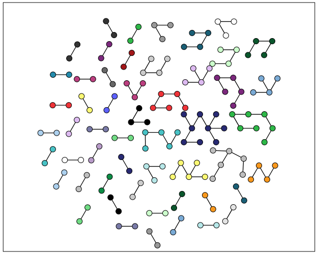
At the end of the post I have some more code to illustrate this with a slightly larger random network of 300 potential nodes and 100 random edges. Again SPSS does quite a nice job of laying out the graph, and the colors by group reinforce that our solution is correct.

My most recent use application for this had a set of 2,000+ plus edges and this code returned the solution instantaneously. Definitely a speed improvement over taking powers of a binary adjacency matrix in MATRIX code.

I wanted to make this network graph using small multiples by group, but I can’t figure out the correct code for the faceting (example commented out at the end of the code snippet). So if anyone has an example of making an SPSS graph with small multiples let me know.

*Similar graphs for larger network.
DATASET CLOSE ALL.
INPUT PROGRAM.
COMPUTE #Nodes = 300.
LOOP #i = 1 TO 100.
  COMPUTE A = TRUNC(RV.UNIFORM(0,#Nodes+1)).
  COMPUTE B = TRUNC(RV.UNIFORM(0,#Nodes+1)).
  END CASE.
END LOOP.
END FILE.
END INPUT PROGRAM.
DATASET NAME Test.
FORMATS A B (F5.0).
EXECUTE.

DATASET DECLARE Int.
BEGIN PROGRAM.
#grab SPSS data
import spss, spssdata
alldata = spssdata.Spssdata().fetchall()

#turning SPSS data into NetworkX graph
#functions are already defined
G = to_graph(alldata)
results = connected_components(G)
ml = max(map(len,results))
print ml

#now make an SPSS dataset
spss.StartDataStep()
datasetObj = spss.Dataset(name='Int')
for i in range(ml):
  v = 'V' + str(i+1) 
  datasetObj.varlist.append(v,0)
for j in results:
  datasetObj.cases.append(j)
spss.EndDataStep()

#make a macro value to signify the last variable
macroValue=[]
macroName="!VEnd"
macroValue.append('V' + str(ml)) 
spss.SetMacroValue(macroName, macroValue)
END PROGRAM.

*Now merging groups back into original set.
DATASET ACTIVATE Int.
COMPUTE Group = $casenum.
FORMATS Group (F5.0).
VARSTOCASES
  /MAKE A FROM V1 TO !VEnd.
FORMATS A (F5.0).
SORT CASES BY A.

DATASET ACTIVATE Test.
SORT CASES BY A.
MATCH FILES FILE = *
  /TABLE = 'Int'
  /BY A.
EXECUTE.

GGRAPH
  /GRAPHDATASET NAME="edges" DATASET = "Test" VARIABLES=A B Group
  /GRAPHDATASET NAME="nodes" DATASET = "Int" VARIABLES=A Group
  /GRAPHSPEC SOURCE=INLINE.
BEGIN GPL
 SOURCE: e=userSource(id("edges"))
 DATA: Ae=col(source(e), name("A"), unit.category())
 DATA: Be=col(source(e), name("B"), unit.category())
 DATA: Groupe=col(source(e), name("Group"), unit.category())
 SOURCE: n=userSource(id("nodes"))
 DATA: An=col(source(n), name("A"), unit.category())
 DATA: Groupn=col(source(n), name("Group"), unit.category())
 GUIDE: axis(dim(1), null())
 GUIDE: axis(dim(2), null())
 GUIDE: legend(aesthetic(aesthetic.color.interior), null())
 ELEMENT: edge(position(layout.network(node(An), from(Ae), to(Be))))
 ELEMENT: point(position(layout.network(node(An), from(Ae), to(Be))), color.interior(Groupn), size(size."11"))
END GPL.

*This small multiple faceting is not working.
*Error is Groupe & Groupn are not same faceting structure.
 * GGRAPH
  /GRAPHDATASET NAME="edges" DATASET = "Test" VARIABLES=A B Group
  /GRAPHDATASET NAME="nodes" DATASET = "Int" VARIABLES=A Group
  /GRAPHSPEC SOURCE=INLINE.
 * BEGIN GPL
 SOURCE: e=userSource(id("edges"))
 DATA: Ae=col(source(e), name("A"), unit.category())
 DATA: Be=col(source(e), name("B"), unit.category())
 DATA: Groupe=col(source(e), name("Group"), unit.category())
 SOURCE: n=userSource(id("nodes"))
 DATA: An=col(source(n), name("A"), unit.category())
 DATA: Groupn=col(source(n), name("Group"), unit.category())
 GUIDE: axis(dim(1), null())
 GUIDE: axis(dim(2), null())
 GUIDE: legend(aesthetic(aesthetic.color.interior), null())
 ELEMENT: edge(position(layout.network(1*1*Groupe, node(An), from(Ae), to(Be))))
 ELEMENT: point(position(layout.network(1*1*Groupn, node(An), from(Ae), to(Be))), color.interior(Groupn), size(size."14"), label(An))
END GPL.

Plotting interactions and non-linear predictions

When interpreting regression model coefficients in which the predictions are non-linear in the original variables, such as when you have polynomial terms or interaction effects, it is much simpler to make plots of the predicted values and interpret those than it is to interpret the coefficients directly.

This came up in some discussion of interpreting polynomial terms on the SPSS list-serve recently, and the example I will use came from this CrossValidated question. So I figured a blog post showing how to do it in SPSS was warranted.

So to start off I will make some fake data to work with, note the highly non-linear function Y is of the covariates.

FILE HANDLE save /NAME = "!Your Handle Here!".
INPUT PROGRAM.
LOOP Id = 1 TO 3000.
END CASE.
END LOOP.
END FILE.
END INPUT PROGRAM.
VECTOR X(3).
LOOP #i = 1 TO 3.
  COMPUTE X(#i) = RV.NORMAL(0,1).
END LOOP.
COMPUTE Y = 5 + 0.6*(X1) + 0.2*(X2) + -3*(X3) + 
            0.38*(X1**2) + 0.15*(X2**2) + -0.1*(X3**2) +
            0.3*(X1*X2) + -0.1*(X2*X3) + RV.NORMAL(0,1).
COMPUTE X1SQ = X1**2.
COMPUTE X2SQ = X2**2.
COMPUTE X3SQ = X3**2.
COMPUTE X1X2 = X1*X2.
COMPUTE X2X3 = X2*X3.

Now I am going to use REGRESSION to estimate the model with all of the terms and save the model to an XML file (at the save handle location defined before I made the fake data). The point of saving the model estimates is to use it later on to score predictions to a new set of data.

REGRESSION
  /MISSING LISTWISE
  /STATISTICS COEFF OUTS R ANOVA
  /CRITERIA=PIN(.05) POUT(.10)
  /NOORIGIN 
  /DEPENDENT Y
  /METHOD=ENTER X1 X2 X3 X1SQ X2SQ X3SQ X1X2 X2X3
  /OUTFILE=MODEL('save\LinModel.xml').

For illustration of how informative the model coefficients are, below is an image of the table. Given the sample size of 3000 and the small amount of error I added the coefficients are very close the the simulated model.

Now tell me based on the table if X1 takes a value of -1 and X3 takes a value of 0, does a change in X2 from -1 to 0 result in a positive change to the outcome or a negative change in the outcome? If you can figure out the direction of the change how large is the effect? This information is not impossible to cull from the table, but do your readers a favor and spare them these mental calculus gymnastics and plot the effects!

To do that I am going to make a new set of data in regular intervals over the explanatory values of interest.

*Now making a new set of variables to score the model.
DATASET CLOSE ALL.
INPUT PROGRAM.
COMPUTE #dens = 10.
COMPUTE #min = -2.
COMPUTE #max = 2.
COMPUTE #step = (#max - #min)/#dens.
LOOP #x1 = 0 TO #dens.
  LOOP #x2 = 0 TO #dens.
    LOOP #x3 = 0 TO #dens.
      COMPUTE Id = #x2.
      COMPUTE X1 = #min + #step*#x1. 
      COMPUTE X2 = #min + #step*#x2.
      COMPUTE X3 = #min + #step*#x3.       
      END CASE.
    END LOOP.
  END LOOP.
END LOOP.
END FILE.
END INPUT PROGRAM.
COMPUTE X1SQ = X1**2.
COMPUTE X2SQ = X2**2.
COMPUTE X3SQ = X3**2.
COMPUTE X1X2 = X1*X2.
COMPUTE X2X3 = X2*X3.
EXECUTE.

Here I used the INPUT MODEL and loops to control the sampling of where the independent variables are located at. Now you can score the model using the MODEL HANDLE and the subsequent APPLYMODEL statements available for computation.

*Score the model.
MODEL HANDLE NAME=LinModel FILE='save\LinModel.xml'
  /OPTIONS MISSING=SUBSTITUTE.
COMPUTE StandardError=APPLYMODEL(LinModel, 'STDDEV').
COMPUTE PredictedValue=APPLYMODEL(LinModel, 'PREDICT').
EXECUTE.
MODEL CLOSE NAME=LinModel.
FORMATS X1 X2 X3 X1SQ X2SQ X3SQ X1X2 X2X3 (F3.1)
        PredictedValue (F2.0).

Now we have a set of predictions and standard errors for our model. Given the three way set of interactions what I do is make a plot that has X1 on the X axis, varying values of X2 as a set of individual lines (with the color of the line a continuous color ramp) and panelled by values of X3.

*Make predicted graph.
GGRAPH
  /GRAPHDATASET NAME="graphdataset" VARIABLES=X1 PredictedValue X2 X3 Id
    MISSING=LISTWISE REPORTMISSING=NO
  /GRAPHSPEC SOURCE=INLINE.
BEGIN GPL
  PAGE: begin(scale(800px,600px))
  SOURCE: s=userSource(id("graphdataset"))
  DATA: X1=col(source(s), name("X1"))
  DATA: PredictedValue=col(source(s), name("PredictedValue"))
  DATA: X2=col(source(s), name("X2"))
  DATA: X3=col(source(s), name("X3"), unit.category())
  DATA: Id=col(source(s), name("Id"), unit.category())
  COORD: rect(dim(1,2), wrap())
  GUIDE: axis(dim(1), label("X1"))
  GUIDE: axis(dim(2), label("PredictedValue"))
  GUIDE: axis(dim(3), label("X3"), opposite())
  GUIDE: legend(aesthetic(aesthetic.color.interior), label("X2"))
  SCALE: linear(aesthetic(aesthetic.color.interior), aestheticMinimum(color.green), 
         aestheticMaximum(color.purple))
  ELEMENT: line(position(X1*PredictedValue*X3), color.interior(X2), split(Id), 
           transparency(transparency."0.3"))
  PAGE: end()
END GPL.

So lets try to answer my original question now: if X1 takes a value of -1 and X3 takes a value of 0, does a change in X2 from -1 to 0 result in a positive change to the outcome or a negative change in the outcome?

Answer: The predicted value of Y at the covariate values of X1 = -1 and X3 = 0 can be seen in the middle row of panels, second in from the left. The predicted values appear to range between 5 and 6 for the given values of X2. Going up in value for X2 (from green to purple) results in a slight decrease in the predicted value, probably less than 1 in total.

Interpreting the equation more generally though, the values of X3 mainly serve as a change in intercept of the predicted values. The shape of the slopes only changes slightly between panels – but X3 acts a moderator – bringing the slopes closer together. X2 acts a moderator on X1 in most circumstances. The green lines tend to be lower than the purple lines when both X1 and X2 take positive values, but that isn’t the whole story. Describing X2 in terms of mediating or moderating X1 is insufficient here, as you can see when both take negative values the relationship is switched and causes decreases in values of Y. When both are positive, the relationship is moderated, and a smaller change in X1 results in a larger change in the predicted value.

Now, linear OLS regression models typically don’t have so many complicated interaction and polynomial terms. But other regression models that have a link functions (e.g. Logistic, Poisson) are non-linear in the parameters when taking the inverse of the function. So even if they don’t have interaction terms they are prime candidates for similar plots of predicted values with a set of different lines and panels for various values of other explanatory variables in the model. My generic experience is looking at odds ratios (or incident rate ratios) tends to give an overly dramatic representation of effects compared to these types of plots.

When interpreting different effects of changing the explanatory variables these graphs are definitely easier to see the marginal changes of interest than the original regression coefficients. Imagine if Y in this example are physical fitness test scores, and the X’s are time spent in various exercise routines. If you are a Phys. Ed. teacher, you may want to spend more time in one activity, but since time is zero-sum you have to take time away from another. In that case, looking at the original coefficients can be slightly misleading, as you can’t increase X1 by 1 without decreasing X2 or X3 by an equivalent amount.

In this situation, the optimal scenario would be having X3 as low as possible and X1 and X2 as high as possible. For scenarios in which X3 is positive though the predictions dip in the middle, so you are better off having more extreme values of X1 and X2 then you are of having them around 0 in those circumstances.

The mad scientist workflow: Some examples of using python and R within SPSS

I figured I would share some of the scripts I have been recently working on to produce a set of figures on a regular basis for reports. SPSS GGRAPH can not be directly parameterized within macro’s (at least without a lot of work – see a counter example of Marta Garcia-Granero’s macro for Kalbfleisch-Prentice 95%CI for survival), but can be called using python code. Jon Peck has some examples at the Developerworks blog, and here I will show some more! I am also going to show how to make some automated maps in R using the ggmap package, with which you can grab various basemap tiles from online and superimpose point data.

So lets provide some example data to work with.

DATA LIST FREE / Id (A1) Crime (A8) Hour (F2.0) Lon Lat (2F16.8). BEGIN DATA 1 Robbery 18 -74.00548939 41.92961837 2 Robbery 19 -73.96800055 41.93152595 3 Robbery 19 -74.00755075 41.92996862 4 Burglary 11 -74.01183343 41.92925202 5 Burglary 12 -74.00708100 41.93262613 6 Burglary 14 -74.00923393 41.92667552 7 Burglary 12 -74.00263453 41.93267197 END DATA. DATASET NAME Crimes.

And now let’s say you want to make a graph of the hours of the day that Robberies occur in. Many small to mid-range police departments have few serious crimes when examining over shorter time spans (like a week or a month). So one type of chart I like to use are histogram like dot plots. Here is an example for the entire dataset in question.

GGRAPH /GRAPHDATASET NAME="graphdataset" VARIABLES=Hour MISSING=LISTWISE REPORTMISSING=NO /GRAPHSPEC SOURCE=INLINE. BEGIN GPL PAGE: begin(scale(600px,300px)) SOURCE: s=userSource(id("graphdataset")) DATA: Hour=col(source(s), name("Hour")) TRANS: bottom=eval(0) TRANS: top=eval(10) TRANS: begin=eval(7) TRANS: end=eval(14.5) COORD: rect(dim(1,2)) GUIDE: axis(dim(1), label("Hour of Day"), delta(1)) GUIDE: axis(dim(2), null()) GUIDE: text.title(label("Crimes by Hour Reported")) SCALE: linear(dim(1), min(1), max(22.5)) SCALE: linear(dim(2), min(0), max(3)) ELEMENT: polygon(position(link.hull((begin+end)*(bottom+top))), color.interior(color.lightblue), transparency.interior(transparency."0.5"), transparency.exterior(transparency."1")) ELEMENT: point.dodge.asymmetric(position(bin.dot(Hour, dim(1), binWidth(1))), color.interior(color.darkgrey), size(size."30")) PAGE: end() END GPL.

One of the things I like to do though is to make charts for different subsets of the data. One way is to use FILTER to only plot a subset of the data, but a problem with this approach is the fixed aspects of the chart, like the title, do not change to reflect the current data. Here I will use FILTER in combination with a python BEGIN PROGRAM ... END PROGRAM block to grab the crime type to insert into the title of the graph.

COMPUTE Bur = (Crime = "Burglary"). FILTER BY Bur. BEGIN PROGRAM. import spss MyVars = [1] dataCursor=spss.Cursor(MyVars) MyData=dataCursor.fetchone() dataCursor.close() CrimeType = MyData[0].strip() print CrimeType END PROGRAM. FILTER OFF.

So when grabbing the SPSS case data, python respects the current FILTER on the dataset. First I set an array, MyVars, to grab the variables I want. Here I only want the Crime variable, which is the second variable in the dataset. Python’s arrays are indexed at zero, so I end up wanting the variable in the [1] position. Then SPSS has a set of functions to grab data out of the active dataset using spss.Cursor. What I do is use the fetchone() object property to only grab the first row of data, and assign it the name MyData. Then after closing the cursor using dataCursor.close(), I access the string that is in the first location in the array MyData and use the strip() property to clean up trailing blanks in the string (see this example on Stackoverflow for where this was handy). When running the above code you can see that it prints Burglary, even though the burglary cases are not the first ones in the dataset. Now we can extend this example to insert the chart title and submit the GGRAPH syntax.

FILTER BY Bur. BEGIN PROGRAM. import spss MyVars = [1] dataCursor=spss.Cursor(MyVars) MyData=dataCursor.fetchone() dataCursor.close() CrimeType = MyData[0].strip() spss.Submit(""" GGRAPH /GRAPHDATASET NAME="graphdataset" VARIABLES=Hour MISSING=LISTWISE REPORTMISSING=NO /GRAPHSPEC SOURCE=INLINE. BEGIN GPL PAGE: begin(scale(600px,300px)) SOURCE: s=userSource(id("graphdataset")) DATA: Hour=col(source(s), name("Hour")) TRANS: bottom=eval(0) TRANS: top=eval(10) TRANS: begin=eval(7) TRANS: end=eval(14.5) COORD: rect(dim(1,2)) GUIDE: axis(dim(1), label("Hour of Day"), delta(1)) GUIDE: axis(dim(2), null()) GUIDE: text.title(label("%s by Hour Reported")) SCALE: linear(dim(1), min(1), max(22.5)) SCALE: linear(dim(2), min(0), max(3)) ELEMENT: polygon(position(link.hull((begin+end)*(bottom+top))), color.interior(color.lightblue), transparency.interior(transparency."0.5"), transparency.exterior(transparency."1")) ELEMENT: point.dodge.asymmetric(position(bin.dot(Hour, dim(1), binWidth(1))), color.interior(color.darkgrey), size(size."30")) PAGE: end() END GPL. """ %(CrimeType)) END PROGRAM. FILTER OFF.

You can do this same process for calling R commands, as again grabbing the case data from SPSS respects the current FILTER or (TEMPORARY + SELECT IF). One favorite of mine recently is to make automated maps using the ggmap library. Grabbing the online tiles makes my job of making a nice background much easier. Here is an example of grabbing case data from SPSS and placing the locations on the map (note this is made up data, these aren’t actual crime locations in Kingston!)

FILTER BY Bur. BEGIN PROGRAM R. #using ggmap to make a basemap library(ggmap) loc <- c(left = -74.04, bottom = 41.91, right = -73.960, top = 41.948) KingstonBasemap <- get_map(location = loc, zoom = 14, maptype = "toner", source = "stamen") #setting styles for ggplot map axisStyle <- theme(axis.text.y=element_blank(),axis.text.x=element_blank(), axis.ticks=element_blank(),axis.title.x=element_blank(), axis.title.y=element_blank() ) titleStyle <- theme(plot.title = element_text(face="bold", size=25)) #now grabbing SPSS data casedata <- spssdata.GetDataFromSPSS(variables=c("Id","Crime","Lon","Lat")) TypeCrime <- as.character(casedata$Crime[1]) #grabs first case for chart title #Data to put on the map point <- geom_point(aes(x = Lon, y = Lat), data=casedata, shape=21, size = 9, fill = "Blue") labels <- geom_text(aes(x = Lon, y = Lat, label = as.character(Id)), data=casedata, hjust = -0.03, vjust = -0.8, size = 8, fontface=2, color="cornflowerblue" ) title <- labs(title=paste0(TypeCrime," cases in March")) #Putting all together CrimeMap <- ggmap(KingstonBasemap) + point + labels + axisStyle + titleStyle + title CrimeMap END PROGRAM. FILTER OFF.

To make the map look nice takes a bit of code, but all of the action with grabbing data from SPSS and setting the string I want to use in my chart title are in the two lines of code after the #now grabbing SPSS data comment. (Note I like using Stamen base maps as they allow one to grab non-square tiles. I typically like to use the terrain map – not because the terrain is necessary but just because I like the colors – but I’ve been having problems using the terrain tiles.)

Basically the set up I have now is to place some arbitrary code for graphs and maps in a separate syntax file. So all I need to do set the filter, use INSERT, and then turn the filter off. I can then add graphs for any subsets I am interested in. I have a separate look up table that stashes all the necessary metadata I want for use in the plots for whatever particular categories, which in addition to titles include other chart aesthetics like sizes for point elements or colors. In the future I will have to explore more options for using the SPLIT FILE facilities that both python and R offer when working with SPSS case data, but this is pretty simple and generalizes to non-overlapping groups as well.

The baseline in histograms & outliers

One of my current reads is Graphics of Large Datasets: Visualizing a Million (Unwin, Theus & Hofman, 2007). In one of the introductory chapters (I believe it was Theus) makes the point that for histograms with stretched out values it is very difficult to identify outliers in the tails (or really see the density at all).

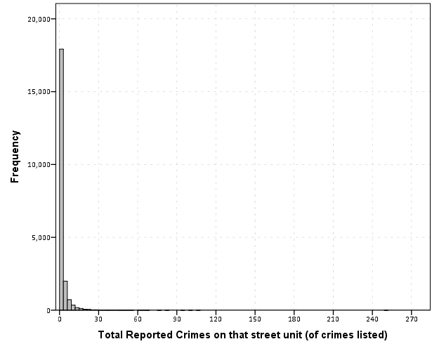
Here is an example with the crime data for 21,506 street units I am using for my dissertation.

Now we know there likely are a few outliers based on SPSS drawing the chart axis to 300, but we can not see their location. The bar lengths are so tiny that they are indiscriminable from the outline of the chart. In very large datasets, the height of the bar is not even guaranteed to encompass one pixel on the screen (depending on the Y axis scale).

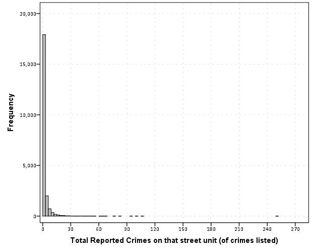
But most statistical packages draw the bars with outlines, so even if the height of the bar won’t necessarily have any pixels devoted to it, most histograms will still spare some ink to draw the outline. So I immediately thought an simple improvement to this same chart would be instead of anchoring the bins to the bottom of the chart, simply add a bit of buffer below the baseline so there is some whitespace between the histogram bars and the chart outline.

So now we can see that we have a lone outlier around 250 crimes on the street and no others within 100 crimes. The density taking into account the outline of the bar may be inaccurate in an absolute sense, but it is really an inconsequential error in terms of evaluating the shape of the distribution.

Clearly histograms are not the most appropriate tool for identifying outliers (e.g. a rug plot showing individual values below the axis would help), but this is a fairly simple change to make the typical histogram more informative. In SPSS you can simply edit the chart interactively to give the Y axis a buffer below the lowest value. The same advice applies to bar charts as well with low values in certain categories. Knowing the difference between very few and 0 is an important distinction both for histograms and bar charts.

Maybe histograms and bar charts should be drawn with this whitespace buffer by default.

A critique of slopegraphs

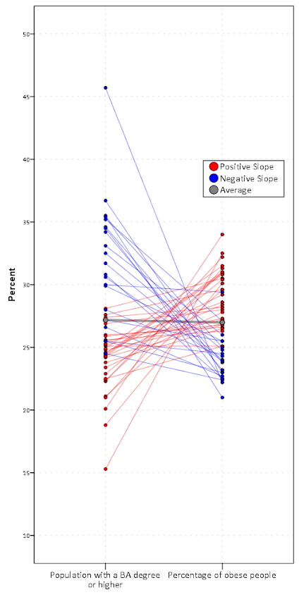
I’ve recently posted a pre-print of an article, A critique of slopegraphs, on SSRN. In the paper I provide a critique of the use of slopegraphs and present alternative graphics to use in their place, using the slopegraph displayed on the cover of Albert Cairo’s The Functional Art as motivation – below is my rendering of that slopegraph.

Initially I wanted to write a blog post about the topic – but I decided to give all of the examples and full discussion I wanted it would be far too long. So I ended up writing a (not so short) paper. Below is the abstract, and I will try to summarize it in a few quick points (but obviously I encourage you to read the full paper!)

Slopegraphs are a popular form of graphic depicting change along two independent axes by means of a connecting line. The critique here lists several reasons why interpreting the slopes may be misleading and suggests alternative plots depending on the goals of the visualization. Guidelines as to appropriate situations to use slopegraphs are discussed.

So the three main points I want to make are:

  • The slope is not the main value of interest in a slopegraph. The slope is itself an arbitrary function of how far away the axes are placed from one another.
  • Slopegraphs are poor for judging correlation and seeing a functional relationship between the two values. Scatterplots or just graphing the change directly are often better choices.
  • Slopegraphs are difficult to judge when the variance between axes changes (which produce either diverging or converging slopes) and when the relationship is negative (which produces many crossings in the slopes).

I’ve catalogued a collection of articles, examples and other critiques of slopegraphs at this location. Much of what I say is redundant with critiques of slopegraphs already posted in other blogs on the internet.

I’m pretty sure my criminal justice colleagues will not be interested in the content of the paper, so I may need to cold email someone to review it for me before I send it off. So if you have comments or a critique of the paper I would love to hear it!

Article: Viz. techniques for JTC flow data

My publication Visualization techniques for journey to crime flow data has just been posted in the online first section of the Cartography and Geographic Information Science journal. Here is the general doi link, but Taylor and Francis gave me a limited number of free offprints to share the full version, so the first 50 visitors can get the PDF at this link.

Also note that:

  • The pre-print is posted to SSRN. The pre-print has more maps that were cut for space, but the final article is surely cleaner (in terms of concise text and copy editing) and has slightly different discussion in various places based on reviewer feedback.
  • Materials I used for the article can be downloaded from here. The SPSS code to make the vector geometries for a bunch of the maps is not terribly friendly. So if you have questions feel free – or if you just want a tutorial just ask and I will work on a blog post for it.
  • If you ever want an off-print for an article just send me an email (you can find it on my CV. I plan on continuing to post pre-prints to SSRN, but I realize it is often preferable to cite the final in print version (especially if you take a quote).

The article will be included in a special issue on crime mapping in the CaGIS due to be published in January 2015.

Visualizing multi-level data using ellipses

After reading Elliptical Insights: Understanding Statistical Methods through Elliptical Geometry (Friendly, Monette & Fox 2013) I was interested in trying ellipses out for viz. multi-level data. Note there is an add-on utility for SPSS to draw ellipses in R graphics (ScatterWEllipse.spd), but I wanted to give it a try in SPSS graphics.

So I’ve made two SPSS macros. The first, !CorrEll, takes two variables and returns a set of data that can be used by the second macro, !Ellipse, to draw data ellipses based on the eigenvectors and eigenvalues of those 2 by 2 covariance matrices by group. In this example I will be using the popular2.sav data available from Joop Hox’s Multilevel Analysis book. The code can be downloaded from here to follow along.

So first lets define the FILE HANDLE where the data and scripts are located. Then we can read in the popular2.sav data. I only know very little about the data – but it is students nested within classrooms (pretty close to around 20 students in 100 classes), and it appears focused on student evaluations of teachers.


FILE HANDLE Mac / name = "!Location For Your Data!".
INSERT FILE = "Mac\MACRO_CorrEll.sps".
INSERT FILE = "Mac\MACRO_EllipseSPSS.sps".
GET FILE = "Mac\popular2.sav".
DATASET NAME popular2.

Now we can call the first macro, !CorrEll for the two variables extrav (a measure of the teachers extroversion) and popular (there are two popular measures in here, and I am unsure what the difference between them are – this is the "sociometry" popular variable though). This will return a dataset with the means, variances and covariances for those two variables split by the group variable class. It will also return the major and minor diameters based on the square root of the eigenvalues of that 2 by 2 matrix, and then the ellipse is rotated according to direction of the covariance.


!CorrEll X = extrav Y = popular Group = class.

This returns a dataset named CorrEll as the active dataset, with which we can then draw the coordinate geometry for our ellipses using the !Ellipse macro.


!Ellipse X = Meanextrav Y = Meanpopular Major = Major Minor = Minor Angle = AngDeg Steps = 100.

The Steps parameter defines the coordinates around the circle that are drawn. So more steps means a more precise drawing (but also more datapoints to draw). This makes a new dataset called Ellipse as the active dataset, and based on this we can draw those ellipses in SPSS using the path element with the split modifier so the ellipses aren’t drawn in one long pen stroke. Also note the ellipses are not closed circles (that is the first point does not meet the last point) so I use the closed() option when drawing the paths.


FORMATS X Y Id (F3.0).
GGRAPH
  /GRAPHDATASET NAME="graphdataset" DATASET = 'Ellipse' VARIABLES=X Y Id
  REPORTMISSING=NO
  /GRAPHSPEC SOURCE=INLINE.
BEGIN GPL
 SOURCE: s=userSource(id("graphdataset"))
 DATA: X=col(source(s), name("X"))
 DATA: Y=col(source(s), name("Y"))
 DATA: Id=col(source(s), name("Id"), unit.category())
 GUIDE: axis(dim(1), label("Extraversion"))
 GUIDE: axis(dim(2), label("Popular"))
 ELEMENT: path(position(X*Y), split(Id), closed())
END GPL.

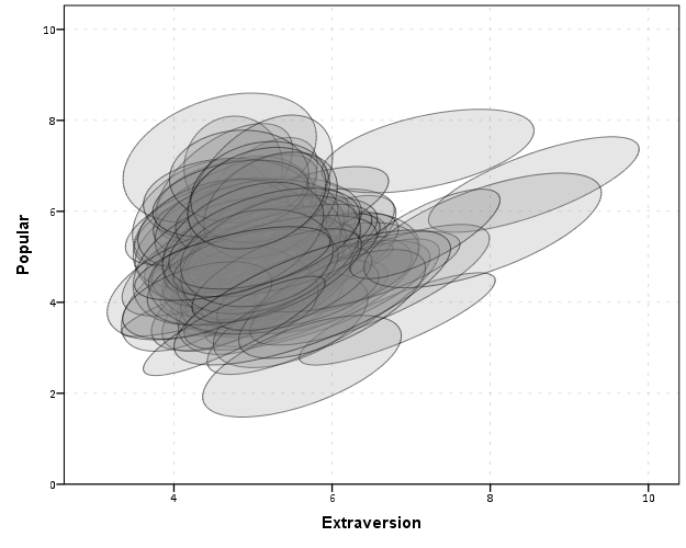
With 100 groups this is a pretty good test of the efficacy of the display. While many multi-level modelling strategies will have fewer groups, if the technique can not scale to at least 100 groups it would be a tough sell. So above is a bit of an overplotted mess, but here I actually draw the polygons with a light grey fill and use a heavy amount of transparency in both the fill and the exterior line. To draw the ellipses I use the polygon element and connect the points using the link.hull statement. The link.hull modifier draws the convex hull of the set of points, which of course an ellipse is convex.


GGRAPH
  /GRAPHDATASET NAME="graphdataset" DATASET = 'Ellipse' VARIABLES=X Y Id
  REPORTMISSING=NO
  /GRAPHSPEC SOURCE=INLINE.
BEGIN GPL
 SOURCE: s=userSource(id("graphdataset"))
 DATA: X=col(source(s), name("X"))
 DATA: Y=col(source(s), name("Y"))
 DATA: Id=col(source(s), name("Id"), unit.category())
 GUIDE: axis(dim(1), label("Extraversion"))
 GUIDE: axis(dim(2), label("Popular"))
 ELEMENT: polygon(position(link.hull(X*Y)), split(Id), color.interior(color.grey), transparency.interior(transparency."0.8"),
          transparency.exterior(transparency."0.5"))
END GPL.

I thought that using a fill might make the plot even more busy, but that doesn’t appear to be the case. Using heavy transparency helps a great deal. Now what can we exactly learn from these plots?

First, you can assess the distribution of the effect of extroversion on popularity by class. In particular for multi-level models we can assess whether we can to include random intercepts and/or random slopes. In this case the variance of the extroversion slope looks very small to me, so it may be reasonable to not let its slope vary by class. Random intercepts for classes though seem reasonable.

Other things you can assess from the plot are if there are any outlying groups, either in coordinates on the x or y axis, or in the direction of the ellipse. Even in a busy – overplotted data display like this we see that the covariances are all basically in the same positive direction, and if one were strongly negative it would stick out. You can also make some judgements about the between group and within group variances for each variable. Although any one of these items may be better suited for another plot (e.g. you could actually plot a histogram of the slopes estimated for each group) the ellipses are a high data density display that may reveal many characteristics of the data at once.

A few other interesting things that are possible to note from a plot like this are aggregation bias and interaction effects. For aggregation bias, if the direction of the orientation of the ellipses are in the opposite direction of the point cloud of the means, it provides evidence that the correlation for the aggregate data is in the opposite direction as the correlation for the micro level data.

For interaction effects, if you see any non-random pattern in the slopes it would suggest an interaction between extroversion and some other factor. The most common one is that slopes with larger intercepts tend to be flatter, and most multi-level software defaults to allow the intercepts and slopes to be correlated when they are estimated. I was particularly interested in this here, as the popularity score is bounded at 10. So I really expected that to have a limiting effect on the extroversion slope, but that doesn’t appear to be the case here.

So unfortunately none of the cool viz. things I mention (outliers, aggregation bias or interaction effects) really appear to occur in this plot. The bright side is it appears to be a convenient set of data to fit a multi-level model too, and even the ceiling effect of the popularity measure do not appear to be an issue.

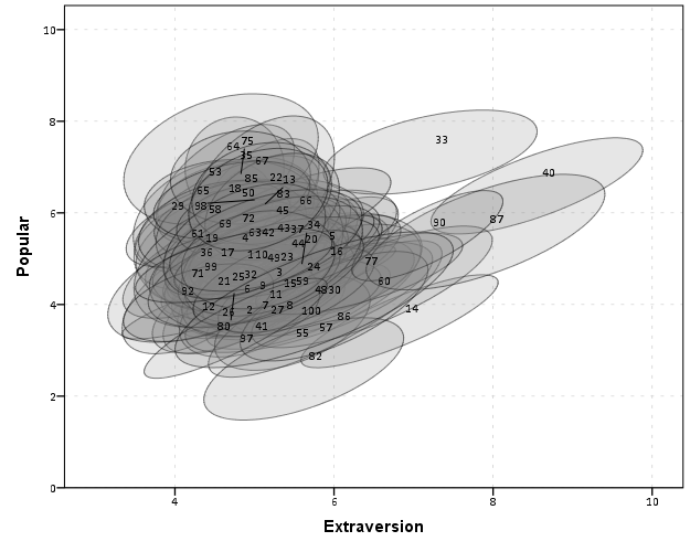
We can add in other data to the plot from either the original dataset or the CorrEll calculated dataset. Here is an example of grabbing data from the CorrEll dataset and labelling the ellipses with their group numbers. It is not very useful for the dense cloud, but for the outlying groups you can pretty easily see which label is associated with each ellipse.


DATASET ACTIVATE CorrEll.
FORMATS Meanpopular Meanextrav class (F3.0).
DATASET ACTIVATE Ellipse.
GGRAPH
  /GRAPHDATASET NAME="graphdataset" DATASET = 'Ellipse' VARIABLES=X Y Id
  /GRAPHDATASET NAME="Center" DATASET = 'CorrEll' VARIABLES=Meanpopular Meanextrav class
  REPORTMISSING=NO
  /GRAPHSPEC SOURCE=INLINE.
BEGIN GPL
 SOURCE: s=userSource(id("graphdataset"))
 DATA: X=col(source(s), name("X"))
 DATA: Y=col(source(s), name("Y"))
 DATA: Id=col(source(s), name("Id"), unit.category())
 SOURCE: c=userSource(id("Center"))
 DATA: CentY=col(source(c), name("Meanpopular"))
 DATA: CentX=col(source(c), name("Meanextrav"))
 DATA: class=col(source(c), name("class"), unit.category())
 GUIDE: axis(dim(1), label("Extraversion"))
 GUIDE: axis(dim(2), label("Popular"))
 ELEMENT: polygon(position(link.hull(X*Y)), split(Id), color.interior(color.grey), transparency.interior(transparency."0.8"),
          transparency.exterior(transparency."0.5"))
 ELEMENT: point(position(CentX*CentY), transparency.exterior(transparency."1"), label(class))
END GPL.

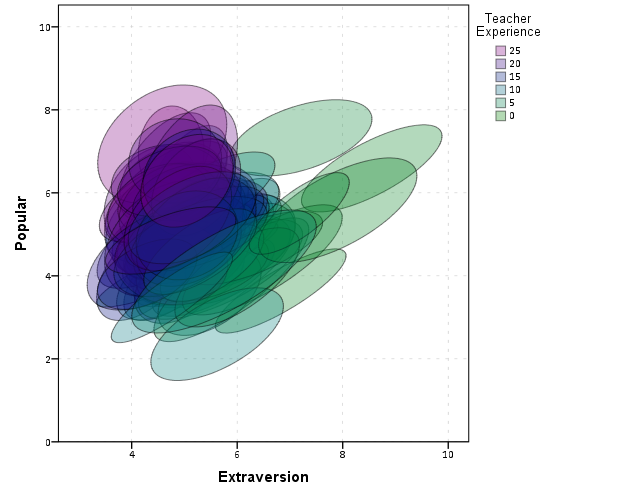
Another piece of information we can add into the plot is to color the fill of the ellipses using some alternative variable. Here I color the fill of the ellipse according to teacher experience with a green to purple continuous color ramp. SPSS uses some type of interpolation through some color space, and the default is the dreaded blue to red rainbow color ramp. With some experimentation I discovered the green to purple color ramp is aesthetically pleasing (I figured the diverging color ramps from colorbrewer would be as good a place to start as any). I use a diverging ramp as I want a higher amount of discrimination for exploratory graphics like this. Using a sequential ramp ends up muting one end of the spectrum, which I don’t really want in this circumstance.


DATASET ACTIVATE popular2.
DATASET DECLARE TeachExp.
AGGREGATE OUTFILE='TeachExp'
  /BREAK=Class
  /TeachExp=FIRST(texp).
DATASET ACTIVATE Ellipse.
MATCH FILES FILE = *
  /TABLE = 'TeachExp'
  /RENAME (Class = Id)
  /BY Id.
FORMATS TeachExp (F2.0).
*Now making plot with teacher experience colored.
DATASET ACTIVATE Ellipse.
GGRAPH
  /GRAPHDATASET NAME="graphdataset" DATASET = 'Ellipse' VARIABLES=X Y Id TeachExp
  REPORTMISSING=NO
  /GRAPHSPEC SOURCE=INLINE.
BEGIN GPL
 SOURCE: s=userSource(id("graphdataset"))
 DATA: X=col(source(s), name("X"))
 DATA: Y=col(source(s), name("Y"))
 DATA: TeachExp=col(source(s), name("TeachExp"))
 DATA: Id=col(source(s), name("Id"), unit.category())
 GUIDE: axis(dim(1), label("Extraversion"))
 GUIDE: axis(dim(2), label("Popular"))
 GUIDE: legend(aesthetic(aesthetic.color.interior), label("Teacher Experience"))
 SCALE: linear(aesthetic(aesthetic.color.interior), aestheticMinimum(color.green), aestheticMaximum(color.purple))
 ELEMENT: polygon(position(link.hull(X*Y)), split(Id), color.interior(TeachExp), transparency.interior(transparency."0.7"),
          transparency.exterior(transparency."0.5"))
END GPL.

Again I use a heavy amount of transparency and it produces what I think is a very nice looking plot. From this we can deduce that there is a clear relationship between extroversion and teacher experience, younger teachers tend to be more extroverted. We can also see that teacher experience explains some of the differences in means not explained by extroversion. That is some of the teachers with higher mean popular scores but lower extroversion scores are more experienced. This suggests the effects of teacher experience and extroversion are additive in the model predicting popularity.

You could of course color the ellipse with other variables as well. Because these are data ellipses and not confidence ellipses, you could make ellipses with fewer observations more transparent to illustrate that those estimates are less certain. Here the classrooms are all very similar size, so the error in the estimates is basically constant for all of the groups in this example.

The current code calculates the ellipses based on the eigenvectors and eigenvalues of the covariance matrix, but I may change this in the future to calculate them based on the Cholesky decomposition. If you read the Friendly paper most of the notation is written in terms of the Cholesky decomposition, and this would allow one to estimate confidence ellipses as well as the data ellipses here. So you could draw an ellipse that shows a confidence interval as opposed to the ellipses here that are just one possible level curve through the bivariate normal estimate.

Another thing I noticed the other day in the bowels of the SPSS chart template was that the xml defined glyphs had a rotation and an aspect parameter, so you could actually make a set of ellipse glyphs (although to cycle through them in SPSS charts is a pain). That makes me think that rotation and aspect should be mappable in the grammar of graphics, but I am unfamiliar with any statistical packages that allow you to easily manipulate figures in plots by specifying either the rotation of a glyph or the aspect of the glyph.

Let me know if there are any other good examples of using ellipses to visualize multi-level data.

Network Xmas Tree in SPSS

Motivated by Rick Wicklin’s raster based Christmas Tree in SAS, here I will show how to lay out a network Xmas tree in SPSS – XKCD network style.

SPSS’s GPL language has the ability to lay out different network diagrams given a list of edges and vertices. One of the layouts is a tree layout, and is intended for hierarchical data. Dendrograms created from hierarchical clustering are some of the most popular uses for this type of layout.

So to create the data for our Xmas tree, what I first did was just drew the XKCD tree on a piece of paper, and then replaced the ornaments with an integer value used to represent a node. Below is my best ASCII art representation of that tree.


              1
          ____|______
         |           |
         2           3
     ____|      _____|_____
    |          |           |
    4          5           6
 ___|____      |       ____|____
|        |     |      |         |
7        8     9     10        11
|_____      ___|___   |         |         
|     |    |       |  |         |
12   13    14      15 16       17

From here we can make an edge dataset that consists of the form of all the directed connections in the above graph. So 1 is connected to 2, 2 is connected to 4 etc. That dataset will look like below.


data list free / XFrom XTo.
begin data
1 2
1 3
2 4
3 5
3 6
4 7
4 8
5 9
6 10
6 11
7 12
7 13
9 14
9 15
10 16
11 17
end data.
dataset name edges.

If all I wanted to do was to draw the edges this would be sufficient for the graph. But I also want to style the nodes, so I create a dataset listing the nodes and a color which I will draw them with.


data list free / Node (F2.0) Type (A15).
begin data
1 Yellow
2 Red
3 Red
4 Green
5 Red
6 Red
7 Red
8 Red
9 Red
10 Green
11 Green
12 Green
13 Red
14 Green
15 Red
16 Green
17 Red
end data.
dataset name nodes.

Now here is the magic of GPL to draw our Xmas tree.


GGRAPH
  /GRAPHDATASET NAME="edges" DATASET = "edges" VARIABLES=XFrom XTo
  /GRAPHDATASET NAME="nodes" DATASET = "nodes" VARIABLES=Node Type
  /GRAPHSPEC SOURCE=INLINE.
BEGIN GPL
 SOURCE: e=userSource(id("edges"))
 DATA: XFrom=col(source(e), name("XFrom"), unit.category())
 DATA: XTo=col(source(e), name("XTo"), unit.category())
 SOURCE: n=userSource(id("nodes"))
 DATA: Node=col(source(n), name("Node"), unit.category())
 DATA: Type=col(source(n), name("Type"), unit.category())
 GUIDE: axis(dim(1), null())
 GUIDE: legend(aesthetic(aesthetic.color.interior), null())
 COORD: rect(dim(1,2), reflect(dim(2)))
 SCALE: cat(aesthetic(aesthetic.color.interior), map(("Yellow", color.yellow), ("Red", color.red), ("Green", color.green)))
 ELEMENT: edge(position(layout.tree(node(Node),from(XFrom), to(XTo), root("1"))))
 ELEMENT: point(position(layout.tree(node(Node),from(XFrom), to(XTo), root("1"))), color.interior(Type), size(size."14"))
END GPL.

I ended up drawing the Y axis (and reflecting it) because my chart template did not have enough padding for the root node and the yellow circle was partially cut off in the plot. I then post-hoc deleted the Y axis, changed the aspect ratio and the background color of the plot. And Voila – Happy Holidays!