Assessing Categorical Effects in Machine Learning Models

One model diagnostic for machine learning models I like are accumulated local effects (ALE), see Wheeler & Steenbeek (2021) for an example and Molnar (2020) for a canonical mathematical reference. With these we get some ex-ante interpretability of models – I use this for mostly EDA of the final fitted model. Here is an example of seeing the diffusion effect of DART stations on robberies in Dallas from my cited paper:

So the model is behaving as expected – nearby DART stations causes an uptick, and that slowly diffuses away. And the way the ML model is set up it can estimate that diffusion effect, I did not apriori specify what that should look like.

These are essentially average/marginal effects (or approximate derivatives) for complicated machine learning models. In short pseudoish/python code, pretend we have a set of data D and a model, the local effect of variable x at the value 5 is something like:

D['x'] = 5 # set all the data for x to value 5
pred5 = mod.predict(D)
D['x'] = 5 + 0.001 # change value x by just alittle
predc = mod.predict(D)
loc_eff = (pred5 - predc)/0.001
print(loc_eff.mean())

So in shorthand [p(y|x) - p(y|x+s)]/s, so s is some small change (approximate the continuous derivative via finite differences). Then you generate these effects (over your sample), for various values of x, and then make a plot.

Many people say that this only applies to numerical features. So say we have a categorical effect with three variables, a/b/c. We could calculate p(y|a) and p(y|b), but because a - b is not defined (what is the difference in categorical variables), we cannot have anything like a derivative in the ALE for categorical features.

This seems to me though short sited. While we cannot approximate a derivative, the value p(y|a) - p(y|b) is pretty interpretable without the division – this is the predicted difference if we switch from category a to category b. Here I think a decent default is to simply do p(y|cat) - mean(p(y|other cat)), and then you can generate average categorical effects for each category (with very similar interpretation to ALEs). For those who know about regression contrasts, this would be like saying we have dummy variables for A/B/C, and the effect of A is contrast coded via 1,-1/2,-1/2.

Here is a simple example in python. For data see my prior post on the NIJ recidivism challenge or mine and Gio’s working paper (Circo & Wheeler, 2021). Front end cleaning up the data is very similar. I use a catboost model here.

import catboost
import numpy as np
import pandas as pd

# Ommitted Code, see 
# https://andrewpwheeler.com/2021/07/24/variance-of-leaderboard-metrics-for-competitions/
# for how pdata is generated
pdata = prep_data(full_data)

# Original train/test split
train = pdata[pdata['Training_Sample'] == 1].copy()
test = pdata[pdata['Training_Sample'] == 0].copy()

# estimate model, treat all variables as categorical
y_var = 'Recidivism_Arrest_Year1'
x_vars = list(pdata)
x_vars.remove(y_var)
x_vars.remove('Training_Sample')
cat_vars = list( set(x_vars) - set(more_clip) )

cb = catboost.CatBoostClassifier(cat_features=cat_vars)
cb.fit(train[x_vars],train[y_var])

Now we can do the hypothetical change the category and see how it impacts the predicted probabilities (you may prefer to do this on the logit scale, but since it is conditional on all other covariates it should be OK IMO). Here I calculate the probabilities over each of the individual PUMAs in the sample.

# Get the differences in probabilities swapping
# out each county, conditional on other factors
pc = train.copy()
counties = pd.unique(train['Residence_PUMA']).tolist()
res_vals = []
for c in counties:
    pc['Residence_PUMA'] = c
    pp = cb.predict_proba(pc[x_vars])[:,1]
    res_vals.append(pd.Series(pp))

res_pd = pd.concat(res_vals,axis=1)
res_pd.columns = counties
res_pd

So you can see for the person in the first row, if they were in PUMA 16, they would have a predicted probability of recidivism of 0.140. If you switched them to PUMA 24, it changes to 0.136. So you can see the PUMA overall doesn’t appear to have much of an impact on the recidivism prediction in this catboost model.

Now here is leave one out centering as I stated before. So we compare PUMA 16 to the average of all other PUMAs, within each row.

# Now mean center
n = res_pd.shape[1]
row_sum = res_pd.sum(axis=1)
row_adj = (-1*res_pd).add(row_sum,axis=0)/(n-1)
ycent = res_pd - row_adj
ycent

And now we can do various column aggregations to get the average categorical effects per each category. You can do whatever aggregation you want (means/medians/percentiles). (I’ve debated on making my own library to make ALEs a bit more general and return variance estimates as well.)

# Now can get mean/sd/ptils
mn = ycent.mean(axis=0)
sd = ycent.std(axis=0)
low = ycent.quantile(0.025,axis=0)
hig = ycent.quantile(0.975,axis=0)
fin_stats = pd.concat([mn,sd,low,hig],axis=1)
# Cleaning up the data
fin_stats.columns = ['Mean','Std','Low','High']
fin_stats.reset_index(inplace=True)
fin_stats.rename(columns={"index":"PUMA"}, inplace=True)
fin_stats.sort_values(by='Mean',ascending=False,
                      inplace=True,ignore_index=True)
fin_stats

And we can see that while I sorted the PUMAs and PUMA 25 has a mean effect of 0.03, its standard deviation is quite high. The only PUMA that the percentiles do not cover 0 is PUMA 13, with a negative effect of -0.06.

Like I said, I like these more so for model checking/EDA/face validity. Here I would dig into further PUMA 25/13, make sure nothing funny is going on with the data (and whether I should try to tease out more features from these in real life if I had access to the source data, e.g. smaller aggregations). The other PUMAs though are quite unremarkable and have spreads of +/-2 percentage points pretty consistently.

References

  • Circo, G., & Wheeler, A.P. (2021). National Institute of Justice Recidivism Forecasting Challange Team “MCHawks” Performance Analysis. CrimRXiv.
  • Molnar, C. (2020). Interpretable machine learning. Ebook.
  • Wheeler, A. P., & Steenbeek, W. (2021). Mapping the risk terrain for crime using machine learning. Journal of Quantitative Criminology, 37(2), 445-480.

Using linear programming to assess spatial access

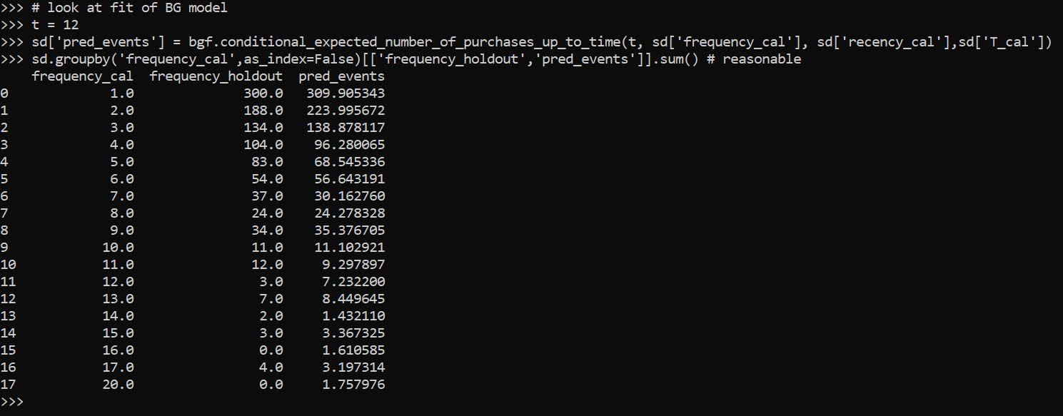
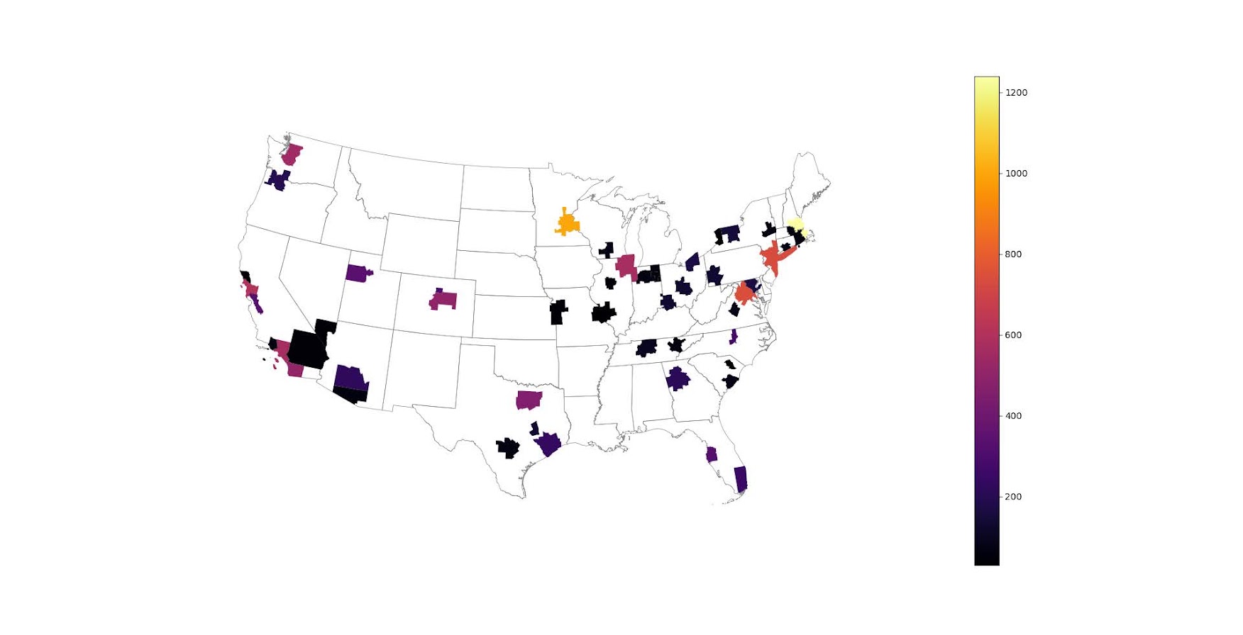
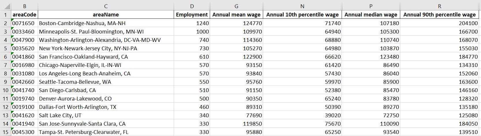
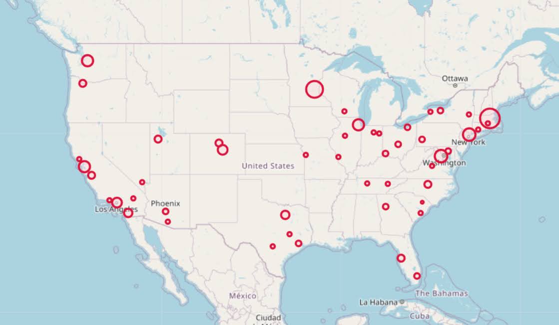
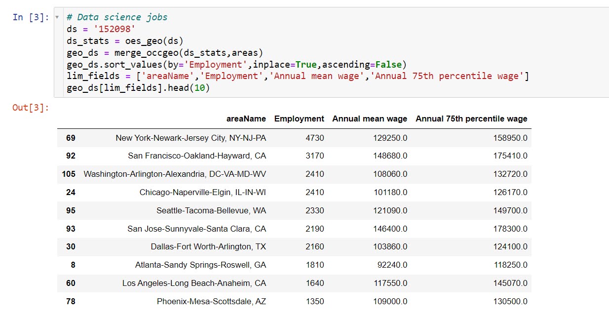
So one of the problems I have been thinking about at work is assessing spatial access to providers. Some common metrics are ‘distance to nearest’, or combining distance as well as total provider capacity into one metric, the two-step floating catchment method (2SFCA).

So imagine we are trying to evaluate the coverage of opioid treatment facilities relative to the spatial distribution of people abusing opioids. Say for example we have two areas, A and B. Area A has a facility that can treat 50 people, but has a total of 100 people who need service. Now Area B has no treatment provider, but only has 10 people that need service.

If you looked at distance to nearest provider, location B would look worse than A. So you may think to yourself – we should open up a facility in Area B. But if you look at the total number of people, as well as the capacity of the treatment provider in Area A, it would probably be a better investment to expand the capacity of treatment center A. It has more potential demand.

The 2SFCA partially captures this, but I am going to show a linear programming approach that can decompose the added benefit of adding capacity to a particular provider, or adding in potential new providers. I have the posted these functions on github, but can walk through the linear programming model, and how to assess potential policy interventions in that framework.

So first lets make just a simple set of data, we have 10 people with XY coordinates, and 2 service providers. The two service providers have capacity 3 and 5, so we cannot cover 2 of the people.

# Python example code
import numpy as np
import pandas as pd
import pulp

# locations of people
id = range(10)
px = [1,1,3,3,4,5,6,6,9,9]
py = [2,8,1,8,4,6,1,2,5,8]
peop = pd.DataFrame(zip(id,px,py),columns=['id','px','py'])

# locations of 2 providers & capacity 3/5
hid = [1,2]
hx = [1,8]
hy = [1,8]
hc = [3,5] # so cant cover 2 people
prov = pd.DataFrame(zip(hid,hx,hy,hc),columns=['hid','hx','hy','hc'])

Now for the subsequent model I show, it is going to assign the people to the nearest possible provider, given the distance constraints. To make the model feasible, we need to add in a slack provider that can soak up the remaining people not covered. We set this location to somewhere very far away, so the model will only assign people to this slack provider in the case no other options are available.

# add in a slack location to the providers
# very out of the way and large capacity
prov_slack = prov.iloc[[0],:].copy()
prov_slack['hid'] = 999
prov_slack['hx'] = 999
prov_slack['hy'] = 999
prov_slack['hc'] = peop.shape[0]
prov_add = pd.concat([prov,prov_slack],axis=0)

Now the decision model looks at all pairwise combinations between people and providers (potentially eliminating combinations that are too far away to be reasonable). So I do the cross join between the people/providers, and then calculate the Euclidean distance between them. I set the distance for the slack provider to a very high value (here 9999).

# distance between people/providers
peop['const'] = 1
prov_add['const'] = 1
cross = pd.merge(peop,prov_add,on='const')
cross['dist'] = np.sqrt( (cross['px']-cross['hx'])**2 + 
                         (cross['py']-cross['hy'])**2 )
cross.set_index(['id','hid'],inplace=True)
# setting max distance for outside provider to 9999
cross.loc[cross.xs(999,level="hid",drop_level=False).index,"dist"] = 9999

Now we are ready to fit our linear programming model. First our objective is to minimize distances. (If all inputs are integers, you can use continuous decision variables and it will still return integer solutions.)

# now setting up linear program
# each person assigned to a location
# locations have capacity
# minimize distance traveled

# Minimize distances
P = pulp.LpProblem("MinDist",pulp.LpMinimize)

# each pair gets a decision variable
D = pulp.LpVariable.dicts("DA",cross.index.tolist(),
                          lowBound=0, upBound=1, cat=pulp.LpContinuous)

# Objective function based on distance
P += pulp.lpSum(D[i]*cross.loc[i,'dist'] for i in cross.index)

And we have two types of constraints, one is that each person is assigned a single provider in the end:

# Each person assigned to a single provider
for p in peop['id']:
    provl = cross.xs(p,0,drop_level=False).index
    P += pulp.lpSum(D[i] for i in provl) == 1, f"pers_{p}"

As a note later on, I will expand this model to include multiple people from a single source (e.g. count of people in a zipcode). For that expanded model, this constraint turns into pulp.lpSum(...) == tot where tot is the total people in a single area.

The second constraint is that providers have a capacity limit.

# Each provider capacity constraint
for h in prov_add['hid']:
    peopl = cross.xs(h,level=1,drop_level=False)
    pid = peopl.index
    cap = peopl['hc'].iloc[0] # should be a constant
    P += pulp.lpSum(D[i] for i in pid) <= cap, f"prov_{h}"

Now we can solve the model, and look at who was assigned to where:

# Solve the model
P.solve(pulp.PULP_CBC_CMD()) 
# CPLEX or CBC only ones I know of that return shadow
pulp.value(P.objective) #print objective 20024.33502494309


# Get the person distances
res_pick = []
for ph in cross.index:
    res_pick.append(D[ph].varValue)

cross['picked'] = res_pick
cross[cross['picked'] > 0.99]

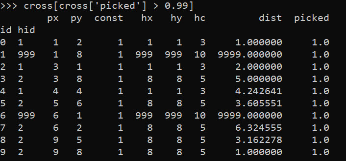
So we can see two people were assigned the slack provider 999. Note that some people are not even assigned the closest – person 7 (6,2) is assigned to provider 2 at a distance of 6.3, it is only a distance of 5.1 away from provider 1. Because provider 1 has limited capacity though, they are assigned to provider 2 in the end.

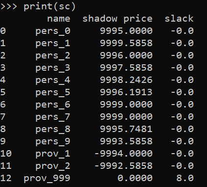
In this framework, we can get the shadow price for the constraints, which says if we relax the constraint, how much it will improve our objective value.So if we add 1 capacity to provider 1, we will improve our objective by -9994.

# Get the shadow constraints per provider
o = [{'name':name, 'shadow price':c.pi, 'slack': c.slack} 
     for name, c in P.constraints.items()]
sc = pd.DataFrame(o)
print(sc)

I have helper functions at the github link above, so I don’t need to go through all of these motions again. You input your people matrix and the field names for the id, x, y, totn values.

And then you input your provider matrix with the field names for the providerid, x, y, prov_capacity (note this is not the matrix with the additional slack provider, my code adds that in automatically). The final two arguments limit the potential locations (e.g. here saying can’t assign a person to a provider over 12 distance away). And the last argument sets the super high distance penalty to people are not assigned.

# load in model functions
from assign_funcs import ProvAssign

# Const=1 is the total people per area
m1 = ProvAssign(peop,
                ['id','px','py','const'],
                prov,
                ['hid','hx','hy','hc'],
                12,
                9999)

m1.solve(pulp.PULP_CBC_CMD())
# see the same objective as before

Now we can go ahead and up our capacity at provider 1 by 1, and see how the objective is reduced by -9994:

# if we up the provider capacity for
# prov by 1, the model objective goes 
# down by -9994
prov['hc'] = [4,5]

m2 = ProvAssign(peop,
                ['id','px','py','const'],
                prov,
                ['hid','hx','hy','hc'],
                12,
                9999)
m2.solve(pulp.PULP_CBC_CMD())
m1.obj - m2.obj # 9994!

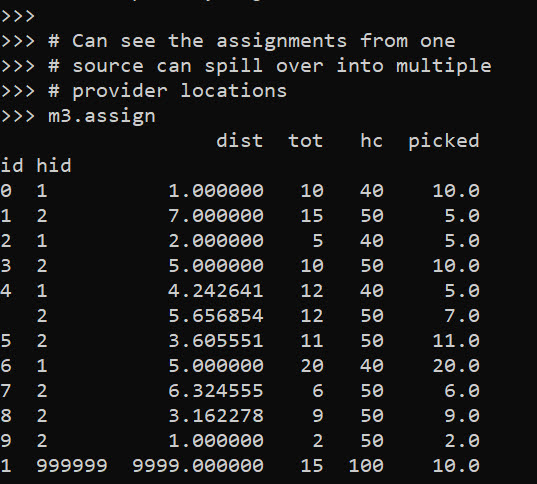
Like I said, I extended this to the scenario that you don’t have individual people, but have multiple counts of people in a spatial area. What can happen in this scenario is one source location can send people to multiple providers. Here you can see that source location 4 (total of 12 people), 5 were sent to provider 1, and 7 were sent to provider 2.

# Can make these multiple people, 100 total
peop['tot'] = [10,15,5,10,12,11,20,6,9,2]
prov['cap'] = [40,50] # should assign 10 people to slack

m3 = ProvAssign(peop,
                ['id','px','py','tot'],
                prov,
                ['hid','hx','hy','cap'],
                12,
                9999)
m3.solve(pulp.PULP_CBC_CMD())
# Can see the assignments from one
# source can spill over into multiple
# provider locations
m3.assign

So one of the things I like about this approach I already showed, we can do hypothetical scenarios ‘add capacity’ and see how it improves overall travel. Another potential intervention is to just place dummy 0 capacity providers over the study area, then look at the shadow constraints to see the best locations to open new facilities. Here I add in a potential provider at location (5,5).

# Can add in hypothetical providers with
# no capacity (make new providers)
# and check out the shadow
p2 = prov_slack.copy()
p2['hid'] = 10
p2['hx'] = 5
p2['hy'] = 5
p2['hc'] = 0
p2['cap'] = 0
prov_add = pd.concat([prov,p2],axis=0)


m4 = ProvAssign(peop,
                ['id','px','py','tot'],
                prov_add,
                ['hid','hx','hy','cap'],
                10,
                9999)

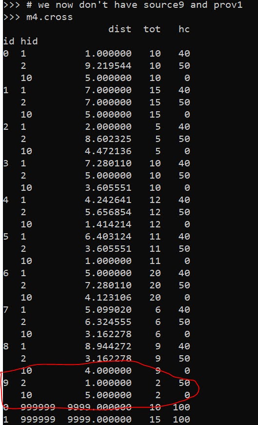
# we now don't have source9 and prov1
m4.cross

Here in the code, I also have a function to limit potential assignments. Here if I set that limit to 10, it only just prevents id 9 (9,8) from being assigned to provider 1 (1,1), which is a distance of 10.6 away. This is useful with larger datasets, in which you may not be able to fit all of the pairwise distances into memory and model. (Although this model is pretty simple, you may be able to look at +1 million pairwise combos and solve in a reasonable time with open source solvers.)

Now we can go ahead and solve this model. I have a bunch of helper functions as well, so after solving we can check out the shadow price matrix:

# Solve m4 model
m4.solve(pulp.PULP_CBC_CMD())

# can see the new provider 10
# if we added capacity would
# decrease distance travelled by -9996.2426
m4.shadow

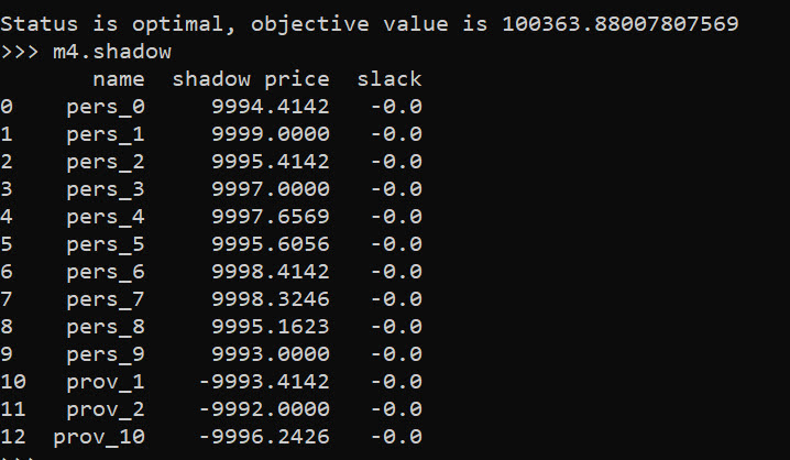
And based on this, it does look like we will have the best improvement by adding capacity at our hypothetical new provider 10, as oppossed to adding capacity at provider 1 or 2. Lets see what happens if you add 10 capacity to our hypothetical provider:

# Now lets add capacity for new provider
# by 10, should the objective go down
# by 10*-9996.2426 ?
prov_add['cap'] = [40,50,10]

m5 = ProvAssign(peop,
                ['id','px','py','tot'],
                prov_add,
                ['hid','hx','hy','cap'],
                12,
                9999)
m5.solve(pulp.PULP_CBC_CMD())

# Not quite -9996.2 but close!
(m5.obj - m4.obj)/10

We can see that the objective was not quite reduced by the expected, but is close. If it is not feasible to add a totally new provider, but simpler to give resources to expand current ones, we can see what will happen if we expand provider 1 by 10.

# we could add capacity
# to provider 1 by 10
# as well
prov_add['cap'] = [50,50,0]

m6 = ProvAssign(peop,
                ['id','px','py','tot'],
                prov_add,
                ['hid','hx','hy','cap'],
                10,
                9999)
m6.solve(pulp.PULP_CBC_CMD())

# Not quite -9993.4 but close!
(m6.obj - m4.obj)/10

In addition to doing different policy interventions in this approach, I provide different metrics to assess distance traveled and coverage. So going back to model 4, we can look at which areas have limited coverage. It only ends up that source area 1 has 10/15 people not covered. The rest of the areas are covered.

# Can look at sources and see stats
# for distance travelled as well
# as potential non-coverage
m4.source_stats

The fields are Trav is the average distance travelled for people who are covered (so could have high coverage but those people have to go a ways). Tot is the total number of people within that particular source area, and picked/not-covered are those assigned a provider/not assigned a provider (so go to the slack) respectively.

I additionally I have stats available rolled up to providers, mostly based on the not covered nearby. One way that the shadow doesn’t work, if you only have 10 people nearby, it doesn’t make sense to expand capacity to any more than 10 people. Here you can see the shadow price, as well as those not covered that are nearby to that provider.

# Can look at providers
# and see which ones would result in
# most reduced travel given increased coverage
# Want high NotCover and low shadow price
m4.prov_stats

The other fields, hc is the listed capacity. Trav is the total travel for those not covered. The last field bisqw, is a way to only partially count not covered based on distance. It uses the bi-square kernel weight, based on the max distance field you provided in the model object. So if many people are nearby it will get a higher weight.

Here good add capacity locations are those with low shadow prices, and high notcovered/bisqw fields.

Note these won’t per se give the best potential places to add capacity. It may be the best new solution is to spread out new capacity – so here instead of adding 10 to a single provider, add a few to different providers.

You could technically figure that out by slicing out those leftover people in the m4.source_stats that have some not covered, adding in extra capacity to each provider, and then rerunning the algorithm and seeing where they end up.

Again I like this approach as it lets you articulate different policy proposals and see how that changes the coverage/distance travelled. Although no doubt there are other ways to formulate the problem that may make sense, such as maximizing coverage or making a coverage/distance bi-objective function.

Estimating Criminal Lifetime Value

At work I am currently working on estimating/forecasting healthcare spending. Similar to work I have done on forecasting person level crime risks (Wheeler et al., 2019), I build the predictive model dataset like this:

CrimeYear2020 PriorCrimeA PriorCrimeB
     0              2          3
     1              5          0
     0              0          0

etc. So I flatten people to a single row, and as covariates include prior cumulative crime histories. Most people do this similarly in the healthcare setting, so it looks like:

SpendingYear2020 PriorComorbidA PriorComorbidB
     3000              1          2
      500              3          0
    10000              0          0

Or sometimes people do a longitudinal dataset, where it is a spending*year*person panel (see Lauffenburger et al., 2020 for an example). I find this approach annoying for a few reasons though. One, it requires arbitrary temporal binning, which is somewhat problematic in these transaction level databases. We are talking for chronic offenders a few crimes per year is quite high, and ditto in the healthcare setting a few procedures a year can be very costly. So there is not much data to estimate the underlying function over time.

A second aspect I think is bad is that it doesn’t take into account the recency of the patterns. So the variables on the right hand side can be very old or very new. And with transaction level databases it is somewhat difficult to define how to estimate the lookback – do you consider it normalized by time? The VOID paper I mentioned we evaluated the long term scores, but the PD that does that chronic offender system has two scores – one a cumulative history and another a 90 day history to attempt to deal with that issue (again ad-hoc).

One approach to this issue from marketing research I have seen from very similar types of transactions databases are models to estimate Customer Lifetime Value (Fader et al. 2005). These models in the end generate a dataset that looks like this:

Person    RecentMonths  TotalEvents AveragePurchase
  A            3             5            $50
  B            1             2           $100
  C            9             8            $25

TotalEvents should be straightforward, RecentMonths just is a measure of the time since the last purchase, and then you have the average value of the purchases. And using just this data, estimates the probability of any future purchases, as well as projects the total value of the future average purchases. So here I use an example of this approach, using the Wolfgang Philly cohort public data. I am not going into the model more specifically (read some of the Bruce Hardie notes to get a flavor).

I have created some python code to follow along and apply these same customer lifetime value estimates to chronic offender data. Most examples of weighting crime harm apply it to spatial areas (Mitchell, 2019; Wheeler & Reuter, 2021), but you can apply it the same to chronic offender lists (Liggins et al., 2019).

Example Criminal Lifetime Value in Python

First, install the lifetimes python library – Cam’s documentation is excellent and makes the data manipulation/modelling quite simple.

Here I load in the transaction level crime data, e.g. it just have person A, 1/5/1960, 1000, where the 1000 is a crime seriousness index created by Wolfgang. Then the lifetimes package has some simple functions to turn our data into the frequency/recency format.

Note that for these models, you drop the first event in the series. To build a model to do train/test, I also split the data into evens before 1962, and use 1962 as the holdout test period.

import lifetimes as lt
import pandas as pd

# Just the columns from dataset II
# ID, SeriousScore, Date
df = pd.read_csv('PhilData.csv')
df['Date'] = pd.to_datetime(df['Date'])

# Creating the cumulative data
# Having holdout for one year in future
sd = lt.utils.calibration_and_holdout_data(df,'ID','Date',
              calibration_period_end='12-31-1961',
              observation_period_end='12-31-1962',
              freq='M',
              monetary_value_col='SeriousScore')

# Only keeping people with 2+ events in prior period
sd = sd[sd['frequency_cal'] > 0].copy()
sd.head()

Recency_cal is how many months since a prior crime (starting in 1/1/1962), frequency is the total number of events (minus 1, so number of repeat events technically), and the monetary_value_cal here is the average of the crime seriousness across all the events. The way this function works, the variables with the subscript _cal are in the training period, and _holdout are events in the 1962 period. For subsequent models I subset out people with at least 2 events total in the modeling.

Now we can fit a model to estimate the predicted number of future crimes a person will commit – so this does not take into account the seriousness of those crimes. The final groupby statement shows the predicted number of crimes vs those actually committed, broken down by number of crimes in the training time period. You can see the model is quite well calibrated over the entire sample.

# fit BG model
bgf = lt.BetaGeoFitter(penalizer_coef=0)
bgf.fit(sd['frequency_cal'],sd['recency_cal'],sd['T_cal'])

# look at fit of BG model
t = 12
sd['pred_events'] = bgf.conditional_expected_number_of_purchases_up_to_time(t, sd['frequency_cal'], sd['recency_cal'],sd['T_cal'])
sd.groupby('frequency_cal',as_index=False)[['frequency_holdout','pred_events']].sum() # reasonable

Now we can fit a model to estimate the average crime severity score for an individual as well. Then you can project a future cumulative score for an offender (here over a horizon of 1 year), by multiple the predicted number of events times the estimate of the average severity of the events, what I label as pv here:

# See conditional seriousness
sd['pred_ser'] = ggf.conditional_expected_average_profit(
                              sd['frequency_cal'],
                              sd['monetary_value_cal'])

sd['pv'] = sd['pred_ser']*sd['pred_events']
sd['cal_tot_val'] = sd['monetary_value_holdout']*sd['frequency_holdout']
# Not great correlation, around 0.2
vc = ['frequency_holdout','monetary_value_holdout','cal_tot_val','pred_events','pv']
sd[vc].corr()

The correlation between pv and the holdout cumulative crime severity cal_tot_val, is not great at 0.26. But lets look at this relative to the more typical approach analysts will do, simply rank prior offenders based on either total number of events or the crime seriousness:

# Lets look at this method via just ranking prior
# seriousness or frequency
sd['rank_freq'] = sd['frequency_cal'].rank(method='first',ascending=True)
sd['rank_seri'] = (sd['monetary_value_cal']*sd['frequency_cal']).rank(method='first',ascending=True)
vc += ['rank_freq','rank_seri']
sd[vc].corr()[vc[-3:]]

So we can see that pv outperforms ranking based on total crimes (rank_freq), or ranking based on the cumulative serious score for offenders (rank_seri) in terms of the correlation for either the total number of future events or the cumulative crime harm.

If we look at capture rates, e.g. pretend we highlight the top 50 chronic offenders for intervention, we can see the criminal lifetime value pv estimate outperforms either simple ranking scheme by quite a bit:

# Look at capture rates by ranking
topn = 50
res_summ = []
for v in vc[-3:]:
    rank = sd[v].rank(method='first',ascending=False)
    locv = sd[rank <= topn].copy()
    tot_crimes = locv['frequency_holdout'].sum()
    tot_ser = locv['cal_tot_val'].sum()
    res_summ.append( [v,tot_crimes,tot_ser,topn] )

res_df = pd.DataFrame(res_summ,columns=['Var','TotCrimes','TotSer','TotN'])
res_df

In terms of the seriousness projection, it is reasonably well calibrated over the entire sample, but has a very tiny variance – it basically just predicts the average crime serious score over the sample and assigns that as the prediction going forward:

# Cumulative stats over sample reasonable
# variance much too small
sd[['cal_tot_val','pv']].describe()

So what this means is that if say Chicago READI wanted to do estimates to reasonably justify the max dollar cost for their program (over a large number of individuals) that would be reasonable. And this is how most marketing people use this info, average benefits of retaining a customer.

For individual projections though, e.g. I think OffenderB will generate between [low,high] crime harm in the next year, this is not quite up to par. I am hoping though to pursue these models further, maybe either in a machine learning/regression framework to estimate the parameters directly, or to use mixture models in an equivalent way that marketers use “segmentation” to identify different types of customers. Knowing the different way people have formulated models though is very helpful to be able to build a machine learning framework, which you can incorporate covariates.

References

Some pandas notes (part 1, EDA)

Teaching my son python at the moment – when I gave him a final project to do on his own, he complained and said he did not remember how to do one step from the prior lessons.

In the end, I am guessing I really only have maybe 30 commands in any language memorized, and then maybe another 70 I know of (but often need to look at the docs for its less often used arguments).

Here I figured it would be good for learners for me to put down my notes on pandas dataframes in python. At least the less than 20 commands I regularly use.

So first of I think a 3 part series, is using pandas for exploratory data analysis (EDA). Besides these tables I will show here, I often only use histograms and smooth conditional plots. Those I don’t even use very often.

Debated on writing a post that EDA is overrated, (I spend way more time understanding business objectives, then tuning a reasonably non-linear machine learning model and seeing its results dominates after that point). So it makes writing a post on EDA quite easy though – I can show a dozen pandas methods I regularly use and that is over 90% of the typical EDA work I do.

Here I will show an example using the PPP loan data available to download, in particular I will be using the over 150k loan data. A nice aspect of pandas is you can read in a CSV file directly from a url.

# Python code examples for EDA
import pandas as pd

# PPP loans, see full dataset
# at https://data.sba.gov/dataset/ppp-foia
url = r'https://data.sba.gov/dataset/8aa276e2-6cab-4f86-aca4-a7dde42adf24/resource/501af711-1c91-477a-80ce-bf6428eb9253/download/public_150k_plus_220403.csv'

# Can read in from url directly
pp_loans = pd.read_csv(url)
pp_loans.shape # over 900k rows

At work I am often querying a database using SQLAlchemy instead of reading a csv file. But this is a nice example to show off – the data is too big to really work effectively in Excel, but pandas it should be no problem for most peoples machines.

So you can see the first thing I look at is data.shape to get the number of rows and columns. Next I often just print the columns using list(data):

# Can use list to see all of the variables
list(pp_loans)

So you can access/modify the actual column names via data.columns, but this is a bit nicer printing.

Next I often summarize the data using the data.describe() method. I like transposing this result to be easier to read though.

# Transpose describe for easier reading
pp_loans.describe().T

Here we get a bit of a mess of scientific notation (also this only shows summaries of float data by default, not categorical or dates). If you want to set a bit easier on the eyes printing, I typically have this pd.set_option() handy. Also you can scale the data, here I divide everything by 1000.

# If you dont want scientific notation
pd.set_option('display.float_format', '{:,.0f}'.format)
pp_loans.describe().T/1000

One of the things I like about this the most is the count, so you can see data that has missing values (that here should likely be set to 0 for the *_PROCEED variables). The second thing I look at are the min/max. Sometimes you can spot rogue missing values or censoring in the data. Then looking at the quartiles is typically informative as to how skewed the data is. Only then do I bother with the mean – which for binary data is reasonably informative.

You can see for this particular data, it is the loans over $150k – here this means apparently the CurrentApprovalAmount, as 150k to 10million (the apparent cap on the PPP loans). So this is $150k conditional on approval dataset.

The next step I am typically looking the distribution of various categorical data. For that I am often just using data['variable'].value_counts():

Value counts is maybe my favorite

pp_loans[‘BusinessType’].value_counts()

This prints out all of the business types in this example, but with a very large number will limit to the head/tail. Here we can see Corps are the most common, with LLCs and s-corps as the next.

The next most common pandas method I use is data.groupby(), this produces summary aggregations conditional on different groups in the data. For example, here we can do the total sum of the loans (per million dollars) for each of the business types.

# Groupby with stats is next, per million
x = 'BusinessType'
y = 'CurrentApprovalAmount'
pp_loans.groupby(x)[y].sum().sort_values()/1e6

You can see that you can chain multiple pandas methods together, which is just a typical python object oriented pattern. So I tack on a .sort_values() to the end of the groupby. Note again these are in millions of dollars, so Coop’s got over a billion dollars of PPP loans in this data (it will be more overall, these again are only loans over $150k, the link at the beginning has a bunch of additional datasets with smaller loan amounts).

You can subsequently do additional functions in groupby, for just an example here I create my own normal distribution confidence interval of the mean for large samples.

# Can do more complicated functions
def ci95(x):
    mx = x.mean()
    sx = x.std()
    res = pd.DataFrame([[mx - 2*sx,mx + 2*sx]])
    res.columns = ['low','high']
    return res

pp_loans.groupby(x)[y].apply(ci95)

I often use this for functions with binary data, but otherwise we can again chain methods together, so we can use data.groupby(x)[y].describe() to get those summaries for each of our groups. Also as an FYI you can pass in multiple y values to summarize via a list, although it gets a bit hairy in the output:

# And can have multiple outcome variables
ys = [y,'PAYROLL_PROCEED']
pp_loans.groupby(x)[ys].describe()

One of the common things I do at this point is to simply dump the results to a CSV file I can lookat, e.g. something like:

# Can chain together and save result to csv
pp_loans.groupby(x)[ys].describe().to_csv('aggstats.csv')

Or assign to a new object, and some python editors (such as Spyder) have a data browsers.

The final EDA part I use most often is simply sorting the dataset and looking at the head/tail.

# Can sort values and look at head/tail
pp_loans.sort_values(by=ys,ascending=False,inplace=True,ignore_index=True)
pp_loans[['BorrowerName'] + ys].head()

I often will export the head of the data, e.g. something like data.head().to_csv('checkdata.csv') to view all of the fields and their content as well when first figuring out fields, how often they are filled in, etc.

Next part in the series, I will describe more regular pandas data manipulation operations I regularly use, e.g. getting a single column vs multiple columns, filtering, string manipulation functions, etc.

Getting census data over time

A former student recently asked about getting census data over time, in particular for smaller geographies like block groups. My GIS course I teach students the manual way of downloading data year-by-year from the FTP site. That is partially for pedagogical reasons though, I want students to realize the number of variables (there are so many) and how the data is stored by the census for the American Community Survey.

But Census now has a web api, where you can query the data. So if you are familiar with R or python programming, you can get the data in a bit easier fashion. You just need to know the years + census geographies + variables. I have notes on variables I often use for crim research, but going to the FTP site you can find the big documents or the excel templates.

I have honestly avoided these APIs in my workflows for several years, as my experience with the Census geocoding API was quite flaky, but I have not had the same problems with the APIs for querying the data. Here are examples in R (tidycensus library) and python (census library) of downloading several variables over the 2014-2019 span.

#############################
# R code
library(tidycensus)

# sign up for census key#
# https://api.census.gov/data/key_signup.html
census_api_key(key='????yourkeyhere????')

# place to store results and combine them
years <- 2014:2019
res <- vector("list",length(years))
names(res) <- years

# variables that you want
#        Tot Pop     White non-Hisp  FemHeadHouse  FamPoverty
vars <- c('B03001_001','B03002_003','B11003_016','B17010_002')

# loop over years, save data
# could also apply county filter, see help(get_acs)
# using smaller Deleware just for example
for (y in years){
    # download data
    ld <- as.data.frame(get_acs(year = y,
                                geography='cbg',
                                survey='acs5',
                                variables = vars,
                                state="DE"))
    # reshape long to wide
    ld2 <- reshape(ld,
                   idvar="GEOID",
                   timevar="variable",
                   direction="wide",
                   drop=c("NAME","moe"))
    # insert into list and add in year
    res[[y]] <- ld2
    res[[y]]$year <- y
}

# Combining the data frames together for final analysis
combo <- do.call("rbind",res)
head(combo) # can see B03001_001 is missing for block groups
summary(combo)
#############################

So in R you can ask for a variable, but if it is not available you will just get missing. So you need to make sure the variables you ask for are available over the time span.

The python census library will just straight up give you an error if the variable is not available. Also you need to specify E/M estimates, not just the base variable.

#############################
# Python code

from census import Census
import pandas as pd

key = '????yourkeyhere????'
c = Census(key)
# will get error with unknown variable
# need to specify E/M for estimate or margin of error
vars = ['B03002_003E','B11003_016E','B17010_002E']
res = []

for y in range(2014,2019+1):
    # '10' is Delaware, first '*' is county, second '*' is specific
    # geoid for a block group
    lk = c.acs5.state_county_blockgroup(vars, '10', "*", "*",year=y)
    ld = pd.DataFrame(lk)
    ld['year'] = y
    res.append(ld)

combo = pd.concat(res,axis=0)
combo.head()
#############################

(Initial post had an error not passing in year into the download function, now the two results are the same.)

For making reproducible scripts, instead of putting your API key into the code, a common way is to create a config file with the API key (don’t upload the config file to github), and then read in the config file into your script. (Another way is to use environment variables as secrets, I think the config is easier for people to grok though.)

Another friend recently referred me to requests-cache library. It is a good idea to only download the data locally once, then use that local data. No need to requery the data every time you update your code. Easiest approach is to just have a special script to download the data and save it (in a database or csv files would work here), and then later scripts work with that local data.

Building wheel files in github actions

At work we are using a new databricks environment (claims based pop health related models). Databricks is very nice as a data querying environment, but it is challenging building well vetted code libraries in python. See the blog post Please don’t make me use databricks notebooks for an overview of the issues. (Other environments that make you write in notebooks, such as Apache Zeppelin, have pretty much all the same limitations.)

So we are still working out the design pattern for how to best write well vetted code. It is looking a bit like this workflow by menziess, I have been able to get dbconnect (and databricks-sql), installed on local windows machines. From there I can do all the usual junk – linting pre-commits, writing unit tests, etc. on my local machine. Then I push, and can do some final checks (or run a real life pipeline), in the databricks GUI environment.

One difference though is instead of doing Azure pipelines to build the wheel files, I am using Github Actions. To share I use my retenmod package as an example. The github action is pretty straightforward, and uses the same trick to push inside the action as I wrote about previously.

So here is the action code in-situ, but I can copy-paste the workflow right here in the blog to illustrate the yaml:

# Github actions to build
# and push wheel files
on:
  push:
    branches:
      - main
      - master

jobs:
  build_wheel:
    runs-on: ubuntu-latest
    steps:
      - uses: actions/checkout@v2
      - name: Set up Python
        uses: actions/setup-python@v2
        with:
          python-version: 3.9
      - name: Build wheel and install
        run: |
          python -m pip install --user --upgrade build
          python -m build
          #pip install .
          find ./dist/*.whl | xargs pip install
          python simple_test.py
      - name: Configure Git
        run: |
          git config --global user.email "apwheele@gmail.com"
          git config --global user.name "apwheele"
      - name: Commit and push wheel
        run: |
          git add -f ./dist/*.whl
          git commit -m 'pushing new wheel'
          git push

And then in your databricks notebooks, you can then have a locally scoped environment, so can have:

%pip install ./dist/libname.whl

At the front of your notebook. And then in a code cell, can then do:

import retenmod as rm
# do whatever rm functions from the library

Just like any normal python package. There are a few potential gotchas here. 1) I will need to write a python script to also edit libname.whl in the data pipelines whenever I update versions (my unix grep/sed fu is not up to task to grep out whl files). But that should be as simple as calling python edit_files.py inside the github action, and then amending the git add . to scoop up the edited files.

A second part is that with work repos, pushing inside the action is a bit trickier, so we need to work with personal access tokens/actions secrets and set the remote url for the push. It is tough for me to illustrate that with public repos though, so will have to wait until another blog post.

Fitting a plateau effects model in scipy

Dealing with a few models recently that people fit non-linear effects (either via polynomials or splines), and the results are just on their face too curvy.

There is also a common social science trope where people fit a polynomial to some data, and that clearly exploratory model fitting exercise becomes a main focal point of the paper.

But there is one scenario I commonly see though for curves that I think makes sense for quite a bit of social science data – a plateau effect. See for example this Hipp article that finds a plateau effect for poverty -> crime rates. John though uses a cubic function later to fit these effects, so it curves back down – I think a more reasonable model would enforce monotonic constraints so it doesn’t dip back down in the tails of the data. (The same issue often happens with quadratic polynomials as well.) I have some other blog posts on segmented models as well that are subject to the same not being monotonic where they should be.

A plateau model is difficult to fit out of the box though in most current stat software. Rick Wicklin on his blog has a nice formulation though:

It fits a quadratic, and then plateaus after a particular breakpoint. For theory testing I imagine the breakpoint itself will be of interest to many criminologists, and you can estimate that location in this formulation.

Rick works for SAS, and so if familiar with SAS go ahead and use his code. But here I coded up an example fitting a constrained non-linear regression in python using scipy.

Python Code

Taking the same data from Rick Wicklin’s blog post, this code just reads in the data and converts dates to days since 3/20/2019. I don’t scale the data here to be an exact replicate of Rick’s blog post, but for data with a wider range it would be necessary to prevent some numerical instability.

# Python libraries to replicate

from datetime import datetime
import numpy as np
import pandas as pd
from scipy.optimize import minimize
from scipy.optimize import NonlinearConstraint

# Via https://blogs.sas.com/content/iml/2020/12/14/segmented-regression-sas.html
dat = [(1,'3/20/2019',182),
       (3,'5/30/2019',223),
       (5,'6/11/2019',111),
       (7,'7/26/2019',83),
       (9,'8/29/2019',162),
       (11,'10/10/2019',70),
       (13,'10/31/2019',113),
       (15,'11/21/2019',83),
       (17,'12/5/2019',73),
       (19,'12/19/2019',86),
       (21,'1/16/2020',124),
       (23,'1/30/2020',134),
       (25,'6/4/2020',60),
       (2,'5/16/2019',150),
       (4,'6/6/2019',142),
       (6,'7/11/2019',164),
       (8,'8/22/2019',144),
       (10,'9/19/2019',83),
       (12,'10/17/2019',114),
       (14,'11/7/2019',97),
       (16,'12/5/2019',111),
       (18,'12/12/2019',87),
       (20,'1/9/2020',102),
       (22,'1/23/2020',95),
       (24,'3/5/2020',121)]

df = pd.DataFrame(dat,columns=['SugeryNo','Date','Duration'])
df['Date'] = pd.to_datetime(df['Date'])
df['DaysRef'] = (df['Date'] - pd.to_datetime('3/20/2019')).dt.days
df['DR2'] = df['DaysRef']**2

Now, one of the things I sometimes find confusing in posts that optimize arbitrary functions (in R or python) is that to minimize a function, it is with respect to your data at hand. Sometimes folks have functions that can pass in data and the parameters. But I find it easier to just keep the data fixed and only pass in parameters.

So you can see in my non-linear pred function, it passes in the parameters (which we will estimate), and gives a prediction for the fixed dataset. Ditto for the loss function (you could update to do logistic regression for example if predicting 0/1s). Then the nlconst object is a special python function to define the non-linear constraints that make this plateau model work. Then start solutions and finally minimize the function (using a Fortran solver!):

# Pass in global data into the function
def prednl(x):
    b0 = x[0]
    b1 = x[1]
    b2 = x[2]
    brp = x[3]
    before = (df['DaysRef'] < brp)
    y0 = b0 + b1*df['DaysRef'] + b2*df['DR2']
    y1 = b0 + b1*brp + b2*brp*brp
    return y0*before + (~before)*y1

def lossnl(x):
    yhat = prednl(x)
    squares = (df['Duration'] - yhat)**2
    return squares.sum()

def nlconst(x):
    r1 = x[4] - (x[0] + x[1]*x[3] + x[2]*x[3]*x[3])    # plateau
    r2 = x[3] - ((-0.5*x[1])/x[2])                     # breakpoint
    # Could also consider bounds on breakpoint and curve needs to be non-zero
    return np.array([r1,r2])

nlc = NonlinearConstraint(nlconst, np.array([0.0,0.0]), 
                                   np.array([0.0,0.0]))

start = np.array([185.0,-1.0,0.1,150.0,60.0])

solution = minimize(lossnl,start,method='trust-constr',
                    constraints=nlc,options={'maxiter':50000})

And this returns the same fit as did the SAS routine:

Now I will admit defeat to trying to figure out analytical standard errors (tried via the outer product gradient approach via autograd, as well as using BFGS and its inverse hessian estimate, which is not even close to the results SAS gives).

So I do the thing all lazy statisticians do at this point – the bootstrap. (SPSS I believe will only give standard errors for its nonlinear estimates via bootstrap.)

# Do the bootstrap, 95% CI
res = []
mess = []
for i in range(19):
    print(f'iter {i+1}: ',datetime.now())
    boot = df.sample(n=df.shape[1],replace=True).reset_index(drop=True)
    days_ref = boot['DaysRef'].to_numpy()
    duration = boot['Duration'].to_numpy()
    dr2 = boot['DR2'].to_numpy()
    def lb(x):
        b0 = x[0]
        b1 = x[1]
        b2 = x[2]
        brp = x[3]
        before = (days_ref < brp)
        y0 = b0 + b1*days_ref + b2*dr2
        y1 = b0 + b1*brp + b2*brp*brp
        yhat = y0*before + (~before)*y1
        squares = (duration - yhat)**2
        return squares.sum()
    sl = minimize(lb,start,method='trust-constr',
                  constraints=nlc,options={'maxiter':50000})
    mess.append(sl.message)
    print(sl.message)
    res.append(sl.x)

rdf = pd.DataFrame(res,columns=['B0','B1','B2','break','plateau'])
rdf.describe() #min/max are the 95% CIs

And we can see that these estimates are very wide. We can look at individual iterations, and in a few the estimates go off the rails (and they still say they converged, they just converged to non-sense).

# Some of the wayward estimates
# still pass convergence
rdf['Eval'] = mess
rdf

But this is the nature of these non-linear functions. They can be pretty finicky. If a straight line fits the data quite well, the quadratic term will be very small, and so the estimated plateau may be outside of the data (or just totally unstable).

Still, even though it is more work and potentially more finicky in model fitting, I would rather people have explicit functional form predictions for non-linear effects, than simply throwing in polynomial functions and writing a paper about “look at these non-linear effects”.

And this formulation provides an explicit mechanism to measure the location of a plateau effect directly as a parameter.

Some more github action tricks

Hackernews shared the other day a project using github actions to generate a nice readme for your base Github profile. That workflow uses rust to query the github API and get some stats to then insert into the README.

Two things I noticed I did not realize you could do with actions previously; 1) you can schedule actions to run on a regular basis via a cron job, 2) you can push to the repo inside of the action. (And this does not cause some infinite recursion with actions.) So I have updated my profile to run some python code, generating an image of the number of potholes filled in Raleigh per week.

And you can see that this was updated on 4/7, and that was the automated job that was re-run.

It is pretty simple python code. You just have to have a step in your actions to build the python environment, then you can run your code.

With the regular cron job, you could offload different pieces of work to github, say automate scraping a site or sending out emails once a week. You just need to have a python (or whatever language) script to automate that process. Or you could do more fancy analysis for a project, and post that in the readme via a Jupyter notebook script. If the source data can be downloaded via the internet anyway.

Downloading Social Vulnerability Index data

So Gainwell has let me open source one of the projects I have been working on at work – a python package to download SVI data. The SVI is an index created by the CDC to identify areas of high health risk in four domains based on census data (from the American Community Survey).

For my criminologist friends, these are very similar variables we typically use to measure social disorganization (see Wheeler et al., 2018 for one example criminology use case). It is a simple python install, pip install svi-data. And then you can get to work. Here is a simple example downloading zip code data for the entire US.

import numpy as np
import pandas as pd
import svi_data

# Need to sign up for your own key
key = svi_data.get_key('census_api.txt')

# Download the data from census API
svi_zips = svi_data.get_svi(key,'zip',2019)
svi_zips['zipcode'] = svi_zips['GEO_ID'].str[-5:]

Note I deviate from the CDC definition in a few ways. One is that when I create the themes, instead of using percentile rankings, I z-score the variables instead. It will likely result in very similar correlations, but this is somewhat more generalizable across different samples. (I also change the denominator for single parent heads of households to number of families instead of number of households, I think that is likely just an error on CDC’s part.)

Summed Index vs PCA

So here quick, lets check out my z-score approach versus a factor analytic approach via PCA. Here I just focus on the poverty theme:

pov_vars = ['EP_POV','EP_UNEMP','EP_PCI','EP_NOHSDP','RPL_THEME1']
svi_pov = svi_zips[['zipcode'] + pov_vars ].copy()

from sklearn import decomposition
from sklearn.preprocessing import scale

svi_pov.corr()

Note the per capita income has a negative correlation, but you can see the index works as expected – lower correlations for each individual item, but fairly high correlation with the summed index.

Lets see what the index would look like if we used PCA instead:

pca = decomposition.PCA()
sd = scale(svi_pov[pov_vars[:-1]])
pc = pca.fit_transform(sd)
svi_pov['PC1'] = pc[:,0]
svi_pov.corr() #almost perfect correlation

You can see that besides the negative value, we have an almost perfect correlation between the first principal component vs the simpler sum score.

One benefit of PCA though is a bit more of a structured approach to understand the resulting indices. So we can see via the Eigen values that the first PC only explains about 50% of the variance.

print(pca.explained_variance_ratio_)

And if we look at the loadings, we can see a more complicated pattern of residual loadings for each sucessive factor.

comps = pca.components_.T
cols = ['PC' + str(i+1) for i in range(comps.shape[0])]
load_dat = pd.DataFrame(comps,columns=cols,index=pov_vars[:-1])
print(load_dat)

So for PC3 for example, it has areas with high no highschool, as well as high per capita income. So higher level components can potentially identify more weird scenarios, which healthcare providers probably don’t care about so much by is a useful thing to know for exploratory data analysis.

Mapping

Since these are via census geographies, we can of course map them. (Here I grab zipcodes, but the code can download counties or census tracts as well.)

We can download the census geo data directly into geopandas dataframe. Here I download the zip code tabulation areas, grab the outline of Raleigh, and then only plot zips that intersect with Raleigh.

import geopandas as gpd
import matplotlib.pyplot as plt

# Getting the spatial zipcode tabulation areas
zip_url = r'https://www2.census.gov/geo/tiger/TIGER2019/ZCTA5/tl_2019_us_zcta510.zip'
zip_geo = gpd.read_file(zip_url)
zip_geo.rename(columns={'GEOID10':'zipcode'},inplace=True)

# Merging in the SVI data
zg = zip_geo.merge(svi_pov,on='zipcode')

# Getting outline for Raleigh
ncp_url = r'https://www2.census.gov/geo/tiger/TIGER2019/PLACE/tl_2019_37_place.zip'
ncp_geo = gpd.read_file(ncp_url)
ral = ncp_geo[ncp_geo['NAME'] == 'Raleigh'].copy()
ral_proj = 'EPSG:2278'
ral_bord = ral.to_crs(ral_proj)

ral_zips = gpd.sjoin(zg,ral,how='left')
ral_zips = ral_zips[~ral_zips['index_right'].isna()].copy()
ral_zipprof = ral_zips.to_crs(ral_proj)

# Making a nice geopandas static map, zoomed into Raleigh

fig, ax = plt.subplots(figsize=(6,6), dpi=100)

# Raleighs boundary is crazy
#ral_bord.boundary.plot(color='k', linewidth=1, edgecolor='k', ax=ax, label='Raleigh')
ral_zipprof.plot(column='RPL_THEME1', cmap='PRGn',
                 legend=True,
                 edgecolor='grey',
                 ax=ax)

# via https://stackoverflow.com/a/42214156/604456
ral_zipprof.apply(lambda x: ax.annotate(text=x['zipcode'], xy=x.geometry.centroid.coords[0], ha='center'), axis=1)

ax.get_xaxis().set_ticks([])
ax.get_yaxis().set_ticks([])

plt.show()

I prefer to use smaller geographies when possible, so I think zipcodes are about the largest areas that are reasonable to use this for (although I do have the ability to download this for counties). Zipcodes since they don’t nicely overlap city boundaries can cause particular issues in data analysis as well (Grubesic, 2008).

Other Stuff

I have a notebook in the github repo showing how to grab census tracts, as well as how to modify the exact variables you can download.

It does allow you to specify a year as well (in the notebook I show you can do the 2018 SVI for the 16/17/18/19 data at least). Offhand for these small geographies I would only expect small changes over time (see Miles et al., 2016 for an example looking at SES).

One of the things I think has more value added (and hopefully can get some time to do more on this at Gainwell), is to peg these metrics to actual health outcomes – so instead of making an index for SES, look at micro level demographics for health outcomes, and then post-stratify based on census data to get estimates across the US. But that being said, the SVI often does have reasonable correlations to actual geospatial health outcomes, see Learnihan et al. (2022) for one example that medication adherence the SVI is a better predictor than distance for pharmacy for example.

References

Use circles instead of choropleth for MSAs

We are homeschooling the kiddo at the moment (the plunge was reading by Bryan Caplan’s approach, and seeing with online schooling just how poor middle school education was). Wife is going through AP biology at the moment, and we looked up various job info on biomedical careers. Subsequently came across this gem of a map of MSA estimates from the Bureau of Labor Stats (BLS) Occupational Employment and Wage Stats series (OES).

I was actually mapping some metro stat areas (MSAs) at work the other day, and these are just terrifically bad geo areas to show via a choropleth map. All choropleth maps have the issue of varying size areas, but I never realized having somewhat regular borders (more straight lines) makes the state and county maps not so bad – these MSA areas though are tough to look at. (Wife says it scintillates for her if she looks too closely.)

There are various incredibly tiny MSAs next to giant ones that you will just never see in these maps (no matter what color scheme you use). Nevada confused for me quite a bit, until I zoomed in to see that there are 4 areas, Reno is just a tiny squib.

Another example is Boulder above Denver. (Look closely at the BLS map I linked, you can just make out Boulder if you squint, but I cannot tell what color it corresponds to in the legend.) The outline heavy OES maps, which are mostly missing data, are just hopeless to display like this effectively. Reno could be the hottest market for whatever job, and it will always be lost in this map if you show employment via the choropleth approach. So of course I spent the weekend hacking together some maps in python and folium.

The BLS has a public API, but I was not able to find the OES stats in that. But if you go through the motions of querying the data and muck around in the source code for those queries, you can see they have an undocumented API call to generate json to fill the tables. Then using this tool to convert the json calls to python (thank you Hacker News), I was able to get those tables into python.

I have these functions saved on github, so check out that source for the nitty gritty. But just here quickly, here is a replicated choropleth map, showing the total employees for bio jobs (you can go to here to look up the codes, or run my function bls_maps.ocodes() to get a pandas dataframe of those fields).

# Creating example bls maps
from bls_geo import *

# can check out https://www.bls.gov/oes/current/oes_stru.htm
bio = '172031'
bio_stats = oes_geo(bio)
areas = get_areas() # this takes a few minutes
state = state_albers()
geo_bio = merge_occgeo(bio_stats,areas)

ax = geo_bio.plot(column='Employment',cmap='inferno',legend=True,zorder=2)
state.boundary.plot(ax=ax,color='grey',linewidth=0.5,zorder=1)
ax.set_ylim(0.1*1e6,3.3*1e6)
ax.set_xlim(-0.3*1e7,0.3*1e7)   # lower 48 focus (for Albers proj)
ax.set_axis_off()
plt.show()

And that is not much better than BLSs version. For this data, if you are just interested in looking up or seeing the top metro areas, just doing a table, e.g. above geo_bio.to_excel('biojobs.xlsx'), works just as well as a map.

So I was surprised to see Minneapolis pop up at the top of that list (and also surprised Raleigh doesn’t make the list at all, but Durham has a few jobs). But if you insist on seeing spatial trends, I prefer to go the approach of mapping proportion or graduate circles, placing the points at the centroid of the MSA:

att = ['areaName','Employment','Location Quotient','Employment per 1,000 jobs','Annual mean wage']
form = ['',',.0f','.2f','.2f',',.0f']

map_bio = fol_map(geo_bio,'Employment',['lat', 'lon'],att,form)
#map_bio.save('biomap.html')
map_bio #if in jupyter can render like this

I am too lazy to make a legend, you can check out nbviewer to see an interactive Folium map, which I have tool tips (similar to the hover for the BLS maps).

Forgive my CSS/HTML skills, not sure how to make nicer popups. So you lose the exact areas these MSA cover in this approach, but I really only expect a general sense from these maps anyway.

These functions are general enough for whatever wage series you want (although these functions will likely break when the 2021 data comes out). So here is the OES table for data science jobs:

I feel going for the 90th percentile (mapping that to the 10 times programmer) is a bit too over the top. But I can see myself reasonably justifying 75th percentile. (Unfortunately these agg tables don’t have a way to adjust for years of experience, if you know of a BLS micro product I could do that with let me know!). So you can see here the somewhat inflated salaries for the SanFran Bay area, but not as inflated as many might have you think (and to be clear, these are for 2020 survey estimates).

If we look at map of data science jobs, varying the circles by that 75th annual wage percentile, it looks quite uniform. What happens is we have some real low outliers (wages under 70k), resulting in tiny circles (such as Athen’s GA). Most of the other metro regions though are well over 100k.

In more somber news, those interactive maps are built using Leaflet as the backend, which was create by a Ukranian citizen, Vladimir Agafonkin. We can do amazing things with open source code, but we should always remember it is on the backs of someones labor we are able to do those things.