License plate readers and the trade off in privacy

As a researcher in criminal justice, tackling ethical questions is a difficult task. There are no hypotheses to test, nor models to fit, just opinions bantering around. I figured I would take my best shot and writing some coherent thoughts on the topic of the data police collect and its impacts on personal privacy – and my blog is really the best outlet.

What prompted this is a recent Nick Selby post which suggested the use of license plate readers (LPRs) to target Johns in LA is one of the worst ideas ever and a good example of personal privacy invasion by law enforcement. (Also see this Washington Post opinion article.)

I have a bit of a different and more neutral take on the program, and will try to articulate some broader themes in personal privacy invasion and the collection/use of data by police. I think it is an important topic and will continue to be with the continual expansion of public sensor data being collected by the police (with body worn cameras, stationary cameras, cell phone data, GPS traces being some examples). Basically, much of the negative sentiment I’ve seen so far of this hypothetical intervention are for reasons that don’t have to do with privacy. I’ll articulate these points by presenting alternative, currently in use police programs that use similar means, but have different ends.

To describe the LA program in a nutshell, the police use what are called license plate readers to identify particular vehicles being driven in known prostitution areas. LPRs are just cameras that take a snapshot of a license plate, automatically code the alpha-numeric plate, and then place that [date-time-location-plate-car image] in a database. Linking up this data with registered vehicles, in LA the idea is to have the owner of the vehicle sent a letter in the mail. The letter itself won’t have any legal consequences, just a note that says the police know you have been spotted. The idea in theory is that you will think you are more likely to be caught in the future, and may have some public shaming also if your family happens to see the letter, so you will be less likely to solicit a prostitute in the future.

To start with, some of the critiques of the program focus on the possibilities of false positives. Probably no reasonable person would think this is a worthwhile idea if the false positive rate is anything but small – people will be angry with being falsely accused, there are negative externalities in terms of family relationships, and any potential crime reduction upside would be so small that it is not worthwhile. But, I don’t think that itself is damning to this idea – I think you could build a reasonable algorithm to limit false positives. Say the car is spotted multiple times at a very specific location, and specific times, and the home owners address is not nearby the location. It would be harder to limit false positives in areas where people conduct other legitimate business, but I think it has potential with just LPR data, and would likely improve by adding in other information from police records.

If you have other video footage, like from a stationary camera, I think limiting false positives can definitely be done by incorporating things like loitering behavior and seeing the driver interact with an individual on the street. Eric Piza has done similar work on human coding/monitoring video footage in Newark to identify drug transactions, and I have had conversations with an IBM Smart City rep. and computer scientists about automatically coding audio and video to identify particular behaviors that are just as complicated. False negatives may still be high, but I would be pretty confident you could create a pretty low false positive rate for identifying Johns.

As a researcher, we often limit our inquiries to just evaluating 1) whether the program works (e.g. reduces crime) and 2) if it works whether it is cost-effective. LPR’s and custom notifications are an interesting case compared to say video cameras because they are so cheap. Camera’s and the necessary data storage infrastructure are so expensive that, to be frank, are unlikely to be a cost-effective return on investment in any short term time frame even given the best case scenario crime reductions (ditto for police body worn cameras). LPR’s and mailing letters on the other hand are cheap (both in terms of physical capital and human labor), so even small benefits could be cost-effective.

So in short, I don’t think the idea should be dismissed outright because of false positives, and the idea of using public video/sensor footage to proactively identify criminal behavior could be expanded to other areas. I’m not saying this particular intervention would work, but I think it has better potential than some programs police departments are currently spending way more money on.

Assuming you could limit the false positives, the next question then is it ok for the police to intrude on the privacy of individuals who have not committed any particular crime? The answer to this I don’t know, but there are other examples of police sending letters that are similar in nature but haven’t generated much critique. One is the use of letters to trick offenders with active warrants to turning themselves in. Another more similar example though are custom notifications. These are very similar in that often the individuals aren’t identified because of specific criminal charges, but are identified using data analytics and human intelligence to place them as high risk and gang involved offenders. Intrusion to privacy is way higher for these custom notifications than the suggested Dear John letters, but individuals did much more to precipitate police action as well.

When the police stop you in the car or on the street the police are using discretion to intrude in your privacy under circumstances where you have not necessarily committed a crime. Is there any reason a cop has to take that action in person versus seeing it on a video? Automatic citations at red light cameras are similar in mechanics to what this program is suggesting.

The note about negative externalities to legitimate businesses in the areas and the cost of letters I consider hyperbole. Letters are cheap, and actual crime data is frequently available that could already be used to redline neighborhoods. But Nick’s critique of the information being collated by outside agencies and used in other actuarial aspects, such as loans and employment decisions, I think is legitimate. I have no good answers to this problem – I have mixed feelings as I think open data is important (which ironically I can’t quantify in any meaningful way), and I think perpetual online criminal histories are a problem as well. Should we not have public crime maps though because businesses are less likely to invest in high crime neighborhoods? I think doing a criminal background check for many businesses is a legitimate query as well.

I have mixed feelings about familial shaming being an explicit goal of the letters, but compared to an arrest the letter is mundane. It is even less severe than a citation (which given some state laws you could be given a citation for loitering in a high prostitution area). Is a program that intentionally tries to shame a person – which I agree could have incredible family repercussions – a legitimate goal of the criminal justice system? Fair question, but in terms of privacy issues though I think it is a red herring – you can swap out different letters that would not have those repercussions but still uses the same means.

What if instead of the "my eyes are on you" letter the police simply sent a PSA like post-card that talked about the blight of sex workers? Can police never send out letters? How about if police send out letters to people who have previous victimizations about ways to prevent future victimization? I have a feeling much of the initial negative reactions to the Dear John program are because of the false positive aspect and the "victimless" nature of the crime. The ethical collection and use of data is a bit more subtle though.

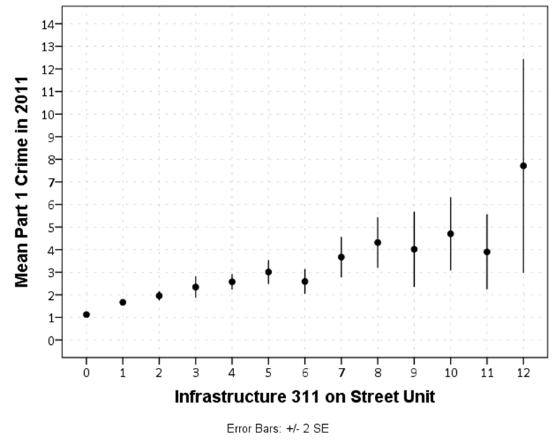
LPR data was initially intended to passively identify stolen cars, but it is pretty ripe for mission creep. One example is that the police could use LPR data to actively track a cars location without a warrant. It is easy to think of both good and other bad examples of its use. For good examples, retrospectively identifying a car at the scene of a crime I think is reasonable, or to notify the police of a vehicle associated with a kidnapping.

For another example use of LPR data, what if the police did not send custom notifications, but used such LPR data to create a John list of vehicles, and then used that as information to profile the cars? If we think using LPR data to identify stolen cars is a legitimate use should we ignore the data we have for other uses? Does the potential abuse of the data outweigh the benefits – so LPR collection shouldn’t be allowed at all?

For equivalent practices, most police departments have chronic offender or gang lists that use criminal history, victimizations, where you have been stopped and who you have been stopped with to create similar databases. This is all from data the police routinely collect. The LPR data can be reasonably questioned whether it is available for such analytics use – police RMS data is often available in large swaths to the general public though.

Although you can question whether police should be allowed to collect LPR data, I am going to assume LPR data is not going to go away, and cameras definitely are not. So how do you regulate the use of such data within police departments? In New York, when you conduct an online criminal history check you have to submit a reason for doing the check. That is a police officer or a crime analyst can’t do a check of your next door neighbor because you are curious – you are supposed to have a more relevant reason related to some criminal investigation. You could have a similar set up with LPR that prevents actively monitoring a car except in particular circumstances and to purge the data after a particular time frame. It would be up to the state though to enact legislation and monitor its use. There is currently some regulation of gang databases, such as sending notifications to individuals if they are on the list and when to take people off the list.

Similar questions can be extended beyond public cameras though to other domains, such as DNA collection and cell phone data. Cell phone data is regularly collected with warrants currently. DNA searching is going beyond the individual to familial searches (imagine getting a DUI, and then the police use your DNA to tell that a close family member committed a rape).

Going forward, to frame the discussion of police behavior in terms of privacy issues, I would ask two specific questions:

  • Should the police be allowed to collect this data?
  • Assuming the police have said data, what are reasonable uses of that data?

I think the first question, should the police be allowed to collect this data, should be intertwined with how well does the program work and how cost-effective is the program (or potential if the program has not been implemented yet). There are no bright lines, but there will always be a trade off between personal privacy and public intrusion. Higher personal intrusion would demand a higher level of potential benefits in terms of safety. Given that LPR’s are passively collecting data I consider it an open question whether they meet a threshold of whether it is reasonable for the police to collect such data.

Some data police now collect, such as public video and DNA, I don’t see going away whether or not they meet a reasonable trade-off. In those cases I think it is better to ask what are reasonable uses of that data and how to prevent abuses of it. Basically any police technology can be given extreme examples where it saved a life or where a rogue agent used it in a nefarious way. Neither extreme case should be the only information individuals use to evaluate whether such data collection and use is ethical though.

Spatial analysis course in CJ (graduate) – Spring 2016 SUNY Albany

This spring I am teaching a graduate level GIS course for the school of criminal justice on the downtown SUNY campus. There are still seats available, so feel free to sign up. Here is the page with the syllabus, and I will continue to add additional info./resources to that page.

Academics tend to focus on regression of lattice/areal data (e.g. see Matt Ingrams course over in Poli. Sci.), and in this course I tried to mix in more things I regularly encountered while working as a crime analyst that I haven’t seen coverage of in other GIS courses. For example I have a week devoted to the journey to crime and geographic offender profiling. I also have a week devoted to introducing the current most popular models used to forecast crime.

I’ve started a specific wordpress page for courses, which I will update with additional courses I prepare.

Accepted position at University of Texas at Dallas

After being on the job market 2+ years, I have finally landed a tenure-track job at the University of Texas at Dallas in their criminology department. Long story short, I’m excited for the opportunity at Dallas, and I’m glad I’m done with the market.

I will refrain from giving job advice, I doubt I did a good job in many circumstances in all stages. But now that it is over I wanted to map all the locations I applied to. Red balloons are places I had an in person interview for a tenure track position.

In the end I applied to around 80 ads over the two year period (about 40 per each wave), and I had 8 in person interviews before I landed the Dallas position. My rate is worse than all of my friends/colleagues on the market during the past few years (hence why I shouldn’t give advice), but around 4~5 interviews before getting an offer is the norm among the small sample size of my friends (SUNY Albany CJ grads that is).

So folks soon to be on the market this is one data point of what to expect.

Presentation at ASC 2015

Later this week I will be at the American Society of Criminology meetings in D.C. I am presenting some of the work from my dissertation on the correlation between 311 calls for service and crime as a test of the broken windows thesis. I have an updated pre-print on SSRN based on some reviewer feedback, the title is

The Effect of 311 Calls for Service on Crime in D.C. at Micro Places

and here is the structured abstract:

Objectives: This study tests the broken windows theory of crime by examining the relationship between 311 calls for service and crime at the street segment and intersection level in Washington, D.C.

Methods: Using data on 311 calls for service in 2010 and reported Part 1 crimes in 2011, this study predicts the increase in counts of crime per street unit per additional reported 311 calls for service using negative binomial regression models. Neighborhood fixed effects are used to control for omitted neighborhood level variables.

Results: 311 calls for service based on detritus and infrastructure complaints both have a positive but very small effect on Part 1 crimes while controlling for unobserved neighborhood effects.

Conclusions: Results suggest that 311 calls for service are a valid indicator of physical disorder where available. The findings partially confirm the broken windows hypothesis, but reducing physical disorder is unlikely to result in appreciable declines in crime.

Not in the paper (but in my presentation), here is the marginal relationship between infrastructure related 311 complaints and crime

I am presenting the paper on Wednesday at 11 am. The panel title is Environmental Approaches to Crime Prevention and Intervention, and it is located at Hilton, E – Embassy, Terrace Level. There are two other presentations as well, all related to the spatial analysis of crime. (Kelly Edmiston has followed up and stated he can not make it.)

I will be in D.C. from Wednesday until Friday afternoon, so if you want to get together in that time frame feel free to send me an email.

The spatial clustering of hits-vs-misses in shootings using Ripley’s K

My article, Replicating Group-Based Trajectory Models of Crime at Micro-Places in Albany, NY was recently published online first at the Journal of Quantitative Criminology (here is a pre-print version, and you can get my JQC offprint for the next few weeks).

Part of the reason I blog is to show how to replicate some of my work. I have previously shown how to generate the group based trajectory models (1,2), and here I will illustrate how to replicate some of the point pattern analysis I conducted in that paper.

A regular task for an analyst is to evaluate spatial clustering. A technique I use in that article is to use Ripley’s K statistic to evaluate clustering between different types of events, or what spatial statistics jargon calls a marked point pattern. I figured I would illustrate how to do this on some example point patterns of shootings, so analysts could replicate for other situations. The way crime data is collected and geocoded makes generating the correct reference distributions for the tests different than if the points could occur anywhere in the study region.

An example I am going to apply are shooting incidents that have marks of whether they hit the intended victim or missed. One theory in criminology is that murder is simply the extension of general violence — with the difference in aggravated assault versus murder often being happenstance. One instance this appears to be the case from my observations are shootings. It seems pure luck whether an individual gets hit or the bullets miss everyone. Here I will see if there appear to be any spatial patterning in shots fired with a victim hit. That is, we know that shootings themselves are clustered, but within those clusters of shootings are the locations of hits-and-misses further clustered or are they random?

A hypothetical process in which clustering of shooting hits can occur is if some shootings are meant to simply scare individuals vs. being targeted at people on the street. It could also occur if there are different tactics, like drive-bys vs. being on foot. This could occur if say one area had many shootings related to drug deals gone wrong, vs. another area that had gang retaliation drive by shootings. If they are non-random, the police may consider different interventions in different places – probably focusing on locations where people are more likely to be injured from the shooting. If they are random though, there is nothing special about analyzing shootings with a person hit versus shootings that missed everyone – you might as well analyze and develop strategy for all shootings.

So to start we will be using the R statistical package and the spatstat library. To follow along I made a set of fake shooting data in a csv file. So first load up R, I then change the working directory to where my csv file is located, then I read in the csv into an R data frame.

library(spatstat)

#change R directory to where your file is
MyDir <- "C:\\Users\\andrew.wheeler\\Dropbox\\Documents\\BLOG\\R_shootingVic\\R_Code"
setwd(MyDir)

#read in shooting data
ShootData <- read.csv("Fake_ShootingData.csv", header = TRUE)
head(ShootData)

The file subsequently has four fields, ID, X & Y coordinates, and a Vic column with 0’s and 1’s. Next to conduct the spatial analysis we are going to convert this data into an object that the spatstat library can work with. To do that we need to create a study window. Typically you would have the outline of the city, but for this analysis the window won’t matter, so here I make a window that is just slightly larger than the bounding box of the data.

#create ppp file, window does not matter for permuation test
StudyWin <- owin(xrange=c(min(ShootData$X)-0.01,max(ShootData$X)+0.01),yrange=c(min(ShootData$Y)-0.01,max(ShootData$Y)+0.01))
Shoot_ppp <- ppp(ShootData$X, ShootData$Y, window=StudyWin, marks=as.factor(ShootData$Vic), unitname = c("meter","meters"))

Traditionally when Ripley’s K was originally developed it was for points that could occur anywhere in the study region, such as the location of different tree species. Crimes are a bit different though, in that there are some areas in any city that a crime basically cannot occur (such as the middle of a lake). Also, crimes are often simply geocoded according to addresses and intersections, so this further reduces the locations where the points can be located in a crime dataset. To calculate the sample statistic for Ripley’s K one does not need to account for this, but to tell whether those patterns are random one needs to simulate the point pattern under a realistic null hypothesis. There are different ways to do the simulation, but here the simulation keeps the shooting locations fixed, but randomly assigns a shooting to be either a victim or a not with the same marginal frequencies. That is, it basically just shuffles which events are counted as a victim being hit or one in which there were no people hit. The Dixon article calls this the random relabelling approach.

Most of the spatstat functions can take a separate list of point patterns to use to simulate error bounds for different functions, so this function takes the initial point pattern, generates the permutations, and stuffs them in a list. I set the seed so the analysis can be reproduced exactly.

#generate the simulation envelopes to use in the Cross function
MarkedPerms <- function(ppp, nlist) {
  require(spatstat)
  myppp_list <- c() #make empty list
  for (i in 1:nlist) {
    current_ppp <-  ppp(ppp$x, ppp$y,window=ppp$window,marks=sample(ppp$marks))  #making permutation      
    myppp_list[[i]] <- current_ppp                                               #appending perm to list
  }
  return(myppp_list)
}

#now making a set of simulated permutations
set.seed(10) #setting seed for reproducibility
MySimEvel <- MarkedPerms(ppp=Shoot_ppp,nlist=999)

Now we have all the ingredients to conduct the analysis. Here I call the cross K function and submit my set of simulated point patterns named MySimEvel. With only 100 points in the dataset it works pretty quickly, and then we can graph the Ripley’s K function. The grey bands are the simulated K statistics, and the black line is the observed statistic. We can see the observed is always within the simulated bands, so we conclude that conditional on shooting locations, there is no clustering of shootings with a victim versus those with no one hit. Not surprising, since I just simulated random data.

#Cross Ripleys K
CrossK_Shoot <- alltypes(Shoot_ppp, fun="Kcross", envelope=TRUE, simulate=MySimEvel)
plot(CrossK_Shoot$fns[[2]], main="Cross-K Shooting Victims vs. No Victims", xlab="Meters")

I conducted this same analysis with actual shooting data in three separate cities that I have convenient access to the data. It is a hod podge of length, but City A and City B have around 100 shootings, and City C has around 500 shootings. In City A the observed line is very near the bottom, suggesting some evidence that shootings victims may be further apart than would be expected, but for most instances is within the 99% simulation band. (I can’t think of a theoretical reason why being spread apart would occur.) City B is pretty clearly within the simulation band, and City C’s observed pattern mirrors the mean of the simulation bands almost exactly. Since City C has the largest sample, I think this is pretty good evidence that shootings with a person hit are spatially random conditional on where shootings occur.

Long story short, when conducting Ripley’s K with crime data, the default way to generate the simulation envelopes for the statistics are not appropriate given how crime data is recorded. I show here one way to account for that in generating simulation envelopes.

Poster presentations should have a minimum font size of 25 points

A fairly generic problem I’ve been trying to do some research on is how large should fonts be for posters and PowerPoint presentations. The motivation is my diminishing eyesight over the years, and in particular default labels for statistical graphics are almost always too small in my opinion. Projected presentations just exacerbate the problem.

First, to tackle the project we need to find research about the the sizes that individuals can comfortably read letters. You don’t measure size of letters in absolute distance terms though, you measure it in the subtended angle that an object commands in your vision. That is, it is both a function of the height of the letters as well as the distance you are away from the object. I.e. in the below diagram angle A is larger than angle B.

The best guide for the size of this angle I have found for letters is an article by Sidney Smith, Letter Size and Legibility. Smith (1979) had a set of students make various labels and then have people stand too far away to be able to read them. Then the participants walked towards the labels until they could read them. Here is the histogram of those subtended angles (in radians) Smith produced:

From this Smith gives the recommendation as 0.007 radians as a good bet for pretty much everyone to be able to read the text. My research into other recommendations (eye tests, highway symbols) tends to be smaller, and between mine and Smith’s other sources tends to produce a range of 0.003 to 0.010 radians. Personal experimentation for me is that 0.007 is a good size, although up to 0.010 is not uncomfortably large. Most everyone with corrective vision can clearly see under 0.007, but we shouldn’t be making our readers strain to read the text.

For comparison, I sit approximately 22 inches away from my computer screen. A subtended angle of 0.007 produces a font size of just over 11 points at that distance. At my usual sitting distance I can read fonts down to 7 points, but I would prefer not to under usual circumstances.

This advice can readily translate to font sizes in poster presentations, since there is a limited range in which people will attempt to read them. Block’s (1996) suggestion that most people are around 4 feet away when they read a poster seems pretty reasonable to me, and so this produces a letter height of 0.34 inches needed to correspond to a 0.007 subtended angle. One point of font is 1/72 inches in letter height, so this converts to a 25 point font as the minimum to which most individuals can comfortably read the words in a poster. (R Functions at the end of the post for conversions, although it is based on relatively simple geometry.)

This advice is larger than Block’s (which is 20 point), but fits in line with Colin Purrington’s templates, which use 28 point for the smallest font. Again note that this is the minimum font for the poster, things like titles and author names should clearly be larger than the minimum to create a hierarchy. Again a frequent problem are axis labels for statistical graphics.

It will take more work to extend this advice to projected presentations, since there is more variability in projected sizes as well as rooms. So if you see a weirdo with a measuring tape at the upcoming ASC conference, don’t be alarmed, I’m just collecting some data!


Here are some R functions, the first takes a height and distance and return the subtended angle (in radians). The second takes the distance and radians to produce a height.

visual_angleR <- function(H,D){ 
   x <- 2*atan(H/(2*D))
   return(x)
}

visual_height <- function(D,Rad) {
  x <- 2*D*tan(Rad/2) #can use sin as well instead of tan
  return(x)
}

Since a point of font is 1/72 of an inch, the code to calculate the recommended font size is visual_height(D=48,Rad=0.007)*72 and I take the ceiling of this value for the 25 point recommendation.

One sided line buffers in R using rgeos

I’ve started to do more geographic data manipulation in R, and part of the reason I do blog posts is for self-reference, so I figured I would share some of the geographic functions I have been working on.

The other day on StackOverflow there was a question that asked how to do one sided buffers in R. The question was closed (and the linked duplicate is closed as well), so I post my response here.

The workflow I describe to make one sided buffers is in a nutshell

  • expand the original polyline into a very small area by using a normal buffer, calls this Buf0
  • do a normal two sided buffer on the original polyline, without square or rounded ends, call this Buf1
  • take the geographic difference between Buf1 and Buf0, which basically splits the original buffer into two parts, and then return them as two separate spatial objects

Here is a simple example.

library(rgeos)
library(sp)

TwoBuf <- function(line,width,minEx){
  Buf0 <- gBuffer(line,width=minEx,capStyle="SQUARE")
  Buf1 <- gBuffer(line,width=width,capStyle="FLAT")
  return(disaggregate(gDifference(Buf1,Buf0)))
}

Squig <- readWKT("LINESTRING(0 0, 0.2 0.1, 0.3 0.6, 0.4 0.1, 1 1)") #Orig
TortBuf <- TwoBuf(line=Squig,width=0.05,minEx=0.0001)
plot(TortBuf, col=c('red','blue'))  #First object on left, second on right

If you imagine travelling along the polyline, which in this example goes from left to right, this is how I know the first red polygon is the left hand and the blue is the right hand side buffer. (To pick a specific one, you can subset like TortBuf[1] or TortBuf[2].)

If we reverse the line string, the order will subsequently be reversed.

SquigR <- readWKT("LINESTRING(1 1, 0.4 0.1, 0.3 0.6, 0.2 0.1, 0 0)") #Reversed
TortBuf <- TwoBuf(line=SquigR,width=0.05,minEx=0.0001)
plot(TortBuf, col=c('red','blue'))  #Again first object on left, second on right

Examples of south to north and north to south work the same as well.

SquigN <- readWKT("LINESTRING(0 0, 0 1)") #South to North
TortBuf <- TwoBuf(line=SquigN,width=0.05,minEx=0.0001)
plot(TortBuf, col=c('red','blue'))  #Again first object on left, second on right

SquigS <- readWKT("LINESTRING(0 1, 0 0)") #North to South
TortBuf <- TwoBuf(line=SquigS,width=0.05,minEx=0.0001)
plot(TortBuf, col=c('red','blue'))  #Again first object on left, second on right

One example in which this procedure does not work is if the polyline creates other polygons.

Square <- readWKT("LINESTRING(0 0, 1 0, 1 1, 0 1, 0 0)") #Square
TortBuf <- TwoBuf(line=Square,width=0.05,minEx=0.0001)
plot(TortBuf, col=c('red','blue','green'))

#Switch the direction
SquareR <- readWKT("LINESTRING(0 0, 0 1, 1 1, 1 0, 0 0)") #Square Reversed
TortBuf <- TwoBuf(line=SquareR,width=0.05,minEx=0.0001)
plot(TortBuf, col=c('red','blue','green'))                #Still the same order

This messes up the order as well. If you know that your polyline is actually a polygon you can do a positive and negative buffer to get the desired effect of interest. If I have a need to expand this to multipart polylines I will post an update, but I have some other buffer functions I may share in the mean time.

Some plots to go with group based trajectory models in R

On my prior post on estimating group based trajectory models in R using the crimCV package I received a comment asking about how to plot the trajectories. The crimCV model object has a base plot object, but here I show how to extract those model predictions as well as some other functions. Many of these plots are illustrated in my paper for crime trajectories at micro places in Albany (forthcoming in the Journal of Quantitative Criminology). First we are going to load the crimCV and the ggplot2 package, and then I have a set of four helper functions which I will describe in more detail in a minute. So run this R code first.

library(crimCV)
library(ggplot2)

long_traj <- function(model,data){
  df <- data.frame(data)
  vars <- names(df)
  prob <- model['gwt'] #posterior probabilities
  df$GMax <- apply(prob$gwt,1,which.max) #which group # is the max
  df$PMax <- apply(prob$gwt,1,max)       #probability in max group
  df$Ord <- 1:dim(df)[1]                 #Order of the original data
  prob <- data.frame(prob$gwt)
  names(prob) <- paste0("G",1:dim(prob)[2]) #Group probabilities are G1, G2, etc.
  longD <- reshape(data.frame(df,prob), varying = vars, v.names = "y", 
                   timevar = "x", times = 1:length(vars), 
                   direction = "long") #Reshape to long format, time is x, y is original count data
  return(longD)                        #GMax is the classified group, PMax is the probability in that group
}

weighted_means <- function(model,long_data){
  G_names <- paste0("G",1:model$ng)
  G <- long_data[,G_names]
  W <- G*long_data$y                                    #Multiple weights by original count var
  Agg <- aggregate(W,by=list(x=long_data$x),FUN="sum")  #then sum those products
  mass <- colSums(model$gwt)                            #to get average divide by total mass of the weight
  for (i in 1:model$ng){
    Agg[,i+1] <- Agg[,i+1]/mass[i]
  }
  long_weight <- reshape(Agg, varying=G_names, v.names="w_mean",
                         timevar = "Group", times = 1:model$ng, 
                         direction = "long")           #reshape to long
  return(long_weight)
}
  
pred_means <- function(model){
    prob <- model$prob               #these are the model predicted means
    Xb <- model$X %*% model$beta     #see getAnywhere(plot.dmZIPt), near copy
    lambda <- exp(Xb)                #just returns data frame in long format
    p <- exp(-model$tau * t(Xb))
    p <- t(p)
    p <- p/(1 + p)
    mu <- (1 - p) * lambda
    t <- 1:nrow(mu)
    myDF <- data.frame(x=t,mu)
    long_pred <- reshape(myDF, varying=paste0("X",1:model$ng), v.names="pred_mean",
                         timevar = "Group", times = 1:model$ng, direction = "long")
    return(long_pred)
}

#Note, if you estimate a ZIP model instead of the ZIP-tau model
#use this function instead of pred_means
pred_means_Nt <- function(model){
    prob <- model$prob               #these are the model predicted means
    Xb <- model$X %*% model$beta     #see getAnywhere(plot.dmZIP), near copy
    lambda <- exp(Xb)                #just returns data frame in long format
	Zg <- model$Z %*% model$gamma
    p <- exp(Zg)
    p <- p/(1 + p)
    mu <- (1 - p) * lambda
    t <- 1:nrow(mu)
    myDF <- data.frame(x=t,mu)
    long_pred <- reshape(myDF, varying=paste0("X",1:model$ng), v.names="pred_mean",
                         timevar = "Group", times = 1:model$ng, direction = "long")
    return(long_pred)
}

occ <- function(long_data){
 subdata <- subset(long_data,x==1)
 agg <- aggregate(subdata$PMax,by=list(group=subdata$GMax),FUN="mean")
 names(agg)[2] <- "AvePP" #average posterior probabilites
 agg$Freq <- as.data.frame(table(subdata$GMax))[,2]
 n <- agg$AvePP/(1 - agg$AvePP)
 p <- agg$Freq/sum(agg$Freq)
 d <- p/(1-p)
 agg$OCC <- n/d #odds of correct classification
 agg$ClassProp <- p #observed classification proportion
 #predicted classification proportion
 agg$PredProp <- colSums(as.matrix(subdata[,grep("^[G][0-9]", names(subdata), value=TRUE)]))/sum(agg$Freq) 
 #Jeff Ward said I should be using PredProb instead of Class prop for OCC
 agg$occ_pp <- n/ (agg$PredProp/(1-agg$PredProp))
 return(agg)
}

Now we can just use the data in the crimCV package to run through an example of a few different types of plots. First lets load in the TO1adj data, estimate the group based model, and make our base plot.

data(TO1adj)
out1 <-crimCV(TO1adj,4,dpolyp=2,init=5)
plot(out1)

Now most effort seems to be spent on using model selection criteria to pick the number of groups, what may be called relative model comparisons. Once you pick the number of groups though, you should still be concerned with how well the model replicates the data at hand, e.g. absolute model comparisons. The graphs that follow help assess this. First we will use our helper functions to make three new objects. The first function, long_traj, takes the original model object, out1, as well as the original matrix data used to estimate the model, TO1adj. The second function, weighted_means, takes the original model object and then the newly created long_data longD. The third function, pred_means, just takes the model output and generates a data frame in wide format for plotting (it is the same underlying code for plotting the model).

longD <- long_traj(model=out1,data=TO1adj)
x <- weighted_means(model=out1,long_data=longD)
pred <- pred_means(model=out1)

We can subsequently use the long data longD to plot the individual trajectories faceted by their assigned groups. I have an answer on cross validated that shows how effective this small multiple design idea can be to help disentangle complicated plots.

#plot of individual trajectories in small multiples by group
p <- ggplot(data=longD, aes(x=x,y=y,group=Ord)) + geom_line(alpha = 0.1) + facet_wrap(~GMax)
p 

Plotting the individual trajectories can show how well they fit the predicted model, as well as if there are any outliers. You could get more fancy with jittering (helpful since there is so much overlap in the low counts) but just plotting with a high transparency helps quite abit. This second graph plots the predicted means along with the weighted means. What the weighted_means function does is use the posterior probabilities of groups, and then calculates the observed group averages per time point using the posterior probabilities as the weights.

#plot of predicted values + weighted means
p2 <- ggplot() + geom_line(data=pred, aes(x=x,y=pred_mean,col=as.factor(Group))) + 
                 geom_line(data=x, aes(x=x,y=w_mean,col=as.factor(Group))) + 
                geom_point(data=x, aes(x=x,y=w_mean,col=as.factor(Group)))
p2

Here you can see that the estimated trajectories are not a very good fit to the data. Pretty much eash series has a peak before the predicted curve, and all of the series except for 2 don’t look like very good candidates for polynomial curves.

It ends up that often the weighted means are very nearly equivalent to the unweighted means (just aggregating means based on the classified group). In this example the predicted values are a colored line, the weighted means are a colored line with superimposed points, and the non-weighted means are just a black line.

#predictions, weighted means, and non-weighted means
nonw_means <- aggregate(longD$y,by=list(Group=longD$GMax,x=longD$x),FUN="mean")
names(nonw_means)[3] <- "y"

p3 <- p2 + geom_line(data=nonw_means, aes(x=x,y=y), col='black') + facet_wrap(~Group)
p3

You can see the non-weighted means are almost exactly the same as the weighted ones. For group 3 you typically need to go to the hundredths to see a difference.

#check out how close
nonw_means[nonw_means$Group==3,'y'] -  x[x$Group==3,'w_mean']

You can subsequently superimpose the predicted group means over the individual trajectories as well.

#superimpose predicted over ind trajectories
pred$GMax <- pred$Group
p4 <- ggplot() + geom_line(data=pred, aes(x=x,y=pred_mean), col='red') + 
                 geom_line(data=longD, aes(x=x,y=y,group=Ord), alpha = 0.1) + facet_wrap(~GMax)
p4

Two types of absolute fit measures I’ve seen advocated in the past are the average maximum posterior probability per group and the odds of correct classification. The occ function calculates these numbers given two vectors (one of the max probabilities and the other of the group classifications). We can get this info from our long data by just selecting a subset from one time period. Here the output at the console shows that we have quite large average posterior probabilities as well as high odds of correct classification. (Also updated to included the observed classified proportions and the predicted proportions based on the posterior probabilities. Again, these all show very good model fit.) Update: Jeff Ward sent me a note saying I should be using the predicted proportion in each group for the occ calculation, not the assigned proportion based on the max. post. prob. So I have updated to include the occ_pp column for this, but left the old occ column in as a paper trail of my mistake.

occ(longD)
#  group     AvePP Freq        OCC  ClassProp   PredProp     occ_pp
#1     1 0.9880945   23 1281.00444 0.06084656 0.06298397 1234.71607
#2     2 0.9522450   35  195.41430 0.09259259 0.09005342  201.48650
#3     3 0.9567524   94   66.83877 0.24867725 0.24936266   66.59424
#4     4 0.9844708  226   42.63727 0.59788360 0.59759995   42.68760

A plot to accompany this though is a jittered dot plot showing the maximum posterior probability per group. You can here that groups 3 and 4 are more fuzzy, whereas 1 and 2 mostly have very high probabilities of group assignment.

#plot of maximum posterior probabilities
subD <- longD[x==1,]
p5 <- ggplot(data=subD, aes(x=as.factor(GMax),y=PMax)) + geom_point(position = "jitter", alpha = 0.2)
p5

Remember that these latent class models are fuzzy classifiers. That is each point has a probability of belonging to each group. A scatterplot matrix of the individual probabilities will show how well the groups are separated. Perfect separation into groups will result in points hugging along the border of the graph, and points in the middle suggest ambiguity in the class assignment. You can see here that each group closer in number has more probability swapping between them.

#scatterplot matrix
library(GGally)
sm <- ggpairs(data=subD, columns=4:7)
sm

And the last time series plot I have used previously is a stacked area chart.

#stacked area chart
nonw_sum <- aggregate(longD$y,by=list(Group=longD$GMax,x=longD$x),FUN="sum")
names(nonw_sum)[3] <- "y"
p6 <- ggplot(data=nonw_sum, aes(x=x,y=y,fill=as.factor(Group))) + geom_area(position='stack')
p6

I will have to put another post in the queue to talk about the spatial point pattern tests I used in that trajectory paper for the future as well.

Online geocoding in R using the NYS GIS server

Previously I wrote a post on using the NYS ESRI geocoding server in python. I recently wrote a function in R to do the same. The base url server has changed since I wrote the Python post, but it is easy to update that (the JSON returned doesn’t change.) This should also be simple to update for other ESRI servers, just change the base variable in the first function. This uses the httr package to get the url and the jsonlite package to parse the response.

#################################################################
#Functions for geocoding using online NYS GIS Esri API, https://gis.ny.gov/
library(httr)
library(jsonlite)

#getting a single address, WKID 4326 is WGS 1984, so returns lat/lon
get_NYSAdd <- function(address,WKID='4326'){
  base <- "http://gisservices.dhses.ny.gov/arcgis/rest/services/Locators/Street_and_Address_Composite/GeocodeServer/findAddressCandidates"
  soup <- GET(url=base,query=list(SingleLine=address,maxLocations='1',outSR=WKID,f='pjson'))
  dat <- fromJSON(content(soup,as='text'),simplifyVector=TRUE)$candidates
  return(dat)
}
#looping over a vector of addresses, parsing, and returning a data frame
geo_NYSAdd <- function(addresses,...){
  #make empy matrix
  l <- length(addresses)
  MyDat <- data.frame(matrix(nrow=l,ncol=3))
  names(MyDat) <- c("Address","Lon","Lat")
  for (i in 1:l){
    x <- get_NYSAdd(address=addresses[i],...)
    if (length(x) > 0){
      MyDat[i,1] <- x[,1]
      MyDat[i,2] <- x[,2][1]
      MyDat[i,3] <- x[,2][2]
    }
  }
  MyDat$OrigAdd <- addresses
  return(MyDat)
}
#################################################################

The first function takes a single address, gets and parses the returning JSON. The second function loops over a list of addresses and returns a data frame with the original addresses, the matched address, and the lat/lon coordinates. I use a loop instead of an apply type function because with the web server you really shouldn’t submit large jobs that it would take along time anyway. The NYS server is free and has no 2,500 limit, but I wouldn’t submit jobs much bigger than that though.

AddList <- c("100 Washington Ave, Albany, NY","100 Washington Ave Ext, Albany, NY",
             "421 New Karner Rd., Albany, NY","Washington Ave. and Lark St., Albany, NY","poop")
GeoAddresses <- geo_NYSAdd(addresses=AddList)
GeoAddresses

We can compare these to what the google geocoding api returns (using the ggmap package):

library(ggmap)
googleAddresses <- geocode(AddList,source="google")
GeoAddresses$G_lon <- googleAddresses$lon
GeoAddresses$G_lat <- googleAddresses$lat
GeoAddresses

And we can see that the nonsense "poop" address was actually geocoded! See some similar related funny results from the google maps geocoding via StackMaps.

We can also see some confusion between Washington Ave. Ext as well. The NYS online server should theoretically have more up to date data than Google, but as above shows it is not always better. To do geocoding well takes some serious time to examine the initial addresses and the resulting coordinates in my experience.

To calculate the great circle distance between the coordinates we can use the spDists function in the sp library.

library(sp)
spDists(x = as.matrix(GeoAddresses[1:4,c("Lon","Lat")]),
        y = as.matrix(GeoAddresses[1:4,c("G_lon","G_lat")]),
        longlat=TRUE,diagonal=TRUE) #distance in kilometers

But really, we should just project the data and calculate the Euclidean distance (see the proj4 library). Note that using the law of cosines is typically not recommended for very small distances, so the last distance is suspect. (For reference I point to some resources and analysis showing how to calculate great circle distances in SPSS on Nabble recently.)

Using KDTree’s in python to calculate neighbor counts

For a few different projects I’ve had to take a set of crime data and calculate the number of events nearby. It is a regular geospatial task, counting events in a particular buffer, but one that can be quite cumbersome if you have quite a few points to cross-reference. For one project I needed to calculate this for 4,500 street segments and intersections against a set of over 100,000 crime incidents. While this is not big data, if you go the brute force route and simply calculate all pair-wise distances, this results in 450 million comparisons. Since all I wanted was the number of counts within a particular distance buffer, KDTree’s offer a much more efficient search solution.

Here I give an example in Python using numpy and the nearest neighbor algorithms available in SciPy. This example is calculating the number of shootings in DC within 1 kilometer of schools. The shooting data is sensor data via ShotSpotter, and is publicly available at the new open data site. The school data I calculated the centroids based on school area polygons, available from the legacy DC data site. This particular example was motivated by this Urban Institute post.

There are around 170 schools and under 40,000 total shootings, so this would not be a big issue to calculate all the pairwise distances. It is a simple and quick example though. Here I have the Python code and CSV files are available to download.

So first we will just import the spatial data into numpy arrays. Note each file has the coordinates in projected meters.

import numpy as np
#getting schools and shootings from CSV files
schools = np.genfromtxt('DC_Schools.csv', delimiter=",", skip_header=1)
shootings = np.genfromtxt('ShotSpotter.csv', delimiter=",", skip_header=1, usecols=(4,5))

Next we can import the KDTree function, and then supply it with the two spatial coordinates for the shootings. While this is a relatively small file, even for my example larger set of crime data with over 100,000 incidents building the tree was really fast, less than a minute.

#making KDTree, and then searching within 1 kilometer of school
from sklearn.neighbors import KDTree
shoot_tree = KDTree(shootings)

Finally you can then search within a particular radius. You can either search one location at a time, but here I do a batch search and count the number of shootings that are within 1,000 meters from each school. Again this is a small example, but even with my 4,500 locations against 100,000 crimes it was very fast. (Whereas my initial SPSS code to do all 450 million pairwise combinations was taking all night.)

shoot_tree.query_radius(schools[:,[1,2]],r=1000,count_only=True)

Which produces an array of the counts for each of the schools:

array([1168,  179, 2384,  686,  583, 1475,  239, 1890, 2070,  990,   74,
        492,   10,  226, 2057, 1813, 1137,  785,  742, 1893, 4650, 1910,
          0,  926, 2380,  818, 2868, 1230,    0, 3230, 1103, 2253, 4531,
       1548,    0,    0,    0, 1002, 1912,    0, 1543,    0,  580,    4,
       1224,  843,  212,  591,    0,    0, 1127, 4520, 2283, 1413, 3255,
        926,  972,  435, 2734,    0, 2828,  724,  796,    1, 2016, 2540,
        369, 1903, 2216, 1697,  155, 2337,  496,  258,  900, 2278, 3123,
        794, 2312,  636, 1663,    0, 4896,  604, 1141,    7,    0, 1803,
          2,  283,  270, 1395, 2087, 3414,  143,  238,  517,  238, 2017,
       2857, 1100, 2575,  179,  876, 2175,  450, 5230, 2441,   10, 2547,
        202, 2659, 4006, 2514,  923,    6, 1481,    0, 2415, 2058, 2309,
          3, 1132,    0, 1363, 4701,  158,  410, 2884,  979, 2053, 1120,
       2048, 2750,  632, 1492, 1670,  242,  131,  863, 1246, 1361,  843,
       3567, 1311,  107, 1501,    0, 2176,  296,  803,    0, 1301,  719,
         97, 2312,  150,  475,  764, 2078,  912, 2943, 1453,  178,  177,
        389,  244,  874,  576,  699,  295,  843,  274])

And that is it! Quite simple.

The ShotSpotter data is interesting, with quite a few oddities that are worth exploring. I recently wrote a chapter on SPSS’s geospatial tools for an upcoming book on advanced SPSS features, providing a predictive police example predicting weekly shootings using the new geospatial temporal modelling tool. The book is edited by Keith McCormick and Jesus Salcedo, and I will write a blog post whenever it comes out highlighting what the chapter goes over.