Weekly Error Bar Chart in Tableau

I have posted my Tableau tutorial #2 for making a weekly error bar chart in Tableau. (Tutorial #1 was for a seasonal chart.) This is replicating prior examples I provided in Excel for IACA workshops and my undergrad crime analysis course.

WEEKLY ERROR BAR CHART TUTORIAL

For a sneak peak of the end result, see here:

Making error bars in Tableau is quite a chore. One approach that people use for Excel, making a cumulative area chart, and then make the under area invisible, does not work in Tableau. Since you can interact with everything, making something that is there but invisible is not an option. You could do that approach and turn the area white, but then the gridlines or anything below that object are not visible.

So the best workaround I found here was to do discrete time, and use the reference band option in the background. This is a good example for non-normal error bars, here this is for low count Poisson data, but another use case I will have to show sometime are for proportion confidence intervals in Tableau. (This is one reason I am doing this, I need to do something similar for my work for proportions to monitor my machine learning models. No better way to teach myself than to do it myself.)

Next up I will have to show an example that illustrates the unique ability of Tableau (at least relative to Excel) – making a dashboard that has brushing/linking. Tinkering with showing that off using this same example data with a geographic map as well. My dashboards I have tried so far all tend to look not very nice though, so I will need to practice some more before I can show those off.

The WDD test with different area sizes

So I have two prior examples of weighting the WDD test (a simple test for pre-post crime counts in an experimental setting):

And a friend recently asked about weighting for different areas, so the test is crime reduction per area density instead of overall counts. First before I get into the example, this isn’t per se necessary. All that matters in the end for this test to be valid is 1) the crime data are Poisson distributed, 2) the control areas follow parallel trends to the treated area. So based on this I’ve advocated that it is ok to have a control area be ‘the rest of the city’ for example.

Some of my work on long term crime trends at micro places, shows low-crime and high-crime areas all tend to follow the same overall temporal trends (and Martin Andresen’s related work one would come to the same conclusion). So that would suggest you can aggregate up many low crimes to make a reasonable control comparison to a hot spot treated area.

So as I will show weighting by area is possible, but it actually changes the identification strategy slightly (whereas the prior two weighting examples do not) – the parallel trends assumption needs to be on the crime per area estimate, as opposed to the original count scale. Since the friend who asked about this is an Excel GURU (check out Grant’s very nice YouTube videos for crime analysis) I will show how to do the calculations in Excel, as well as how to do a simulation to show my estimator behaves as it should. (And the benefit of that is you can do power analysis based on the simulations.)

Example Calculations in Excel

I have posted an Excel spreadsheet to show the calculations here. But for a quick overview, I made the spreadsheet very similar to the original WDD calculation, you just need to insert your areas for the different treated/control/displacement areas.

And you can check out the formulas, again it is just weighting the estimator by the areas, and then making the appropriate transformations to the variance estimates.

I have an added extra portion of this though – a simulation tab to show the estimator works.

Only thing to note, a way to simulate to Poisson data in Excel is to generate a random number on the unit interval (0,1), and then for the distribution of interest use the inverse CDF function. There is no inverse Poisson function in Excel, but you can reasonably approximate it via the inverse binomial with a very large number of trials. I’ve tested and it is good enough for my purposes to use a base of 10k for the binomial trials.

The simulation tab on this spreadsheet you can input your own numbers for planning purposes as well. So the idea is if you think you can only reasonably reduce crimes by X amount in your targeted areas, this lets you do power analysis. So in this example, going from 60 to 40 crimes results in a power estimate of only 0.44 (so you will fail to reject the null over 5 out of 10 times, even if your intervention actually works as well as you think). But if you think you can reduce crimes from 60 to 30, the power in this example gets close to 0.8 (what you typically shoot for in up-front experiments, although there is no harm for going for higher power!). So if you have low power you may want to expand the time periods under study or expand the number of treated areas.

Wrap Up

Between this and the prior WDD examples, I have about wrapped up all the potential permutations of weighting I can think of offhand. So you can mix/match all of these different weighting strategies together (e.g. you could do multiple time periods and area weighting). It is just algebra and carrying through the correct changes to the variance estimates.

I do have one additional blog post slated in the future. David Wilson has a recent JQC article using a different estimate, but essentially the same pre/post data I am using here. The identifying assumptions are different again for this (parallel trends on the ratio scale, not the linear scale), and I will have more to say when I think you would prefer the WDD to David’s estimator. (In short I think David’s is good for meta-analysis, but I prefer my WDD for individual evaluations.)

The spatial dispersion of NYC shootings in 2020

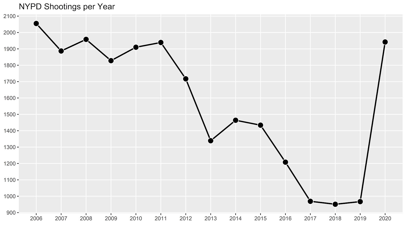
If you had asked me at the start of widespread Covid lockdown measures what the effect would be on crime, I am pretty sure I would have guessed it will make crime go down. Fewer people out and about causes fewer interactions that can lead to a crime. That isn’t how it has shaped up though, quite a few places have seen increases in serious violent crime. One of the most dramatic examples of this is that shootings in NYC doubled from 900 in 2019 to over 1800 in 2020. I am going to show how to generate this chart later via some R code, but it is easier to show than to say. NYPD’s open data on shootings (historical, current) go back to 2006.

I know I am critical on this site of folks overinterpreting crime increases, for example going from 20 to 35 is pretty weak evidence of an increase given the inherent variance for low count Poisson data (a Poisson e-test has a p-value of 0.04 in that case). But going from 900 to 1800 is a much clearer signal.

Jerry Ratcliffe recently posted an R library to do his crime dispersion analysis, so I figured this would be an excellent example use case. The idea behind this analysis is spatial – we know there is a crime increase, but did the increase happen everywhere, or did it just happen in a few locations. Here I am going to use the NYPD shooting data aggregated at the precinct level to test this.

As another note, while I often use micro-spatial units of analysis in my work, this method, along with others (such as the sppt test), are just not going to work out for very low count, very tiny spatial units of analysis. I would suggest offhand to only do this analysis if the spatial units of analysis under study have an average of at least 10 crimes per area in the pre time period. Which is right about on the mark for the precinct analysis in NYC.

Here is the data and R code to follow along, below I will give a walkthrough.

Crime increase dispersion analysis in R

So first as some front matter, I load in my libraries (Jerry’s crimedispersion you can install from github via devtools, see his page for an example), and the function I define here I’ve gone over in a prior blog post of mine as well.

###############################
library(ggplot2)
library(crimedispersion)

# Increase contours, see https://andrewpwheeler.com/2020/02/21/some-additional-plots-to-go-with-crime-increase-dispersion/
make_cont <- function(pre_crime,post_crime,levels=c(-3,0,3),lr=10,hr=max(pre_crime)*1.05,steps=1000){
    #calculating the overall crime increase
    ov_inc <- sum(post_crime)/sum(pre_crime)
    #Making the sequence on the square root scale
    gr <- seq(sqrt(lr),sqrt(hr),length.out=steps)^2
    cont_data <- expand.grid(gr,levels)
    names(cont_data) <- c('x','levels')
    cont_data$inc <- cont_data$x*ov_inc
    cont_data$lines <- cont_data$inc + cont_data$levels*sqrt(cont_data$inc)
    return(as.data.frame(cont_data))
}

my_dir <- 'D:\\Dropbox\\Dropbox\\Documents\\BLOG\\NYPD_ShootingIncrease\\Analysis'
setwd(my_dir)
###############################

Now we are ready to import our data and stack them into a new data frame. (These are individual incident level shootings, not aggregated. If I ever get around to it I will do an analysis of fatality and distance to emergency rooms like I did with the Philly data.)

###############################
# Get the NYPD data and stack it
# From https://data.cityofnewyork.us/Public-Safety/NYPD-Shooting-Incident-Data-Year-To-Date-/5ucz-vwe8
# And https://data.cityofnewyork.us/Public-Safety/NYPD-Shooting-Incident-Data-Historic-/833y-fsy8
# On 2/1/2021
old <- read.csv('NYPD_Shooting_Incident_Data__Historic_.csv', stringsAsFactors=FALSE)
new <- read.csv('NYPD_Shooting_Incident_Data__Year_To_Date_.csv', stringsAsFactors=FALSE)

# Just one column off
print( cbind(names(old), names(new)) )
names(new) <- names(old)
shooting <- rbind(old,new)
###############################

Now we just want to do aggregate counts of these shootings per year and per precinct. So first I substring out the year, then use table to get aggregate counts in R, then make my nice time series graph using ggplot.

###############################
# Create the current year and aggregate
shooting$Year <- substr(shooting$OCCUR_DATE, 7, 10)
year_stats <- as.data.frame(table(shooting$Year))
year_stats$Year <- as.numeric(as.character(year_stats$Var1))
year_plot <- ggplot(data=year_stats, aes(x=Year,y=Freq)) + 
             geom_line(size=1) + geom_point(shape=21, colour='white', fill='black', size=4) +
             scale_y_continuous(breaks=seq(900,2100,by=100)) +
             scale_x_continuous(breaks=2006:2020) +
             theme(axis.title.x=element_blank(), axis.title.y=element_blank(),
                   panel.grid.minor = element_blank()) + 
             ggtitle("NYPD Shootings per Year")

year_plot
# Not quite the same as Petes, https://copinthehood.com/shooting-in-nyc-2020/
###############################

Part of the reason I do this is not because I don’t trust Pete’s analysis, but because I don’t want to embed pictures from someone elses website! So wanted to recreate the time series graph myself. So next up we need to do the same aggregating, but not for the whole city, but by each precinct. You can use the same table method again, but simply pass in additional columns. That gets you the data in long format, so then I reshape it to wide for later analysis (so each row is a single precinct and each column is a yearly count of shootings). (Note there have been some splits in precincts over the years IIRC, I don’t worry about that here, will cause it to be 0,0 in the 2019/2020 data I look at.)

###############################
#Now aggregating to year and precinct
counts <- as.data.frame(table(shooting$Year, shooting$PRECINCT))
names(counts) <- c('Year','PCT','Count')
# Reshape long to wide
count_wide <-  reshape(counts, idvar = "PCT", timevar = "Year", direction = "wide")
###############################

And now we can give Jerry’s package a test run, where you just pass it your variable names.

# Jerrys function for crime increase dispersion
output <- crimedispersion(count_wide, 'PCT', 'Count.2019', 'Count.2020')
output

The way to understand this is in a hypothetical world in which we could reduce shootings in one precinct at a time, we would need to reduce shootings in 57 of the 77 precincts to reduce 2020 shootings to 2019 levels. So this suggests very widespread increases, it isn’t just concentrated among a few precincts.

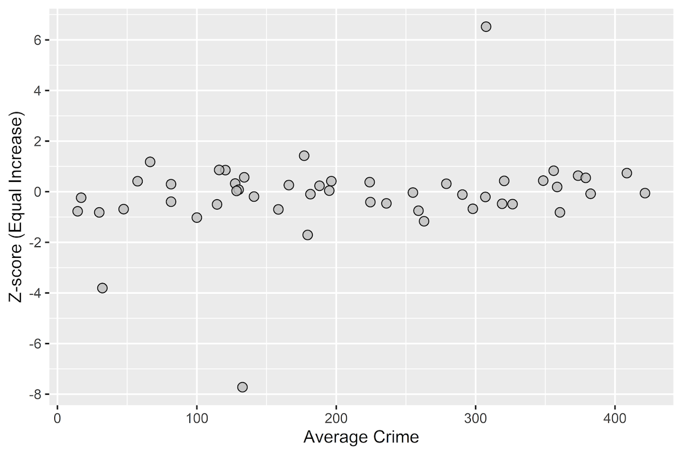
Another graph I have suggested to explore this, while taking into account the typical variance with Poisson count data, is to plot the pre crime counts on the X axis, and the post crime counts on the Y axis.

###############################
# My example contour with labels
cont_lev <- make_cont(count_wide$Count.2019, count_wide$Count.2020, lr=5)

eq_plot <- ggplot() + 
           geom_line(data=cont_lev, color="darkgrey", linetype=2, 
                     aes(x=x,y=lines,group=levels)) +
           geom_point(data=count_wide, shape = 21, colour = "black", fill = "grey", size=2.5, 
                      alpha=0.8, aes(x=Count.2019,y=Count.2020)) +
           scale_y_continuous(breaks=seq(0,140,by=10) +
           scale_x_continuous(breaks=seq(0,70,by=5)) +
           coord_cartesian(ylim = c(0, 140)) +
           xlab("2019 Shootings Per Precinct") + ylab("2020 Shootings")
eq_plot
###############################

The contour lines show the hypothesis that crime increased (by around 100% here). So if a point is near the middle line, it follows that doubled mark almost exactly. The upper/lower lines indicate the typical variance, which is a very good fit to the data here you can see. Very few points are outside the boundaries.

Both of these analyses point to the fact that shooting increases were widespread across NYC precincts. Pretty much everywhere doubled in the number of shootings, it is just some places had a larger baseline to double than others (and the data has some noise, you can pick out some places that did not increase if you cherry pick the data).

And as a final R note, if you want to save these graphs as a nice high resolution PNG, here is an example with Jerry’s dispersion object:

# Saving dispersion plot as a high res PNG
png(file = "ODI.png", bg = "transparent", height=5, width=9, units="in", res=1000, type="cairo")
output #this is the object from Jerrys crimedispersion() function earlier
dev.off()

Going forward I am wondering if there is a good way to do spatial monitoring for crime data like this, like some sort of control chart that takes into account both space and time. So isn’t retrospective a year later recap, but in near real time identify spatial increases.

Other References of Interest

  • Justin Nix & company have a few blog posts looking at NYC data as well. In the first they talk about the variance in cities, many are up but several are down as well in violence. A later post though updated with the clear increase in shootings in NYC.
  • There are too many papers at this point for me to do a bibliography of all the Covid and crime updates, but two open examples are Matt Ashby did a paper on several US cities, and Campedelli et al have an analysis of Chicago. Each show variance again, so no universal up or down in trends, but various examples of increases or decreases both between cities and between different crime types within a city.

Checking a Poisson distribution fit: An example with officer involved shooting deaths WaPo data (R functions)

So besides code on my GitHub page, I have a list of various statistic functions I’ve scripted on the blog over the years on my code snippets page. One of those functions I will illustrate today is some R code to check the fit of the Poisson distribution. Many of my crime analysis examples rely on crime data being approximately Poisson distributed. Additionally it is relevant in regression model building, e.g. should I use a Poisson GLM or do I need to use some type of zero-inflated model?

Here is a brief example to show how my R code works. You can source it directly from my dropbox page. Then I generated 10k simulated rows of Poisson data with a mean of 0.2. So I see many people in CJ make the mistake that, OK my data has 85% zeroes, I need to use some sort of zero-inflated model. If you are working with very small spatial/temporal units of analysis and/or rare crimes, it may be the mean of the distribution is quite low, and so the Poisson distribution is actually quite close.

# My check Poisson function
source('https://dl.dropboxusercontent.com/s/yj7yc07s5fgkirz/CheckPoisson.R?dl=0')

# Example with simulated data
set.seed(10)
lambda <- 0.2
x <- rpois(10000,lambda)
CheckPoisson(x,0,max(x),mean(x))

Here you can see in the generated table from my CheckPoisson function, that with a mean of 0.2, we expect around 81.2% zeroes in the data. And since we simulated the data according to the Poisson distribution, that is what we get. The table shows that out of the 10k simulation rows, 8121 were 0’s, 1692 rows were 1’s etc.

In real life data never exactly conform to hypothetical distributions. But we often want to see how close they are to the hypothetical before building predictive models. A real life example as close to Poisson distributed data as I have ever seen is the Washington Post Fatal Use of Force data. Every year WaPo has been collating the data, the total number of Fatal uses of Police Force in the US have been very close to 1000 events per year. And even in all the turmoil this past year, that is still the case.

# Washington Post Officer Involved Shooting Deaths Data
oid <- read.csv('https://raw.githubusercontent.com/washingtonpost/data-police-shootings/master/fatal-police-shootings-data.csv',
                stringsAsFactors = F)

# Year Stats
oid$year <- as.integer(substr(oid$date,1,4))
year_stats <- table(oid$year)[1:6]
year_stats 
mean(year_stats)
var(year_stats)

One way to check the Poison distribution is that the mean and the variance should be close, and here at the yearly level the data have some evidence of underdispersion according to the Poisson distribution (most crime data is overdispersed – the variance is much greater than the mean). If the actual mean is around 990, you would expect typical variations of say around plus/minus 60 per year (~ 2*sqrt(990)). But that only gives us a few observations to check (6 years). We can dis-aggregate the data to smaller intervals and check the Poisson assumption. Here I aggregate to days (note that this includes zero days in the table levels calculation). Then we again check the fit of the Poisson distribution.

#Now aggregating to count per day
oid$date_val <- as.Date(oid$date)
date_range <- paste0(seq(as.Date('2015-01-01'),max(oid$date_val),by='days'))
day_counts <- as.data.frame(table(factor(oid$date,levels=date_range)))
head(day_counts)
pfit <- CheckPoisson(day_counts$Freq, 0, 10, mean(day_counts$Freq))
pfit

According to the mean and the variance, it appears the distribution is a very close fit to the Poisson. We can see in this data we expected to have around 147 days with 0 fatal encounters, and in reality there were 160. I like seeing the overall counts, but another way is via the proportions in the final three columns of the table. You can see for all of the integers, we are less than 2 percentage points off for any particular integer count. E.g. we expect the distribution to have 3 fatal uses of force on about 22% of the days, but in the observed distribution days with 3 events only happened around 21% of the days (or 20.6378132 without rounding). So overall these fatal use of force data of course are not exactly Poisson distributed, but they are quite close.

So the Poisson distribution is motivated via a process in which the inter-arrival dates of events being counted are independent. Or in more simple terms one event does not cause a future event to come faster or slower. So offhand if you had a hypothesis that publicizing officer fatalities made future officers more hesitant to use deadly force, this is not supported in this data. Given that this is officer involved fatal encounters in the entire US, it is consistent with the data generating process that a fatal encounter in one jurisdiction has little to do with fatal encounters in other jurisdictions.

(Crime data we are often interested in the opposite self-exciting hypothesis, that one event causes another to happen in the near future. Self-excitation would cause an increase in the variance, so the opposite process would result in a reduced variance of the counts. E.g. if you have something that occurs at a regular monthly interval, the counts of that event will be underdispersed according to a Poisson process.)

So the above examples just checked a univariate data source for whether the Poisson distribution was a decent fit. Oftentimes academics are interested in whether the conditional distribution is a good fit post some regression model. So even if the marginal distribution is not Poisson, it may be you can still use a Poisson GLM, generate good predictions, and the conditional model is a good fit for the Poisson distribution. (That being said, you model has to do more work the further away it is from the hypothetical distribution, so if the marginal is very clearly off from Poisson a Poisson GLM probably won’t fit very well.)

My CheckPoisson function allows you to check the fit of a Poisson GLM by piping in varying predicted values over the sample instead of just one. Here is an example where I use a Poisson GLM to generate estimates conditional on the day of the week (just for illustration, I don’t have any obvious reason fatal encounters would occur more or less often during particular days of the week).

#Do example for the day of the week
day_counts$wd <- weekdays(as.Date(day_counts$Var1))
mod <- glm(Freq ~ as.factor(wd) - 1, family="poisson", data=day_counts)
#summary(mod), Tue/Wed/Thu a bit higher
lin_pred <- exp(predict(mod))
pfit_wd <- CheckPoisson(day_counts$Freq, 0, 10, lin_pred)
pfit_wd

You can see that the fit is almost exactly the same as before with the univariate data, so the differences in days of the week does not explain most of the divergence from the hypothetical Poisson distribution, but again this data is already quite close to a Poisson distribution.

So it is common for people to do tests for goodness-of-fit using these tables. I don’t really recommend it – just look at the table and see if it is close. Departures from hypothetical can inform modeling decisions, e.g. if you do have more zeroes than expected than you may need a negative binomial model or a zero-inflated model. If the departures are not dramatic, variance estimates from the Poisson assumption are not likely to be dramatically off-the-mark.

But if you must, here is an example of generating a Chi-Square goodness-of-fit test with the example Poisson fit table.

# If you really want to do a test of fit
chi_stat <- sum((pfit$Freq - pfit$PoisF)^2/pfit$PoisF)
df <- length(pfit$Freq) - 2
dchisq(chi_stat, df)

So you can see in this example the p-value is just under 0.06.

I really don’t recommend this though for two reasons. One is that with null hypothesis significance testing you are really put in a position that large data samples always reject the null, even if the departures are trivial in terms of the assumptions you are making for whatever subsequent model. The flipside of this is that with small samples the test is underpowered, so there are never many good scenarios where it is useful in practice. Two, you can generate superfluous categories (or collapse particular categories) in the Chi-Square test to increase the degrees of freedom and change the p-value.

One of the things though that this is useful for is checking the opposite, people fudging data. If you have data too close to the hypothetical distribution (so very high p-values here), it can be evidence that someone manipulated the data (because real data is never that close to hypothetical distributions). A famous example of this type of test is whether Mendel manipulated his data.

I intentionally chose the WaPo data as it is one of the few that out of the box really appears to be close to Poisson distributed in the wild. One of my next tasks though is to do some similar code for negative binomial fits. Like Paul Allison, for crime count data I rarely see much need for zero-inflated models. But while I was working on that I noticed that the parameters in NB fits with even samples of 1,000 to 10,000 observations were not very good. So I will need to dig into that more as well.

Some additional plots to go with Crime Increase Dispersion

So Jerry nerdsniped me again with his Crime Increase Dispersion statistic (Ratcliffe, 2010). Main motivation for this post is that I don’t find that stat very intuitive to be frank. So here are some alternate plots, based on how counts of crime approximately follow a Poisson distribution. These get at the same question though as Jerry’s work, is a crime increase (or decrease) uniform across the city or specific to a few particular sub-areas.

First, in R I am going to simulate some data. This creates a set of data that has a constant increase over 50 areas of 20%, but does the post crime counts as Poisson distributed (so it isn’t always exactly a 20% increase). I then create 3 outliers (two low places and one high place).

###########################################
#Setting up the simulation
set.seed(10)
n <- 50
low <- 10
hig <- 400
inc <- 0.2
c1 <- trunc(runif(n,low,hig))
c2 <- rpois(n,(1+inc)*c1)
#Putting in 2 low outliers and 1 high outlier
c2[5] <- c1[5]*0.5
c2[10] <- c1[10]*0.5
c2[40] <- c1[40]*2
#data frame for ggplot
my_dat <- data.frame(pre=c1,post=c2)
###########################################

The first plot I suggest is a simple scatterplot of the pre-crime counts on the X axis vs the post-crime counts on the Y axis. My make_cont function takes those pre and post crime counts as arguments and creates a set of contour lines to put as a backdrop to the plot. Points within those lines support the hypothesis that the area increased in crime at the same rate as the overall crime increase, taking into account the usual ups and downs you would expect with Poisson data. This is very similar to mine and Jerry’s weighted displacement difference test (Wheeler & Ratcliffe, 2018), and uses a normal based approximation to examine the differences in Poisson data. I default to plus/minus three because crime data tends to be slightly over-dispersed (Wheeler, 2016), so coverage with real data should be alittle better (although here is not necessary).

###########################################
#Scatterplot of pre vs post with uniform 
#increase contours

make_cont <- function(pre_crime,post_crime,levels=c(-3,0,3),lr=10,hr=max(pre_crime)*1.05,steps=1000){
    #calculating the overall crime increase
    ov_inc <- sum(post_crime)/sum(pre_crime)
    #Making the sequence on the square root scale
    gr <- seq(sqrt(lr),sqrt(hr),length.out=steps)^2
    cont_data <- expand.grid(gr,levels)
    names(cont_data) <- c('x','levels')
    cont_data$inc <- cont_data$x*ov_inc
    cont_data$lines <- cont_data$inc + cont_data$levels*sqrt(cont_data$inc)
    return(as.data.frame(cont_data))
}

contours <- make_cont(c1,c2)

library(ggplot2)
eq_plot <- ggplot() + 
           geom_line(data=contours, color="darkgrey", linetype=2, 
                     aes(x=x,y=lines,group=levels)) +
           geom_point(data=my_dat, shape = 21, colour = "black", fill = "grey", size=2.5, 
                      alpha=0.8, aes(x=pre,y=post)) +
           scale_y_continuous(breaks=seq(0,500,by=100)) +
           coord_fixed() +
           xlab("Pre Crime Counts") + ylab("Post Crime Counts")
           #scale_y_sqrt() + scale_x_sqrt() #not crazy to want square root scale here
eq_plot

#weighted correlation to view the overall change
cov.wt(my_dat[,c('pre','post')], wt = 1/sqrt(my_dat$pre), cor = TRUE)$cor[1,2]
########################################### 

So places that are way outside the norm here should pop out, either for increases or decreases. This will be better than Jerry’s stats for identifying outliers in lower baseline crime places.

I also show how to get an overall index based on a weighted correlation coefficient on the last line (as is can technically return a value within (-1,1), so might square it for a value within (0,1)). But I don’t think the overall metric is very useful – it has no operational utility for a crime department deciding on a strategy. You always need to look at the individual locations, no matter what the overall index metric says. So I think you should just cut out the middle man and go straight to these plots. I’ve had functionally similar discussions with folks about Martin Andresen’s S index metric (Wheeler, Steenbeek, Andresen, 2018), just make your graphs and maps!

An additional plot that basically takes the above scatterplot and turns it on its side is a Poisson version of a Bland-Altman plot. Traditionally this plot is the differences of two measures on the Y axis, and the average of the two measures on the X axis. Here to make the measures have the same variance, I divide the post-pre crime count differences by sqrt(post+pre). This is then like a Poison Z-score, taking into account the null of an equal increase (or decrease) in crime stats among all of the sub-areas. (Here you might also use the Poisson e-test to calculate p-values of the differences, but the normal based approximation works really well for say crime counts of 5+.)

###########################################
#A take on the Bland-Altman plot for Poisson data

ov_total <- sum(my_dat$post)/sum(my_dat$pre)
my_dat$dif <- (my_dat$post - ov_total*my_dat$pre)/sqrt(my_dat$post + my_dat$pre)
my_dat$ave <- (my_dat$post + my_dat$pre)/2

ba_plot <- ggplot(data=my_dat, aes(x=ave, y=dif)) + 
           geom_point(shape = 21, colour = "black", fill = "grey", size=2.5, alpha=0.8) +
           scale_y_continuous(breaks=seq(-8,6,by=2)) +
           xlab("Average Crime") + ylab("Z-score (Equal Increase)")

ba_plot

#false discovery rate correction
my_dat$p_val <- pnorm(-abs(my_dat$dif))*2 #two-tailed p-value
my_dat$p_adj <- p.adjust(my_dat$p_val,method="BY") #BY correction since can be correlated
my_dat <- my_dat[order(my_dat$p_adj),]
my_dat #picks out the 3 cases I adjusted
###########################################

So again places with large changes that do not follow the overall trend will pop out here, both for small and large crime count places. I also show here how to do a false-discovery rate correction (same as in Wheeler, Steenbeek, & Andresen, 2018) if you want to actually flag specific locations for further investigation. And if you run this code you will see it picks out my three outliers in the simulation, and all other adjusted p-values are 1.

One thing to note about these tests are they are conditional on the observed overall citywide crime increase. If it does happen that only one area increased by alot, it may make more sense to set these hypothesis tests to a null of equal over time. If you see that one area is way above the line and a ton are below the line, this would indicate that scenario. To set the null to no change in these graphs, for the first one just pass in the same pre estimates for both the pre and post arguments in the make_cont function. For the second graph, change ov_total <- 1 would do it.

References

  • Ratcliffe, J. H. (2010). The spatial dependency of crime increase dispersion. Security Journal, 23(1), 18-36.
  • Wheeler, A. P. (2016). Tables and graphs for monitoring temporal crime trends: Translating theory into practical crime analysis advice. International Journal of Police Science & Management, 18(3), 159-172.
  • Wheeler, A. P., & Ratcliffe, J. H. (2018). A simple weighted displacement difference test to evaluate place based crime interventions. Crime Science, 7(1), 11.
  • Wheeler, A. P., Steenbeek, W., & Andresen, M. A. (2018). Testing for similarity in area‐based spatial patterns: Alternative methods to Andresen’s spatial point pattern test. Transactions in GIS, 22(3), 760-774.

New paper: A simple weighted displacement difference test to evaluate place based crime interventions

At the ECCA conference this past spring Jerry Ratcliffe asked if I could apply some of my prior work on evaluating changes in crime patterns over time to make a set of confidence intervals for the weighted displacement quotient statistic (WDQ). The answer to that is no, you can’t, but in its stead I created another statistic in which you can do that, the weighted displacement difference (WDD). The work is published in the open access journal Crime Science.

The main idea is we wanted a simple statistic folks can use to evaluate place based interventions to reduce crime. All you need is pre and post crime counts for you treated and control areas of interest. Here is an excel spreadsheet to calculate the statistic, and below is a screen shot. You just need to fill in the pre and post counts for the treated and control locations and the spreadsheet will spit out the statistic, along with a p-value and a 95% confidence interval of the number of crimes reduced.

What is different compared to the WDQ statistic is that you need a control area for the displacement area too in this statistic. But if you are not worry about displacement, you can actually just put in zero’s for the displacement area and still do the statistic for the local (and its control area). In this way you can actually do two estimates, one for the local effects and one for the displacement. Just put in zero’s for the other values.

While you don’t really need to read the paper to be able to use the statistic, we do have some discussion on choosing control areas. In general the control areas should have similar counts of crime, you shouldn’t have a treatment area that has 100 crimes and a control area that only has 10 crimes. We also have this graph, which is basically a way to conduct a simple power analysis — the idea that “could you reasonably detect whether the intervention reduced crime” before you actually conduct the analysis.

So the way to read this graph is if you have a set of treated and control areas that have an average of 100 crimes in each period (so the cumulative total crimes is around 800), the number of crimes you need to reduce due to the intervention to even have weak evidence of a crime reduction (a one-tailed p-value of less than 0.1), the intervention needs to have prevented around 30 crimes. Many interventions just aren’t set up to have strong evidence of crime reductions. For example if you have a baseline of 20 crimes, you need to prevent 15 of them to find weak evidence of effectiveness. Interventions in areas with fewer baseline crimes basically cannot be verified they are effective using this simple of a design.

For those more mathy, I created a test statistic based on the differences in the changes of the counts over time by making an assumption that the counts are Poisson distributed. This is then basically just a combination of two difference-in-difference estimates (for the local and the displacement areas) using counts instead of means. For researchers with the technical capabilities, it probably makes more sense to use a data based approach to identify control areas (such as the synthetic control method or propensity score matching). This is of course assuming an actual randomized experiment is not feasible. But this is too much a burden for many crime analysts, so if you can construct a reasonable control area by hand you can use this statistic.

Testing changes in short run crime patterns: The Poisson e-test

A common task for a crime analyst is to see if a current set of crime numbers is significantly rising. For a typical example, in prior data there are on average 16 robberies per month, so are the 25 robberies that occurred this month a significant change from the historical pattern? Before I go any further:

PERCENT CHANGE IS A HORRIBLE METRIC — PLEASE DO NOT USE PERCENT CHANGE ANYMORE

But I cannot just say don’t use X — I need to offer alternatives. The simplest is to just report the change in the absolute number of crimes and let people judge for themselves whether they think the increase is noteworthy. So you could say in my hypothetical it is an increase of 9 crimes. Not good, but not the end of the world. See also Jerry Ratcliffe’s different take but same general conclusion about year-to-date percent change numbers.

Where this fails for the crime analyst is that you are looking at so many numbers all the time, it is difficult to know where to draw the line to dig deeper into any particular pattern. Time is zero-sum, if you spend time looking into the increase in robberies, you are subtracting time from some other task. If you set your thresholds for when to look into a particular increase too low, you will spend all of your time chasing noise — looking into crime increases that have no underlying cause, but are simply just due to the random happenstance. Hence the need to create some rules about when to look into crime increases that can be applied to many different situations.

For this I have previously written about a Poisson Z-score test to replace percent change. So in our original example, it is a 56% increase in crimes, (25-16)/16 = 0.5625. Which seems massive when you put it on a percent change scale, but only amounts to 9 extra crimes. But using my Poisson Z-test, which is simply 2 * [ Square_Root(Current) - Square_Root(Historical) ] and follows an approximate standard normal distribution, you end up with:

2*(sqrt(25) - sqrt(16)) = 2*(5 - 4) = 2

Hearkening back to your original stats class days, you might remember a z-score of plus or minus 2 has about a 0.05 chance in occurring (1 in 20). Since all analysts are monitoring multiple crime patterns over time, I suggest to up-the-ante beyond the usual plus or minus 2 to the more strict plus or minus 3 to sound the alarm, which is closer to a chance occurrence of 1 in 1000. So in this hypothetical case there is weak evidence of a significant increase in robberies.

The other day on the IACA list-serve Isaac Van Patten suggested to use the Poisson C-test via this Evan Miller app. There is actually a better test than that C-test approach, see A more powerful test for comparing two Poisson means, by Ksrishnamoorthy and Thomson (2004), which those authors name as the E-test (PDF link here). So I just examine the E-test here and don’t worry about the C-test.

Although I had wrote code in Python and R to conduct the e-test, I have never really studied it. In this example the e-test would result in a p-value rounded to 0.165, so again not much evidence that the underlying rate of changes in the hypothetical example.

My Poisson Z-score wins in terms of being simple and easy to implement in a spreadsheet, but the Poisson e-test certainly deserves to be studied in reference to my Poisson Z-score. So here I will test the Poisson e-test versus my Poisson Z-score approach using some simulations. To do this I do two different tests. First, I do a test where the underlying Poisson distribution from time period to time period does not change at all, so we can estimate the false positive rate for each technique. The second I introduce actual changes into the underlying crime patterns, so we can see if the test is sensitive enough to actually identify when changes do occur in the underlying crime rate. SPSS and Python code to replicate this simulation can be downloaded from here.

No Changes and the False Positive Rate

First for the set up, I generate 100,000 pairs of random Poisson distributed numbers. I generate the Poisson means to have values of 5, 10, 15, 20 and 25. Since each of these pairs is always the same, any statistically significant differences are just noise chasing. (I limit to a mean of 25 as the e-test takes a bit longer for higher integers, which is not a big deal for an analyst in practice, but is for a large simulation!)

Based on those simulations, here is a table of the false positive rate given both procedures and different thresholds.1

So you can see my Poisson Z-score has near constant false positive rate for each of the different means, but the overall rate is higher than you would expect from the theoretical standard normal distribution. My advice to up the threshold to 3 only limits the false positive rate for this data to around 4 in 100, whereas setting the threshold to a Z-score of 4 makes it fewer than 1 in 100. Note these are false positives in either direction, so the false positive rate includes both false alarms for significantly increasing trends as well as significantly decreasing trends.

The e-test is as advertised though, the false positive rate is pretty much exactly as it should be for p-values of less than 0.05, 0.01, and 0.001. So in this round the e-test is a clear winner based on false positives over my Poisson Z-score.

Testing the power of each procedure

To be able to test the power of the procedure, I add in actual differences to the underlying Poisson distributed random values and then see if the procedure identifies those changes. The differences I test are:

  • base 5, add in increase of 1 to 5 by 1
  • base 15, add in increase of 3 to 15 by 3
  • base 25, add in increase of 5 to 25 by 5

I do each of these for pairs of again 100,000 random Poisson draws, then see how often the procedure flags the the second value as being significantly larger than the first (so I don’t count bad inferences in the wrong direction). Unlike the prior simulation, these numbers are always different, so a test with 100% power would always say these simulated values are different. No test will ever reach that level of power though for tiny differences in Poisson data, so we see what proportion of the tests are flagged as different, and that proportion is the power of the test. In the case with tiny changes in the underlying Poisson distribution, any test will have less power, so you evaluate the power of the test over varying ranges of actual differences in the underlying data.

Then we can draw the power curves for each procedure, where the X axis is the difference from the underlying Poisson distribution, and the Y axis is the proportion of true positives flagged for each procedure.2 A typical "good" amount of power is considered to be 0.80, but that is more based on being a simple benchmark to aim for in experimental designs than any rigorous reasoning that I am aware of.

So you can see there is a steep trade-off in power with setting a higher threshold for either the Poisson Z score or the E-test. The curves for the Z score of above 3 and above 4 basically follow the E-test curves for <0.05 and <0.01. The Poisson Z-score of over 2 has a much higher power, but of course that comes with the much higher false positive rate as well.

For the lowest base mean of 5, even doubling the underlying rate to 10 still has quite low power to uncover the difference via any of these tests. With bases of 15 and 25 doubling gets into a bit better range of at least 0.5 power or better. Despite the low power though, the way these statistics are typically implemented in crime analysis departments along regular intervals, I think doing a Poisson Z-score of > 3 should be the lowest evidentiary threshold an analyst should use to say "lets look into this increase further".

Of course since the E-test is better behaved than my Poisson Z-score you could swap that out as well. It is a bit harder to implement as a simple spreadsheet formula, but for those who do not use R or Python I have provided an excel spreadsheet to test the differences in two simple pre-post counts in the data files to replicate this analysis.

In conclusion

I see a few things to improve upon this work in the future.

First is that given the low power, I wonder if there is a better way to identify changes when monitoring many series but still be able to control the false positive rate. Perhaps some lower threshold for the E-test but simultaneously doing a false discovery rate correction to the p-values, or maybe some way to conduct partial pooling of the series into a multi-level model with shrinkage and actual parameters of the increase over time.

A second is a change in the overall approach about how such series are monitored, in particular using control charting approaches in place of just testing one vs another, but to identify consistent rises and falls. Control charting is tricky with crime data — there is no gold standard for when an alarm should be sounded, crime data show seasonality that needs to be adjusted, and it is unclear when to reset the CUSUM chart — but I think those are not unsolvable problems.

One final thing I need to address with future work is the fact that crime data is often over-dispersed. For my Poisson Z-score just setting the threshold higher with data seemed to work ok for real and simulated data distributed like a negative binomial distribution, but I would need to check whether that is applicable to the e-test as well. I need to do more general analysis to see the typical amounts of over/under dispersion though in crime data to be able to generate a reasonable simulation though. I can probably use NIBRS data to figure that out — so for the next blog post!


  1. Note the e-test is not defined when both values are zero.

  2. You can technically calculate the exact power of the e-test, see the cited Ksrishnamoorthy & Thomson (2004) article that introduces it. For simplicity I am just doing the simulation for both my Poisson Z-scores and the e-test here.

Understanding Uncertainty – crime counts and the Poisson distribution

A regular occurrence for me when I was a crime analyst went along the lines of, "There was a noteworthy crime event in the media, can you provide some related analysis". Most of the time this followed one or multiple noteworthy crimes that caught the public’s attention, which could range from a series of thefts from vehicles over a month, the same gas station being robbed on consecutive days, or a single murder.

Any single violent crime is awful, and this is not meant to deny that. But often single noteworthy events are often misconstrued as crime waves, or general notions that the neighborhood is in decline or the city is a more dangerous place now than it ever was. The media is intentionally hyperbole, so it is not an effective gauge whether or not crime is really increasing or decreasing. Here I will show an example of using the Poisson distribution to show whether or not a recent spree of crimes is more than you would expect by chance.

So lets say that over the course of 20 years, the mean number of homicides in a jurisdiction is 2. Lets also say that in the year so far, we have 5 homicides. Ignoring that the year has not concluded, what is the probability of observing 5 or more homicides? Assuming the number of homicides is a Poisson distributed random variable (often not too unreasonable for low counts over long time periods) the probability is 5.7%. Small, but not totally improbable. To calculate this probability it is just 1 minus the cumulative distribution function for a Poisson distribution with the given mean. This can be calculated easily in R by using ppois, i.e. 1 - ppois(5-1,2) (just replace 5 with your observed count and 2 with your mean). Note that I subtract 1 from 5, otherwise it would be testing the probability of over 5 instead of 5 or more. For those analysts using Excel, the formula is =1 - POISSON.DIST(5-1,2,TRUE). For SPSS it would be COMPUTE Prob = 1 - CDF.POISSON(5-1,2).

The reason for making these calculations is specifically to understand chance variations given the numbers historically. For the crime analyst it is necessary to avoid chasing noise. For the public it is necessary to understand the context of the current events in light of historical data. For another example, say that the average number of robberies in a month is 15, what is the probability of observing 21 or more robberies? It is 8%, so basically you would expect this high of a number to happen at least one time every year (i.e. 0.08*12~1). Without any other information, there is little reason for a crime analyst to spend extra time examining 21 robberies in a month based on the total number of events alone. Ditto for the public there is little reason to be alarmed by that many robberies in a month given the historical data. (The analyst may want to examine the robberies for other reasons, but there is no reason to be fooled into thinking there is an unexpected increase.)

Here I’ve ignored some complications for the sake of simplicity in the analysis. One is that crime may not be Poisson distributed, but may be under or over-dispersed. In the case of over-dispersion (which seems to happen more often with crime data) the series likely has a higher number of 0’s and then high bursts of activity. In this case you would expect the higher bursts more often than you would with the Poisson distribution. For under-dispersed Poisson data, the variance is smaller than the mean, and so higher bursts of activity are less likely. These are fairly simple to check (at least to see if they are grossly violated), either see if the mean approximately equals the variance, or draw a histogram and superimpose a density estimate for the Poisson distribution. This also ignores seasonal fluctuations in crime (e.g. more burglaries occur in the summer than in the winter).

Even if you do not like making the Poisson assumption a very simple analysis to conduct is to plot the time series of the event over a long period. The rarer the crime the larger aggregation and time series you might need, but this is pretty straightforward to conduct with a SQL query and whatever program you use to conduct analysis. If it is for UCR crime counts, you can try going onto the UCR data tool to see if your jurisdiction has historical annual data going back to 1985. My experience is the vast majority of crime waves depicted in the media are simply chance fluctuations, clearly visible as such just by inspecting the time series plot. Similarly such a plot will show if there is an increase or a decrease compared to historical numbers. Another simple analysis is to take the current numbers and rank them against, say the prior 50 to 100 values in the series. If it is abnormal it should be the the highest or very near the highest in those prior values.

Another complication I have ignored is that of multiple testing. When one is constantly observing a series, even a rare event is likely to happen over a long period of observation. So lets say that in your jurisdiction on average there are 3 domestic assaults in a week, and one week you observe 9. The probability of observing 9 or more is 0.003, but over a whole year the probability of this happening at least once is around 18% (i.e. 1 - ppois(8,3)^52 in R code). Over the course of 10 years (around 520 weeks) we would expect around 2 weeks to have 9 or more domestic assaults (i.e. 520*(1-ppois(8,3))). (This probability goes up higher if we consider sliding windows, e.g. 9 or more domestic assaults in any 7 day span, instead of just over different weeks.) These statistics make the assumption that events are independent (likely not true in practice) but I rather make that false assumption to get a sense of the probability then rely on gut feelings or opinions based on the notoriety of the recent crime(s).

The title for this blog post is taken from David Spiegelhalter’s site Understanding Uncertainty, and that link provides a synonymous example with the recent cluster of plane crashes.

Poisson regression and crazy predictions

Here is a problem I’ve encountered a few times in my own work (and others) with Poisson regression models and the exponential link function. It came up recently in some discussions on the scatterplot blog by Jeremy Freese (see 1 & 2) critiquing the PNAS paper on the effect of female named hurricanes on death tolls, so I figured I would expand up those thoughts a little here.

So the problem is when you estimate a Poisson regression model is that the exponential link function can become explosive for explanatory variables that have a large range. So to be clear, we have a Poisson regression model of the form (here E[Y] mean the expected value of Y):

log(E[Y]) = B1*(X)
    E[Y]  = e^(B1*X)

If X has a small range this may be fine, but if X has a large range it can become problematic. Consider if Y are hurricane deaths, X is monetary damage of the hurricane, and B1 = 0.01. Lets say the monetary damage ranges from 1 to 1000 (imagine these are in thousands of dollars, so range between $1,000 and $1 million). What happens with the predictions?

E[Deaths] = e^(0.01*   1) =     1.01
E[Deaths] = e^(0.01*   5) =     1.05
E[Deaths] = e^(0.01*  10) =     1.11
E[Deaths] = e^(0.01*  50) =     1.65
E[Deaths] = e^(0.01* 100) =     2.71
E[Deaths] = e^(0.01* 500) =   148
E[Deaths] = e^(0.01*1000) = 22026

These predictions are invariant to linear transformations – that is Z-scoring X in the original units doesn’t change the predictions (the same as expressing X in [dollars/1000] doesn’t make any difference than just by including [X] on the right hand side). The linear predictor of B1 will simply be scaled by the appropriate inverse transformation. Also I’d note that expressed in terms of incident rate ratios the effect would be e^0.01=1.01. This appears on its face a totally innocuous effect, and only in consideration of the variation in X does it appear to be absurd.

You can see that if the range of X were smaller, say between 1 and 100, the predictions might be fine. The predictions between 1 and 100 only vary by 1.7 deaths. The problem with these explosive predictions at larger values is that they are nonsense for most of social scientific research. A simple sanity check to see if this is occurring is to check the predicted value from your Poisson regression equation at the low end of X versus the high end (and just pretend all of the other explanatory variables are set to 0) exactly as I have done here. If the high end is crazy, you will need to consider some alternative model specification (or be very clear that the model can not be extrapolated to the larger values of X).

A useful alternate parametrization is simply to log X, and in this case when exponentiating the right hand side, it will make the predictor a power of the original metric.

So imagine we fit the model:

log(E[Y]) = B2*(log(X))
    E[Y]) = e^(B2*log(X)) 
          = x^B2

Lets say here that B2 = 0.5. What happens to our predictions again?

E[Deaths] =    1^0.5 =  1
E[Deaths] =    5^0.5 =  2.2
E[Deaths] =   10^0.5 =  3.2
E[Deaths] =   50^0.5 =  7.1
E[Deaths] =  100^0.5 = 10
E[Deaths] =  500^0.5 = 22
E[Deaths] = 1000^0.5 = 32

Those predictions look a little bit easier to swallow at the larger ranges. Notice also the differences in predictions in the smaller stages? There is more discrimination for the smaller values than on the original scale, but the larger values are suppressed. Lets consider the predictions side by side for easier comparison.

   X      B1   B2
   -      --   --
   1       1    1
   5       1    2
  10       1    3
  50       2    7
 100       3   10
 500     148   22
1000   22026   32

A frequent problem with logging the explanatory variables is that they contain zeroes. A simple alternative is to treat log(0) as 0 and then have a separate dummy variable equal to 1 when X = 0. This model may not make Occam happy, as it implies a discontinuity at 0, but it is in my opinion a small price to pay. Also if there are a lot of zeroes this doesn’t strike me as totally unrealistic to have a mixture of what happens at 0 and then what happens at the higher values. So the full model written out would be:

log(E[Y]) = B3*D + B4*(log(X))

But the model is essentially discontinuous. When X=0, we treat log(X)=0 and D=1, so the model reduces to;

log(E[Y]) = B3*D :When X = 0

When X>0, D=0 and the model reduces to:

log(E[Y]) = B4*(log(X)) :When X > 0

Now, it certainly would be weird if B3>>0, as this would imply a high spike at 0, and then at the X value of 1 Y goes back down to 1 and then increases with X. If we expect B4 to be positive, then a negative value of B3 (or very close to 0) would make the most sense. It is still a discontinuity in the function, but one that may make theoretical sense. So imagine we fit the equation log(E[Y]) = B3*D + B4*(log(X)), lets say B4 is 0.5 (the same as B2), and that B3 is equal to -0.1. This would then make the set of predictions go:

E[Deaths] =  e^-0.01 =  0.9
E[Deaths] =    1^0.5 =  1.0
E[Deaths] =    5^0.5 =  2.2
E[Deaths] =   10^0.5 =  3.2
E[Deaths] =   50^0.5 =  7.1
E[Deaths] =  100^0.5 = 10
E[Deaths] =  500^0.5 = 22
E[Deaths] = 1000^0.5 = 32

So in this made up example the discontinuity pretty much fits right in with the rest of the function. We may consider other non-linear transformations of X as well (splines or higher powers) but frequently an additional problem is that the bulk of the data lie in the lower end of the range. So for our dollars if it was highly right skewed, there may only be a few values at 100 or higher. These can be highly influential if you use powers of X (e.g. include X^2, X^3 etc. on the right hand side) – so splines are a better choice – but essentially no matter how you fit the function it will be hard to verify the fit at these values or extrapolate to those tails. So the fit in the original function may be fine – but it just implies unrealistic marginal effects in the tails.

So how do we verify one equation over the other? Visualizing count data in scatterplots tend to be harder than visualizing continuous data, especially if there is a stock pile of data at 0. The problem is simply exacerbated if the explanatory variable has a similar right skew, there will be a large mass near the origin of the plot and very sparse everywhere else.

My simple suggesting is to just bin the data at X values, which is very simple if X is integer valued, and then plot the mean and standard error of the Y value within those bins. As Poisson regression and its variants rely on asymptotic properties, if the error bars are too variable to deduce a pattern you should be concerned your sample size isn’t large enough to begin with.

If the bulk of the data only have a small range over X, then it will be hard in practice to differentiate between the two model parametrizations I suggest here (with the typical noisy data we have in the social sciences). So you may prefer logging the X variable simply to prevent the dramatic explosions in the tails of the data right from the start.

I do feel comfortable saying that if the ratio of the smallest to largest value for the independent variable is over 100, you should check the predictions of the exponential link function very closely (if the smallest value is 0 just estimate the ratio as if the smallest value is 1). If this ratio is 100 or larger, unless the linear predictor in the Poisson regression equation is very small (<<.01) the predictions may explode into very implausible ranges for the larger X values.