Using Steiner trees to select a subgraph of interest

This is just a quick blog post. A crime analyst friend the other day posed a network problem to me. They had a social network in which they had particular individuals of interest, and wanted to show just a subset of that graph that connected those key individuals. The motivation was for plotting – if you show the entire hairball it can become really difficult to uncover any relationships.

Here is an example gang network from this paper. I randomly chose 10 nodes to highlight (larger red circles), and you can see it is quite hairy. You often want to label the nodes for these types of graphs, but that becomes impossible with so many intertwined nodes.

One solution to select out a subgraph of the connected bits is to use a Steiner tree. Here is that graph after running the approximate Steiner tree algorithm in networkx (in python).

Much simpler! And much more space to put additional labels.

I’ve posted the code and data to replicate here. Initially I debated on solving this via setting up the problem as a min-cost-flow, where one of the highlighted nodes had the supply, and the other highlighted nodes had the demand. But this approximate algorithm in my few tests looks really good in selecting tiny subsets, so not much need.

A few things to note about this. It is likely for many dense networks there will be many alternative subsets that are the same size, but different nodes (e.g. you can swap out a node and have the same looking network). A better approach to see connections between interesting nodes may be a betweenness centrality metric, where you only consider the flows between the highlighted nodes.

A partial solution to that problem is to add nodes/edges back in after the Steiner tree subset. Here is an example where I add back in all first degree nodes to the red nodes of interest:

So it is still a tiny enough network to plot. This just provides a way to identify higher order nodes of interest that aren’t directly connected to those red nodes.

Histogram notes in python with pandas and matplotlib

Here are some notes (for myself!) about how to format histograms in python using pandas and matplotlib. The defaults are no doubt ugly, but here are some pointers to simple changes to formatting to make them more presentation ready.

First, here are the libraries I am going to be using.

import pandas as pd
import numpy as np
import matplotlib
from matplotlib import pyplot as plt
from matplotlib.ticker import StrMethodFormatter
from matplotlib.ticker import FuncFormatter

Then I create some fake log-normal data and three groups of unequal size.

#generate three groups of differing size
n = 50000
group = pd.Series(np.random.choice(3, n, p=[0.6, 0.35, 0.05]))
#generate log-normal data
vals = pd.Series(np.random.lognormal(mean=(group+2)*2,sigma=1))
dat = pd.concat([group,vals], axis=1)
dat.columns = ['group','vals']

And note I change my default plot style as well. So if you are following along your plots may look slightly different than mine.

One trick I like is using groupby and describe to do a simple textual summary of groups. But I also like transposing that summary to make it a bit nicer to print out in long format. (I use spyder more frequently than notebooks, so it often cuts off the output.) I also show setting the pandas options to a print format with no decimals.

#Using describe per group
pd.set_option('display.float_format', '{:,.0f}'.format)
print( dat.groupby('group')['vals'].describe().T )

Now onto histograms. Pandas has many convenience functions for plotting, and I typically do my histograms by simply upping the default number of bins.

dat['vals'].hist(bins=100, alpha=0.8)

Well that is not helpful! So typically when I see this I do a log transform. (Although note if you are working with low count data that can have zeroes, a square root transformation may make more sense. If you have only a handful of zeroes you may just want to do something like np.log([dat['x'].clip(1)) just to make a plot on the log scale, or some other negative value to make those zeroes stand out.)

#Histogram On the log scale
dat['log_vals'] = np.log(dat['vals'])
dat['log_vals'].hist(bins=100, alpha=0.8)

Much better! It may not be obvious, but using pandas convenience plotting functions is very similar to just calling things like ax.plot or plt.scatter etc. So you can assign the plot to an axes object, and then do subsequent manipulations. (Don’t ask me when you should be putzing with axes objects vs plt objects, I’m just muddling my way through.)

So here is an example of adding in an X label and title.

#Can add in all the usual goodies
ax = dat['log_vals'].hist(bins=100, alpha=0.8)
plt.title('Histogram on Log Scale')
ax.set_xlabel('Logged Values')

Although it is hard to tell in this plot, the data are actually a mixture of three different log-normal distributions. One way to compare the distributions of different groups are by using groupby before the histogram call.

#Using groupby to superimpose histograms
dat.groupby('group')['log_vals'].hist(bins=100)

But you see here two problems, since the groups are not near the same size, some are shrunk in the plot. The second is I don’t know which group is which. To normalize the areas for each subgroup, specifying the density option is one solution. Also plotting at a higher alpha level lets you see the overlaps a bit more clearly.

dat.groupby('group')['log_vals'].hist(bins=100, alpha=0.65, density=True)

Unfortunately I keep getting an error when I specify legend=True within the hist() function, and specifying plt.legend after the call just results in an empty legend. So another option is to do a small multiple plot, by specifying a by option within the hist function (instead of groupby).

#Small multiple plot
dat['log_vals'].hist(bins=100, by=dat['group'], 
                     alpha=0.8, figsize=(8,8))

This takes up more room, so can pass in the figsize() parameter directly to expand the area of the plot. Be careful when interpreting these, as all the axes are by default not shared, so both the Y and X axes are different, making it harder to compare offhand.

Going back to the superimposed histograms, to get the legend to work correctly this is the best solution I have come up with, just simply creating different charts in a loop based on the subset of data. (I think that is easier than building the legend yourself.)

#Getting the legend to work!
for g in pd.unique(dat['group']):
    dat.loc[dat['group']==g,'log_vals'].hist(bins=100,alpha=0.65,
                                             label=g,density=True)
plt.legend(loc='upper left')

Besides the density=True to get the areas to be the same size, another trick that can sometimes be helpful is to weight the statistics by the inverse of the group size. The Y axis is not really meaningful here, but this sometimes is useful for other chart stats as well.

#another trick, inverse weighting
dat['inv_weights'] = 1/dat.groupby('group')['vals'].transform('count')
for g in pd.unique(dat['group']):
    sub_dat = dat[dat['group']==g]
    sub_dat['log_vals'].hist(bins=100,alpha=0.65,
                             label=g,weights=sub_dat['inv_weights'])
plt.legend(loc='upper left')    

So far, I have plotted the logged values. But I often want the labels to show the original values, not the logged ones. There are two different ways to deal with that. One is to plot the original values, but then use a log scale axis. When you do it this way, you want to specify your own bins for the histogram. Here I also show how you can use StrMethodFormatter to return a money value. Also rotate the labels so they do not collide.

#Specifying your own bins on original scale
#And using log formatting
log_bins = np.exp(np.arange(0,12.1,0.1))
ax = dat['vals'].hist(bins=log_bins, alpha=0.8)
plt.xscale('log', basex=10)
ax.xaxis.set_major_formatter(StrMethodFormatter('${x:,.0f}'))
plt.xticks(rotation=45)

If you omit the formatter option, you can see the returned values are 10^2, 10^3 etc. Besides log base 10, folks should often give log base 2 or log base 5 a shot for your data.

Another way though is to use our original logged values, and change the format in the chart. Here we can do that using FuncFormatter.

#Using the logged scaled, then a formatter
#https://napsterinblue.github.io/notes/python/viz/tick_string_formatting/
def exp_fmt(x,pos):
    return '${:,.0f}'.format(np.exp(x))
fmtr = FuncFormatter(exp_fmt)

ax = dat['log_vals'].hist(bins=100, alpha=0.8)
plt.xticks(np.log([5**i for i in range(7)]))
ax.xaxis.set_major_formatter(fmtr)
plt.xticks(rotation=45)

On the slate is to do some other helpers for scatterplots and boxplots. The panda defaults are no doubt good for EDA, but need some TLC to make more presentation ready.

An example of soft constraints in linear programming

Most of the prior examples of linear programming on my site use hard constraints. These are examples where I say to the model, “only give me results that strictly meet these criteria”, like “only select 40 cases to audit”, or “keep the finding rate over 50%”, etc.

There are alternative ways though to tell the model, “I want to select a finding rate over 50%, but still potentially consider those with lower finding rates”. One way to do that is via soft constraints, modifying the objective function directly to penalize (or favor) particular outcomes. For example, say you knew you could translate a 1% finding rate difference over 50% to a value of $1000. So if our original model is:

Maximize Sum{D_i*Return_i} 

Subject To
  D_i element of (0,1) #decision variables are 0/1
  Sum{D_i} = 100       #so select 100 cases

We would then place an additional penalty term that looks like this:

Maximize Sum{D_i*Return_i} + Sum{D_i*[(prob_i - 0.5)*1000]}  

Subject To
  D_i element of (0,1)
  Sum{D_i} = 100

So instead of a subject to constraint that says we need to be over 50% finding rate, we added a second penalty term for solutions that have an under 50% finding rate. So here if the finding rate in the end is 49%, it takes a hit of $1000 in the objective function. This example is also similar to a bi-objective function, here I just set an exact translation between finding rates and returns, but in practice often you don’t have that exact translation.

It just depends on your situation whether hard constraints or soft constraints make sense. Many situations you can swap one for the other, so different means same ends. For a good example of this, my allocating police resources paper on reducing disproportionate minority contact uses hard constraints (Wheeler, 2020), and George Mohler and colleagues have a very similar paper which uses soft constraints (Mohler et al., 2018). I imagine these will end up being very similar ends, although in that circumstance I prefer my hard constraint approach, as George’s you need to fiddle with the magnitude of the penalty term. Also I don’t tend to like changing the loss function for statistical/machine learning models, I just like changing what you do with the info after you have fit your model (Kleinberg et al., 2018).

Here I provide an example of where I think soft constraints make a bit of sense though. Imagine you have continuous predictive outputs, you need to make a binary yes/no decision among those options, but those predictive outputs also have a variance. An example of where this comes up is if you are making loan decisions, you want your portfolio to have a high return, but you also want to lower the variance of those returns as well.

For a simple example, imagine you are the lending institution and you have the choice between two scenarios:

  • Scenario A: lend 1 person $100,000 with an expected return of $8,000, with a variance of $4,000
  • Scenario B: lend 2 people $50,000, with an expected return of each for $4,000 each, with a variance of $1,000 for each loan

Since you expect to make the same amount of money under each scenario, option B is preferable if the loans are independent of each other (e.g. one going under does not cause the other to go under). In that case, variances are additive, so the total variance of option B is $2,000, so has much less volatility than does the A scenario.

(Sorry to my criminology friends, this example is generic but I strain to find a criminal justice example to apply it to. It would not be crazy that you have low volatility vs high volatility hot spots. So you may want to choose a consistent hot spot as oppossed to a fleeting one for an intervention. But I don’t think that will happen in practice quite like that. Choosing among expensive high risk/reward vs inexpensive treatment regimes low risk/reward in corrections settings may also make sense, but that is crazy pie in the sky technocratic given the current state of affairs as well.)

Example with Lending Club Data

So to illustrate an example with actual data, I’ve provide Python code fitting a predictive model to Lending Club data on loans. (I got the original dataset from Kaggle.) I am just going to highlight some key points here in the blog post. You will need to go to the code to see everything.

First, I’ve been introduced to this dataset as predicting a binary default/no-default. I have code doing that in the code snippet as well, and it performed OK. But it was very uncalibrated as to whether my portfolio made money – so even though the default estimates were pretty well spot on, my portfolios did not make much money. This is because people who default pay back some loans, and also quite a few people in the dataset pay back the loans fast, so the lenders don’t make as much as interest as you would expect at the start of the loan.

So I cut out the middle man and just estimated a random forest model predicting the actual money one made on the loan. I only kept cases that are either 'Fully Paid','Charged Off', 'Default', so I don’t model loans that are still ongoing. I end up modeling then the value total_pymnt - loan_amnt. You can look into the code to see the variables I included in the model, but one of the neat things about regression random forests is that you can not only get the mean prediction, you can also look at the variance over all the trees. See below a function to do that (in the 01 py file):

###############################################################
#Fit random forest model
model = RandomForestRegressor(n_estimators=1000, 
                              random_state=10, 
                              min_samples_leaf=100)
model.fit(train[x_vars], train[y_var])

#Check the predicted vs actual on the test set
y_pred = model.predict(test[x_vars]) #predicted mean
test['y_pred'] = y_pred

#I want an estimate of the variance
def tree_var(X, rf_mod):
    per_tree_pred = [pd.Series(tree.predict(X), index=X.index) for tree in rf_mod.estimators_]
    pd_res = pd.concat(per_tree_pred, axis=1)
    pd_var = pd_res.var(axis=1)
    return pd_var

test['y_var'] = tree_var(X=test[x_vars], rf_mod=model)
###############################################################

And that predicted value and variance are then what I feed into my subsequent linear programming problem (in the 02 py file). The model in some more text is:

Maximize Sum{D_i*(prediction - lambda*variance)}

Subject To:
  D element of (0,1)                #decision variables
  Sum{D_i*loan_amount_i} <= 300000  #only have so much $ to loan, so no leveraging
  

Where lambda is the tuner – higher variances will get higher penalties. So going back to our two loan example, if lambda = 1, scenario A it would be 8000 - 1*4000 = 4000, and scenario B would be 8000 - 1*2000 = 6000, so that penalty would choose scenario B over A. Whereas without the penalty the two scenarios are exactly the same.

Since the lambda value is arbitrary, I illustrate the approach selecting portfolios of loans that are a total of $300,000 (I divided the loans by $1000 to make the numbers a bit easier to view). This is a totally held out sample of around 5k loans. So you can see my first model (with no constraints):

And my second model with a higher lambda value of 1 selects more (smaller) loans, and reduces the variance. You can see since we have the actual outcomes, I can show that both portfolios turned a profit, each above what I predicted. But the standard deviation for second portfolio is cut not quite in half.

So you can see in that one selection it worked out OK, but this does not verify that my variance estimates are correct (they are no doubt too small, as you can see the actual returns are way higher than I predicted).

To test them out though I do a simulation. I draw 1000 cases out of those 5000, and then again pick $300k in loans. I do that process 1000 times under a set of different lambda penalty terms, [0, 0.5, 1.0, 2.0, 3.0]. For those simulations, here is the overall distribution of the returns under different penalty terms for the variance.

Note that those histograms have different X axes. It is easier to see the moments of the spread in a boxplot:

So here you can see each scenario has pretty near the same median return (somewhere around $30k), but the penalties reduce the variance. The higher penalties end up selecting portfolio’s that always at least make money, whereas the lower penalty terms you do end up losing money in some scenarios.

Unfortunately I did not beat the market in my simple weekend experimentation, so don’t sink a bunch of money into Lending club based on this! The average returns starting from $300k are something like an annualized rate of return of around 3% (over 3 years) for the smaller simulation pick from 1000. These include loans of 60 months as well though. So even though my linear program with the penalty term did a good job of reducing the risk, this isn’t good enough returns for me to put a bunch of my money into Lending Club.

But there is no doubt improvements both to the modeling as well as the portfolio selection. For modeling I would be tempted to try out a discrete time survival model for payments over time, but that would be more work than I could do in a weekend. (Also I only incorporated the easy continuous variables here I could prepare in just a few minutes, so maybe more feature engineering would boost my results.)

I could also adapt the linear program to take into account covariance between the loans, but not sure how to estimate them (a multi-level model perhaps?). You also may want to do some sort of conditional value at risk approach in the linear program, say instead of piping in the variance from random forests, count up how often you lose money and put that as a penalty or constraint on the system.

References

GPU go brrr: Estimating OLS (with standard errors) via deep learning

So a bunch of my criminologists friends have methods envy. So to help them out, I made some python functions to estimate OLS models using pytorch (a deep learning python library). So if you use my functions, you can just append something like an analysis with GPU accelerated deep learning to the title of your paper and you are good to go. So for example, if your paper is An analysis of the effects of self control on asking non-questions at an ASC conference, you can simply change it to A GPU accelerated deep learning analysis of the effects of self control on asking non-questions at an ASC conference. See how that works, instantly better.

Code and data saved here. There are quite a few tutorials on doing OLS in deep learning libraries, only thing special here is I also calculate the standard errors for OLS in the code as well.

python code walkthrough

So first I just import the libraries I need. Then change the directory to wherever you saved the code on your local machine, and then import my deep_ols script. The deep_ols script also relies on the scipy.stats library, but besides pytorch it is the usual scientific python stack.

import os
import sys
import torch
import statsmodels.api as sm
import pandas as pd
import numpy as np

###########################################
#Setting the directory and importing
#My deep learning OLS function

my_dir = r'C:\Users\andre\OneDrive\Desktop\DeepLearning_OLS'
os.chdir(my_dir)
sys.path.append(my_dir)
import deep_ols
############################################

For the dataset I am using, it is a set of the number of doctor visits I took from some of the Stata docs.

#Data from Stata, https://www.stata-press.com/data/r16/gsem_mixture.dta
#see pg 501 https://www.stata.com/manuals/sem.pdf

visit_dat = pd.read_stata('gsem_mixture.dta')
visit_dat['intercept'] = 1
y_dat = visit_dat['drvisits']
x_dat = visit_dat[['intercept','private','medicaid','age','educ','actlim','chronic']]

print( y_dat.describe() )
print( x_dat.describe() )

Then to estimate the model it is simply below, the function returns the torch model object, the variance/covariance matrix of the coefficients (as a torch tensor), and then a nice pandas data frame of the results.

mod, vc, res = deep_ols.ols_deep(y=y_dat,x=x_dat)

As you can see, it prints out GPU accelerated loss results so fast for your pleasure.

Then, like a champ you can see the OLS results. P-values < 0.05 get a strong arm, those greater than this get a shruggie. No betas to be found in my model results.

Just to confirm, I show you get the same results using statsmodel.

stats_mod = sm.OLS(y_dat,x_dat)
sm_results = stats_mod.fit()
print(sm_results.summary())

So get on my level bro and start estimating your OLS models with a GPU.

Some Notes

First, don’t actually use this in real life. I don’t do any pre-processing of the data, so if you have some data that is not on a reasonable scale (e.g. if you had a variable income going from 0 to $500,000) all sorts of bad things can happen. Second, it is not really accelerated – I mean it is on the GPU and the GPU goes brr, but I’m pretty sure this will not ever be faster than typical OLS libraries. Third, this isn’t really “deep learning” – I don’t have any latent layers in the model.

Also note the standard errors for the coefficients are just calculated using a closed form solution that I pilfered from this reddit post. (If anyone has a textbook reference for that would appreciate it! I Maria Kondo’d most of my text books when I moved out of my UTD office.) If I figure out the right gradient calculations, I could probably also add ‘robust’ somewhere to my suggested title (by using the outer product gradient approach to get a robust variance/covariance matrix for the coefficients).

As a bonus in the data file, I have a python script that shows how layers in a vanilla deep learning model (with two layers) are synonymous with a particular partial least squares model. The ‘relu activation function’ is equivalent to a constraint that restricts the coefficients to be positive, but otherwise will produce equivalent predictions.

You could probably do some nonsense of saving the Jacobian matrix to get standard errors for the latent layers in the neural network if you really wanted to.

To end, for those who are really interested in deep learning models, I think a better analogy is that they are just a way to specify and estimate a set of simultaneous equations. Understanding the nature of those equations will help you relate how deep learning is similar to regression equations you are more familiar with. The neuron analogy is just nonsense IMO and should be retired.

Adjusting predicted probabilities for sampling

Ryx had a blog post the other day about how many confuse how to turn predicted probabilities into a final classification 0/1 decision, Why Do So Many Practicing Data Scientists Not Understand Logistic Regression?. (Highly suggest Ryx’s blog and twitter feed in general, opinions expressed frequently mirror my own very closely.)

So I won’t go into why SMOTE (synthetic upsampling of the rare class) in general doesn’t make sense for most predictive applications here. (It may in some complicated machine learning scenarios I don’t fully understand.) But, there are a few scenarios where downsampling makes total sense. One is in case control studies, where it is costly to sample the control cases. (Motivated in part to write this as I reviewed a paper the other day that estimated marginal effects on the probability scale using case-control data, so they need to adjust them using the same technique I show here.) The other scenario, which I expect is more common for the working data scientist, is you just have a crazy large dataset, so you need to downsample just to fit the model of interest.

Say you are looking at fraud in bank transactions, and you have 500 million transactions and only 500,000 identified fraud cases. It makes total sense to take a sample of 500,000 control cases and then fit your models on the cases vs controls using whatever complicated model you want just so you can get an answer in a decent time on your local machine.

The predicted probabilities from that adjusted sample though will be wrong. But fortunately it is quite easy to adjust them back to the scale you want (and this will work just as well for SMOTE upsampling as well). I illustrate using an example in python and XGBoost. Most examples online show this for GLMs, but it works the same way for any model that returns a predicted probability.

So first lets load our libraries and create some simulated data. Here the positive class only occurs around 5% of the time.

#############################################
import numpy as np
import pandas as pd
import matplotlib
import matplotlib.pyplot as plt
from xgboost import XGBClassifier

#Creating simulated data

np.random.seed(10)
total_cases = 1000000
x1 = np.random.uniform(size=total_cases)
x2 = np.random.binomial(1,0.5,size=total_cases)
x3 = np.random.poisson(5,size=total_cases)
y_logit = -1 + 0.3*x1 + 0.1*x2 + -0.5*x3 + 0.05*x1*x2 + -0.03*x2*x3
y_prob = 1/(1 + np.exp(-y_logit))
y_bin = np.random.binomial(1,y_prob)
my_vars = ['x1','x2','x3','y_prob','y_bin']
sim_data = pd.DataFrame(zip(x1,x2,x3,y_prob,y_bin),
                        columns=my_vars)
x_vars = my_vars[:3]
y_var = my_vars[-1]

#Checking the distribution, make intercept larger if
#Not enough 0's to your liking
print( sim_data[y_var].mean() )
sim_data['y_prob'].hist(bins=100)
#############################################

The model is not that complicated (just some interactions), so hopefully XGBoost has no problem fitting it. But say we are in the ‘need to downsample because my data is too big scenario’. So here I create a training dataset that has a 50/50 split for the positive negative cases, and keep the test data the same.

#############################################
#Creating test/train samples

sim_data['index'] = range(sim_data.shape[0])
train = sim_data[sim_data['index'] <= 700000]
test = sim_data[sim_data['index'] > 700000]

#downsampling the training dataset
#so classes are equal
down_n = train['y_bin'].sum()
down_prop = train['y_bin'].mean()
down_neg = train[train['y_bin'] == 0].sample(n=down_n)
down_pos = train[train['y_bin'] == 1]
train_down = pd.concat([down_neg,down_pos],axis=0)

wrong_pr =  train_down[y_var].mean()
print( wrong_pr )
#############################################

So if you are following along in python, wrong_pr here is exactly 0.5 by construction. So next we fit our XGBoost model, generate the predicted probabilities on the test dataset, and then draw a lift-calibration chart. (If you are not familiar with what XGBoost is, I suggest this statquest series of videos. You can just pretend it is a black box here though that you get out predicted probabilities.)

#############################################
#Upping the number of trees for a higher resolution of 
#predicted probabilities
model = XGBClassifier(n_estimators=1000)
model.fit(train_down[x_vars], train_down[y_var])

#making predictions for the test set
#probabilities
y_pred = model.predict_proba(test[x_vars])
test['y_pred_down'] = y_pred[:,1]

#Now looking at the calibration
def cal_data(prob, true, data, bins, plot=False, figsize=(6,4), save_plot=False):
    cal_dat = data[[prob,true]].copy()
    cal_dat['Count'] = 1
    cal_dat['Bin'] = pd.qcut(cal_dat[prob], bins, range(bins) ).astype(int) + 1
    agg_bins = cal_dat.groupby('Bin', as_index=False)['Count',prob,true].sum()
    agg_bins['Predicted'] = agg_bins[prob]/agg_bins['Count']
    agg_bins['Actual'] = agg_bins[true]/agg_bins['Count']
    if plot:
        fig, ax = plt.subplots(figsize=figsize)
        ax.plot(agg_bins['Bin'], agg_bins['Predicted'], marker='+', label='Predicted')
        ax.plot(agg_bins['Bin'], agg_bins['Actual'], marker='o', markeredgecolor='w', label='Actual')
        ax.set_ylabel('Probability')
        ax.legend(loc='upper left')
        if save_plot:
            plt.savefig(save_plot, dpi=500, bbox_inches='tight')
        plt.show()
    return agg_bins

cal_down = cal_data(prob='y_pred_down',true=y_var,data=test,bins=60,
                    plot=True, figsize=(6,6)) 
#############################################

Oh my, you can see that our calibration is very bad. I am predicting something to happen 80% of the time in the top bin, but in reality it only happens 20% of the time. But we can fix it using an adjustment formula (originally saw the idea from Norm Matloff and rewrote an R function to python).

#############################################
#Rebalancing function

#rewrite from
#https://github.com/matloff/regtools/blob/master/inst/UnbalancedClasses.md
#and https://www.listendata.com/2015/04/oversampling-for-rare-event.htm
def classadjust(condprobs,wrongprob,trueprob):
    a = condprobs/(wrongprob/trueprob)
    comp_cond = 1 - condprobs
    comp_wrong = 1 - wrongprob
    comp_true = 1 - trueprob
    b = comp_cond/(comp_wrong/comp_true)
    return a/(a+b)

test['y_pred_adj'] = classadjust(test['y_pred_down'], wrong_pr, down_prop)

cal_adj = cal_data(prob='y_pred_adj',true=y_var,data=test,bins=60,
                    plot=True, figsize=(6,6))
#############################################

Alright, now we are much closer. It still is overpredicting at the highest classes (predicts 40% of the time when it should predict only 20%), but it is well calibrated for low predictions.

For kicks, I estimated the XGBoost model using the original sample data that is unbalanced and calculated the calibration plot.

#############################################
#What does it look like if I train with original?

model2 = XGBClassifier(n_estimators=1000) 
model2.fit(train[x_vars], train[y_var]) #takes a minute!

#making predictions for the test set
#probabilities
y_pred = model2.predict_proba(test[x_vars])
test['y_pred_orig'] = y_pred[:,1]

cal_adj = cal_data(prob='y_pred_orig',true=y_var,data=test,bins=60,
                    plot=True, figsize=(6,6))
#############################################

So this is slightly better than the adjusted downsampled XGBoost, but it still shows it is overpredicting for the tail of the dataset. But the overprediction here is like 31% vs 23%, where prior we were talking about 40% vs 20%.

Why these calibration metrics matter is that to generate estimates of how much money your model is making in practice will almost always rely on correctly estimating predicted probabilities, which translate into true positives and false negatives. If the model is not well calibrated, your estimates of these will be gravely off.

It doesn’t always matter, these transformations don’t change the rank order of the predictions. So say you are always just grabbing the top 100 predictions, this adjustment does not change what predictions are in the top 100. It will change how many of those cases though you expect to translate into true positives though.


Creating a basemap in python using contextily

Me and Gio received a peer review asking for a nice basemap in Philadelphia showing the relationship between hospital locations and main arterials for our paper on shooting fatalities.

I would typically do this in ArcMap, but since I do not have access to that software anymore, I took some time to learn the contextily library in python to accomplish the same task.

Here is the map we will be producing in the end:

So if you are a crime analyst working for a specific city, it may make sense to pull the original vector data for streets/highways and create your own style for your maps. That is quite a bit of work though, so for a more general solution these basemaps are really great. (And are honestly nicer than I could personally make even with the original vector data anyway).

Below I walk through the python code, but the data to replicate my paper with Gio can be found here, including the updated base map python script and shapefile data.

Front matter

So first, I have consistently had a difficult time working with the various geo tools in python on my windows machine. Most recently the issue was older version of pyproj and epsg codes were giving me fits. So at the recommendation of the geopandas folks, I just created my own conda environment for geospatial stuff, and that has worked nicely so far.

So here I need geopandas, pyproj, & contexily as non-traditional libraries. Then I change my working directory to where I have my data, and then update my personal matplotlib defaults.

'''
Python script to make a basemap
For Philadelphia
'''

import geopandas
import pyproj
import contextily as cx
import matplotlib
import matplotlib.pyplot as plt
import os
os.chdir(r'D:\Dropbox\Dropbox\School_Projects\Shooting_Survival_Philly\Analysis\OriginalData'

#Plot theme
andy_theme = {'axes.grid': True,
              'grid.linestyle': '--',
              'legend.framealpha': 1,
              'legend.facecolor': 'white',
              'legend.shadow': True,
              'legend.fontsize': 14,
              'legend.title_fontsize': 16,
              'xtick.labelsize': 14,
              'ytick.labelsize': 14,
              'axes.labelsize': 16,
              'axes.titlesize': 20,
              'figure.dpi': 100}

matplotlib.rcParams.update(andy_theme)

Data Prep with geopandas & pyproj

The next part we load in our shapefile into a geopandas data frame (just a border for Philly), then I just define the locations of hospitals (with level 1 trauma facilities) in text in the code.

Note that the background is in projected coordinates, so then I use some updated pyproj code to transform the lat/lon into the local projection I am using.

I thought at first you needed to only use typical web map projections to grab the tiles, but Dani Arribas-Bel has done a bunch of work to make this work for any projection. So I prefer to stick to projected maps when I can.

If you happened to want to stick to typical web map projections though geopandas makes it quite easy using geo_dat.to_crs('epsg:4326').

#####################################
#DATA PREP

ph_gp = geopandas.GeoDataFrame.from_file('City_Limits_Proj.shp')

#Locations of the hospitals
hos = [('Einstein',40.036935,-75.142657),
       ('Hahneman',39.957284,-75.163222),
       ('Temple',40.005507,-75.150257),
       ('Jefferson',39.949121,-75.157631),
       ('Penn',39.949819,-75.192883)]

#Convert to local projection
transformer = pyproj.Transformer.from_crs("epsg:4326", ph_gp.crs.to_string())
hx = []
hy = []
for h, lat, lon in hos:
    xp, yp = transformer.transform(lat, lon)
    hx.append(xp)
    hy.append(yp)
#####################################

Making the basemap

Now onto the good stuff. Here I use the default plotting methods from geopandas boundary plot to create a base matplotlib plot object with the Philly border outline.

Second I turn off the tick marks.

Next I have some hacky code to do the north arrow and scale bar. The north arrow is using annotations and arrows, so this just relies on the fact that north is up in the plot. (If it isn’t, you will need to adjust this for your map.)

The scale bar is more straightforward – I just plot a rectangle on the matplotlib plot, and then put text in the middle of the bar. Since the projected units are in meters, I just draw a rectangle that is 5 kilometers longways.

Then I add in the hospital locations. Note I gave the outline a label, as well as the hospitals. This is necessary to have those objects saved into the matplotlib legend. Which I add to the plot after this, and increase the default size.

Finally I add my basemap. I do not need to do anything special here, the contextily add_basemap function figures it all out for me, given that I pass in the coordinate reference system of the basemap. (You can take out the zoom level argument at first, 12 is the default zoom for Philly.)

Then I save the file to a lower res PNG.

#####################################
#Now making a basemap in contextily

ax = ph_gp.boundary.plot(color='k', linewidth=3, figsize=(12,12), label='City Boundary', edgecolor='k')
#ax.set_axis_off() #I still want a black frame around the plot
ax.get_xaxis().set_ticks([])
ax.get_yaxis().set_ticks([])

#Add north arrow, https://stackoverflow.com/a/58110049/604456
x, y, arrow_length = 0.85, 0.10, 0.07
ax.annotate('N', xy=(x, y), xytext=(x, y-arrow_length),
            arrowprops=dict(facecolor='black', width=5, headwidth=15),
            ha='center', va='center', fontsize=20,
            xycoords=ax.transAxes)

#Add scale-bar
x, y, scale_len = 829000, 62500, 5000 #arrowstyle='-'
scale_rect = matplotlib.patches.Rectangle((x,y),scale_len,200,linewidth=1,edgecolor='k',facecolor='k')
ax.add_patch(scale_rect)
plt.text(x+scale_len/2, y+400, s='5 KM', fontsize=15, horizontalalignment='center')

#Add in hospitals as points
plt.scatter(hx, hy, s=200, c="r", alpha=0.5, label='Trauma Hospitals')

#Now making a nice legend
ax.legend(loc='upper left', prop={'size': 20})

#Now adding in the basemap imagery
cx.add_basemap(ax, crs=ph_gp.crs.to_string(), source=cx.providers.CartoDB.Voyager, zoom=12)

#Now exporting the map to a PNG file
plt.savefig('PhillyBasemap_LowerRes.png', dpi=100) #bbox_inches='tight'
#####################################

And voila, you have your nice basemap.

Extra: Figuring out zoom levels

I suggest playing around with the DPI and changing the zoom levels, and changing the background tile server to see what works best given the thematic info you are superimposing on your map.

Here are some nice functions to help see the default zoom level, how many map tiles need to be downloaded when you up the default zoom level, and a list of various tile providers available. (See the contextily github page and their nice set of notebooks for some overview maps of the providers.)

#####################################
#Identifying how many tiles
latlon_outline = ph_gp.to_crs('epsg:4326').total_bounds
def_zoom = cx.tile._calculate_zoom(*latlon_outline)
print(f'Default Zoom level {def_zoom}')

cx.howmany(*latlon_outline, def_zoom, ll=True) 
cx.howmany(*latlon_outline, def_zoom+1, ll=True)
cx.howmany(*latlon_outline, def_zoom+2, ll=True)

#Checking out some of the other providers and tiles
print( cx.providers.CartoDB.Voyager )
print( cx.providers.Stamen.TonerLite )
print( cx.providers.Stamen.keys() )
#####################################

Using Association Rules to Conduct Conjunctive Analysis

I’ve suggested to folks a few times in the past that a popular analysis in CJ, called conjunctive analysis (Drawve et al., 2019; Miethe et al., 2008; Hart & Miethe, 2015), could be automated in a fashion using a popular machine learning technique called association rules. So I figured a blog post illustrating it would be good.

I was motivated by some recent work by Nix et al. (2019) examining officer involved injuries in NIBRS data. So I will be doing a relevant analysis (although not as detailed as Justin’s) to illustrate the technique.

This ended up being quite a bit of work. NIBRS is complicated, and I had to do some rewrites of finding frequent itemsets to not run out of memory. I’ve posted the python code on GitHub here. So this blog post will be just a bit of a nicer walkthrough. I also have a book chapter illustrating geospatial association rules in SPSS (Wheeler, 2017).

A Brief Description of Conjunctive Analysis

Conjunctive analysis is more of an exploratory technique examining high cardinality categorical sets. Or in other words, you search though a database of cases that have many categories to find “interesting” patterns. It is probably easier to see an example than for me to describe it. Here is an example from Miethe et al. (2008):

You can see that here they are looking at characteristics of drug offenders, and then trying to identify particular sets of characteristics that influence the probability of a prison sentence. So this is easy to do in one dimension, it gets very difficult in multiple dimensions though.

Association rules were created for a very different type of problem – identifying common sets of items that shoppers buy together at the same time. But you can borrow that work to aid in conducting conjunctive analysis.

Data Prep for NIBRS

So here I am using 2012 NIBRS data to conduct analysis. Like I mentioned, I was motivated by the Nix and company paper examining officer injuries. They were interested in specifically examining officer involved injuries, and whether the perception that domestic violence cases were more dangerous for officers was justified.

For brevity I only ended up examining five different variable sets in NIBRS (Justin has quite a few more in his paper):

  • assault (or injury) type V4023
  • victim/off relationship V4032
  • ucr type V2006
  • drug use V2009 (also includes computer use!)
  • weapon V2017

All of these variables have three different item sets in the NIBRS codes, and many categories. You will have to dig into the python code, 00_AssocRules.py in the GitHub page to see how I recoded these variables.

Also maybe of interest I have some functions to do one-hot encoding of wide data. So a benefit of NIBRS is that you can have multiple crimes in one incident. So e.g. you can have one incident in which an assault and a burglary occurs. I do the analysis in a way that if you have common co-crimes they would pop out.

Don’t take this as very formal though. Justin’s paper which used 2016 NIBRS data only had 1 million observations, whereas here I have over 5 million (so somewhere along the way me and Justin are using different units of analysis). Also Justin’s incorporates dozens of other different variables into the analysis I don’t here.

It ends up being that with just these four variables (and the reduced sets of codes I created), there still end up being 34 different categories in the data.

Analysis of Frequent Item Sets

The first part of conjunctive analysis (or association rules) is to identify common item sets. So the work of Hart/Miethe is always pretty vague about how you do this. Association rules has the simple approach that you find any item sets, categories in which a particular itemset meets an arbitrary threshold.

So the way you represent the data is exactly how the prior Miethe et al. (2008) data showed, you create a series of dummy 0/1 variables. Then in association rules you look for sets in which for different cases all of the dummy variables take the value of 1.

The code 01_AssocRules.py on GitHub shows this going from the already created dummy variable data. I ended up writing my own function to do this, as I kept getting out of memory errors using the mlextend library. (I don’t know if this is due to my data is large N but smaller number of columns.) You can see my freq_sets function to do this.

Typically in association rules you identify item sets that meet a particular support threshold. Support here just means the proportion of cases that those items co-occur. E.g. if 20% of cases of assault also have a weapon of fists listed. Instead though I wrote the code to have a minimum N, which I choose here to be 1000 cases. (So out of 5 million cases, this is a support of 1/5000.)

I end up finding a total of 411 frequent item sets in the data that have at least 1000 cases (out of the over 5 million). Here are a few examples, with the frequencies to the left. So there are over 2000 cases in the 2012 NIBRS data that had a known relationship between victim/offender, resulted in assault, the weapon used was fists (or kicking), and involved computer use in some way. I only end up finding two itemsets that have 5 categories and that is it, there are no higher sets of categories that have at least 1000 cases in this dataset.

3509    {'rel_Known', 'ucr_Assault', 'weap_Fists', 'ucr_Drug'}
2660    {'rel_Known', 'ucr_Assault', 'weap_Firearm', 'ucr_WeaponViol'}
2321    {'rel_Known', 'ucr_Assault', 'weap_Fists', 'drug_ComputerUse'}
1132    {'rel_Known', 'ucr_Assault', 'weap_Fists', 'weap_Knife'}
1127    {'ucr_Assault', 'weap_Firearm', 'weap_Fists', 'ucr_WeaponViol'}
1332    {'rel_Known', 'ass_Argument', 'rel_Family', 'ucr_Assault', 'weap_Fists'}
1416    {'rel_Known', 'rel_Family', 'ucr_Assault', 'weap_Fists', 'ucr_Vandalism'}

Like I said I was interested in using NIBRS because of the Nix example. One way we can then examine what variables are potentially related to officer involved injuries during a commission of a crime would be to just pull out any itemsets which include the variable of interest, here ass_LEO_Assault.

4039    {'ass_LEO_Assault'}
1232    {'rel_Known', 'ass_LEO_Assault'}
4029    {'ucr_Assault', 'ass_LEO_Assault'}
1856    {'ass_LEO_Assault', 'weap_Fists'}
1231    {'rel_Known', 'ucr_Assault', 'ass_LEO_Assault'}
1856    {'ucr_Assault', 'ass_LEO_Assault', 'weap_Fists'}

So we see there are a total of just over 4000 officer assaults in the dataset. Unsurprisingly almost all of these also had an UCR offense of assault listed (4029 out of 4039).

Analysis of Association Rules

Sometimes just identifying the common item sets is what is of main interest in conjunctive analysis (see Hart & Miethe, 2015 for an example of examining the geographic characteristics of crime events).

But the apriori algorithm is one way to find particular rules that are of the form if A occurs then B occurs quite often, but swap out more complicated itemsets in the antecedent (A) and consequent (B) in the prior statement, and different ways of quantifying ‘quite often’.

I prefer conditional probability notation to the more typical association rule one, but for typical rules we have (here I use A for antecedent and B for consequent):

  • confidence: P(A & B) / P(B). So if the itemset of just B occurs 20% of the time, and the itemset of A and B together occurs 10% of the time, the confidence would be 50%. (Or more simply the probability of B conditional on A, P(B | A)).
  • lift: confidence(A,B) / P(B). This is a ratio of the baseline a category occurs for the denominator, and the numerator is the prior confidence category. So if you have a baseline B occurring 25% of the time, and the confidence of A & B is 50%, you would then have a lift of 2.

There are other rules as well that folks use, but those are the most common two I am interested in.

So for example in this data if I draw out rules that have a lift of over 2, I find rules like {'ucr_Vandalism', 'rel_Family'} -> {'ass_Argument'} produces a lift of over 6. (I can use the mlextend implementation here in this code, it was only the frequent itemsets code that was giving me problems.) So it ends up being arguments are listed in the injury codes around 1.6% of the time, but when you have a ucr crime of vandalism, and the relationship between victim/offender are family members, injury type of argument happens around 10.5% of the time (so 10.5/1.6 ~= 6).

The original use case for this is recommender systems/market analysis (so say if you see someone buy A, give them a coupon for B). So this ends up being not so interesting in this NIBRS example when you have you have more clear cause-effect type relationships criminologists would be interested in. But I describe in the next section some further potential machine learning models that may be more relevant, or how I might in the future amend the apriori algorithm for examining specific outcomes.

Further Notes

If you have a particular outcome you are interested in a specific outcome from the get go (so not so much totally exploratory analysis as here), there are a few different options that may make more sense than association rules.

One is the RuleFit algorithm, which basically just uses a regularized regression to find simple models and low order interactions. An example of this idea using police stop data is in Goel et al. (2016). These are very similar in the end to simple decision trees, you can also have continuous covariates in the analysis and it splits them into binary above/below rules. So you could say do RTM distance analysis, and still have it output a rule if < 1000 ft predict high risk. But they are fit in a way that tend to behave better out of sample than doing simple decision trees.

Another is fitting a more complicated model, say random forests, and then having reduced form summaries to describe those models. I have some examples of using shapely values for spatial crime prediction in Wheeler & Steenbeek (2020), but for a more if-then type sets of rules you could look at Scoped Rules.

I may need to dig into the association rules code some more though, and try to update the code to take the sample sizes and statistical significance into account for a particular outcome variable. So if you find higher lift in a four set predicting a particular outcome, you search the tree for more sets with a smaller support in the distribution. (I should probably also work on some cool network viz. to look at all the different rules.)

References


An intro to linear programming for criminologists

Erik Alda made the point the other day on twitter that we are one of the few crim folks that do anything related to linear programming. I think it is crazy useful – much more so than say teaching myself some new regression technique or a programming language.

I don’t quite remember the motivation to learn it. I think I kept seeing repeated applications in papers I read, but was also totally baffled by it; I did not understand peoples notation for it at all. In retrospect that was because it is not statistics. You are optimizing a function by estimating some parameters (there is nothing stochastic about it, so there is no statistical inference). So it is more like finding the min/max of a function in calculus.

I think the best way to think about linear programming is in terms of decision analysis. We have a set of options among which we need to choose some action. So we make the choices that either maximize or minimize some objective, but also take into account constraints on the decisions we can make.

For social scientists here is an example that hopefully illustrates the difference between statistics and linear programming. Say we are interested in conducting a hot spots policing randomized experiment. So we define our top 20 crime hot spots in the city, and randomly assign 10 of them to receive the hot spots treatment. Linear programming is basically the obverse of this, given our 20 hot spot areas, which are the best 10 locations to choose for our intervention.

This problem as stated you might be thinking is trivial – just rank each of the 20 hot spots by the total number of crimes, and then choose the top 10. Where linear programming really helps though is if you have constraints on the final choices you make. Say you did not want to choose hot spots that are within 1 mile of each other (to spread out the hot spot interventions throughout the city). There is no simple way to sort your hot spots to obey that constraint, but you can encode that in the linear program and have the computer solve it quite easily.

There is no shortage of ways you could expand the complexity of this example hot spot decision analysis. Say you had two different types of hot spot treatments, and that they had different efficacy in different areas (one was good for property crime, and the other was better for violent crime). You might think of this as doing two separate decision analyses, where a constraint is that an area can only be assigned one of the two interventions.

Here I will provide some code examples in python using the pulp library to illustrate some more examples using data you can see in action, as well as different ways to think about linear programming problems in practice. (Technically the examples I give are all mixed integer linear programs, as the decision variables are binary 0/1.)

Formulating Objectives and Constraints

For this example I will be simulating data, but imagine a case you are an analyst for the IRS, and you want to determine which business tax returns to audit. We want to audit cases that both have a high probability of being fraudulent, as well as cases in which the total amount of the underpayment is large. (If you want a more typical criminology example, imagine assigning criminal cases to detectives, some cases have more costs, e.g. homicide vs burglary, and some cases have different probabilities of being solvable. This type of decision problem is very common in my experience – pretty much any time you have to make a binary choice, and those choices have variable costs/benefits.)

First I start off by simulating some data (the only libraries we need are numpy and pulp). So I simulate 1000 business tax returns, which have an estimate of the probability they are fraud, prob_fraud, and an estimate of the amount they underpayed, underpay_est.

import numpy as np
import pulp

###########################################################
#Simulate data for costs and probabilities

np.random.seed(10)
total_cases = 1000
underpay_est = np.random.uniform(1000,100000,total_cases)
prob_fraud = np.random.uniform(0,1,total_cases)
exp_return = prob_fraud*underpay_est

###########################################################

The objective we will be maximizing then is the expected return of auditing a tax return, exp_return, which is simply the multiplication of the probability of fraud multiplied by the amount of the underpayment. For a simple example, say we have a case where fraud is estimated to be 50%, and the estimate of the underpayment amount is $10,000. So our expected return for auditing that case is $5,000.

We need these two estimates external to our linear programming problem, and they themselves can be informed by predictive models (or simpler estimates, e.g. underpayment is proportional ~30% of deductions or something like that).

Now we have all we need to set up our linear programming problem. I am going to choose 100 cases out of these 1000 to audit. Hopefully that code is documented enough to see creating the decision variables (each tax return either gets a 1 if it is chosen, or a 0 if it is not), the original objective function that we are maximizing, and the results.

#Setting up the problem
case_index = list(range(total_cases))
tot_audit = 100

####################################
#Basic Problem
P = pulp.LpProblem("Choosing Cases to Audit", pulp.LpMaximize)
D = pulp.LpVariable.dicts("Decision Variable", [i for i in case_index], lowBound=0, upBound=1, cat=pulp.LpInteger)
#Objective Function
P += pulp.lpSum( D[i]*exp_return[i] for i in case_index)
#Constraint on total number of cases audited
P += pulp.lpSum( D[i] for i in case_index ) == tot_audit
#Solve the problem
P.solve()
#Get the decision variables
dec_list = [D[i].varValue for i in case_index]
dec_np = np.asarray(dec_list)
#Expected return
print( (dec_np * exp_return).sum() )
#Should be the same
print( pulp.value(P.objective) )
#Hit rate of cases
print( (dec_np * prob_fraud).sum()/tot_audit )
####################################

If you are following along in python, you will see that the total expected return is 7,287,915, and the estimated hit rate (or clearance rate) of the audits is around 0.88.

This example would be no different if we just chose the top 100 cases based on the expected return. Say that you thought the hit rate though of 88% was too low. You will choose cases that are big dollar amounts, but not necessarily a very high probability. So you may say I want my clearance rate to be over 90% overall. That is a simple constraint to add into the above model.

####################################
#Updating the problem to constrain on the hit rate
#Above a particular threshold
hit_rate = 0.9
P += pulp.lpSum( D[i]*prob_fraud[i] for i in case_index ) >= hit_rate*tot_audit
P.solve()
#Get the decision variables
dec_list = [D[i].varValue for i in case_index]
dec_np = np.asarray(dec_list)
#Expected return is slightly lower than before
print( pulp.value(P.objective) )
#Hit rate of cases
print( (dec_np * prob_fraud).sum()/tot_audit )
####################################

So now the total expected return is lower than without the constraint, 7,229,140 (so a reduction of about $60k), but our expected hit rate is just above 90%.

You may be thinking, “why not just eliminate cases with a probability of lower than 90%”, and then amongst those left over select the highest expected return. That meets your constraints, but has a lower expected return than this program! Think of this program as more tit-for-tat. High expected return / lower probability audits can still be selected with this model, but you need to balance them out with some high probability cases in response to tip the scales to meet the overall hit rate objective.

Trade-Offs and the Frontier Curve

So you may be thinking, ok the trade-off to get a 90% clearance was not too bad in terms of total extra taxes collected. So why not set the constraint to 95%. When you create constraints, they always lower the objective function (lower or equal to be more precise). The question then becomes quantifying that trade off.

You can subsequently vary the hit rate constraint, and see how much it changes the total expected return. Here is an example of doing that, each model only takes around a second to complete.

###########################################################
#Drawing the trade-off in hit rate vs expected return

hit_rate = np.linspace(0.85, 0.95, 30)
total_return = []

#Function to estimate the model
def const_hit_rate(er, prob, tot_n, hr):
    c_index = range(len(er))
    Prob = pulp.LpProblem("Choosing Cases to Audit", pulp.LpMaximize)
    Dec = pulp.LpVariable.dicts("Decision Variable", [i for i in c_index], lowBound=0, upBound=1, cat=pulp.LpInteger)
    Prob += pulp.lpSum( Dec[i]*er[i] for i in c_index)
    Prob += pulp.lpSum( Dec[i] for i in c_index ) == tot_n
    Prob += pulp.lpSum( Dec[i]*prob[i] for i in c_index ) >= hr*tot_n
    Prob.solve()
    dec_li = [Dec[i].varValue for i in c_index]
    dec_np = np.asarray(dec_li)
    return pulp.value(Prob.objective), dec_np

for h in hit_rate:
    print(f'Estimating hit rate {h}')
    obj, dec_res = const_hit_rate(exp_return, prob_fraud, 100, h)
    total_return.append(obj)

###########################################################

For this simulated data example, there end up being pretty severe trade-offs in the total return after you get above 91% hit rates, so from this it may not be worth the trade-off to get a much higher hit rate in practice. Just depends on how much you are willing to trade-off one for the other.

There are other ways to formulate this trade off (via bi-objective functions/soft-constraints, or weighted ranking schemes), but the blog post is long enough as is!

Other Potential Applications

So in terms of my work, I have examples of using linear programs to make spatial location decisions, encode fairness constraints into predictive policing, and allocate treatment assignment with network spillovers.

Erik Alda and Joseph Ferrandino have conducted frontier analysis of different criminal justice organizations, which is based on estimating the frontier curve above from data (instead of a pre-specified objective function).

That is about it for criminologists that I know of, but there are plenty of applications towards criminal justice topics using linear programming (or related concepts). It is most popular among operations researchers, of which Laura Albert is one of my favorites. (Criminal Justice as a field might not exist for Albert Blumstein, who was also a very influential operations researcher.)

One of the things that makes this different from more traditional quantitative work in the social sciences is that again it is not statistics – we are not testing hypotheses. The contribution is simply formulating the decision problem in a tractable way that can be solved, and the drawing of the trade-offs I showed above.

It is one of the ways I really like it though – unlike saying how your regression model can be used to inform decisions, this much more explicitly shows the utility of the results of those models in some practice.

Conjoint Analysis of Crime Rankings

So part of my recent research mapping crime harm spots uses cost of crime estimates relevant to police departments (Wheeler & Reuter, 2020). But a limitation of this is that cost of crime estimates are always somewhat arbitrary.

For a simple example, those cost estimates are based mostly on people time by the PD to respond to crimes and devote investigative resources. Many big city PDs entirely triage crimes like breaking into vehicles though. So based on PD response the cost of those crimes are basically $0 (especially if PDs have an online reporting system).

But I don’t think the public would agree with that sentiment! So in an act of cognitive dissonance with my prior post, I think asking the public is likely necessary for police to be able to ultimately serve the publics interest when doing valuations. For some ethical trade-offs (like targeting hot spots vs increasing disproportionate minority contact, Wheeler, 2019) I am not sure there is any other reasonable approach than simply getting a bunch of peoples opinions.

But that being said, I suspected that these different metrics would provide pretty similar rankings for crime severity overall. So while it is criminology 101 that official crime and normative perceptions of deviance are not a perfect 1 to 1 mapping, most folks (across time and space) have largely similar agreement on the severity of different crimes, e.g. that assault is worse than theft.

So what I did was grab some survey ranking of crime data from the original source of crime ranking that I know of, Marvin Wolfgang’s supplement to the national crime victimization survey (Wolfgang et al., 2006). I have placed all the code in this github folder to replicate. And in particular check out this Jupyter notebook with the main analysis.

Conjoint Analysis of Crime Ranks

This analysis is often referred to as conjoint analysis. There are a bunch of different ways to conduct conjoint analysis – some ask folks to create a ranked list of items, others ask folks to choose between a list of a few items, and others ask folks to rank problems on a Likert item 1-5 scale. I would maybe guess Likert items are the most common in our field, see for example Spelman (2004) using surveys of asking people about disorder problems (and that data is available to, Taylor, 2008).

The Wolfgang survey I use here is crazy complicated, see the codebook, but in a nutshell they had an anchoring question where they assigned stealing a bike to a value of 10, and then asked folks to give a numeric score relative to that theft for a series of 24 other crime questions. Here I only analyze one version of the questionnaire, and after eliminating missing data there are still over 4,000 responses (in 1977!).

So you could do analyze those metric scores directly, but I am doing the lazy route and just doing a rank ordering (where ties are the average rank) within person. Then conjoint analysis is simply a regression predicting the rank. See the notebook for a more detailed walkthrough, so this just produces the same analysis as looking at the means of the ranks.

About the only thing I do different here than typical conjoint analysis is that I rescale the frequency weights (just changes the degrees of freedom for standard error estimates) to account for the repeated nature of the observations (e.g. I treat it like a sample of 4000 some observations, not 4000*25 observations). (I don’t worry about the survey weights here.)

To test my assertion of whether these different ranking systems will be largely in agreement, I take Jerry’s crime harm paper (Ratcliffe, 2015), which is based on sentencing guidelines, and map them as best I could to the Wolfgang questions (you could argue with me some though on those assements – and some questions don’t have any analog, like a company dumping waste). I rescaled the Wolfgang rankings to be in a range of 1-14, same as Jerry’s, instead of 1-25.

Doing a more deep dive into the Wolfgang questions, there are definately different levels in the nature of the questions you can tease out. Folks clearly take into account both harm to the victim and total damages/theft amounts. But overall the two systems are fairly correlated. So if an analyst wants to make crime harm spots now, I think it is reasonable to use one of these ranking systems, and then worry about getting the public perspective later on down the line.

The Wolfgang survey is really incredible. In this regression framework you can either adjust for other characteristics (e.g. it asks about all the usual demographics) or look at interactions (do folks who were recently victimized up their scores). So this is really just scratching the surface. I imagine if someone redid it with current data many of the metrics would be similar as well, although if I needed to do this I don’t think I would devise something as complicated as this, and would ask people to rank a smaller set of items directly.

References

  • Ratcliffe, J.H. (2015). Towards an index for harm-focused policing. Policing: A Journal of Policy and Practice, 9(2), 164-182.
  • Spelman, W. (2004). Optimal targeting of incivility-reduction strategies. Journal of Quantitative Criminology, 20(1), 63-88.
  • Taylor, R.B. (2008). Impacts of Specific Incivilities on Responses to Crime and Local Commitment, 1979-1994: [Atlanta, Baltimore, Chicago, Minneapolis-St. Paul, and Seattle]. https://doi.org/10.3886/ICPSR02520.v1
  • Wheeler, A.P., & Reuter, S. (2020). Redrawing hot spots of crime in Dallas, Texas. https://doi.org/10.31235/osf.io/nmq8r
  • Wheeler, A.P. (2019). Allocating police resources while limiting racial inequality. Justice Quarterly, Online First.
  • Wolfgang, M.E., Figlio, R.M., Tracy, P.E., and Singer, S.I. (2006). National Crime Surveys: Index of Crime Severity, 1977. https://doi.org/10.3886/ICPSR08295.v1

Notes on matplotlib and seaborn charts (python)

My current workplace is a python shop. I actually didn’t use pandas/numpy for most of my prior academic projects, but I really like pandas for data manipulation now that I know it better. I’m using python objects (lists, dictionaries, sets) inside of data frames quite a bit to do some tricky data manipulations.

I do however really miss using ggplot to make graphs. So here are my notes on using python tools to make plots, specifically the matplotlib and seaborn libraries. Here is the data/code to follow along on your own.

some set up

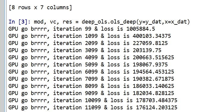
First I am going to redo the data analysis for predictive recidivism I did in a prior blog post. One change is that I noticed the default random forest implementation in sci-kit was prone to overfitting the data – so one simple regularization was to either limit depth of trees, or number of samples needed to split, or the total number of samples in a final leaf. (I noticed this when I developed a simulated example xgboost did well with the defaults, but random forests did not. It happened to be becauase xgboost defaults had a way smaller number of potential splits, when using similar defaults they were pretty much the same.)

Here I just up the minimum samples per leaf to 100.

#########################################################
#set up for libraries and data I need
import pandas as pd
import os
import numpy as np
from sklearn.ensemble import RandomForestClassifier
import matplotlib
import matplotlib.pyplot as plt
import seaborn as sns

my_dir = r'C:\Users\andre\Dropbox\Documents\BLOG\matplotlib_seaborn'
os.chdir(my_dir)

#Modelling recidivism using random forests, see below for background 
#https://andrewpwheeler.com/2020/01/05/balancing-false-positives/

recid = pd.read_csv('PreppedCompas.csv')
#Preparing the variables I want
recid_prep = recid[['Recid30','CompScore.1','CompScore.2','CompScore.3',
                    'juv_fel_count','YearsScreening']]
recid_prep['Male'] = 1*(recid['sex'] == "Male")
recid_prep['Fel'] = 1*(recid['c_charge_degree'] == "F")
recid_prep['Mis'] = 1*(recid['c_charge_degree'] == "M")
recid_prep['race'] = recid['race']

#Now generating train and test set
recid_prep['Train'] = np.random.binomial(1,0.75,len(recid_prep))
recid_train = recid_prep[recid_prep['Train'] == 1]
recid_test = recid_prep[recid_prep['Train'] == 0]

#Now estimating the model
ind_vars = ['CompScore.1','CompScore.2','CompScore.3',
            'juv_fel_count','YearsScreening','Male','Fel','Mis'] #no race in model
dep_var = 'Recid30'
rf_mod = RandomForestClassifier(n_estimators=500, random_state=10, min_samples_leaf=100)
rf_mod.fit(X = recid_train[ind_vars], y = recid_train[dep_var])

#Now applying out of sample
pred_prob = rf_mod.predict_proba(recid_test[ind_vars] )
recid_test['prob'] = pred_prob[:,1]
#########################################################

matplotlib themes

One thing you can do is easily update the base template for matplotlib. Here are example settings I typically use, in particular making the default font sizes much larger. I also like a using a drop shadow for legends – although many consider drop shadows for data chart-junky, they actually help distinguish the legend from the background plot (a trick I learned from cartographic maps).

#########################################################
#Settings for matplotlib base

andy_theme = {'axes.grid': True,
              'grid.linestyle': '--',
              'legend.framealpha': 1,
              'legend.facecolor': 'white',
              'legend.shadow': True,
              'legend.fontsize': 14,
              'legend.title_fontsize': 16,
              'xtick.labelsize': 14,
              'ytick.labelsize': 14,
              'axes.labelsize': 16,
              'axes.titlesize': 20,
              'figure.dpi': 100}
 
print( matplotlib.rcParams )
#matplotlib.rcParams.update(andy_theme)

#print(plt.style.available)
#plt.style.use('classic')
#########################################################

I have it commented out here, but once you define your dictionary of particular style changes, then you can just run matplotlib.rcParams.update(your_dictionary) to update the base plots. You can also see the ton of options by printing matplotlib.rcParams, and there are a few different styles already available to view as well.

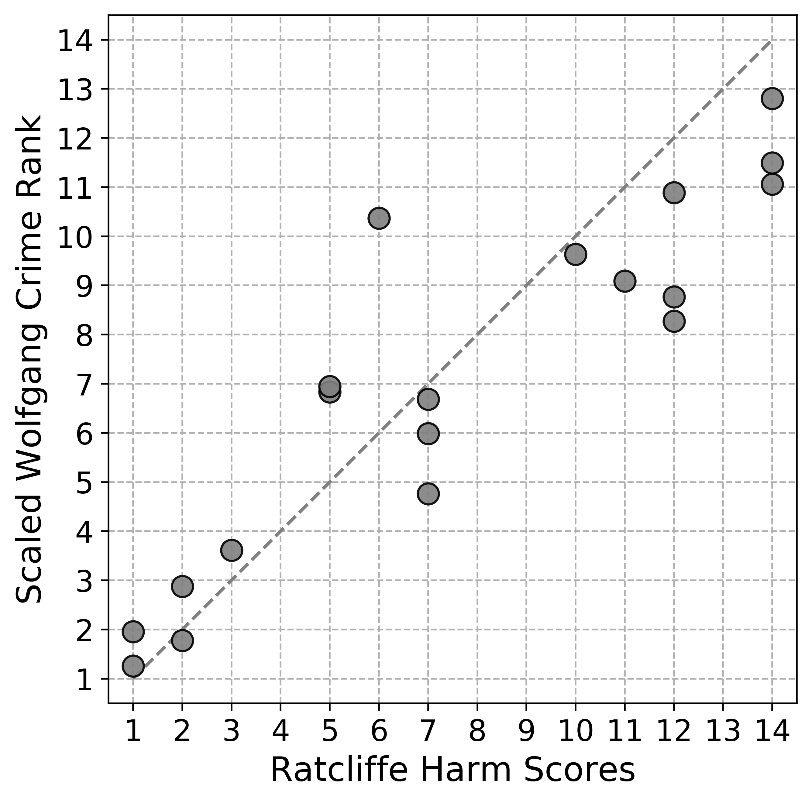
creating a lift-calibration line plot

Now I am going to create a plot that I have seen several names used for – I am going to call it a calibration lift-plot. Calibration is basically “if my model predicts something will happen 5% of the time, does it actually happen 5% of the time”. I used to always do calibration charts where I binned the data, and put the predicted on the X axis, and observed on the Y (see this example). But data-robot has an alternative plot, where you superimpose those two lines that has been growing on me.

#########################################################
#Creating a calibration lift-plot for entire test set

bin_n = 30
recid_test['Bin'] = pd.qcut(recid_test['prob'], bin_n, range(bin_n) ).astype(int) + 1
recid_test['Count'] = 1

agg_bins = recid_test.groupby('Bin', as_index=False)['Recid30','prob','Count'].sum()
agg_bins['Predicted'] = agg_bins['prob']/agg_bins['Count']
agg_bins['Actual'] = agg_bins['Recid30']/agg_bins['Count']

#Now can make a nice matplotlib plot
fig, ax = plt.subplots(figsize=(6,4))
ax.plot(agg_bins['Bin'], agg_bins['Predicted'], marker='+', label='Predicted')
ax.plot(agg_bins['Bin'], agg_bins['Actual'], marker='o', markeredgecolor='w', label='Actual')
ax.set_ylabel('Probability')
ax.legend(loc='upper left')
plt.savefig('Default_mpl.png', dpi=500, bbox_inches='tight')
plt.show()
#########################################################

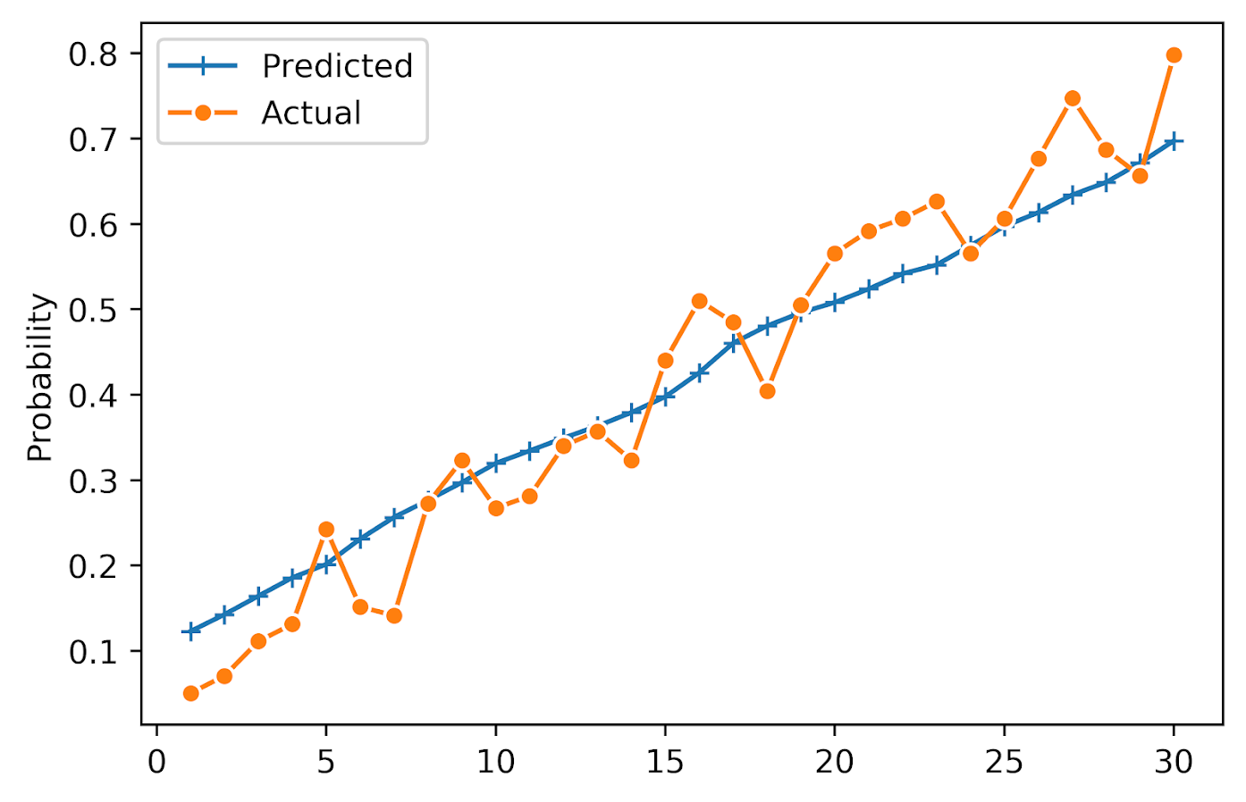
You can see that the model is fairly well calibrated in the test set, and that the predictions range from around 10% to 75%. It is noisy and snakes high and low, but that is expected as we don’t have a real giant test sample here (around a total of 100 observations per bin).

So this is the default matplotlib style. Here is the slight update using my above specific theme.

matplotlib.rcParams.update(andy_theme)
fig, ax = plt.subplots(figsize=(6,4))
ax.plot(agg_bins['Bin'], agg_bins['Predicted'], marker='+', label='Predicted')
ax.plot(agg_bins['Bin'], agg_bins['Actual'], marker='o', markeredgecolor='w', label='Actual')
ax.set_ylabel('Probability')
ax.legend(loc='upper left')
plt.savefig('Mytheme_mpl.png', dpi=500, bbox_inches='tight')
plt.show()

Not too different from the default, but I only have to call matplotlib.rcParams.update(andy_theme) one time and it will apply it to all my charts. So I don’t have to continually set the legend shadow, grid lines, etc.

making a lineplot in seaborn

matplotlib is basically like base graphics in R, where if you want to superimpose a bunch of stuff you make the base plot and then add in lines() or points() etc. on top of the base. This is ok for only a few items, but if you have your data in long format, where a certain category distinguishes groups in the data, it is not very convenient.

The seaborn library provides some functions to get closer to the ggplot idea of mapping aesthetics using long data, so here is the same lineplot example. seaborn builds stuff on top of matplotlib, so it inherits the style I defined earlier. In this code snippet, first I melt the agg_bins data to long format. Then it is a similarish plot call to draw the graph.

#########################################################
#Now making the same chart in seaborn
#Easier to melt to wide data

agg_long = pd.melt(agg_bins, id_vars=['Bin'], value_vars=['Predicted','Actual'], var_name='Type', value_name='Probability')

plt.figure(figsize=(6,4))
sns.lineplot(x='Bin', y='Probability', hue='Type', style='Type', data=agg_long, dashes=False,
             markers=True, markeredgecolor='w')
plt.xlabel(None)
plt.savefig('sns_lift.png', dpi=500, bbox_inches='tight')   
#########################################################

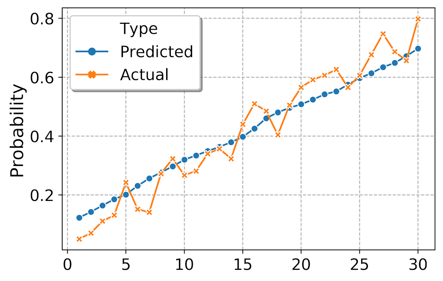
By default seaborn adds in a legend title – although it is not stuffed into the actual legend title slot. (This is because they will handle multiple sub-aesthetics more gracefully I think, e.g. map color to one attribute and dash types to another.) But here I just want to get rid of it. (Similar to maps, no need to give a legend the title “legend” – should be obvious.) Also the legend did not inherit the white edge colors, so I set that as well.

#Now lets edit the legend
plt.figure(figsize=(6,4))
ax = sns.lineplot(x='Bin', y='Probability', hue='Type', style='Type', data=agg_long, dashes=False,
             markers=True, markeredgecolor='w')
plt.xlabel(None)
handles, labels = ax.get_legend_handles_labels()
for i in handles:
    i.set_markeredgecolor('w')
legend = ax.legend(handles=handles[1:], labels=labels[1:])
plt.savefig('sns_lift_edited_leg.png', dpi=500, bbox_inches='tight')

making a small multiple plot

Another nicety of seaborn is that it can make small multiple plots for you. So here I conduct analysis of calibration among subsets of data for different racial categories. First I collapse the different racial subsets into an other category, then I do the same qcut, but within the different groupings. To figure that out, I do what all good programmers do, google it and adapt from a stackoverflow example.

#########################################################
#replace everyone not black/white as other
print( recid_test['race'].value_counts() )
other_group = ['Hispanic','Other','Asian','Native American']
recid_test['RaceComb'] = recid_test['race'].replace(other_group, 'Other')
print(recid_test['RaceComb'].value_counts() )

#qcut by group
bin_sub = 20
recid_test['BinRace'] = (recid_test.groupby('RaceComb',as_index=False)['prob']
                        ).transform( lambda x: pd.qcut(x, bin_sub, labels=range(bin_sub))
                        ).astype(int) + 1

#Now aggregate two categories, and then melt
race_bins = recid_test.groupby(['BinRace','RaceComb'], as_index=False)['Recid30','prob','Count'].sum()
race_bins['Predicted'] = race_bins['prob']/race_bins['Count']
race_bins['Actual'] = race_bins['Recid30']/race_bins['Count']
race_long = pd.melt(race_bins, id_vars=['BinRace','RaceComb'], value_vars=['Predicted','Actual'], var_name='Type', value_name='Probability')

#Now making the small multiple plot
d = {'marker': ['o','X']}
ax = sns.FacetGrid(data=race_long, col='RaceComb', hue='Type', hue_kws=d,
                   col_wrap=2, despine=False, height=4)
ax.map(plt.plot, 'BinRace', 'Probability', markeredgecolor="w")
ax.set_titles("{col_name}")
ax.set_xlabels("")
#plt.legend(loc="upper left")
plt.legend(bbox_to_anchor=(1.9,0.8))
plt.savefig('sns_smallmult_niceleg.png', dpi=500, bbox_inches='tight')
#########################################################

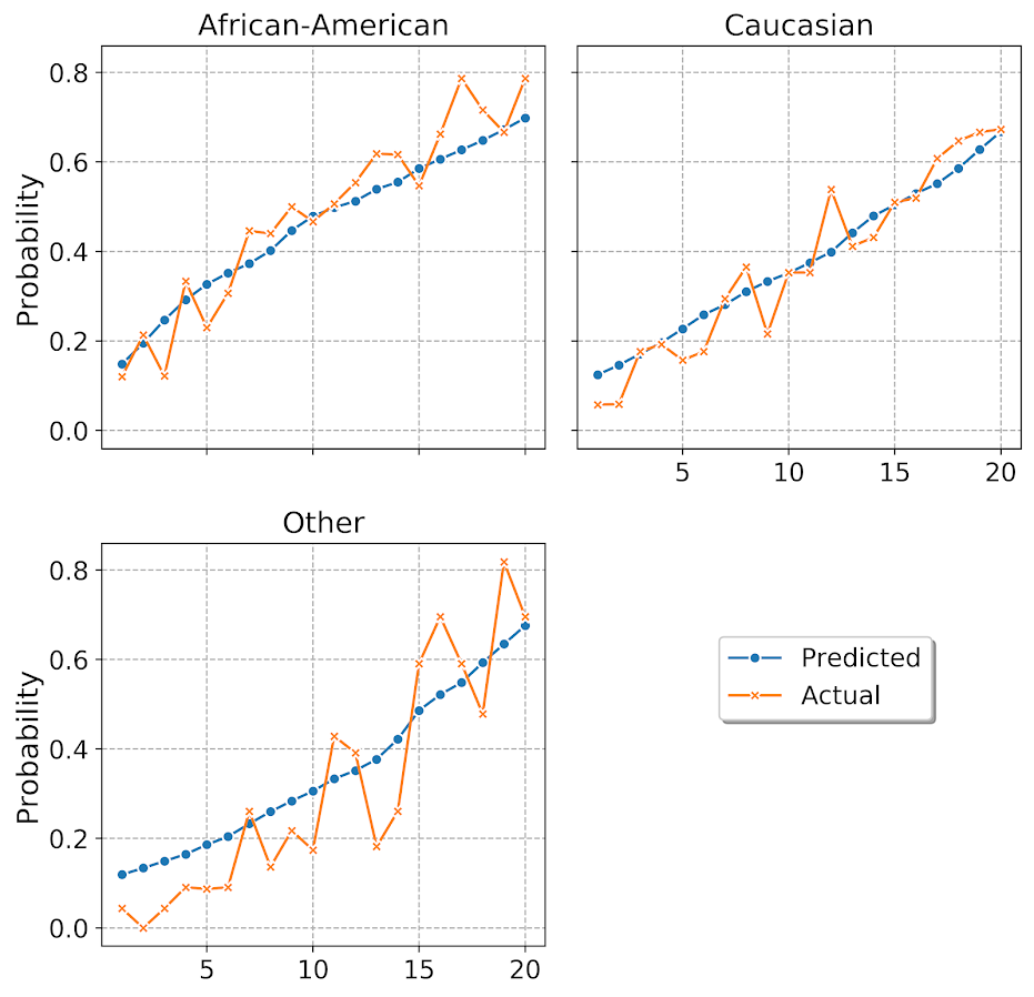
And you can see that the model is fairly well calibrated for each racial subset of the data. The other category is more volatile, but it has a smaller number of observations as well. But overall does not look too bad. (If you take out my end leaf needs 100 samples though, all of these calibration plots look really bad!)

I am having a hellishly hard time doing the map of sns.lineplot to the sub-charts, but you can just do normal matplotlib plots. When you set the legend, it defaults to the last figure that was drawn, so one way to set it where you want is to use bbox_to_anchor and just test to see where it is a good spot (can use negative arguments in this function to go to the left more). Seaborn has not nice functions to map the grid text names using formatted string substitution. And the post is long enough, you can play around yourself to see how the other options change the look of the plot.

For a few notes on various gotchas I’ve encountered so far:

  • For sns.FacetGrid, you need to set the size of the plots in that call, not by instantiating plt.figure(figsize=(6,4)). (This is because it draws multiple figures.)
  • When drawing elements in the chart, even for named arguments the order often matters. You often need to do things like color first before other arguments for aethetics. (I believe my problem mapping sns.lineplot to my small multiple is some inheritance problems where plt.plot does not have named arguments for x/y, but sns.lineplot does.)
  • To edit the legend in a FacetGrid generated set of charts, ax returns a grid, not just one element. Since each grid inherits the same legend though, you can do handles, labels = ax[0].get_legend_handles_labels() to get the legend handles to edit if you want.