2014 Blog stats, and why Blogging >> Articles

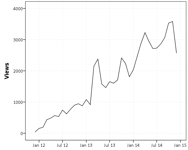
The readership of the blog has continued to grow. Here are the total site views per month since the beginning in December 2011.

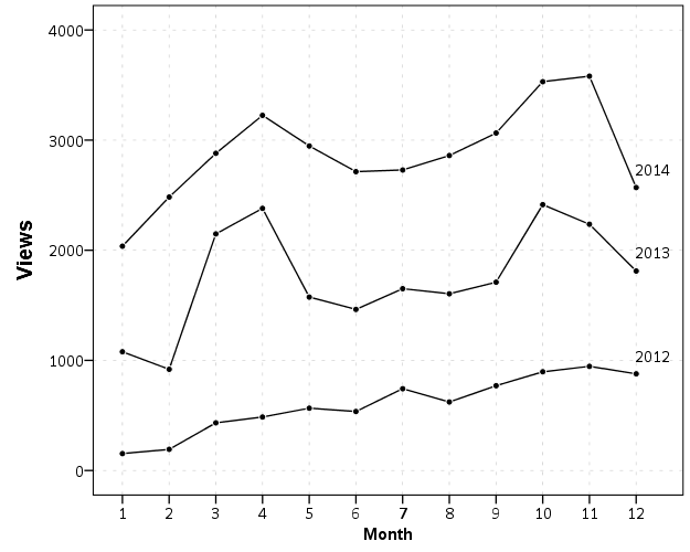
At this point we can start to see some seasonal patterns. I take a big hit in December and January, and increases when school is in session. I get quite a bit of my traffic from SPSS searches, so I presume much of the traffic are students using SPSS.

I do not worry too much about posting regularly, but I like to take some time if I have not published anything in around 2 weeks. I just enjoy taking a break from a specific work projects, and often I blog about something I have dealt with multiple times (or answered peoples questions multiple times) so I like making a blog post for my own and others reference.

Now, one of the more popular posts I have written is Odds Ratios NEED To Be Graphed On Log Scales. This I published in October 2013, recieved around 100 referrals from twitter the day I published it, and since has averaged about 5-10 views per day (it has accumulated a total of near 3,000 total). It is one of the first sites returned for odds ratio graph from a google search.

Certainly not a number of views to write home to my mother about, but I believe it is better outreach of my opinion than a journal article (not that I would be able to publish such a limited point in a journal article anyway). Take for instance Rothman et al.’s 2011 article, Should Graphs of Risk or Rate Ratios be Plotted on a Log Scale? in the American Journal of Epidemiology that has a differing opinion of mine. I can not find any readership stats for AJE, but I highly doubt that article has been viewed by 3,000 people, and according to google scholar it only has 2 citations currently. One is the response by the editor to the article, and the other is likely in error as it was published before the Rothman article. Site views are superficial as well, but I would place a wager my blog post has reached more readers than the Rothman article. 3,000 is way higher than views or downloads for my papers on SSRN, and even the most viewed articles since 2011 on the Cartography and GIS website have not accumulated 3,000 downloads at this point. (My Viz JTC paper has just over 100 downloads so far after being up for close to a year at this point.) AJE articles very likely have a larger readership than CaGIS – but I have no idea how much larger. I would guess the American Statistician has a more comparable (likely larger?) membership via the ASA, and articles from the first issue of 2014 have accumulated mostly between 200 and 1500 downloads currently (the last issue of 2013 is quite a bit lower). I suspect a download is a bit more of an investment than a page view of my blog (so both are over-estimates of those actually reading the article, but page views are likely a larger over-estimate). But in most cases I get so many more views on the blog compared to that I would an article outreach on the blog is clearly the winner. The audience is different as well, not necessarily better or worse, just different.

I don’t take my work as venerable as Ken Rothman’s (obviously he is a well respected and influential epidemiologist or methodologist more generally for his books), but I disagree with his reasoning for using linear scales in some circumstances in the referenced article. My general response to the Rothman example is that if you want to show absolute risk differences then show them. Plotting the ratios on an arithmentic scale is misleading, and while close for his example is still not as accurate as just plotting the risk differences. In Rothman et al.’s example plotting the odds ratios would result in an overestimate of the absolute risk differences by over 10%! (The absolute risk difference is 90 - 1 = 89, whereas the linear difference between the odds is 10 - .01 = 9.99. The former mapped onto a scale from 0 to 10 would result in a length of 8.9, so an over estimate of (9.99 - 8.9)/8.9 ~ 12%.)

I don’t take blogging as a replacement for academic work, more like an open nerd journal. I’m pretty sure this venue has quite a bit more readership than my journal articles ever will though.


Solving problems as a metaphor for scientific writing

One analogy I hear in academics describing the process of writing a literature review is identifying the gaps in prior literature(s). I was reading Helping doctoral students write: Pedagogies for supervision recently, and Kamler & Thomson used this same analogy in describing the process of writing a literature review for a dissertation (although it is generally the same for shorter articles or books). Similar terminology Kamler & Thomson describe are blank spots and blind spots (see page 45). In that same chapter since Kamler & Thomson suggest the use of appropriate metaphors in describing the work of writing a literature review, I figured a critique of this one to be apropos.

I do not think the analogy is completely off base — but I do not like it as it does not jive with my personal experience of how I go about writing an article or thinking about research more generally. The first reason I do not like this terminology is that it has negative connotations for prior research. I think of building knowledge as a more cumulative endeavour as opposed to filling in between the lines of prior research.

For an analogy, say a researcher is attempting to improve the fuel efficiency of small combustible engines. It is likely they take mostly prior engineering knowledge about combustible engines and provide some modifications to slightly improve the design. Filling a gap implies to me an explicit design flaw in prior engines, when in reality it is more likely the researcher brings new knowledge to improve the design, and only in the context of the new research is the old design potentially described as inefficient. A social science example may be evaluating the costs and benefits to a particular policy in place by a public institution. The policy may be evidence based, and so an evaluation of the policy provides new information to that agency of whether it works as intended, or more general scientific knowledge about applying that policy in a real world setting. Neither seem to me filling in a gap, more so contributing and/or refining a set of knowledge already established.

I like the metaphor of the accumulation of knowledge, like a pyramid one brick at a time, better in terms of describing what I do when I write a literature review as opposed to identifying gaps. A convenient format for a literature review is to take a historical walk through the literature, and let the chronological order of previous findings be the guide for how you write the lit. review. But that metaphor is not sufficient to me either, as it implies a very linear structure, whereas prior research strikes me as more sphere-like — there is a base to which you add but the direction of the current research is not limited by the trajectory of the prior work. (A more accurate physical analogy may be an irregular growth of cells — they may meander in any particular direction but they always need to be connected to the prior work.) The scientific writer imposes a linear structure when describing prior work, but in reality the prior literatures are not that focused on whatever particular problem the current article is trying to address.

That is why I like the simple metaphor of identifying and solving a problem as a descriptor of what I do when I write a literature review – or even more broadly about describing the decisions I make in my research agenda. There are several reasons I prefer this analogy to either the accumulation of knowledge or identifying gaps. Identifying gaps implies you can read the prior literature and the gaps will be obvious — this is not the case. The prior literature is written in a particular context – the authors cannot anticipate future conditions or how that work will potentially be applied in the future. The gap does not exist in the current or prior literatures, you as a writer/researcher make the gap. I prefer problem solving as opposed to the accumulation of knowledge because it implies the focused nature of the endeavour. You do not simply write a paper to add a linear line of prior knowledge, you use that prior knowledge to solve a particular problem you have in your current context. It is your job as a researcher to basically say how the prior knowledge helps to solve that problem, and then advance the current knowledge to solve your particular problem. (This focus on giving the writer agency seems to be in line with most of Kamler & Thomson’s advice as well.)

This is how Popper described how knowledge actually accumulates — people have problems and they try to learn how to solve them. There is no prior divine truth to which future knowledge is added. We simply have problems, and some research may show a better solution to that problem than prior knowledge (be it whether the prior knowledge is well established or simply folklore). The analogy is not perfect, as many researchers would say they do not solve problems but are simply describe reality, but is a frame of reference I find useful to describe how I approach writing, describe my research, and in particular how I approach consuming the prior literature. It shows how I take the prior work and apply it to my interest, I am not a passive reader when trying to synthesize prior work.

Big data problems for Criminal Justice

I am on the job market this year, and I have noticed a few academic jobs focused on big data (see this Penn State posting for one example). Because example data sets in criminal justice are not typical fodder for big data conversations, I figured I would talk abit about my experiences and illustrate the need for the types of skills needed to manipulate and analyze these big datasets.

As opposed to trying to further define the big data buzzword, I will simply talk about the actual size of data I have dealt with. Depending on the definition used, most large criminal justice datasets may be called medium sized data. That is you can load it in a database or statistical program (particularly those that do not load everything into RAM, like SPSS and SAS) and calculate different summary statistics and fit simple models. Were not talking about datasets that need custom big data solutions like Hadoop. The biggest single table I’ve personally worked with is a set of 25 million arrest histories (with around 150 variables). Using SPSS server to sort this dataset took less than a minute, using my local machine it took about 10 minutes. Nothing much to complain about there, and it is where the statistical programs that don’t load everything into memory shine.

To talk specifics, the police agency where I was an analyst at (Troy, NY) is a fairly small city with a population of around 50,000 people. They generated around 60,000 calls for service per year (this includes anytime someone calls 911, or police initiated interactions like a traffic stop). Every single one of these incidents generates a one to many relationship for multiple tables, and here is a sampling of those relationships; multiple free text description of the event and follow up investigations, people involved in the incident, offences committed, property stolen or damaged, persons arrested, property recovered or confiscated, drug and weapon contraband, vehicles involved, etc. Over the time period of 04-13 the incident narratives themselves are around 1 gigabyte, and the number of unique individuals and institutions in the "names" table was around 100,000. None of these tables alone would be considered big data, but when taking multiple years and having to conduct multiple table merges it turns into complicated medium size data pretty quickly.

I’m sure I’m not alone here working with police departments. In the past month I’ve had conversations with two individuals about corrections datasets that result in millions of records. Criminal justice organizations have been collecting data for along time, and given say 50,000 records per year it only takes 10 years to turn that into 500,000. When considering larger agencies (like statewide corrections or courts) the per year becomes even larger.

Most of the time summary statistics and fairly simple regression models are all researchers and analysts are interested in in criminal justice. The field is not heavily devoted to prediction, and certainly not to fitting complicated machine learning models. Many regression tasks can be estimated with data as large as 25 million records (given that the number of predictor variables tends to be small) and even if it didn’t sampling (or reducing the data to unique observations and weighting) is an obvious option. So for these types of simple needs just learning effective practices at manipulating datasets — such as SQL and best practices for conducting data manipulations in statistical packages is most of the education one needs. But these are still definitely needs that are not met in any social science curricula that I am aware. By fire is my only experience.

Two particular areas that turn little data into big data are spatial and network analysis, as one not only needs to consider the number of nodes but also the number of edges (or potential edges) in the system to calculate various measures. For example, in my dissertation I needed to conduct spatial lags of several variables (and this is needed in calculating measures such as Moran’s I). In matrix notation this typically involves calculating Wx, where W is an n by n spatial weights matrix. In my dissertation, n was 21,506, so not a large dataset, but W is then a 21,506^2 matrix. It can be held in memory, but good luck trying to calculate anything with it. Most of the spatial econometrics literature discusses how calculating W^-1 is problematic, let alone the simpler operation of Wx. So to do those calculations I needed to create custom code. I hope to be able to write a blog post on how it can be done at some point – but these blog posts aren’t earning me any brownie points to getting a job (let alone getting tenure in the future).

The other area that I believe needs to be developed in the social science related to medium data problems are custom visualization solutions. Data in social science typically has lots of noise to signal, and adding in 100,000 observations rarely makes things clearer. This is why I think visualization within the social sciences has potential to expand, as the majority of historical discussions are not extensible to our particular use applications in the social sciences.

So I’m excited by academia recognizing that big data is a problem and takes custom solutions in the social sciences. An environment where I can be reworded for taking on those big data tasks and partly focus on publishing software, as opposed to solely publish or perish, would help develop the field and have a more lasting impact on practical applications than journal articles. At least a place that acknowledges the need to develop curricula related to these data management tasks would be a good start. But I’m not sure I like the types of applications currently being pitched in the social sciences as big data problems, particularly the trivial applications of examining social networks like facebook or twitter, nor emphasis on big data tools like Hadoop that I don’t think are applicable to the social scientists toolset. But I’m certainly biased to think that applications in criminal justice have more practical implications than alot of contemporary social science research.

Dissertation Draft

I figured I would post the current draft of my dissertation. It is being evaluated by the committee members now, and so why not have everyone evaluate it! Also, since I am on the job market there is proof I am close to finished.

Here is a pdf of the draft. This draft is not guaranteed to stay the same as I find errors, but at this point changes should (hopefully) be minimal. As always I appreciate any feedback. The title is What we can learn from small units of analysis, and below is the abstract.

The dissertation is aimed at advancing knowledge of the correlates of crime at small geographic units of analysis. I begin by detailing what motivates examining crime at small places, and focus on how aggregation creates confounds that limit causal inference. Local and spatial effects are confounded when using aggregate units, so to the extent the researcher wishes to distinguish between these two types of effects it should guide what unit of analysis is chosen. To illustrate these differences, I examine local, spatial and contextual effects for bars, broken windows and crime using publicly available data from Washington, D.C.


Quantifying racial bias in peremptory challenges

A question came up recently on cross validated about putting some numbers on the amount of bias in jury selection. I had a previous question of a similar nature, so it had been on my mind previously. The original poster did not say this was specifically for a Batson challenge, but that is simply my presumption. It is both amazing and maddening that given the same question four different potential analyses were suggested. Although it is a bit out of the norm for what I talk about, I figured it would be worth a post.

Some background on Batson

For some background, Batson challenges are specifically in the context of selecting jurors for a trial. (Everything that follows is specific to what I know about law in the US.) To select a jury first the court selects potential jurors for the venire from the general public. Then both the prosecution and defence counsels have the opportunity to question individuals in the venire. A typical flow seems to be that a panel of the venire is selected (say 10), then the court has a set of standardized questions they ask every individual potential juror. This part is referred to as voir dire. If the individual states they can not be impartial, or there is some other characteristic that indicates they cannot be impartial that potential juror can be eliminated for cause. Without intervention of counsel the standard questions by the court typically weeds out any obvious cases. After the standard questions both counsels have the opportunity to ask their own questions and further identify challenges for cause. There are no limits on who can be eliminated for cause.

The wrinkle specific to Batson though is that each counsel is given a fixed number of peremptory challenges. The number is dictated by the severity of the case (in more serious cases each side has a higher number of challenges). The wikipedia page says in some circumstances the defense gets more than the prosecution, but the total number is always fixed in advance.

The logic behind peremptory challenges is that either counsel can use personal discretion to eliminate potential jurors without needing a justification. Basically it is a fail-safe of the court to allow gut feelings of either counsel to eliminate jurors they believe will be partial to the opposing side. But based on the equal protection clause it was decided in Batson vs. Kentucky that one can not use the challenges solely based on race. As a side effect of allowing so many peremptory challenges, one can easily eliminate a particular minority group, as being a minority group they will only have a few representatives in the venire.

During the voir dire if the opposing counsel believes the opposition is using the peremptory challenges in a racially discriminatory manner, they can object with a Batson challenge. The supreme court decided on three steps to evaluate the challenge.

  1. The party that objected has the burden to prove a prima facie case that the challenges were used in a discriminatory manner. This includes an argument that the group is discriminated against is cognizable, and that there is additional numerical evidence of discrimination.
  2. Then the burden shifts on the party being challenged to justify the use of the peremptory challenges based on race neutral reasons.
  3. The burden then shifts back to the original challenging party. This is to dispute whether the reasons proferred for the use of the peremptory challenges are purely pretextual.

Witnessing the proceedings for this particular case in the New York court of appeals case is what prompted my interest, and I recommend reading their decision as a good general background on Batson challenges (the wikipedia page is lacking quite a bit). What follows is some number crunching specific to the first part, establishing a prima facie case of discrimination.

Now some numbers

Batson challenges are made in situ during voir dire. All the cases I am familiar with simply use fractions to establish that the peremptory challenges are being used in a discriminatory manner. The fact that the numbers are changing during voir dire makes the calculations of statistics more difficult. But I will address the ex post facto assessment of the first step given the final counts of the number of peremptory challenges and the total number on the venire with their racial distribution. This presumption I will later discuss how it might impact on the findings in a more realistic setting.

Consider the case of People vs. Hecker (linked to above). It happened that the peremptory challenges by the defence to exclude two Asian’s from the jury panel is what prompted the Batson challenge. Later on one other Asian juror was seated to the jury. The appeals court considered in this case whether step 1 was justified, so it is not a totally academic question to attempt to quantify the chances of two out of three Asian’s being challenged.

First, I will specify how we might put a number of this chance occurrence. If a person randomly selected 13 names out of a hat with 39 people, and of those names 3 individuals were Asian, what is the probability that 2 of those selected would be Asian? This probability is dictated by the hypergeometric distribution. More generally, the set up is:

  • n equals the total number of eligible cases that are subject to be challenged
  • p equals the total number of the race in question that are subject to be challenged
  • k equals the total number of peremptory challenges used on the racial group in question
  • d equals the total number of peremptory challenges

And the hypergeometric distribution is calculated using binomial coefficients as:

\frac{{p \choose k} {n-p \choose d-k} }{{n \choose d}}

So plugging the numbers listed above into the formula, we get the probability of two out of three Asian jurors being challenged if the challenges were made randomly would be equal to below according to Wolfram Alpha:

\frac{{p \choose k} {n-p \choose d-k} }{{n \choose d}} = \frac{{3 \choose 2} {39-3 \choose 13-2} }{{39 \choose 13}} = \frac{156}{703} \approx 0.22

So the probability of a chance occurrence given this particular set of circumstances is 22%, not terribly small, although may be sufficient given other circumstances to justify the first step (it seems the first step is intended that the burden is rather light). Where did my numbers come from though exactly? Given the circumstances of the case in the appeal decision the only number that would be uncontroversial would be p = 2, that two Asian jurors were excluded based on peremptory challenges. p = 3 comes from after the case, in which one other Asian juror was actually seated. It appears in the appeals case I linked to they consider the jury composition after the Batson challenge was initially brought, but obviously the initial trial judge can’t use that future information. I choose to use d = 13 because the defence only used 13 of their 15 peremptory challenges by the end of the seating. The total number n = 39 is the most difficult to come by.

The appeal case states that in the first pool 18 jurors were brought for questioning, 5 were eliminated for cause, and that both the defence and prosecution used 5 peremptory challenges. I chose to count the total number as 13 for this round, 18 minus the 5 eliminated for cause. In our pulling names out of the hat experiment though you may consider the number to be only 8, so not count the cases the prosecution used their peremptory challenges on. The second round brought another 18 potential jurors, of which 4 were eliminated for challenge. In this round the two Asian jurors were challenged by the defence when the judge asked to evaluate the first 9 of this panel (given the language it appears defence used 3 peremptory challenges during this evaluation of the first 9). At the end of the second round both parties used another 5 peremptory challenges. So to get the the total number of 39, I use 13 for the first round plus 14 for the second, although I could reasonably use 8 for the first and 9 for the second. I end up at 39 by using 13 + 14 + 12 – the last Asian juror (Kazuko) was the the 13th to be questioned on the third panel. One prior juror had been challenged for cause, so I count this as 12 towards the total of 39. There were a total of 26 panellists in this round, and the defence used a total of another 3 peremptory challenges, and there is no other information on whether the prosecution used any more peremptory challenges. (I’m unsure the total number of jurors seated for the case, so I can’t make many other guesses – the total number of jurors selected in the prior two rounds were 7). I don’t worry about the selection of the alternate juror for this analysis.

So lets try to apply this same analysis at the exact time the Batson challenge was raised, when the second Asian juror was eliminated. I prefer to make the calculations at the time the challenge was raised, as the opposing counsel may later alter their behavior in light of a prior Batson challenge. In doing this, now we have p = 2 and k = 2 (there was no other mention of any Asian’s being challenged for cause). We have a bit of uncertainty about d and n though. d at a minimum for the defence has to be 7 at this point (five in the first round plus the two Asians in the second round), but could be as many as 10 (5 in the first and 5 in the second). n could be as mentioned before 8 + 9 = 17 (excluding cases the prosecution challenged) or 13 + 14 = 27 (including all cases not challenged for cause). In the middle you may consider n to be 13 + 9 = 22, the exact point when the defence was asked to bring forth challenges for the first 9 seated on that round of the panel. So what difference does this make on the estimated probabilities? Well lets just graph the estimates for all values of d between 7 and 10, and n between 17 and 27. Here the lines are for different values of d (with labels at the beginning left part of the line), and the x axis is the different values of n. We can see the probabilities follow the pattern that as n increases and d decreases the probability of that combination goes down. Even over all these values the probability never goes below 5%. I do not know if a 5% probability is sufficient for the numerical justification of the prima facie case of discrimination. 22% seems too low a threshold to me (by chance about 1 in 5 times) but 5% may be good enough (by chance 1 in 20 times).

So lets try this same sensitivity analysis for the entire case. For the evaluation of everything after the fact I think p = 3 and k = 2 are largely uncontroversial, but lets vary d between 7 and 15 and n between 23 (chosen to be at the lower end of cases that were legitimately evaluated in the pool by the end I believe) to 45. Some of these situations are not commensurate with the limited information we have (e.g. d = 7 and n = 45 is not possible) but I think the graph will be informative anyway. My labelling could use more work, but the line on top is d = 15 and they increment until the line on bottom where d = 7.

So here we can see that the probability after the fact never gets much below 10%, and that is for lower values of d and higher values of n that are not likely possible given the data. So basically in the case that looks the worst for the defence here the probability of selecting two out of three Asian’s by random (giving varying numbers of peremptory challenges and varying the pool from which to draw them) is never below 10%. Not a terribly strong case that the numerical portion of step 1 has been satisfied. Basically, no matter what reasonable values you put in for d or n in this circumstance the probability of choosing 2 out of three Asian jurors randomly is not going to be much below 10%.

On some of the other suggested analyses

On the original question on CV I mentioned previously, besides my own suggested analysis here there were 3 other suggested analysis:

  • Using a regression model to predict the probability of a racial group being challenged
  • Analysis of Contingency tables
  • Calculating all potential permutations, and then counting the percentage of those permutations that meet some criteria.

All three I do not think are completely unreasonable, but I prefer the approach I listed above. I will attempt to articulate those reasons.

So first I will talk about the regression approach. This is generically a model of the form predicting the probability of a peremptory challenge based on the race of the potential juror:

\text{Prob}(\text{Challenge}) = f(\beta_0 + \beta_1(\text{Racial Group}_i))

The anonymous function is typically a logit (for a logistic model) or a probit function. This generalized linear model is then estimated via maximum likelihood, and one formulates hypothesis tests for the B_1 coefficient. The easy critique of this is that the test is not likely to be very powerful with the small samples – as the estimates are based on maximum likelihood and are only guaranteed to unbiased asymptotically. This could be a fairly simple exercise to attempt to see the behavior of this bias in the small samples, but I suspect it reduces the power of the test greatly. Also note that in the case where the subgroup of interest is always challenged, such as in the two out of two Asian’s in the Hecker case mentioned, the equation is not identified due to perfect separation. There are alternative ways to estimate the equation in the case of perfect separation, but this does not mitigate the small sample problem.

More generally, my original formulation of the data generating mechanism being the hypergeometric distribution, drawing names out of hat, is quite different than this. This is a model of the probability of anyone being peremptory challenged. One then estimates the model to see if the probability is increased among the racial group of interest. This is arguably not the question of interest. For instance, say the model estimated the probability of an Asian being challenged to be only 6%, and the probability of anyone else to be 4%. In one sense, this establishes the prima facie case of discrimination of Asian’s compared to everyone else, but does only a probability of 6% of using a peremptory challenge warrant a Batson challenge? I don’t think so. If you think that a challenge will never come with such low probabilities, you are right in that the expected probabilities for the racial group of question will not be that low when a Batson challenge is made, but once you consider the uncertainty in the estimates (e.g. 95% confidence intervals) they could easily be that low. On the flip side if the racial group is struck 96% of the time, but everyone else is struck 94% of the time, does that establish the numerical evidence of discrimination? I’m not sure, it may if this prevents any of the particular racial group being seated.

The analysis of contingency tables, in particular Fisher’s Exact Test, is exactly the same as my hypergeometric approach if one only considers the racial group of interest against all other parties. Fisher’s exact test is a reasonable approach over the more typical chi-square because, 1) the cells will be quite small, and 2) this is one of the unusual cases where the marginals are fixed. So making a 2 by 2 contingency table based on the very first example I gave (which resulted in a probability of around 22%) would be a table:

Challenge No Challenge Total
Asian 2 1 3
Other 11 25 36
Total 13 26 39

For the formula the 2 by 2 table is referred to as:

Challenge No Challenge Total
Asian a b a + b
Other c d c + d
Total a + c b + d n

Which Fisher’s Exact Test can be formulated by the binomial coefficients:

\frac{{a + b \choose a} {c+d \choose c} }{{n \choose a+c}} = \frac{{2 + 1 \choose 2} {11+25 \choose 11} }{{39 \choose 13}}

Which if you look closely is exactly the same set of binomial coefficients for the hypergeometric test I listed previously. So, as long as one only tests the one racial group against all others Fisher’s Exact test of a 2 by 2 contingency table is exactly the same as my recommendation. I don’t particularly think the historical p-value <= 0.05 standard is necessary, but it is the same information.

What bothers me more about this approach is when people start adding other cells in the contingency table. In the first step you need to establish a pattern of discrimination against one particular cognizable group. The treatment of other groups is non sequitur to this question in the first step. (In People vs Black evaluations of how unemployment was treated for non-black jurors was considered is steps 2 and 3, but not in the first step.) Including other groups into the table though will change the outcome. Such ad hoc decisions on what racial groups to consider should not have any effect on the evidence of discrimination against the specific racial group of interest. This problem of what groups is similarly applicable to the regression approach mentioned above. Hypothesis tests of the coefficients will be dependent on what particular contrasts you wish to draw and will change the estimates if certain groups are specified in the equation.

The final approach, counting up particular permutations that meet a particular threshold is intuitive, but again has an ad hoc element, the same problem with choosing which racial groups will impact the test statistic. All of the approaches (including my own) need to be explicit about the groups being tested beforehand. Only monitoring one group as in the hypergeometric test I presented earlier is much simpler to justify ex post facto, but it still would be best to establish the cognizable groups before voir dire takes place. For the tests that use other racial or ethnic groups in the calculations are much more suspect to justification, as the picking and choosing of the other groups will impact the calculations.

Some recommendations

A typical question I get asked as an academic is, So what would you recommend to improve the situation? Totally reasonable question that I often don’t have a good answer to. It is easy to throw out recommendations without considering the entirety of the situation, and the complexities of the criminal justice system are no exception. With full awareness that no one with any authority will likely read my recommendations, my suggestions follow none-the-less.

The first is, only slightly in jest, is to only allow 1 peremptory challenge. There is no bright line rule on numerical evidence presented that is necessary to establish discrimination, but the NY State court of appeals case I mentioned did indicate that it takes more than 1 challenge to establish a pattern of discrimination. This may seem extreme, but the logic applies to the same to allowing fewer peremptory challenges. The fewer the challenges, the less capability either counsel has to entirely eliminate a particular racial group from the jury. It simultaneously makes counsels use of the challenges more precious, so they should be more hesitant to use them based on gut feelings predicated solely by racial stereotyping.

As another side effect (good or bad depending on how you look at it) it also makes the evaluation of whether one is using the challenges in a racially discriminatory manner much clearer. As I shown above, when d decreased the probability of the outcome generally decreased. For example with the Hecker case, pretend there were only a total of 5 peremptory challenges. So in this hypothetical situation have n = 20, d = 5, and p and k = 2 (if the number of n was much higher with the number of peremptory challenges limited to 5 for each side the jury would have to be close to set already by the time 20 individuals were questioned). The probability of this is 5%, whereas if d = 7 the probability is 11%. To be very generic, having fewer challenges makes particular racial patterns less likely by chance.

I understand the motivation for peremptory challenges, but it is unclear to me why such a large number are currently afforded for most cases. Also to the extent that timeliness is a priority for the court, allowing fewer challenges would certainly decrease the necessary time needed for voir dire. (Which was a concern in the Hecker case, as the court only allowed a very short time for questioning the panels.)

The second is that case-law should be established for cognizable groups, particularly given the racial make up of the defendent(s) and victim(s). Or, conversely, counsels should be required a priori to voir dire to establish the cognizable groups. This avoids cherry picking any group for a Batson challenge, as one could always specify a group based on the ex post facto characteristics of the groups used for peremptory challenges. To put a probability to whether a certain number of a particular group could be chosen at at random it is necessary to supply the hypothesis before looking at data. Ad hoc selections of a group could always occur, and with some of the other statistical tests ad hoc inclusion of cells in a contingency table or to include in a test statistic could impact the analysis. Making such a case a priori should prevent any nefarious manipulation of the numbers after the fact.

Neither of these appear to be too onerous to me to be reasonable suggestions. I doubt any lawyer or judge is going to be typing binomial coefficients into Wolfram Alpha during voir dire anytime soon though. Maybe I should make a look up table or nomogram for hypergeometric probabilities for typical values that would come up during voir dire. It would be pretty easy for a lawyer to keep a tally and then do a look up, or keep in mind before hand at what point a set of challenges is unlikely due to chance. With many peremptory challenges and few uses of a particular group, I suspect the probabilities of that happening by chance are much larger than people expect. The two out of two Asian’s in the Hecker case is a good example where the numerical evidence of discrimination is very weak no matter how you plug in the numbers.
Presentation at IACA 2014 – Making Field Stops Smart

Part of the work I am doing with the Finn Institute in collaboration with the Albany Police Department was accepted as a presentation at the upcoming IACA conference in Seattle next week. The NIJ used to have a separate Crime Mapping conference, but they folded it into the yearly IACA conference. So this is one of the NIJ Crime Mapping presentations.

The title of the presentation is Making Field Stops Smart, and below is the abstract:

Mapping hot spots of crime incidents for use in allocating patrol resources has become commonplace. This research is intended to extend the logic to mapping locations of field interviews. The project has two specific spatial analysis components; 1) are most of the stops being conducted a high crime locations, and 2) are locations with the most stops the locations with the most productive stops (in terms of arrests, contraband recovery, stopping chronic offenders). Making stops smart is being conducted as a research partnership between the Albany, NY police department and the Finn Institute of Public Safety.

The time of the presentation is at 15:30 on Thursday 9/11. Two other presenters, Eric Paull from Akron, Ohio and Christian Peterson from Portland, Oregon have presentations on the panel as well (see the IACA agenda for their talk abstracts).

I am uncomfortable publicly releasing the pre-print white papers given the collaboration (Rob Worden and Sarah McLean are co-authors) and because that APD’s name is directly attached to the work. But if you send me an email I can forward the white paper for this presentation and related work we are doing.

If you see me at IACA feel free to come up and say hi. I do not have any other plans while I am in town besides going to presentations.


Rejected!

My Critique of Slope Graphs paper was recently rejected as a short article from The American Statistician. I’ve uploaded the new paper to SSRN with the suggested critiques and my responses to them (posted here).

I ended up bugging Nick Cox for some pre peer-review feedback and he actually agreed! (A positive externality of participating at the Cross Validated Q/A site.) The main outcome of Nick’s review was a considerably shorter paper. The reviews from TAS were pretty mild (and totally reasonable), but devoid of anything positive. The main damning aspect of the paper is that the reviewers (including Cox) just did not find the paper very interesting or well motivated.

My main motivation was the recent examples of slope graphs in the popular media, most of which are poor statistical graphics (and are much better suited as a scatterplot). The most obvious being Cairo’s book cover, which I thought in and of itself deserved a critique – but maybe I should not have been so surprised about a poor statistical graphic on the cover. This I will not argue is a rather weak motivation, but one I felt was warranted given the figures praising the use of slopegraphs in inappropriate situations.

In the future I may consider adding in more examples of slopegraphs besides the cover of Albert Cairo’s book. In my collection of examples I may pull out a few more examples from the popular media and popular data viz books (besides Cairo’s there are blog post examples from Ben Fry and Andy Kirk – haven’t read their books so I’m unsure if they are within them.) For a preview, pretty much all of the examples I consider bad except for Tufte’s original ones. Part of the reason I did not do this is that I wrote the paper as a short article for TAS — and I figured adding these examples would make it too long.

I really had no plans to submit it anywhere besides TAS, so this may sit as just a pre-print for now. Let me know if you think it may be within the scope of another journal that I may consider.

New paper – Testing for Randomness in Day of Week Crime Sprees with Small Samples

I’ve uploaded a new paper, Testing for Randomness in Day of Week Crime Sprees with Small Samples, to SSRN. The abstract is below:

This paper discusses exact tests for evaluating whether a series of offences are randomly distributed across days of the week for small sample sizes. The given context is if a crime analyst has identified a series of events that are committed by the same offender(s), can the analyst determine if those events are randomly distributed with respect to the day of week given only a few offences? I detail how one can develop exact reference distributions since the number of potential permutations are small. I also discuss the power of the chi^2 and Kuiper’s V test for small sample sizes, and give an example of hypothesis testing when crimes have uncertain days of occurrence.

Here is an example graph of the power of the tests under different alternate hypotheses of crimes only having probability of being committed on a certain subset of days in the week. Comments on the paper would be wonderful (I will have to bug someone to give me some pre peer-review feedback) – so feel free.

Poisson regression and crazy predictions

Here is a problem I’ve encountered a few times in my own work (and others) with Poisson regression models and the exponential link function. It came up recently in some discussions on the scatterplot blog by Jeremy Freese (see 1 & 2) critiquing the PNAS paper on the effect of female named hurricanes on death tolls, so I figured I would expand up those thoughts a little here.

So the problem is when you estimate a Poisson regression model is that the exponential link function can become explosive for explanatory variables that have a large range. So to be clear, we have a Poisson regression model of the form (here E[Y] mean the expected value of Y):

log(E[Y]) = B1*(X)
    E[Y]  = e^(B1*X)

If X has a small range this may be fine, but if X has a large range it can become problematic. Consider if Y are hurricane deaths, X is monetary damage of the hurricane, and B1 = 0.01. Lets say the monetary damage ranges from 1 to 1000 (imagine these are in thousands of dollars, so range between $1,000 and $1 million). What happens with the predictions?

E[Deaths] = e^(0.01*   1) =     1.01
E[Deaths] = e^(0.01*   5) =     1.05
E[Deaths] = e^(0.01*  10) =     1.11
E[Deaths] = e^(0.01*  50) =     1.65
E[Deaths] = e^(0.01* 100) =     2.71
E[Deaths] = e^(0.01* 500) =   148
E[Deaths] = e^(0.01*1000) = 22026

These predictions are invariant to linear transformations – that is Z-scoring X in the original units doesn’t change the predictions (the same as expressing X in [dollars/1000] doesn’t make any difference than just by including [X] on the right hand side). The linear predictor of B1 will simply be scaled by the appropriate inverse transformation. Also I’d note that expressed in terms of incident rate ratios the effect would be e^0.01=1.01. This appears on its face a totally innocuous effect, and only in consideration of the variation in X does it appear to be absurd.

You can see that if the range of X were smaller, say between 1 and 100, the predictions might be fine. The predictions between 1 and 100 only vary by 1.7 deaths. The problem with these explosive predictions at larger values is that they are nonsense for most of social scientific research. A simple sanity check to see if this is occurring is to check the predicted value from your Poisson regression equation at the low end of X versus the high end (and just pretend all of the other explanatory variables are set to 0) exactly as I have done here. If the high end is crazy, you will need to consider some alternative model specification (or be very clear that the model can not be extrapolated to the larger values of X).

A useful alternate parametrization is simply to log X, and in this case when exponentiating the right hand side, it will make the predictor a power of the original metric.

So imagine we fit the model:

log(E[Y]) = B2*(log(X))
    E[Y]) = e^(B2*log(X)) 
          = x^B2

Lets say here that B2 = 0.5. What happens to our predictions again?

E[Deaths] =    1^0.5 =  1
E[Deaths] =    5^0.5 =  2.2
E[Deaths] =   10^0.5 =  3.2
E[Deaths] =   50^0.5 =  7.1
E[Deaths] =  100^0.5 = 10
E[Deaths] =  500^0.5 = 22
E[Deaths] = 1000^0.5 = 32

Those predictions look a little bit easier to swallow at the larger ranges. Notice also the differences in predictions in the smaller stages? There is more discrimination for the smaller values than on the original scale, but the larger values are suppressed. Lets consider the predictions side by side for easier comparison.

   X      B1   B2
   -      --   --
   1       1    1
   5       1    2
  10       1    3
  50       2    7
 100       3   10
 500     148   22
1000   22026   32

A frequent problem with logging the explanatory variables is that they contain zeroes. A simple alternative is to treat log(0) as 0 and then have a separate dummy variable equal to 1 when X = 0. This model may not make Occam happy, as it implies a discontinuity at 0, but it is in my opinion a small price to pay. Also if there are a lot of zeroes this doesn’t strike me as totally unrealistic to have a mixture of what happens at 0 and then what happens at the higher values. So the full model written out would be:

log(E[Y]) = B3*D + B4*(log(X))

But the model is essentially discontinuous. When X=0, we treat log(X)=0 and D=1, so the model reduces to;

log(E[Y]) = B3*D :When X = 0

When X>0, D=0 and the model reduces to:

log(E[Y]) = B4*(log(X)) :When X > 0

Now, it certainly would be weird if B3>>0, as this would imply a high spike at 0, and then at the X value of 1 Y goes back down to 1 and then increases with X. If we expect B4 to be positive, then a negative value of B3 (or very close to 0) would make the most sense. It is still a discontinuity in the function, but one that may make theoretical sense. So imagine we fit the equation log(E[Y]) = B3*D + B4*(log(X)), lets say B4 is 0.5 (the same as B2), and that B3 is equal to -0.1. This would then make the set of predictions go:

E[Deaths] =  e^-0.01 =  0.9
E[Deaths] =    1^0.5 =  1.0
E[Deaths] =    5^0.5 =  2.2
E[Deaths] =   10^0.5 =  3.2
E[Deaths] =   50^0.5 =  7.1
E[Deaths] =  100^0.5 = 10
E[Deaths] =  500^0.5 = 22
E[Deaths] = 1000^0.5 = 32

So in this made up example the discontinuity pretty much fits right in with the rest of the function. We may consider other non-linear transformations of X as well (splines or higher powers) but frequently an additional problem is that the bulk of the data lie in the lower end of the range. So for our dollars if it was highly right skewed, there may only be a few values at 100 or higher. These can be highly influential if you use powers of X (e.g. include X^2, X^3 etc. on the right hand side) – so splines are a better choice – but essentially no matter how you fit the function it will be hard to verify the fit at these values or extrapolate to those tails. So the fit in the original function may be fine – but it just implies unrealistic marginal effects in the tails.

So how do we verify one equation over the other? Visualizing count data in scatterplots tend to be harder than visualizing continuous data, especially if there is a stock pile of data at 0. The problem is simply exacerbated if the explanatory variable has a similar right skew, there will be a large mass near the origin of the plot and very sparse everywhere else.

My simple suggesting is to just bin the data at X values, which is very simple if X is integer valued, and then plot the mean and standard error of the Y value within those bins. As Poisson regression and its variants rely on asymptotic properties, if the error bars are too variable to deduce a pattern you should be concerned your sample size isn’t large enough to begin with.

If the bulk of the data only have a small range over X, then it will be hard in practice to differentiate between the two model parametrizations I suggest here (with the typical noisy data we have in the social sciences). So you may prefer logging the X variable simply to prevent the dramatic explosions in the tails of the data right from the start.

I do feel comfortable saying that if the ratio of the smallest to largest value for the independent variable is over 100, you should check the predictions of the exponential link function very closely (if the smallest value is 0 just estimate the ratio as if the smallest value is 1). If this ratio is 100 or larger, unless the linear predictor in the Poisson regression equation is very small (<<.01) the predictions may explode into very implausible ranges for the larger X values.

What is up with 3d graphics for book covers?

The other day in Google books I noticed Graphics for Statistics and Data Analysis with R by Kevin Keen in the related book section. What caught my eye was not the title (there have to be 100+ related R books at this point) but the really awful 3d pie chart.

Looking at the preview on google books this appears to be an unfortunate substitution. The actual cover has a much more reasonable set of surface plots and other online book stores (e.g. Amazon) appear to have the correct cover.

I suspect someone at CRC Press used some stock imagery for the cover, and unfortunately the weird 3d pie graph has been propagated to the google book preview without correction.

This reminded me of a few other book covers in cartography and data visualization though that I find less than appealing. Now, I’m not saying here to judge a book by its cover, and I have not read all of the books I will point to here. But I find the use of 3d graphics in book covers in the data visualization field to be strange and bordering cognitive dissonance with the advice most of the authors give.

First I’ll start with a book I have read, and would suggest to everyone, Thematic cartography and geographic visualization by Slocum et al. I have the 2005 version, and it is dawned by this 3d landscape. (Sorry this is the largest image I can find online – other editions I believe have different covers.)

The multivariate display of data is admirable – so for exploratory analysis you could make a reasonable argument for the use of proportional sized circles superimposed on the choropleth map. The use of 3d in this circumstance though is gratuitous, and the extreme perspective hides much of the data while highlighting the green hills in the background.

The second mapping book I have slight reservations about critiquing the cover (I am on the job market!). I have not read the book, so I can not say anything about its contents. But roaming the book displays at an ASC conference I remember seeing this cover, GIS and Spatial Analysis for the Social Sciences: Coding, Mapping, and Modeling by Nash and Asencio.

This probably should not count in the other 3d graphics I am showing. The bar columns do have shading for 3d perspective – but the map otherwise is 2d. But the spectral color scheme is an awful choice. The red in the map tends to stand out the most – which places with zero crimes I don’t think you want to make that impression. The choropleth colors appear to be displaying the same data as the point data. The point data are so clustered that the choropleth can only be described as misleading – which may be a good point in text for side by side maps – but on the cover? Bar locations seem to be unrelated (as we might expect for juvenile crime) but they are again aggregated to the (probably) census units – making me question if the aggregation obfuscates the relationship. Bars are not available from the census – so it is likely this aggregation was intentional. I have no idea about the content of the book and I will likely get it and do an overall review of all crime mapping books sometime. But the cover is unambiguously a bad map.

The last book cover with 3d graphics (related to data-visualization) that I immediately remembered was R For Dummies by Meys and de Vries.

Now this when you look close really is not bad. It is not a graph on the cover, but a set of winding, hexagon cylinder stairsteps. So the analogy of taking small steps is fine – but the visual similarity to other statistical 3d graphics is clear. Consider the SPSS For Dummies book by Griffith.

Now that is an intentional, 3d chart made up of tiny blocks, with a trend line if you look closely, shadowed by cigarette like red bars in the background. At least this is so strange (and not possible in statistical software) that this example would never be confused with an actual reasonable statistical graphic. The Dummies series has such brand recognition as well that the dominant part of the cover might be the iconic yellow and type, as opposed to the inset graphic.

Not wanting to leave other software out of the loop, I looked for examples for SAS and Stata. SAS has a reasonable 3d cover in SAS System for Statistical Graphics by Friendly.

Short sidetrack story: I first learned statistical programming using SAS back in undergrad days at Bloomsburg University. Default graphics for SAS at that point (04-08) I believe were still the ASCII art looking things (at least that is what I remember). During our last meeting for my last statistics class – one of the other students showed me you could turn on the ODS output to html – and tables and graphs were by default pretty nice. I since have not had a need to use SAS.

This 3d cover by Friendly is arguably a reasonable use of 3d. 3d graphs are hard to navigate, and the use the anchors connecting the observations to the non-linear surface more easily associate a point with below or above the surface. It is certainly difficult though to understand the fit of the function – so likely a series of bivariate graphs would be more intuitive – especially given the meager number of points. I suspect the 3d on the cover is for the same reason 3d graphics were used in the other covers – because it looks cooler to book marketers!

Stata managed to debunk the 3d graph trends – I could not find any example Stata books with 3d graphics. Nick Cox’s newer collection of his Speaking Stata series though has some interesting embellishments.

While in isolation all of the graphs are fine – I’m sure Cox would not endorse the gratuitous use of color gradients in the graphics (I don’t think svg like gradients like that are even possible in Stata graphics). The ternary diagrams show nothing but triangles as well – so I don’t think such gradients are a good idea in any case for simply the background of the plot. Such embellishments could actually decode data, but in the case of bar graphs do not likely hurt or help with understanding the plot. When such gradients are used as the background though they likely compete with the actual data in the plot. Stata apparently can do 3d graphs – so I might suggest I write a book on crime modelling (published by Stata press) and insert a 3d graph on the cover (as this is clearly a niche in the market not currently filled!) I might have to make room for Chernoff faces somewhere on the front or back cover as well.

So maybe I am just seeing things in the examples of 3d covers. If anyone has any insight into how these publishers choose the covers let me know – or if you have other examples of bad book cover examples of data vizualization! Since most of my maps and graphs are pretty dull in 2d I might just outsource the graphic design if I made a book.