Some plots to go with group based trajectory models in R

On my prior post on estimating group based trajectory models in R using the crimCV package I received a comment asking about how to plot the trajectories. The crimCV model object has a base plot object, but here I show how to extract those model predictions as well as some other functions. Many of these plots are illustrated in my paper for crime trajectories at micro places in Albany (forthcoming in the Journal of Quantitative Criminology). First we are going to load the crimCV and the ggplot2 package, and then I have a set of four helper functions which I will describe in more detail in a minute. So run this R code first.

library(crimCV)
library(ggplot2)

long_traj <- function(model,data){
  df <- data.frame(data)
  vars <- names(df)
  prob <- model['gwt'] #posterior probabilities
  df$GMax <- apply(prob$gwt,1,which.max) #which group # is the max
  df$PMax <- apply(prob$gwt,1,max)       #probability in max group
  df$Ord <- 1:dim(df)[1]                 #Order of the original data
  prob <- data.frame(prob$gwt)
  names(prob) <- paste0("G",1:dim(prob)[2]) #Group probabilities are G1, G2, etc.
  longD <- reshape(data.frame(df,prob), varying = vars, v.names = "y", 
                   timevar = "x", times = 1:length(vars), 
                   direction = "long") #Reshape to long format, time is x, y is original count data
  return(longD)                        #GMax is the classified group, PMax is the probability in that group
}

weighted_means <- function(model,long_data){
  G_names <- paste0("G",1:model$ng)
  G <- long_data[,G_names]
  W <- G*long_data$y                                    #Multiple weights by original count var
  Agg <- aggregate(W,by=list(x=long_data$x),FUN="sum")  #then sum those products
  mass <- colSums(model$gwt)                            #to get average divide by total mass of the weight
  for (i in 1:model$ng){
    Agg[,i+1] <- Agg[,i+1]/mass[i]
  }
  long_weight <- reshape(Agg, varying=G_names, v.names="w_mean",
                         timevar = "Group", times = 1:model$ng, 
                         direction = "long")           #reshape to long
  return(long_weight)
}
  
pred_means <- function(model){
    prob <- model$prob               #these are the model predicted means
    Xb <- model$X %*% model$beta     #see getAnywhere(plot.dmZIPt), near copy
    lambda <- exp(Xb)                #just returns data frame in long format
    p <- exp(-model$tau * t(Xb))
    p <- t(p)
    p <- p/(1 + p)
    mu <- (1 - p) * lambda
    t <- 1:nrow(mu)
    myDF <- data.frame(x=t,mu)
    long_pred <- reshape(myDF, varying=paste0("X",1:model$ng), v.names="pred_mean",
                         timevar = "Group", times = 1:model$ng, direction = "long")
    return(long_pred)
}

#Note, if you estimate a ZIP model instead of the ZIP-tau model
#use this function instead of pred_means
pred_means_Nt <- function(model){
    prob <- model$prob               #these are the model predicted means
    Xb <- model$X %*% model$beta     #see getAnywhere(plot.dmZIP), near copy
    lambda <- exp(Xb)                #just returns data frame in long format
	Zg <- model$Z %*% model$gamma
    p <- exp(Zg)
    p <- p/(1 + p)
    mu <- (1 - p) * lambda
    t <- 1:nrow(mu)
    myDF <- data.frame(x=t,mu)
    long_pred <- reshape(myDF, varying=paste0("X",1:model$ng), v.names="pred_mean",
                         timevar = "Group", times = 1:model$ng, direction = "long")
    return(long_pred)
}

occ <- function(long_data){
 subdata <- subset(long_data,x==1)
 agg <- aggregate(subdata$PMax,by=list(group=subdata$GMax),FUN="mean")
 names(agg)[2] <- "AvePP" #average posterior probabilites
 agg$Freq <- as.data.frame(table(subdata$GMax))[,2]
 n <- agg$AvePP/(1 - agg$AvePP)
 p <- agg$Freq/sum(agg$Freq)
 d <- p/(1-p)
 agg$OCC <- n/d #odds of correct classification
 agg$ClassProp <- p #observed classification proportion
 #predicted classification proportion
 agg$PredProp <- colSums(as.matrix(subdata[,grep("^[G][0-9]", names(subdata), value=TRUE)]))/sum(agg$Freq) 
 #Jeff Ward said I should be using PredProb instead of Class prop for OCC
 agg$occ_pp <- n/ (agg$PredProp/(1-agg$PredProp))
 return(agg)
}

Now we can just use the data in the crimCV package to run through an example of a few different types of plots. First lets load in the TO1adj data, estimate the group based model, and make our base plot.

data(TO1adj)
out1 <-crimCV(TO1adj,4,dpolyp=2,init=5)
plot(out1)

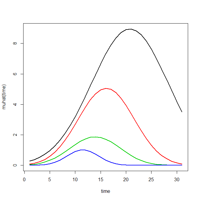
Now most effort seems to be spent on using model selection criteria to pick the number of groups, what may be called relative model comparisons. Once you pick the number of groups though, you should still be concerned with how well the model replicates the data at hand, e.g. absolute model comparisons. The graphs that follow help assess this. First we will use our helper functions to make three new objects. The first function, long_traj, takes the original model object, out1, as well as the original matrix data used to estimate the model, TO1adj. The second function, weighted_means, takes the original model object and then the newly created long_data longD. The third function, pred_means, just takes the model output and generates a data frame in wide format for plotting (it is the same underlying code for plotting the model).

longD <- long_traj(model=out1,data=TO1adj)
x <- weighted_means(model=out1,long_data=longD)
pred <- pred_means(model=out1)

We can subsequently use the long data longD to plot the individual trajectories faceted by their assigned groups. I have an answer on cross validated that shows how effective this small multiple design idea can be to help disentangle complicated plots.

#plot of individual trajectories in small multiples by group
p <- ggplot(data=longD, aes(x=x,y=y,group=Ord)) + geom_line(alpha = 0.1) + facet_wrap(~GMax)
p 

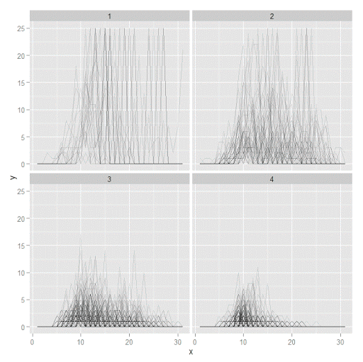
Plotting the individual trajectories can show how well they fit the predicted model, as well as if there are any outliers. You could get more fancy with jittering (helpful since there is so much overlap in the low counts) but just plotting with a high transparency helps quite abit. This second graph plots the predicted means along with the weighted means. What the weighted_means function does is use the posterior probabilities of groups, and then calculates the observed group averages per time point using the posterior probabilities as the weights.

#plot of predicted values + weighted means
p2 <- ggplot() + geom_line(data=pred, aes(x=x,y=pred_mean,col=as.factor(Group))) + 
                 geom_line(data=x, aes(x=x,y=w_mean,col=as.factor(Group))) + 
                geom_point(data=x, aes(x=x,y=w_mean,col=as.factor(Group)))
p2

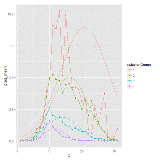
Here you can see that the estimated trajectories are not a very good fit to the data. Pretty much eash series has a peak before the predicted curve, and all of the series except for 2 don’t look like very good candidates for polynomial curves.

It ends up that often the weighted means are very nearly equivalent to the unweighted means (just aggregating means based on the classified group). In this example the predicted values are a colored line, the weighted means are a colored line with superimposed points, and the non-weighted means are just a black line.

#predictions, weighted means, and non-weighted means
nonw_means <- aggregate(longD$y,by=list(Group=longD$GMax,x=longD$x),FUN="mean")
names(nonw_means)[3] <- "y"

p3 <- p2 + geom_line(data=nonw_means, aes(x=x,y=y), col='black') + facet_wrap(~Group)
p3

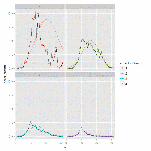
You can see the non-weighted means are almost exactly the same as the weighted ones. For group 3 you typically need to go to the hundredths to see a difference.

#check out how close
nonw_means[nonw_means$Group==3,'y'] -  x[x$Group==3,'w_mean']

You can subsequently superimpose the predicted group means over the individual trajectories as well.

#superimpose predicted over ind trajectories
pred$GMax <- pred$Group
p4 <- ggplot() + geom_line(data=pred, aes(x=x,y=pred_mean), col='red') + 
                 geom_line(data=longD, aes(x=x,y=y,group=Ord), alpha = 0.1) + facet_wrap(~GMax)
p4

Two types of absolute fit measures I’ve seen advocated in the past are the average maximum posterior probability per group and the odds of correct classification. The occ function calculates these numbers given two vectors (one of the max probabilities and the other of the group classifications). We can get this info from our long data by just selecting a subset from one time period. Here the output at the console shows that we have quite large average posterior probabilities as well as high odds of correct classification. (Also updated to included the observed classified proportions and the predicted proportions based on the posterior probabilities. Again, these all show very good model fit.) Update: Jeff Ward sent me a note saying I should be using the predicted proportion in each group for the occ calculation, not the assigned proportion based on the max. post. prob. So I have updated to include the occ_pp column for this, but left the old occ column in as a paper trail of my mistake.

occ(longD)
#  group     AvePP Freq        OCC  ClassProp   PredProp     occ_pp
#1     1 0.9880945   23 1281.00444 0.06084656 0.06298397 1234.71607
#2     2 0.9522450   35  195.41430 0.09259259 0.09005342  201.48650
#3     3 0.9567524   94   66.83877 0.24867725 0.24936266   66.59424
#4     4 0.9844708  226   42.63727 0.59788360 0.59759995   42.68760

A plot to accompany this though is a jittered dot plot showing the maximum posterior probability per group. You can here that groups 3 and 4 are more fuzzy, whereas 1 and 2 mostly have very high probabilities of group assignment.

#plot of maximum posterior probabilities
subD <- longD[x==1,]
p5 <- ggplot(data=subD, aes(x=as.factor(GMax),y=PMax)) + geom_point(position = "jitter", alpha = 0.2)
p5

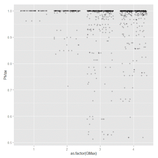
Remember that these latent class models are fuzzy classifiers. That is each point has a probability of belonging to each group. A scatterplot matrix of the individual probabilities will show how well the groups are separated. Perfect separation into groups will result in points hugging along the border of the graph, and points in the middle suggest ambiguity in the class assignment. You can see here that each group closer in number has more probability swapping between them.

#scatterplot matrix
library(GGally)
sm <- ggpairs(data=subD, columns=4:7)
sm

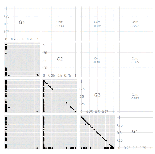
And the last time series plot I have used previously is a stacked area chart.

#stacked area chart
nonw_sum <- aggregate(longD$y,by=list(Group=longD$GMax,x=longD$x),FUN="sum")
names(nonw_sum)[3] <- "y"
p6 <- ggplot(data=nonw_sum, aes(x=x,y=y,fill=as.factor(Group))) + geom_area(position='stack')
p6

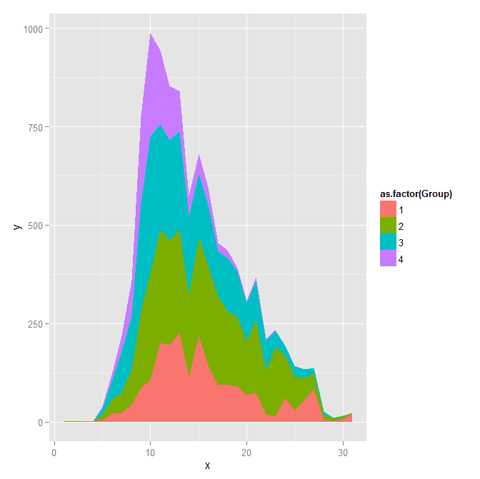
I will have to put another post in the queue to talk about the spatial point pattern tests I used in that trajectory paper for the future as well.

Online geocoding in R using the NYS GIS server

Previously I wrote a post on using the NYS ESRI geocoding server in python. I recently wrote a function in R to do the same. The base url server has changed since I wrote the Python post, but it is easy to update that (the JSON returned doesn’t change.) This should also be simple to update for other ESRI servers, just change the base variable in the first function. This uses the httr package to get the url and the jsonlite package to parse the response.

#################################################################
#Functions for geocoding using online NYS GIS Esri API, https://gis.ny.gov/
library(httr)
library(jsonlite)

#getting a single address, WKID 4326 is WGS 1984, so returns lat/lon
get_NYSAdd <- function(address,WKID='4326'){
  base <- "http://gisservices.dhses.ny.gov/arcgis/rest/services/Locators/Street_and_Address_Composite/GeocodeServer/findAddressCandidates"
  soup <- GET(url=base,query=list(SingleLine=address,maxLocations='1',outSR=WKID,f='pjson'))
  dat <- fromJSON(content(soup,as='text'),simplifyVector=TRUE)$candidates
  return(dat)
}
#looping over a vector of addresses, parsing, and returning a data frame
geo_NYSAdd <- function(addresses,...){
  #make empy matrix
  l <- length(addresses)
  MyDat <- data.frame(matrix(nrow=l,ncol=3))
  names(MyDat) <- c("Address","Lon","Lat")
  for (i in 1:l){
    x <- get_NYSAdd(address=addresses[i],...)
    if (length(x) > 0){
      MyDat[i,1] <- x[,1]
      MyDat[i,2] <- x[,2][1]
      MyDat[i,3] <- x[,2][2]
    }
  }
  MyDat$OrigAdd <- addresses
  return(MyDat)
}
#################################################################

The first function takes a single address, gets and parses the returning JSON. The second function loops over a list of addresses and returns a data frame with the original addresses, the matched address, and the lat/lon coordinates. I use a loop instead of an apply type function because with the web server you really shouldn’t submit large jobs that it would take along time anyway. The NYS server is free and has no 2,500 limit, but I wouldn’t submit jobs much bigger than that though.

AddList <- c("100 Washington Ave, Albany, NY","100 Washington Ave Ext, Albany, NY",
             "421 New Karner Rd., Albany, NY","Washington Ave. and Lark St., Albany, NY","poop")
GeoAddresses <- geo_NYSAdd(addresses=AddList)
GeoAddresses

We can compare these to what the google geocoding api returns (using the ggmap package):

library(ggmap)
googleAddresses <- geocode(AddList,source="google")
GeoAddresses$G_lon <- googleAddresses$lon
GeoAddresses$G_lat <- googleAddresses$lat
GeoAddresses

And we can see that the nonsense "poop" address was actually geocoded! See some similar related funny results from the google maps geocoding via StackMaps.

We can also see some confusion between Washington Ave. Ext as well. The NYS online server should theoretically have more up to date data than Google, but as above shows it is not always better. To do geocoding well takes some serious time to examine the initial addresses and the resulting coordinates in my experience.

To calculate the great circle distance between the coordinates we can use the spDists function in the sp library.

library(sp)
spDists(x = as.matrix(GeoAddresses[1:4,c("Lon","Lat")]),
        y = as.matrix(GeoAddresses[1:4,c("G_lon","G_lat")]),
        longlat=TRUE,diagonal=TRUE) #distance in kilometers

But really, we should just project the data and calculate the Euclidean distance (see the proj4 library). Note that using the law of cosines is typically not recommended for very small distances, so the last distance is suspect. (For reference I point to some resources and analysis showing how to calculate great circle distances in SPSS on Nabble recently.)

Using KDTree’s in python to calculate neighbor counts

For a few different projects I’ve had to take a set of crime data and calculate the number of events nearby. It is a regular geospatial task, counting events in a particular buffer, but one that can be quite cumbersome if you have quite a few points to cross-reference. For one project I needed to calculate this for 4,500 street segments and intersections against a set of over 100,000 crime incidents. While this is not big data, if you go the brute force route and simply calculate all pair-wise distances, this results in 450 million comparisons. Since all I wanted was the number of counts within a particular distance buffer, KDTree’s offer a much more efficient search solution.

Here I give an example in Python using numpy and the nearest neighbor algorithms available in SciPy. This example is calculating the number of shootings in DC within 1 kilometer of schools. The shooting data is sensor data via ShotSpotter, and is publicly available at the new open data site. The school data I calculated the centroids based on school area polygons, available from the legacy DC data site. This particular example was motivated by this Urban Institute post.

There are around 170 schools and under 40,000 total shootings, so this would not be a big issue to calculate all the pairwise distances. It is a simple and quick example though. Here I have the Python code and CSV files are available to download.

So first we will just import the spatial data into numpy arrays. Note each file has the coordinates in projected meters.

import numpy as np
#getting schools and shootings from CSV files
schools = np.genfromtxt('DC_Schools.csv', delimiter=",", skip_header=1)
shootings = np.genfromtxt('ShotSpotter.csv', delimiter=",", skip_header=1, usecols=(4,5))

Next we can import the KDTree function, and then supply it with the two spatial coordinates for the shootings. While this is a relatively small file, even for my example larger set of crime data with over 100,000 incidents building the tree was really fast, less than a minute.

#making KDTree, and then searching within 1 kilometer of school
from sklearn.neighbors import KDTree
shoot_tree = KDTree(shootings)

Finally you can then search within a particular radius. You can either search one location at a time, but here I do a batch search and count the number of shootings that are within 1,000 meters from each school. Again this is a small example, but even with my 4,500 locations against 100,000 crimes it was very fast. (Whereas my initial SPSS code to do all 450 million pairwise combinations was taking all night.)

shoot_tree.query_radius(schools[:,[1,2]],r=1000,count_only=True)

Which produces an array of the counts for each of the schools:

array([1168,  179, 2384,  686,  583, 1475,  239, 1890, 2070,  990,   74,
        492,   10,  226, 2057, 1813, 1137,  785,  742, 1893, 4650, 1910,
          0,  926, 2380,  818, 2868, 1230,    0, 3230, 1103, 2253, 4531,
       1548,    0,    0,    0, 1002, 1912,    0, 1543,    0,  580,    4,
       1224,  843,  212,  591,    0,    0, 1127, 4520, 2283, 1413, 3255,
        926,  972,  435, 2734,    0, 2828,  724,  796,    1, 2016, 2540,
        369, 1903, 2216, 1697,  155, 2337,  496,  258,  900, 2278, 3123,
        794, 2312,  636, 1663,    0, 4896,  604, 1141,    7,    0, 1803,
          2,  283,  270, 1395, 2087, 3414,  143,  238,  517,  238, 2017,
       2857, 1100, 2575,  179,  876, 2175,  450, 5230, 2441,   10, 2547,
        202, 2659, 4006, 2514,  923,    6, 1481,    0, 2415, 2058, 2309,
          3, 1132,    0, 1363, 4701,  158,  410, 2884,  979, 2053, 1120,
       2048, 2750,  632, 1492, 1670,  242,  131,  863, 1246, 1361,  843,
       3567, 1311,  107, 1501,    0, 2176,  296,  803,    0, 1301,  719,
         97, 2312,  150,  475,  764, 2078,  912, 2943, 1453,  178,  177,
        389,  244,  874,  576,  699,  295,  843,  274])

And that is it! Quite simple.

The ShotSpotter data is interesting, with quite a few oddities that are worth exploring. I recently wrote a chapter on SPSS’s geospatial tools for an upcoming book on advanced SPSS features, providing a predictive police example predicting weekly shootings using the new geospatial temporal modelling tool. The book is edited by Keith McCormick and Jesus Salcedo, and I will write a blog post whenever it comes out highlighting what the chapter goes over.

Music and distractions in the workplace

I was recently re-reading Zen and the Art of Motorcycle Maintenance, and it re-reminded me of why I do not like to listen to music in the workplace. The thesis in Pirsig’s book (in regards to listening to music) is simple; you can’t concentrate entirely on the task at hand if you have music distracting you. So those who value their work tend to not have idle distractions like music playing (and be all engrossed in their work).

I have worked in various shared workspaces (cubicles and shared offices) for quite a while now, and I do have a knack for going off into space and ignoring all of the background noise around me. But I still do not like listening to music, even though I have learned to cope with the situation. At this point I prefer the open office workspace, as there at least is no illusion of privacy. When I worked at a cubicle someone coming behind me and scaring me was basically a daily thing.

Scott Adams, the artist of the Dilbert comic, had a recent blog post saying that music is the lesser evil compared to constant distractions via the internet (email, facebook, twitter, etc.) This I can understand as well, and sometimes I turn off the wi-fi to try to get work done without distraction. I don’t see how turning on music helps, but given its prevalence it may just be differences between myself and other people. I should probably turn off the wi-fi for all but an hour in the morning and an hour in the afternoon everyday, but I’m pretty addicted to the internet at this point.

It partly depends on the task I am currently working on though how easily I am distracted. Sometimes I can get really engrossed in a particular problem and become obsessed with it to the point you could probably set the office on fire and I wouldn’t notice. For example this programming problem dominated my thoughts for around two days, and I ended up thinking of the general solution while I did not have access to the computer (while I was waiting for my car to get inspected). Most of the time though I can only give that type of concentration for an hour or two a day though, and the rest of the time I am working in a state of easy distraction.

Background music I don’t like, and other ambient noises I can manage to drown out, but background TV drives me crazy. My family was watching videos (on TV and tablets) the other day while I was reading Zen and ironically I became angry, because I was really into the book and wanted to give it my full concentration. I know people who watch TV in bed to go to sleep, and it is giving me a headache just thinking about it while I am writing this blog post.

I highly recommend both Zen and the Art of Motorcycle Maintenance and Scott Adam’s blog. I’m glad I revisited Zen, as it is an excellent philosophical book on the logic of science that did not make much of an impression on me as an undergrad, but I have a much better grasp of it after having my PhD and reading some other philosophy texts (like Popper).

Using local Python objects in SPSSINC TRANS – examples with network statistics

When using SPSSINC TRANS, you have a wider array of functions to compute on cases in SPSS. Within the local session, you can create your own python functions within a BEGIN PROGRAM and END PROGRAM block. In SPSSINC TRANS you pass in the values in the current dataset, but you can also create functions that use data in the local python environment as well. An example use case follows in which you create a network in the local python environment using SPSS data, and then calculate several network statistics on the nodes. Here is a simple hierarchical network dataset that signifies managers and subordinates in an agency.

*Edge list. 
DATA LIST FREE / Man Sub (2F1.0). 
BEGIN DATA 
1 2 
2 3 
2 4 
3 5 
3 6 
4 7 
4 8 
END DATA. 
DATASET NAME Boss. 

We can subsequently turn this into a NetworkX graph with the code below. Some of my prior SPSS examples using NetworkX had a bit more complicated code using loops and turning the SPSS dataset into the network object. But actually the way SPSS dumps the data in python (as a tuples nested within a list) is how the add_edges_from function expects it in NetworkX, so no looping required (and it automatically creates the nodes list from the edge data).

BEGIN PROGRAM Python. 
import networkx as nx
import spss, spssdata

alldata = spssdata.Spssdata().fetchall()  #get SPSS data
G = nx.DiGraph()                          #create empty graph
G.add_edges_from(alldata)                 #add edges into graph
print G.nodes()
END PROGRAM.

Note now that we have the graph object G in the local python environment for this particular SPSS session. We can then make our own functions that references G, but takes other inputs. Here I have examples for the geodesic distance between two nodes, closeness and degree centrality, and the average degree of the neighbors.

BEGIN PROGRAM Python.
#path distance
def geo_dist(source,target): 
  return nx.shortest_path_length(G,source,target)
#closeness centrality
def close_cent(v):
  return nx.closeness_centrality(G,v)
#degree
def deg(v):
  return G.degree(v)
#average degree of neighbors
def avg_neideg(v):
  return nx.average_neighbor_degree(G,nodes=[v])[v]
END PROGRAM.

Here is the node list in a second SPSS dataset that we will calculate the mentioned statistics on. For large graphs, this is nice because you can select out a smaller subset of nodes and only worry about the calculations on that subset. For a crime analysis example, I may be monitoring a particular set of chronic offenders, and I want to calculate how close every arrested person within the month is to the set of chronic offenders.

DATA LIST FREE / Employ (F1.0). 
BEGIN DATA 
1 
2
3
4
5
6
7
8
END DATA. 
DATASET NAME Emp. 
DATASET ACTIVATE Emp.

Now we have all the necessary ingredients to calculate our network statistics on these nodes. Here are examples of using SPSSINC TRANS to calculate the network statistics in the local SPSS dataset.

*Geodesic distance from 1.
SPSSINC TRANS RESULT=Dist TYPE=0
  /FORMULA "geo_dist(source=1.0,target=Employ)".

*closeness centrality.
SPSSINC TRANS RESULT=Cent TYPE=0
  /FORMULA "close_cent(v=Employ)".

*degree.
SPSSINC TRANS RESULT=Deg TYPE=0
  /FORMULA "deg(v=Employ)".

*Average neighbor degree.
SPSSINC TRANS RESULT=NeighDeg TYPE=0
  /FORMULA "avg_neideg(v=Employ)".

Custom square root scale (with negative values) in ggplot2 (R)

My prior rootogram post Jon Peck made the astute comment that rootograms typically are plotted on a square root scale. (Which should of been obvious to me given the name!) The reason for a square root scale for rootograms is visualization purposes, the square root scale gives more weight to values nearby 0 and shrinks values farther away from 0.

SPSS can not have negative values on a square root scale, but you can make a custom scale using ggplot2 and the scales package in R for this purpose. Here I just mainly replicated this short post by Paul Hiemstra.

So in R, first we load the scales and the ggplot2 package, and then create our custom scale function. Obviously the square root of a negative value is not defined for real numbers, so what we do is make a custom square root function. The function simply takes the square root of the absolute value, and then multiplies by the sign of the original value. This function I name S_sqrt (for signed square root). We also make its inverse function, which is named IS_sqrt. Finally I make a third function, S_sqrt_trans, which is the one used by the scales package.

library(scales)
library(ggplot2)

S_sqrt <- function(x){sign(x)*sqrt(abs(x))}
IS_sqrt <- function(x){x^2*sign(x)}
S_sqrt_trans <- function() trans_new("S_sqrt",S_sqrt,IS_sqrt)

Here is a quick example data set in R to work with.

#rootogram example, see http://stats.stackexchange.com/q/140473/1036
MyText <- textConnection("
Dist Val1 Val2
1 0.03 0.04
2 0.12 0.15
3 0.45 0.50
4 0.30 0.24 
5 0.09 0.04 
6 0.05 0.02
7 0.01 0.01
")
MyData <- read.table(MyText,header=TRUE)
MyData$Hang <- MyData$Val1 - MyData$Val2

And now we can make our plots in ggplot2. First the linear scale, and second update our plot to the custom square root scale.

p <- ggplot(data=MyData, aes(x = as.factor(Dist), ymin=Hang, ymax=Val1)) + 
     geom_hline(aes(yintercept=0)) + geom_linerange(size=5) + theme_bw()
p

p2 <- p + scale_y_continuous(trans="S_sqrt",breaks=seq(-0.1,0.5,0.05), name="Density")
p2

Laplacian Centrality in NetworkX (Python)

The other day I read a few papers on a new algorithm for calculating centrality in networks. Below are the two papers describing the Laplacian Centrality metric. The first is for non-weighted networks, and the second for weighted networks.

  • Qi, X., Duval, R. D., Christensen, K., Fuller, E., Spahiu, A., Wu, Q., Wu, Y., Tang, W., and Zhang, C. (2013). Terrorist networks, network energy and node removal: A new measure of centrality based on laplacian energy. Social Networking, 02(01):19-31.
  • Qi, X., Fuller, E., Wu, Q., Wu, Y., and Zhang, C.-Q. (2012). Laplacian centrality: A new centrality measure for weighted networks. Information Sciences, 194:240-253. PDF Here.

The metric is fairly intuitive I think. The centrality parameter is a function of the local degree plus the degree’s of the neighbors (with different weights for each). I figured it would be a quick programming exercise (which means I spent way too long trying to implement it!). To follow is some code that replicates the measures for both weighted and non-weighted graphs, using the Python networkx library.

The non-weighted graph code is easy, and is a near copy-paste from some igraph code snippet that was already available. Just some updates to idiom’s for NetworkX specifically. The norm option specifies whether you want solely the numerator value, the difference between the energy in the full graph versus the graph with the node removed (norm=False), or whether you want to divide this value by the energy for the full graph. Note this function ignores the weights in the graph. nbunch is if you want to pass the function only a subset of points to calculate the centrality. (If you do that you might as well have norm=False for time savings as well.)

def lap_cent(graph, nbunch=None, norm=False):
  if nbunch is None:
    vs = graph.nodes()
  else:
    vs = nbunch
  degrees = graph.degree(weight=None)
  if norm is True:
    den = sum(v**2 + v for i,v in degrees.items())
    den = float(den)
  else:
    den = 1
  result = []
  for v in vs:
    neis = graph.neighbors(v)
    loc = degrees[v]
    nei = 2*sum(degrees[i] for i in neis)
    val = (loc**2 + loc + nei)/den
    result.append(val)
  return result

The weighted network is a bit more tricky though. I thought coding all of the two walks seemed a royal pain, so I developed a different algorithm that I believe is quicker. Here are three functions, but the last one is the one of interest, lap_cent_weighted. The options are similar to the unweighted version, with the exception that you can pass a weight attribute (which is by default named ‘weight’ in NetworkX graphs).

def lap_energy(graph, weight='weight'):
  degrees = graph.degree(weight=weight)
  d1 = sum(v**2 for i,v in degrees.items())
  wl = 0
  for i in graph.edges(data=True):
    wl += (i[2].get(weight))**2
  return [d1,2*wl]

def cw(graph,node,weight='weight'):
  neis = graph.neighbors(node)
  ne = graph[node]
  cw,sub = 0,0
  for i in neis:
    we = ne[i].get(weight)
    od = graph.degree(i,weight=weight)
    sub += -od**2 + (od - we)**2
    cw += we**2
  return [cw,sub]

def lap_cent_weighted(graph, nbunch=None, norm=False, weight='weight'):
  if nbunch is None:
    vs = graph.nodes()
  else:
    vs = nbunch
  if norm == True:
    fe = lap_energy(graph,weight=weight)
    den = float(fe[0]+fe[1])
  else:
    den = 1
  result = []
  for i in vs:
     d2 = graph.degree(i,weight=weight)
     w2 = cw(graph,i,weight=weight)
     fin = d2**2 - w2[1] + 2*w2[0]
     result.append(fin/den)
  return result

For a brief overview of the new algorithm (in some quick and dirty text math), to define the energy of the entire graph it is:

sum(di^2) + 2*sum(wij^2)   (1)

Where di are the degrees for all i nodes, and the second term is 2 times the sum of the weights squared. So when you take out a particular node, say ‘A’, the drop in the second term is easy, just iterate over the neighbors of ‘A’, and calculate 2*sum(waj^2), then subtract that from the second term in equation 1.

The first term is slightly more complex. First there is a decrease due to simply the degree of the removed node, da^2. There is also a decrease in the degree on the neighboring nodes as well, so you need to calculate their updated contribution. The necessary info. is available when you iterate over the neighbor list though, and if the original contribution is di^2, and the weight of wia, then the updated weight is -di^2 + (di - wia)^2. You can calculate this term at the same time you calculate the decrease in the weights in the second term.

I believe this algorithm is faster than the one originally written in the second paper. It should be something like O(n*a), where a is the average number of neighbors for the entire graph, and n are the number of nodes. Or in worst case a is the maximum number of neighbors any node has in the graph (which should be less than or equal to the max degree in a weighted graph).

Here is an example of using the functions with the small, toy example in the weighted network paper. Note that the lap_cent function ignores the weights.

import networkx as nx

Gp = nx.Graph()
ed = [('A','B',4),('A','C',2),('C','B',1),('B','D',2),('B','E',2),('E','F',1)]
Gp.add_weighted_edges_from(ed)

x = lap_cent(Gp)
xw = lap_cent_weighted(Gp, norm=True)
for a,b,c in zip(Gp.nodes(),x,xw):
  print a,b,c

Which prints out at the console:

A 18 0.7 
C 18 0.28 
B 34 0.9 
E 16 0.26 
D 10 0.22 
F 6 0.04

If you want to see that the graph is the same as the graph in the weighted Qi paper, use below.

import matplotlib.pyplot as plt
pos=nx.spring_layout(Gp) # positions for all nodes
nx.draw(Gp,pos=pos)
nx.draw_networkx_labels(Gp,pos=pos)
nx.draw_networkx_edge_labels(Gp,pos=pos)
plt.show()

Venn diagrams in R (with some discussion!)

The other day I had a set of three separate categories of binary data that I wanted to visualize with a Venn diagram (or a Euler) diagram of their intersections. I used the venneuler R package and it worked out pretty well.

library(venneuler)
MyVenn <- venneuler(c(A=74344,B=33197,C=26464,D=148531,"A&B"=11797, 
                       "A&C"=9004,"B&C"=6056,"A&B&C"=2172,"A&D"=0,"A&D"=0,"B&D"=0,"C&D"=0))
MyVenn$labels <- c("A\n22","B\n7","C\n5","D\n58")
plot(MyVenn)
text(0.59,0.52,"1")
text(0.535,0.51,"3")
text(0.60,0.57,"2")
text(0.64,0.48,"4") 

Some digging around on this topic though I came across some pretty interesting discussion, in particular a graph makeover of a set of autism diagnoses, see:

for background. Below is a recreated image of the original Venn diagram under discussion (from Kosara’s American Scientist article.)

Applying this example to the venneuler library did not work out so well.

MyVenn2 <- venneuler(c(A=111,B=65,C=94,"A&B"=62,"A&C"=77,"B&C"=52,"A&B&C"=51))
MyVenn2$labels <- c("PL-ADOS","clinician","ADI-R")
plot(MyVenn2)

Basically there is a limit on the size the intersections can be with the circles, and here the intersection of all three sets is very large, so there is no feasible solution for this example.

This is alittle bit different situation than typical for Venn diagrams though. Typically these charts all one is interested in is the overlaps between each set. But the autism graph that is secondary. What they were really interested in was the sensitivity of the different diagnostic measures (i.e. percentage identifying true positives), and to see if any particular combination had the greatest sensitivity. Although Kosara in his blog post says that all of the redesigns are better than the original I don’t entirely agree, I think Kosara’s version of the Venn diagram with the text labels does a pretty good job, although I think Kosara’s table is sufficient as well. (Kosara’s recreated graph has better labelling than the original Venn diagram, mainly by increasing the relative font size.)

For the autism graph there are basically two over-arching goals:

  • identifying the percent within arbitrary multiple intersections
  • keeping in mind the baseline N for each of the arbitrary sets

It is not immediately visually obvious, but IMO it is not that hard to arbitrarily collapse different categories in the original Venn diagram and make some rough judgements about the sensitivity. To me the first thing I look at is the center piece, see it is quite a high percentage, and then look to see if I can make any other arbitrary categories to improve upon the sensitivity of all three tests together. All others are either very small baselines or do not improve the percentage, so I conclude that all three combined likely have the most sensitivity. You may also see that the clinicians are quite high for each intersection, so it is questionable whether the two other diagnostics offer any significant improvement over just the clinicians judgement, but many of the clinician sets have quite small N’s, so I don’t put as much stock in that.

Another way to put it is if we think of the original Venn diagram as a graphical table I think it does a pretty good job. The circles and the intersections are a lie factor in the graph, in that their areas do not represent the baseline rates, but it is an intuitive way to lay out the textual categories, and only takes a little work to digest the material. Kosara’s sorted table does a nice job of this as well, but it is easier to ad-hoc combine categories in the Venn diagram than in table rows that are not adjacent. Visually the information does not pop out at you, like a functional relationship in a scatterplot, but the Venn diagram has the ingredients that allow you to drill down and estimate the information you are looking for. Being able to combine arbitrary categories is the key here, and I don’t think any of the other graphical representations allow one to do that very easily.

I thought a useful redesign would be to keep the Venn theme, but have the repeated structures show the base rate via Isotype like recurring graphs. Some of this is motivated by using such diagrams in interpreting statistics (see this post by David Spieghalter for one example, the work of Gerd Gigenzer is relevant as well). I was not able make a nice set of contained glyphs though. Here is a start of what I am talking about, I just exported the R graph into Inkscape and superimposed a bunch of rectangles.

This does not visualize the percentage, but one way to do that would be to color or otherwise distinguish the blocks in a certain way. Also I gave up before I finished the intersecting middle piece, and I would need to make the boxes a bit smaller to be able to squeeze it in. I think this idea could be made to work, but this particular example making the Venn even approximately proportional is impossible, and so sticking with the non-proportional Venn diagram and just saying it is not proportional is maybe less likely to be misleading.

I think the idea of using Isotype like repeated structures though could be a generally good idea. Even when the circles can be made to have the areas of the intersection exact, it is still hard to visually gauge the size of circles (rectangles are easier). So the multiple repeated pixels may be more useful anyway, and putting them inside of the circles still allows the arbitrary collapsing of different intersections while still being able to approximately gauge base rates.

Transforming KDE estimates from Logistic to Probability Scale in R

The other day I had estimates from several logistic regression models, and I wanted to superimpose the univariate KDE’s of the predictions. The outcome was fairly rare, so the predictions were bunched up at the lower end of the probability scale, and the default kernel density estimates on the probability scale smeared too much of the probability outside of the range.

It is a general problem with KDE estimates, and there are two general ways to solve it:

  • truncate the KDE and then reweight the points near the edge (example)
  • estimate the KDE on some other scale that does not have a restricted domain, and then transform the density back to the domain of interest (example)

The first is basically the same as edge correction in spatial statistics, just in one dimension instead of the two. Here I will show how to do the second in R, mapping items on the logistic scale to the probability scale. The second linked CV post shows how to do this when using the log transformation, and here I will show the same with mapping logistic estimates (e.g. from the output of a logistic regression model). This requires the data to not have any values at 0 or 1 on the probability scale, because these will map to negative and positive infinity on the logistic scale.

In R, first define the logit function as log(p/(1-p) and the logistic function as 1/(1+exp(-x)) for use later:

logistic <- function(x){1/(1+exp(-x))}
logit <- function(x){log(x/(1-x))}

We can generate some fake data that might look like output from a logistic regression model and calculate the density object.

set.seed(10)
x <- rnorm(100,0,0.5)
l <- density(x)  #calculate density on logit scale

This blog post goes through the necessary math, but in a nut shell you can’t simply just transform the density estimate using the same function, you need to apply an additional transformation (referred to as the Jacobian). So here is an example transforming the density estimate from the logistic scale, l above, to the probability scale.

px <- logistic(l$x)  #transform density to probability scale
py <- l$y/(px*(1-px))
plot(px,py,type='l')

To make sure that the area does sum to one, we can superimpose the density calculated on the data transformed to the probability scale. In this example of fake data the two are pretty much identical. (Black line is my transformed density, and the red is the density estimate based on the probability data.)

dp <- density(logistic(x)) #density on the probability values to begin with
lines(dp$x,dp$y,col='red')

Here is a helper function, denLogistic, to do this in the future, which simply takes the data (on the logistic scale) and returns a density object modified to the probability scale.

logistic <- function(x){1/(1+exp(-x))}
logit <- function(x){log(x/(1-x))}
denLogistic <- function(x){
  d <- density(x)
  d$x <- logistic(d$x)
  d$y <- d$y/(d$x*(1-d$x))
  d$call <- 'Logistic Density Transformed to Probability Scale'
  d$bw <- paste0(signif(d$bw,4)," (on Logistic scale)")
  return(d)
}

In cases where more of the probability density is smeared beyond 0-1 on the probability scale, the logistic density estimate will look different. Here is an example with a wider variance and more predictions near zero, so the two estimates differ by a larger amount.

lP <- rnorm(100,-0.9,1)
test <- denLogistic(lP)
plot(test)
lines(density(logistic(lP)),col='red')

Again, this works well for data on the probability scale that can not be exactly zero or one. If you have data like that, the edge correction type KDE estimators are better suited.

New working paper: What We Can Learn from Small Units of Analysis

I’ve posted a new working paper, What We Can Learn from Small Units of Analysis to SSRN. This is a derivative of my dissertation (by the same title). Below is the abstract:

This article provides motivation for examining small geographic units of analysis based on a causal logic framework. Local, spatial, and contextual effects are confounded when using larger units of analysis, as well as treatment effect heterogeneity. I relate these types of confounds to all types of aggregation problems, including temporal aggregation, and aggregation of dependent or explanatory variables. Unlike prior literature critiquing the use of aggregate level data, examples are provided where aggregation is unlikely to hinder the goals of the particular research design, and how heterogeneity of measures in smaller units of analysis is not a sufficient motivation to examine small geographic units. Examples of these confounds are presented using simulation with a dataset of crime at micro place street units (i.e. street segments and intersections) in Washington, D.C.

As always, if you have comments or critiques let me know.