I figured I would share some of the scripts I have been recently working on to produce a set of figures on a regular basis for reports. SPSS GGRAPH can not be directly parameterized within macro’s (at least without a lot of work – see a counter example of Marta Garcia-Granero’s macro for Kalbfleisch-Prentice 95%CI for survival), but can be called using python code. Jon Peck has some examples at the Developerworks blog, and here I will show some more! I am also going to show how to make some automated maps in R using the ggmap package, with which you can grab various basemap tiles from online and superimpose point data.
So lets provide some example data to work with.
DATA LIST FREE / Id (A1) Crime (A8) Hour (F2.0) Lon Lat (2F16.8).
BEGIN DATA
1 Robbery 18 -74.00548939 41.92961837
2 Robbery 19 -73.96800055 41.93152595
3 Robbery 19 -74.00755075 41.92996862
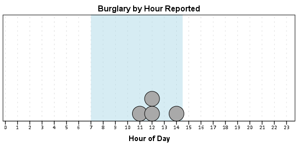
4 Burglary 11 -74.01183343 41.92925202
5 Burglary 12 -74.00708100 41.93262613
6 Burglary 14 -74.00923393 41.92667552
7 Burglary 12 -74.00263453 41.93267197
END DATA.
DATASET NAME Crimes.
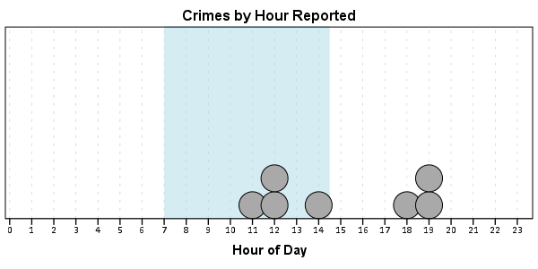
And now let’s say you want to make a graph of the hours of the day that Robberies occur in. Many small to mid-range police departments have few serious crimes when examining over shorter time spans (like a week or a month). So one type of chart I like to use are histogram like dot plots. Here is an example for the entire dataset in question.
GGRAPH
  /GRAPHDATASET NAME="graphdataset" VARIABLES=Hour MISSING=LISTWISE REPORTMISSING=NO
  /GRAPHSPEC SOURCE=INLINE.
BEGIN GPL
  PAGE: begin(scale(600px,300px))
  SOURCE: s=userSource(id("graphdataset"))
  DATA: Hour=col(source(s), name("Hour"))
  TRANS: bottom=eval(0)
  TRANS: top=eval(10)
  TRANS: begin=eval(7)
  TRANS: end=eval(14.5)
  COORD: rect(dim(1,2))
  GUIDE: axis(dim(1), label("Hour of Day"), delta(1))
  GUIDE: axis(dim(2), null())
  GUIDE: text.title(label("Crimes by Hour Reported"))
  SCALE: linear(dim(1), min(1), max(22.5))
  SCALE: linear(dim(2), min(0), max(3))
  ELEMENT: polygon(position(link.hull((begin+end)*(bottom+top))), color.interior(color.lightblue),
                  transparency.interior(transparency."0.5"), transparency.exterior(transparency."1"))
  ELEMENT: point.dodge.asymmetric(position(bin.dot(Hour, dim(1), binWidth(1))), color.interior(color.darkgrey), size(size."30"))
  PAGE: end()
END GPL.
One of the things I like to do though is to make charts for different subsets of the data. One way is to use FILTER to only plot a subset of the data, but a problem with this approach is the fixed aspects of the chart, like the title, do not change to reflect the current data. Here I will use FILTER in combination with a python BEGIN PROGRAM ... END PROGRAM block to grab the crime type to insert into the title of the graph.
COMPUTE Bur = (Crime = "Burglary").
FILTER BY Bur.
BEGIN PROGRAM.
import spss
MyVars = [1]
dataCursor=spss.Cursor(MyVars)
MyData=dataCursor.fetchone()
dataCursor.close()
CrimeType = MyData[0].strip()
print CrimeType
END PROGRAM.
FILTER OFF.
So when grabbing the SPSS case data, python respects the current FILTER on the dataset. First I set an array, MyVars, to grab the variables I want. Here I only want the Crime variable, which is the second variable in the dataset. Python’s arrays are indexed at zero, so I end up wanting the variable in the [1] position. Then SPSS has a set of functions to grab data out of the active dataset using spss.Cursor. What I do is use the fetchone() object property to only grab the first row of data, and assign it the name MyData. Then after closing the cursor using dataCursor.close(), I access the string that is in the first location in the array MyData and use the strip() property to clean up trailing blanks in the string (see this example on Stackoverflow for where this was handy). When running the above code you can see that it prints Burglary, even though the burglary cases are not the first ones in the dataset. Now we can extend this example to insert the chart title and submit the GGRAPH syntax.
FILTER BY Bur.
BEGIN PROGRAM.
import spss
MyVars = [1]
dataCursor=spss.Cursor(MyVars)
MyData=dataCursor.fetchone()
dataCursor.close()
CrimeType = MyData[0].strip()
spss.Submit("""
GGRAPH
  /GRAPHDATASET NAME="graphdataset" VARIABLES=Hour MISSING=LISTWISE REPORTMISSING=NO
  /GRAPHSPEC SOURCE=INLINE.
BEGIN GPL
  PAGE: begin(scale(600px,300px))
  SOURCE: s=userSource(id("graphdataset"))
  DATA: Hour=col(source(s), name("Hour"))
  TRANS: bottom=eval(0)
  TRANS: top=eval(10)
  TRANS: begin=eval(7)
  TRANS: end=eval(14.5)
  COORD: rect(dim(1,2))
  GUIDE: axis(dim(1), label("Hour of Day"), delta(1))
  GUIDE: axis(dim(2), null())
  GUIDE: text.title(label("%s by Hour Reported"))
  SCALE: linear(dim(1), min(1), max(22.5))
  SCALE: linear(dim(2), min(0), max(3))
  ELEMENT: polygon(position(link.hull((begin+end)*(bottom+top))), color.interior(color.lightblue),
                  transparency.interior(transparency."0.5"), transparency.exterior(transparency."1"))
  ELEMENT: point.dodge.asymmetric(position(bin.dot(Hour, dim(1), binWidth(1))), color.interior(color.darkgrey), size(size."30"))
  PAGE: end()
END GPL.
""" %(CrimeType))
END PROGRAM.
FILTER OFF.
You can do this same process for calling R commands, as again grabbing the case data from SPSS respects the current FILTER or (TEMPORARY + SELECT IF). One favorite of mine recently is to make automated maps using the ggmap library. Grabbing the online tiles makes my job of making a nice background much easier. Here is an example of grabbing case data from SPSS and placing the locations on the map (note this is made up data, these aren’t actual crime locations in Kingston!)
FILTER BY Bur.
BEGIN PROGRAM R.
#using ggmap to make a basemap
library(ggmap)
loc <- c(left = -74.04, bottom = 41.91, right = -73.960, top = 41.948)
KingstonBasemap <- get_map(location = loc, zoom = 14, maptype = "toner",
                           source = "stamen")

#setting styles for ggplot map
axisStyle <- theme(axis.text.y=element_blank(),axis.text.x=element_blank(),
            axis.ticks=element_blank(),axis.title.x=element_blank(),
            axis.title.y=element_blank()
            )
titleStyle <- theme(plot.title = element_text(face="bold", size=25))

#now grabbing SPSS data
casedata <- spssdata.GetDataFromSPSS(variables=c("Id","Crime","Lon","Lat"))
TypeCrime <- as.character(casedata$Crime[1]) #grabs first case for chart title

#Data to put on the map
point <- geom_point(aes(x = Lon, y = Lat), data=casedata, shape=21, size = 9, fill = "Blue")
labels <- geom_text(aes(x = Lon, y = Lat, label = as.character(Id)), data=casedata,
                    hjust = -0.03, vjust = -0.8, size = 8, fontface=2, color="cornflowerblue"
                    )
title <- labs(title=paste0(TypeCrime," cases in March"))

#Putting all together
CrimeMap <- ggmap(KingstonBasemap) + point + labels + axisStyle + titleStyle + title
CrimeMap
END PROGRAM.
FILTER OFF.
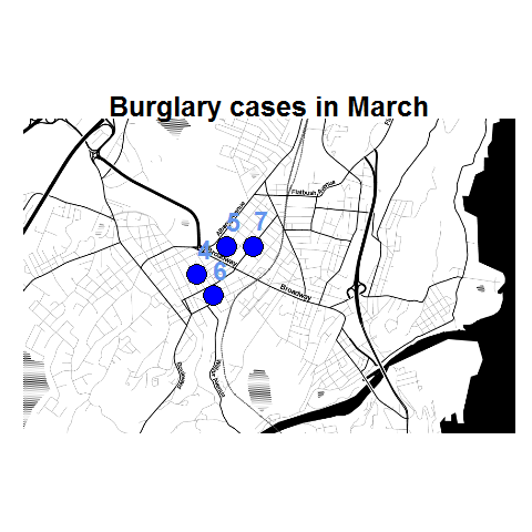
To make the map look nice takes a bit of code, but all of the action with grabbing data from SPSS and setting the string I want to use in my chart title are in the two lines of code after the #now grabbing SPSS data comment. (Note I like using Stamen base maps as they allow one to grab non-square tiles. I typically like to use the terrain map – not because the terrain is necessary but just because I like the colors – but I’ve been having problems using the terrain tiles.)
Basically the set up I have now is to place some arbitrary code for graphs and maps in a separate syntax file. So all I need to do set the filter, use INSERT, and then turn the filter off. I can then add graphs for any subsets I am interested in. I have a separate look up table that stashes all the necessary metadata I want for use in the plots for whatever particular categories, which in addition to titles include other chart aesthetics like sizes for point elements or colors. In the future I will have to explore more options for using the SPLIT FILE facilities that both python and R offer when working with SPSS case data, but this is pretty simple and generalizes to non-overlapping groups as well.