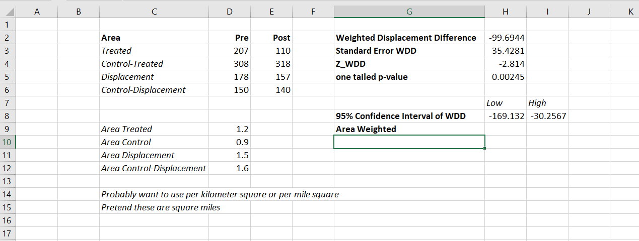
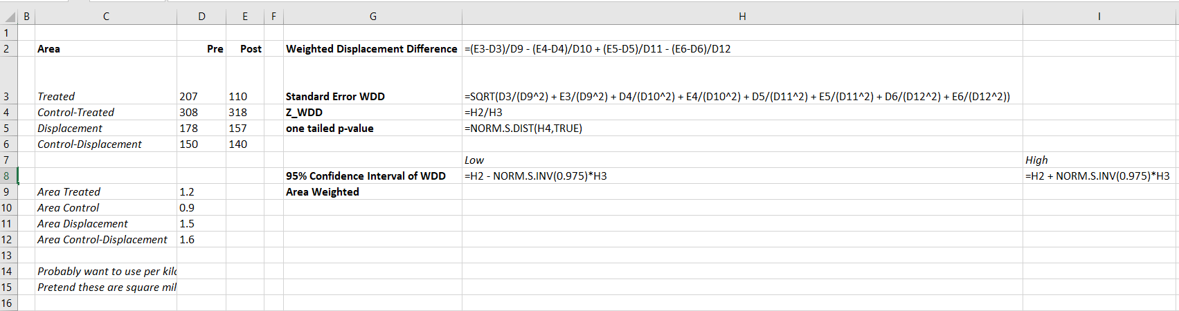
So this is maybe my final post on the WDD estimator for the time being (Wheeler & Ratcliffe, 2018). Recently David Wilson had an article in JQC that proposes a different estimator using the same basic information, just pre-post crime counts for treated and control areas (Wilson, 2021). So say we had the table:
         Pre   Post
Treated   50     30
Control   60     55
So in this scenario, my WDD estimate is -20 in the treated area, and -5 in the control area, so the overall estimate is -20 – -5 = -15.
30 - 50 - (55 - 60) = -15So an estimated reduction of -15 crimes overall. David’s estimator is the logged incident rate ratio (IRR), and so is just like above, except logs all of the values:
log(30) - log(50) - ( log(55) - log(60) ) = -0.4238142This is a logged incident rate adjustment, so most of the time people exponentiate this value, which is exp(-0.4238142) = 0.6545455. So this suggests crime is reduced by approximately 35% in the treated area relative to the control area in this hypothetical. Or another way to write it is (30/50)/(55/60) = 0.6545455.
So instead of a linear estimate of the total numbers of crimes reduced, this is an estimate of the overall rate reduction. So this begs the question when would you prefer my WDD vs the IRR? I will try to answer that below – in short I think David’s estimator makes sense for meta-analyses (as I have said before in reference to the work in Braga & Weisburd, 2020). But for an individual agency doing an experimental evaluation I much prefer my estimator. The skinny of this logic is that we only really care about the overall crime reduction estimate from a cost-benefit analysis perspective. Backing out this total crime reduction count estimate from David’s IRR estimate can result in some funny business for an individual study.
Identifying Assumptions
So there are really two different assumptions my WDD estimator and David’s IRR estimator make. To generate a standard error estimate around the point estimate for either estimator, both require the data are Poisson distributed. So that makes no difference between the two. The assumption that really distinguishes between the WDD and the IRR estimate is the parallel trends assumption. The WDD assumes parallel trends are on the linear scale, whereas the IRR assumes parallel trends are on the ratio scale.
What exactly does this mean? Imagine we have a treated and control area, but look at the crime trends per time period before the treatment occurred. This set of areas has a set of parallel trends on the linear scale:
Time Treated Control
 0     50      60
 1     40      50
 2     45      55
 3     50      60
When the treated area goes down by 10 crimes, the control area goes down by 10 crimes. That is a parallel on the linear scale. Whereas this scenario is parallel on the ratio scale:
Time Treated Control
 0     50      60
 1     40      48
 2     45      54
 3     50      60
When crime goes down by 20% in the treated area, it goes down by 20% in the control area.
So while this gives a potential way to say you should use the WDD (parallel on the linear scale), or the IRR (parallel on the ratio scale), in practice it is not so simple. For one thing, if you only has the pre/post counts of crime, you cannot distinguish between these two scenarios. You can only tell in the case you have historical data to examine.
For a second part of this, you typically can choose your own control area (see for example the synthetic control estimator). So in most scenarios you could choose a control area to obey the linear or the ratio parallel trends assumption if you wanted to. However it may be in many scenarios there is a natural/easy control area, and you may see what is a better fit in that case for linear/ratio.
A final wee bit of a perverse aspect about this I will mention – pretend we have a treated/control area have approximately the same baseline crime counts/rates:
Time Treated Control
 0      30     30
 1      25     25
 2      20     20
 3      25     25
You actually cannot tell in this scenario whether the parallel trends are on the linear scale for my WDD or the ratio scale for the IRR estimate. They are consistent with either! In practice I think in many cases it will be like this – with noisy data, if you choose a control area that has approximately the same baseline crime counts, it will be quite hard to tell whether the linear parallel trends makes more sense or the ratio parallel trends makes more sense.
There are situations where the linear changes do not make sense, but they tend to be scenarios such as the control area has very little crime (so cannot go below 0 to match larger ups/downs in the treated area). So in that case sure the IRR is plausible and the WDD is not, but those are cases where the control area itself is quite questionable. Also note the IRR is not defined for any cells with 0 crimes – but again it is not good for either of our estimators in that case (although mine won’t fail to spit out a number, the power is so low the number it spits out won’t be worth much).
Bias/Coverage
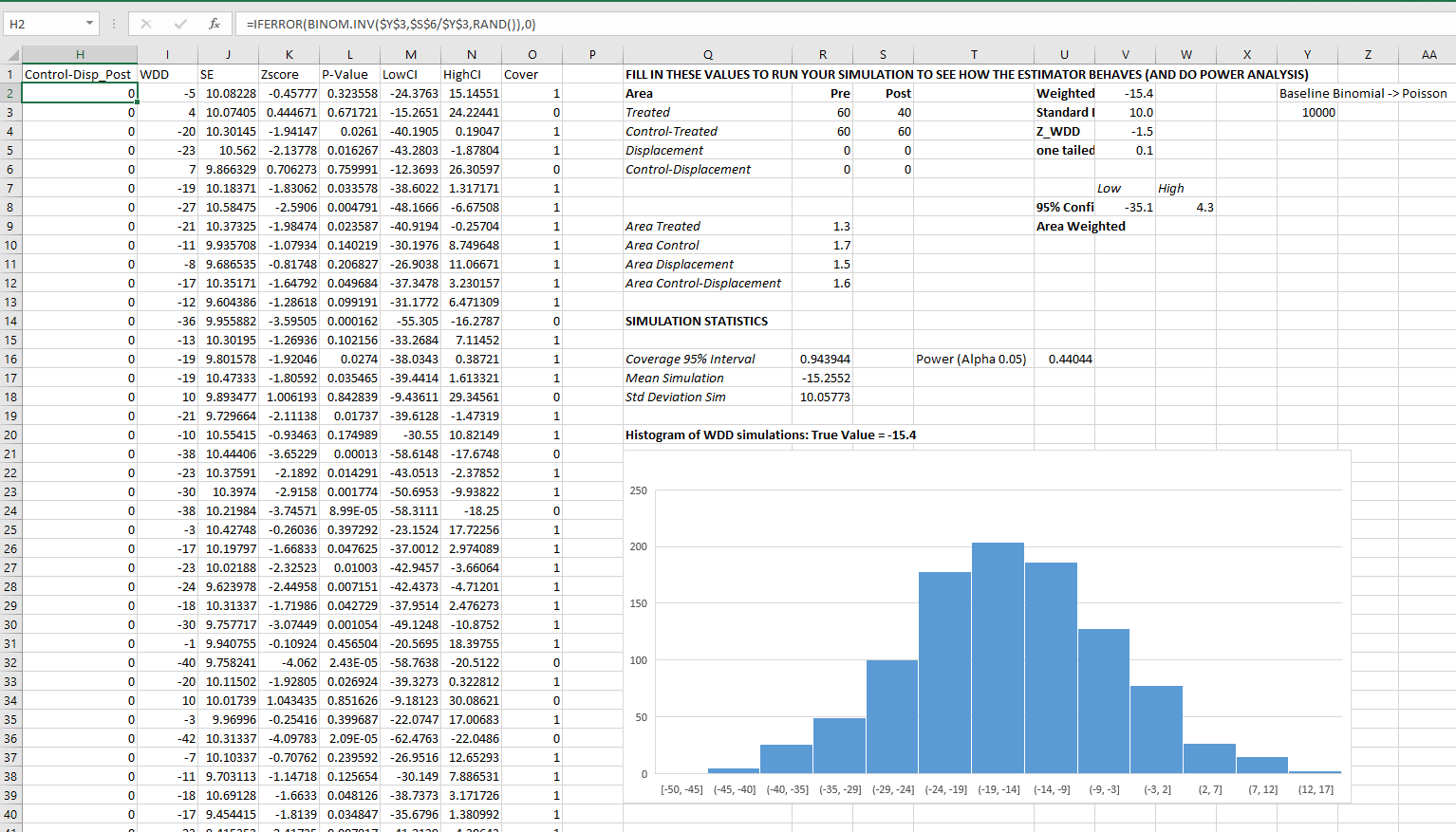
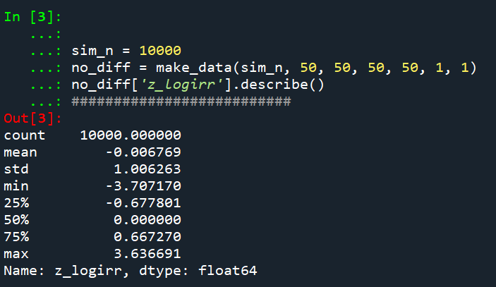
So I have adapted the same simulation code I used in prior studies/blog posts to evaluate the null distribution and the coverage of David’s IRR estimator. I partly did not pursue it initially back when me and Jerry were discussing this idea, because I thought it would be biased. Generalized linear models are based on maximum likelihood estimators, which are only asymptotically valid. In short it appears I was wrong here and David’s IRR estimator is fine even with just four observations, at least for the handful of scenarios I have tried it (have not looked at very tiny counts of crime, it is undefined if any cell has 0 crimes, as you cannot take the log of 0).
Python code pasted at the very end of the blog post, but for example if we generate a set of null no changes pre/post with a baseline of 50 crimes, the logged irr estimate (converted into a z-score here) is just fine and dandy and has a very close to standard normal distribution based on 10k simulations.
So lets look at the scenario where the control area doesn’t change, but the treated area goes from 50 to 30. We can see again the point estimate in this scenario is spot on the money.
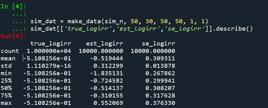
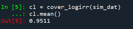
And then we can see the coverage of the logged irr estimator is spot on as well:
So if you are interested in slightly different baseline scenarios, you can use that same simulation code to check out the behavior of David’s estimator and conduct simulated power analysis the same way I have shown for the WDD estimator in prior blog posts.
So if both are unbiased and have good coverage again, why would you prefer the WDD estimator over the IRR estimator (or vice-versa)? Well, lets take the 35% reduction I talked about at the beginning of the post, and the department needs to spend $250k on extra officers to conduct whatever hot spot policing intervention. A 35% reduction may be worth it if we start with a baseline of 200 crimes (so would expect to go down to 130, for a reduction of 70 crimes). If the baseline is 20 crimes, it goes down to 13 crimes (so only a reduction of 7 crimes). The actual benefit of the IRR estimate is entirely dependent on the baseline count of crimes it is applied to.
Even if the IRR estimate is itself unbiased and has proper coverage, for even an individual study backing out the estimated reduction in total crimes from the IRR is biased. So here in this same simulated data (50 to 30 in treated, and 50 to 50 in control areas). The true count reduction is -20, and here is the point estimate on the X axis and the length of the confidence interval for each simulation on the Y axis for my WDD test. You can see they are nicely centered on -20, and the length of the confidence intervals has a very tiny variance – they are mostly just a smidge over 50 in total length. So that is probably tough to wrap your head around, but the variance of the variance estimates for the WDD are small.
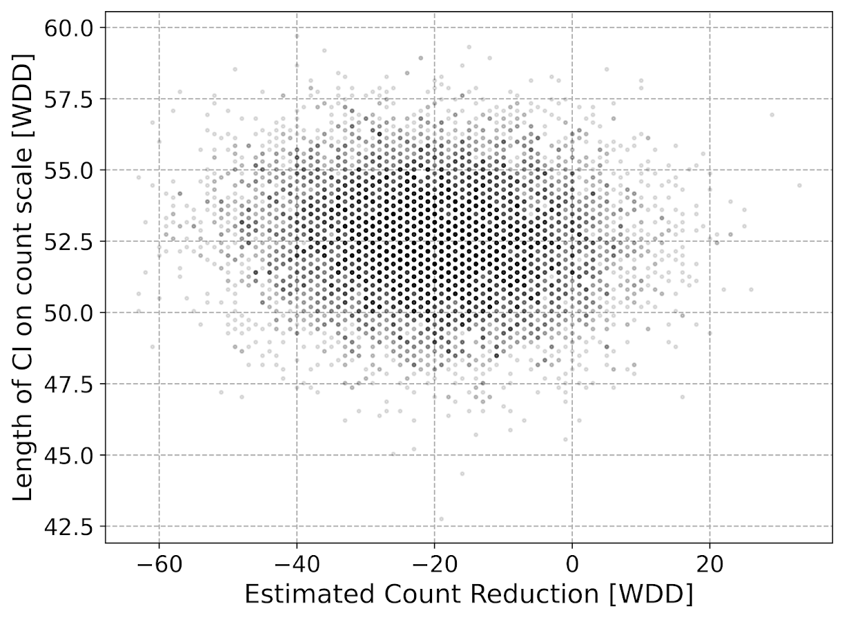
Now lets do the same graph for the IRR estimate, but translated back out to a count crime reduction based on the simulated values:
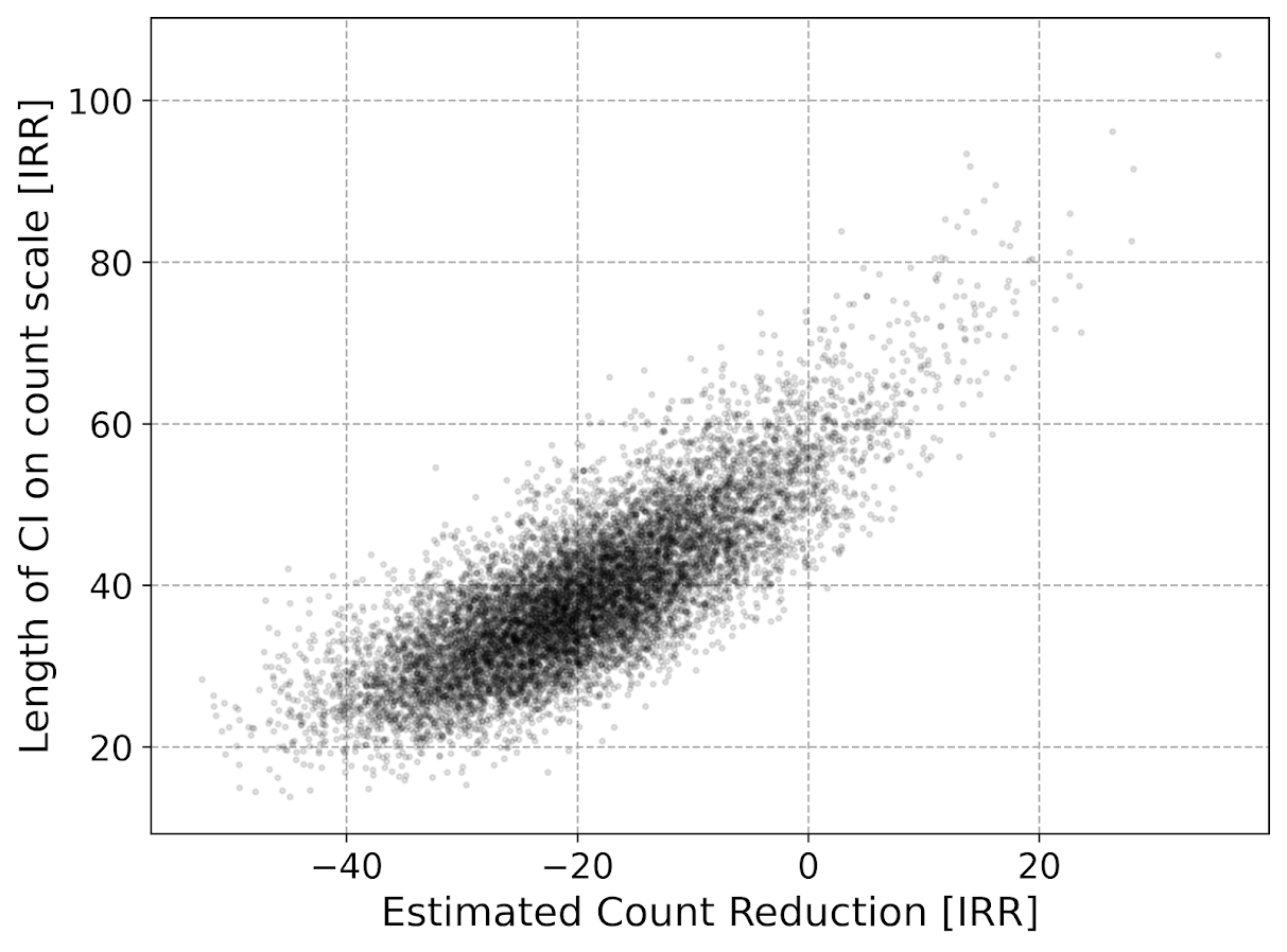
We either have a ton of bias in this estimate (if the estimate of the count reduction is too large, the confidence interval is too small). Or the opposite, the estimate of the count reduction is too small, and the confidence interval is crazy wide. In Andrew Gelman’s terminology, it can result in pretty large type M (magnitude) errors in this simulated example (Gelman & Carlin, 2014). So the variance of the variance estimates in this scenario are quite large.
To be clear – if you are interested in estimating a percent reduction, by all means use David’s IRR estimator. If you however want to translate that percent reduction into an estimate of the total crimes reduced though you should use my WDD estimator in that case. You should not back out a total crimes reduced estimate from the IRR.
Final Thoughts
So I have said a few times I think the IRR estimator makes more sense for meta-analyses. Why do I think that? Well, imagine we have an underlying causal process through which a hot spots policing experiment can randomly deter/prevent a particular proportion of crimes. That underlying causal process suggests an IRR effect. And also the problem I mention with translating back to crime counts I believe should get smaller with tighter estimates.
For a causal process that is more akin to my WDD estimator, imagine some crimes will always be deterred/prevented from a hot spots policing experiment, and some will never be. And we don’t know up-front which is which, so the observed reduction is based on whatever mixture of the two we have at that particular location.
The proportion reduction seems to make more sense to me for active patrol type interventions (which are ephemeral) vs permanent CPTED like interventions which should prevent certain criminal acts in perpetuity. But of course any situation in the real world could have both occurring at the same time.
When you go and look at the meta-analysis of hot spots policing, those interventions are all over the place (Hinkle et al., 2020). I think my WDD estimate would not make sense to mash up into a final meta-analytic estimate. The IRR may not make sense either in the end, but it is plausibly more relevant to compare the IRRs from a study with a baseline of 200 crimes vs one with 40 crimes at baseline. I am not sure it makes sense to compare WDDs in that scenario. But that being said, a few of my blog posts have discussed the WDD normalized per unit area or per unit time. Those normalized estimates are probably more apples to apples in the 200 vs 40 scenario.
A final note I have not discussed here is that David discusses a correction for overdispersion, so that is a potential feather in the cap for his estimator vs the WDD. I’d be a bit hesitant though with that – only four observations to estimate the dispersion term is slicing it a bit thin IMO. But I was wrong about the original estimator, so I may be wrong about that as well. It will take simulation evidence to determine that though – David’s paper just provides the correction term, he doesn’t provide evidence for its utility with small sample data.
And to be fair I have not done simulations to see how my estimator behaves in the presence of overdispersion either. I believe it will simply just cause the standard errors to be too small, so like in Wheeler (2016), I imagine it will just require upping the interval (e.g. use a z-score of 3 instead of 2) to get proper coverage for real crime data.
References
- Braga, A. A., & Weisburd, D. L. (2020). Does Hot Spots Policing Have Meaningful Impacts on Crime? Findings from An Alternative Approach to Estimating Effect Sizes from Place-Based Program Evaluations. Journal of Quantitative Criminology, Online First.
- Gelman, A., & Carlin, J. (2014). Beyond power calculations: Assessing type S (sign) and type M (magnitude) errors. Perspectives on Psychological Science, 9(6), 641-651.
- Hinkle, J. C., Weisburd, D., Telep, C. W., & Petersen, K. (2020). Problem-oriented policing for reducing crime and disorder: An updated systematic review and meta-analysis. Campbell Systematic Reviews, 16(2), e1089.
- Wheeler, A. P. (2016). Tables and graphs for monitoring temporal crime trends: Translating theory into practical crime analysis advice. International Journal of Police Science & Management, 18(3), 159-172.
- Wheeler, A.P., & Ratcliffe, J.H. (2018). A simple weighted displacement difference test to evaluate place based crime interventions. Crime Science, 7(1), 11.
- Wilson, D. B. (2021). The relative incident rate ratio effect size for count-based impact evaluations: When an odds ratio is not an odds ratio. Journal of Quantitative Criminology, 1-19.
Other Posts of Interest
Python simulation code
Here is a copy-pasted chunk of the entire python simulation code.
'''
Comparing WDD to log(IRR) from Wilson's
recent paper, https://link.springer.com/article/10.1007/s10940-021-09494-w

Andy Wheeler
'''

import pandas as pd
import numpy as np
from scipy.stats import norm
from scipy.stats import poisson
from scipy.stats import uniform
import matplotlib
import matplotlib.pyplot as plt
import os
my_dir = r'D:\Dropbox\Dropbox\Documents\BLOG\wdd_vs_irr'
os.chdir(my_dir)

#########################################################
#Settings for matplotlib

andy_theme = {'axes.grid': True,
              'grid.linestyle': '--',
              'legend.framealpha': 1,
              'legend.facecolor': 'white',
              'legend.shadow': True,
              'legend.fontsize': 14,
              'legend.title_fontsize': 16,
              'xtick.labelsize': 14,
              'ytick.labelsize': 14,
              'axes.labelsize': 16,
              'axes.titlesize': 20,
              'figure.dpi': 100}

matplotlib.rcParams.update(andy_theme)
#########################################################


#This works for the scipy functions as well
np.random.seed(seed=10)

# A function to generate the WDD estimate for simulated data
def wdd_sim(treat0,treat1,cont0,cont1,pre,post):
    tr_cr_0 = poisson.rvs(mu = treat0, size=int(pre)).sum()
    co_cr_0 = poisson.rvs(mu = cont0, size=int(pre)).sum()
    tr_cr_1 = poisson.rvs(mu = treat1, size=int(post)).sum()
    co_cr_1 = poisson.rvs(mu = cont1, size=int(post)).sum()
    # WDD estimates
    est = ( tr_cr_1/post - tr_cr_0/pre ) - ( co_cr_1/post - co_cr_0/pre )
    post2 = (1/post)**2
    pre2 = (1/pre)**2
    var_est = tr_cr_0*pre2 + tr_cr_1*post2 + co_cr_0*pre2 + co_cr_1*post2
    true_val = ( treat1 - treat0 ) - ( cont1 - cont0 )
    z_score = est / np.sqrt(var_est)
    # Wilson log IRR estimates
    true_logirr = np.log( (treat1*cont0) / (cont1*treat0) )
    est_logirr = np.log( ((tr_cr_1/post)*(co_cr_0/pre)) / ( (co_cr_1/post)*(tr_cr_0/pre) ) )
    se_logirr = np.sqrt( 1/tr_cr_1 + 1/co_cr_0 + 1/co_cr_1 + 1/tr_cr_0 )
    z_logirr = est_logirr / se_logirr
    return (tr_cr_0, co_cr_0, tr_cr_1, co_cr_0, est, var_est, true_val, z_score, true_logirr, est_logirr, se_logirr, z_logirr)

def make_data(n, treat0, treat1, cont0, cont1, pre, post):
    base = pd.DataFrame( range(n), columns=['index'])
    base['treat0'] = treat0
    if treat1 is not None:
        base['treat1'] = treat1
    else:
        base['treat1'] = base['treat0']
    if cont0 is not None:
        base['cont0'] = cont0
    else:
        base['cont0'] = base['treat0']
    if cont1 is not None:
        base['cont1'] = cont1
    else:
        base['cont1'] = base['cont0']
    base.drop(columns='index',inplace=True)
    base['pre'] = pre
    base['post'] = post
    sim_vals = base.apply(lambda x: wdd_sim(**x), axis=1, result_type='expand')
    sim_vals.columns = ['sim_t0','sim_c0','sim_t1','sim_c1','est','var_est','true_val','z_score',
                        'true_logirr','est_logirr','se_logirr','z_logirr']
    return pd.concat([base,sim_vals], axis=1)

# Coverage of the log irr estimate
# Lets look at the coverage rate for a decline from 40 to 20
def cover_logirr(data, ci=0.95):
    mult = (1 - ci)/2
    nv = norm.ppf(1 - mult)
    dif = nv*data['se_logirr']
    low = data['est_logirr'] - dif
    high = data['est_logirr'] + dif
    cover = ( data['true_logirr'] > low) & ( data['true_logirr'] < high )
    return cover

# Length of ci for WDD
def len_ci(data, ci=0.95):
    mult = (1 - ci)/2
    nv = norm.ppf(1 - mult)
    dif = nv*np.sqrt( data['var_est'] )
    low = data['est'] - dif
    high = data['est'] + dif
    return low, high, high - low

# Length of ci for IRR estimate on count scale
# This depends on the baseline estimate to multiply
# The IRR by, using the baseline average of the
# Treatment area

def len_irr(data, ci=0.95):
    mult = (1 - ci)/2
    nv = norm.ppf(1 - mult)
    dif = nv*data['se_logirr']
    low = data['est_logirr'] - dif
    high = data['est_logirr'] + dif
    baseline = data['sim_t0']/data['pre']
    # Even if you use hypothetical, the variance is quite high
    #baseline = data['treat0']
    est_count = baseline*np.exp(data['est_logirr']) - baseline
    c1 = baseline*np.exp(low) - baseline
    c2 = baseline*np.exp(high) - baseline
    return est_count, c1, c2, np.abs(c2 - c1)

##########################
# Example with no change, lets look at the null distribution
sim_n = 10000
no_diff = make_data(sim_n, 50, 50, 50, 50, 1, 1)
no_diff['z_logirr'].describe()
##########################

##########################
# Example with equal time periods, a reduction from 50 to 30 and 50 to 50 in control area
sim_dat = make_data(sim_n, 50, 30, 50, 50, 1, 1)
sim_dat[['true_logirr','est_logirr','se_logirr']].describe()

cl = cover_logirr(sim_dat)
cl.mean()

# Compare length of CI for IRR vs WDD

# WDD length
lowdd, highwdd, lwdd = len_ci(sim_dat)
lwdd.describe()

# IRR length on the count scale
est_cnt_irr, lo_irr, hi_irr, ln_irr = len_irr(sim_dat)
ln_irr.describe()

# Scatterplot of estimated count reduction vs
# Length of CI
fig, ax = plt.subplots(figsize=(8,6))
ax.scatter(est_cnt_irr, ln_irr, c='k',
            alpha=0.1, s=4)
ax.set_axisbelow(True)
ax.set_xlabel('Estimated Count Reduction [IRR]')
ax.set_ylabel('Length of CI on count scale [IRR]')
plt.savefig('IRR_Len_Est.png', dpi=500, bbox_inches='tight')
plt.show()

# Lets compare to the WDD estimate
fig, ax = plt.subplots(figsize=(8,6))
ax.scatter(sim_dat['est'], lwdd, c='k',
            alpha=0.1, s=4)
ax.set_axisbelow(True)
ax.set_xlabel('Estimated Count Reduction [WDD]')
ax.set_ylabel('Length of CI on count scale [WDD]')
plt.savefig('WDD_Len_Est.png', dpi=500, bbox_inches='tight')
plt.show()
##########################