The value of a PhD

For my current work as a data scientist, I spend most of my time writing SQL queries, generating some sort of predictive model on that data using python, and automating those data pipelines using additional command line scripts. Pretty much nothing coding wise I do on a day to day basis I learned in my entire educational career.

The only specific coding classes I took in school were SAS in undergrad and SPSS in grad. All other coding was in Stata and a very tiny bit in R, both incidental to statistical classes. Even those should hardly count, as all it entails is load a dataset and run reg y x or something similar.

That focuses on the software engineering side – the other side of being a data scientist is essentially being an applied mathematician. That may sound fancy, but the work I do I like to think is more akin to accounting with probabilities (where I have to personally create models to estimate the probabilities). While I had extensive quantitative training in graduate school, again nothing I was taught even remotely resembles the mathematics I use on a regular basis at my job.

My social science education entirely focused on causal inference, estimating parameters on the right hand side of the regression equation. I did not cover prediction/forecasting/machine-learning one iota in my classes. I did not even have any classes on cost-benefit analysis, which is more akin to me calculating potential return on investment when I am creating new machine learning models for my company.

The only thing I do regularly at my job you could reasonably point to specific educational training/prep on was presenting results in PowerPoint presentations.

That being said, no way I would be in my current position if I did not have a PhD. For a potential counter-factual, I debated on dropping out of undergrad at one point and going to community college to install HVAC systems. I feel pretty comfortable assuming I would not have ended up as a data scientist if I took that career path. (Before you think to poo-poo on that career path choice, it is easily possible my personal net worth would be in the same ballpark at this point in my life in that counter-factual installing HVAC world. There are significant opportunity costs you are eating when you pursue a PhD.)

So what exactly was the value of my PhD? While you take some classes as a PhD student, I don’t see the main benefit of those as being vocational in nature. When pursuing a PhD it is a full time endeavor, and it is the entire environment that marks it as a major difference from undergraduate education. Pretty much every conversation you have as a PhD student is focused on science.

A second major difference is that you are not a passive consumer of scientific research – you have bridged to becoming a producer of that knowledge. A PhD dissertation by its nature is very sink or swim – you are expected to come up with a particular research topic/agenda, and conduct the appropriate analysis to investigate that particular topic, then share your results with the world. This is very different than working in a job where someone tells you what to do – you show up in the morning and you have 100% latitude to pursue whatever you want.

These two things together I believe are where the value lies in a PhD. The independence necessary to be a successful in a PhD is by its nature not something you can get via prior work experience (unless you count say starting your own business). This coupled with the scientific environment provides an atmosphere where constant learning is necessary to get to the finish line of the dissertation. Even if I still was an academic, it is always necessary for me to consume new material, teach myself new things, and apply that to the work I am pursuing.

So while I did not learn python programming or machine learning in grad school, I just go out, try to consume as much as I can on the material, and apply that knowledge to solve the current problems I am dealing with. There will always be something new I need to teach myself while I am still working, but that is OK. I have the means to teach myself those things from my PhD experience. I am not sure I would have really ever gotten to that point just by focusing on vocational aspects (e.g. taking classes on machine learning or programming) – I think I only got to that point by having to pursue my own independent research.


I’ve been musing this more as potential students ask me whether it is worth it to pursue a PhD. I have mixed feelings, but have settled on this simple dichotomy – if you are only pursuing a PhD because you want to teach, I have grave reservations against recommending a PhD. The supply for these professor positions greatly outpace the demand from universities. So even if you do well as a student, there is no guarantee you will get a tenure track position. In the current market where there are dozens of really good candidates for any position, network effects can dominate that decision.

But, if you are more open to other potential positions, such as public sector researcher positions, think tanks, or private sector data science, I feel more comfortable in saying going for the PhD is a reasonable career choice.

Unfortunately, current education in terms of preparing you to be competitive for private sector data science is somewhat lacking across the social sciences. As I stated at the beginning of this post, I did not personally learn any of the tools I use regularly at my job via traditional education, but more as ancillary to my particular research interests. To follow in my path, the research you pursue needs to somewhat match the skills the current market wants, and these include:

  • predictive modeling (e.g. tree based models, boosted models, deep learning)
  • legitimate coding skills in python/R, as well as tools like git/Docker
  • working with moderately large datasets (SQL, Hadoop, or online AWS)
  • data visualization to explain results/models

I am hoping my former colleagues in social sciences will do a better job of expanding the graduate curricula to better teach these skills. They have utility for the more traditional research as well. I am not holding my breath though for that. So in the meantime if you are pursuing a PhD in the social sciences, and you want to pursue a data science job (or simply hedge in case you cannot land a tenure track gig), these are skills you need to develop on your own while also doing your PhD.

Updated SPSS Chart Template (V26) and Chart Notes

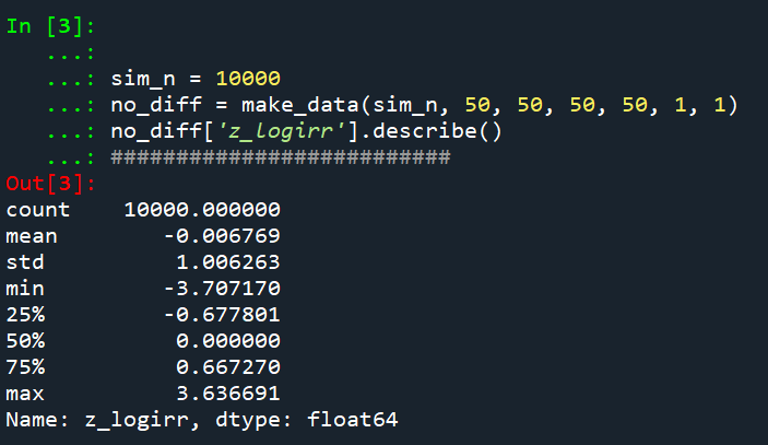
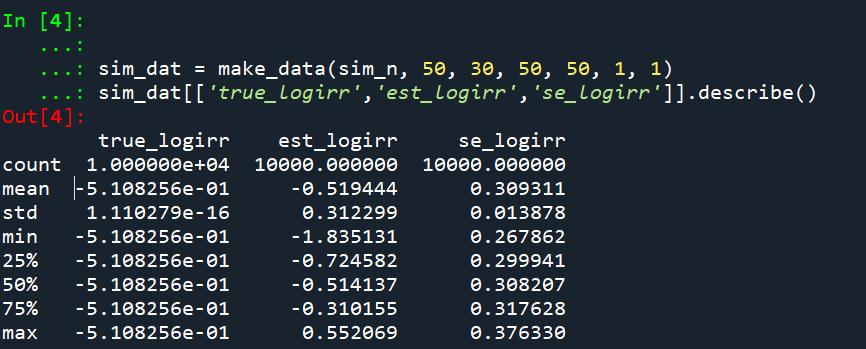
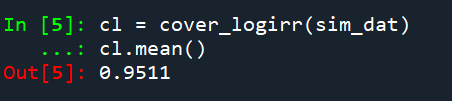
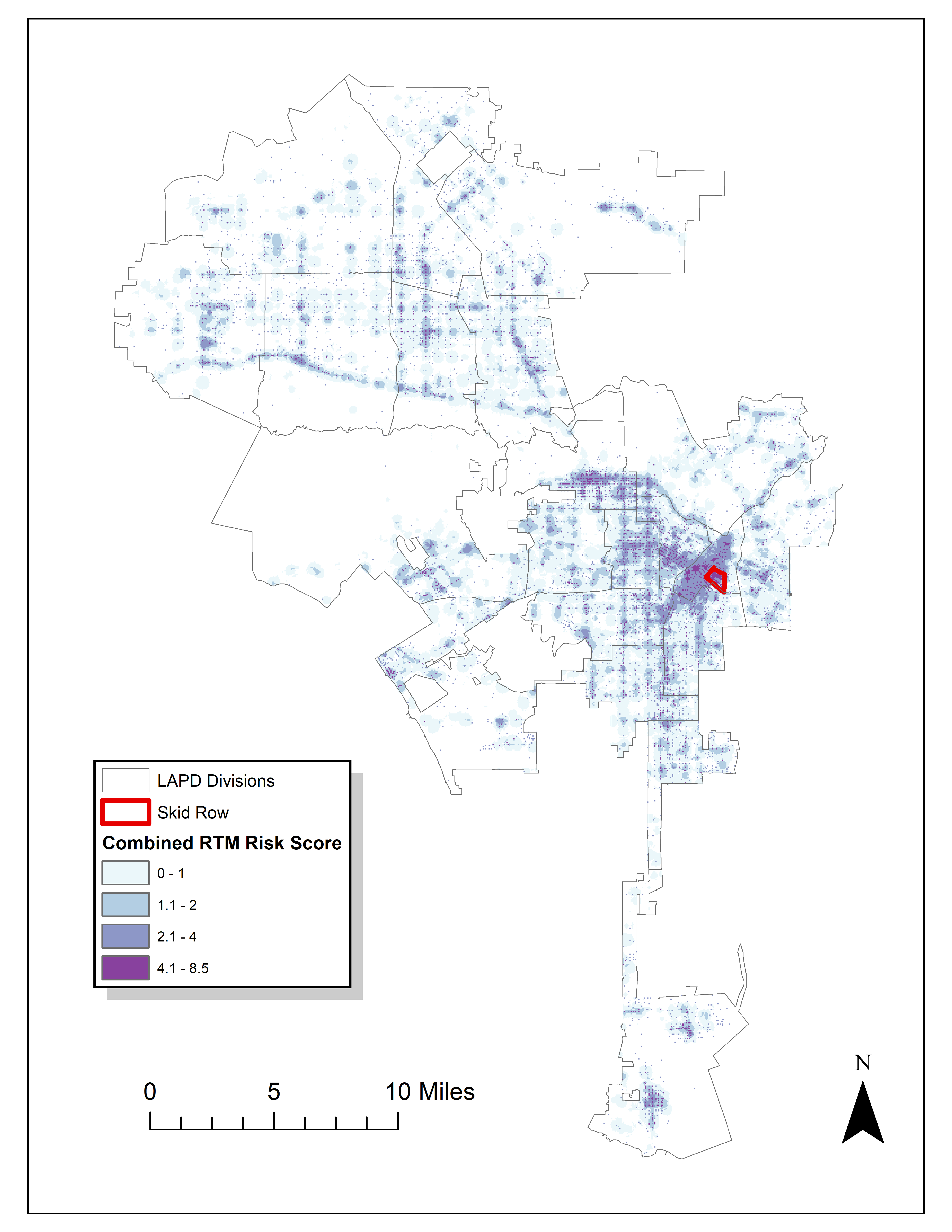
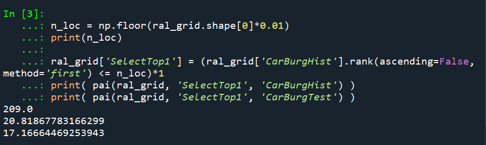
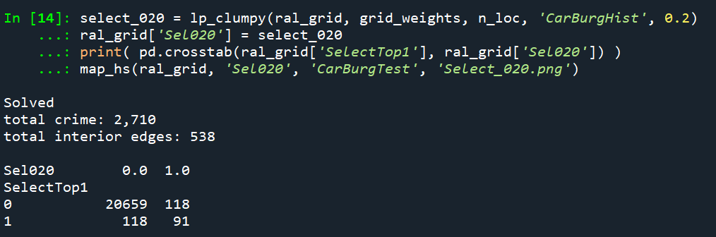
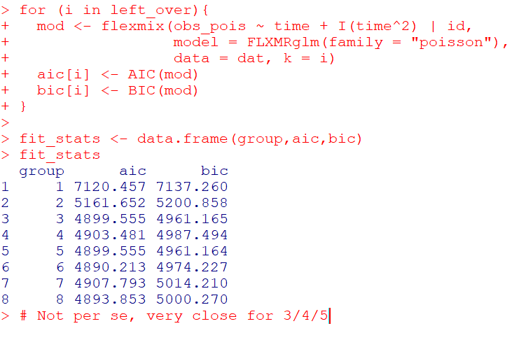
So I was helping someone out the other day with SPSS chart templates, and figured it would be a good opportunity to update mine. I have a new template version for V26, V26_ChartStyle.sgt. I also have some code to illustrate the template, plus a few random SPSS charting tips along the way.

For notes about chart templates, I have written about it previously, and Ruben has a nice tutorial on his site as well. For those not familiar, SPSS chart templates specify the default looks of the chart, very similar to CSS for HTML. So for example, if you want your labels to be a particular font, or you want the background for the chart to be light grey, or you want the gridlines to be dashed, are all examples you can specify in a chart template.

It is plain text XML file under the hood – unfortunately there is not any official documentation about what is valid from IBM SPSS that I am aware of, so to amend it just takes trial and error. So in case anyone from SPSS pays attention here, if you have other docs to note let me know!

Below I will walk through my updated template and various charts to illustrate the components of it.

Walkthrough Template Example

So first to start out, if you want to specify a new template, you can either do it via the GUI (Edit -> Options -> Charts Tab), or via syntax such as SET CTEMPLATE='data\template.sgt'. Here I make some fake data to illustrate various chart types.

SET SEED 10.
INPUT PROGRAM.
LOOP Id = 1 TO 20.
END CASE.
END LOOP.
END FILE.
END INPUT PROGRAM.
DATASET NAME Test.
COMPUTE Group = TRUNC(RV.UNIFORM(1,7)).
COMPUTE Pair = RV.BERNOULLI(0.5).
COMPUTE X = RV.UNIFORM(0,1).
COMPUTE Y = RV.UNIFORM(0,1).
COMPUTE Time = MOD(Id-1,10) + 1.
COMPUTE TGroup = TRUNC((Id-1)/10).
FORMATS Id Group Pair TGroup Time (F2.0) X Y (F2.1).
VALUE LABELS Group 
  1 'A' 
  2 'B'
  3 'C'
  4 'D'
  5 'E'
  6 'F'
.
VALUE LABELS Pair
  0 'Group One'
  1 'Group Two'
.
VALUE LABELS TGroup
 0 'G1'
 1 'G2'
.
EXECUTE.

Now to start out, I show off my new color palette using a bar chart. I use a color palette derived from a Van Gogh’s bedroom as my default set. An idea I got from Sidonie Christophe (and I used this palette generator website). I also use a monospace font, Consolas, for all of the text (SPSS pulls from the system fonts, and I am a windows guy). The default font sizes are too small IMO, especially for presentations, so the X/Y axes tick labels are 14pt.

*Bar graph to show colors, title, legend.
GGRAPH
  /GRAPHDATASET NAME="graphdataset" VARIABLES=Group MEAN(X)[name="MEAN"]
  /GRAPHSPEC SOURCE=INLINE.
BEGIN GPL
  SOURCE: s=userSource(id("graphdataset"))
  DATA: Group=col(source(s), name("Group"), unit.category())
  DATA: X=col(source(s), name("MEAN"))
  GUIDE: axis(dim(1), label("Group"))
  GUIDE: axis(dim(2), label("Mean X"))
  GUIDE: legend(aesthetic(aesthetic.color.interior), label("Group"))
  GUIDE: text.title(label("Main Title"))
  GUIDE: text.subtitle(label("Subtitle"))
  SCALE: cat(dim(1), include("1", "2", "3", "4", "5", "6"))
  SCALE: linear(dim(2), include(0))
  ELEMENT: interval(position(Group*X), shape.interior(shape.square), color.interior(Group))
END GPL.

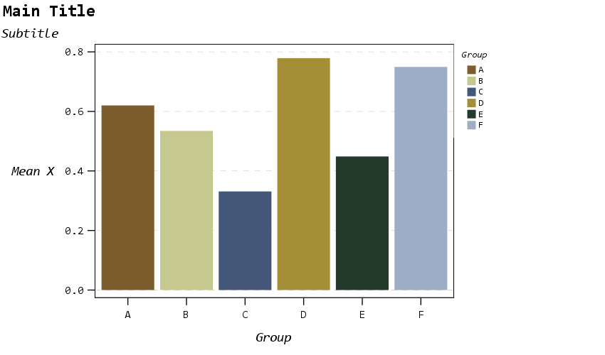
The legend I would actually prefer to have an outline box, but it doesn’t behave so nicely when I use a continuous aesthetic and pads too much. I will end the blog post with things I wish I could do with templates and/or GPL. (I wished for documentation to help me with the template for legends for example, but wish I could specify the location of the legend in inline GPL code.)

The next chart shows a scatterplot. One thing I make sure in the template is to not prevent you specifying what you want in inline GPL that is possible. So for example you could specify a default scatterplot of size 12 and the inside is grey, but as far as I can tell that prevents you from changing the color later on. Also I show a trick with using the subtitle to make a Y axis label at the top of the chart, a trick I saw originally from Naomi Robbins. (She actually prefers the text orientation on the side running north/south if you do that approach, but I prevented that in this template, I really dislike having to turn my head to read it!)

* Scatterplot, showing Y axis trick with subtitle.
* Would prefer the setStyle subtype="simple" type="scatter" works as default.
GGRAPH
  /GRAPHDATASET NAME="graphdataset" VARIABLES=X Y
  /GRAPHSPEC SOURCE=INLINE
  /FITLINE TOTAL=NO.
BEGIN GPL
  SOURCE: s=userSource(id("graphdataset"))
  DATA: X=col(source(s), name("X"))
  DATA: Y=col(source(s), name("Y"))
  GUIDE: axis(dim(1), label("X Label"))
  GUIDE: axis(dim(2))
  GUIDE: text.subtitle(label("  Y Label"))
  ELEMENT: point(position(X*Y), size(size."12"), color.interior(color."bebebe"))
END GPL.

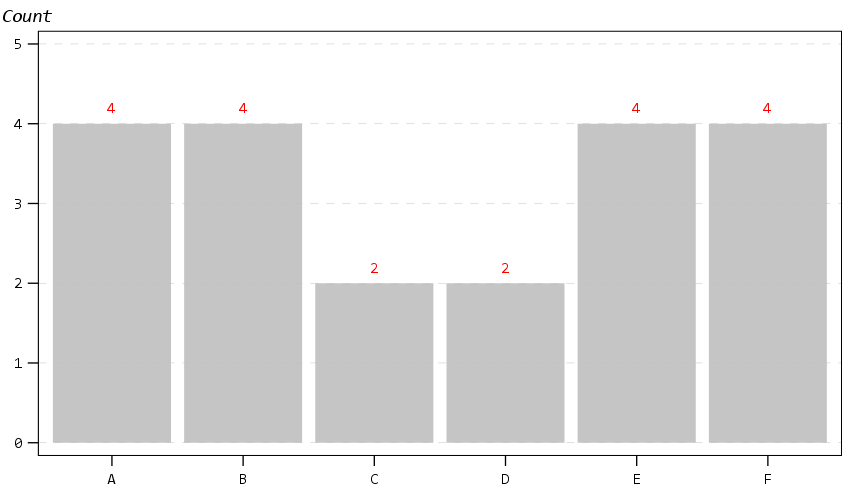
The next chart shows off my default data labels. I have the labels positioned at the center point, and also inherit the color from the data element. So one trick I like to use is to use the polygon element to explicitly set the locations of labels (and you can draw the polygons transparent, so you only see the labels in the end). So if you want to put labels at the top of bars (or above a line graph) like Excel does, you can just shift them up a smidge.

*Label trick for bar graphs.
GGRAPH 
  /GRAPHDATASET NAME="graphdataset" VARIABLES=Group COUNT()[name="COUNT"]
  /GRAPHSPEC SOURCE=INLINE. 
BEGIN GPL 
  SOURCE: s=userSource(id("graphdataset")) 
  DATA: Group=col(source(s), name("Group"), unit.category()) 
  DATA: COUNT=col(source(s), name("COUNT")) 
  TRANS: ext = eval(COUNT + 0.2)
  GUIDE: axis(dim(1)) 
  GUIDE: axis(dim(2)) 
  GUIDE: text.subtitle(label("Count")) 
  SCALE: cat(dim(1), include("1", "2", "3", "4", "5", "6")) 
  SCALE: linear(dim(2), include(0)) 
  ELEMENT: interval(position(Group*COUNT), color.interior(color."bebebe")) 
  ELEMENT: polygon(position(Group*ext), label(COUNT), color.interior(color.red),
                    transparency.interior(transparency."1"), transparency.exterior(transparency."1")) 
END GPL.

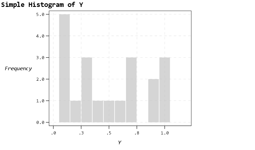
Next up is a histogram. SPSS has an annoying habit of publishing a statistics summary frame with mean/standard deviation when you make a histogram. Unfortunately the only solution I have found to this is to still generate the frame, but it is invisible so doesn’t show anything. It still takes up space in the chart area though, so the histogram will be shrunk to be somewhat smaller in width. Also I was unable to find a solution to not print the Frequency numbers with decimals here. (You can use setTickLabelFormat to say no decimals, but then that applies to all charts by default. SPSS typically chooses the numeric format from the data, but here since it calculates it inline GPL, there is no way to specify it in advance that I know of.)

* Histogram, no summary frame.
* Still not happy with Frequency numbers, stat summary is there but is empty.
GGRAPH
  /GRAPHDATASET NAME="graphdataset" VARIABLES=Y
  /GRAPHSPEC SOURCE=INLINE.
BEGIN GPL
  SOURCE: s=userSource(id("graphdataset"))
  DATA: Y=col(source(s), name("Y"))
  GUIDE: axis(dim(1), label("Y"))
  GUIDE: axis(dim(2), label("Frequency"))
  GUIDE: text.title(label("Simple Histogram of Y"))
  ELEMENT: interval(position(summary.count(bin.rect(Y, binWidth(0.1), binStart(-0.05) ))),
                    color.interior(color."bebebe"), color.exterior(color.white), 
                    transparency.interior(transparency."0.35"), transparency.exterior(transparency."0.35"))
END GPL.

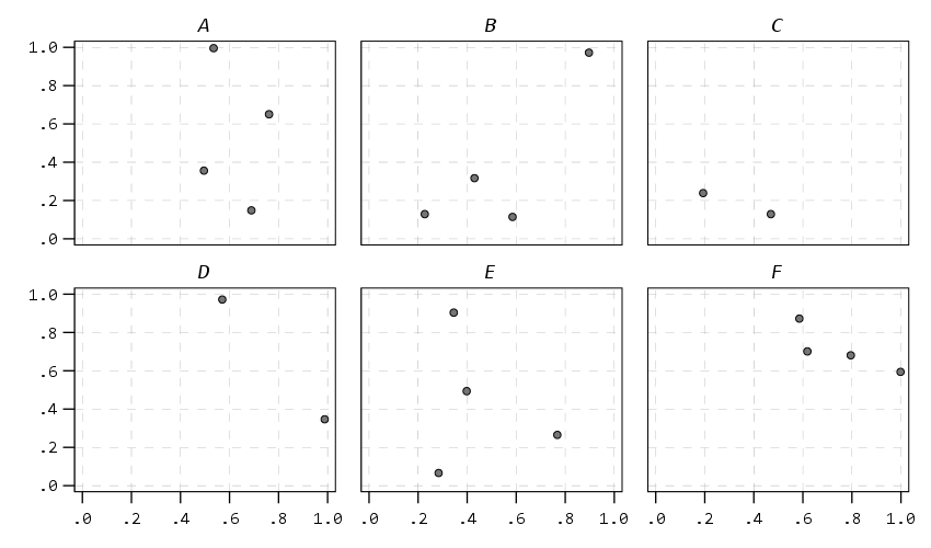
The next few charts I will illustrate how SPSS pulls the axes label formats from the data itself. So first I create a few new variables for percentages, dollars, and long values with comma groupings. Additionally a new part of this template is I was able to figure out how to set the text style for small multiple panels (they are ticked like tick marks for X/Y axes). So this illustrates my favorite way to mark panels.

* Small multiple columns, illustrating different variable formats.
COMPUTE XPct = X*100.
COMPUTE YDollar = Y * 5000.
COMPUTE YComma = Y * 50000.
*Can also do PCT3.1, DOLLAR5.2, COMMA 4.1, etc.
FORMATS XPct (PCT3) YDollar (DOLLAR4) YComma (COMMA7).
EXECUTE. 

GGRAPH
  /GRAPHDATASET NAME="graphdataset" VARIABLES=XPct YDollar Pair
  /GRAPHSPEC SOURCE=INLINE
  /FITLINE TOTAL=NO.
BEGIN GPL
  SOURCE: s=userSource(id("graphdataset"))
  DATA: X=col(source(s), name("XPct"))
  DATA: Y=col(source(s), name("YDollar"))
  DATA: Pair=col(source(s), name("Pair"), unit.category())
  GUIDE: axis(dim(1), label("X Label"))
  GUIDE: axis(dim(2), label("Y Label"))
  GUIDE: axis(dim(3), opposite())
  ELEMENT: point(position(X*Y*Pair), size(size."12"), color.interior(color."bebebe"))
END GPL.

That is to make panels in columns, but you can also do it in rows. And again I prevent all the text I can from turning vertical up/down, and force it to write the text horizontally.

* Small multiple rows.
GGRAPH
  /GRAPHDATASET NAME="graphdataset" VARIABLES=X YComma Pair
  /GRAPHSPEC SOURCE=INLINE
  /FITLINE TOTAL=NO.
BEGIN GPL
  SOURCE: s=userSource(id("graphdataset"))
  DATA: X=col(source(s), name("X"))
  DATA: Y=col(source(s), name("YComma"))
  DATA: Pair=col(source(s), name("Pair"), unit.category())
  GUIDE: axis(dim(1), label("X Label"))
  GUIDE: axis(dim(2), label("Y Label"))
  GUIDE: axis(dim(4), opposite())
  ELEMENT: point(position(X*Y*1*Pair))
END GPL.

And finally if you do wrapped panels and set the facet label to opposite, it puts the grid label on the top of the panel.

* Small multiple wrap.
GGRAPH
  /GRAPHDATASET NAME="graphdataset" VARIABLES=X Y Group
  /GRAPHSPEC SOURCE=INLINE
  /FITLINE TOTAL=NO.
BEGIN GPL
  SOURCE: s=userSource(id("graphdataset"))
  DATA: X=col(source(s), name("X"))
  DATA: Y=col(source(s), name("Y"))
  DATA: Group=col(source(s), name("Group"), unit.category())
  COORD: rect(dim(1,2), wrap())
  GUIDE: axis(dim(1))
  GUIDE: axis(dim(2))
  GUIDE: axis(dim(3), opposite())
  ELEMENT: point(position(X*Y*Group))
END GPL.

Next up I show how my default colors do with line charts, I typically tell people to avoid yellow for lines, but this tan color does alright I think. (And Van Gogh was probably color blind, so it works out well for that.) I have not tested out printing in grey-scale, I don’t think it will work out well for that beyond just the first two colors.

* Multiple line chart (long format).
GGRAPH
  /GRAPHDATASET NAME="graphdataset" VARIABLES=Time Y TGroup
  /GRAPHSPEC SOURCE=INLINE.
BEGIN GPL
  SOURCE: s=userSource(id("graphdataset"))
  DATA: Time=col(source(s), name("Time"))
  DATA: Y=col(source(s), name("Y"))
  DATA: TGroup=col(source(s), name("TGroup"), unit.category())
  SCALE: linear(dim(1), min(1))
  GUIDE: axis(dim(1), delta(1))
  GUIDE: axis(dim(2))
  GUIDE: legend(aesthetic(aesthetic.color.interior))
  GUIDE: legend(aesthetic(aesthetic.size), label("Size Y"))
  GUIDE: text.subtitle(label("   Y"))
  SCALE: cat(aesthetic(aesthetic.color.interior), include("0", "1"))
  ELEMENT: line(position(Time*Y), color.interior(TGroup))
  ELEMENT: point(position(Time*Y), shape(TGroup), color.interior(TGroup),
                    color.exterior(color.white), size(size."10")) )
END GPL.

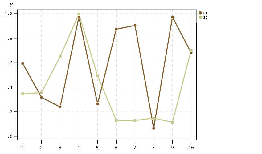
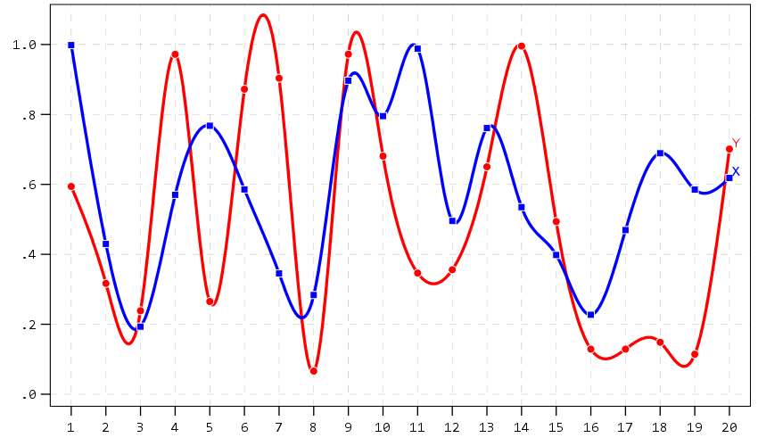
A nice approach that forgoes the legend though with line charts is to label the ends of the lines, and I show that below. Also the data above is in long format, and when superimposing points does not quite work out perfectly (G2 should always be above G1, but sometimes the G1 point is above the G2 line). Drawing each individual line in wide format though you can prevent that from happening (but results in more work to write the GPL, need several ELEMENT statements for a single line). I also show how to use splines here, which can sometimes help disentangle the spaghetti lines, but user beware, the interpolated spline values can be misleading (one of the reasons I like superimposing the point markers as well).

* Multiple line chart with end labels (wide format).
AGGREGATE OUTFILE=* MODE=ADDVARIABLES OVERWRITE=YES
  /BREAK
  /LastTime = MAX(Id).
IF Id = LastTime IdLabel = Id.
FORMATS IdLabel (F2.0).
EXECUTE.

GGRAPH
  /GRAPHDATASET NAME="graphdataset" VARIABLES=Id X Y IdLabel
   MISSING=VARIABLEWISE
  /GRAPHSPEC SOURCE=INLINE.
BEGIN GPL
  SOURCE: s=userSource(id("graphdataset"))
  DATA: Id=col(source(s), name("Id"))
  DATA: IdLabel=col(source(s), name("IdLabel")) 
  DATA: X=col(source(s), name("X"))
  DATA: Y=col(source(s), name("Y"))
  DATA: TGroup=col(source(s), name("TGroup"), unit.category())
  SCALE: linear(dim(1), min(1))
  SCALE: linear(dim(2), max(1.08))
  GUIDE: axis(dim(1), delta(1))
  GUIDE: axis(dim(2))
  SCALE: cat(aesthetic(aesthetic.color.interior), include("0", "1"))
  ELEMENT: line(position(smooth.spline(Id*Y)), color(color.red))
  ELEMENT: line(position(smooth.spline(Id*X)), color(color.blue))
  ELEMENT: point(position(Id*Y), color.interior(color.red), color.exterior(color.white),
                    size(size."9"), shape(shape.circle))
  ELEMENT: point(position(Id*X), color.interior(color.blue), color.exterior(color.white),
                    size(size."8"), shape(shape.square))
  ELEMENT: point(position(IdLabel*Y), color(color.red), label("Y"), 
                    transparency.interior(transparency."1"), transparency.exterior(transparency."1"))
  ELEMENT: point(position(IdLabel*X), color(color.blue), label("X"), 
                    transparency.interior(transparency."1"), transparency.exterior(transparency."1"))
END GPL.

A final example I illustrate is an error bar chart, but also include a few different notes about line breaks. You can use a special \n character in labels to break lines where you want. Also had a request for labeling the ends of the chart as well. Here I fudge that look by adding in a bunch of white space. This takes trial-and-error to figure out the right number of spaces to include, and can change if the Y axes labels change length, but is the least worst way I can think to do such a task. For error bars and bar graphs, it is also often easier to generate them going vertical, and just use COORD: transpose() to make them horizontal if you want.

* Error Bar chart.
VALUE LABELS Pair
  0 'Group\nOne'
  1 'Group\nTwo'
.
GGRAPH
  /GRAPHDATASET NAME="graphdataset" VARIABLES=Pair MEANCI(Y, 95)[name="MEAN_Y" LOW="MEAN_Y_LOW" 
    HIGH="MEAN_Y_HIGH"] MISSING=LISTWISE REPORTMISSING=NO
  /GRAPHSPEC SOURCE=INLINE.
BEGIN GPL
  SOURCE: s=userSource(id("graphdataset"))
  DATA: Pair=col(source(s), name("Pair"), unit.category())
  DATA: MEAN_Y=col(source(s), name("MEAN_Y"))
  DATA: LOW=col(source(s), name("MEAN_Y_LOW"))
  DATA: HIGH=col(source(s), name("MEAN_Y_HIGH"))
  COORD: transpose()
  GUIDE: axis(dim(1))
  GUIDE: axis(dim(2), label("Low Anchor                                                    High Anchor", "\nLine 2"))
  GUIDE: text.title(label("Simple Error Bar Mean of Y by Pair\n[Transposed]"))
  GUIDE: text.footnote(label("Error Bars: 95% CI"))
  SCALE: cat(dim(1), include("0", "1"), reverse() )
  SCALE: linear(dim(2), include(0))
  ELEMENT: interval(position(region.spread.range(Pair*(LOW+HIGH))), shape.interior(shape.ibeam))
  ELEMENT: point(position(Pair*MEAN_Y), size(size."12"))
END GPL.

Going to back to some scatterplots, I will illustrate a continuous legend example using size of points in a scatterplot. For size elements it typically makes sense to use a square root scale instead of a linear one (SPSS default power scale is to x^0.5, so a square root). If you go to edit the chart and click on the legend, you will see here what I mean by the excessive padding of white space at the bottom. (Also wish you could control the breaks that are shown in inline GPL, breaks for non-linear scales though are no doubt tricky.)

* Continuous legend example.
GGRAPH
  /GRAPHDATASET NAME="graphdataset" VARIABLES=X Y
  /GRAPHSPEC SOURCE=INLINE
  /FITLINE TOTAL=NO.
BEGIN GPL
  SOURCE: s=userSource(id("graphdataset"))
  DATA: X=col(source(s), name("X"))
  DATA: Y=col(source(s), name("Y"))
  GUIDE: axis(dim(1), label("X Label"))
  GUIDE: axis(dim(2))
  GUIDE: text.subtitle(label("  Y Label"))
  GUIDE: legend(aesthetic(aesthetic.size), label("SizeLab"))
  SCALE: linear(dim(2), max(1.05))
  SCALE: pow(aesthetic(aesthetic.size), aestheticMinimum(size."6px"), 
               aestheticMaximum(size."30px"), min(0), max(1))
  ELEMENT: point(position(X*Y), size(Y), color.interior(color."bebebe"))
END GPL.

And you can also do multiple legends as well. SPSS does a good job blending them together in this example, but to label the group you need to figure out which hierarchy wins first I guess.

* Multiple legend example.
GGRAPH
  /GRAPHDATASET NAME="graphdataset" VARIABLES=X Y Pair
  /GRAPHSPEC SOURCE=INLINE
  /FITLINE TOTAL=NO.
BEGIN GPL
  SOURCE: s=userSource(id("graphdataset"))
  DATA: X=col(source(s), name("X"))
  DATA: Y=col(source(s), name("Y"))
  DATA: Pair=col(source(s), name("Pair"), unit.category())
  GUIDE: axis(dim(1), label("X Label"))
  GUIDE: axis(dim(2))
  GUIDE: text.subtitle(label("  Y Label"))
  GUIDE: legend(aesthetic(aesthetic.color.interior), label("Color/Shape Lab"))
  GUIDE: legend(aesthetic(aesthetic.size), label("Size & Trans. Lab"))
  SCALE: linear(dim(2), max(1.05))
  SCALE: linear(aesthetic(aesthetic.size), aestheticMinimum(size."6px"), 
               aestheticMaximum(size."30px"), min(0), max(1))
  SCALE: linear(aesthetic(aesthetic.transparency.interior), aestheticMinimum(transparency."0"), 
               aestheticMaximum(transparency."0.6"), min(0), max(1))
  ELEMENT: point(position(X*Y), transparency.interior(Y), 
                            shape(Pair), size(Y), color.interior(Pair))
END GPL.

But that is not too shabby for just out of the box and no post-hoc editing.

Wishes for GPL and Templates

So I have put in my comments on things I wish I could do via chart templates. For a recap some documentation on what is possible, turning off the summary statistics for histograms entirely (not just making it invisible), padding for continuous legends, and making the setStyle defaults for the various charts styleOnly are a few examples. And then there are some parts I wish you could do in inline GPL, such as setting the location of the legend. Also I would not mind having access to any of these elements in inline GPL as well, such as say setting the number format in a GUIDE statement I think would make sense. (I have no idea how hard/easy these things though are under the hood.) But no documentation for templates is a real hassle when trying to edit your own.

Do y’all have any other suggestions for a chart template? Other default charts I should check out to see how my template does? Other suggested color scales? Let me know your thoughts!

Comparing the WDD vs the Wilson log IRR estimator

So this is maybe my final post on the WDD estimator for the time being (Wheeler & Ratcliffe, 2018). Recently David Wilson had an article in JQC that proposes a different estimator using the same basic information, just pre-post crime counts for treated and control areas (Wilson, 2021). So say we had the table:

         Pre   Post
Treated   50     30
Control   60     55

So in this scenario, my WDD estimate is -20 in the treated area, and -5 in the control area, so the overall estimate is -20 – -5 = -15.

30 - 50 - (55 - 60) = -15

So an estimated reduction of -15 crimes overall. David’s estimator is the logged incident rate ratio (IRR), and so is just like above, except logs all of the values:

log(30) - log(50) - ( log(55) - log(60) ) = -0.4238142

This is a logged incident rate adjustment, so most of the time people exponentiate this value, which is exp(-0.4238142) = 0.6545455. So this suggests crime is reduced by approximately 35% in the treated area relative to the control area in this hypothetical. Or another way to write it is (30/50)/(55/60) = 0.6545455.

So instead of a linear estimate of the total numbers of crimes reduced, this is an estimate of the overall rate reduction. So this begs the question when would you prefer my WDD vs the IRR? I will try to answer that below – in short I think David’s estimator makes sense for meta-analyses (as I have said before in reference to the work in Braga & Weisburd, 2020). But for an individual agency doing an experimental evaluation I much prefer my estimator. The skinny of this logic is that we only really care about the overall crime reduction estimate from a cost-benefit analysis perspective. Backing out this total crime reduction count estimate from David’s IRR estimate can result in some funny business for an individual study.

Identifying Assumptions

So there are really two different assumptions my WDD estimator and David’s IRR estimator make. To generate a standard error estimate around the point estimate for either estimator, both require the data are Poisson distributed. So that makes no difference between the two. The assumption that really distinguishes between the WDD and the IRR estimate is the parallel trends assumption. The WDD assumes parallel trends are on the linear scale, whereas the IRR assumes parallel trends are on the ratio scale.

What exactly does this mean? Imagine we have a treated and control area, but look at the crime trends per time period before the treatment occurred. This set of areas has a set of parallel trends on the linear scale:

Time Treated Control
 0     50      60
 1     40      50
 2     45      55
 3     50      60

When the treated area goes down by 10 crimes, the control area goes down by 10 crimes. That is a parallel on the linear scale. Whereas this scenario is parallel on the ratio scale:

Time Treated Control
 0     50      60
 1     40      48
 2     45      54
 3     50      60

When crime goes down by 20% in the treated area, it goes down by 20% in the control area.

So while this gives a potential way to say you should use the WDD (parallel on the linear scale), or the IRR (parallel on the ratio scale), in practice it is not so simple. For one thing, if you only has the pre/post counts of crime, you cannot distinguish between these two scenarios. You can only tell in the case you have historical data to examine.

For a second part of this, you typically can choose your own control area (see for example the synthetic control estimator). So in most scenarios you could choose a control area to obey the linear or the ratio parallel trends assumption if you wanted to. However it may be in many scenarios there is a natural/easy control area, and you may see what is a better fit in that case for linear/ratio.

A final wee bit of a perverse aspect about this I will mention – pretend we have a treated/control area have approximately the same baseline crime counts/rates:

Time Treated Control
 0      30     30
 1      25     25
 2      20     20
 3      25     25

You actually cannot tell in this scenario whether the parallel trends are on the linear scale for my WDD or the ratio scale for the IRR estimate. They are consistent with either! In practice I think in many cases it will be like this – with noisy data, if you choose a control area that has approximately the same baseline crime counts, it will be quite hard to tell whether the linear parallel trends makes more sense or the ratio parallel trends makes more sense.

There are situations where the linear changes do not make sense, but they tend to be scenarios such as the control area has very little crime (so cannot go below 0 to match larger ups/downs in the treated area). So in that case sure the IRR is plausible and the WDD is not, but those are cases where the control area itself is quite questionable. Also note the IRR is not defined for any cells with 0 crimes – but again it is not good for either of our estimators in that case (although mine won’t fail to spit out a number, the power is so low the number it spits out won’t be worth much).

Bias/Coverage

So I have adapted the same simulation code I used in prior studies/blog posts to evaluate the null distribution and the coverage of David’s IRR estimator. I partly did not pursue it initially back when me and Jerry were discussing this idea, because I thought it would be biased. Generalized linear models are based on maximum likelihood estimators, which are only asymptotically valid. In short it appears I was wrong here and David’s IRR estimator is fine even with just four observations, at least for the handful of scenarios I have tried it (have not looked at very tiny counts of crime, it is undefined if any cell has 0 crimes, as you cannot take the log of 0).

Python code pasted at the very end of the blog post, but for example if we generate a set of null no changes pre/post with a baseline of 50 crimes, the logged irr estimate (converted into a z-score here) is just fine and dandy and has a very close to standard normal distribution based on 10k simulations.

So lets look at the scenario where the control area doesn’t change, but the treated area goes from 50 to 30. We can see again the point estimate in this scenario is spot on the money.

And then we can see the coverage of the logged irr estimator is spot on as well:

So if you are interested in slightly different baseline scenarios, you can use that same simulation code to check out the behavior of David’s estimator and conduct simulated power analysis the same way I have shown for the WDD estimator in prior blog posts.

So if both are unbiased and have good coverage again, why would you prefer the WDD estimator over the IRR estimator (or vice-versa)? Well, lets take the 35% reduction I talked about at the beginning of the post, and the department needs to spend $250k on extra officers to conduct whatever hot spot policing intervention. A 35% reduction may be worth it if we start with a baseline of 200 crimes (so would expect to go down to 130, for a reduction of 70 crimes). If the baseline is 20 crimes, it goes down to 13 crimes (so only a reduction of 7 crimes). The actual benefit of the IRR estimate is entirely dependent on the baseline count of crimes it is applied to.

Even if the IRR estimate is itself unbiased and has proper coverage, for even an individual study backing out the estimated reduction in total crimes from the IRR is biased. So here in this same simulated data (50 to 30 in treated, and 50 to 50 in control areas). The true count reduction is -20, and here is the point estimate on the X axis and the length of the confidence interval for each simulation on the Y axis for my WDD test. You can see they are nicely centered on -20, and the length of the confidence intervals has a very tiny variance – they are mostly just a smidge over 50 in total length. So that is probably tough to wrap your head around, but the variance of the variance estimates for the WDD are small.

Now lets do the same graph for the IRR estimate, but translated back out to a count crime reduction based on the simulated values:

We either have a ton of bias in this estimate (if the estimate of the count reduction is too large, the confidence interval is too small). Or the opposite, the estimate of the count reduction is too small, and the confidence interval is crazy wide. In Andrew Gelman’s terminology, it can result in pretty large type M (magnitude) errors in this simulated example (Gelman & Carlin, 2014). So the variance of the variance estimates in this scenario are quite large.

To be clear – if you are interested in estimating a percent reduction, by all means use David’s IRR estimator. If you however want to translate that percent reduction into an estimate of the total crimes reduced though you should use my WDD estimator in that case. You should not back out a total crimes reduced estimate from the IRR.

Final Thoughts

So I have said a few times I think the IRR estimator makes more sense for meta-analyses. Why do I think that? Well, imagine we have an underlying causal process through which a hot spots policing experiment can randomly deter/prevent a particular proportion of crimes. That underlying causal process suggests an IRR effect. And also the problem I mention with translating back to crime counts I believe should get smaller with tighter estimates.

For a causal process that is more akin to my WDD estimator, imagine some crimes will always be deterred/prevented from a hot spots policing experiment, and some will never be. And we don’t know up-front which is which, so the observed reduction is based on whatever mixture of the two we have at that particular location.

The proportion reduction seems to make more sense to me for active patrol type interventions (which are ephemeral) vs permanent CPTED like interventions which should prevent certain criminal acts in perpetuity. But of course any situation in the real world could have both occurring at the same time.

When you go and look at the meta-analysis of hot spots policing, those interventions are all over the place (Hinkle et al., 2020). I think my WDD estimate would not make sense to mash up into a final meta-analytic estimate. The IRR may not make sense either in the end, but it is plausibly more relevant to compare the IRRs from a study with a baseline of 200 crimes vs one with 40 crimes at baseline. I am not sure it makes sense to compare WDDs in that scenario. But that being said, a few of my blog posts have discussed the WDD normalized per unit area or per unit time. Those normalized estimates are probably more apples to apples in the 200 vs 40 scenario.

A final note I have not discussed here is that David discusses a correction for overdispersion, so that is a potential feather in the cap for his estimator vs the WDD. I’d be a bit hesitant though with that – only four observations to estimate the dispersion term is slicing it a bit thin IMO. But I was wrong about the original estimator, so I may be wrong about that as well. It will take simulation evidence to determine that though – David’s paper just provides the correction term, he doesn’t provide evidence for its utility with small sample data.

And to be fair I have not done simulations to see how my estimator behaves in the presence of overdispersion either. I believe it will simply just cause the standard errors to be too small, so like in Wheeler (2016), I imagine it will just require upping the interval (e.g. use a z-score of 3 instead of 2) to get proper coverage for real crime data.

References

Other Posts of Interest

Python simulation code

Here is a copy-pasted chunk of the entire python simulation code.

'''
Comparing WDD to log(IRR) from Wilson's
recent paper, https://link.springer.com/article/10.1007/s10940-021-09494-w

Andy Wheeler
'''

import pandas as pd
import numpy as np
from scipy.stats import norm
from scipy.stats import poisson
from scipy.stats import uniform
import matplotlib
import matplotlib.pyplot as plt
import os
my_dir = r'D:\Dropbox\Dropbox\Documents\BLOG\wdd_vs_irr'
os.chdir(my_dir)

#########################################################
#Settings for matplotlib

andy_theme = {'axes.grid': True,
              'grid.linestyle': '--',
              'legend.framealpha': 1,
              'legend.facecolor': 'white',
              'legend.shadow': True,
              'legend.fontsize': 14,
              'legend.title_fontsize': 16,
              'xtick.labelsize': 14,
              'ytick.labelsize': 14,
              'axes.labelsize': 16,
              'axes.titlesize': 20,
              'figure.dpi': 100}

matplotlib.rcParams.update(andy_theme)
#########################################################


#This works for the scipy functions as well
np.random.seed(seed=10)

# A function to generate the WDD estimate for simulated data
def wdd_sim(treat0,treat1,cont0,cont1,pre,post):
    tr_cr_0 = poisson.rvs(mu = treat0, size=int(pre)).sum()
    co_cr_0 = poisson.rvs(mu = cont0, size=int(pre)).sum()
    tr_cr_1 = poisson.rvs(mu = treat1, size=int(post)).sum()
    co_cr_1 = poisson.rvs(mu = cont1, size=int(post)).sum()
    # WDD estimates
    est = ( tr_cr_1/post - tr_cr_0/pre ) - ( co_cr_1/post - co_cr_0/pre )
    post2 = (1/post)**2
    pre2 = (1/pre)**2
    var_est = tr_cr_0*pre2 + tr_cr_1*post2 + co_cr_0*pre2 + co_cr_1*post2
    true_val = ( treat1 - treat0 ) - ( cont1 - cont0 )
    z_score = est / np.sqrt(var_est)
    # Wilson log IRR estimates
    true_logirr = np.log( (treat1*cont0) / (cont1*treat0) )
    est_logirr = np.log( ((tr_cr_1/post)*(co_cr_0/pre)) / ( (co_cr_1/post)*(tr_cr_0/pre) ) )
    se_logirr = np.sqrt( 1/tr_cr_1 + 1/co_cr_0 + 1/co_cr_1 + 1/tr_cr_0 )
    z_logirr = est_logirr / se_logirr
    return (tr_cr_0, co_cr_0, tr_cr_1, co_cr_0, est, var_est, true_val, z_score, true_logirr, est_logirr, se_logirr, z_logirr)

def make_data(n, treat0, treat1, cont0, cont1, pre, post):
    base = pd.DataFrame( range(n), columns=['index'])
    base['treat0'] = treat0
    if treat1 is not None:
        base['treat1'] = treat1
    else:
        base['treat1'] = base['treat0']
    if cont0 is not None:
        base['cont0'] = cont0
    else:
        base['cont0'] = base['treat0']
    if cont1 is not None:
        base['cont1'] = cont1
    else:
        base['cont1'] = base['cont0']
    base.drop(columns='index',inplace=True)
    base['pre'] = pre
    base['post'] = post
    sim_vals = base.apply(lambda x: wdd_sim(**x), axis=1, result_type='expand')
    sim_vals.columns = ['sim_t0','sim_c0','sim_t1','sim_c1','est','var_est','true_val','z_score',
                        'true_logirr','est_logirr','se_logirr','z_logirr']
    return pd.concat([base,sim_vals], axis=1)

# Coverage of the log irr estimate
# Lets look at the coverage rate for a decline from 40 to 20
def cover_logirr(data, ci=0.95):
    mult = (1 - ci)/2
    nv = norm.ppf(1 - mult)
    dif = nv*data['se_logirr']
    low = data['est_logirr'] - dif
    high = data['est_logirr'] + dif
    cover = ( data['true_logirr'] > low) & ( data['true_logirr'] < high )
    return cover

# Length of ci for WDD
def len_ci(data, ci=0.95):
    mult = (1 - ci)/2
    nv = norm.ppf(1 - mult)
    dif = nv*np.sqrt( data['var_est'] )
    low = data['est'] - dif
    high = data['est'] + dif
    return low, high, high - low

# Length of ci for IRR estimate on count scale
# This depends on the baseline estimate to multiply
# The IRR by, using the baseline average of the 
# Treatment area

def len_irr(data, ci=0.95):
    mult = (1 - ci)/2
    nv = norm.ppf(1 - mult)
    dif = nv*data['se_logirr']
    low = data['est_logirr'] - dif
    high = data['est_logirr'] + dif
    baseline = data['sim_t0']/data['pre']
    # Even if you use hypothetical, the variance is quite high
    #baseline = data['treat0']
    est_count = baseline*np.exp(data['est_logirr']) - baseline
    c1 = baseline*np.exp(low) - baseline
    c2 = baseline*np.exp(high) - baseline
    return est_count, c1, c2, np.abs(c2 - c1)

##########################
# Example with no change, lets look at the null distribution
sim_n = 10000
no_diff = make_data(sim_n, 50, 50, 50, 50, 1, 1)
no_diff['z_logirr'].describe()
##########################

##########################
# Example with equal time periods, a reduction from 50 to 30 and 50 to 50 in control area
sim_dat = make_data(sim_n, 50, 30, 50, 50, 1, 1)
sim_dat[['true_logirr','est_logirr','se_logirr']].describe()

cl = cover_logirr(sim_dat)
cl.mean()

# Compare length of CI for IRR vs WDD

# WDD length
lowdd, highwdd, lwdd = len_ci(sim_dat)
lwdd.describe()

# IRR length on the count scale
est_cnt_irr, lo_irr, hi_irr, ln_irr = len_irr(sim_dat)
ln_irr.describe()

# Scatterplot of estimated count reduction vs
# Length of CI
fig, ax = plt.subplots(figsize=(8,6))
ax.scatter(est_cnt_irr, ln_irr, c='k', 
            alpha=0.1, s=4)
ax.set_axisbelow(True)
ax.set_xlabel('Estimated Count Reduction [IRR]')
ax.set_ylabel('Length of CI on count scale [IRR]')
plt.savefig('IRR_Len_Est.png', dpi=500, bbox_inches='tight')
plt.show()

# Lets compare to the WDD estimate
fig, ax = plt.subplots(figsize=(8,6))
ax.scatter(sim_dat['est'], lwdd, c='k', 
            alpha=0.1, s=4)
ax.set_axisbelow(True)
ax.set_xlabel('Estimated Count Reduction [WDD]')
ax.set_ylabel('Length of CI on count scale [WDD]')
plt.savefig('WDD_Len_Est.png', dpi=500, bbox_inches='tight')
plt.show()
##########################

Crime analysis dashboards in Tableau

So previously I have rewritten a few of my Crime Analysis tutorials (in Excel) to show how to use Tableau.

It takes too much work to do a nice tutorial like that with no clear end user, so I will just post some further examples I have been constructing to self-teach myself Tableau. To see my current workbook, you can download the files here.

The real benefit of Tableau over static charts in Excel (or whatever statistical program), is you can do interactive filtering and brushing/linking. So here is an example GIF showing how you can superimpose the weekly & seasonal chart I showed earlier, along with additional charts. Here instead of a dropdown to filter by different crime types, I show how you can use a Treemap as a filter. You can also select either one element or multiple elements, so first I show selecting different types of larceny (orange), then I show selecting all of the Part 2 nuisance crimes.

The Treemap idea is courtesy of Jerry Ratcliffe and Grant Drawve, and one of my co-workers used it like this in a Tableau dashboard to give me this idea. Here the different colors represent Part 2 disorder crimes (Blue), Property Crimes (orange), and Violent Crimes (Red). While you cannot see labels for each one, it does has tooltips, so in the end you can see what individual cells contain when you also consider the interactivity component.

You can mash-up additional tables, graphs, and maps as well. Here is another example using Compstat like tables for crime totals by year, a table of counts of crime per street (would prefer to do individual addresses, but the Burlington CAD data I used to illustrate does not have individual addresses) filtered to the top 30, and a point map. You can select any one graphic and it subsets the others.

While Tableau has maps I am not real bemused by them offhand. Points maps are no big deal, but with many points they become inscrutable. You can do a kernel density map, but it is very difficult to make it look reasonable depending on the filtering/zoom. If Tableau implements something like Leaflets cluster marker for point maps I think that would be a bit more friendly.

Dashboards no doubt are a trade-off with space. You can only reasonably put so much in a limited space. But brushing/linking between graphics is a really big different between Tableau and other traditional static graphics. It may not always be necessary, but it can sometimes be useful.

Next up I have a few ideas to make a predictive model monitoring dashboard in Tableau.

Git excluding specific files when merging branches

The other day at work I had a mildly annoying problem – merging only selected files between a test and production branch in github. My particular use case was I had a test branch that needed to only interact with a test database, and the master branch needed to talk to the prod database. So I had particular config files with essentially different SQLAlchemy connection strings, but nothing else. Note I did not want these files ignored, just not merged between branches. (If I edit them I will need to make sure to edit both master & test branches in the end.)

I often use the GitHub desktop GUI to commit changes (when working on my local laptop). You can use the GUI to make a pull request, but when accepting the pull request in the browser I think it is all or nothing. I also need an entire command line solution for when I am working on a remote headerless machine with no GUI as well anyway. So here are my notes on how I solved the issue.

So just for illustration I added a test branch to my Blog_Code repository, and then some junk files just to illustrate. Via the git bash shell, if you navigate to your repository and do git diff master test --name-only, it shows you the different files in the two branches:

So you can see that I have 5 different files in total. Two config files and three different text files. If we do git diff master test -- special_config1, we can see the more specific differences between those two config files:

So you can see that the test branch version (in red) and the master branch version (in green), just have a minor difference. But in the end I want to keep those two files different between the branches, and not merge this config file (along with the other config file).

So here is the particular logic I put together, piping a bunch of commands together:

git switch master
git diff master test --name-only |
grep -v 'special_config1' |
grep -v 'Python/special_config2' |
sed 's/.*/"&"/' |
xargs git checkout test

The first line git switch is pretty self explanatory – I switch to the master branch (I will typically be doing work on test). Second I grab all the files that are different using git diff branch1 branch2, and only print out the file names. Third/Fourth lines I use grep to get rid of my specific config files out of that resulting list of files. You could also do grep -v 'file1.txt|file2.txt' |, but in this case this was giving me fits (maybe due to the forward slash not being escaped the right way for grep?).

The fifth sed line I wrap the files in quotes (if you have a file that has a space it will cause problems otherwise).

Sixth line I then use xargs to pass git checkout from the test environment, and pass in all of my files (minus my two config files). This is advice taken from this blog, just a slicker way to grab all of the files that are different minus a few specific config files. So instead of typing git checkout test file1.txt file2.txt etc. and typing the files by hand, I just grab all the files that are different and check them all out together.

Then once that is done it is the usual to commit the updated files. And then here in the end I switch the active environment back to test.

git commit -m 'Example only merging select files'
git push
git switch test

Maybe one of these days I will entirely ditch the GUI behind. But for now will just have to get by with my limited command line fu compared to these real computer programmers I work with more regularly.

How arrests reduce near repeats: Breaking the Chain paper published

My paper (with colleagues Jordan Riddell and Cory Haberman), Breaking the chain: How arrests reduce the probability of near repeat crimes, has been published in Criminal Justice Review. If you cannot access the peer reviewed version, always feel free to email and I can send an offprint PDF copy. (For those not familiar, it is totally OK/legal for me to do this!) Or if you don’t want to go to that trouble, I have a pre-print version posted here.

The main idea behind the paper is that crimes often have near-repeat patterns. That is, if you have a car break in on 100 1st St on Monday, the probability you have another car break in at 200 1st St later in the week is higher than typical. This is most often caused by the same person going and committing multiple offenses in a short time period. So a way to prevent that would on its face be to arrest the individual for the initial crime.

I estimate models showing the reduction in the probability of a near repeat crime if an arrest occurs, based on publicly available Dallas PD data (paper has links to replication code). Because near repeat in space & time is a fuzzy concept, I estimate models showing reductions in near repeats for several different space-time thresholds.

So here the model is Prob[Future Crime = I(time < t & distance < d)] ~ f[Beta*Arrest + sum(B_x*Control_x)] where the f function is a logistic function, and I plot the Beta estimates given different time and space look aheads. Points indicate statistical significance, so you can see they tend to be negative for many different crime and different specifications (with a linear coefficient of around -0.3).

Part of the reason I pursued this is that the majority of criminal justice responses to near repeat patterns in the past were target hardening or traditional police patrol. Target hardening (e.g. when a break in occurs, go to the neighbors and tell them to lock their doors) does not appear to be effective, but traditional patrol does (see the work of Rachel/Robert Santos for example).

It seems to me ways to increase arrest rates for crimes is a natural strategy that is worthwhile to explore for police departments. Easier said than done, but one way may be to prospectively identify incidents that are likely to spawn near repeats and give them higher priority in assigning detectives. In many urban departments, lower level property crimes are never assigned a detective at all.

Open Data and Reproducible Criminology Research

This is part of a special issue put together by Jonathan Grubb and Grant Drawve on spatial approaches to community violence. Jon and Grant specifically asked contributors to discuss a bit about open data standards and replication materials. I repost my thoughts on that here in full:

In reference to reproducibility of the results, we have provided replication materials. This includes the original data sources collated from open sources, as well as python, Stata, and SPSS scripts used to conduct the near-repeat analysis, prepare the data, generate regression models, and graph the results. The Dallas Police Department has provided one of the most comprehensive open sources of crime data among police agencies in the world (Ackerman & Rossmo, 2015; Wheeler et al., 2017), allowing us the ability to conduct this analysis. But it also identifies one particular weakness in the data as well – the inability to match the time stamp of the occurrence of an arrest to when the crime occurred. It is likely the case that open data sources provided by police departments will always need to undergo periodic revision to incorporate more information to better the analytic potential of the data.

For example, much analysis of the arrest and crime relationship relies on either aggregate UCR data (Chamlin et al., 1992), or micro level NIBRS data sources (Roberts, 2007). But both of these data sources lack specific micro level geographic identifiers (such as census tract or addresses of the events), which precludes replicating the near repeat analysis we conduct. If however NIBRS were to incorporate address level information, it would be possible to conduct a wide spread analysis of the micro level deterrence effects of arrests on near repeat crimes across many police jurisdictions. That would allow much broader generalizability of the results, and not be dependent on idiosyncratic open data sources or special relationships between academics and police departments. Although academic & police practitioner relationships are no doubt a good thing (for both police and academics), limiting the ability to conduct analysis of key policing processes to the privileged few is not.

That being said, currently both for academics and police departments there are little to no incentives to provide open data and reproducible code. Police departments have some slight incentives, such as assistance from governmental bodies (or negative conditions for funding conditional on reporting). As academics we have zero incentives to share our code for this manuscript. We do so simply because that is a necessary step to ensure the integrity of scientific research. Relying on the good will of researchers to share replication materials has the same obvious disadvantage that allowing police departments to pick and choose what data to disseminate does – it can be capricious. What a better system to incentivize openness may look like we are not sure, but both academics and police no doubt need to make strides in this area to be more professional and rigorous.

Clumpy hotspots

Read an article by Tim Hart the other day (part of a special issue I will have an article in as well here soon). In it he evaluated hot spot methods not only by how well they forecast crime, but also by the clumpiness of the hot spot method. Some hot spot methods, such as risk terrain modeling (Caplan et al., 2020; Fox et al., 2021), machine learning models (Wheeler & Steenbeek, 2020), or self-exciting point process models (Mohler et al., 2018) can by their nature produce discontinuous hot spots. Here is an example of a RTM map I made in Yoo & Wheeler (2019) for homeless related crime in Los Angeles, and you can see this is quite spotty in the ups/downs in the high risk areas:

Other hot spot methods, like hierarchical clustering (Wheeler & Reuter, 2020) or kernel density maps however this is not as big an issue. Here is an example kernel density map also from Yoo & Wheeler (2019) based on the same data:

So you can see how the hot spots in the kernel density map are spatially contiguous, whereas the RTM example can be little hot spots all over the jurisdiction. So it is obviously easier to patrol a single contiguous area than many islands over the entire jurisdiction. So it may make sense to trade off a contiguous area that captures somewhat fewer crimes than speckled areas that are all over the map.

Adepeju et al. (2016) was the first to use a particular statistic, the clumpiness index, to evaluate different hot spot methods. Their figure below is a pretty good depiction of the idea – count up the number of internal edges to a hot spot (when a hot spot grid-cell neighbors another hot spot), and the number of external edges. Then it is just a particular formula to make the index range from -1 to 1 given different sized hot spots.

So here I flip this idea on its head abit – instead of using a particular hot spot technique and see its clumpiness, I formulate a linear program given a prediction to trade off a smaller number of predicted crimes in the hot spot vs making the hot spot areas more clumpy. I illustrate my clumpy hot spots using just prior data to predict future data, in particular thefts from motor vehicles in Raleigh North Carolina.

I have posted the data/code on github here. It is a bit too long to embed the code directly in the blog post, but just see the 00_PrepData.py file. The crime data and Raleigh border I downloaded from the Raleigh open data website.

A Linear Program to Clump Hot Spots

So for some quick and dirty math in text, the linear program I formulate is:

Maximize { Sum[ theta*S_i*Crime_i + (1 - theta)*E_i ] }
Subject To:
    1) Sum( S_i ) = k
    2) E_i <= Sum(S_n for n in neighbors(i) ) for each i
    3) E_i <= S_i for each i
    4) S_i element of {0,1}, E_i >= 0 (and can be continuous)

The idea behind this is that if theta=1, this is the same as just taking whatever your input areas are and ranking them to pick the top k areas. So if you have 10000 500 by 500 foot grid cells as your spatial units of analysis, and you wanted the top 1% of the city, that is 100 grid cells. So you would choose k=100 in that scenario. Crime_i here I use as prior counts of crime in the grid cell, but it could be the predicted value from whatever model as well. That is the first constraint in this model approach – you need to choose the total area you want. S_i are the decision variables for the final selected hot spot areas.

The second and third constraints determine the values for the second set of decision variables, E_i. These are the decision variables that encode the interconnected links when a selected grid cell touches another grid cell. Constraint 2 sets E_i to the total number of neighbors of i that are selected, except constraint 3 says if S_i is 0 E_i needs to be 0 as well.

In this formulation, S_i need to be integer variables, but the E_i are defined by the sum of S_i, so they can be continuous. In this formulation if you have N grid cells (or whatever spatial units of analysis), this results in 2*N decision variables, and 2*N + 1 constraints. You could maybe save a few constraints here by working with an undirected graph instead of a directed one (in essence this double counts, a-b and b-a would count as two links). But this will just make it 1.5*N constraints instead of 2*N. So not a big deal probably. I did have some issues solving this using pulps default coin/GLPK solver. But CPLEX solved it no problem. (My example is a total of 20,986 500 by 500 foot grid cells, and I use rook contiguity like the Adepeju article as well. And using CPLEX it solves the models in just a few seconds.)

In this formulation you can think of theta as trading off crimes in the hot spot vs interior edges. So imagine you had theta=0.9, and you had a solution with 200 crimes and 100 interior edges. The objective function in that scenario would be 0.9*200 + 0.1*100 = 190. Now imagine you had an alternative scenario with 190 crimes, but 200 internal edges, the objective function would be 0.9*190 + 0.1*200 = 191. So you are saying, it is ok to have hot spots capture a smaller number of crimes, if they are more connected.

Normal Hotspots vs Clumpy Ones in Raleigh

The open data I use for Raleigh, North Carolina for the NIBRS dataset goes back to June 2014, and has data updated in the beginning of March 2021. I pull out larcenies from motor vehicles, and for the historical train dataset use car larcenies from 2014 through 2019 (n = 17,681). For the test dataset I use car larcenies in 2020 and what is available so far in 2021 (n = 3,376). Again these are grid cells generated over the city boundaries at 500 by 500 foot intervals. For illustration I grab out the top 1% of the city (209 grid cells). I use a train/test dataset as out of sample test data will typically result in reduced predictions. Here are the PAI stats for train vs test when selecting the top 1%.

For all subsequent selections I always use the historical training data to select the hot spots, and the test dataset to evaluate the PAI.

If we do the typical approach of just taking the highest crime grid cells based on the historical data, here are the results both for the PAI and the CI (clumpy index). For those not familiar, PAI is % Crime Capture/% Area, so if the denominator is 1%, and the PAI (for the test data) is 17, that means the hot spots capture 17% of the total thefts from vehicles. The CI ranges from -1 (spread apart) to 1 (entirely clustered). Here it is just over 0, suggesting these are basically randomly distributed in terms of clustering.

You may think that almost spatial randomness in terms of clumping seems at odds with that crime clusters! But it is not really – a consistent relationship with crime hot spots is that they are intensely localized, and often you can go down the street and be in a low crime area (Harries, 2006). The same idea when people say high crime neighborhoods often are spotty interior – they tend to have mostly low crime areas and just a few specific hot spots.

OK, so now to show off my linear program. So what happens if we use theta=0.9?

The total crime numbers are here for the historical data, and it ends up capturing the exact same number of crimes as the select top 1% does (3,664). But, it switches the selection of one of the areas. So what happens here is that we have ties – even with basically little weight assigned to the interior connections, it will prioritize tied crime areas to be connected to other chosen hot spots (whereas before the ties are just random in the way I chose the top 1%). So if you have many ties at the threshold for your hot spot, this is a great way to prioritize particular tied areas.

What happens if we turn down theta to 0.5? So this is saying you would trade off one for one – one interior edge is equal to one crime.

You can see that it changed the selections slightly more here, traded off 24 areas compared to the original just rank solution. Lets check out the map and the CI:

The CI value is now 0.17 (up from 0.08). You can see some larger blobs, but it is still pretty spread apart. But the reduction in the total number of crimes captured is pretty small, going from a PAI of 17 to now a PAI of 16. How about if we crank down theta even more to 0.2?

This trades off a much larger number of areas and total amount of crime – over half of the chosen grid cells are flipped in this scenario. In the subsequent map you can see the hot spots are much more clumpy now, and have a CI of 0.64.

The PAI of 12.6 is a bit of a hit as well, but is not too shabby still. I typically take a PAI of 10 to be the ballpark of what is reasonable based on Weisburd’s Law of Crime Concentration – 5% of the areas contain 50% of the crime (which is a PAI of 10).

So this shows one linear programming approach to trade off clumpy chosen areas vs disconnected speckles over the map. It may be the case though that other approaches are more reasonable, such as using some type of clustering to begin with. E.g. I could use DBSCAN on the gridded predicted values (Wheeler & Reuter, 2020) as see how clumpy those hot spots are. This approach is nice though if you have a fixed area you want to cover though.

Why Raleigh?

For a bit of personal news, I will be moving to the Raleigh area here shortly. I recently negotiated to be 100% remote at my job – so I will still be at HMS (or since we were recently purchased I might be employed by Gainwell I guess by the time I move). So looking forward to the new adventure back on the east coast but still in more temperate climates than PA or NY!

References

Simulating Group Based Trajectories (in R)

The other day I pointed out on Erwin Kalvelagen’s blog how mixture models are a solution to fit regression models with multiple lines (where identification of which particular function/line is not known in advance).

I am a big fan of simulating data when testing out different algorithms for simply the reason it is often difficult to know how an estimator will behave with your particular data. So we have a bunch of circumstances with mixture models (in particular here I am focusing on repeated measures group based traj type mixture models) that it is hard to know upfront how they will do. Do you want to estimate group based trajectories, but have big N and small T? Or the other way, small N and big T? (Larger sample sizes tend to result in identifying more mixtures as you might imagine (Erosheva et al., 2014).) Do you have sparse Poisson data? Or high count Poisson data? Do you have 100,000 data points, and want to know how big of data and how long it may take? These are all good things to do a simulation to see how it behaves when you know the correct answer.

These are relevant no matter what the particular algorithm – so the points are all the same for k-medoids for example (Adepeju et al., 2021; Curman et al., 2015). Or whatever clustering algorithm you want to use in this circumstance. So here I show a few different simulations showing:

  • GBTM can recover the correct underlying equations
  • AIC/BIC fit stats have a difficult time distinguishing the correct number of groups
  • If the underlying model is a random effects instead of latent clusters, AIC/BIC performs quite well

The last part is because GBTM models have a habit of spitting out solutions, even if the true underlying data process has no discrete groups. This is what Skardhamar (2010) did in his article. It was focused on life course, but it applies equally to the spatial analysis GBTM myself and others have done as well (Curman et al., 2015; Weisburd et al., 2004; Wheeler et al., 2016). I’ve pointed out in the past that even if the fit for GBTM looks good, the underlying data can suggest a random effects model will work quite well, and Greenberg (2016) makes pretty much the same point as well.

Example in R

In the past I have shown how to use the crimCV package to fit these group based traj models, specifically zero-inflated Poisson models (Nielsen et al., 2014). Here I will show a different package, the R flexmix package (Grün & Leisch, 2007). This will be Poisson mixtures, but they have an example of doing zip models in there docs if you want.

So first, I load in the flexmix library, set the seed, and generate longitudinal data for three different Poisson models. One thing to note here, mixture models don’t assign an observation 100% to an underlying mixture, but the data I simulate here is 100% in a particular group.

################################################
library("flexmix")
set.seed(10)

# Generate simulated data
n <- 200 #number of individuals
t <- 10   #number of time periods
dat <- expand.grid(t=1:t,id=1:n)

# Setting up underlying 3 models
time <- dat$t
p1 <- 3.5 - time
p2 <- 1.3 + -1*time + 0.1*time^2
p3 <- 0.15*time
p_mods <- data.frame(p1,p2,p3)

# Selecting one of these by random
# But have different underlying probs
latent <- sample(1:3, n, replace=TRUE, prob=c(0.35,0.5,0.15))
dat$lat <- expand.grid(t=1:t,lat=latent)$lat
dat$sel_mu <- p_mods[cbind(1:(n*t), dat$lat)]
dat$obs_pois <- rpois(n=n*t,lambda=exp(dat$sel_mu))
################################################

Now that is the hard part really – figuring out exactly how you want to simulate your data. Here it would be relatively simple to increase the number of people/areas or time period. It would be more difficult to figure out underlying polynomial functions of time.

Next part we fit a 3 mixture model, then assign the highest posterior probabilities back into the original dataset, and then see how we do.

################################################
# Now fitting flexmix model
mod3 <- flexmix(obs_pois ~ time + I(time^2) | id, 
                model = FLXMRglm(family = "poisson"),
                data = dat, k = 3)
dat$mix3 <- clusters(mod3)

# Seeing if they overlap with true labels
table(dat$lat, dat$mix3)/t
################################################

So you can see that the identified groupings are quite good. Only 4 groups out of 200 are mis-placed in this example.

Next we can see if the underlying equations were properly recovered (you can have good separation between groups, but the polynomial fit may be garbage).

# Seeing if the estimated functions are close
rm3 <- refit(mod3)
summary(rm3)

This shows the equations are really as good as you could expect. The standard errors are as wide as they are because this isn’t really all that large a data sample for generalized linear models.

So this shows that if I feed in the correct underlying equation (almost, I could technically submit different equations with/without quadratic terms for example). But what about the real world situation in which you do not know the correct number of groups? Here I fit models for 1 to 8 groups, and then use the typical AIC/BIC to see which group it selects:

################################################
# If I look at different groups will AIC/BIC
# pick the right one?

group <- 1:8
left_over <- group[!(group %in% 3)]
aic <- rep(-1, 8)
bic <- rep(-1, 8)
aic[3] <- AIC(mod3)
bic[3] <- BIC(mod3)

for (i in left_over){
  mod <- flexmix(obs_pois ~ time + I(time^2) | id, 
                 model = FLXMRglm(family = "poisson"),
                 data = dat, k = i)
  aic[i] <- AIC(mod)
  bic[i] <- BIC(mod)
}

fit_stats <- data.frame(group,aic,bic)
fit_stats
################################################

Here it actually fit the same model for 3/5 groups (sometimes even if you tell flexmix to fit 5 groups, it will only return a smaller number). You can see that the fit stats for group 4 through are almost the same. So while AIC/BIC did technically pick the right number in this simulated example, it is cutting the margin pretty close to picking 4 groups in this data instead of 3.

So the simulation Skardhamar (2010) did was slightly different than this so far. What he did was simulate data with no underlying trajectory groups, and then showed GBTM tended to spit out solutions. Here I will show that is the case as well. I simulate random intercepts and a simple linear trend over time.

################################################
# Simulate random effects model
library(lme4)
rand_eff <- rnorm(n=n,0,1.5)
dat$re <- expand.grid(t=1:t,re=rand_eff)$re
dat$re_pois <- rpois(n=n*t,lambda=exp(dat$sel_mu))
dat$mu_re <- 3 + -0.2*time + dat$re
dat$re_pois <- rpois(n=n*t,lambda=exp(dat$mu_re))

re_mod <- glmer(re_pois ~ 1 + time + (1 | id), 
                data = dat, family = poisson(link = "log"))
summary(re_mod)
################################################

So you can see that the random effects model is all fine and dandy – recovers both the fixed coefficients, as well as estimates the correct variance for the random intercepts.

So here I go and see how the AIC/BIC compares for the random effects models vs GBTM models for 1 to 8 groups (I stuff the random effects model in the first row for group 0):

################################################
# Test AIC/BIC for random effects vs GBTM
group <- 0:8
left_over <- 1:8
aic <- rep(-1, 9)
bic <- rep(-1, 9)
aic[1] <- AIC(re_mod)
bic[1] <- BIC(re_mod)

for (i in left_over){
  mod <- flexmix(re_pois ~ time + I(time^2) | id, 
                 model = FLXMRglm(family = "poisson"),
                 data = dat, k = i)
  aic[i+1] <- AIC(mod)
  bic[i+1] <- BIC(mod)
}

fit_stats <- data.frame(group,aic,bic)
fit_stats
################################################

So it ends up flexmix will not give us any more solutions than 2 groups. But that the random effect fit is so much smaller (either by AIC/BIC) than the GBTM you wouldn’t likely make that mistake here.

I am not 100% sure how well we can rely on AIC/BIC for these different models (R does not count the individual intercepts as a degree of freedom here, so k=3 instead of k=203). But no reasonable accounting of k would flip the AIC/BIC results for these particular simulations.

One of the things I will need to experiment with more, I really like the idea of using out of sample data to validate these models instead of AIC/BIC – no different than how Nielsen et al. (2014) use leave one out CV. I am not 100% sure if that is possible in this set up with flexmix, will need to investigate more. (You can have different types of cross validation in that context, leave entire groups out, or forecast missing data within an observed group.)

References

Adepeju, M., Langton, S., & Bannister, J. (2021). Anchored k-medoids: a novel adaptation of k-medoids further refined to measure long-term instability in the exposure to crime. Journal of Computational Social Science, 1-26.

Grün, B., & Leisch, F. (2007). Fitting finite mixtures of generalized linear regressions in R. Computational Statistics & Data Analysis, 51(11), 5247-5252.

Curman, A. S., Andresen, M. A., & Brantingham, P. J. (2015). Crime and place: A longitudinal examination of street segment patterns in Vancouver, BC. Journal of Quantitative Criminology, 31(1), 127-147.

Erosheva, E. A., Matsueda, R. L., & Telesca, D. (2014). Breaking bad: Two decades of life-course data analysis in criminology, developmental psychology, and beyond. Annual Review of Statistics and Its Application, 1, 301-332.

Greenberg, D. F. (2016). Criminal careers: Discrete or continuous?. Journal of Developmental and Life-Course Criminology, 2(1), 5-44.

Nielsen, J. D., Rosenthal, J. S., Sun, Y., Day, D. M., Bevc, I., & Duchesne, T. (2014). Group-based criminal trajectory analysis using cross-validation criteria. Communications in Statistics-Theory and Methods, 43(20), 4337-4356.

Skardhamar, T. (2010). Distinguishing facts and artifacts in group-based modeling. Criminology, 48(1), 295-320.

Weisburd, D., Bushway, S., Lum, C., & Yang, S. M. (2004). Trajectories of crime at places: A longitudinal study of street segments in the city of Seattle. Criminology, 42(2), 283-322.

Wheeler, A. P., Worden, R. E., & McLean, S. J. (2016). Replicating group-based trajectory models of crime at micro-places in Albany, NY. Journal of Quantitative Criminology, 32(4), 589-612.

Weekly Error Bar Chart in Tableau

I have posted my Tableau tutorial #2 for making a weekly error bar chart in Tableau. (Tutorial #1 was for a seasonal chart.) This is replicating prior examples I provided in Excel for IACA workshops and my undergrad crime analysis course.

WEEKLY ERROR BAR CHART TUTORIAL

For a sneak peak of the end result, see here:

Making error bars in Tableau is quite a chore. One approach that people use for Excel, making a cumulative area chart, and then make the under area invisible, does not work in Tableau. Since you can interact with everything, making something that is there but invisible is not an option. You could do that approach and turn the area white, but then the gridlines or anything below that object are not visible.

So the best workaround I found here was to do discrete time, and use the reference band option in the background. This is a good example for non-normal error bars, here this is for low count Poisson data, but another use case I will have to show sometime are for proportion confidence intervals in Tableau. (This is one reason I am doing this, I need to do something similar for my work for proportions to monitor my machine learning models. No better way to teach myself than to do it myself.)

Next up I will have to show an example that illustrates the unique ability of Tableau (at least relative to Excel) – making a dashboard that has brushing/linking. Tinkering with showing that off using this same example data with a geographic map as well. My dashboards I have tried so far all tend to look not very nice though, so I will need to practice some more before I can show those off.

Podcast and Video Shout Outs

So y’all know I really enjoy blogs. So much so I think they often have a higher value added than traditional peer review papers. There are other mediums I would like to recognize, and those are Podcasts and video tutorials. So while I like to do lab tutorials (pretty much like my blog posts in which I step through some code), I know many students would prefer I do videos and lectures. And I admit some of these I have seen done quite well on Coursera for example.

Another source I have been consuming quite a bit lately are Podcasts. These often take the form of an interview. So are not technical in nature, but are more soft story telling, such as talking about a particular topical area the interviewee is expert in, or that persons career path. So here are my list of these resources I have personally learned from and enjoyed.

None of these I have listened/watched 100% of the offerings, but have listened/watch multiple episodes (and will continue to listen/watch more)! These are very criminal justice focused, so would love to branch out to data science and health care resources if folks have suggestions!

Podcasts

Reducing Crime – Jerry Ratcliffe interviews a mix of academics and folks working in the criminal justice field. I have quite a few of these episodes I found personally very informative. John Eck, Kim Rossmo, and Phil Goff were perhaps my favorites of academics. Danny Murphy and Thomas Abt were really good as well (for my favorite non-academics offhand).

Niro Knowledge – Nicholas Roy is a current crime analyst, and interviews other crime analysts and academics. Favorite interviews so far are Cynthia Lum and Renee Mitchell. Similar to reducing crime is typically more focused on a particular topic of interest to the person being interviewed (e.g. Renee talked about her work on crime harm indices).

Analyst Talk – This is a podcast hosted by Jason Elder where he interviews crime analysts from all over about their careers. Annie Thompson and my former colleague Shelagh Dorn’s are my favorite so far, but I also need to listen in sometime on Sean Bair’s series of talks as well.

Abt Podcasts – This I only came across a week ago, but have listened to several on data science, CJ, and social determinants of health. These are a bit different than the other podcasts here, they are shorter and have two individuals from different fields discuss social science relevant to the chosen topic.

Videos

Canadian Society of Evidence Based Policing – Has many interviews of academics in crim/cj. I have an interview with them (would not recommend, I need to work on sitting still!) I really enjoyed the Peter Neyroud interview though is my favorite.

UARK CASDAL – These are instructional videos uploaded by Grant Drawve, mostly around doing crime analysis in Excel, but also has a few in ArcGIS.

StatQuest with Josh Starmer – This is one of the few non crim/cj examples I watch regularly. As interview questions at my work place for entry data scientists we often ask folks to explain machine learning models (such as random forests or XGBoost) in some simple terms. These videos are excellent resources to get you to understand the basics of the mathematics behind the techniques.

Again let me know if of podcasts/video series I am missing out on in the comments!