Rejected!

My Critique of Slope Graphs paper was recently rejected as a short article from The American Statistician. I’ve uploaded the new paper to SSRN with the suggested critiques and my responses to them (posted here).

I ended up bugging Nick Cox for some pre peer-review feedback and he actually agreed! (A positive externality of participating at the Cross Validated Q/A site.) The main outcome of Nick’s review was a considerably shorter paper. The reviews from TAS were pretty mild (and totally reasonable), but devoid of anything positive. The main damning aspect of the paper is that the reviewers (including Cox) just did not find the paper very interesting or well motivated.

My main motivation was the recent examples of slope graphs in the popular media, most of which are poor statistical graphics (and are much better suited as a scatterplot). The most obvious being Cairo’s book cover, which I thought in and of itself deserved a critique – but maybe I should not have been so surprised about a poor statistical graphic on the cover. This I will not argue is a rather weak motivation, but one I felt was warranted given the figures praising the use of slopegraphs in inappropriate situations.

In the future I may consider adding in more examples of slopegraphs besides the cover of Albert Cairo’s book. In my collection of examples I may pull out a few more examples from the popular media and popular data viz books (besides Cairo’s there are blog post examples from Ben Fry and Andy Kirk – haven’t read their books so I’m unsure if they are within them.) For a preview, pretty much all of the examples I consider bad except for Tufte’s original ones. Part of the reason I did not do this is that I wrote the paper as a short article for TAS — and I figured adding these examples would make it too long.

I really had no plans to submit it anywhere besides TAS, so this may sit as just a pre-print for now. Let me know if you think it may be within the scope of another journal that I may consider.

Log Scaled Charts in SPSS

Log scales are convenient for a variety of data. Here I am going to post a brief tutorial about making and formatting log scales in SPSS charts. So first lets start with a simple set of data:

DATA LIST FREE / X (F1.0) Y (F3.0).
BEGIN DATA
1 1
2 5
3 10
4 20
5 40
6 50
7 70
8 90
9 110.
END DATA.
DATASET NAME LogScales.
VARIABLE LEVEL X Y (SCALE).
EXECUTE.

In GPL code a scatterplot with linear scales would simply be:

GGRAPH
  /GRAPHDATASET NAME="graphdataset" VARIABLES=X Y
  /GRAPHSPEC SOURCE=INLINE.
BEGIN GPL
  SOURCE: s=userSource(id("graphdataset"))
  DATA: X=col(source(s), name("X"))
  DATA: Y=col(source(s), name("Y"))
  GUIDE: axis(dim(1), label("X"))
  GUIDE: axis(dim(2), label("Y"))
  ELEMENT: point(position(X*Y))
END GPL.

To change this chart to a log scale you need to add a SCALE statement. Here I will specify the Y axis (the 2nd dimension) as having a logarithmic scale by inserting SCALE: log(dim(2), base(2)) between the last GUIDE statement and the first ELEMENT statement. When using log scales, many people default to having a base of 10, but this uses a base of 2, which works much better with the range of data in this example. (Log base 2 also works much better for ratios that don’t span into the 1,000’s as well.)

GGRAPH
  /GRAPHDATASET NAME="graphdataset" VARIABLES=X Y
  /GRAPHSPEC SOURCE=INLINE.
BEGIN GPL
  SOURCE: s=userSource(id("graphdataset"))
  DATA: X=col(source(s), name("X"))
  DATA: Y=col(source(s), name("Y"))
  GUIDE: axis(dim(1), label("X"))
  GUIDE: axis(dim(2), label("Y"))
  SCALE: log(dim(2), base(2))
  ELEMENT: point(position(X*Y))
END GPL.

Although the order of the commands makes no difference, I like to have the ELEMENT statements last, and then the prior statements before and together with like statements. If you want to have more control over the scale, you can specify and min or a max for the chart (by default SPSS tries to choose nice values based on the data). With log scales the minimum needs to be above 0. Here I use 0.5, which is an equivalent distance from 1 -> 2 on a log scale.

GGRAPH
  /GRAPHDATASET NAME="graphdataset" VARIABLES=X Y
  /GRAPHSPEC SOURCE=INLINE.
BEGIN GPL
  SOURCE: s=userSource(id("graphdataset"))
  DATA: X=col(source(s), name("X"))
  DATA: Y=col(source(s), name("Y"))
  GUIDE: axis(dim(1), label("X"))
  GUIDE: axis(dim(2), label("Y"))
  SCALE: log(dim(2), base(2), min(0.5))
  ELEMENT: point(position(X*Y))
END GPL.

You can see here though we have a problem — two 1’s in the Y axis! SPSS inherits the formats for the axis from the data. Since the Y data are formatted as F3.0, the 0.5 tick mark is rounded up to 1. You can fix this by formatting the variable before the GGRAPH command.

FORMATS Y (F4.1).
GGRAPH
  /GRAPHDATASET NAME="graphdataset" VARIABLES=X Y
  /GRAPHSPEC SOURCE=INLINE.
BEGIN GPL
  SOURCE: s=userSource(id("graphdataset"))
  DATA: X=col(source(s), name("X"))
  DATA: Y=col(source(s), name("Y"))
  GUIDE: axis(dim(1), label("X"))
  GUIDE: axis(dim(2), label("Y"))
  SCALE: log(dim(2), base(2), min(0.5))
  ELEMENT: point(position(X*Y))
END GPL.

But this is annoying, as it adds a decimal to all of the tick values. I wish you could use fractions in the ticks, but this is not possible that I know of. To prevent this you should be able to specify the start() option in the GUIDE command for the second dimension, but in a few attempts it was not working for me (and it wasn’t a conflict with my template — in this example set the DEFAULTTEMPLATE=NO to check). So here I adjusted the minimum to be 0.8 instead of 0.5 and SPSS did not draw any ticks below 1 (you may have to experiment with this based on how much padding the Y axis has in your default template).

FORMATS Y (F3.0).
GGRAPH
  /GRAPHDATASET NAME="graphdataset" VARIABLES=X Y
  /GRAPHSPEC SOURCE=INLINE DEFAULTTEMPLATE=YES.
BEGIN GPL
  SOURCE: s=userSource(id("graphdataset"))
  DATA: X=col(source(s), name("X"))
  DATA: Y=col(source(s), name("Y"))
  GUIDE: axis(dim(1), label("X"))
  GUIDE: axis(dim(2), label("Y"), start(1))
  SCALE: log(dim(2), base(2), min(0.8))
  ELEMENT: point(position(X*Y))
END GPL.

I will leave talking about using log scales if you have 0’s in your data for another day (and talk about displaying missing data in the plot as well.) SPSS has a safeLog scale, which is good for data that has negative values, but not necessarily my preferred approach if you have count data with 0’s.

Understanding Uncertainty – crime counts and the Poisson distribution

A regular occurrence for me when I was a crime analyst went along the lines of, "There was a noteworthy crime event in the media, can you provide some related analysis". Most of the time this followed one or multiple noteworthy crimes that caught the public’s attention, which could range from a series of thefts from vehicles over a month, the same gas station being robbed on consecutive days, or a single murder.

Any single violent crime is awful, and this is not meant to deny that. But often single noteworthy events are often misconstrued as crime waves, or general notions that the neighborhood is in decline or the city is a more dangerous place now than it ever was. The media is intentionally hyperbole, so it is not an effective gauge whether or not crime is really increasing or decreasing. Here I will show an example of using the Poisson distribution to show whether or not a recent spree of crimes is more than you would expect by chance.

So lets say that over the course of 20 years, the mean number of homicides in a jurisdiction is 2. Lets also say that in the year so far, we have 5 homicides. Ignoring that the year has not concluded, what is the probability of observing 5 or more homicides? Assuming the number of homicides is a Poisson distributed random variable (often not too unreasonable for low counts over long time periods) the probability is 5.7%. Small, but not totally improbable. To calculate this probability it is just 1 minus the cumulative distribution function for a Poisson distribution with the given mean. This can be calculated easily in R by using ppois, i.e. 1 - ppois(5-1,2) (just replace 5 with your observed count and 2 with your mean). Note that I subtract 1 from 5, otherwise it would be testing the probability of over 5 instead of 5 or more. For those analysts using Excel, the formula is =1 - POISSON.DIST(5-1,2,TRUE). For SPSS it would be COMPUTE Prob = 1 - CDF.POISSON(5-1,2).

The reason for making these calculations is specifically to understand chance variations given the numbers historically. For the crime analyst it is necessary to avoid chasing noise. For the public it is necessary to understand the context of the current events in light of historical data. For another example, say that the average number of robberies in a month is 15, what is the probability of observing 21 or more robberies? It is 8%, so basically you would expect this high of a number to happen at least one time every year (i.e. 0.08*12~1). Without any other information, there is little reason for a crime analyst to spend extra time examining 21 robberies in a month based on the total number of events alone. Ditto for the public there is little reason to be alarmed by that many robberies in a month given the historical data. (The analyst may want to examine the robberies for other reasons, but there is no reason to be fooled into thinking there is an unexpected increase.)

Here I’ve ignored some complications for the sake of simplicity in the analysis. One is that crime may not be Poisson distributed, but may be under or over-dispersed. In the case of over-dispersion (which seems to happen more often with crime data) the series likely has a higher number of 0’s and then high bursts of activity. In this case you would expect the higher bursts more often than you would with the Poisson distribution. For under-dispersed Poisson data, the variance is smaller than the mean, and so higher bursts of activity are less likely. These are fairly simple to check (at least to see if they are grossly violated), either see if the mean approximately equals the variance, or draw a histogram and superimpose a density estimate for the Poisson distribution. This also ignores seasonal fluctuations in crime (e.g. more burglaries occur in the summer than in the winter).

Even if you do not like making the Poisson assumption a very simple analysis to conduct is to plot the time series of the event over a long period. The rarer the crime the larger aggregation and time series you might need, but this is pretty straightforward to conduct with a SQL query and whatever program you use to conduct analysis. If it is for UCR crime counts, you can try going onto the UCR data tool to see if your jurisdiction has historical annual data going back to 1985. My experience is the vast majority of crime waves depicted in the media are simply chance fluctuations, clearly visible as such just by inspecting the time series plot. Similarly such a plot will show if there is an increase or a decrease compared to historical numbers. Another simple analysis is to take the current numbers and rank them against, say the prior 50 to 100 values in the series. If it is abnormal it should be the the highest or very near the highest in those prior values.

Another complication I have ignored is that of multiple testing. When one is constantly observing a series, even a rare event is likely to happen over a long period of observation. So lets say that in your jurisdiction on average there are 3 domestic assaults in a week, and one week you observe 9. The probability of observing 9 or more is 0.003, but over a whole year the probability of this happening at least once is around 18% (i.e. 1 - ppois(8,3)^52 in R code). Over the course of 10 years (around 520 weeks) we would expect around 2 weeks to have 9 or more domestic assaults (i.e. 520*(1-ppois(8,3))). (This probability goes up higher if we consider sliding windows, e.g. 9 or more domestic assaults in any 7 day span, instead of just over different weeks.) These statistics make the assumption that events are independent (likely not true in practice) but I rather make that false assumption to get a sense of the probability then rely on gut feelings or opinions based on the notoriety of the recent crime(s).

The title for this blog post is taken from David Spiegelhalter’s site Understanding Uncertainty, and that link provides a synonymous example with the recent cluster of plane crashes.

Using regular expressions in SPSS

SPSS has a native set of string manipulations that will suffice for many simple situations. But with the ability to call Python routines, one can use regular expressions (or regex is often used for short) to accomplish more complicated searches. A post on Nabble recently discussed extracting zip codes from address data as an example, and I figured it would be a good general example for the blog.

So first, the SPSSINC TRANS command basically allows you to use Python functions the same as SPSS functions to manipulate a set of data. So for example if there is a function in Python and it takes one parameter, say f(a), and returns one value, you can use SPSSINC TRANS to have SPSS return a new variable based on this Python function. So say we have a variable named X1 and we want to get the result of f(X1) for every case in our dataset, as long as the function f() is available in the Python environment the following code would accomplish this:

SPSSINC TRANS RESULT=f_X TYPE=0 /FORMULA f(X1).

This will create a new variable in the active SPSS dataset, f_X, that is the result based on passing the values of X1 to the function. The TYPE parameter specifies the format of the resulting variable; 0 signifies that the result of the function is a number and if it is a string you simply pass the size of the string.

So using SPSSINC TRANS, we can create a function that does a regular expression search and returns the matching substring. The case on Nabble is a perfect example, extracting a set of 5 consecutive digits in a string, that is difficult to do with native SPSS string manipulation functions. It is really easy to do with regex’s though.

So the workflow is quite simple, import the re library, define your regular expression search, and then make your function. For SPSS if you return more than one value for a function in expects it is a tuple. If you look at the Nabble thread it discusses more complicated regex’s but here I keep it simple, \d{5}. This is interpreted as search for \d, which is shorthand for all digits 0-9, and then {n} is shorthand for search for the preceding string n times in a row.

BEGIN PROGRAM Python.
import re
s = re.compile(r'\d{5}')
def SearchZip(MyStr):
  Zip = re.search(s,MyStr)
  if Zip:
    return [Zip.group()]
  else:
    return [""]
END PROGRAM. 

Lets make up some test data to test our function within Python to make sure it works correctly.

BEGIN PROGRAM Python. 
#Lets try a couple of examples. 
test = ["5678 maple lane townname, md 20111", 
        "123 oak st #4 someplace, RI 02913-1234", 
        "9011 cedar place villagename"] 

for i in test: 
  print i 
  print SearchZip(i) 
END PROGRAM. 

And this outputs in the SPSS window:

5678 maple lane townname, md 20111 
['20111'] 
123 oak st #4 someplace, RI 02913-1234 
['02913'] 
9011 cedar place villagename 
['']

So at this point it is as simple as below (assuming Address is the string field in the SPSS dataset we are searching):

SPSSINC TRANS RESULT=Zip TYPE=5 /FORMULA SearchZip(Address).

This just scratches the surface of what regex’s can do. Based on some of the back and forth on the recent Nabble discussion this is a pretty general solution that searches an address at the end of the string, optionally finds a dash or a space, and then searches for 4 digits, re.compile(r"(\d{5})(?:[\s-])?(\d{4})?\s*$"). Note because the middle grouping is optional this would match 9 digits in a row (which I think is ok in my experience cleaning string address fields, especially since the search is limited to the end of the string).

Here is the full function for use. Note if you get errors about the None type conversion update your version of SPSSINC TRANS, see this Nabble thread for details.

BEGIN PROGRAM Python.
import re
SearchZ = re.compile(r"(\d{5})(?:[\s-])?(\d{4})?\s*$") #5 digits in a row @ end of string
                                                       #and optionally space or dash plus 4 digits
def SearchZip(MyStr):
  Zip = re.search(SearchZ,MyStr)
  #these return None if there is no match, so just replacing with
  #a tuple of two None's if no match
  if Zip:
    return Zip.groups()
  else:
    return (None,None)

#Lets try a couple of examples. 
test = ["5678 maple lane townname, md 20111", 
        "5678 maple lane townname, md 20111 \t",
        "123 oak st #4 someplace, RI 02913-1234", 
        "9011 cedar place villagename",
        "123 oak st #4 someplace, RI 029131234",
        "123 oak st #4 someplace, RI 02913 1234"] 

for i in test: 
  print [i] 
  print SearchZip(i) 
END PROGRAM. 

Because this returns two separate groups, the SPSSINC TRANS command will need to specify multiple variables, so would be something like:

SPSSINC TRANS RESULT=Zip5 Zip4 TYPE=5 4 /FORMULA SearchZip(Address).

Estimating group based trajectory models using SPSS and R

For a project I have been estimating group based trajectory models for counts of crime at micro places. Synonymous with the trajectory models David Weisburd and colleagues estimated for street segments in Seattle. Here I will show how using SPSS and the R package crimCV one can estimate similar group based trajectory models. Here is the crimCV package help and here is a working paper by the authors on the methodology. The package specifically estimates a zero inflated poisson model with the options to make the 0-1 part and/or the count part have quadratic or cubic terms – and of course allows you specify the number of mixture groups to search for.

So first lets make a small set of fake data to work with. I will make 100 observations with 5 time points. The trajectories are three separate groups (with no zero inflation).

*Make Fake data.
SET SEED 10.
INPUT PROGRAM.
LOOP Id = 1 TO 100.
END CASE.
END LOOP.
END FILE.
END INPUT PROGRAM.
DATASET NAME OrigData.
*Make 3 fake trajectory profiles.
VECTOR Count(5,F3.0).
DO REPEAT Count = Count1 TO Count5 /#iter = 1 TO 5.
COMPUTE #i = #iter - 3.
COMPUTE #ii  = #i**2.
COMPUTE #iii = #i**3.
  DO IF Id <= 30.
    COMPUTE #P    = 10 + #i*0.3 + #ii*-0.1 + #iii*0.05.
    COMPUTE Count = RV.POISSON(#P).
  ELSE IF Id <=60.
    COMPUTE #P    =  5 + #i*-0.8 + #ii*0.3 + #iii*0.05.
    COMPUTE Count = RV.POISSON(#P).
  ELSE. 
    COMPUTE #P    =  4 + #i*0.8 + #ii*-0.5 + #iii*0.
    COMPUTE Count = RV.POISSON(#P).
  END IF.
END REPEAT.
FORMATS Id Count1 TO Count5 (F3.0).
EXECUTE.

Note The crimCV package wants the data to be wide format for the models, that is each separate time point in its own column. Now we can call R code using BEGIN PROGRAM R to recreate the wide SPSS dataset in an R data frame.

*Recreate SPSS data in R data frame.
BEGIN PROGRAM R.
casedata <- spssdata.GetDataFromSPSS(variables=c("Id","Count1","Count2",
                                                "Count3","Count4","Count5")) #grab data from SPSS
casedataMat <- as.matrix(casedata[,2:6]) #turn into matrix
#summary(casedata) #check contents
#casedataMat[1:10,1:5]
END PROGRAM.

Now to fit one model with 3 groups (without calculating the cross validation statistics) the code would be as simple as:

*Example estimating model with 3 groups and no CV.
BEGIN PROGRAM R.
library(crimCV)
crimCV(casedataMat,3,rcv=FALSE,dpolyp=3,dpolyl=3)
END PROGRAM.

But when we are estimating these group based trajectory models we don’t know the number of groups in advance. So typically one progressively fits more groups and then uses model selection criteria to pick the mixture solution that best fits the data. Here is a loop I created to successively estimate models with more groups and stuffs the models results in a list. It also makes a separate data frame that saves the model fit statistics, so you can see which solution fits the best (at least based on these statistics). Here I loop through estimates of 1 through 4 groups (this takes about 2 minutes in this example). Be warned – here are some bad programming practices in R (the for loops are defensible, but growing the lists within the loop is not – they are small though in my application and I am lazy).

*looping through models 1 through 4.
BEGIN PROGRAM R.
results <- c()  #initializing a set of empty lists to store the seperate models
measures <- data.frame(cbind(groups=c(),llike=c(),AIC=c(),BIC=c(),CVE=c())) #nicer dataframe to check out model 
                                                                            #model selection diagnostics
max <- 4 #this is the number of grouping solutions to check

#looping through models
for (i in 1:max){
    model <- crimCV(casedataMat,i,rcv=TRUE,dpolyp=3,dpolyl=3)
    results <- c(results, list(model))
    measures <- rbind(measures,data.frame(cbind(groups=i,llike=model$llike,
                                          AIC=model$AIC,BIC=model$BIC,CVE=model$cv)))
    #save(measures,results,file=paste0("Traj",as.character(i),".RData")) #save result
    }
#table of the model results
measures
END PROGRAM.

In my actual application the groups take a long time to estimate, so I have the commented line saving the resulting list in a file. Also if the model does not converge it breaks the loop. So here we see that the mixture with 3 groups is the best fit according to the CVE error, but the 2 group solution would be chosen by AIC or BIC criteria. Just for this tutorial I will stick with the 3 group solution. We can plot the predicted trajectories right within R by selecting the nested list.

*plot best fitting model.
BEGIN PROGRAM R.
plot(results[[3]])
#getAnywhere(plot.dmZIPt) #this is the underlying code
END PROGRAM.

Now the particular object that stores the probabilities is within the gwt attribute, so we can transform this to a data frame, merge in the unique identifier, and then use the STATS GET R command to grab the resulting R data frame back into an SPSS dataset.

*Grab probabiltiies back SPSS dataset.
BEGIN PROGRAM R.
myModel <- results[[3]] #grab model
myDF <- data.frame(myModel$gwt) #probabilites into dataframe
myDF$Id <- casedata$Id #add in Id
END PROGRAM.
*back into SPSS dataset.
STATS GET R FILE=* /GET DATAFRAME=myDF DATASET=TrajProb.

Then we can merge this R data frame into SPSS. After that, we can classify the observations into groups based on the maximum posterior probability of belonging to a particular group.

*Merge into original dataset, and the assign groups.
DATASET ACTIVATE OrigData.
MATCH FILES FILE = *
  /FILE = 'TrajProb'
  /BY ID
  /DROP row.names.
DATASET CLOSE TrajProb.
*Assign group based on highest prob.
*If tied last group wins.
VECTOR X = X1 TO X3.
COMPUTE #MaxProb = MAX(X1 TO X3).
LOOP #i = 1 TO 3.
  IF X(#i) = #MaxProb Group = #i.
END LOOP.
FORMATS Group (F1.0).

Part of the motivation for doing this is not only to replicate some of the work of Weisburd and company, but that it has utility for identifying long term hot spots. Part of what Weisburd (and similarly I am) finding is that crime at small places is pretty stable over long periods of time. So we don’t need to make up to date hotspots to allocate police resources, but are probably better off looking at crime over much longer periods to identify places for targeted strategies. Trajectory models are a great tool to help identify those long term high crime places, same as geographic clustering is a great tool to help identify crime hot spots.

New paper – Testing for Randomness in Day of Week Crime Sprees with Small Samples

I’ve uploaded a new paper, Testing for Randomness in Day of Week Crime Sprees with Small Samples, to SSRN. The abstract is below:

This paper discusses exact tests for evaluating whether a series of offences are randomly distributed across days of the week for small sample sizes. The given context is if a crime analyst has identified a series of events that are committed by the same offender(s), can the analyst determine if those events are randomly distributed with respect to the day of week given only a few offences? I detail how one can develop exact reference distributions since the number of potential permutations are small. I also discuss the power of the chi^2 and Kuiper’s V test for small sample sizes, and give an example of hypothesis testing when crimes have uncertain days of occurrence.

Here is an example graph of the power of the tests under different alternate hypotheses of crimes only having probability of being committed on a certain subset of days in the week. Comments on the paper would be wonderful (I will have to bug someone to give me some pre peer-review feedback) – so feel free.

Aggregating values in time series charts

One common task I undertake in is to make time series graphs of crime counts, often over months or shorter time periods. Here is some example data to illustrate, a set of 20 crimes with a particular date in 2013.

*Make some fake data.
SET SEED 10.
INPUT PROGRAM.
LOOP #i = 1 TO 20.
  COMPUTE #R = RV.UNIFORM(0,364).
  COMPUTE DateRob = DATESUM(DATE.MDY(1,1,2013),#R,"DAYS").
  END CASE.
END LOOP.
END FILE.
END INPUT PROGRAM.
FORMATS DateRob (ADATE10).
EXECUTE.

SPSS has some convenient functions to aggregate right within GGRAPH, so if I want a chart of the number of crimes per month I can create my own Month variable and aggregate. The pasted GGRAPH code is generated directly though the Chart Builder GUI.

COMPUTE Month = XDATE.MONTH(DateRob).
FORMATS Month (F2.0).

*Default Line chart.
GGRAPH
  /GRAPHDATASET NAME="graphdataset" VARIABLES=Month COUNT()[name="COUNT"] MISSING=LISTWISE 
    REPORTMISSING=NO
  /GRAPHSPEC SOURCE=INLINE.
BEGIN GPL
  SOURCE: s=userSource(id("graphdataset"))
  DATA: Month=col(source(s), name("Month"), unit.category())
  DATA: COUNT=col(source(s), name("COUNT"))
  GUIDE: axis(dim(1), label("Month"))
  GUIDE: axis(dim(2), label("Count"))
  SCALE: linear(dim(2), include(0))
  ELEMENT: line(position(Month*COUNT), missing.wings())
END GPL.

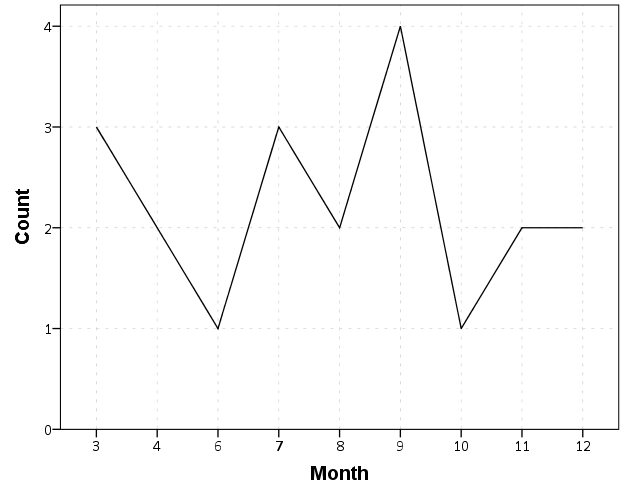
So at first glance that looks alright, but notice that the month’s do not start until 3. Also if you look close you will see a 5 is missing. What happens is that to conduct the aggregation in GGRAPH, SPSS needs to treat Month as a categorical variable – not a continuous one. SPSS only knows of the existence of categories contained in the data. (A similar thing happens in GROUP BY statements in SQL.) So SPSS just omits those categories.

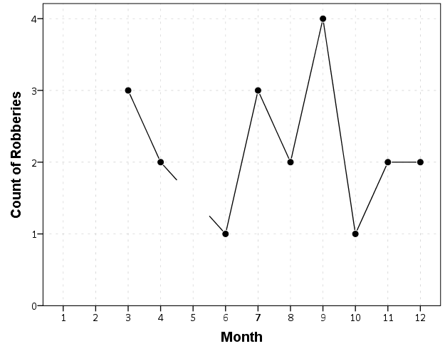
We can manually specify all of the month categories in the axis. To reinforce where the measurements come from I also plot the points on top of the line.

*Line chart with points easier to see.
GGRAPH
  /GRAPHDATASET NAME="graphdataset" VARIABLES=Month COUNT()[name="COUNT"] MISSING=LISTWISE 
    REPORTMISSING=NO
  /GRAPHSPEC SOURCE=INLINE.
BEGIN GPL
  SOURCE: s=userSource(id("graphdataset"))
  DATA: Month=col(source(s), name("Month"), unit.category())
  DATA: COUNT=col(source(s), name("COUNT"))
  GUIDE: axis(dim(1), label("Month"))
  GUIDE: axis(dim(2), label("Count of Robberies"))
  SCALE: cat(dim(1), include("1","2","3","4","5","6","7","8","9","10","11","12"))
  SCALE: linear(dim(2), include(0))
  ELEMENT: line(position(Month*COUNT), missing.wings())
  ELEMENT: point(position(Month*COUNT), color.interior(color.black), 
           color.exterior(color.white), size(size."10"))
END GPL.

So you can see that include statement with all of the month numbers. You can also see what that mysterious missing.wings() function actually does in this example. It is misleading though, as 5 isn’t missing, it is simply zero.

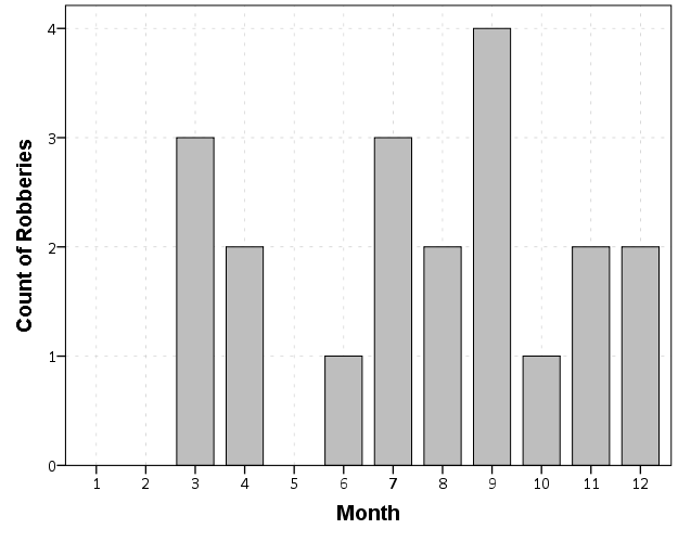
A simple workaround for this example is to just use a bar chart. A zero bar is not misleading.

GGRAPH
  /GRAPHDATASET NAME="graphdataset" VARIABLES=Month COUNT()[name="COUNT"] MISSING=LISTWISE 
    REPORTMISSING=NO
  /GRAPHSPEC SOURCE=INLINE.
BEGIN GPL
  SOURCE: s=userSource(id("graphdataset"))
  DATA: Month=col(source(s), name("Month"), unit.category())
  DATA: COUNT=col(source(s), name("COUNT"))
  GUIDE: axis(dim(1), label("Month"))
  GUIDE: axis(dim(2), label("Count of Robberies"))
  SCALE: cat(dim(1), include("1","2","3","4","5","6","7","8","9","10","11","12"))
  SCALE: linear(dim(2), include(0))
  ELEMENT: interval(position(Month*COUNT))
END GPL.

I often prefer line charts for several reasons though, often to superimpose multiple lines (e.g. I may want to put the lines for counts of crimes in 2012 and 2011 as well). Line charts are clearly superior to clustered bar charts in that situation. Also I prefer to be able to keep time is a numerical variable in the charts, and one can’t do that with aggregation in GGRAPH.

So I do the aggregation myself.

*Make a new dataset.
DATASET DECLARE AggRob.
AGGREGATE OUTFILE='AggRob'
  /BREAK = Month
  /CountRob = N.
DATASET ACTIVATE AggRob.

But we have the same problem here, in that months with zero counts are not in the data. To fill in the zeroes, I typically make a new dataset of the date ranges using INPUT PROGRAM and loops, same as I did to make the fake data at the beginning of the post.

*Make a new dataset to expand to missing months.
INPUT PROGRAM.
LOOP #i = 1 TO 12.
  COMPUTE Month = #i.
  END CASE.
END LOOP.
END FILE.
END INPUT PROGRAM.
DATASET NAME TempMonExpan.

Now we can simply merge this expanded dataset back into AggRob, and the recode the system missing values to zero.

*File merge back into AggRob.
DATASET ACTIVATE AggRob.
MATCH FILES FILE = *
  /FILE = 'TempMonExpan'
  /BY Month.
DATASET CLOSE TempMonExpan.
RECODE CountRob (SYSMIS = 0).

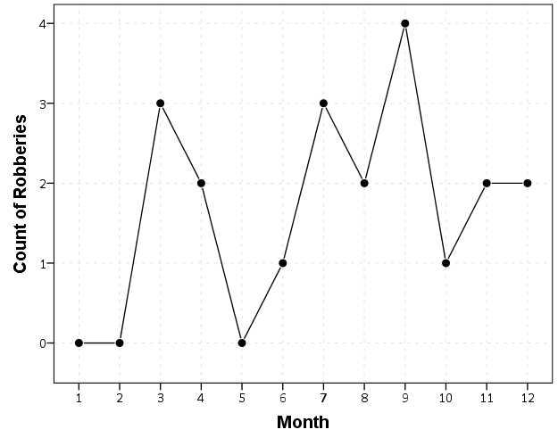
Now we can make our nice line chart with the zeros in place.

GGRAPH
  /GRAPHDATASET NAME="graphdataset" VARIABLES=Month CountRob
  /GRAPHSPEC SOURCE=INLINE.
BEGIN GPL
  SOURCE: s=userSource(id("graphdataset"))
  DATA: Month=col(source(s), name("Month"))
  DATA: CountRob=col(source(s), name("CountRob"))
  GUIDE: axis(dim(1), label("Month"), delta(1), start(1))
  GUIDE: axis(dim(2), label("Count of Robberies"), start(0))
  SCALE: linear(dim(1), min(1), max(12))
  SCALE: linear(dim(2), min(-0.5))
  ELEMENT: line(position(Month*CountRob))
  ELEMENT: point(position(Month*CountRob), color.interior(color.black), 
           color.exterior(color.white), size(size."10"))
END GPL.

To ease making these separate time series datasets I have made a set of macros, one named !TimeExpand and the other named !DateExpand. Both take a begin and end date and then make an expanded dataset of times. The difference between the two is that !TimeExpand takes a user specified step size, and !DateExpand takes a string of the types used in SPSS date time calculations. The situation in which I like to use !TimeExpand is when I do weekly aggregations from a specified start time (e.g. the weeks don’t start over at the beginning of the year). It also works for irregular times though, say if you wanted 15 minute bins. !DateExpand can take years, quarters, months, weeks, days, hours, minutes, and seconds. The end dates can also be system variables like $TIME as well. The macro can be found here, and it contains several examples within. Update: I have added a few macros that do the same thing for panel data. It just needs to take one numeric variable as the panel id, otherwise the argument for the macros are the same.

Using Google Fusion Tables to make some maps!

In the past to share interactive maps with others I’ve used BatchGeo and CartoDB. BatchGeo is super easy to geocode a few incidents, and CartoDB has a few more stylistic options (including some very cool animations). Both of these projects have a limit on the number of points you can map with the free service though. The new Google maps allows you make similar products to BatchGeo and CartoDB, in that you can upload a csv file or kml and then do some light editing of the points, and then embed an iframe in a website if you want (I wish Google Maps had a time slider like Google Earth does). Here is an example from my PhD of a few locations that one of my original models did a very poor job of predicting the amount of crime at the street midpoint or intersection.

But a few recent projects I wanted to place many more geographies on the map than these free versions allow. ArcGIS online is pretty slick in my few tests, but I am settling on Google Fusion tables for the ability to link the geographies and data tables (plus the ability to filter is very nice). Basically you can upload your data table and kml in seperate Fusion tables and then merge them to create your own polygons with associated data. Here is another example from my dissertation and embedded map below.

Basically what I do is make a set of units of analysis based on street mid-points and intersections. I then divide the city up based on the Thiessen polygons of those sets of points for the allocation of different areal measures. E.g. I can calculate the overlap of the Thiessen polygon with the area of sidewalks.

I’m using Google Fusion tables for some other projects in which I want people within the PD to be able to interactively explore the data. My main interest in these slippy maps are that you can pan and zoom – and with a static map it is hard to recreate all of the potential views a consumer of the map wants. I can typically make a nicer overview map of the forest or any general data patterns in a static map, but if I think the user of the map will want to zoom in to particular locations these interactive maps meet that challenge. Pop-ups allow for a brief digging into the data as well, but don’t allow for visualizing patterns. Fusion tables are very limited though it the styling of the geography. (All of these free versions are pretty limited, but the Fusion tables are especially restrictive for point symbology and creating choropleth classes).

Using these maps has a trade off when sharing with the PD though. They are what I would call semi-public, in that if you want others to be able to view the map you can share a link, but anyone with the link can see the map. This prevents sharing of intimate information on the map that might be possibly leaked. (For the ability to have access control to more sensitive information, e.g. a user has to sign on to a secure website, I know Bair analytics offers paid for products like that – probably some of the prior web map apps I mentioned do so as well.) I’ve made them in the past for Troy P.D., but I really have no idea how often they were used – so other analysts let me know in the comments if you’ve had success with maps like these disseminating info. within the police department.

I’m getting devilishly close to finishing my dissertation, and I will post an update and link when the draft is complete. My prospectus can be seen here, and the linked maps are part of some supplemental material I compiled. The supplemental info. should provide a little more details on what the maps are showing.

Smoothed regression plots for multi-level data

Bruce Weaver on the SPSS Nabble site pointed out that the Centre for Multilevel Modelling has added some syntax files for multilevel modelling for SPSS. I went through the tutorials (in R and Stata) a few years ago and would highly recommend them.

Somehow following the link trail I stumbled on this white paper, Visualising multilevel models; The initial analysis of data, by John Bell and figured it would be good fodder for the the blog. Bell basically shows how using smoothed regression estimates within groups is a good first step in data analysis of complicated multi-level data. I obviously agree, and previously showed how to use ellipses to the same effect. The plots in the Bell whitepaper though are very easy to replicate directly in base SPSS syntax (no extra stat modules or macros required) using just GGRAPH and inline GPL.

For illustration purposes, I will use the same data as I did to illustrate ellipses. It is the popular2.sav sample from Joop Hox’s book. So onto the SPSS code; first we will define a FILE HANDLE for where the popular2.sav data is located and open that file.

FILE HANDLE data /NAME = "!!!!!!Your Handle Here!!!!!".
GET FILE = "data\popular2.sav".
DATASET NAME popular2.

Now, writing the GGRAPH code that will follow is complicated. But we can use the GUI to help us write the most of it and them edit the pasted code to get the plot we want in the end. So, the easiest start to get the graph with the regression lines we want in the end is to navigate to the chart builder menu (Graphs -> Chart Builder), and then create a scatterplot with extrav on the x axis, popular on the y axis, and use class to color the points. The image below is a screen shot of this process, and below that is the GGRAPH code you get when you paste the syntax.

*Base plot created from GUI.
GGRAPH
  /GRAPHDATASET NAME="graphdataset" VARIABLES=extrav popular class[LEVEL=NOMINAL] MISSING=LISTWISE 
    REPORTMISSING=NO
  /GRAPHSPEC SOURCE=INLINE.
BEGIN GPL
  SOURCE: s=userSource(id("graphdataset"))
  DATA: extrav=col(source(s), name("extrav"))
  DATA: popular=col(source(s), name("popular"))
  DATA: class=col(source(s), name("class"), unit.category())
  GUIDE: axis(dim(1), label("extraversion"))
  GUIDE: axis(dim(2), label("popularity sociometric score"))
  GUIDE: legend(aesthetic(aesthetic.color.exterior), label("class ident"))
  ELEMENT: point(position(extrav*popular), color.exterior(class))
END GPL.

Now, we aren’t going to generate this chart. With 100 classes, it will be too difficult to identify any differences between classes unless a whole class is an extreme outlier. Here I am going to make several changes to generate the linear regression line of extraversion on popular within each class. To do this we will make some edits to the ELEMENT statement:

  • replace point with line
  • replace position(extrav*popular) with position(smooth.linear(extrav*popular)) – this tells SPSS to generate the linear regression line
  • replace color.exterior(class) with split(class) – the split modifier tells SPSS to generate the regression lines within each class.
  • make the regression lines semi-transparent by adding in transparency(transparency."0.7")

Extra things I did for aesthetics:

  • I added jittered points to the plot, and made them small and highly transparent (these really aren’t necessary in the plot and are slightly distracting). Note I placed the points first in the GPL code, so the regression lines are drawn on top of the points.
  • I changed the FORMATS of extrav and popular to F2.0. SPSS takes the formats for the axis in the charts from the original variables, so this prevents decimal places in the chart (and SPSS intelligently chooses to only label the axes at integer values on its own).
  • I take out the GUIDE: legend line – it is unneeded since we do not use any colors in the chart.
  • I change the x and y axis labels, e.g. GUIDE: axis(dim(1), label("Extraversion")) to be title case.

*Updated chart with smooth regression lines.
FORMATS extrav popular (F2.0).
GGRAPH
  /GRAPHDATASET NAME="graphdataset" VARIABLES=extrav popular class[LEVEL=NOMINAL] MISSING=LISTWISE 
    REPORTMISSING=NO
  /GRAPHSPEC SOURCE=INLINE.
BEGIN GPL
  SOURCE: s=userSource(id("graphdataset"))
  DATA: extrav=col(source(s), name("extrav"))
  DATA: popular=col(source(s), name("popular"))
  DATA: class=col(source(s), name("class"), unit.category())
  GUIDE: axis(dim(1), label("Extraversion"))
  GUIDE: axis(dim(2), label("Popularity Sociometric Score"))
  ELEMENT: point.jitter(position(extrav*popular), transparency.exterior(transparency."0.7"), size(size."3"))
  ELEMENT: line(position(smooth.linear(extrav*popular)), split(class), transparency(transparency."0.7"))
END GPL.

So here we can see that the slopes are mostly positive and have intercepts varying mostly between 0 and 6. The slopes are generally positive and (I would guess) around 0.25. There are a few outlier slopes, and given the class sizes do not vary much (most are around 20) we might dig into these outlier locations a bit more to see what is going on. Generally though with 100 classes it doesn’t strike me as very odd as some going against the norm, and a random effects model with varying intercepts and slopes seems reasonable, as well as the assumption that the distribution of slopes are normal. The intercept and slopes probably have a slight negative correlation, but not as much as I would have guessed with a set of scores that are so restricted in this circumstance.

Now the Bell paper has several examples of using the same type of regression lines within groups, but using loess regression estimates to assess non-linearity. This is really simple to update the above plot to incorporate this. One would simply change smooth.linear to smooth.loess. Also SPSS has the ability to estimate quadratic and cubic polynomial terms right within GPL (e.g. smooth.cubic).

Here I will suggest a slightly different chart that allows one to assess how much the linear and non-linear regression lines differ within each class. Instead of super-imposing all of the lines on one plot, I make a small multiple plot where each class gets its own panel. This allows much simpler assessment if any one class shows a clear non-linear trend.

  • Because we have 100 groups I make the plot bigger using the PAGE command. I make it about as big as can fit on my screen without having to scroll, and make it 1,200^2 pixels. (Also note when you use a PAGE: begin command you need an accompanying PAGE: end() command.
  • For the small multiples, I wrap the panels by setting COORD: rect(dim(1,2), wrap()).
  • I strip the x and y axis labels from the plot (simply delete the label options within the GUIDE statements. Space is precious – I don’t want it to be taken up with axis labels and legends.
  • For the panel label I place the label on top of the panel by setting the opposite option, GUIDE: axis(dim(3), opposite()).

WordPress in the blog post shrinks the graph to fit on the website, but if you open the graph up in a second window you can see how big it is and explore it easier.

*Checking for non-linear trends.
GGRAPH
  /GRAPHDATASET NAME="graphdataset" VARIABLES=extrav popular class[LEVEL=NOMINAL] MISSING=LISTWISE 
    REPORTMISSING=NO
  /GRAPHSPEC SOURCE=INLINE.
BEGIN GPL
  PAGE: begin(scale(1200px,1200px))
  SOURCE: s=userSource(id("graphdataset"))
  DATA: extrav=col(source(s), name("extrav"))
  DATA: popular=col(source(s), name("popular"))
  DATA: class=col(source(s), name("class"), unit.category())
  COORD: rect(dim(1,2), wrap())
  GUIDE: axis(dim(1))
  GUIDE: axis(dim(2))
  GUIDE: axis(dim(3), opposite())
  ELEMENT: line(position(smooth.linear(extrav*popular*class)), color(color.black))
  ELEMENT: line(position(smooth.loess(extrav*popular*class)), color(color.red))
  PAGE: end()
END GPL.

The graph is complicated, but with some work one can go group by group to see any deviations from the linear regression line. So here we can see that most of the non-linear loess lines are quite similar to the linear line within each class. The only one that strikes me as noteworthy is class 45.

Here there is not much data within classes (around 20 students), so we have to wary of small samples to be estimating these non-linear regression lines. You could generate errors around the linear and polynomial regression lines within GPL, but here I do not do that as it adds a bit of complexity to the plot. But, this is an excellent tool if you have many points within your groups and it can be amenable to quite a large set of panels.

Jittered scatterplots with 0-1 data

Scatterplots with discrete variables and many observations take some touches beyond the defaults to make them useful. Consider the case of a categorical outcome that can only take two values, 0 and 1. What happens when we plot this data against a continuous covariate with my default chart template in SPSS?

Oh boy, that is not helpful. Here is the fake data I made and the GGRAPH code to make said chart.

*Inverse logit - see.
*https://andrewpwheeler.wordpress.com/2013/06/25/an-example-of-using-a-macro-to-make-a-custom-data-transformation-function-in-spss/.
DEFINE !INVLOGIT (!POSITIONAL  !ENCLOSE("(",")") ) 
1/(1 + EXP(-!1))
!ENDDEFINE.

SET SEED 5.
INPUT PROGRAM.
LOOP #i = 1 TO 1000.
  COMPUTE X = RV.UNIFORM(0,1).
  DO IF X <= 0.2.
    COMPUTE YLin = -0.5 + 0.3*(X-0.1) - 4*((X-0.1)**2).
  ELSE IF X > 0.2 AND X < 0.8.
    COMPUTE YLin = 0 - 0.2*(X-0.5) + 2*((X-0.5)**2) - 4*((X-0.5)**3).
  ELSE.
      COMPUTE YLin = 3 + 3*(X - 0.9).
  END IF.
  COMPUTE #YLin = !INVLOGIT(YLin).
  COMPUTE Y = RV.BERNOULLI(#YLin).
  END CASE.
END LOOP.
END FILE.
END INPUT PROGRAM.
DATASET NAME NonLinLogit.
FORMATS Y (F1.0) X (F2.1).

*Original chart.
GGRAPH
  /GRAPHDATASET NAME="graphdataset" VARIABLES=X Y
  /GRAPHSPEC SOURCE=INLINE.
BEGIN GPL
  SOURCE: s=userSource(id("graphdataset"))
  DATA: X=col(source(s), name("X"))
  DATA: Y=col(source(s), name("Y"))
  GUIDE: axis(dim(1), label("X"))
  GUIDE: axis(dim(2), label("Y"))
  ELEMENT: point(position(X*Y))
END GPL.

So here we will do a few things to the chart to make it easier to interpret:

SPSS can jitter the points directly within GGRAPH code (see point.jitter), but here I jitter the data slightly myself a uniform amount. The extra aesthetic options for making points smaller and semi-transparent are at the end of the ELEMENT statement.

*Making a jittered chart.
COMPUTE YJitt = RV.UNIFORM(-0.04,0.04) + Y.
FORMATS Y YJitt (F1.0).
GGRAPH
  /GRAPHDATASET NAME="graphdataset" VARIABLES=X Y YJitt
  /GRAPHSPEC SOURCE=INLINE.
BEGIN GPL
  SOURCE: s=userSource(id("graphdataset"))
  DATA: X=col(source(s), name("X"))
  DATA: Y=col(source(s), name("Y"))
  DATA: YJitt=col(source(s), name("YJitt"))
  GUIDE: axis(dim(1), label("X"))
  GUIDE: axis(dim(2), label("Y"), delta(1), start(0))
  SCALE: linear(dim(2), min(-0.05), max(1.05))
  ELEMENT: point(position(X*YJitt), size(size."3"), 
           transparency.exterior(transparency."0.7"))
END GPL.

If I made the Y axis categorical I would need to use point.jitter in the inline GPL code because SPSS will always force the categories to the same spot on the axis. But since I draw the Y axis as continuous here I can do the jittering myself.

A useful tool for exploratory data analysis is to add a smoothing term to plot – a local estimate of the mean at different locations of the X-axis. No binning necessary, here is an example using loess right within the GGRAPH call. The red line is the smoother, and the blue line is the actual proportion I generated the fake data from. It does a pretty good job of identifying the discontinuity at 0.8, but the change points earlier are not visible. Loess was originally meant for continuous data, but for exploratory analysis it works just fine on the 0-1 data here. See also smooth.mean for 0-1 data.

*Now adding in a smoother term.
COMPUTE ActualFunct = !INVLOGIT(YLin).
FORMATS Y YJitt ActualFunct (F2.1).
GGRAPH
  /GRAPHDATASET NAME="graphdataset" VARIABLES=X Y YJitt ActualFunct
  /GRAPHSPEC SOURCE=INLINE.
BEGIN GPL
  SOURCE: s=userSource(id("graphdataset"))
  DATA: X=col(source(s), name("X"))
  DATA: Y=col(source(s), name("Y"))
  DATA: YJitt=col(source(s), name("YJitt"))
  DATA: ActualFunct=col(source(s), name("ActualFunct"))
  GUIDE: axis(dim(1), label("X"))
  GUIDE: axis(dim(2), label("Y"), delta(0.2), start(0))
  SCALE: linear(dim(2), min(-0.05), max(1.05))
  ELEMENT: point(position(X*YJitt), size(size."3"), 
           transparency.exterior(transparency."0.7"))
  ELEMENT: line(position(smooth.loess(X*Y, proportion(0.2))), color(color.red))
  ELEMENT: line(position(X*ActualFunct), color(color.blue))
END GPL.

SPSS’s default smoothing is alittle too smoothed for my taste, so I set the proportion of the X variable to use in estimating the mean within the position statement.

I wish SPSS had the ability to draw error bars around the smoothed means (you can draw them around the linear regression lines with quadratic or cubic polynomial terms, but not around the local estimates like smooth.loess or smooth.mean). I realize they are not well defined and rarely have coverage properties of typical regression estimators – but I rather have some idea about the error than no idea. Here is an example using the ggplot2 library in R. Of course we can work the magic right within SPSS.

BEGIN PROGRAM R.
#Grab Data
casedata <- spssdata.GetDataFromSPSS(variables=c("Y","X"))
#ggplot smoothed version
library(ggplot2)
library(splines)
MyPlot <- ggplot(aes(x = X, y = Y), data = casedata) + 
          geom_jitter(position = position_jitter(height = .04, width = 0), alpha = 0.1, size = 2) +
          stat_smooth(method="glm", family="binomial", formula = y ~ ns(x,5))
MyPlot
END PROGRAM.

To accomplish the same thing in SPSS you can estimate restricted cubic splines and then use any applicable regression procedure (e.g. LOGISTIC, GENLIN) and save the predicted values and confidence intervals. It is pretty easy to call the R code though!

I haven’t explored the automatic linear modelling, so let me know in the comments if there is a simply way right in SPSS to get explore such non-linear predictions.