Using simulations to show ROI for predictive models in python

Two resources I have been consuming lately I would highly recommend:

Keith’s perspective is nearly a 100% match to my experiences, e.g. should aim for projects that have around $1 million in expected revenue to justify a data science person/team, up front estimates should be on the low end, the easiest projects you can formulate as micro-decisions and you use a model to improve those binary decisions, etc. How to measure anything fits right into this as well, where Hubbard basically says get a prior distribution on expected outcomes, and then do simulations to see possible outcomes.

Here I am going to show an example that is very close to several of the projects I have done to show the potential increase in revenue from taking a model based approach using simulations in python.

Background

So the point in the data science project I am going to be illustrating is you have already decided to do an initial pilot model, and you have historical cases and then predicted probabilities from your model. Here I am thinking of the case of auditing some type transaction (it can be whatever you want, tax-returns, bank transactions, insurance claims, etc.). Here I am going to simulate some fake data to illustrate the later ROI estimates, but in real life you would use your own data for the business.

Here the variables I simulate are:

  • 5000 transactions, total_cases
  • a model based predicted probability, prob
  • a dollar value for the transaction, dollar
  • a historical marker whether a transaction was audited, audit
  • a historical marker whether the transaction was bad, hit

To be clear, this would be data you would normally already have for your business use case (e.g. historical transactions). To just illustrate my point I am making 100% fake data for everyone to follow along.

####################################
# Simulating data, probabilities
# and money values

from scipy.stats import norm
from scipy.stats import binom
from scipy.stats import beta
import numpy as np
import pandas as pd
from matplotlib import pyplot as plt

np.random.seed(10)
total_cases = 5000

# Beta(1,5), to generate the probs
prob = beta.rvs(1, 5, size=total_cases)

# Lognormal for the dollar values, clipped
dollar = np.exp(norm.rvs(7,2,size=total_cases)).clip(500,25000)

# Historical auditing process, all cases over 15000
audit = (dollar > 15000)*1

# Out of these, random 10% are hits
hit = binom.rvs(1, 0.10, size=total_cases)

# Putting into a dataframe
cases = pd.concat([pd.Series(dollar),pd.Series(audit),
                   pd.Series(prob), pd.Series(hit)], 
                   axis=1)
cases.columns = ['value','audit','prob', 'hit']
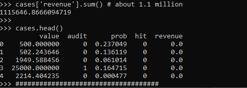
cases['revenue'] = cases['hit']*cases['value']*cases['audit']

cases['revenue'].sum() # about 1.1 million

cases.head()
####################################

These are all simulated from various probability distributions to look somewhat like real data. Probabilities and dollar values are right skewed. They are independent here, but it is ok if in your real data they are not.

Here I pretend the historical audit selection process is they automatically audit all large transactions, over $15k. And these historical audits have a 10% probability of finding a hit (think of it as fraud if you want). So the context is given our model estimates prob, how much more money do we think we can make if you use these model based decision as opposed to our simple threshold that is the current process?

Revenue Simulations

So here for my revenue simulations, what I am going to do is pretend I can audit the same number of cases (471), based on my model estimates, audit_total.

audit_total = audit.sum() #pretend we get to model the same
                          #number of cases
cases['model_expected'] = cases['prob']*cases['value']
cases['model_rank'] = cases['model_expected'].rank(method='first', ascending=False)
cases['model_audit'] = 1*(cases['model_rank'] >= audit_total)

# Expected revenue from our model based approach
(cases['model_audit']*cases['model_expected']).sum()
# About 1.3 million

So if our model is well calibrated, we can take those predicted probabilities and estimate what we think should happen if we used our model to audit 471 cases. Here we think we would make around 1.3 million, so about a lift of over $200k.

But, these models are probabilistic estimates. So I like to use simulations to hedge a bit when I am presenting to the business. Here I do 5000 simulations where I select my 471 cases, use a binomial random number generator to flip the coin whether the case results in a hit or not, and then calculate the total revenue.

# Simulating binomial process, seeing what the revenue is
cases_audit = cases[cases['model_audit'] == 1].copy()
rev_sim = [] #doing 5000 simulations
for i in range(5000):
    hit_sim = binom.rvs(1, cases_audit['prob'])
    sim_outs = hit_sim * cases_audit['value']
    rev_sim.append( (sim_outs.sum(), hit_sim.mean()) )

rev_sim = pd.DataFrame(rev_sim, columns=['RevSim','HitRateSim'])

We can then turn this into a nice graph of simulated potential outcomes. In our model approach, on average we would expect to make $1.3 million (versus the actual revenue of $1.1 million), but we have variance around that estimate:

# making a nice graph
actual_rev = cases['revenue'].sum()/1000000
ax = (rev_sim['RevSim']/1000000).hist(bins=100, alpha=0.8, color='grey')
ax.grid(False)
ax.axvline(actual_rev, color='r', linewidth=3)
ax.set_xlabel('Audit Revenue in $1,000,000')
plt.text(actual_rev + 0.008, 150, 'Actual Revenue', color='r')
plt.title('Simulated Revenue when using Model')
plt.show()

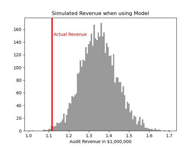
So you can see on a very few occasions we make less than the revenue under the current strategy of audit all large cases. But in just as many circumstances we are making over $400k in additional profit.

You may ask why 5000 simulations instead of more or less? Well these are small enough I can easily do them quickly, so I could up the simulations to a higher value if I wanted. Long story short, if you look at the histogram of outcomes and it is still quite bumpy, you should probably do more simulations. Here 5000 is plenty, although 1000 was clearly more bumpy.

If you don’t want to present the histogram, or have more complicated scenarios and prefer a table laying those scenarios out, you can pull out simulated confidence intervals of the additional revenue outcomes:

# If you want to put a confidence interval on it
# Per 1000 dollars
diff = (rev_sim['RevSim'] - cases['revenue'].sum())/1000
diff.describe()

# 95% confidence interval
diff.quantile([0.025,0.975])

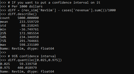
One of the benefits of having a model, even if the revenue is not increased, is that you can generate estimates for other types of interventions. In the auditing case, you can potentially justify more auditors (e.g. we can hire more people to investigate 400 more cases and still expect to make a profit). (Here I have a related criminal justice example for bail decisions.) Or you can apply the models as a potential sales pitch to a new client. E.g. if you hire us to do these audits, given your data and our model, we think we can make the $X dollars.

Model based approaches also allow you to meet more constraints, such as increasing the hit rate, or meeting fairness constraints. Here in this simulation if we use a model based approach, the hit rate goes up to around 15% as opposed to 10%. Which may be worth it for your investigators or clients depending on the situation.

Fitting a pytorch model

Out of the box when fitting pytorch models we typically run through a manual loop. So typically something like this:

# Example fitting a pytorch model
# mod is the pytorch model object
opt = torch.optim.Adam(mod.parameters(), lr=1e-4)
crit = torch.nn.MSELoss(reduction='mean')
for t in range(20000):
    opt.zero_grad()
    y_pred = mod(x)   #x is tensor of independent vars
    loss = crit(y_pred,y) #y is tensor of outcomes
    loss.backward()
    opt.step()

And this would use backpropogation to adjust our model parameters to minimize the loss function, here just the mean square error, over 20,000 iterations. Best practices are to both evaluate the loss in-sample and wait for it to flatten out, as well as evaluate out of sample.

I recently wrote some example code to make this process somewhat more like the sklearn approach, where you instantiate an initial model object, and then use a mod.fit(X, y) function call to fit the pytorch model. For an example use case I will just use a prior Compas recidivism data I have used for past examples on the blog (see ROC/Calibration plots, and Balancing False Positives). Here is the prepped CSV file to download to follow along.

So first, I load the libraries and then prep the recidivism data before I fit my predictive models.

###############################################
# Front end libraries/data prep

import pandas as pd
import numpy as np
import matplotlib.pyplot as plt
import torch

# Setting seeds
torch.manual_seed(10)
np.random.seed(10)

# Prepping the Compas data and making train/test
recid = pd.read_csv('PreppedCompas.csv')

#Preparing the variables I want
recid_prep = recid[['Recid30','CompScore.1','CompScore.2','CompScore.3',
                    'juv_fel_count','YearsScreening']].copy()
recid_prep['Male'] = 1*(recid['sex'] == "Male")
recid_prep['Fel'] = 1*(recid['c_charge_degree'] == "F")
recid_prep['Mis'] = 1*(recid['c_charge_degree'] == "M")
dum_race = pd.get_dummies(recid['race'])

# White for reference category
for d in list(dum_race):
    if d != 'Caucasion':
        recid_prep[d] = dum_race[d]

# reference category is separated/unknown/widowed
dum_mar = pd.get_dummies(recid['marital_status'])
recid_prep['Single'] = dum_mar['Single']
recid_prep['Married'] = dum_mar['Married'] + dum_mar['Significant Other']

#Now generating train and test set
recid_prep['Train'] = np.random.binomial(1,0.75,len(recid_prep))
recid_train = recid_prep[recid_prep['Train'] == 1].copy()
recid_test = recid_prep[recid_prep['Train'] == 0].copy()

#Independant variables
ind_vars = ['CompScore.1','CompScore.2','CompScore.3',
            'juv_fel_count','YearsScreening','Male','Fel','Mis',
            'African-American','Asian','Hispanic','Native American','Other',
            'Single','Married']

# Dependent variable
y_var = 'Recid30'
###############################################

Now next part is more detailed, but it is the main point of the post. Typically we will make a pytorch model object something like this. Here I have various switches, such as the activation function (tanh or relu or pass in your own function), or the final function to limit predictions to 0/1 (either sigmoid or clamp or again pass in your own function).

# Initial pytorch model class
class logit_pytorch(torch.nn.Module):
    def __init__(self, nvars, device, activate='relu', bias=True,
                 final='sigmoid'):
        """
        Construct parameters for the coefficients 
        activate - either string ('relu' or 'tanh', 
                   or pass in your own torch function
        bias - whether to include bias (intercept) in model
        final - use either 'sigmoid' to squash to probs, or 'clamp'
                or pass in your own torch function
        device - torch device to construct the tensors
                 default cuda:0 if available
        """
        super(logit_pytorch, self).__init__()
        # Creating the coefficient parameters
        self.coef = torch.nn.Parameter(torch.rand((nvars,1),
                    device=device)/10)
        # If no bias it is 0
        if bias:
            self.bias = torch.nn.Parameter(torch.zeros(1,
                    device=device))
        else:
            self.bias = torch.zeros(1, device=device)
        # Various activation functions
        if activate == 'relu':
            self.trans = torch.nn.ReLU()
        elif activate == 'tanh':
            self.trans = torch.nn.Tanh()
        else:
            self.trans = activate
        if final == 'sigmoid':
            self.final = torch.nn.Sigmoid()
        elif final == 'clamp':
            # Defining my own clamp function
            def tclamp(input):
                return torch.clamp(input,min=0,max=1)
            self.final = tclamp
        else: 
            # Can pass in your own function
            self.final = final
    def forward(self, x):
        """
        predicted probability
        """
        output = self.bias + torch.mm(x, self.trans(self.coef))
        return self.final(output)

To use this though again we need to specify the number of coefficients to create, and then do a bunch of extras like the optimizer, and stepping through the function (like described at the beginning of the post). So here I have created a second class that behaves more like sklearn objects. I create the empty object, and only when I pass in data to the .fit() method it spins up the actual pytorch model with all its tensors of the correct dimensions.

# Creating a class to instantiate model to data and then fit
class pytorchLogit():
    def __init__(self, loss='logit', iters=25001, 
                 activate='relu', bias=True, 
                 final='sigmoid', device='gpu',
                 printn=1000):
        """
        loss - either string 'logit' or 'brier' or own pytorch function
        iters - number of iterations to fit (default 25000)
        activate - either string ('relu' or 'tanh', 
                   or pass in your own torch function
        bias - whether to include bias (intercept) in model
        final - use either 'sigmoid' to squash to probs, or 'clamp'
                or pass in your own torch function. Should not use clamp
                with default logit loss
        opt - ?optimizer? should add an option for this
        device - torch device to construct the tensors
                 default cuda:0 if available
        printn - how often to check the fit (default 1000 iters)
        """
        super(pytorchLogit, self).__init__()
        if loss == 'logit':
            self.loss = torch.nn.BCELoss()
            self.loss_name = 'logit'
        elif loss == 'brier':
            self.loss = torch.nn.MSELoss(reduction='mean')
            self.loss_name = 'brier'
        else:
            self.loss = loss
            self.loss_name = 'user defined function'
        # Setting the torch device
        if device == 'gpu':
            try:
                self.device = torch.device("cuda:0")
                print(f'Torch device GPU defaults to cuda:0')
            except:
                print('Unsuccessful setting to GPU, defaulting to CPU')
                self.device = torch.device("cpu")
        elif device == 'cpu':
            self.device = torch.device("cpu")
        else:
            self.device = device #can pass in whatever
        self.iters = iters
        self.mod = None
        self.activate = activate
        self.bias = bias
        self.final = final
        self.printn = printn
        # Other stats to carry forward
        self.loss_metrics = []
        self.epoch = 0
    def fit(self, X, y, outX=None, outY=None):
        x_ten = torch.tensor(X.to_numpy(), dtype=torch.float,
                             device=self.device)
        y_ten = torch.tensor(pd.DataFrame(y).to_numpy(), dtype=torch.float,
                             device=self.device)
        # Only needed if you pass in an out of sample to check as well
        if outX is not None:
            x_out_ten = torch.tensor(outX.to_numpy(), dtype=torch.float,
                             device=self.device)
            y_out_ten = torch.tensor(pd.DataFrame(outY).to_numpy(), dtype=torch.float,
                             device=self.device)
        self.epoch += 1
        # If mod is not already created, create a new one, else update prior
        if self.mod is None:
            loc_mod = logit_pytorch(nvars=X.shape[1], activate=self.activate, 
                                    bias=self.bias, final=self.final, 
                                    device=self.device)
            self.mod = loc_mod
        else:
            loc_mod = self.mod
        opt = torch.optim.Adam(loc_mod.parameters(), lr=1e-4)
        crit = self.loss
        for t in range(self.iters):
            opt.zero_grad()
            y_pred = loc_mod(x_ten)
            loss = crit(y_pred,y_ten)
            if t % self.printn == 0:
                if outX is not None:
                    pred_os = loc_mod(x_out_ten)
                    loss_os = crit(pred_os,y_out_ten)
                    res_tup = (self.epoch, t, loss.item(), loss_os.item())
                    print(f'{t}: insample {res_tup[2]:.4f}, outsample {res_tup[3]:.4f}')
                else:
                    res_tup = (self.epoch, t, loss.item(), None)
                    print(f'{t}: insample {res_tup[2]:.5f}')
                self.loss_metrics.append(res_tup)
            loss.backward()
            opt.step()
    def predict_proba(self, X):
        x_ten = torch.tensor(X.to_numpy(), dtype=torch.float,
                             device=self.device)
        res = self.mod(x_ten)
        pp = res.cpu().detach().numpy()
        return np.concatenate((1-pp,pp), axis=1)
    def loss_stats(self, plot=True, select=0):
        pd_stats = pd.DataFrame(self.loss_metrics, columns=['epoch','iteration',
                                                            'insamploss','outsamploss'])
        if plot:
            pd_stats2 = pd_stats.rename(columns={'insamploss':'In Sample Loss', 'outsamploss':'Out of Sample Loss'})
            pd_stats2 = pd_stats2[pd_stats2['iteration'] > select].copy()
            ax = pd_stats2[['iteration','In Sample Loss','Out of Sample Loss']].plot.line(x='iteration', 
                            ylabel=f'{self.loss_name} loss')
            plt.show()
        return pd_stats

Again it allows you to pass in various extras, which here are just illustrations for binary predictions (like the loss function as the Brier score or the more typical log-loss). It also allows you to evaluate the fit for just in-sample, or for out of sample data as well. It also allows you to specify the number of iterations to fit.

So now that we have all that work done, here as some simple examples of its use.

# Creating a model and fitting
mod = pytorchLogit()
mod.fit(recid_train[ind_vars], recid_train[y_var])

So you can see that this is very similar now to sklearn functions. It will print at the console fit statistics over the iterations:

So it defaults to 25k iterations, and you can see that it settles down much before that. I created a predict_proba function, same as most sklearn model objects for binary predictions:

# Predictions out of sample
predprobs = mod.predict_proba(recid_test[ind_vars])
predprobs # 1st column is probability 0, 2nd prob 1

And this returns a numpy array (not a pytorch tensor). Although you could modify to return a pytorch tensor if you wanted it to (or give an option to specify which).

Here is an example of evaluating out of sample fit as well, in addition to specifying a few more of the options.

# Evaluating predictions out of sample, more iterations
mod2 = pytorchLogit(activate='tanh', iters=40001, printn=100)
mod2.fit(recid_train[ind_vars], recid_train[y_var], recid_test[ind_vars], recid_test[y_var])

I also have an object function, .loss_stats(), which gives a nice graph of in-sample vs out-of-sample loss metrics.

# Making a nice graph
dp = mod2.loss_stats()

We can also select the loss function to only show later iterations, so it is easier to zoom into the behavior.

# Checking out further along
mod2.loss_stats(select=10000)

And finally like I said you could modify some of your own functions here. So instead of any activation function I pass in the identity function – so this turns the model into something very similar to a vanilla logistic regression.

# Inserting in your own activation (here identity function)
def ident(input):
    return input

mod3 = pytorchLogit(activate=ident, iters=40001, printn=2000)
mod3.fit(recid_train[ind_vars], recid_train[y_var], recid_test[ind_vars], recid_test[y_var])

And then if you want to access the coefficients weights, it is just going down the rabbit hole to the pytorch object:

# Can get the coefficients/intercept
print( mod3.mod.coef )
print( mod3.mod.bias )

This type of model can of course be extended however you want, but modifying the pytorchLogit() and logit_pytorch class objects to specify however detailed switches you want. E.g. you could specify adding in hidden layers.

One thing I am not 100% sure the best way to accomplish is loss functions that take more parameters, as well as the best way to set up the optimizer. Maybe use *kwargs for the loss function. So for my use cases I have stuffed extra objects into the initial class, so they are there later if I need them.

Also here I would need to think more about how to save the model to disk. The model is simple enough I could dump the tensors to numpy, and on loading re-do them as pytorch tensors.

ROC and calibration plots for binary predictions in python

When doing binary prediction models, there are really two plots I want to see. One is the ROC curve (and associated area under the curve stat), and the other is a calibration plot. I have written a few helper functions to make these plots for multiple models and multiple subgroups, so figured I would share, binary plots python code. To illustrate their use, I will use the same Compas recidivism data I have used in the past, (CSV file here). So once you have downloaded those two files you can follow along with my subsequent code.

Front Prep

First, I have downloaded the binary_plots.py file and the PreppedCompas.csv file to a particular folder on my machine, D:\Dropbox\Dropbox\Documents\BLOG\binary_plots. To import these functions, I append that path using sys, and change the working directory using os. The other packages are what I will be using the fit the models.

###############################################
# Front end prep

import pandas as pd
import numpy as np
from xgboost import XGBClassifier
from sklearn.ensemble import RandomForestClassifier
from sklearn.linear_model import LogisticRegression

import os
import sys

my_dir = r'D:\Dropbox\Dropbox\Documents\BLOG\binary_plots'
os.chdir(my_dir)

# Can append to path
sys.path.append(my_dir)
import binary_plots

np.random.seed(10) #setting the seed for the random
# split for train/test
###############################################

Next up I prepare the data, this is just boring stuff turning categorical variables into various dummies and making a train/test split for the data (which can be done in a variety of ways).

###############################################
# Prepping Compas Data

#For notes on data source, check out 
#https://github.com/apwheele/ResearchDesign/tree/master/Week11_MachineLearning
recid = pd.read_csv('PreppedCompas.csv')

#Preparing the variables I want
recid_prep = recid[['Recid30','CompScore.1','CompScore.2','CompScore.3',
                    'juv_fel_count','YearsScreening']].copy()
recid_prep['Male'] = 1*(recid['sex'] == "Male")
recid_prep['Fel'] = 1*(recid['c_charge_degree'] == "F")
recid_prep['Mis'] = 1*(recid['c_charge_degree'] == "M")

print( recid['race'].value_counts() )
dum_race = pd.get_dummies(recid['race'])
# White for reference category
for d in list(dum_race):
    if d != 'Caucasion':
        recid_prep[d] = dum_race[d]

print( recid['marital_status'].value_counts() )
dum_mar = pd.get_dummies(recid['marital_status'])
recid_prep['Single'] = dum_mar['Single']
recid_prep['Married'] = dum_mar['Married'] + dum_mar['Significant Other']
# reference category is separated/unknown/widowed

#Now generating train and test set
recid_prep['Train'] = np.random.binomial(1,0.75,len(recid_prep))
recid_train = recid_prep[recid_prep['Train'] == 1].copy()
recid_test = recid_prep[recid_prep['Train'] == 0].copy()

#Independant variables
ind_vars = ['CompScore.1','CompScore.2','CompScore.3',
            'juv_fel_count','YearsScreening','Male','Fel','Mis',
            'African-American','Asian','Hispanic','Native American','Other',
            'Single','Married']

# Dependent variable
y_var = 'Recid30'
###############################################

Next, the sklearn library makes it quite easy to fit a set of multiple models. Most of the time I start with XGBoost, random forests, and a normal logistic model with no coefficient penalty. I just stuff the base model object in a dictionary, pipe in the same training data, and fit the models. Then I can add in the predicted probabilities from each model into the test dataset. (These plots I show you should only show on the test dataset, of course the data will be calibrated on the training dataset.)

###############################################
# Training three different models, Logit,
# Random Forest, and XGBoost

final_models = {}
final_models['XGB'] = XGBClassifier(n_estimators=100, max_depth=5)
final_models['RF'] = RandomForestClassifier(n_estimators=1000, max_depth=10, min_samples_split=50)
final_models['Logit'] = LogisticRegression(penalty='none', solver='newton-cg')

# Iterating over each model and fitting on train
for nm, mod in final_models.items():
    mod.fit(recid_train[ind_vars], recid_train[y_var])

# Adding predicted probabilities back into test dataset
for nm, mod in final_models.items():
    # Predicted probs out of sample
    recid_test[nm] =  mod.predict_proba(recid_test[ind_vars])[:,1]
###############################################

This is fairly tiny data, so I don’t need to worry about how long this takes or run out of memory. I’d note you can do the same model, but different hyperparameters in this approach. Such as tinkering with the depth for tree based models is one I by default limit quite a bit.

AUC Plots

First, my goto metric to see the utility of a particular binary prediction model is the AUC stat. This has one interpretation in terms of the concordance stat, an AUC of 0.7 means if you randomly picked a 0 case and a 1 case, the 1 case would have a higher value 70% of the time. So AUC is all about how well your prediction discriminates between the two classes.

So with my binary_plots function, you can generate an ROC curve for the test data for a single column of predictions as so:

# A single column
binary_plots.auc_plot(recid_test, y_var, ['Logit'], save_plot='AUC1.png')

As I have generated predictions for multiple models, I have also generated a similar graph, but stuff the AUC stats in the matplotlib legend:

# Multiple columns to show different models
pred_prob_cols = list(final_models.keys()) #variable names
binary_plots.auc_plot(recid_test, y_var, pred_prob_cols, save_plot='AUC2.png')

It is also the case you want to do these plots for different subgroups of data. In recidivism research, we are often interested in sex and racial breakdowns. Here is the Logit model AUC broken down by Males (1) and Females (0).

# By subgroups in the data
binary_plots.auc_plot_long(recid_test, y_var, 'Logit', group='Male', save_plot='AUC3.png')

So this pulls the labels from the data, but you can pass in strings to get nicer labels. And finally, I show how to put both of these together, both by models and by subgroups in the data. Subgroups are different panels, and you can pass in a fontsize moniker to make the legends smaller for each subplot, and a size for each subplot (they are squares).

# Lets make nicer variable names for Male/Females and Racial Groups
recid_test['Sex'] = recid_test['Male'].replace({0: 'Female', 1:'Male'})
recid_test['Race'] = recid[recid_prep['Train'] == 0]['race']
recid_test['Race'] = recid_test['Race'].replace({'Hispanic': 'Other', 'Asian':'Other', 'Native American':'Other', 'African-American':'Black', 'Caucasian':'White'})

# Now can do AUC plot by gender and model type
binary_plots.auc_plot_wide_group(recid_test, y_var, pred_prob_cols, 'Sex', size=4, leg_size='x-small', save_plot='AUC4.png')

The plots have a wrap function (default wrap at 3 columns), so you can plot as many subgroups as you want. Here is an example combing the sex and race categories:

One limitation to note in these plots, ROC plots are normalized in a way that the thresholds for each subgroup may not be at the same area of the plot (e.g. a FPR of 0.1 for one subgroup implies a predicted probability of 30%, whereas for another subgroup it implies a predicted probability of 40%).

ROC/AUC is definitely not a perfect stat, most of the time we are only interested in the far left hand side of the ROC curve (how well we can identify high risk cases without a ton of false positives). That is why I think drawing the curves are important – one model may have a higher AUC, but it is in an area of the curve not relevant for how you will use the predictions in practice. (For tree based models with limited depth and limited variables, it can produce flat areas in the ROC curve for example.)

But I find the ROC curve/AUC metric the most useful default for both absolute comparisons (how well is this model doing overall), as well as relative model comparisons (is Model A better than Model B).

Most models I work with I can get an AUC of 0.7 without much work, and once I get an AUC of 0.9 I am in the clearly diminishing returns category to tinkering with my model (this is true for both criminology related models I work with, as well as healthcare related models in my new job).

This is of course data dependent, and even an AUC of 0.9 is not necessarily good enough to use in practice (you need to do a cost-benefit type analysis given how you will use the predictions to figure that out).

Calibration Charts

For those with a stat background, these calibration charts I show are a graphical equivalent of the Hosmer-Lemeshow test. I don’t bother conducting the Chi-square test, but visually I find them informative to not only see if an individual model is calibrated, but also to see the range of the predictions (my experience XGBoost will be more aggressive in the range of predicted probabilities, but is not always well calibrated).

So we have the same three types of set ups as with the ROC plots, a single predicted model:

# For single model
binary_plots.cal_data('XGB', y_var, recid_test, bins=60, plot=True, save_plot='Cal1.png')

For multiple models, I always do these on separate subplots, they would be too busy to superimpose. And because it is a single legend, I just build the data and use seaborn to do a nice small multiple. (All of these functions return the dataframe I use to build the final plot in long format.) The original plot was slightly noisy with 60 bins, so I reduce it to 30 bins here, but it is still slightly noisy (but each model is pretty well calibrated). XGBoost has a wider range of probabilities, random forests lowest bin is around 0.1 and max is below 0.8. Logit has lower probabilities but none above 0.8.

# For multiple models
binary_plots.cal_data_wide(pred_prob_cols, y_var, recid_test, bins=30, plot=True, save_plot='Cal2.png')

For a single model, but by subgroups in the data. The smaller other race group is more noisy, but again each model appears to be approximately calibrated.

# For subgroups and one model
binary_plots.cal_data_group('XGB', y_var, 'Race', recid_test, bins=20, plot=True, save_plot='Cal3.png')

And a combo of subgroup data and multiple models. Again the smaller subgroup Females appear more noisy, but all three models appear to be doing OK in this quick example.

# For subgroups and multiple models
binary_plots.cal_data_wide_group(pred_prob_cols, y_var, 'Sex', recid_test, bins=20, plot=True, save_plot='Cal4.png')

Sometimes people don’t bin the data (Peter Austin likes to do a smoothed plot), but I find the binned data easier to follow and identify deviations above/below predicted probabilities. In real life you often have some fallout/dropoff if there is feedback between the model and how other people respond to the model (e.g. the observed is always 5% below the predicted).

Some ACS download helpers and Research Software Papers

The blog has been a bit sparse recently, as moving has been kicking my butt (hanging up curtains and recycling 100 boxes today!). So just a few quick notes.

Downloading ACS Data

First, I have posted some helper functions to work with American Community Survey data (ACS) in python. For a quick overview, if you import/define those functions, here is a quick example of downloading the 2019 Texas micro level files (for census tracts and block groups) from the census FTP site. Can pipe in another year (if available) and and whatever state into the function.

# Python code to download American Community Survey data
base = r'??????' #put your path here where you want to download data
temp = os.path.join(base,'2019_5yr_Summary_FileTemplates')
data = os.path.join(base,'tables')

get_acs5yr(2019,'Texas',base)

Some locations have census tract data to download, I think the FTP site is the only place to download block group data though. And then based on those files you downloaded, you can then grab the variables you want, and here I show selecting out the block groups from those fields:

interest = ['B03001_001','B02001_005','B07001_017','B99072_001','B99072_007',
            'B11003_016','B11003_013','B14006_002','B01001_003','B23025_005',
            'B22010_002','B16002_004','GEOID','NAME']
labs, comp_tabs = merge_tabs(interest,temp,data)
bg = comp_tabs['NAME'].str.find('Block Group') == 0

Then based on that data, I have an additional helper function to calculate proportions given two lists of the numerators and denominators that you want:

top = ['B17010_002',['B11003_016','B11003_013'],'B08141_002']
bot = ['B17010_001',        'B11002_001'       ,'B08141_001']
nam = ['PovertyFamily','SingleHeadwithKids','NoCarWorkers']
prep_sdh = prop_prep(bg, top, bot, nam)

So here to do Single Headed Households with kids, you need to add in two fields for the numerator ['B11003_016','B11003_013']. I actually initially did this example with census tract data, so not sure if all of these fields are available at the block group level.

I have been doing some work on demographics looking at the social determinants of health (see SVI data download, definitions), hence the work with census data. I have posted my prior example fields I use from the census, but criminologists may just use the social-vulnerability-index from the CDC – it is essentially the same as how people typically define social disorganization.

Peer Review for Criminology Software

Second, jumping the gun a bit on this, but in the works is an overlay journal for CrimRxiv. Part of the contributions we will accept are software contributions, e.g. if you write an R package to do some type of analysis function common in criminology.

It is still in the works, but we have some details up currently and a template for submission (I need to work on a markdown template, currently just a word doc). High level I wanted something like the Journal of Statistical Software or the Journal of Open Source Software (I do not think the level of detail of JSS is necessary, but wanted an example use case, which JoSS does not have).

Just get in touch if you have questions whether your work is on topic. Aim is to be more open to contributions at first. Really excited about this, as publicly sharing code is currently a thankless prospect. Having a peer reviewed venue for such code contributions for criminologists fills a very important role that traditional journals do not.

Future Posts?

Hopefully can steal some time to continue writing posts here and there, but will definitely be busy getting the house in order in the next month. Hoping to do some work on mapping grids and KDE in python/geopandas, and writing about the relationship between healthcare data and police incident report data are two topics I hope to get some time to work on in the near future for the blog.

If folks have requests for particular topics on the blog though feel free to let me know in the comments or via email!

Using Random Forests in ArcPro to forecast hot spots

So awhile back had a request about how to use the random forest tool in ArcPro for crime prediction. So here I will show how to set up the data in a way to basically replicate how I used random forests in this paper, Mapping the Risk Terrain for Crime using Machine Learning. ArcPro is actually pretty nice to replicate how I set it up in that paper to do the models, but I will discuss some limitations at the end.

I am not sharing the whole project, but the data I use you can download from a prior post of mine, RTM Deep Learning style. So here is my initial data set up based on the spreadsheets in that post. So for original data I have crimes aggregated to street units in DC Prepped_Crime.csv (street units are midpoints in street blocks and intersections), and then point dataset tables of alcohol outlet locations AlcLocs.csv, Metro entrances MetroLocs.csv, and 311 calls for service Calls311.csv.

I then turn those original csv files into several spatial layers, via the display XY coordinates tool (these are all projected data FYI). On top of that you can see I have two different kernel density estimates – one for 311 calls for service, and another for the alcohol outlets. So the map is a bit busy, but above is the basic set of information I am working with.

For the crimes, these are the units of analysis I want to predict. Note that this vector layer includes spatial units of analysis even with 0 crimes – this is important for the final model to make sense. So here is a snapshot of the attribute table for my street units file.

Here we are going to predict the Viol_2011 field based on other information, both other fields included in this street units table, as well as the other point/kernel density layers. So while I imagine that ArcPro can predict for raster layers as well, I believe it will be easier for most crime analysts to work with vector data (even if it is a regular grid).

Next, in the Analysis tab at the top click the Tools toolbox icon, and you get a bar on the right to search for different tools. Type in random forest – several different tools come up (they just have slightly different GUI’s) – the one I showcase here is the Spatial Stats tools one.

So this next screenshot shows filling in the data to build a random forest model to predict crimes.

  1. in the input training features, put your vector layer for the spatial units you want to predict. Here mine is named Prepped_Crime_XYTableToPoint.
  2. Select the variable to predict, Viol_2011. The options are columns in the input training features layer.
  3. Explanatory Training Variables are additional columns in your vector layer. Here I include the XY locations, whether a street unit is an intersection, and then several different area variables. These variables are all calculated outside of this procedure.

Note for the predictions, if you just have 0/1 data, you can change the variable to predict as categorical. But later on in determining hotspots you will want to use the predicted probability from that output, not the binary final threshold.

For explanatory variables, here it is ok to use the XY coordinates, since I am predicting for the same XY locations in the future. If I fit a model for Dallas, and then wanted to make predictions for Austin, the XY inputs would not make sense. Finally it is OK to also include other crime variables in the predictions, but they should be lagged in time. E.g. I could use crimes in 2010 (either violent/property) to predict violent crimes in 2011. This dataset has crimes in 2012, and we will use that to validate our predictions in the end.

Then we can also include traditional RTM style distance and kernel density inputs as well into the predictions. So we then include in the training distance features section our point datasets (MetroLocs and AlcLocs), and in our training rasters section we include our two kernel density estimates (KDE_311 calls and KernelD_AlcL1 is the kernel density for alcohol outlets).

Going onto the next section of filling out the random forest tool, I set the output for a layer named PredCrime_Test2, and also save a table for the variable importance scores, called VarImport2. The only other default I change is upping the total number of trees, and click on Calculate Uncertainty at the bottom.

My experience with Random Forests, for binary classification problems, it is a good idea to set the minimum leaf size to say 50~100, and the depth of the trees to 5~10. But for regression problems, regulating the trees is not necessarily as big of a deal.

Click run, and then even with 1000 trees this takes less than a minute. I do get some errors about missing data (should not have done the kernel density masked to the DC boundary, but buffered the boundary slightly I think). But in the end you get a new layer, here it is named PredCrime_Test2. The default symbology for the residuals is not helpful, so here I changed it to proportional circles to the predicted new value.

So you would prioritize your hotspots based on these predicted high crime areas, which you can see in the screenshot are close to the historical ranks but not a 100% overlap. Also this provides a potentially bumpy (but mostly smoothed) set of predicted values.

Next what I did was a table join, so I could see the predicted values against the future 2012 violent crime data. This is just a snap shot, but see this blog post about different metrics you can use to evaluate how well the predictions do.

Finally, we saved the variable importance table. I am not a big fan of these, these metrics are quite volatile in my experience. So this shows the sidewalk area and kernel density for 311 calls are the top two, and the metro locations distance and intersection are at the bottom of variable importance.

But these I don’t think are very helpful in the end (even if they were not volatile). For example even if 311 calls for service are a good predictor, you can have a hot spot without a large number of 311 calls nearby (so other factors can combine to make hotspots have different factors that contribute to them being high risk). So I show in my paper linked at the beginning how to make reduced form summaries for hot spots using shapely values. It is not possible using the ArcPro toolbox (but I imagine if you bugged ESRI enough they would add this feature!).

This example is for long term crime forecasting, not for short term. You could do random forests for short term, such as predicting next week based on several of the prior weeks data. This would be more challenging to automate though in ArcPro environment I believe than just scripting it in R or python IMO. I prefer the long term forecasts though anyway for problem oriented strategies.

The value of a PhD

For my current work as a data scientist, I spend most of my time writing SQL queries, generating some sort of predictive model on that data using python, and automating those data pipelines using additional command line scripts. Pretty much nothing coding wise I do on a day to day basis I learned in my entire educational career.

The only specific coding classes I took in school were SAS in undergrad and SPSS in grad. All other coding was in Stata and a very tiny bit in R, both incidental to statistical classes. Even those should hardly count, as all it entails is load a dataset and run reg y x or something similar.

That focuses on the software engineering side – the other side of being a data scientist is essentially being an applied mathematician. That may sound fancy, but the work I do I like to think is more akin to accounting with probabilities (where I have to personally create models to estimate the probabilities). While I had extensive quantitative training in graduate school, again nothing I was taught even remotely resembles the mathematics I use on a regular basis at my job.

My social science education entirely focused on causal inference, estimating parameters on the right hand side of the regression equation. I did not cover prediction/forecasting/machine-learning one iota in my classes. I did not even have any classes on cost-benefit analysis, which is more akin to me calculating potential return on investment when I am creating new machine learning models for my company.

The only thing I do regularly at my job you could reasonably point to specific educational training/prep on was presenting results in PowerPoint presentations.

That being said, no way I would be in my current position if I did not have a PhD. For a potential counter-factual, I debated on dropping out of undergrad at one point and going to community college to install HVAC systems. I feel pretty comfortable assuming I would not have ended up as a data scientist if I took that career path. (Before you think to poo-poo on that career path choice, it is easily possible my personal net worth would be in the same ballpark at this point in my life in that counter-factual installing HVAC world. There are significant opportunity costs you are eating when you pursue a PhD.)

So what exactly was the value of my PhD? While you take some classes as a PhD student, I don’t see the main benefit of those as being vocational in nature. When pursuing a PhD it is a full time endeavor, and it is the entire environment that marks it as a major difference from undergraduate education. Pretty much every conversation you have as a PhD student is focused on science.

A second major difference is that you are not a passive consumer of scientific research – you have bridged to becoming a producer of that knowledge. A PhD dissertation by its nature is very sink or swim – you are expected to come up with a particular research topic/agenda, and conduct the appropriate analysis to investigate that particular topic, then share your results with the world. This is very different than working in a job where someone tells you what to do – you show up in the morning and you have 100% latitude to pursue whatever you want.

These two things together I believe are where the value lies in a PhD. The independence necessary to be a successful in a PhD is by its nature not something you can get via prior work experience (unless you count say starting your own business). This coupled with the scientific environment provides an atmosphere where constant learning is necessary to get to the finish line of the dissertation. Even if I still was an academic, it is always necessary for me to consume new material, teach myself new things, and apply that to the work I am pursuing.

So while I did not learn python programming or machine learning in grad school, I just go out, try to consume as much as I can on the material, and apply that knowledge to solve the current problems I am dealing with. There will always be something new I need to teach myself while I am still working, but that is OK. I have the means to teach myself those things from my PhD experience. I am not sure I would have really ever gotten to that point just by focusing on vocational aspects (e.g. taking classes on machine learning or programming) – I think I only got to that point by having to pursue my own independent research.


I’ve been musing this more as potential students ask me whether it is worth it to pursue a PhD. I have mixed feelings, but have settled on this simple dichotomy – if you are only pursuing a PhD because you want to teach, I have grave reservations against recommending a PhD. The supply for these professor positions greatly outpace the demand from universities. So even if you do well as a student, there is no guarantee you will get a tenure track position. In the current market where there are dozens of really good candidates for any position, network effects can dominate that decision.

But, if you are more open to other potential positions, such as public sector researcher positions, think tanks, or private sector data science, I feel more comfortable in saying going for the PhD is a reasonable career choice.

Unfortunately, current education in terms of preparing you to be competitive for private sector data science is somewhat lacking across the social sciences. As I stated at the beginning of this post, I did not personally learn any of the tools I use regularly at my job via traditional education, but more as ancillary to my particular research interests. To follow in my path, the research you pursue needs to somewhat match the skills the current market wants, and these include:

  • predictive modeling (e.g. tree based models, boosted models, deep learning)
  • legitimate coding skills in python/R, as well as tools like git/Docker
  • working with moderately large datasets (SQL, Hadoop, or online AWS)
  • data visualization to explain results/models

I am hoping my former colleagues in social sciences will do a better job of expanding the graduate curricula to better teach these skills. They have utility for the more traditional research as well. I am not holding my breath though for that. So in the meantime if you are pursuing a PhD in the social sciences, and you want to pursue a data science job (or simply hedge in case you cannot land a tenure track gig), these are skills you need to develop on your own while also doing your PhD.

Crime analysis dashboards in Tableau

So previously I have rewritten a few of my Crime Analysis tutorials (in Excel) to show how to use Tableau.

It takes too much work to do a nice tutorial like that with no clear end user, so I will just post some further examples I have been constructing to self-teach myself Tableau. To see my current workbook, you can download the files here.

The real benefit of Tableau over static charts in Excel (or whatever statistical program), is you can do interactive filtering and brushing/linking. So here is an example GIF showing how you can superimpose the weekly & seasonal chart I showed earlier, along with additional charts. Here instead of a dropdown to filter by different crime types, I show how you can use a Treemap as a filter. You can also select either one element or multiple elements, so first I show selecting different types of larceny (orange), then I show selecting all of the Part 2 nuisance crimes.

The Treemap idea is courtesy of Jerry Ratcliffe and Grant Drawve, and one of my co-workers used it like this in a Tableau dashboard to give me this idea. Here the different colors represent Part 2 disorder crimes (Blue), Property Crimes (orange), and Violent Crimes (Red). While you cannot see labels for each one, it does has tooltips, so in the end you can see what individual cells contain when you also consider the interactivity component.

You can mash-up additional tables, graphs, and maps as well. Here is another example using Compstat like tables for crime totals by year, a table of counts of crime per street (would prefer to do individual addresses, but the Burlington CAD data I used to illustrate does not have individual addresses) filtered to the top 30, and a point map. You can select any one graphic and it subsets the others.

While Tableau has maps I am not real bemused by them offhand. Points maps are no big deal, but with many points they become inscrutable. You can do a kernel density map, but it is very difficult to make it look reasonable depending on the filtering/zoom. If Tableau implements something like Leaflets cluster marker for point maps I think that would be a bit more friendly.

Dashboards no doubt are a trade-off with space. You can only reasonably put so much in a limited space. But brushing/linking between graphics is a really big different between Tableau and other traditional static graphics. It may not always be necessary, but it can sometimes be useful.

Next up I have a few ideas to make a predictive model monitoring dashboard in Tableau.

Git excluding specific files when merging branches

The other day at work I had a mildly annoying problem – merging only selected files between a test and production branch in github. My particular use case was I had a test branch that needed to only interact with a test database, and the master branch needed to talk to the prod database. So I had particular config files with essentially different SQLAlchemy connection strings, but nothing else. Note I did not want these files ignored, just not merged between branches. (If I edit them I will need to make sure to edit both master & test branches in the end.)

I often use the GitHub desktop GUI to commit changes (when working on my local laptop). You can use the GUI to make a pull request, but when accepting the pull request in the browser I think it is all or nothing. I also need an entire command line solution for when I am working on a remote headerless machine with no GUI as well anyway. So here are my notes on how I solved the issue.

So just for illustration I added a test branch to my Blog_Code repository, and then some junk files just to illustrate. Via the git bash shell, if you navigate to your repository and do git diff master test --name-only, it shows you the different files in the two branches:

So you can see that I have 5 different files in total. Two config files and three different text files. If we do git diff master test -- special_config1, we can see the more specific differences between those two config files:

So you can see that the test branch version (in red) and the master branch version (in green), just have a minor difference. But in the end I want to keep those two files different between the branches, and not merge this config file (along with the other config file).

So here is the particular logic I put together, piping a bunch of commands together:

git switch master
git diff master test --name-only |
grep -v 'special_config1' |
grep -v 'Python/special_config2' |
sed 's/.*/"&"/' |
xargs git checkout test

The first line git switch is pretty self explanatory – I switch to the master branch (I will typically be doing work on test). Second I grab all the files that are different using git diff branch1 branch2, and only print out the file names. Third/Fourth lines I use grep to get rid of my specific config files out of that resulting list of files. You could also do grep -v 'file1.txt|file2.txt' |, but in this case this was giving me fits (maybe due to the forward slash not being escaped the right way for grep?).

The fifth sed line I wrap the files in quotes (if you have a file that has a space it will cause problems otherwise).

Sixth line I then use xargs to pass git checkout from the test environment, and pass in all of my files (minus my two config files). This is advice taken from this blog, just a slicker way to grab all of the files that are different minus a few specific config files. So instead of typing git checkout test file1.txt file2.txt etc. and typing the files by hand, I just grab all the files that are different and check them all out together.

Then once that is done it is the usual to commit the updated files. And then here in the end I switch the active environment back to test.

git commit -m 'Example only merging select files'
git push
git switch test

Maybe one of these days I will entirely ditch the GUI behind. But for now will just have to get by with my limited command line fu compared to these real computer programmers I work with more regularly.

Simulating Group Based Trajectories (in R)

The other day I pointed out on Erwin Kalvelagen’s blog how mixture models are a solution to fit regression models with multiple lines (where identification of which particular function/line is not known in advance).

I am a big fan of simulating data when testing out different algorithms for simply the reason it is often difficult to know how an estimator will behave with your particular data. So we have a bunch of circumstances with mixture models (in particular here I am focusing on repeated measures group based traj type mixture models) that it is hard to know upfront how they will do. Do you want to estimate group based trajectories, but have big N and small T? Or the other way, small N and big T? (Larger sample sizes tend to result in identifying more mixtures as you might imagine (Erosheva et al., 2014).) Do you have sparse Poisson data? Or high count Poisson data? Do you have 100,000 data points, and want to know how big of data and how long it may take? These are all good things to do a simulation to see how it behaves when you know the correct answer.

These are relevant no matter what the particular algorithm – so the points are all the same for k-medoids for example (Adepeju et al., 2021; Curman et al., 2015). Or whatever clustering algorithm you want to use in this circumstance. So here I show a few different simulations showing:

  • GBTM can recover the correct underlying equations
  • AIC/BIC fit stats have a difficult time distinguishing the correct number of groups
  • If the underlying model is a random effects instead of latent clusters, AIC/BIC performs quite well

The last part is because GBTM models have a habit of spitting out solutions, even if the true underlying data process has no discrete groups. This is what Skardhamar (2010) did in his article. It was focused on life course, but it applies equally to the spatial analysis GBTM myself and others have done as well (Curman et al., 2015; Weisburd et al., 2004; Wheeler et al., 2016). I’ve pointed out in the past that even if the fit for GBTM looks good, the underlying data can suggest a random effects model will work quite well, and Greenberg (2016) makes pretty much the same point as well.

Example in R

In the past I have shown how to use the crimCV package to fit these group based traj models, specifically zero-inflated Poisson models (Nielsen et al., 2014). Here I will show a different package, the R flexmix package (Grün & Leisch, 2007). This will be Poisson mixtures, but they have an example of doing zip models in there docs if you want.

So first, I load in the flexmix library, set the seed, and generate longitudinal data for three different Poisson models. One thing to note here, mixture models don’t assign an observation 100% to an underlying mixture, but the data I simulate here is 100% in a particular group.

################################################
library("flexmix")
set.seed(10)

# Generate simulated data
n <- 200 #number of individuals
t <- 10   #number of time periods
dat <- expand.grid(t=1:t,id=1:n)

# Setting up underlying 3 models
time <- dat$t
p1 <- 3.5 - time
p2 <- 1.3 + -1*time + 0.1*time^2
p3 <- 0.15*time
p_mods <- data.frame(p1,p2,p3)

# Selecting one of these by random
# But have different underlying probs
latent <- sample(1:3, n, replace=TRUE, prob=c(0.35,0.5,0.15))
dat$lat <- expand.grid(t=1:t,lat=latent)$lat
dat$sel_mu <- p_mods[cbind(1:(n*t), dat$lat)]
dat$obs_pois <- rpois(n=n*t,lambda=exp(dat$sel_mu))
################################################

Now that is the hard part really – figuring out exactly how you want to simulate your data. Here it would be relatively simple to increase the number of people/areas or time period. It would be more difficult to figure out underlying polynomial functions of time.

Next part we fit a 3 mixture model, then assign the highest posterior probabilities back into the original dataset, and then see how we do.

################################################
# Now fitting flexmix model
mod3 <- flexmix(obs_pois ~ time + I(time^2) | id, 
                model = FLXMRglm(family = "poisson"),
                data = dat, k = 3)
dat$mix3 <- clusters(mod3)

# Seeing if they overlap with true labels
table(dat$lat, dat$mix3)/t
################################################

So you can see that the identified groupings are quite good. Only 4 groups out of 200 are mis-placed in this example.

Next we can see if the underlying equations were properly recovered (you can have good separation between groups, but the polynomial fit may be garbage).

# Seeing if the estimated functions are close
rm3 <- refit(mod3)
summary(rm3)

This shows the equations are really as good as you could expect. The standard errors are as wide as they are because this isn’t really all that large a data sample for generalized linear models.

So this shows that if I feed in the correct underlying equation (almost, I could technically submit different equations with/without quadratic terms for example). But what about the real world situation in which you do not know the correct number of groups? Here I fit models for 1 to 8 groups, and then use the typical AIC/BIC to see which group it selects:

################################################
# If I look at different groups will AIC/BIC
# pick the right one?

group <- 1:8
left_over <- group[!(group %in% 3)]
aic <- rep(-1, 8)
bic <- rep(-1, 8)
aic[3] <- AIC(mod3)
bic[3] <- BIC(mod3)

for (i in left_over){
  mod <- flexmix(obs_pois ~ time + I(time^2) | id, 
                 model = FLXMRglm(family = "poisson"),
                 data = dat, k = i)
  aic[i] <- AIC(mod)
  bic[i] <- BIC(mod)
}

fit_stats <- data.frame(group,aic,bic)
fit_stats
################################################

Here it actually fit the same model for 3/5 groups (sometimes even if you tell flexmix to fit 5 groups, it will only return a smaller number). You can see that the fit stats for group 4 through are almost the same. So while AIC/BIC did technically pick the right number in this simulated example, it is cutting the margin pretty close to picking 4 groups in this data instead of 3.

So the simulation Skardhamar (2010) did was slightly different than this so far. What he did was simulate data with no underlying trajectory groups, and then showed GBTM tended to spit out solutions. Here I will show that is the case as well. I simulate random intercepts and a simple linear trend over time.

################################################
# Simulate random effects model
library(lme4)
rand_eff <- rnorm(n=n,0,1.5)
dat$re <- expand.grid(t=1:t,re=rand_eff)$re
dat$re_pois <- rpois(n=n*t,lambda=exp(dat$sel_mu))
dat$mu_re <- 3 + -0.2*time + dat$re
dat$re_pois <- rpois(n=n*t,lambda=exp(dat$mu_re))

re_mod <- glmer(re_pois ~ 1 + time + (1 | id), 
                data = dat, family = poisson(link = "log"))
summary(re_mod)
################################################

So you can see that the random effects model is all fine and dandy – recovers both the fixed coefficients, as well as estimates the correct variance for the random intercepts.

So here I go and see how the AIC/BIC compares for the random effects models vs GBTM models for 1 to 8 groups (I stuff the random effects model in the first row for group 0):

################################################
# Test AIC/BIC for random effects vs GBTM
group <- 0:8
left_over <- 1:8
aic <- rep(-1, 9)
bic <- rep(-1, 9)
aic[1] <- AIC(re_mod)
bic[1] <- BIC(re_mod)

for (i in left_over){
  mod <- flexmix(re_pois ~ time + I(time^2) | id, 
                 model = FLXMRglm(family = "poisson"),
                 data = dat, k = i)
  aic[i+1] <- AIC(mod)
  bic[i+1] <- BIC(mod)
}

fit_stats <- data.frame(group,aic,bic)
fit_stats
################################################

So it ends up flexmix will not give us any more solutions than 2 groups. But that the random effect fit is so much smaller (either by AIC/BIC) than the GBTM you wouldn’t likely make that mistake here.

I am not 100% sure how well we can rely on AIC/BIC for these different models (R does not count the individual intercepts as a degree of freedom here, so k=3 instead of k=203). But no reasonable accounting of k would flip the AIC/BIC results for these particular simulations.

One of the things I will need to experiment with more, I really like the idea of using out of sample data to validate these models instead of AIC/BIC – no different than how Nielsen et al. (2014) use leave one out CV. I am not 100% sure if that is possible in this set up with flexmix, will need to investigate more. (You can have different types of cross validation in that context, leave entire groups out, or forecast missing data within an observed group.)

References

Adepeju, M., Langton, S., & Bannister, J. (2021). Anchored k-medoids: a novel adaptation of k-medoids further refined to measure long-term instability in the exposure to crime. Journal of Computational Social Science, 1-26.

Grün, B., & Leisch, F. (2007). Fitting finite mixtures of generalized linear regressions in R. Computational Statistics & Data Analysis, 51(11), 5247-5252.

Curman, A. S., Andresen, M. A., & Brantingham, P. J. (2015). Crime and place: A longitudinal examination of street segment patterns in Vancouver, BC. Journal of Quantitative Criminology, 31(1), 127-147.

Erosheva, E. A., Matsueda, R. L., & Telesca, D. (2014). Breaking bad: Two decades of life-course data analysis in criminology, developmental psychology, and beyond. Annual Review of Statistics and Its Application, 1, 301-332.

Greenberg, D. F. (2016). Criminal careers: Discrete or continuous?. Journal of Developmental and Life-Course Criminology, 2(1), 5-44.

Nielsen, J. D., Rosenthal, J. S., Sun, Y., Day, D. M., Bevc, I., & Duchesne, T. (2014). Group-based criminal trajectory analysis using cross-validation criteria. Communications in Statistics-Theory and Methods, 43(20), 4337-4356.

Skardhamar, T. (2010). Distinguishing facts and artifacts in group-based modeling. Criminology, 48(1), 295-320.

Weisburd, D., Bushway, S., Lum, C., & Yang, S. M. (2004). Trajectories of crime at places: A longitudinal study of street segments in the city of Seattle. Criminology, 42(2), 283-322.

Wheeler, A. P., Worden, R. E., & McLean, S. J. (2016). Replicating group-based trajectory models of crime at micro-places in Albany, NY. Journal of Quantitative Criminology, 32(4), 589-612.

Podcast and Video Shout Outs

So y’all know I really enjoy blogs. So much so I think they often have a higher value added than traditional peer review papers. There are other mediums I would like to recognize, and those are Podcasts and video tutorials. So while I like to do lab tutorials (pretty much like my blog posts in which I step through some code), I know many students would prefer I do videos and lectures. And I admit some of these I have seen done quite well on Coursera for example.

Another source I have been consuming quite a bit lately are Podcasts. These often take the form of an interview. So are not technical in nature, but are more soft story telling, such as talking about a particular topical area the interviewee is expert in, or that persons career path. So here are my list of these resources I have personally learned from and enjoyed.

None of these I have listened/watched 100% of the offerings, but have listened/watch multiple episodes (and will continue to listen/watch more)! These are very criminal justice focused, so would love to branch out to data science and health care resources if folks have suggestions!

Podcasts

Reducing Crime – Jerry Ratcliffe interviews a mix of academics and folks working in the criminal justice field. I have quite a few of these episodes I found personally very informative. John Eck, Kim Rossmo, and Phil Goff were perhaps my favorites of academics. Danny Murphy and Thomas Abt were really good as well (for my favorite non-academics offhand).

Niro Knowledge – Nicholas Roy is a current crime analyst, and interviews other crime analysts and academics. Favorite interviews so far are Cynthia Lum and Renee Mitchell. Similar to reducing crime is typically more focused on a particular topic of interest to the person being interviewed (e.g. Renee talked about her work on crime harm indices).

Analyst Talk – This is a podcast hosted by Jason Elder where he interviews crime analysts from all over about their careers. Annie Thompson and my former colleague Shelagh Dorn’s are my favorite so far, but I also need to listen in sometime on Sean Bair’s series of talks as well.

Abt Podcasts – This I only came across a week ago, but have listened to several on data science, CJ, and social determinants of health. These are a bit different than the other podcasts here, they are shorter and have two individuals from different fields discuss social science relevant to the chosen topic.

Videos

Canadian Society of Evidence Based Policing – Has many interviews of academics in crim/cj. I have an interview with them (would not recommend, I need to work on sitting still!) I really enjoyed the Peter Neyroud interview though is my favorite.

UARK CASDAL – These are instructional videos uploaded by Grant Drawve, mostly around doing crime analysis in Excel, but also has a few in ArcGIS.

StatQuest with Josh Starmer – This is one of the few non crim/cj examples I watch regularly. As interview questions at my work place for entry data scientists we often ask folks to explain machine learning models (such as random forests or XGBoost) in some simple terms. These videos are excellent resources to get you to understand the basics of the mathematics behind the techniques.

Again let me know if of podcasts/video series I am missing out on in the comments!