Youtube interview with Manny San Pedro on Crime Analysis and Data Science

I recently did an interview with Manny San Pedro on his YouTube channel, All About Analysis. We discuss various data science projects I conducted while either working as an analyst, or in a researcher/collaborator capacity with different police departments:

Here is an annotated breakdown of the discussion, as well as links to various resources I discuss in the interview. This is not a replacement for listening to the video, but is an easier set of notes to link to more material on what particular item I am discussing.

0:00 – 1:40, Intro

For rundown of my career, went to do PhD in Albany (08-15). During that time period I worked as a crime analyst at Troy, NY, as well as a research analyst for my advisor (Rob Worden) at the Finn Institute. My research focused on quant projects with police departments (predictive modeling and operations research). In 2019 went to the private sector, and now work as an end-to-end data scientist in the healthcare sector working with insurance claims.

You can check out my academic and my data science CV on my about page.
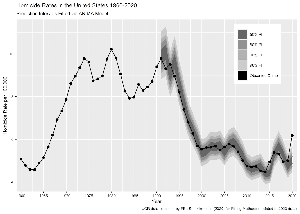
I discuss the workshop I did at the IACA conference in 2017 on temporal analysis in Excel.

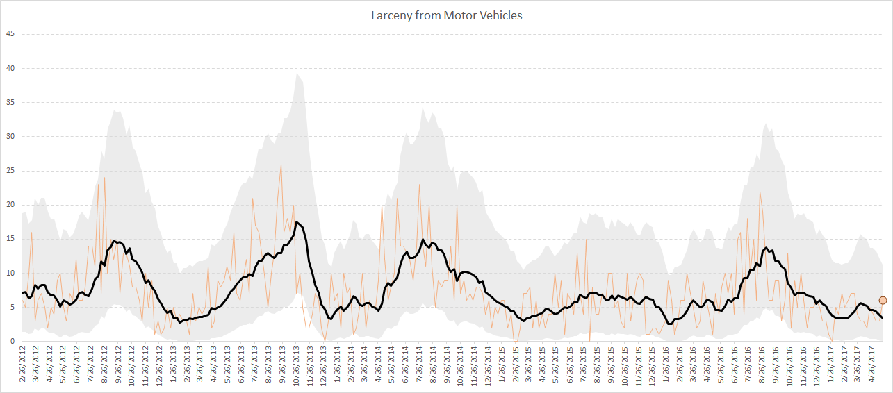
Long story short, don’t use percent change, use other metrics and line graphs.

7:30 – 13:10, Patrol Beat Optimization

I have the paper and code available to replicate my work with Carrollton PD on patrol beat optimization with workload equality constraints.

For analysts looking to teach themselves linear programming, I suggest Hillier’s book. I also give examples on linear programming on this blog.

It is different than statistical analysis, but I believe has as much applicability to crime analysis as your more typical statistical analysis.

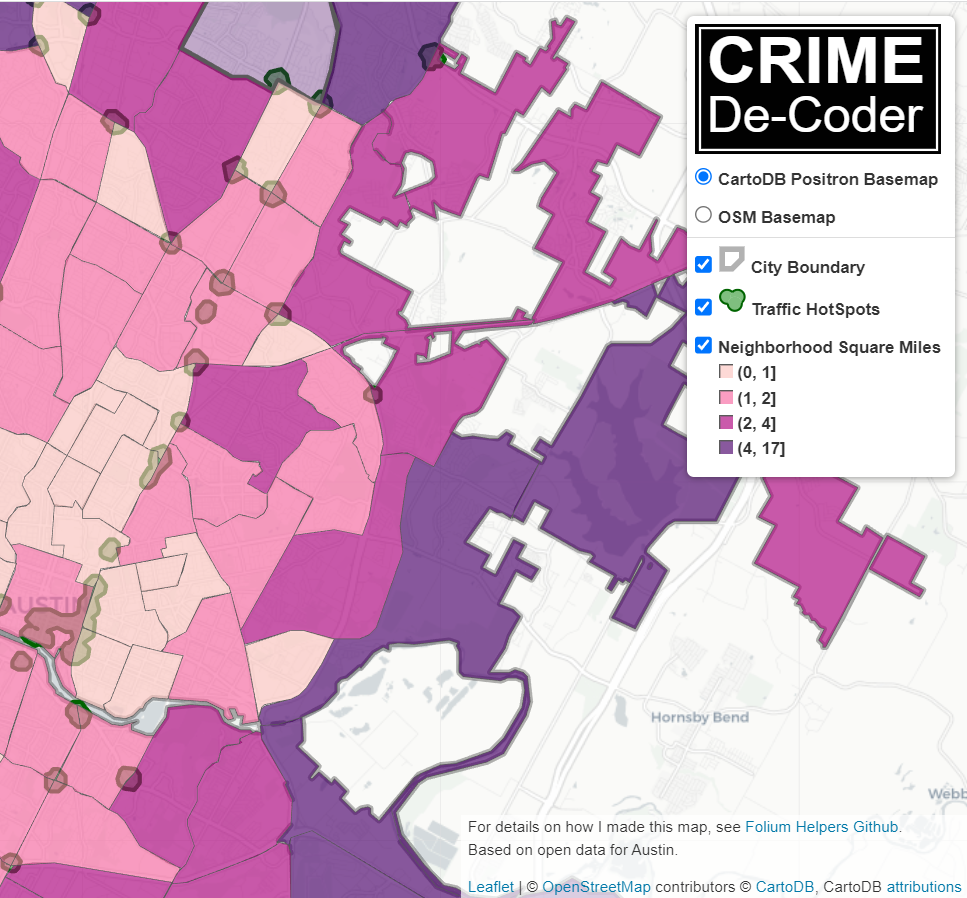
13:10 – 14:15, Million Dollar Hotspots

There are hotspots of crime that are so concentrated, the expected labor cost reduction in having officers assigned full time likely offsets the position. E.g. if you spend a million dollars in labor addressing crime at that location, and having a full time officer reduces crime by 20%, the return on investment for hotspots breaks even with paying the officers salary.

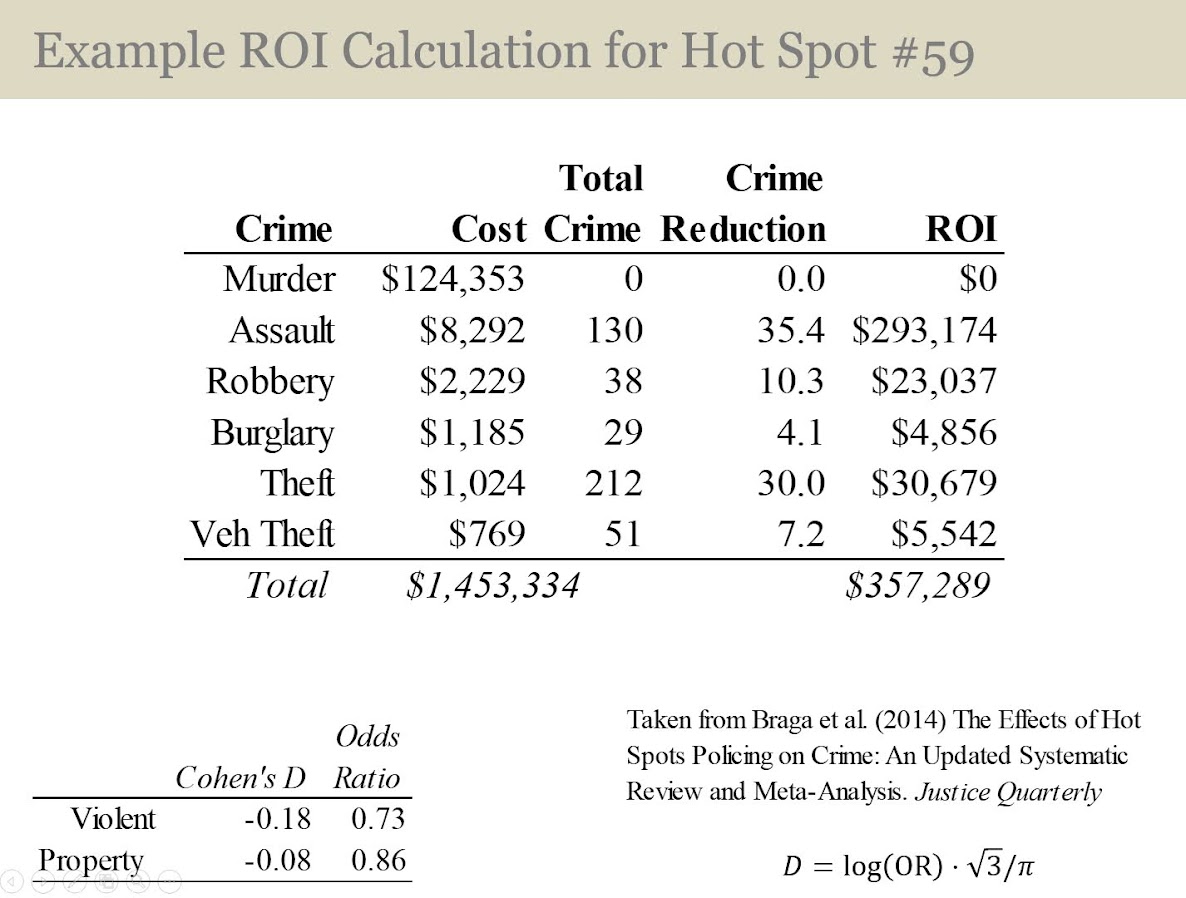
I call these Million dollar hotspots.

14:15 – 28:25, Prioritizing individuals in a group violence intervention

Here I discuss my work on social network algorithms to prioritize individuals to spread the message in a focussed deterrence intervention. This is opposite how many people view “spreading” in a network, I identify something good I want to spread, and seed the network in a way to optimize that spread:

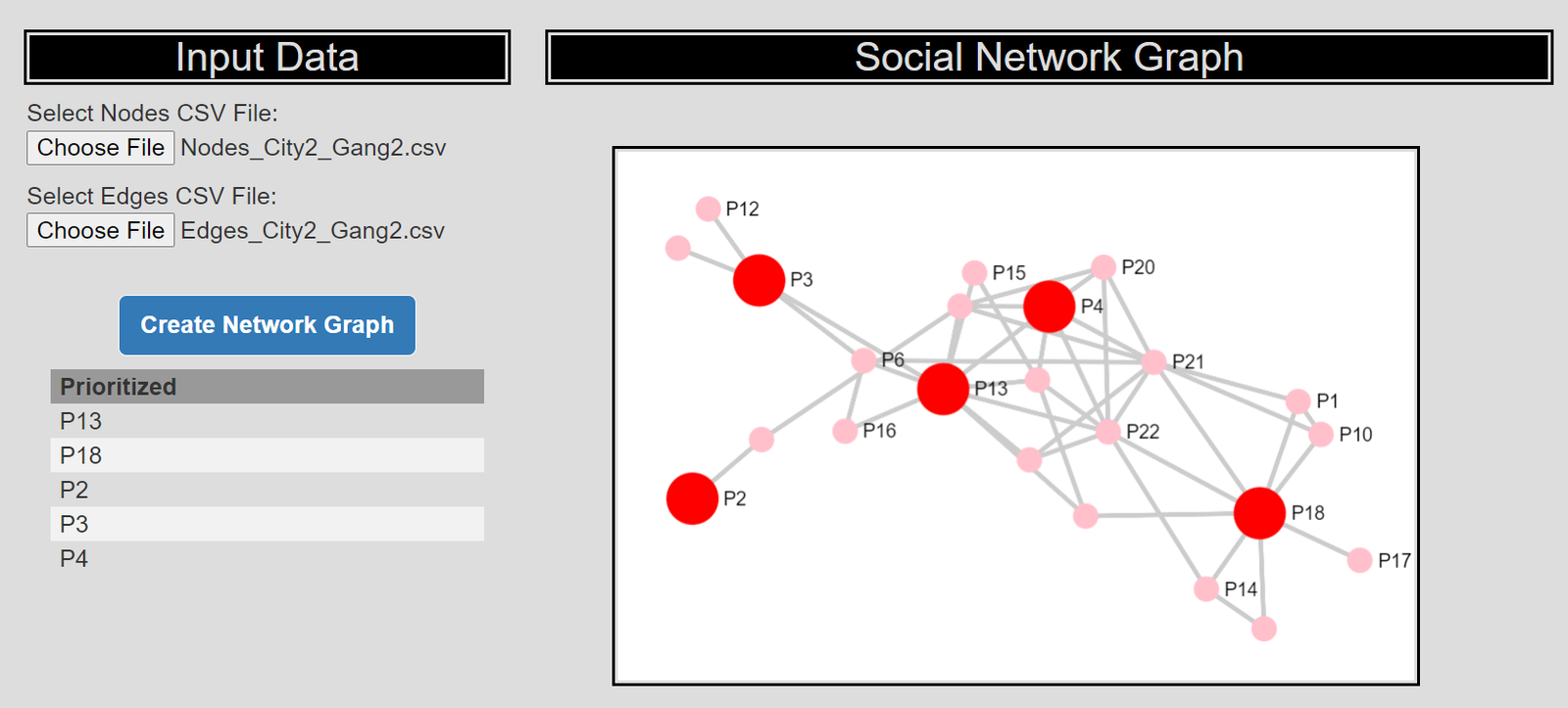
I also have a primer on SNA, which discusses how crime analysts typically define nodes and edges using administrative data.

Listen to the interview as I discuss more general advice – in SNA it matters what you want to accomplish in the end as to how you would define the network. So I discuss how you may want to define edges via victimization to prevent retaliatory violence (I think that would make sense for violence interupptors to be proactive for example).

I also give an example of how detective case allocation may make sense to base on SNA – detectives have background with an individuals network (e.g. have a rapport with a family based on prior cases worked).

28:25 – 33:15, Be proactive as an analyst and learn to code

Here Manny asked the question of how do analysts prevent their role being turned into more administrative role (just get requests and run simple reports). I think the solution to this (not just in crime analysis, but also being an analyst in the private sector) is to be proactive. You shouldn’t wait for someone to ask you for specific information, you need to be defining your own role and conducting analysis on your own.

He also asked about crime analysis being under-used in policing. I think being stronger at computer coding opens up so many opportunities that learning python, R, SQL, is the area I would like to see stronger skills across the industry. And this is a good career investment as it translates to private sector roles.

33:15 – 37:00, How ChatGPT can be used by crime analysts

I discuss how ChatGPT may be used by crime analysis to summarize qualitative incident data and help inform . (Check out this example by Andreas Varotsis for an example.)

To be clear, I think this is possible, but the tech I don’t think is quite up to that standard yet. Also do not submit LEO sensitive data to OpenAI!

Also always feel free to reach out if you want to nerd out on similar crime analysis questions!

Javascript apps and ASEBP update

So for a quick update, my most recent post on ASEBP, This One Simple Trick Will Improve Attitudes Toward Police. (Note you need a ASEBP membership to read.) There are several recent studies by different groups showing follow up to victims, even if you won’t solve the crime in the end, improves overall attitudes towards police. Simple thing for PDs to do. See the reference list at the end of the post for various studies.

Besides that, no blog posts here recently as I have been working on my CRIME De-Coder site, in particular developing a few additional javascript demo’s. My most recent one is a social network app applying my dominant set algorithm (to prioritize call-ins in a group violence/focused deterrence intervention) (Wheeler et al., 2019).

The javascript apps are very nice, as they are all client side – my website just serves the text files, and your local browser does all the hard work. I don’t need to worry about dealing with LEO sensitive data in that scenario either.

I am still learning a ton of website development (will have some surveys deployed using PHP + google sheets here soonish on CRIME De-Coder). Debate on whether it is worth writing up blog posts here. The javascript network application is almost a 1:1 translate of my python code. Vectorized stuff I don’t know much about doing in javascript, but the network algorithm stuff is mostly just dictionaries, sets, and loops. If interested, you can just right click on the browser when the page is open and inspect the source.

References

  • Clark, B., Ariel, B., & Harinam, V. (2022). How Should the Police Let Victims Down? The Impact of Reassurance Call-Backs by Local Police Officers to Victims of Vehicle and Cycle Crimes: A Block Randomized Controlled Trial. Police Quarterly, Online First.
  • Curtis-Ham, S., & Cantal, C. (2022). Locks, lights, and lines of sight: an RCT evaluating the impact of a CPTED intervention on repeat burglary victimisation. Journal of Experimental Criminology, Online First.
  • Henning, Kris et al. 2023. The Impact of Online Crime Reporting on Community Trust, Police Chief Online, April 12, 2023
  • Wheeler, A. P., McLean, S. J., Becker, K. J., & Worden, R. E. (2019). Choosing representatives to deliver the message in a group violence intervention. Justice Evaluation Journal, 2(2), 93-117.

Hacking folium for nicer legends

I have accumulated various code to hack folium based maps over several recent projects, so figured would share. It is a bit too much to walk through the entire code inline in a blog post, but high level the extras this code does:

  • Adds in svg elements for legends in the layer control
  • Has a method for creating legends for choropleth maps
  • Inserts additional javascript to make a nice legend title (here a clickable company logo) + additional attributions

Here is the link to a live example, and below is a screenshot:

So as a quick rundown, if you are adding in an element to a folium layer, e.g.:

folium.FeatureGroup(name="Your Text Here",overlay=True,control=True)

You can insert arbitrary svg code into the name parameter, e.g. you can do something like <span><svg .... /svg>HotSpots</span>, and it will correctly render. So I have functions to make the svg icon match the passed color. So you can see I have a nice icon for city boundary’s, as well as a blobby thing for hotspots.

There in the end are so many possible parameters, I try to make reasonable functions without too crazy many parameters. So if someone wanted different icons, I might just make a different function (probably wouldn’t worry about passing in different potential svg).

I have a function for choropleth maps as well – I tend to not like the functions that you pass in a continuous variable and it does a color map for you. So here it is simple, you pass in a discrete variable with the label, and a second dictionary with the mapped colors. I tend to not use choropleth maps in interactive maps very often, as they are more difficult to visualize with the background map. But there you have it if you want it.

The final part is using javascript to insert the Crime Decoder logo (as a title in the legend/layer control), as well as the map attribution with additional text. These are inserted via additional javascript functions that I append to the html (so this wouldn’t work say inline in a jupyter notebook). The logo part is fairly simple, the map attribution though is more complicated, and requires creating an event listener in javascript on the correct elements.

The way that this works, I actually have to save the HTML file, then I reread the text back into python, add in additional CSS/javascript, and then resave the file.

If you want something like this for your business/website/analysts, just get in contact.

For next tasks, I want to build a demo-dashboard for Crime De-Coder (probably a serverless dashboard using wasm/pyscript). But in terms of leaflet extras, the ability to embed SVG into different elements, you can create charts in popups/tooltips, which would be a cool addition to my hotspots (click and it has a time series chart inside).

An alt take on opioid treatment coverage in North Carolina

The Raleigh News & Observer has been running multiple stories on the recent Medicaid expansion in North Carolina, with one recently about expanded opioid treatment coverage. Myself and Kaden Call have worked in the past on developing an algorithm to identify underprovided estimates (see background blog post, and Kaden’s work at Gainwell while an intern).

I figured I would run our algorithm through to see what North Carolina looks like. So here is an interactive map, with the top 10 zipcodes that have need for service (in red polygons), and CMS certified opioid treatment providers (in blue pins). (Below is a static image)

My initial impression was that this did not really jive with the quotes in the News & Observer article that suggested NC was a notorious service dessert – there are quite a few treatment providers across the state. So the cited Rural HealthInfo source disagrees with this. I cannot find their definition offhand, but I am assuming this is due to only counting in-patient treatment providers, whereas my list of CMS certified providers is mostly out-patient.

So although my algorithm identified various areas in the state that likely could use expanded services, this begs the question of whether NC is really a service dessert. It hinges on whether you think people need in-patient or out-patient treatment. Just a quick sampling of those providers, maybe half say they only take private, so it is possible (although not certain) that the recent Medicaid expansion will open up many treatment options to people who are dependent on opioids.

SAMHSA estimates that of those who get opioid treatment, around 5% get in-patient services. So maybe in the areas of high need I identify there is enough demand to justify opening new in-patient service centers – it is close though I am not sure the demand justifies opening more in-patient (as opposed to making it easier to access out-patient).

Asking folks with a medical background at work, it seems out-patient has proven to be as effective as in-patient, and that the biggest hurdle is to get people on buprenorphine/methadone/naltrexone (which the out-patient can do). So I am not as pessimistic as many of the health experts that are quoted in the News & Observer article.

Use circles instead of choropleth for MSAs

We are homeschooling the kiddo at the moment (the plunge was reading by Bryan Caplan’s approach, and seeing with online schooling just how poor middle school education was). Wife is going through AP biology at the moment, and we looked up various job info on biomedical careers. Subsequently came across this gem of a map of MSA estimates from the Bureau of Labor Stats (BLS) Occupational Employment and Wage Stats series (OES).

I was actually mapping some metro stat areas (MSAs) at work the other day, and these are just terrifically bad geo areas to show via a choropleth map. All choropleth maps have the issue of varying size areas, but I never realized having somewhat regular borders (more straight lines) makes the state and county maps not so bad – these MSA areas though are tough to look at. (Wife says it scintillates for her if she looks too closely.)

There are various incredibly tiny MSAs next to giant ones that you will just never see in these maps (no matter what color scheme you use). Nevada confused for me quite a bit, until I zoomed in to see that there are 4 areas, Reno is just a tiny squib.

Another example is Boulder above Denver. (Look closely at the BLS map I linked, you can just make out Boulder if you squint, but I cannot tell what color it corresponds to in the legend.) The outline heavy OES maps, which are mostly missing data, are just hopeless to display like this effectively. Reno could be the hottest market for whatever job, and it will always be lost in this map if you show employment via the choropleth approach. So of course I spent the weekend hacking together some maps in python and folium.

The BLS has a public API, but I was not able to find the OES stats in that. But if you go through the motions of querying the data and muck around in the source code for those queries, you can see they have an undocumented API call to generate json to fill the tables. Then using this tool to convert the json calls to python (thank you Hacker News), I was able to get those tables into python.

I have these functions saved on github, so check out that source for the nitty gritty. But just here quickly, here is a replicated choropleth map, showing the total employees for bio jobs (you can go to here to look up the codes, or run my function bls_maps.ocodes() to get a pandas dataframe of those fields).

# Creating example bls maps
from bls_geo import *

# can check out https://www.bls.gov/oes/current/oes_stru.htm
bio = '172031'
bio_stats = oes_geo(bio)
areas = get_areas() # this takes a few minutes
state = state_albers()
geo_bio = merge_occgeo(bio_stats,areas)

ax = geo_bio.plot(column='Employment',cmap='inferno',legend=True,zorder=2)
state.boundary.plot(ax=ax,color='grey',linewidth=0.5,zorder=1)
ax.set_ylim(0.1*1e6,3.3*1e6)
ax.set_xlim(-0.3*1e7,0.3*1e7)   # lower 48 focus (for Albers proj)
ax.set_axis_off()
plt.show()

And that is not much better than BLSs version. For this data, if you are just interested in looking up or seeing the top metro areas, just doing a table, e.g. above geo_bio.to_excel('biojobs.xlsx'), works just as well as a map.

So I was surprised to see Minneapolis pop up at the top of that list (and also surprised Raleigh doesn’t make the list at all, but Durham has a few jobs). But if you insist on seeing spatial trends, I prefer to go the approach of mapping proportion or graduate circles, placing the points at the centroid of the MSA:

att = ['areaName','Employment','Location Quotient','Employment per 1,000 jobs','Annual mean wage']
form = ['',',.0f','.2f','.2f',',.0f']

map_bio = fol_map(geo_bio,'Employment',['lat', 'lon'],att,form)
#map_bio.save('biomap.html')
map_bio #if in jupyter can render like this

I am too lazy to make a legend, you can check out nbviewer to see an interactive Folium map, which I have tool tips (similar to the hover for the BLS maps).

Forgive my CSS/HTML skills, not sure how to make nicer popups. So you lose the exact areas these MSA cover in this approach, but I really only expect a general sense from these maps anyway.

These functions are general enough for whatever wage series you want (although these functions will likely break when the 2021 data comes out). So here is the OES table for data science jobs:

I feel going for the 90th percentile (mapping that to the 10 times programmer) is a bit too over the top. But I can see myself reasonably justifying 75th percentile. (Unfortunately these agg tables don’t have a way to adjust for years of experience, if you know of a BLS micro product I could do that with let me know!). So you can see here the somewhat inflated salaries for the SanFran Bay area, but not as inflated as many might have you think (and to be clear, these are for 2020 survey estimates).

If we look at map of data science jobs, varying the circles by that 75th annual wage percentile, it looks quite uniform. What happens is we have some real low outliers (wages under 70k), resulting in tiny circles (such as Athen’s GA). Most of the other metro regions though are well over 100k.

In more somber news, those interactive maps are built using Leaflet as the backend, which was create by a Ukranian citizen, Vladimir Agafonkin. We can do amazing things with open source code, but we should always remember it is on the backs of someones labor we are able to do those things.

Using Natural Frequencies to Reason about Tests

Hackernews shared an article about visualizing Bayes Theorem using Venn diagrams, with the common example of going from sensitivity/specificity of a test to switch the probability of ‘do I have cancer’. I actually do not find Bayes Theorem to be really helpful to think through this problem. I much prefer Gerd Gigerenzer’s approach using natural frequencies.

So here is an example, say we have a Covid rapid test that has a sensitivity of 90%. This metric is “if you have Covid, how often does the test say you have Covid”. In conditional probability terms we would write this P( Test Says + | Actually Have Covid ).

Often times we want to know the opposite conditional though, “if we test positive, what is the actual probability we have Covid?”. So we want to know P( Actually Have Covid | Test Says + ). This is switching the conditional from the earlier metric. To figure that out though, we need some more information though. One thing we need is an estimate of “Actually Have Covid” in the overall population. Pretend this is 5% for our scenario.

Another is the false positive rate of the test, P( Test Says + | Do Not Have Covid ). Lets say for our example this is 10%. Now how do we figure out P( Actually Have Covid | Test Says + )? Lets use this nice little tree diagram, where we consider a hypothetical scenario of 1000 people getting Covid rapid tests:

So first thing to note is that the first split in the tree is something that doesn’t have anything to do with the tests at all – it is the overall proportion of Covid cases in the population. Here 5% means out of our 1000 people that take rapid tests, we expect only 50 of them to actually have Covid.

The second level of the splits are the two data based pieces of information, the sensitivity is the split on the left side. The test captures 90% of the true positives, so 45 out of the 50 get a positive result on the rapid test. The right split is the false negative rate of 10%, of those 950 without Covid, 95 will get a false positive result.

So in the end, we have 45 true positives out of 45 + 95 total positive tests (the colored balls in the tree diagram). That is our personal estimate of I tested positive for Covid, do I actually have Covid, P( Actually Have Covid | Test Says + ). This estimate is 32%, or a metric we sometimes like to call the Positive Predictive Value of the test. I have an Excel spreadsheet where you can insert different overall proportions in the underlying population (the prevalence) as well as different estimates of a tests sensitivity/false-positive rate, and it spits out the nice diagram.

In the end even if you have a very sensitive test with a low false positive rate, if the prevalence is very low you will have a low positive predictive value. For example in my work, in predicting chronic offenders involved with shootings, among the top 1000 predictions the PPV was only 3%. Because shooting someone or being shot is very rare. If you compare those top 1000 they have around 200 times higher probability than a random person, but still overall that probability is quite low.

Note for data science folks that these different metrics all relate to the ROC curve. In my head I often translate sensitivity to “capture rate” – the proportion of true cases the test captures in the wild, I can never remember sensitivity. Sometimes in ROC curves I label this as the True Positive Rate, although software often uses 1 – Specificity vs Sensitivity.

Based on the above scenario you may be thinking to yourself ‘I can’t fill out all of the unknowns’, especially such as knowing the underlying prevalence of the outcome in the population. For overall prevalence’s you can often make reasonable guesses. For error rates for tests, that often takes some digging or guess work as to typical error rates though. So even if we don’t have uber precise estimates, we can still make reasonable decisions based on the range of likely scenarios filling in the info we need.

Knowing the Right Conditional Probability?

While in general I like the tree diagram approach, it doesn’t help with the more general issue of knowing the correct probability you care about to make decisions. Totally agree with Gigerenzer’s overall approach (he is basically glass half full compared to Kahneman/Tversky, if you present info the right way we don’t make so biased as decisions), but even scientific experts often make conditional probability mistakes.

Much of the public discussion about Covid in particular is making a specious set of probability estimates to justify positions. Just copy-pasting my Hackernews comment giving examples from the Rogan/Gupta interview, but think that is very symbolic overall of the news coverage:

I think a more basic problem is people don’t even know how to formulate meaningful probability hypothetical/counterfactuals to begin with (let alone update them). For Covid stuff pretty much all an individual should care about is:

P(Bad Stuff | I take action A) > P(Bad Stuff | I take action B)

So you take action B in this scenario (simplifying to ignore costs, many of these decisions are costless). We get a bunch of meaningless drivel in the news though that doesn’t help anyone make any meaningful probability estimates to help them make decisions. I think the Rogan/Gupta interview is a good example. We get various non-sense comparisons such as:

P(Bad Stuff | Covid, Person 5, No Vaccine) < P(Bad Stuff | Covid, Person 50, Vaccine)

[Rogan to Gupta why is it OK for 50 year old to feel safe and not a young kid without a vaccine? Irrelevant counter-factual unless someone invents a reverse aging treatment.]

P(Heart Inflammation | Covid Vaccine, Young Male) > P(Death | Covid, Young Male)

[Rogan saying side effects for young people outweigh benefits. This is true but death is quite a bit worse than the side effects, and this does not consider other Bad Stuff from Covid like long haulers.]

Knowing Bayes Theorem doesn’t help someone figure out the right probability statement they should be interested in to begin with.

The news overall is very frustrating, especially scientific coverage. Often times news entirely avoids any specific numeric estimate, but is often not even clear what the estimate is. A common one from news coverage is P(Bad Thing | ?????), I often can’t tell what composes the conditional on the right hand side. Sometimes it is those tested positive, sometimes it is the overall population in an area, sometimes it is those in the hospital, etc. Those different conditionals can greatly change how you interpret that information.

References

  • Gigerenzer, G. (2011). What are natural frequencies?. BMJ, 343.
  • Wheeler, A. P., Worden, R. E., & Silver, J. R. (2019). The accuracy of the violent offender identification directive tool to predict future gun violence. Criminal Justice and Behavior, 46(5), 770-788.

Regression Discontinuity Designs

Regression Discontinuity Designs (RDD) are one way to evaluate predictive model systems with causal outcomes associated with what you do with that information. For a hypothetical example, imagine you have a predictive model assessing the probability that you will be diagnosed with diabetes in the next two years. Those that score above 30% probability get assigned a caseworker, to try to prevent that individual from contracting diabetes. How do you know how effective that caseworker is in reducing diabetes in those high risk individuals?

The RDD design works like this – you have your running variable (here the predicted probability), and the threshold (over 30%) that gets assigned a treatment. You estimate the probability of the actual outcome (it may be other outcomes besides just future diabetes, such as the caseworker may simply reduce overall medical costs even if the person still ends up being diagnosed with diabetes). You then estimate the dip in the predicted outcome just before and just after the threshold. The difference in those two curves is the estimated effect.

Here is an example graph illustrating (with fake data I made, see the end of the post). The bump in the line (going from the blue to the red) is then the average treatment effect of being assigned a caseworker, taking into account the underlying trend that higher risk people here are more likely to have higher medical bills.

A few things to note about RDD – so there is a tension between estimating the underlying curve and the counterfactual bump at the threshold. Theoretically values closer to the threshold should be more relevant, so some (see the Wikipedia article linked earlier) try to estimate non-linear weighted curves, giving cases closer to the threshold higher weights. This often produces strange artifacts (that Andrew Gelman likes to point out on his blog) that can miss-estimate the RDD effect. This is clearly the case in noisy data if the line dips just before the threshold and curves up right after the threshold.

So you can see in my code at the end I prefer to estimate this using splines, as opposed to weighted estimators that have a bit of noise. (Maybe someday I will code up a solution to do out of sample predictive evaluations for this as an additional check.) And with this approach it is easy to incorporate other covariates (and look at treatment heterogeneity if you want). Note that while wikipedia says the weighted estimator is non-parametric this is laughably wrong (it is two straight lines in their formulation, a quite restrictive for actually) – while I can see some theoretical justification for the weighted estimators, in practice these are quite noisy and not very robust to minor changes in the weights (and you always need to make some parametric assumptions in this design, both for the underlying curve as well as the standard error around the threshold bump).

There are additional design details you need to be worried about, such as fuzzy treatments or self selection. E.g. if a person can fudge the numbers a bit and choose which side of the line they are on, it can cause issues with this design. In those cases there may be a reasonable workaround (e.g. an instrumental variable design), but the jist of the research design will be the same.

Last but not least, to actually conduct this analysis you need to cache the original continuous prediction. In trying to find real data for this blog post, many criminal justice examples of risk assessment people only end up saving the final categories (low, medium, high) and not the original continuous risk instrument.

If folks have a good public data example that I could show with real data please let me know! Scouting for a bit (either parole/probabation risk assessment, or spatial predictive policing) has not turned up any very good examples for me to construct examples with (also health examples would be fine as well).


This is the simulated data (in python), the RDD graph, and the statsmodel code for how I estimate the RDD bump effect. You could of course do more fancy things (such as penalize the derivatives for the splines), but this I think would be a good way to estimate the RDD effect in many designs where appropriate.

from matplotlib import pyplot as plt
import numpy as np
import pandas as pd
import statsmodels.api as sm
import statsmodels.formula.api as smf

########################################
# Simulating data
np.random.seed(10)
n_cases = 3000 # total number of cases
# pretend this is predicted prob
prob = np.random.beta(3,10,size=n_cases)
# pretend this is med costs over a year
med_cost = 3000 + 5000*prob + -500*(prob > 0.3) + np.random.normal(0,500,n_cases)
df = pd.DataFrame(zip(prob,med_cost), columns=['Prob','MedCost'])
# could do something fancier with non-linear effects for prob
########################################

########################################
# Fitting regression model

# Knots are small distance from threshold
# (Could also do a knot right on threshold)
mod = smf.ols(formula='MedCost ~ bs(Prob,knots=[0.2,0.25,0.35,0.4]) + I(Prob > 0.3)', data=df)
res = mod.fit()
print(res.summary())
########################################

########################################
# Plotting fit

# Getting standard errors
prob_se = res.get_prediction().summary_frame()
prob_se['Prob'] = prob
prob_se.sort_values(by='Prob',inplace=True,ignore_index=True)
low = prob_se[prob_se['Prob'] <= 0.3].copy()
high = prob_se[prob_se['Prob'] > 0.3].copy()

# Getting effect for threshold bump
coef = res.summary2().tables[1]
ci = coef.iloc[1,4:6].astype(int).to_list()

fig, ax = plt.subplots(figsize=(6,4))
ax.scatter(df['Prob'], df['MedCost'], c='grey',
           edgecolor='k', alpha=0.15, s=5, zorder=1)
ax.axvline(0.3, linestyle='solid', alpha=1.0, 
           color='k',linewidth=1, zorder=2)
ax.fill_between(low['Prob'],low['mean_ci_lower'],
                low['mean_ci_upper'],alpha=0.6,
                zorder=3, color='darkblue')
ax.fill_between(high['Prob'],high['mean_ci_lower'],
                high['mean_ci_upper'],alpha=0.6,
                zorder=3, color='red')
ax.set_xlabel('Predicted Prob Diabetes')
ax.set_ylabel('Medical Costs')
ax.set_title(f'RDD Reduced Cost Estimate {ci[0]} to {ci[1]} (95% CI)')
ax.text(0.3,6500,'Threshold',rotation=90, size=9,
         ha="center", va="center",
         bbox=dict(boxstyle="round", ec='k',fc='grey'))
plt.savefig('RDD.png', dpi=500, bbox_inches='tight')
########################################

Using precision to plan experiments (SPSS)

SPSS Version 28 has some new nice power analysis facilities. Here is some example code to test the difference in proportions, with sample sizes equal between the two groups, and the groups have an underlying proportion of 0.1 and 0.2.

POWER PROPORTIONS INDEPENDENT
  /PARAMETERS TEST=NONDIRECTIONAL SIGNIFICANCE=0.05 POWER=0.6 0.7 0.8 0.9 NRATIO=1 
    PROPORTIONS=0.1 0.2 METHOD=CHISQ ESTIMATE=NORMAL CONTINUITY=TRUE POOLED=TRUE
  /PLOT TOTAL_N.

So this tells you the sample size to get a statistically significant difference (at the 0.05 level) between two groups for a proportion difference test (here just a chi square test). And you can specify the solution for different power estimates (here a grid of 0.6 to 0.9 by 0.1), as well as get a nice plot.

So this is nice for academics planning factorial experiments, but I often don’t personally plan experiments this way. I typically get sample size estimates via thinking about precision of my estimates. In particular I think to myself, I want subgroup X to have a confidence interval width of no more than 5%. Even if you want to extend this to testing the differences between groups this is OK (but will be conservative), because even if two confidence intervals overlap the two groups can still be statistically different (see this Geoff Cumming reference).

So for example a friend the other day was asking about how to sample cases for an audit, and they wanted to do subgroup analysis in errors between different racial categories. But it was paper records, so they needed to just get an estimate of the total records to sample upfront (can’t really control the subgroup sizes). I suggested to estimate the precision they wanted in the smallest subgroup of interest for the errors, and base the total sample size of the paper audit on that. This is much easier to plan than worrying about a true power analysis, in which you also need to specify the expected differences in the groups.

So here is a macro I made in SPSS to generate precision estimates for binomial proportions (Clopper Pearson exact intervals). See my prior blog post for different ways to generate these intervals.

* Single proportion, precision.
DEFINE !PrecisionProp (Prop = !TOKENS(1)
                      /MinN = !TOKENS(1)
                      /MaxN = !TOKENS(1)
                      /Steps = !DEFAULT(100) !TOKENS(1) 
                      /DName = !DEFAULT("Prec") !TOKENS(1) )
INPUT PROGRAM.
COMPUTE #Lmi = LN(!MinN).
COMPUTE #Step = (LN(!MaxN) - #Lmi)/!Steps.
LOOP #i = 1 TO (!Steps + 1).
  COMPUTE N = EXP(#Lmi + (#i-1)*#Step).
  COMPUTE #Suc = N*!Prop.
  COMPUTE Prop = !Prop.
  COMPUTE Low90 = IDF.BETA(0.05,#Suc,N-#Suc+1).
  COMPUTE High90 = IDF.BETA(0.95,#Suc+1,N-#Suc).
  COMPUTE Low95 = IDF.BETA(0.025,#Suc,N-#Suc+1).
  COMPUTE High95 = IDF.BETA(0.975,#Suc+1,N-#Suc).
  COMPUTE Low99 = IDF.BETA(0.005,#Suc,N-#Suc+1).
  COMPUTE High99 = IDF.BETA(0.995,#Suc+1,N-#Suc).
  END CASE.
END LOOP.
END FILE.
END INPUT PROGRAM.
DATASET NAME !DName.
FORMATS N (F10.0) Prop (F3.2).
EXECUTE.
!ENDDEFINE.

This generates a new dataset, with a baseline proportion of 50%, and shows how the exact confidence intervals change with increasing the sample size. Here is an example generating confidence intervals (90%,95%, and 99%) for sample sizes from 50 to 3000 with a baseline proportion of 50%.

!PrecisionProp Prop=0.5 MinN=50 MaxN=3000.

And we can go and look at the generated dataset. For sample size of 50 cases, the 90% CI is 38%-62%, the 95% CI is 36%-64%, and the 99% CI is 32%-68%.

For sample sizes of closer to 3000, you can then see how these confidence intervals decrease in width to changes in 4 to 5%.

But I really just generated the data this way to do a nice error bar chart to visualize:

*Precision chart.
GGRAPH
  /GRAPHDATASET NAME="graphdataset" VARIABLES=Prop N Low90 High90 Low95 High95 Low99 High99
  /GRAPHSPEC SOURCE=INLINE.
BEGIN GPL
  SOURCE: s=userSource(id("graphdataset"))
  DATA: N=col(source(s), name("N"))
  DATA: Prop=col(source(s), name("Prop"))
  DATA: Low90=col(source(s), name("Low90"))
  DATA: High90=col(source(s), name("High90"))
  DATA: Low95=col(source(s), name("Low95"))
  DATA: High95=col(source(s), name("High95"))
  DATA: Low99=col(source(s), name("Low99"))
  DATA: High99=col(source(s), name("High99"))
  DATA: N=col(source(s), name("N"))
  GUIDE: text.title(label("Base Rate 50%"))
  GUIDE: axis(dim(1), label("Sample Size"))
  GUIDE: axis(dim(2), delta(0.05))
  SCALE: linear(dim(1), min(50), max(3000))
  ELEMENT: area.difference(position(region.spread.range(N*(Low99+High99))), color.interior(color.grey), 
           transparency.interior(transparency."0.6"))
  ELEMENT: area.difference(position(region.spread.range(N*(Low95+High95))), color.interior(color.grey), 
           transparency.interior(transparency."0.6"))
  ELEMENT: area.difference(position(region.spread.range(N*(Low90+High90))), color.interior(color.grey), 
           transparency.interior(transparency."0.6"))
  ELEMENT: line(position(N*Prop))
END GPL.

So here the lightest gray area is the 99% CI, the second lightest is the 95%, and the darkest area is the 90% CI. So here you can make value trade offs, is it worth it to get an extra precision of under 10% by going from 500 samples to 1000 samples? Going from 1500 to 3000 you don’t gain as much precision as going from 500 to 1000 (diminishing returns).

It is easier to see the progression of the CI’s when plotting the sample size on a log scale (or sometimes square root), although often times costs of sampling are on the linear scale.

You can then change the macro arguments if you know your baseline is likely to not be 50%, but say here 15%:

!PrecisionProp Prop=0.15 MinN=50 MaxN=3000.

So you can see in this graph that the confidence intervals are smaller in width than the 50% – a baseline of 50% results in the largest variance estimates for binary 0/1 data, so anything close to 0% or 100% will result in smaller confidence intervals. So this means if you know you want a precision of 5%, but only have a rough guess as to the overall proportion, planning for 50% baseline is the worst case scenario.

Also note that when going away from 50%, the confidence intervals are asymmetric. The interval above 15% is larger than the interval below.

A few times at work I have had pilots that look something like “historical hit rates for these audits are 10%, I want the new machine learning model to increase that to 15%”.

So here I can say, if we can only easily use a sample of 500 cases for the new machine learning model, the precision I expect to be around 11% to 19%. So cutting a bit close to be sure it is actually above the historical baseline rate of 10%. To get a more comfortable margin we need sample sizes of 1000+ in this scenario.

The Big 2020 Homicide Increase in Context

Jeff Asher recently wrote about the likely 2020 increase in Homicides, stating this is an unprecedented increase. (To be clear, this is 2020 data! Homicide reporting data in the US is just a few months shy of a full year behind.)

In the past folks have found me obnoxious, as I often point to how homicide rates (even for fairly large cities), are volatile (Wheeler & Kovandzic, 2018). Here is an example of how I thought the media coverage of the 2015/16 homicide increase was overblown.

I actually later quantified this more formally with then students Haneul Yim and Jordan Riddell (Yim et al., 2020). We found the 2015 increase was akin to when folks on the news say a 1 in 100 year flood. So I was wrong in terms of it was a fairly substantive increase relative to typical year to year changes. Using the same methods, I updated the charts to 2020 data, and 2020 is obviously a much larger increase than the ARIMA model we fit based on historical data would expect:

Looking at historical data, people often argue “it isn’t as high as the early 90’s” – this is not the point though I really intended to make (it is kind of silly to make a normative argument about the right or acceptable number of homicides) – but I can see how I conflated those arguments. Looking at the past is also about understanding the historical volatility (what is the typical year to year change). Here this is clearly a much larger swing (up or down) than we would expect based on the series where we have decent US coverage (going back to 1960).


For thinking about crime spikes, I often come from a place in my crime analyst days where I commonly was posed with ‘crime is on the rise’ fear in the news, and needed to debunk it (so I could get back to doing analysis on actual crime problems, not imaginary ones). One example was a convenience store was robbed twice in the span of 3 days, and of course the local paper runs a story crime is on the rise. So I go and show the historical crime trends to the Chief and the Mayor that no, commercial robberies are flat. And even for that scenario there were other gas stations that had more robberies in toto when looking at the data in the past few years. So when the community police officer went to talk to that convenience store owner to simply lock up his cash in more regular increments, I told that officer to also go to other stores and give similar target hardening advice.

Another aspect of crime trends is not only whether a spike is abnormal (or whether we actually have an upward trend), but what causes it. I am going to punt on that – in short it is basically impossible in normal times to know what caused short term spikes absent identifying specific criminal groups (which is not so relevant for nationwide spikes, but even in large cities one active criminal group can cause observable spikes). We have quite a bit of crazy going on at the moment – Covid, BLM riots, depolicing – I don’t know what caused the increase and I doubt we will ever have a real firm answer. We cannot run an experiment to see why these increases occurred – it is mostly political punditry pinning it on one theory versus another.

For the minor bit it is worth – the time series methods I use here signal that the homicide series is ARIMA(1,1,0) – which means both an integrated random walk component and a auto-regressive component. Random walks will occur in macro level data in which the micro level data are a bunch of AR components. So this suggests a potential causal attribution to increased homicides is homicides itself (crime begets more crime). And this can cause run away effects of long upwards/downwards trends. I don’t know of a clear way though to validate that theory, nor any obvious utility in terms of saying what we should do to prevent increases in homicides or stop any current trends. Even if we have national trends, any intervention I would give a thumbs up to is likely to be local to a particular municipality. (Thomas Abt’s Bleeding Out is about the best overview of potential interventions that I mostly agree with.)

References

  • Wheeler, A. P., & Kovandzic, T. V. (2018). Monitoring volatile homicide trends across US cities. Homicide Studies, 22(2), 119-144.
  • Yim, H. N., Riddell, J. R., & Wheeler, A. P. (2020). Is the recent increase in national homicide abnormal? Testing the application of fan charts in monitoring national homicide trends over time. Journal of Criminal Justice, 66, 101656.

Notes for the 2019/2020 updated homicide data. 2019 data is available from the FBI page, 2020 homicide data I have taken from estimates at USA Facts and total USA pop is taken from Google search results.

R code and data to replicate the chart can be downloaded here.

KDE plots for predicted probabilities in python

So I have previously written about two plots post binary prediction models – calibration plots and ROC curves. One addition to these I am going to show are kernel density estimate plots, broken down by the observed value vs predicted value. One thing in particular I wanted to make these for is to showcase the distribution of the predicted probabilities themselves, which can be read off of the calibration chart, but is not as easy.

I have written about this some before – transforming KDE estimates from logistic to probability scale in R. I will be showing some of these plots in python using the seaborn library. It will be easier instead of transforming the KDE to use edge weighting statistics to get unbiased estimates near the borders for the way the seaborn library is set up.

To follow along, you can download the data I will be using here. It is the predicted probabilities from the test set in the calibration plot blog post, predicting recidivism using several different models.

First to start, I load my python libraries and set my matplotlib theme (which is also inherited by seaborn charts).

Then I load in my data. To make it easier I am just working with the test set and several predicted probabilities from different models.

import pandas as pd
from scipy.stats import norm
import matplotlib
import matplotlib.pyplot as plt
import seaborn as sns

#####################
# My theme

andy_theme = {'axes.grid': True,
              'grid.linestyle': '--',
              'legend.framealpha': 1,
              'legend.facecolor': 'white',
              'legend.shadow': True,
              'legend.fontsize': 14,
              'legend.title_fontsize': 16,
              'xtick.labelsize': 14,
              'ytick.labelsize': 14,
              'axes.labelsize': 16,
              'axes.titlesize': 20,
              'figure.dpi': 100}

matplotlib.rcParams.update(andy_theme)
#####################

And here I am reading in the data (just have the CSV file in my directory where I started python).

################################################################
# Reading in the data with predicted probabilites
# Test from https://andrewpwheeler.com/2021/05/12/roc-and-calibration-plots-for-binary-predictions-in-python/
# https://www.dropbox.com/s/h9de3xxy1vy6xlk/PredProbs_TestCompas.csv?dl=0

pp_data = pd.read_csv(r'PredProbs_TestCompas.csv',index_col=0)
print(pp_data.head())

print(pp_data.describe())
################################################################

So you can see this data has the observed outcome Recid30 – recidivism after 30 days (although again this is the test dataset). And then it also has the predicted probability for three different models (XGBoost, RandomForest, and Logit), and then demographic breakdowns for sex and race.

The plot I am interested in seeing is a KDE estimate for the probabilities, broken down by the observed 0/1 for recidivism. Here is the default graph using seaborn:

# Original KDE plot by 0/1
sns.kdeplot(data=pp_data, x="Logit", hue="Recid30", 
            common_norm=False, bw_method=0.15)

One problem you can see with this plot though is that the KDE estimates are smoothed beyond the data. You cannot have a predicted probability below 0 or above 1. Because we are using a gaussian kernel, we can just reweight observations that are close to the edge, and then clip the KDE estimate. So a predicted probability of 0 would get a weight of 1/0.5 – so it gets double the weight. Note to do this correctly, you need to set the bandwidth the same for the seaborn kdeplot as well as the weights calculation – here 0.15.

# Weighting and clipping
# Amount of density below 0 & above 1
below0 = norm.cdf(x=0,loc=pp_data['Logit'],scale=0.15)
above1 = 1- norm.cdf(x=1,loc=pp_data['Logit'],scale=0.15)
pp_data['edgeweight'] = 1/ (1 - below0 - above1)

sns.kdeplot(data=pp_data, x="Logit", hue="Recid30", 
            common_norm=False, bw_method=0.15,
            clip=(0,1), weights='edgeweight')

This results in quite a dramatic difference, showing the model does a bit better than the original graph. The 0’s were well discriminated, so have many very low probabilities that were smoothed outside the legitimate range.

Another cool plot you can do that again shows calibration is to use seaborn’s fill option:

cum_plot = sns.kdeplot(data=pp_data, x="Logit", hue="Recid30", 
                       common_norm=False, bw_method=0.15,
                       clip=(0,1), weights='edgeweight', 
                       multiple="fill", legend=True)
cum_plot.legend_._set_loc(4) #via https://stackoverflow.com/a/64687202/604456

As expected this shows an approximate straight line in the graph, e.g. 0.2 on the X axis should be around 0.2 for the orange area in the chart.

Next seaborn has another good function here, violin plots. Unfortunately you cannot pass a weight function here. But another option is to simply resample your data a large number of times, using the weights you provided earlier.

n = 1000000 #larger n will result in more accurate KDE
resamp_pp = pp_data.sample(n=n,replace=True, weights='edgeweight',random_state=10)

viol_sex = sns.violinplot(x="Sex", y="XGB", hue="Recid30",
                          data=resamp_pp, split=True, cut=0, 
                          bw=0.15, inner=None,
                          scale='count', scale_hue=False)
viol_sex.legend_.set_bbox_to_anchor((0.65, 0.95))

So here you can see we have more males in the sample, and they have a larger high risk blob that was correctly identified. Females have a risk profile more spread out, although there is a small clump of basically 0 risk that the model identifies.

You can also generate the graph so the areas for the violin KDE’s are normalized, so in both the original and resampled data we have fewer females, and more black individuals.

# Values for Sex for orig/resampled
print(pp_data['Sex'].value_counts(normalize=True))
print(resamp_pp['Sex'].value_counts(normalize=True))

# Values for Race orig/resampled
print(pp_data['Race'].value_counts(normalize=True))
print(resamp_pp['Race'].value_counts(normalize=True))

But if we set scale='area' in the chart the violins are the same size:

viol_race = sns.violinplot(x="Race", y="XGB", hue="Recid30",
                           data=resamp_pp, split=True, cut=0, 
                           bw=0.15, inner=None,
                           scale='area', scale_hue=True)
viol_race.legend_.set_bbox_to_anchor((0.81, 0.95))

I will have to see if I can make some time to contribute to seaborn to make it so you can pass in weights to the violinplot function.