Using and Making Cumulative Probability Charts

Stephen Few had a recent post critiquing an evaluation of a particular data visualization. Long story short, the experiment asked questions like “What is the probability that X is above 5?”, and showed the accuracy based on mean+error bar charts, histogram like visualizations, and animated vizualations showing random draws.

It is always the case in data viz. that some charts are easier to answer particular questions. This is one question, what is the probability a value is above X, in which traditional histograms or error bar charts are not well suited for. But there is an alternative I don’t see used very often, the cumulative probability chart, that is well suited to answer that question.

It is a totally reasonable question to ask as well. For one example use when I was a crime analyst, I used this chart to show the time in-between shootings. Many shootings are retaliatory so I was interested in saying if a shooting happened on Sunday, how long should be PD be on guard for after an initial shooting. Do most retaliatory shootings happen within hours, days, or weeks of a prior shooting? This is a hard question to answer with histograms, but is easier to answer with cumulative probability plots.

Here is that example chart for time-in-between shootings:

Although this chart is not regularly used, it is really easy to explain how to interpret. For example, at time equals 7 days (on the X axis), the probability that a shooting would have occurred is under 60%. In my opinion, it is easier to explain this chart than a histogram to a lay audience.

To produce the chart it is often not a canned option in software, but it takes very simple set of steps to produce the right ingrediants – and then you can use a typical line chart. So those steps generically are:

  • sort the data
  • rank the data (1 for the lowest value, 2 for the second lowest value, etc.)
  • calculate rank/(total sample size) – call this Prop
  • plot the data on the X axis, and Prop on the Y axis

Which can be easily done in any software, but here you can download an excel spreadsheet here used to make the above chart.

A variant of this chart often used in crime analysis is the proportion of places on the X axis and the cumulative proportion of crime on the Y axis. E.g. Pareto’s 80/20 rule – or 50/1 rule – or whatever. The chart makes it easy to pick whatever cut-offs you want. If you have your spatial units of analysis in one column, and the total number of crimes in a second column, the procedure to produce this chart is:

  • sort the data descending by number of crimes
  • rank the data
  • calculate rank/(total sample size) – this equals the proportion of all spatial units – call this PropUnits
  • calculate the cumulative number of crimes – call this Cum_Crime
  • calculate Cum_Crime/(Total Crime) – this equals the proportion of all crimes – call this PerCumCrime
  • plot PerCumCrime on the Y axis and PropUnits on the X axis.

See the third sheet of the excel file for a hypothetical example. This pattern basically happens in all aspects of criminal justice. That is, the majority of the bad stuff is happening among a small number of people/places. See this example from William Spelman showing places, victims, and offenders.

We can see there that 10% of the victims account for 40% of all victimizations etc.

Maps in inline GPL statements (SPSS)

Here I will go through an example of using inline GPL statements to import map backgrounds in SPSS charts. Here you can download the data and code to follow along with this post. This is different than using maps via VIZTEMPLATE, as I will show.

Note you can also use the graphboard template chooser to make some default maps, but I’ve never really learned how to make them on my own. For example, say I want to map that sets both the color and the transparency of areas based on different attributes. This is not possible with the current selection of map templates that comes with SPSS (V22).

But I figured out some undocumented ways to import maps into inline GPL code, and you can get pretty far with just the possibilities available within the grammar of graphics.

The data I will be using is a regular grid of values across DC. What I calculated was the hour of the day with the most Robberies over along time period (2011 through 2015 data) using a weighted average approach synonymous with geographically weighted regression. Don’t take this too seriously though, as there appears to be some errors in the time fields for the historical DC crime data.

So below I first define a handle to where my data is stored, recode the hour field into a smaller set of bins, and then make a scatterplot.

FILE HANDLE data /NAME = "C:\Users\andrew.wheeler\Dropbox\Documents\BLOG\Inline_Maps_GGRAPH".

GET FILE = "data\MaxRobHour.sav".
DATASET NAME MaxRob.

*Basic Scatterplot.
FREQ HourEv.
RECODE HourEv (0 THRU 3 = 1)(11 THRU 19 = 2)(ELSE = COPY) INTO HourBin.
VALUE LABELS HourBin
 1 '0 to 3'
 2 '11 to 19'.

DATASET ACTIVATE MaxRob.
* Chart Builder.
GGRAPH
  /GRAPHDATASET NAME="graphdataset" VARIABLES=XMetFish[LEVEL=SCALE] YMetFish[LEVEL=SCALE] HourBin
    MISSING=LISTWISE REPORTMISSING=NO
  /GRAPHSPEC SOURCE=INLINE.
BEGIN GPL
  SOURCE: s=userSource(id("graphdataset"))
  DATA: XMetFish=col(source(s), name("XMetFish"))
  DATA: YMetFish=col(source(s), name("YMetFish"))
  DATA: HourBin=col(source(s), name("HourBin"), unit.category())
  GUIDE: axis(dim(1), label("XMetFish"))
  GUIDE: axis(dim(2), label("YMetFish"))
  GUIDE: legend(aesthetic(aesthetic.color.exterior), label("HourBin"))
  ELEMENT: point(position(XMetFish*YMetFish), color.exterior(HourBin))
END GPL.

We can do quite a bit to make this map look nicer. Here I change:

  • make the aspect ratio 1 to 1, and set the map limits
  • get rid of the X and Y axis (the particular projected coordinates make no difference)
  • make a nice set of colors based on a ColorBrewer palatte and map the color to the interior of the point

And below that is the map it produces.

*Making chart nice, same aspect ratio, colors, drop x & y.
FORMATS HourBin (F2.0).
GGRAPH
  /GRAPHDATASET NAME="graphdataset" VARIABLES=XMetFish[LEVEL=SCALE] YMetFish[LEVEL=SCALE] HourBin
    MISSING=LISTWISE REPORTMISSING=NO
  /GRAPHSPEC SOURCE=INLINE.
BEGIN GPL
  SOURCE: s=userSource(id("graphdataset"))
  DATA: XMetFish=col(source(s), name("XMetFish"))
  DATA: YMetFish=col(source(s), name("YMetFish"))
  DATA: HourBin=col(source(s), name("HourBin"), unit.category())
  COORD: rect(dim(1,2), sameRatio())
  GUIDE: axis(dim(1), null())
  GUIDE: axis(dim(2), null())
  GUIDE: legend(aesthetic(aesthetic.color.exterior), label("HourBin"))
  SCALE: linear(dim(1), min(389800), max(408000))
  SCALE: linear(dim(2), min(125000), max(147800))
  SCALE: cat(aesthetic(aesthetic.color.interior), map(("1",color."810f7c"),("2",color."edf8fb"),("20",color."bfd3e6"),("21",color."9ebcda"),
         ("22",color."8c96c6"),("23",color."8856a7")))
  ELEMENT: point(position(XMetFish*YMetFish), color.interior(HourBin))
END GPL.

So that is not too shabby a map for just plain SPSS. Now it is a bit hard to vizualize the patterns though, because the surface has needless discontinuities because of the circles. We can use squares as the shape and just do some experimentation to figure out the size needed to fill up each grid cell. Also pro-tip when making choropleth maps, with many areas often light outlines look nicer than black ones.

*Alittle nicer, squares, no outline.
GGRAPH
  /GRAPHDATASET NAME="graphdataset" VARIABLES=XMetFish[LEVEL=SCALE] YMetFish[LEVEL=SCALE] HourBin
    MISSING=LISTWISE REPORTMISSING=NO
  /GRAPHSPEC SOURCE=INLINE.
BEGIN GPL
  SOURCE: s=userSource(id("graphdataset"))
  DATA: XMetFish=col(source(s), name("XMetFish"))
  DATA: YMetFish=col(source(s), name("YMetFish"))
  DATA: HourBin=col(source(s), name("HourBin"), unit.category())
  COORD: rect(dim(1,2), sameRatio())
  GUIDE: axis(dim(1), null())
  GUIDE: axis(dim(2), null())
  GUIDE: legend(aesthetic(aesthetic.color.exterior), label("HourBin"))
  SCALE: linear(dim(1), min(389800), max(408000))
  SCALE: linear(dim(2), min(125000), max(147800))
  SCALE: cat(aesthetic(aesthetic.color.interior), map(("1",color."810f7c"),("2",color."edf8fb"),("20",color."bfd3e6"),("21",color."9ebcda"),
         ("22",color."8c96c6"),("23",color."8856a7")))
  ELEMENT: point(position(XMetFish*YMetFish), color.interior(HourBin), shape(shape.square), size(size."9.5"), 
           transparency.exterior(transparency."1"))
END GPL.

Again looking pretty good for just a map in plain SPSS. With the larger squares it is easier to clump together areas with similar patterns for the peak robbery time. The city never sleeps in Georgetown it appears. A few of the polygons though are very hard to see on the edge of DC though, so we will add in the outline. See the SOURCE: mapsrc, DATA: lon*lat, and the ELEMENT: polygon lines for how this is done. The “DCOutline.smz” is the map template file created by SPSS.

*Now include the outline.
GGRAPH
  /GRAPHDATASET NAME="graphdataset" VARIABLES=XMetFish[LEVEL=SCALE] YMetFish[LEVEL=SCALE] HourBin
    MISSING=LISTWISE REPORTMISSING=NO
  /GRAPHSPEC SOURCE=INLINE.
BEGIN GPL
  SOURCE: s=userSource(id("graphdataset"))
  DATA: XMetFish=col(source(s), name("XMetFish"))
  DATA: YMetFish=col(source(s), name("YMetFish"))
  DATA: HourBin=col(source(s), name("HourBin"), unit.category())
  SOURCE: mapsrc = mapSource(file("C:\\Users\\andrew.wheeler\\Dropbox\\Documents\\BLOG\\Inline_Maps_GGRAPH\\DCOutline.smz"))
  DATA: lon*lat = mapVariables(source(mapsrc))
  COORD: rect(dim(1,2), sameRatio())
  GUIDE: axis(dim(1), null())
  GUIDE: axis(dim(2), null())
  GUIDE: legend(aesthetic(aesthetic.color.exterior), label("HourBin"))
  SCALE: linear(dim(1), min(389800), max(408000))
  SCALE: linear(dim(2), min(125000), max(147800))
  SCALE: cat(aesthetic(aesthetic.color.interior), map(("1",color."810f7c"),("2",color."edf8fb"),("20",color."bfd3e6"),("21",color."9ebcda"),
         ("22",color."8c96c6"),("23",color."8856a7")))
  ELEMENT: point(position(XMetFish*YMetFish), color.interior(HourBin), shape(shape.square), size(size."9.5"), 
           transparency.exterior(transparency."1"))
  ELEMENT: polygon(position(lon*lat))
END GPL.

Now we have a bit more of a reference. The really late at night area appears to be north of Georgetown. The reason I figured this was even possible is that although mapSource is not documented in the GPL reference guide, there is an example using it with the project function (see page 194).

Now, if I were only making one map this isn’t really much of a help – I would just export the data values, make it in ArcGIS and be done with it. But, one of the things hard to do in GIS is make small multiple maps. That is something we can do fairly easily in stat. software though. For an example, here I make a random map to compare with the observed patterns. The grammar automatically recognizes lon*lat*Type and replicates the background outline across each panel. Also I change the size of the overall plot using PAGE statements. I just typically experiment until it looks nice.

*Can use the outline to do small multiples.
COMPUTE HourRand = TRUNC(RV.UNIFORM(0,24)).
RECODE HourRand (0 THRU 3 = 1)(4 THRU 19 = 2)(ELSE = COPY).
VARSTOCASES 
  /MAKE Hour FROM HourBin HourRand
  /INDEX Type.
VALUE LABELS Type 1 'Observed' 2 'Random'.

*Small multiple.
GGRAPH
  /GRAPHDATASET NAME="graphdataset" VARIABLES=XMetFish YMetFish Hour Type
    MISSING=LISTWISE REPORTMISSING=NO
  /GRAPHSPEC SOURCE=INLINE.
BEGIN GPL
  PAGE: begin(scale(1000px,500px))
  SOURCE: s=userSource(id("graphdataset"))
  DATA: XMetFish=col(source(s), name("XMetFish"))
  DATA: YMetFish=col(source(s), name("YMetFish"))
  DATA: Hour=col(source(s), name("Hour"), unit.category())
  DATA: Type=col(source(s), name("Type"), unit.category())
  SOURCE: mapsrc = mapSource(file("C:\\Users\\andrew.wheeler\\Dropbox\\Documents\\BLOG\\Inline_Maps_GGRAPH\\DCOutline.smz"))
  DATA: lon*lat = mapVariables(source(mapsrc))
  COORD: rect(dim(1,2), sameRatio(), wrap())
  GUIDE: axis(dim(1), null())
  GUIDE: axis(dim(2), null())
  GUIDE: axis(dim(3), opposite())
  GUIDE: legend(aesthetic(aesthetic.color.exterior), label("HourBin"))
  SCALE: linear(dim(1), min(389800), max(408000))
  SCALE: linear(dim(2), min(125000), max(147800))
  SCALE: cat(aesthetic(aesthetic.color.interior), map(("1",color."810f7c"),("2",color."edf8fb"),("20",color."bfd3e6"),("21",color."9ebcda"),
         ("22",color."8c96c6"),("23",color."8856a7")))
  ELEMENT: point(position(XMetFish*YMetFish*Type), color.interior(Hour), shape(shape.square), size(size."8"), 
           transparency.exterior(transparency."1"))
  ELEMENT: polygon(position(lon*lat*Type))
  PAGE: end()
END GPL.

We can see that this extreme amount of clustering is clearly not random.

This example works out quite nice because the micro level areas are a regular grid, so I can simulate a choropleth map look by just using square point markers. Unfortunately, I was not able to figure out how to map areas to merge a map file and an id like you can in VIZTEMPLATE. You can see some of my attempts in the attached code. You can however have multiple mapSource statements, so you could import say a street network, rivers and parks and map a nice background map right in SPSS. Hopefully IBM updates the documentation so I can figure out how to make a choropleth map in inline GPL statements.

Keeping it simple: Viz. mass shooting definitions

My wife asked me the other day about some mass shooting statistics, in particular some claims of an average of one a day in the US. Without knowing the source, I told her outright it is probably because that person widened the net to events beyond what most people stereotypically consider a mass shooting.

Now, I have no personal opinion on how it should be defined, and being a researcher in criminal justice I appreciate people digging into the details. I was prompted to write this post by an interactive application showing how the numbers change by Kevin Schaul of the Washington Post (referred via Flowing Data). I was pretty frustrated by Kevin’s example interactive application though – there are much simpler ways than making me change the definition and seeing what individual events pop up. Here is an example screen shot of inputting a definition and then how Kevin’s data pop out.

So, downloading the same Reddit data for 2015 so far (as of 12/7/15) I created what I consider to be simple summaries. Caveat – these crowdsourced datasets are likely to have substantial missing data, especially towards the events with fewer injured. First I made a frequency histogram of the total number of dead per incident.

So you can see that if you only want to include dead in your personal definition, the one per day statistic is a dramatic over-representation. If you want to draw the line at 5 or more you will have around 9 more events than you would if you made the line at 6 or more. If you make the line at 10 or more there are only two incidents, but there are another 4 if you include incidents with 8 or 9 dead.

Another simple overview is a table. Here are tables of dead, injured, and the combined counts per each incident, sorted in descending value of the count. So the way to read this is that there there 147 seperate incidents in the reddit database that had 0 deaths, and 104 that had only one death, etc. The tables also have percents and cumulative percentage, so you can see how where you define the cut-point changes how much of the data you chop-off. Cumulative counts would be just as useful.

I have no personal problem using injured as well in a mass shooting definition. Basically the difference between being shot and being killed is seemingly due to random happenstance, so a shooting with 10 injured and no one killed can easily be argued to be a mass shooting in my opinion. Kevin’s interactive makes you choose an and condition though between injured and killed, whereas one could place the cut point at an or condition or simply the combined total. Here is a cross tabulation of the frequencies of injured by dead.

You can clearly see the reddit definition is the combined total of injured or dead is 4 via the line on the upper left of the table. Kevin’s and condition forces you to make a cut-point along each axis, basically choosing a rectangle in the lower right of the above crosstab table. If you want a combined total though, it will be along a diagonal somewhere in the table.

I appreciate these interactive visualizations allow a viewer to dig deeper into specific events in the data, but that does not mean some simple summaries could not also accompany the piece.

Poster presentations should have a minimum font size of 25 points

A fairly generic problem I’ve been trying to do some research on is how large should fonts be for posters and PowerPoint presentations. The motivation is my diminishing eyesight over the years, and in particular default labels for statistical graphics are almost always too small in my opinion. Projected presentations just exacerbate the problem.

First, to tackle the project we need to find research about the the sizes that individuals can comfortably read letters. You don’t measure size of letters in absolute distance terms though, you measure it in the subtended angle that an object commands in your vision. That is, it is both a function of the height of the letters as well as the distance you are away from the object. I.e. in the below diagram angle A is larger than angle B.

The best guide for the size of this angle I have found for letters is an article by Sidney Smith, Letter Size and Legibility. Smith (1979) had a set of students make various labels and then have people stand too far away to be able to read them. Then the participants walked towards the labels until they could read them. Here is the histogram of those subtended angles (in radians) Smith produced:

From this Smith gives the recommendation as 0.007 radians as a good bet for pretty much everyone to be able to read the text. My research into other recommendations (eye tests, highway symbols) tends to be smaller, and between mine and Smith’s other sources tends to produce a range of 0.003 to 0.010 radians. Personal experimentation for me is that 0.007 is a good size, although up to 0.010 is not uncomfortably large. Most everyone with corrective vision can clearly see under 0.007, but we shouldn’t be making our readers strain to read the text.

For comparison, I sit approximately 22 inches away from my computer screen. A subtended angle of 0.007 produces a font size of just over 11 points at that distance. At my usual sitting distance I can read fonts down to 7 points, but I would prefer not to under usual circumstances.

This advice can readily translate to font sizes in poster presentations, since there is a limited range in which people will attempt to read them. Block’s (1996) suggestion that most people are around 4 feet away when they read a poster seems pretty reasonable to me, and so this produces a letter height of 0.34 inches needed to correspond to a 0.007 subtended angle. One point of font is 1/72 inches in letter height, so this converts to a 25 point font as the minimum to which most individuals can comfortably read the words in a poster. (R Functions at the end of the post for conversions, although it is based on relatively simple geometry.)

This advice is larger than Block’s (which is 20 point), but fits in line with Colin Purrington’s templates, which use 28 point for the smallest font. Again note that this is the minimum font for the poster, things like titles and author names should clearly be larger than the minimum to create a hierarchy. Again a frequent problem are axis labels for statistical graphics.

It will take more work to extend this advice to projected presentations, since there is more variability in projected sizes as well as rooms. So if you see a weirdo with a measuring tape at the upcoming ASC conference, don’t be alarmed, I’m just collecting some data!


Here are some R functions, the first takes a height and distance and return the subtended angle (in radians). The second takes the distance and radians to produce a height.

visual_angleR <- function(H,D){ 
   x <- 2*atan(H/(2*D))
   return(x)
}

visual_height <- function(D,Rad) {
  x <- 2*D*tan(Rad/2) #can use sin as well instead of tan
  return(x)
}

Since a point of font is 1/72 of an inch, the code to calculate the recommended font size is visual_height(D=48,Rad=0.007)*72 and I take the ceiling of this value for the 25 point recommendation.

Some plots to go with group based trajectory models in R

On my prior post on estimating group based trajectory models in R using the crimCV package I received a comment asking about how to plot the trajectories. The crimCV model object has a base plot object, but here I show how to extract those model predictions as well as some other functions. Many of these plots are illustrated in my paper for crime trajectories at micro places in Albany (forthcoming in the Journal of Quantitative Criminology). First we are going to load the crimCV and the ggplot2 package, and then I have a set of four helper functions which I will describe in more detail in a minute. So run this R code first.

library(crimCV)
library(ggplot2)

long_traj <- function(model,data){
  df <- data.frame(data)
  vars <- names(df)
  prob <- model['gwt'] #posterior probabilities
  df$GMax <- apply(prob$gwt,1,which.max) #which group # is the max
  df$PMax <- apply(prob$gwt,1,max)       #probability in max group
  df$Ord <- 1:dim(df)[1]                 #Order of the original data
  prob <- data.frame(prob$gwt)
  names(prob) <- paste0("G",1:dim(prob)[2]) #Group probabilities are G1, G2, etc.
  longD <- reshape(data.frame(df,prob), varying = vars, v.names = "y", 
                   timevar = "x", times = 1:length(vars), 
                   direction = "long") #Reshape to long format, time is x, y is original count data
  return(longD)                        #GMax is the classified group, PMax is the probability in that group
}

weighted_means <- function(model,long_data){
  G_names <- paste0("G",1:model$ng)
  G <- long_data[,G_names]
  W <- G*long_data$y                                    #Multiple weights by original count var
  Agg <- aggregate(W,by=list(x=long_data$x),FUN="sum")  #then sum those products
  mass <- colSums(model$gwt)                            #to get average divide by total mass of the weight
  for (i in 1:model$ng){
    Agg[,i+1] <- Agg[,i+1]/mass[i]
  }
  long_weight <- reshape(Agg, varying=G_names, v.names="w_mean",
                         timevar = "Group", times = 1:model$ng, 
                         direction = "long")           #reshape to long
  return(long_weight)
}
  
pred_means <- function(model){
    prob <- model$prob               #these are the model predicted means
    Xb <- model$X %*% model$beta     #see getAnywhere(plot.dmZIPt), near copy
    lambda <- exp(Xb)                #just returns data frame in long format
    p <- exp(-model$tau * t(Xb))
    p <- t(p)
    p <- p/(1 + p)
    mu <- (1 - p) * lambda
    t <- 1:nrow(mu)
    myDF <- data.frame(x=t,mu)
    long_pred <- reshape(myDF, varying=paste0("X",1:model$ng), v.names="pred_mean",
                         timevar = "Group", times = 1:model$ng, direction = "long")
    return(long_pred)
}

#Note, if you estimate a ZIP model instead of the ZIP-tau model
#use this function instead of pred_means
pred_means_Nt <- function(model){
    prob <- model$prob               #these are the model predicted means
    Xb <- model$X %*% model$beta     #see getAnywhere(plot.dmZIP), near copy
    lambda <- exp(Xb)                #just returns data frame in long format
	Zg <- model$Z %*% model$gamma
    p <- exp(Zg)
    p <- p/(1 + p)
    mu <- (1 - p) * lambda
    t <- 1:nrow(mu)
    myDF <- data.frame(x=t,mu)
    long_pred <- reshape(myDF, varying=paste0("X",1:model$ng), v.names="pred_mean",
                         timevar = "Group", times = 1:model$ng, direction = "long")
    return(long_pred)
}

occ <- function(long_data){
 subdata <- subset(long_data,x==1)
 agg <- aggregate(subdata$PMax,by=list(group=subdata$GMax),FUN="mean")
 names(agg)[2] <- "AvePP" #average posterior probabilites
 agg$Freq <- as.data.frame(table(subdata$GMax))[,2]
 n <- agg$AvePP/(1 - agg$AvePP)
 p <- agg$Freq/sum(agg$Freq)
 d <- p/(1-p)
 agg$OCC <- n/d #odds of correct classification
 agg$ClassProp <- p #observed classification proportion
 #predicted classification proportion
 agg$PredProp <- colSums(as.matrix(subdata[,grep("^[G][0-9]", names(subdata), value=TRUE)]))/sum(agg$Freq) 
 #Jeff Ward said I should be using PredProb instead of Class prop for OCC
 agg$occ_pp <- n/ (agg$PredProp/(1-agg$PredProp))
 return(agg)
}

Now we can just use the data in the crimCV package to run through an example of a few different types of plots. First lets load in the TO1adj data, estimate the group based model, and make our base plot.

data(TO1adj)
out1 <-crimCV(TO1adj,4,dpolyp=2,init=5)
plot(out1)

Now most effort seems to be spent on using model selection criteria to pick the number of groups, what may be called relative model comparisons. Once you pick the number of groups though, you should still be concerned with how well the model replicates the data at hand, e.g. absolute model comparisons. The graphs that follow help assess this. First we will use our helper functions to make three new objects. The first function, long_traj, takes the original model object, out1, as well as the original matrix data used to estimate the model, TO1adj. The second function, weighted_means, takes the original model object and then the newly created long_data longD. The third function, pred_means, just takes the model output and generates a data frame in wide format for plotting (it is the same underlying code for plotting the model).

longD <- long_traj(model=out1,data=TO1adj)
x <- weighted_means(model=out1,long_data=longD)
pred <- pred_means(model=out1)

We can subsequently use the long data longD to plot the individual trajectories faceted by their assigned groups. I have an answer on cross validated that shows how effective this small multiple design idea can be to help disentangle complicated plots.

#plot of individual trajectories in small multiples by group
p <- ggplot(data=longD, aes(x=x,y=y,group=Ord)) + geom_line(alpha = 0.1) + facet_wrap(~GMax)
p 

Plotting the individual trajectories can show how well they fit the predicted model, as well as if there are any outliers. You could get more fancy with jittering (helpful since there is so much overlap in the low counts) but just plotting with a high transparency helps quite abit. This second graph plots the predicted means along with the weighted means. What the weighted_means function does is use the posterior probabilities of groups, and then calculates the observed group averages per time point using the posterior probabilities as the weights.

#plot of predicted values + weighted means
p2 <- ggplot() + geom_line(data=pred, aes(x=x,y=pred_mean,col=as.factor(Group))) + 
                 geom_line(data=x, aes(x=x,y=w_mean,col=as.factor(Group))) + 
                geom_point(data=x, aes(x=x,y=w_mean,col=as.factor(Group)))
p2

Here you can see that the estimated trajectories are not a very good fit to the data. Pretty much eash series has a peak before the predicted curve, and all of the series except for 2 don’t look like very good candidates for polynomial curves.

It ends up that often the weighted means are very nearly equivalent to the unweighted means (just aggregating means based on the classified group). In this example the predicted values are a colored line, the weighted means are a colored line with superimposed points, and the non-weighted means are just a black line.

#predictions, weighted means, and non-weighted means
nonw_means <- aggregate(longD$y,by=list(Group=longD$GMax,x=longD$x),FUN="mean")
names(nonw_means)[3] <- "y"

p3 <- p2 + geom_line(data=nonw_means, aes(x=x,y=y), col='black') + facet_wrap(~Group)
p3

You can see the non-weighted means are almost exactly the same as the weighted ones. For group 3 you typically need to go to the hundredths to see a difference.

#check out how close
nonw_means[nonw_means$Group==3,'y'] -  x[x$Group==3,'w_mean']

You can subsequently superimpose the predicted group means over the individual trajectories as well.

#superimpose predicted over ind trajectories
pred$GMax <- pred$Group
p4 <- ggplot() + geom_line(data=pred, aes(x=x,y=pred_mean), col='red') + 
                 geom_line(data=longD, aes(x=x,y=y,group=Ord), alpha = 0.1) + facet_wrap(~GMax)
p4

Two types of absolute fit measures I’ve seen advocated in the past are the average maximum posterior probability per group and the odds of correct classification. The occ function calculates these numbers given two vectors (one of the max probabilities and the other of the group classifications). We can get this info from our long data by just selecting a subset from one time period. Here the output at the console shows that we have quite large average posterior probabilities as well as high odds of correct classification. (Also updated to included the observed classified proportions and the predicted proportions based on the posterior probabilities. Again, these all show very good model fit.) Update: Jeff Ward sent me a note saying I should be using the predicted proportion in each group for the occ calculation, not the assigned proportion based on the max. post. prob. So I have updated to include the occ_pp column for this, but left the old occ column in as a paper trail of my mistake.

occ(longD)
#  group     AvePP Freq        OCC  ClassProp   PredProp     occ_pp
#1     1 0.9880945   23 1281.00444 0.06084656 0.06298397 1234.71607
#2     2 0.9522450   35  195.41430 0.09259259 0.09005342  201.48650
#3     3 0.9567524   94   66.83877 0.24867725 0.24936266   66.59424
#4     4 0.9844708  226   42.63727 0.59788360 0.59759995   42.68760

A plot to accompany this though is a jittered dot plot showing the maximum posterior probability per group. You can here that groups 3 and 4 are more fuzzy, whereas 1 and 2 mostly have very high probabilities of group assignment.

#plot of maximum posterior probabilities
subD <- longD[x==1,]
p5 <- ggplot(data=subD, aes(x=as.factor(GMax),y=PMax)) + geom_point(position = "jitter", alpha = 0.2)
p5

Remember that these latent class models are fuzzy classifiers. That is each point has a probability of belonging to each group. A scatterplot matrix of the individual probabilities will show how well the groups are separated. Perfect separation into groups will result in points hugging along the border of the graph, and points in the middle suggest ambiguity in the class assignment. You can see here that each group closer in number has more probability swapping between them.

#scatterplot matrix
library(GGally)
sm <- ggpairs(data=subD, columns=4:7)
sm

And the last time series plot I have used previously is a stacked area chart.

#stacked area chart
nonw_sum <- aggregate(longD$y,by=list(Group=longD$GMax,x=longD$x),FUN="sum")
names(nonw_sum)[3] <- "y"
p6 <- ggplot(data=nonw_sum, aes(x=x,y=y,fill=as.factor(Group))) + geom_area(position='stack')
p6

I will have to put another post in the queue to talk about the spatial point pattern tests I used in that trajectory paper for the future as well.

Custom square root scale (with negative values) in ggplot2 (R)

My prior rootogram post Jon Peck made the astute comment that rootograms typically are plotted on a square root scale. (Which should of been obvious to me given the name!) The reason for a square root scale for rootograms is visualization purposes, the square root scale gives more weight to values nearby 0 and shrinks values farther away from 0.

SPSS can not have negative values on a square root scale, but you can make a custom scale using ggplot2 and the scales package in R for this purpose. Here I just mainly replicated this short post by Paul Hiemstra.

So in R, first we load the scales and the ggplot2 package, and then create our custom scale function. Obviously the square root of a negative value is not defined for real numbers, so what we do is make a custom square root function. The function simply takes the square root of the absolute value, and then multiplies by the sign of the original value. This function I name S_sqrt (for signed square root). We also make its inverse function, which is named IS_sqrt. Finally I make a third function, S_sqrt_trans, which is the one used by the scales package.

library(scales)
library(ggplot2)

S_sqrt <- function(x){sign(x)*sqrt(abs(x))}
IS_sqrt <- function(x){x^2*sign(x)}
S_sqrt_trans <- function() trans_new("S_sqrt",S_sqrt,IS_sqrt)

Here is a quick example data set in R to work with.

#rootogram example, see http://stats.stackexchange.com/q/140473/1036
MyText <- textConnection("
Dist Val1 Val2
1 0.03 0.04
2 0.12 0.15
3 0.45 0.50
4 0.30 0.24 
5 0.09 0.04 
6 0.05 0.02
7 0.01 0.01
")
MyData <- read.table(MyText,header=TRUE)
MyData$Hang <- MyData$Val1 - MyData$Val2

And now we can make our plots in ggplot2. First the linear scale, and second update our plot to the custom square root scale.

p <- ggplot(data=MyData, aes(x = as.factor(Dist), ymin=Hang, ymax=Val1)) + 
     geom_hline(aes(yintercept=0)) + geom_linerange(size=5) + theme_bw()
p

p2 <- p + scale_y_continuous(trans="S_sqrt",breaks=seq(-0.1,0.5,0.05), name="Density")
p2

Venn diagrams in R (with some discussion!)

The other day I had a set of three separate categories of binary data that I wanted to visualize with a Venn diagram (or a Euler) diagram of their intersections. I used the venneuler R package and it worked out pretty well.

library(venneuler)
MyVenn <- venneuler(c(A=74344,B=33197,C=26464,D=148531,"A&B"=11797, 
                       "A&C"=9004,"B&C"=6056,"A&B&C"=2172,"A&D"=0,"A&D"=0,"B&D"=0,"C&D"=0))
MyVenn$labels <- c("A\n22","B\n7","C\n5","D\n58")
plot(MyVenn)
text(0.59,0.52,"1")
text(0.535,0.51,"3")
text(0.60,0.57,"2")
text(0.64,0.48,"4") 

Some digging around on this topic though I came across some pretty interesting discussion, in particular a graph makeover of a set of autism diagnoses, see:

for background. Below is a recreated image of the original Venn diagram under discussion (from Kosara’s American Scientist article.)

Applying this example to the venneuler library did not work out so well.

MyVenn2 <- venneuler(c(A=111,B=65,C=94,"A&B"=62,"A&C"=77,"B&C"=52,"A&B&C"=51))
MyVenn2$labels <- c("PL-ADOS","clinician","ADI-R")
plot(MyVenn2)

Basically there is a limit on the size the intersections can be with the circles, and here the intersection of all three sets is very large, so there is no feasible solution for this example.

This is alittle bit different situation than typical for Venn diagrams though. Typically these charts all one is interested in is the overlaps between each set. But the autism graph that is secondary. What they were really interested in was the sensitivity of the different diagnostic measures (i.e. percentage identifying true positives), and to see if any particular combination had the greatest sensitivity. Although Kosara in his blog post says that all of the redesigns are better than the original I don’t entirely agree, I think Kosara’s version of the Venn diagram with the text labels does a pretty good job, although I think Kosara’s table is sufficient as well. (Kosara’s recreated graph has better labelling than the original Venn diagram, mainly by increasing the relative font size.)

For the autism graph there are basically two over-arching goals:

  • identifying the percent within arbitrary multiple intersections
  • keeping in mind the baseline N for each of the arbitrary sets

It is not immediately visually obvious, but IMO it is not that hard to arbitrarily collapse different categories in the original Venn diagram and make some rough judgements about the sensitivity. To me the first thing I look at is the center piece, see it is quite a high percentage, and then look to see if I can make any other arbitrary categories to improve upon the sensitivity of all three tests together. All others are either very small baselines or do not improve the percentage, so I conclude that all three combined likely have the most sensitivity. You may also see that the clinicians are quite high for each intersection, so it is questionable whether the two other diagnostics offer any significant improvement over just the clinicians judgement, but many of the clinician sets have quite small N’s, so I don’t put as much stock in that.

Another way to put it is if we think of the original Venn diagram as a graphical table I think it does a pretty good job. The circles and the intersections are a lie factor in the graph, in that their areas do not represent the baseline rates, but it is an intuitive way to lay out the textual categories, and only takes a little work to digest the material. Kosara’s sorted table does a nice job of this as well, but it is easier to ad-hoc combine categories in the Venn diagram than in table rows that are not adjacent. Visually the information does not pop out at you, like a functional relationship in a scatterplot, but the Venn diagram has the ingredients that allow you to drill down and estimate the information you are looking for. Being able to combine arbitrary categories is the key here, and I don’t think any of the other graphical representations allow one to do that very easily.

I thought a useful redesign would be to keep the Venn theme, but have the repeated structures show the base rate via Isotype like recurring graphs. Some of this is motivated by using such diagrams in interpreting statistics (see this post by David Spieghalter for one example, the work of Gerd Gigenzer is relevant as well). I was not able make a nice set of contained glyphs though. Here is a start of what I am talking about, I just exported the R graph into Inkscape and superimposed a bunch of rectangles.

This does not visualize the percentage, but one way to do that would be to color or otherwise distinguish the blocks in a certain way. Also I gave up before I finished the intersecting middle piece, and I would need to make the boxes a bit smaller to be able to squeeze it in. I think this idea could be made to work, but this particular example making the Venn even approximately proportional is impossible, and so sticking with the non-proportional Venn diagram and just saying it is not proportional is maybe less likely to be misleading.

I think the idea of using Isotype like repeated structures though could be a generally good idea. Even when the circles can be made to have the areas of the intersection exact, it is still hard to visually gauge the size of circles (rectangles are easier). So the multiple repeated pixels may be more useful anyway, and putting them inside of the circles still allows the arbitrary collapsing of different intersections while still being able to approximately gauge base rates.

Transforming KDE estimates from Logistic to Probability Scale in R

The other day I had estimates from several logistic regression models, and I wanted to superimpose the univariate KDE’s of the predictions. The outcome was fairly rare, so the predictions were bunched up at the lower end of the probability scale, and the default kernel density estimates on the probability scale smeared too much of the probability outside of the range.

It is a general problem with KDE estimates, and there are two general ways to solve it:

  • truncate the KDE and then reweight the points near the edge (example)
  • estimate the KDE on some other scale that does not have a restricted domain, and then transform the density back to the domain of interest (example)

The first is basically the same as edge correction in spatial statistics, just in one dimension instead of the two. Here I will show how to do the second in R, mapping items on the logistic scale to the probability scale. The second linked CV post shows how to do this when using the log transformation, and here I will show the same with mapping logistic estimates (e.g. from the output of a logistic regression model). This requires the data to not have any values at 0 or 1 on the probability scale, because these will map to negative and positive infinity on the logistic scale.

In R, first define the logit function as log(p/(1-p) and the logistic function as 1/(1+exp(-x)) for use later:

logistic <- function(x){1/(1+exp(-x))}
logit <- function(x){log(x/(1-x))}

We can generate some fake data that might look like output from a logistic regression model and calculate the density object.

set.seed(10)
x <- rnorm(100,0,0.5)
l <- density(x)  #calculate density on logit scale

This blog post goes through the necessary math, but in a nut shell you can’t simply just transform the density estimate using the same function, you need to apply an additional transformation (referred to as the Jacobian). So here is an example transforming the density estimate from the logistic scale, l above, to the probability scale.

px <- logistic(l$x)  #transform density to probability scale
py <- l$y/(px*(1-px))
plot(px,py,type='l')

To make sure that the area does sum to one, we can superimpose the density calculated on the data transformed to the probability scale. In this example of fake data the two are pretty much identical. (Black line is my transformed density, and the red is the density estimate based on the probability data.)

dp <- density(logistic(x)) #density on the probability values to begin with
lines(dp$x,dp$y,col='red')

Here is a helper function, denLogistic, to do this in the future, which simply takes the data (on the logistic scale) and returns a density object modified to the probability scale.

logistic <- function(x){1/(1+exp(-x))}
logit <- function(x){log(x/(1-x))}
denLogistic <- function(x){
  d <- density(x)
  d$x <- logistic(d$x)
  d$y <- d$y/(d$x*(1-d$x))
  d$call <- 'Logistic Density Transformed to Probability Scale'
  d$bw <- paste0(signif(d$bw,4)," (on Logistic scale)")
  return(d)
}

In cases where more of the probability density is smeared beyond 0-1 on the probability scale, the logistic density estimate will look different. Here is an example with a wider variance and more predictions near zero, so the two estimates differ by a larger amount.

lP <- rnorm(100,-0.9,1)
test <- denLogistic(lP)
plot(test)
lines(density(logistic(lP)),col='red')

Again, this works well for data on the probability scale that can not be exactly zero or one. If you have data like that, the edge correction type KDE estimators are better suited.

Favorite maps and graphs in historical criminology

I was reading Charles Booth’s Life and Labour of the People in London (available entirely at Google books) and stumbled across this gem of a connected dot plot (between pages 18-19, maybe it came as a fold out in the book?)

(You will also get a surprise of the hand of the scanner in the page prior!) This reminded me I wanted to make a collection of my favorite historical examples of maps and graphs for criminology and criminal justice. If you read through Calvin Schmid’s Handbook of Graphical Presentation (available for free at the internet archive) it was a royal pain to create such statistical graphics by hand before computers. It makes you appreciate the effort all that much more, and many of the good ones will rival the quality of any graphic you can make on the computer.

Calvin Schmid himself has some of my favorite example maps. See for instance this gem from Urban Crime Areas: Part II (American Sociological Review, 1960):

The most obvious source of great historical maps in criminology though is from Shaw and McKay’s Juvenile Delinquency in Urban Areas. It was filled with incredible graphs and maps throughout. Here are just a few examples. (These shots are taken from the second edition in 1969, but they are all from the first part of the book, so were likely in the 1942 edition):

Dot maps

Aggregated to grid cells

The concentric zonal model

And they even have some binned scatterplots to ease in calculating linear regression equations

Going back further, Friendly in A.-M. Guerry’s moral statistics of France: Challenges for multivariable spatial analysis has some examples of Guerry’s maps and graphs. Besides choropleth maps, Guerry has one of the first examples of a ranked bumps chart (as later coined by Edward Tufte) of the relative rankings of the counts of crime at different ages (1833):

I don’t have access to any of Quetelet’s historical maps, but Cook and Wainer in A century and a half of moral statistics in the United Kingdom: Variations on Joseph Fletcher’s thematic maps have examples of Joseph Fletcher’s choropleth maps (as of 1849):

Going to more recent mapping examples, the Brantingham’s most notable I suspect is their crime pattern nodes and paths diagram, but my favorites are the ascii glyph contour maps in Crime seen through a cone of resolution (1976):

The earliest example of a journey-to-crime map I am aware of is Capone and Nichols Urban structure and criminal mobility (1976) (I wouldn’t be surprised though if there are earlier examples)

Besides maps, one other famous criminology graphic that came to mind was the age-crime curve. This is from Age and the Explanation of Crime (Hirschi and Gottfredson, 1983) (pdf here). This I presume was made with the computer – although I imagine it was still a pain in the butt to do it in 1983 compared to now! Andresen et al.’s reader Classics in Environmental Criminology in the Quetelet chapter has an age crime curve recreated in it (1842), but I will see if I can find an original scan of the image.

Edit: Was able to find an online scan of Quetelet’s original work in French. This has a fitted sine curve as one of the figures, but if you check out the tables he has binned arrest rates (page 65).

Quetelet_AgeCrimeCurve

I will admit I have not read Wolfgang’s work, but I imagine he had graphs of the empirical cumulative distribution of crime offenses somewhere in Delinquency in a Birth Cohort. But William Spelman has many great examples of them for both people and places. Here is one superimposing the two from Criminal Careers of Public Places (1995):

Michael Maltz has spent much work on advocating for visual presentation as well. Here is an example from his chapter, Look Before You Analyze: Visualizing Data in Criminal Justice (pdf here) of a 2.5d kernel density estimate. Maltz discussed this in an earlier publication, Visualizing Homicide: A Research Note (1998), but the image from the book chapter is nicer.

Here is an album with all of the images in this post. I will continue to update this post and album with more maps and graphs from historical work in criminology as I find them. I have a few examples in mind — I plan on adding a multivariate scatterplot in Don Newman’s Defensible Space, and I think Sampson’s work in Great American City deserves to be mentioned as well, because he follows in much of the same tradition as Shaw and McKay and presents many simple maps and graphs to illustrate the patterns. I would also like to find the earliest network sociogram of crime relationships. Maltz’s book chapter has a few examples, and Papachristo’s historical work on Al Capone should be mentioned as well (I thought I remembered some nicer network graphs though in Papachristos’s book chapter in the Morselli reader).

Let me know if there are any that I am missing or that you think should be added to the list!

Continuous color ramps in SPSS

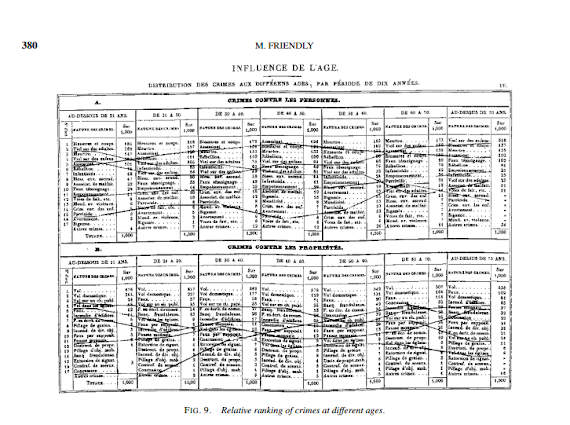
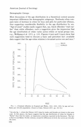
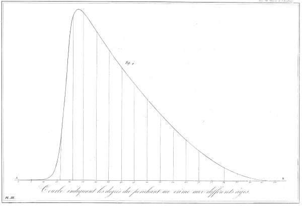
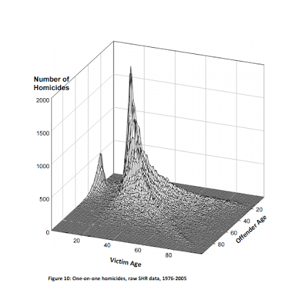
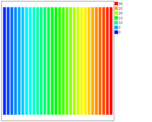
For graphs in syntax SPSS can specify continuous color ramps. Here I will illustrate a few tricks I have found useful, as well as provide alternatives to the default rainbow color ramps SPSS uses when you don’t specify the colors yourself. First we will start with a simple set of fake data.

INPUT PROGRAM.
LOOP #i = 1 TO 30.
  LOOP #j = 1 TO 30.
    COMPUTE x = #i.
    COMPUTE y = #j.
    END CASE.
  END LOOP.
END LOOP.
END FILE.
END INPUT PROGRAM.
DATASET NAME Col.
FORMATS x y (F2.0).
EXECUTE.

The necessary GGRAPH code to make a continuous color ramp is pretty simple, just include a scale variable and map it to a color.

*Colors vary by X, bar graph default rainbow.
TEMPORARY.
SELECT IF y = 1.
GGRAPH
  /GRAPHDATASET NAME="graphdataset" VARIABLES=x y
  /GRAPHSPEC SOURCE=INLINE.
BEGIN GPL
  SOURCE: s=userSource(id("graphdataset"))
  DATA: x=col(source(s), name("x"), unit.category())
  DATA: xC=col(source(s), name("x"))
  DATA: y=col(source(s), name("y"))
  GUIDE: axis(dim(1), null())
  GUIDE: axis(dim(2), null())
  SCALE: linear(dim(2), min(0), max(1))
  ELEMENT: interval(position(x*y), shape.interior(shape.square), color.interior(xC),
           transparency.exterior(transparency."1"))
END GPL.
EXECUTE.

The TEMPORARY statement is just so the bars have only one value passed, and in the inline GPL I also specify that the outsides of the bars are fully transparent. The necessary code is simply creating a variable, here xC, that is continuous and mapping it to a color in the ELEMENT statement using color.interior(xC). Wilkinson in the Grammar of Graphics discusses that even for continuous color ramps he prefers a discrete color legend, which is the behavior in SPSS.

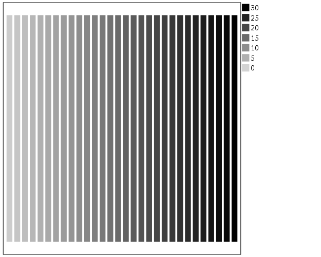
The default color ramp is well known to be problematic, so I will provide some alternatives. A simple choice suitable for many situations is simply a grey-scale chart. To make this you have to make a separate SCALE statement in the inline GPL, and set the aestheticMinimum and the aestheticMaximum. Besides that one additional SCALE statement, the code is the same as before.

*Better color scheme based on grey-scale.
TEMPORARY.
SELECT IF y = 1.
GGRAPH
  /GRAPHDATASET NAME="graphdataset" VARIABLES=x y
  /GRAPHSPEC SOURCE=INLINE.
BEGIN GPL
  SOURCE: s=userSource(id("graphdataset"))
  DATA: x=col(source(s), name("x"), unit.category())
  DATA: xC=col(source(s), name("x"))
  DATA: y=col(source(s), name("y"))
  GUIDE: axis(dim(1), null())
  GUIDE: axis(dim(2), null())
  SCALE: linear(dim(2), min(0), max(1))
  SCALE: linear(aesthetic(aesthetic.color.interior), 
         aestheticMinimum(color.lightgrey), aestheticMaximum(color.black))
  ELEMENT: interval(position(x*y), shape.interior(shape.square), color.interior(xC),
           transparency.exterior(transparency."1"))
END GPL.
EXECUTE.

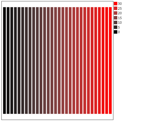
Another option I like is to make a grey-to-red scale ramp (which is arguably diverging or continuous).

*Grey to red.
TEMPORARY.
SELECT IF y = 1.
GGRAPH
  /GRAPHDATASET NAME="graphdataset" VARIABLES=x y
  /GRAPHSPEC SOURCE=INLINE.
BEGIN GPL
  SOURCE: s=userSource(id("graphdataset"))
  DATA: x=col(source(s), name("x"), unit.category())
  DATA: xC=col(source(s), name("x"))
  DATA: y=col(source(s), name("y"))
  GUIDE: axis(dim(1), null())
  GUIDE: axis(dim(2), null())
  SCALE: linear(dim(2), min(0), max(1))
  SCALE: linear(aesthetic(aesthetic.color.interior), 
         aestheticMinimum(color.black), aestheticMaximum(color.red))
  ELEMENT: interval(position(x*y), shape.interior(shape.square), color.interior(xC),
           transparency.exterior(transparency."1"))
END GPL.
EXECUTE.

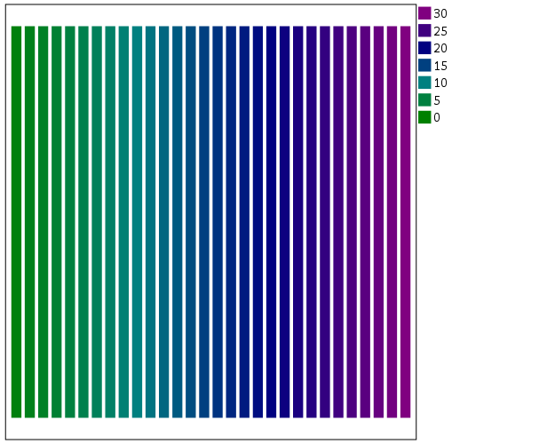
To make an nice looking interpolation with these anchors is pretty difficult, but another one I like is the green to purple. It ends up looking quite close to the associated discrete color ramp from the ColorBrewer palettes.

*Diverging color scale, purple to green.
TEMPORARY.
SELECT IF y = 1.
GGRAPH
  /GRAPHDATASET NAME="graphdataset" VARIABLES=x y
  /GRAPHSPEC SOURCE=INLINE.
BEGIN GPL
  SOURCE: s=userSource(id("graphdataset"))
  DATA: x=col(source(s), name("x"), unit.category())
  DATA: xC=col(source(s), name("x"))
  DATA: y=col(source(s), name("y"))
  GUIDE: axis(dim(1), null())
  GUIDE: axis(dim(2), null())
  SCALE: linear(dim(2), min(0), max(1))
  SCALE: linear(aesthetic(aesthetic.color.interior), 
         aestheticMinimum(color.green), aestheticMaximum(color.purple))
  ELEMENT: interval(position(x*y), shape.interior(shape.square), color.interior(xC),
           transparency.exterior(transparency."1"))
END GPL.
EXECUTE.

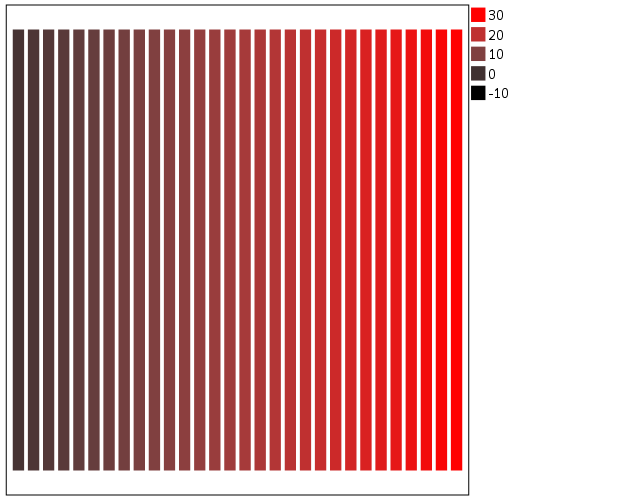
In cartography, whether one uses diverging or continuous ramps is typically related to the data, e.g. if the data has a natural middle point use diverging (e.g. differences with zero at the middle point). I don’t really like this advice though, as pretty much any continuous number can be reasonably turned into a diverging number (e.g. continuous rates to location quotients, splitting at the mean, residuals from a regression, whatever). So I would make the distinction like this, the ramp decides what elements you end up emphasizing. If you want to emphasize the extremes of both ends of the distribution use a diverging ramp, if you only want to emphasize one end use a continuous ramp. There are many situations with natural continuous numbers that we want to emphasize both ends of the ramp based on the questions the map or graph is intended to answer.

Going along with this, you may want the middle break to not be in the middle of the actual data. To set the anchors according to an external benchmark, you can use the min and max function within the same SCALE statement that you specify the colors. Here is an example with the black-to-red color ramp, but I set the minimum lower than the data are, so the ramp starts at a more grey location.

*Setting the break with the external min.
TEMPORARY.
SELECT IF y = 1.
GGRAPH
  /GRAPHDATASET NAME="graphdataset" VARIABLES=x y
  /GRAPHSPEC SOURCE=INLINE.
BEGIN GPL
  SOURCE: s=userSource(id("graphdataset"))
  DATA: x=col(source(s), name("x"), unit.category())
  DATA: xC=col(source(s), name("x"))
  DATA: y=col(source(s), name("y"))
  GUIDE: axis(dim(1), null())
  GUIDE: axis(dim(2), null())
  SCALE: linear(dim(2), min(0), max(1))
  SCALE: linear(aesthetic(aesthetic.color.interior), 
         aestheticMinimum(color.black), aestheticMaximum(color.red), 
         min(-10), max(30))
  ELEMENT: interval(position(x*y), shape.interior(shape.square), color.interior(xC),
           transparency.exterior(transparency."1"))
END GPL.
EXECUTE.

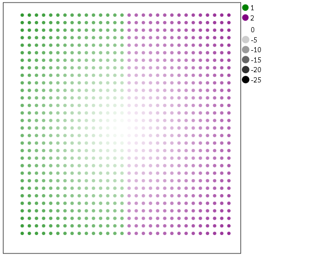
Another trick I like using often is to map discrete colors, and then use transparency to create a continuous ramp (most of the examples I use here could be replicated by specifying the color saturation as well). Here I use two colors and make points more towards the center of the graph more transparent. This can be extended to multiple color bins, see this post on Stackoverflow. Related are value-by-alpha maps, using more transparent to signify more uncertainty in the data (or to draw less attention to those areas). (That linked stackoverflow post wanted to emphasize the middle break for diverging data, but the point remains the same, make things you want to de-emphasize more transparent and things to want to emphasize more saturated.)

*Using transparency and fixed color bins.
RECODE x (1 THRU 15 = 1)(ELSE = 2) INTO XBin.
FORMATS XBin (F1.0).
COMPUTE Dis = -1*SQRT((x - 15)**2 + (y - 15)**2).
FORMATS Dis (F2.0).
GGRAPH
  /GRAPHDATASET NAME="graphdataset" VARIABLES=x y Dis XBin
  /GRAPHSPEC SOURCE=INLINE.
BEGIN GPL
  SOURCE: s=userSource(id("graphdataset"))
  DATA: x=col(source(s), name("x"))
  DATA: y=col(source(s), name("y"))
  DATA: Dis=col(source(s), name("Dis"))
  DATA: XBin=col(source(s), name("XBin"), unit.category())
  GUIDE: axis(dim(1), null())
  GUIDE: axis(dim(2), null())
  SCALE: cat(aesthetic(aesthetic.color.interior), map(("1",color.green),("2",color.purple)))
  ELEMENT: point(position(x*y), color.interior(XBin),
           transparency.exterior(transparency."1"), transparency.interior(Dis))
END GPL.

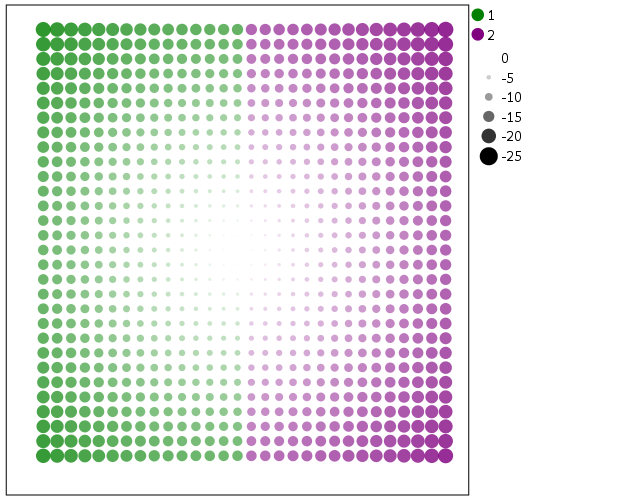
Another powerful visualization tool to emphasize (or de-emphasize) certain points is to map the size of an element in addition to transparency. This is a great tool to add more information to scatterplots.

*Using redundant with size.
GGRAPH
  /GRAPHDATASET NAME="graphdataset" VARIABLES=x y Dis XBin
  /GRAPHSPEC SOURCE=INLINE.
BEGIN GPL
  SOURCE: s=userSource(id("graphdataset"))
  DATA: x=col(source(s), name("x"))
  DATA: y=col(source(s), name("y"))
  DATA: Dis=col(source(s), name("Dis"))
  DATA: XBin=col(source(s), name("XBin"), unit.category())
  GUIDE: axis(dim(1), null())
  GUIDE: axis(dim(2), null())
  SCALE: linear(aesthetic(aesthetic.size), aestheticMinimum(size."1"), 
         aestheticMaximum(size."18"), reverse())
  SCALE: cat(aesthetic(aesthetic.color.interior), map(("1",color.green),("2",color.purple)))
  ELEMENT: point(position(x*y), color.interior(XBin),
           transparency.exterior(transparency."1"), transparency.interior(Dis), size(Dis))
END GPL.

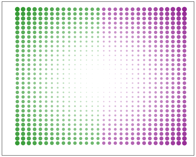
Finally, if you want SPSS to omit the legend (or certain aesthetics in the legend) you have to specify a GUIDE: legend statement for every mapped aesthetic. Here is the previous scatterplot omitting all legends.

*IF you want the legend omitted.
GGRAPH
  /GRAPHDATASET NAME="graphdataset" VARIABLES=x y Dis XBin
  /GRAPHSPEC SOURCE=INLINE.
BEGIN GPL
  SOURCE: s=userSource(id("graphdataset"))
  DATA: x=col(source(s), name("x"))
  DATA: y=col(source(s), name("y"))
  DATA: Dis=col(source(s), name("Dis"))
  DATA: XBin=col(source(s), name("XBin"), unit.category())
  GUIDE: axis(dim(1), null())
  GUIDE: axis(dim(2), null())
  GUIDE: legend(aesthetic(aesthetic.color), null())
  GUIDE: legend(aesthetic(aesthetic.transparency), null())
  GUIDE: legend(aesthetic(aesthetic.size), null())
  SCALE: linear(aesthetic(aesthetic.size), aestheticMinimum(size."1"), 
         aestheticMaximum(size."18"), reverse())
  SCALE: cat(aesthetic(aesthetic.color.interior), map(("1",color.green),("2",color.purple)))
  ELEMENT: point(position(x*y), color.interior(XBin),
           transparency.exterior(transparency."1"), transparency.interior(Dis), size(Dis))
END GPL.