Deep research and open access

Most of the major LLM chatbot vendors are now offering a tool called deep research. These tools basically just scour the web given a question, and return a report. For academics conducting literature reviews, the parallel is obvious. We just tend to limit the review to peer reviewed research.

I started with testing out Google’s Gemini service. Using that, I noticed almost all of the sources cited were public materials. So I did a little test with a few prompts across the different tools. Below are some examples of those:

  • Google Gemini question on measuring stress in police officers (PDF, I cannot share this chat link it appears)
  • OpenAI Effectiveness of Gunshot detection (PDF, link to chat)
  • Perplexity convenience sample (PDF, Perplexity was one conversation)
  • Perplexity survey measures attitudes towards police (PDF, see chat link above)

The report on officer mental health measures was an area I was wholly unfamiliar. The other tests are areas where I am quite familiar, so I could evaluate how well I thought each tool did. OpenAI’s tool is the most irksome to work with, citations work out of the box for Google and Perplexity, but not with ChatGPT. I had to ask it to reformat things several times. Claude’s tool has no test here, as to use its deep research tool you need a paid account.

Offhand each of the tools did a passable job of reviewing the literature and writing reasonable summaries. I could nitpick things in both the Perplexity and the ChatGPT results, but overall they are good tools I would recommend people become familiar with. ChatGPT was more concise and more on-point. Perplexity got the right answer for the convenience sample question (use post-stratification), but also pulled in a large literature on propensity score matching (which is only relevant for X causes Y type questions, not overall distribution of Y). Again this is nit-picking for less than 5 minutes of work.

Overall these will not magically take over writing your literature review, but are useful (the same way that doing simpler searches in google scholar is useful). The issue with hallucinating citations is mostly solved (see the exception for ChatGPT here). You should consult the original sources and treat deep research reports like on-demand Wikipedia pages, but lets not kid ourselves – most people will not be that thorough.

For the Gemini report on officer mental health, I went through quickly and broke down the 77 citations across the publication type or whether the sources were in HTML or PDF. (Likely some errors here, I went by the text for the most part.) For the HTML vs PDF, 59 out of 77 (76%) are HTML web-sources. Here is the breakdown for my ad-hoc categories for types of publications:

  • Peer Review (open) – 39 (50%)
  • Peer review (just abstract) 10 (13% – these are all ResearchGate)
  • Open Reports 23 (30%)
  • Web pages 5 (6%)

For a quick rundown of these. Peer reviewed should be obvious, but sometimes the different tools cite papers that are not open access. In these cases, they are just using the abstract to madlib how Deep Research fills in its report. (I consider ResearchGate articles here as just abstract, they are a mix of really available, but you need to click a link to get to the PDF in those cases. Google is not indexing those PDFs behind a wall, but the abstract.) Open reports I reserve for think tank or other government groups. Web pages I reserve for blogs or private sector white papers.

I’d note as well that even though it does cite many peer review here, many of these are quite low quality (stuff in MDPI, or other what look to me pay to publish locations). Basically none of the citations are in major criminology journals! As I am not as familiar with this area this may be reasonable though, I don’t know if this material is often in different policing journals or Criminal Justice and Behavior and just not being picked up at all, or if that lit in those places just does not exist. I have a feeling it is missing a few of the traditional crim journal sources though (and picks up a few sources in different languages).

The OpenAI report largely hallucinated references in the final report it built (something that Gemini and Perplexity currently do not do). The references it made up were often portmanteaus of different papers. Of the 12 references it provided, 3 were supposedly peer reviewed articles. You can in the ChatGPT chat go and see the actual web-sources it used (actual links, not hallucinated). Of the 32 web links, here is the breakdown:

  • Pubmed 9
  • The Trace 5
  • Kansas City local news station website 4
  • Eric Piza’s wordpress website 3
  • Govtech website 3
  • NIJ 2

There are single links then to two different journals, and one to the Police Chief magazine. I’d note Eric’s site is not that old (first RSS feed started in February 2023), so Eric making a website where he simple shares his peer reviewed work greatly increased his exposure. His webpage in ChatGPT is more influential than NIJ and peer reviewed CJ journals combined.

I did not do the work to go through the Perplexity citations. But in large part they appear to me quite similar to Gemini on their face. They do cite pure PDF documents more often than I expected, but still we are talking about 24% in the Gemini example are PDFs.

The long story short advice here is that you should post your preprints or postprints publicly, preferably in HTML format. For criminologists, you should do this currently on CrimRXiv. In addition to this, just make a free webpage and post overviews of your work.

These tests were just simple prompts as well. I bet you could steer the tool to give better sources with some additional prompting, like “look at this specific journal”. (Design idea if anyone from Perplexity is listening, allow someone to be able to whitelist sources to specific domains.)


Other random pro-tip for using Gemini chats. They do not print well, and if they have quite a bit of markdown and/or mathematics, they do not convert to a google document very well. What I did in those circumstances was to do a bit of javascript hacking. So go into your dev console (in Chrome right click on the page and select “Inspect”, then in the new page that opens up go to the “Console” tab). And depending on the chat browser currently opened, can try entering this javascript:

// Example printing out Google Gemini Chat
var res = document.getElementsByTagName("extended-response-panel")[0];
var report = res.getElementsByTagName("message-content")[0];
var body = document.getElementsByTagName("body")[0];
let escapeHTMLPolicy = trustedTypes.createPolicy("escapeHTML", {
 createHTML: (string) => string
});
body.innerHTML = escapeHTMLPolicy.createHTML(report.innerHTML);
// Now you can go back to page, cannot scroll but
// Ctrl+P prints out nicely

Or this works for me when revisiting the page:

var report = document.getElementById("extended-response-message-content");
var body = document.getElementsByTagName("body")[0];
let escapeHTMLPolicy = trustedTypes.createPolicy("escapeHTML", {
 createHTML: (string) => string
});
body.innerHTML = escapeHTMLPolicy.createHTML(report.innerHTML);

This page scrolling does not work, but Ctrl + P to print the page does.

The idea behind this, I want to just get the report content, which ends up being hidden away in a mess of div tags, promoted out to the body of the page. This will likely break in the near future as well, but you just need to figure out the correct way to get the report content.

Here is an example of using Gemini’s Deep Research to help me make a practice study guide for my sons calculus course as an example.

New preprint and Monitoring Time Between Events

Will be a long post today, have some updates on a preprint, quotes on Flock cameras, an upcoming webinar, plus some R analysis examples of monitoring time between rare crime events.

Pre-print on JTC and examining the Buffer Zone

For a few updates on other projects, I have a pre-print out with Kim Rossmo, The Journey-to-Crime Buffer Zone: Measurement Issues and Methodological Challenges.

Two parts to this paper. Part 1, to test whether a journey to crime (JTC) distribution conforms to a buffer zone (an area with lower, but non-zero, probability of offending nearby their home for predatory crimes against strangers), it only makes sense to look at an individual offenders JTC. This is because mixtures of multiple offenders can each individually have a buffer, but in the aggregate do not (in particular if offenders have varying travel distances). This is the same point in Van Koppen & De Keijser (1997), and the fact that offenders have different travel distance distributions is pretty well established now (Andresen et al., 2014, Drawve et al., 2015; Townsley & Sidebottom, 2010).

The second part is given we need to examine individual offenders, I worked out estimates of how many observations you need to effectively measure whether a buffer zone exists. I estimate you need around 50 observations when using a gamma distribution to measure the existence of a buffer vs monotonically decreasing. Above graphs shows a kernel density estimator that takes into account to not smear the probability below 0 distance, using a transform trick to calculate the KDE on the log scale and then back transform. Both case studies we look at suggest a more peaked distribution for the buffer than gamma probably makes more sense for those samples, but pretty strong evidence the buffer exists. The code to replicate the methods and papers findings is on Github.

If you are a department and you have a good case study of a prolific offender get in touch, would be happy to add more case studies to the paper. Part of the difficulty is having high fidelity measures, offenders tend to move a lot (Wheeler, 2012), and so it is typically necessary to have an analyst really make sure the home (or nearest anchor node) locations are all correct. In addition to most prolific offenders don’t have that many observations.

Flock Story

For a second update, I had a minor quote in Tyler Duke’s story on Flock Cameras in North Carolina, Camera by camera, North Carolina police build growing network to track vehicles. I think license plate readers are good investments for PDs (see Ozer 2016 for a good example, I actually like the mobile ones in vehicles more than fixed ones, see Wheeler & Phillips, 2018 for a case study in Buffalo using them at low friction road blocks). But I do think more regulation to prevent people doing indiscriminate searches is in order (similar to how doing background checks in most states have state rules).

I get more annoyed by Flock’s advertising that suggests they solve 10% of crime nationwide, which is absurd. It is very poorly done design (Snow & Charpentier, 2024) that does a regression of clearance rates regressed on cameras per officer, and suggests the cameras increase clearance rates by 10%. There is multiple things wrong with this – interpreting regression coefficients incorrectly (an increase in 1 in camera per-officer is quite a few cameras and does not in translate to they increase clearances 10% in toto), confounding in the design (smaller agencies with higher clearance by default will have more cameras per officer), not taking into account weights in the modeling or interpretation (e.g. a 20% increase in a small department and a 0% increase in a large department should not average to an overall 10% increase). Probably the worse part about this though is extrapolating from they have cameras in a few hundred departments to saying they help solve 10% of crime nationwide.

It is extra silly because it does not even matter – it makes close to no material difference to the quality of Flock’s products (which look to me high quality, they certainly don’t need to increase clearance rates by 10% to be worth investing in ALPRs for an agency, ALPRs are so cheap if a single camera helps with say 10-20 arrests they are worth it). If anyone from Flock is listening and wants to fund a real high quality study just let me know and ask, but this work they have put out is ridiculous.

Tyle Duke’s (and the Newsobserver in general) I think do a really good job on various data stories. So highly recommend checking out that and their other work.

I am doing a webinar for the Carolina Crime Analysis Association on Monitoring Temporal Crime Trends at the end of the month on May 31st.

Free for CCAA members and $10 for non-members. I will be going over work I have written in various places before, such as the Poisson Z-score for CompStat reports (Wheeler, 2016). I did a recent blog post on the Crime De-Coder site on using the Poisson distribution to flag outliers for rare crime events, e.g. if you have 0.8 robberies per month, is a month with 3 robberies weird?

For other regional crime analysis groups, if you have requests like that feel free. I am thinking I want to spend more time with regional groups than worrying about the bigger IACA group going forward.

And this Poisson example segways into the final section of the blog post.

Monitoring Time in Between Events

So the above of using the Poisson distribution to say is 3 robberies in a month weird, you have to think about the nature of how a crime analyst will use and act on that information. So in that scenario, that may be an analyst has a monthly CompStat report, and it is useful to say ‘yeah 3 is high, but is consistent with chance variation that is not uncommon’. In this scenario though, if you have counts that are high, it is not the best (although better than nothing) to wait until the end of the month CompStat report.

Another common case though is the analyst is regularly reading reports, and they come in and read a new robbery, and right then and there say “I feel like there are more robberies than usual”. How would they tell then if there are more than you would expect? It does not make sense to wait for the end of the month (you technically can back-calculate in the prior month and use a scan statistic, but I think what I will suggest below is a more diagnostic approach).

Here I will outline an approach by examining the time in between events, which is motivated by a comment Rob Fornango mentioned on LinkedIn.

So there is a duality between the Poisson distribution and the exponential distribution – if you have a mean of 0.8 events per month, the inter-arrival times are exponentially distributed with a mean of 1/0.8. The typical motivation for a Poisson distribution is the inter-arrival times are independent, so you can technically just work with the inter-arrival times directly.

Here is a quick simulation in R to show that you can simulate inter-arrival times, and then turn them into counts per unit time. The counts per unit time will then be Poisson distributed. Note that R you give the lambda term directly in the R parameterization, whereas others (like in scipy) you specify 1/lambda. I know it is not documented well, but I leave as an exercise to the reader who cares enough to figure out what I am doing here and why.

set.seed(10)
pmean <- 0.8
n <- 50000

re <- rexp(n,pmean) # simulating exponential
rec <- cumsum(re)   # translating to times
frec <- floor(rec)  # will aggregate to counts per 1 unit

# factor is to include units with 0 counts
recV <- 0:max(frec)
frec <- factor(frec,levels=recV)
re_tab <- as.data.frame(table(frec))
re_tab$frec <- recV
re_tab$Freq <- factor(re_tab$Freq,levels=0:max(re_tab$Freq))

# Two tables are to aggregate to units, and then get a count
# of counts per unit
count_tab <- as.data.frame(table(re_tab$Freq))
names(count_tab) <- c("Count","ExpSim")
count_tab$Count <- as.numeric(levels(count_tab$Count))
count_tab$PoisExp <- round(dpois(count_tab$Count,pmean)*length(recV))

And this prints out a table that shows very close correspondence between the two.

> print(count_tab)
  Count ExpSim PoisExp
      0  28538   28411
      1  22959   22729
      2   8813    9092
      3   2356    2424
      4    482     485
      5     75      78
      6      5      10
      7      2       1

Ok, with that established, how do we take into account the time in between events, and use that to flag if recent events are occurring too close to each other? Going with my suggestion of using 1/100 or 1/1000 probability to flag an outlier, for a single “time between two events”, you can look at the quantiles of the exponential distribution. So for the 1/100 threshold:

qexp(0.01,0.8)

Gives 0.01256292. Note this is in months, so if we say a month is 30 days, we could then say it is 0.01256292*30, which is 0.38 days, or just over 9 hours. So this is saying basically if you had two robberies on the same shift, given a mean of 0.8 per month in your jurisdiction, that may be worth looking into if they are the same offender. Not terribly helpful as that would be something most analysts would spot without the help of analytics.

But say you had an event with a rate of 0.1 per month (so on average just over one per year). Two events in three days then would be cause for alarm, qexp(0.01,0.1)*30 is just over 3 days.

So that is examining two recent events, you could extend this to several recent events nearby in time (what I think is likely to be more useful for crime analysts). So say you had a crime on Monday, Wednesday, and then Saturday. So two times in between of 2 days and 3 days. I would say the probability of this occurring is:

prod(pexp(c(2,3),0.8/30))

Which R gives as 0.003993034, so around 4 in 1,000. This is the probability of the 2 days multiplied by the probability of 3 days. We can make a graph of the string of three events (so two times in-between) that meet our less than 0.01 chance.

library(ggplot2)

theme_cdc <- function(){
  theme_bw() %+replace% theme(
     text = element_text(size = 16),
     panel.grid.major= element_line(linetype = "longdash"),
     panel.grid.minor= element_blank()
) }

days <- 1:20
df <- expand.grid(x=days,y=days)
df$p <- pexp(df$x,pmean/30)*pexp(df$y,pmean/30)
df <- df[df$p < 0.01,]
p <- ggplot(df,aes(x=x,y=y)) + 
     geom_point(pch=21,fill='grey',size=7.5) +
     labs(x=NULL,y=NULL,title='Nearby Days < 0.01') +
     scale_y_continuous(breaks=days,limits=c(1,max(days))) +
     scale_x_continuous(breaks=days,limits=c(1,max(days))) +
     theme_cdc()

p

So this gives a chart that meets the criteria for days between in 3 nearby events for the 0.8 per month scenario. So if you have times between of 3 and 4 it meets this threshold, as well as 2 and 8, etc. This data for 1+ days it pretty much never gets to the 1/1000 threshold.

You can technically extend this to multiple crimes. We are in the cusum chart territory then. The idea behind cusum charts is if you have an expected value of say 10, in a typical process control chart if you had a bunch of values 12,14,11,13,12, they may not individually alarm. But you can see that the process is consistently above the expected value, which for random data it should fluctuate sometimes below 10 and sometimes above 10. The consistent above the expected value is itself a signal that will alarm in the cusum approach.

I debate on doing more cusum type process control charts with crime data, but they are abit of work to reset (they will always alarm eventually, and then you reset the cumulative statistics and start the process over again) – but in this scenario the reset is not too difficult.

So the approach would be something like:

probs <- pexp(days_between,mean_per_unit)
snorm <- qnorm(probs)
cumvals <- cumsum(snorm)

The cusum approach works like this here. So only start counting if the days between are less than qexp(0.5,pmean), which here is about 26 days. If you have any time in between more than 26 days, you reset the cusum chart. But if you have several events with times less than 26 days, you do the above calculations, and if the cumulative sum gets lower than -4 (so multiple events nearby less than 26 days apart), you alarm. So for example, for our mean of 0.8, if you had a string of 7,6,12,9,10 days in between for crimes:

pmean <- 0.8
days_between <- c(7,6,12,9,10)
probs <- pexp(days_between,pmean/30)
snorm <- qnorm(probs)
cumvals <- cumsum(snorm)

That would alarm on the final crime, even though those are 6 crimes spread apart 44 days.

This is because snorm will have a standard normal distribution, and so the typical alarm rate for cusum charts with mean zero and standard deviation of 1 is +/- 4. You can technically use it for events too far apart as well here, although I don’t know of situations where people would care too much about that (either in crime or other monitoring situations).

This is all more complicated than 5+ in a month example, partly why I haven’t used cusum charts (or days in between) in other examples. But hopefully someone finds that useful to monitor rare events, and not wait for their end of month stats to alert them!

References

Some notes on synthetic control and Hogan/Kaplan

This will be a long one, but I have some notes on synthetic control and the back-and-forth between two groups. So first if you aren’t familiar, Tom Hogan published an article on how the progressive District Attorney (DA) in Philadelphia, Larry Krasner, in which Hogan estimates that Krasner’s time in office contributed to a large increase in the number of homicides. The control homicides are estimated using a statistical technique called synthetic control, in which you derive estimates of the trend in homicides to compare Philly to based on a weighted average of comparison cities.

Kaplan and colleagues (KNS from here on) then published a critique of various methods Hogan used to come up with his estimate. KNS provided estimates using different data and a different method to derive the weights, showing that Philadelphia did not have increased homicides post Krasner being elected. For reference:

Part of the reason I am writing this is if people care enough, you could probably make similar back and forths on every synth paper. There are many researcher degrees of freedom in the process, and in turn you can make reasonable choices that lead to different results.

I think it is worthwhile digging into those in more detail though. For a summary of the method notes I discuss for this particular back and forth:

  • Researchers determine the treatment estimate they want (counts vs rates) – solvers misbehaving is not a reason to change your treatment effect of interest
  • The default synth estimator when matching on counts and pop can have some likely unintended side-effects (NYC pretty much has to be one of the donor cities in this dataset)
  • Covariate balancing is probably a red-herring (so the data issues Hogan critiques in response to KNS are mostly immaterial)

In my original draft I had a note that this post would not be in favor of Hogan nor KNS, but in reviewing the sources more closely, nothing I say here conflicts with KNS (and I will bring a few more critiques of Hogan’s estimates that KNS do not mention). So I can’t argue much with KNS’s headline that Hogan’s estimates are fatally flawed.

An overview of synthetic control estimates

To back up and give an overview of what synth is for general readers, imagine we have a hypothetical city A with homicide counts 10 15 30, where the 30 is after a new DA has been elected. Is the 30 more homicides than you would have expected absent that new DA? To answer this, we need to estimate a counterfactual trend – what the homicide count would have been in a hypothetical world in which a new progressive DA was not elected. You can see the city homicides increased the prior two years, from 10 to 15, so you may say “ok, I expected it to continue to increase at the same linear trend”, in which case you would have expected it to increase to 20. So the counterfactual estimated increase in that scenario is observed - counterfactual, here 30 - 20 = 10, an estimated increase of 10 homicides that can be causally attributed to the progressive DA.

Social scientists tend to not prefer to just extrapolate prior trends from the same location into the future. There could be widespread changes that occur everywhere that caused the increase in city A. If homicide rates accelerated in every city in the country, even those without a new progressive DA, it is likely something else is causing those increases. So say we compare city A to city B, and city B had a homicide count trend during the same time period 10 15 35. Before the new DA in city A, cities A/B had the same pre-trend (both 10 15). The post time period City B increased to 35 homicides. So if using City B as the counterfactual estimate, we have the progressive DA reduced 5 homicides, again observed - counterfactual = 30 - 35 = -5. So even though city A increased, it increased less than we expected based on the comparison city B.

Note that this is not a hypothetical concern, it is pretty basic one that you should always be concerned about when examining macro level crime data. There has been national level homicide increases over the time period when Krasner has been in office (Yim et al, 2020, and see this blog post for updates. U.S. city homicide rates tend to be very correlated with each other (McDowall & Loftin, 2009).

So even though Philly has increased in homicide counts/rates when Krasner has been in office, the question is are those increases higher or lower than we would expect. That is where the synthetic control method comes in, we don’t have a perfect city B to compare to Philadelphia, so we create our own “synthetic” counter-factual, based on a weighted average of many different comparison cities.

To make the example simple, imagine we have two potential control cities and homicide trends, city C1 0 30 20, and city C2 20 0 30. Neither looks like a good comparison to city A that has trends 10 15 30. But if we do a weighted average of C1 and C2, with the weights 0.5 for each city, when combined they are a perfect match for the two pre-treatment periods:

C0  C1 Average cityA
 0  20   10     10
30   0   15     15
20  30   25     30

This is what the synthetic control estimator does, although instead of giving equal weights it determines the optimal weights to match the pre-treatment time period given many potential donors. In real data for example C0 and C1 may be given weights of 0.2 and 0.8 to give the correct balance based on the prior to treatment time periods.

The fundamental problem with synth

The rub with estimating the synth weights is that there is no one correct way to estimate the weights – you have more numbers to estimate than data points. In the Hogan paper, he has 5 pre time periods, 2010-2014, and he has 82 potential donors (99 other of the largest cities in the US minus 17 progressive prosecutors). So you need to learn 82 numbers (the weights) based on 5 data points.


Side note: you can also consider matching on covariates additional data points, although I will go into more detail on how matching on covariates is potentially a red-herring. Hogan I think uses an additional 5*3=15 time varying points (pop, cleared homicide, homicide clearance rates), and maybe 3 additional time invariant (median income, 1 prosecutor categorization, and homicides again!). So maybe has 5 + 15 + 3 = 23 data points to match on (so same fundamental problem, 23 numbers to learn 82 weights). I am just going to quote the full passage on Hogan (2022a) here where he discusses covariate matching:

The number of homicides per year is the dependent variable. The challenge with this synthetic control model is to use variables that both produce parallel trends in the pre-period and are sufficiently robust to power the post-period results. The model that ultimately delivered the best fit for the data has population, cleared homicide cases, and homicide clearance rates as regular predictors. Median household income is passed in as the first special predictor. The categorization of the prosecutors and the number of homicides are used as additional special predictors. For homicides, the raw values are passed into the model. Abadie (2021) notes that the underlying permutation distribution is designed to work with raw data; using log values, rates, or other scaling techniques may invalidate results.

This is the reason why replication code is necessary – it is very difficult for me to translate this to what Hogan actually did. “Special” predictors here are code words for the R synth package for time-invariant predictors. (I don’t know based on verbal descriptions how Hogan used time-invariant for the prosecutor categorization for example, just treats it as a dummy variable?) Also only using median income – was this the only covariate, or did he do a bunch of models and choose the one with the “best” fit (it seems maybe he did do a search, but doesn’t describe the search, only the end selected result).

I don’t know what Hogan did or did not do to fit his models. The solution isn’t to have people like me and KNS guess or have Hogan just do a better job verbally describing what he did, it is to release the code so it is transparent for everyone to see what he did.


So how do we estimate those 82 weights? Well, we typically have restrictions on the potential weights – such as the weights need to be positive numbers, and the weights should sum to 1. These are for a mix of technical and theoretical reasons (having the weights not be too large can reduce the variance of the estimator is a technical reason, we don’t want negative weights as we don’t think there are bizzaro comparison areas that have opposite world trends is a theoretical one).

These are reasonable but ultimately arbitrary – there are many different ways to accomplish this weight estimation. Hogan (2022a) uses the R synth package, KNS use a newer method also advocated by Abadie & L’Hour (2021) (very similar, but tries to match to the closest single city, instead of weights for multiple cities). Abadie (2021) lists probably over a dozen different procedures researchers have suggested over the past decade to estimate the synth weights.

The reason I bring this up is because when you have a problem with 82 parameters and 5 data points, the problem isn’t “what estimator provides good fit to in-sample data” – you should be able to figure out a estimator that accomplishes good in-sample fit. The issue is whether that estimator is any good out-of-sample.

Rates vs Counts

So besides the estimator used, you can break down 3 different arbitrary researcher data decisions that likely impact the final inferences:

  • outcome variable (homicide counts vs homicide per capita rates)
  • pre-intervention time periods (Hogan uses 2010-2014, KNS go back to 2000)
  • covariates used to match on

Lets start with the outcome variable question, counts vs rates. So first, as quoted above, Hogan cites Abadie (2021) for saying you should prefer counts to rates, “Abadie (2021) notes that the underlying permutation distribution is designed to work with raw data; using log values, rates, or other scaling techniques may invalidate results.”

This has it backwards though – the researcher chooses whether it makes sense to estimate treatment effects on the count scale vs rates. You don’t goal switch your outcome because you think the computer can’t give you a good estimate for one outcome. So imagine I show you a single city over time:

        Y0    Y1    Y2
Count   10    15    20
Pop   1000  1500  2000

You can see although the counts are increasing, the rate is consistent over the time period. There are times I think counts make more sense than rates (such as cost-benefit analysis), but probably in this scenario the researcher would want to look at rates (as the shifting denominator is a simple explanation causing the increase in the counts).

Hogan (2022b) is correct in saying that the population is not shifting over time in Philly very much, but this isn’t a reason to prefer counts. It suggests the estimator should not make a difference when using counts vs rates, which just points to the problematic findings in KNS (that making different decisions results in different inferences).

Now onto the point that Abadie (2021) says using rates is wrong for the permutation distribution – I don’t understand what Hogan is talking about here. You can read Abadie (2021) for yourself if you want. I don’t see anything about the permutation inferences and rates.

So maybe Hogan mis-cited and meant another Abadie paper – Abadie himself uses rates for various projects (he uses per-capita rates in the 2021 cited paper, Abadie et al., (2010) uses rates for another example), so I don’t think Abadie thinks rates are intrinsically problematic! Let me know if there is some other paper I am unaware of. I honestly can’t steelman any reasonable source where Hogan (2022a) came up with the idea that counts are good and rates are bad though.

Again, even if they were, it is not a reason to prefer counts vs rates, you would change your estimator to give you the treatment effect estimate you wanted.


Side note: Where I thought the idea with the problem with rates was going (before digging in and not finding any Abadie work actually saying there is issues with rates), was increased variance estimates with homicide data. So Hogan (2022a) estimates for the synth weights Detroit (0.468), New Orleans (NO) (0.334), and New York City (NYC) (0.198), here are those cities homicide rates graphed (spreadsheet with data + notes on sources).

You can see NO’s rate is very volatile, so is not a great choice for a matched estimator if using rates. (I have NO as an example in Wheeler & Kovandzic (2018), that much variance though is fairly normal for high crime not too large cities in the US, see Baltimore for example for even more volatility.) I could forsee someone wanting to make a weighted synth estimator for rates, either make the estimator a population weighted average, or penalize the variance for small rates. Maybe you can trick microsynth to do a pop weighted average out of the box (Robbins et al., 2017).


To discuss the Hogan results specifically, I suspect for example NYC being a control city with high weight in the Hogan paper, which superficially may seem good (both large cities on the east coast), actually isn’t a very good control area considering the differences in homicide trends (either rates or counts) over time. (I am also not so sure about describing NYC and New Orlean’s as “post-industrial” by Hogan (2022a) either. I mean this is true to the extent that all urban areas in the US are basically post-industrial, but they are not rust belt cities like Detroit.)

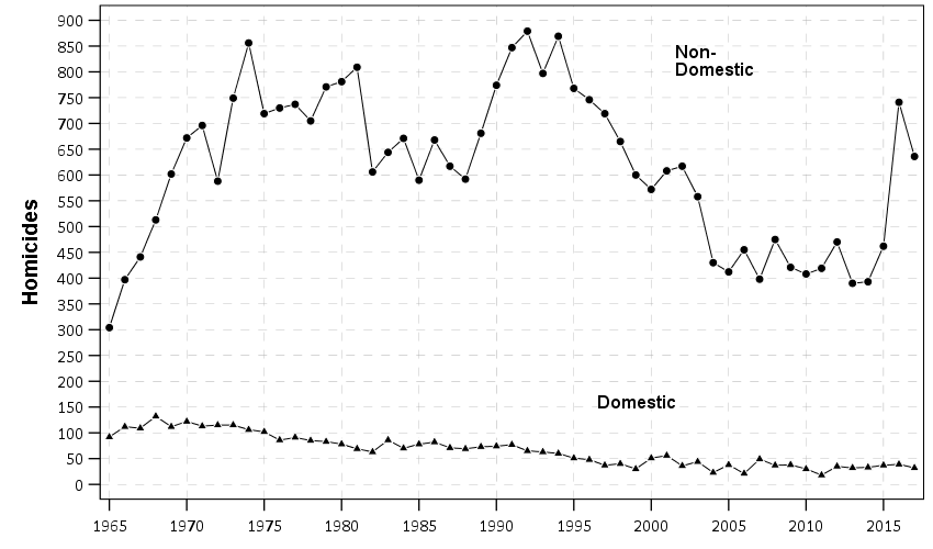
Here is for reference counts of homicides in Philly, Detroit, New Orleans, and NYC going back further in time:

NYC is such a crazy drop in the 90s, lets use the post 2000 data that KNS used to zoom in on the graph.

I think KNS are reasonable here to use 2000 as a cut point – it is more empirical based (post crime drop), in which you could argue the 90’s are a “structural break”, and that homicides settled down in most cities around 2000 (but still typically had a gradual decline). Given the strong national homicide trends though across cities (here is an example I use for class, superimposing Dallas/NYC/Chicago), I think using even back to the 60’s is easily defensible (moreso than limiting to post 2010).

It depends on how strict you want to be whether you consider these 3 cities “good” matches for the counts post 2010 in Hogan’s data. Detroit seems a good match on the levels and ok match on trends. NO is ok match on trends. NYC and NO balance each other in terms of matching levels, NYC has steeper declines though (even during the 2010-2014 period).

The last graph though shows where the estimated increases from Hogan (2022a) come from. Philly went up and those 3 other cities went down from 2015-2018 (and had small upward bumps in 2019).

Final point in this section, careful what you wish for with sparse weights and sum to 1 in the synth estimate. What this means in practice when using counts and matching on pop size, is that you need lines that are above and below Philly on those dimensions. So to get a good match on Pop, it needs to select at least one of NYC/LA/Houston (Chicago was eliminated due to having a progressive prosecutor). To get a good match on homicide counts, it also has to pick at least one city with more homicides per year as well, which limits the options to New York and Detroit (LA/Houston have lower overall homicide counts to Philly).

You can’t do the default Abadie approach for NYC for example (matching on counts and pop) – it will always have a bad fit when using comparison cities in the US as the donor pool. You either need to allow the weights to sum to larger than 1, or the lasso approach with an intercept is another option (so you only match on trend, not levels).

Because matching on trends is what matters for proper identification in this design, not levels, this is all sorts of problematic with the data at hand. (This is also a potential problem with the KNS estimator as well. KNS note though they don’t trust their estimate offhand, their reasonable point is that small changes in the design result in totally different inferences.)

Covariates and Out of Sample Estimates

For sake of argument, say I said Hogan (2022a) is bunk, because it did not match on “per-capita annual number of cheese-steaks consumed”. Even though on its face this covariate is non-sense, how do you know it is non-sense? In the synthetic control approach, there is no empirical, falsifiable way to know whether an covariate is a correct one to match on. There is no way to know that median income is better than cheese-steaks.

If you wish for more relevant examples, Philly has obviously more issues with street consumption of opioids than Detroit/NOLA/NYC, which others have shown relationships to homicide and has been getting worse over the time Krasner has been in office (Rosenfeld et al., 2023). (Or more simply social disorganization is the more common way that criminologists think about demographic trends and crime.)

This uncertainty in “what demographics to control for” is ok though, because matching on covariates is neither necessary nor sufficient to ensure you have estimated a good counter-factual trend. Abadie in his writings intended for covariates to be more like fuzzy guide-rails – they are qualitative things that you think the comparison areas should be similar on.

Because there are effectively an infinite pool of potential covariates to match on, I prefer the approach of simply limiting the donor pool apriori – Hogan limiting to large cities is on its face reasonable. Including other covariates is not necessary, and does not make the synth estimate more or less robust. Whether KNS used good or bad data for covariates is entirely a red-herring as to the quality of the final synth estimate.


Side note: I don’t doubt that Hogan got advice to not share data and code. It is certainly not normative in criminology to do this. It creates a bizarre situation though, in which someone can try to replicate Hogan by collating original sources, and then Hogan always comes back and says “no, the data you have are wrong” or “the approach you did is not exactly replicating my work”.

I get that collating data takes a long time, and people want to protect their ability to publish in the future. (Or maybe just limit their exposure to their work being criticized.) It is blatantly antithetical to verifying the scientific integrity of peoples work though.

Even if Hogan is correct though in the covariates that KNS used are wrong, it is mostly immaterial to the quality of the synth estimates. It is a waste of time for outside researchers to even bother to replicate Hogan’s covariates he used.


So I used the idea of empirical/falsifiable – can anything associated with synth be falsifiable? Why yes it can – the typical approach is to do some type of leave-one-out estimate. It may seem odd because synth estimates an underlying match to a temporal trend in the treated location, but there is nothing temporal about the synth estimate. You could jumble up the years in the pre-treatment sample and still would estimate the same weights.

Because of this, you can leave-a-year-out in the pre-treatment time period, run your synth algorithm, and then predict that left out year. A good synth estimator will be close to the observed value for the out of sample estimates in the pre-treated time period (and as a side bonus, you can use that variance estimate to estimate the error in the post-trend years).

That is a relatively simple way to determine if the Hogan 5 year vs KNS 15 year time periods are “better” synth controls (my money is on KNS for that one). Because Hogan has not released data/code, I am not going to go through that trouble. As I said in the side note earlier, I could try to do that, and Hogan could simply come back and say “you didn’t do it right”.

This also would settle the issue of “over-fit”. You actually cannot just look at the synth weights, and say that if they are sparse they are not over-fit and if not sparse are over-fit. So for reference, you have in Hogan essentially fitting 82 weights based on 5 datapoints, and he identified a fit with 3 non-zero weights. Flip this around, and say I had 5 data points and fit a model with 3 parameters, it is easily possible that the 3 parameter model in that scenario is overfit.

Simultaneously, it is not necessary to have a sparse weights matrix. Several alternative methods to estimate synth will not have sparse weights (I am pretty sure Xu (2017) will not have sparse weights, and microsynth estimates are not sparse either for just two examples). Because US cities have such clear national level trends, a good estimator in this scenario may have many tiny weights (where good here is low bias and variance out of sample). Abadie thinks sparse weights are good to make the model more interpretable (and prevent poor extrapolation), but that doesn’t mean by default a not sparse solution is bad.

To be clear, KNS admit that their alternative results are maybe not trustworthy due to not sparse weights, but this doesn’t imply Hogan’s original estimates are themselves “OK”. I think maybe a correct approach with city level homicide rate data will have non-sparse weights, due to the national level homicide trend that is common across many cities.

Wrapping Up

If Crim and Public Policy still did response pieces maybe I would go through that trouble of doing the cross validation and making a different estimator (although I would unlikely be an invited commenter). But wanted to at least do this write up, as like I said at the start I think you could do this type of critique with the majority of synth papers in criminology being published at the moment.

To just give my generic (hopefully practical) advice to future crim work:

  • don’t worry about matching on covariates, worry about having a long pre-period
  • the default methods you need to worry about if you have enough “comparable” units – this is in terms of levels, not just trends
  • the only way to know the quality of the modeling procedure in synth is to do out of sample estimates.

Bullet points 2/3 are perhaps not practical – most criminologists won’t have the capability to modify the optimization procedure to the situation at hand (I spent a few days trying without much luck to do my penalized variants suggested, sharing so others can try out themselves, I need to move onto other projects!) Also takes a bit of custom coding to do the out of sample estimates.

For many realistic situations though, I think criminologists need to go beyond just point and clicking in software, especially for this overdetermined system of equations synthetic control scenario. I did a prior blog post on how I think many state level synth designs are effectively underpowered (and suggested using lasso estimates with conformal intervals). I think that is a better default in this scenario as well compared to the typical synth estimators, although you have plenty of choices.

Again I had initially written this as trying to two side the argument, and not being for or against either set of researchers. But sitting down and really reading all the sources and arguments, KNS are correct in their critique. Hogan is essentially hiding behind not releasing data and code, and in that scenario can make an endless set of (ultimately trivial) responses of anyone who publishes a replication/critique.

Even if some of the the numbers KNS collated are wrong, it does not make Hogan’s estimates right.

References

This one simple change will dramatically improve reproducibility in journals

So Eric Stewart is back in the news, and it appears a new investigation has prompted him to resign from Florida State. For a background on the story, I suggest reading Justin Pickett’s EconWatch article. In short, Justin did analysis of his own papers he co-authored with Stewart to show what is likely data fabrication. Various involved parties had superficial responses at first, but after some prodding many of Stewart’s papers were subsequently retracted.

So there is quite a bit of human messiness in the responses to accusations of error/fraud, but I just want to focus on one thing. In many of these instances, the flow goes something like:

  1. individual points out clear numeric flaws in a paper
  2. original author says “I need time to investigate”
  3. multiple months later, original author has still not responded
  4. parties move on (no resolution) OR conflict (people push for retraction)

My solution here is a step that mostly fixes the time lag in steps 2/3. Authors who submit quantitative results should be required to submit statistical software log files along with their article to the journal from the start.

So there is a push in social sciences to submit fully reproducible results, where an outside party can replicate 100% of the analysis. This is difficult – I work full time as a software engineer – it requires coding skills most scientists don’t have, as well as outside firms to devote resources to the validation. (Offhand, if you hired me to do this, I would probably charge something like $5k to $10k I am guessing given the scope of most journal articles in social sciences.)

An additional problem with this in criminology research, we are often working with sensitive data that cannot easily be shared.

I agree a fully 100% reproducible would be great – lets not make the perfect the enemy of the good though. What I am suggesting is that authors should directly submit the log files that they used to produce tables/regression results.

Many authors currently are running code interactively in Stata/R/SPSS/whatever, and copy-pasting the results into tables. So in response to 1) above (the finding of a data error), many parties assume it is a data transcription error, and allow the original authors leeway to go and “investigate”. If journals have the log files, it is trivial to see if a data error is a transcription error, and then can move into a more thorough forensic investigation stage if the logs don’t immediately resolve any discrepancies.


If you are asking “Andy, I don’t know how to save a log file from my statistical analysis”, here is how below. It is a very simple thing – a single action or line of code.

This is under the assumption people are doing interactive style analysis. (It is trivial to save a log file if you have created a script that is 100% reproducible, e.g. in R it would then just be something like Rscript Analysis.R > logfile.txt.) So is my advice to save a log file when doing interactive partly code/partly GUI type work.

In Stata, at the beginning of your session use the command:

log using "logfile.txt", text replace

In R, at the beginning of your session:

sink("logfile.txt")
...your code here...
# then before you exit the R session
sink()

In SPSS, at the end of your session:

OUTPUT EXPORT /PDF DOCUMENTFILE="local_path\logfile.pdf".

Or you can go to the output file and use the GUI to export the results.

In python, if you are doing an interactive REPL session, can do something like:

python > logfile.txt
...inside REPL here...

Or if you are using Jupyter notebooks can just save the notebook a html file.

If interested in learning how to code in more detail for regression analysis, I have PhD course notes on R/SPSS/Stata.


This solution is additional work from the authors perspective, but a very tiny amount. I am not asking for 100% reproducible code front to back, I just want a log file that shows the tables. These log files will not show sensitive data (just summaries), so can be shared.

This solution is not perfect. These log files can be edited. Requiring these files will also not prevent someone from doctoring data outside of the program and then running real analysis on faked data.

It ups the level of effort for faking results though by a large amount compared to the current status quo. Currently it just requires authors to doctor results in one location, this at a minimum requires two locations (and to keep the two sources equivalent is additional work). Often the outputs themselves have additional statistical summaries though, so it will be clearer if someone doctored the results than it would be from a simpler table in a peer reviewed article.

This does not 100% solve the reproducibility crisis in social sciences. It does however solve the problem of “I identified errors in your work” and “Well I need 15 months to go and check my work”. Initial checks for transcription vs more serious errors with the log files can be done by the journal or any reasonable outsider in at most a few hours of work.

New paper: An Open Source Replication of a Winning Recidivism Prediction Model

Our paper on the NIJ forecasting competition (Gio Circo is the first author), is now out online first in the International Journal of Offender Therapy and Comparative Criminology (Circo & Wheeler, 2022). (Eventually it will be in special issue on replications and open science organized by Chad Posick, Michael Rocque, and Eric Connolly.)

We ended up doing the same type of biasing as did Mohler and Porter (2022) to ensure fairness constraints. Essentially we biased results to say no one was high risk, and this resulted in “fair” predictions. With fairness constraints or penalities you sometimes have to be careful what you wish for. And because not enough students signed up, me and Gio had more winnings distributed to the fairness competition (although we did quite well in round 2 competition even with the biasing).

So while that paper is locked down, we have the NIJ tech paper on CrimRXiv, and our ugly code on github. But you can always email for a copy of the actual published paper as well.

Of course since not an academic anymore, I am not uber focused on potential future work. I would like to learn more about survival type machine learning forecasts and apply it to recidivism data (instead of doing discrete 1,2,3 year predictions). But my experience is the machine learning models need very large datasets, even the 20k rows here are on the fringe where regression are close to equivalent to non-linear and tree based models.

Another potential application is simple models. Cynthia Rudin has quite a bit of recent work on interpretable trees for this (e.g. Liu et al. 2022), and my linked post has examples for simple regression weights. I suspect the simple regression weights will work reasonably well for this data. Likely not well enough to place on the scoreboard of the competition, but well enough in practice they would be totally reasonable to swap out due to the simpler results (Wheeler et al., 2019).

But for this paper, the main takeaway me and Gio want to tell folks is to create a (good) model using open source data is totally within the capabilities of PhD criminal justice researchers and data scientists working for these state agencies.They are quantitaive skills I wish more students within our field would pursue, as it makes it easier for me to hire you as a data scientist!

References

Some peer review ideas

I recently did two more reviews for Crime Solutions. I actually have two other reviews due, in which I jumped Crime Solutions up in my queue. This of course is likely to say nothing about anyone but myself and my priorities, but I think I can attribute this behavior to two things:

  1. CrimeSolutions pays me to do a review (not much, $250, IMO I think I should get double this but DSG said it was pre-negotiated with NIJ).
  2. CrimeSolutions has a pre-set template. I just have to fill in the blanks, and write a few sentences to point to the article to support my score for that item.

Number 2 in particular was a determinant in me doing the 2nd review CrimeSolutions forwarded to me in very short order. After doing the 1st, I had the template items fresh in my mind, and knew I could do the second with less mental overhead.

I think these can, on the margins, improve some of the current issues with peer reviews. #1 will encourage more people to do reviews, #2 will improve the reliability of peer reviews (as well as make it easier for reviewers by limiting the scope). (CrimeSolutions has the reviewers hash it out if we disagree about something, but that has only happened once to me so far, because the template to fill in is laid out quite nicely.)

Another problem with peer reviews is not just getting people to agree to review, but to also to get them to do the review in a timely manner. For this, I suggest a time graded pay scale – if you do the review faster, you will get paid more. Here are some potential curves if you set the pay scale to either drop linearly with number of days or a logarithmic drop off:

So here, if using the linear scale and have a base rate of $300, if you do the review in two weeks, you would make $170, but if you take the full 30 days, you make $10. I imagine people may not like the clock running so fast, so I also devised a logarithmic pay scale, that doesn’t ding you so much for taking a week or two, but after that penalizes you quite heavily. So at two weeks is just under $250.

I realize pay is unlikely to happen (although is not crazy unreasonable, publishers extract quite a bit of rents from University libraries to subscriptions). But standardized forms are something journals could do right now.

Buffalo shootings paper published

My article examining spatial shifts in shootings in Buffalo pre/post Covid, in collaboration with several of my Buffalo colleagues, is now published in the Journal of Experimental Criminology (Drake et al., 2022).

If you do not have access to that journal, you can always just email, or check out the open access pre-print. About the only difference is a supplement we added in response to reviewers, including maps of different grid cell areas, here is a hex grid version of the changes:

The idea behind this paper was to see if given the dramatic increase in shootings in Buffalo after Covid started (Kim & Phillips, 2021), they about doubled (similar to NYC), did spatial hot spots change? The answer is basically no (and I did a similar analysis in NYC as well).

While other papers have pointed out that crime increases disproportionately impact minority communities (Schleimer et al., 2022), which is true, it stands to be very specific what the differences in my work and this are saying. Imagine we have two neighborhoods:

Neighborhood A, Disadvantaged/Minority, Pre 100 crimes, Post 200 crimes
Neighborhood B,    Advantaged/Majority, Pre   1 crimes, Post   2 crimes

The work that I have done has pointed to these increases due to Covid being that relative proportions/rates are about the same (shootings ~doubled in both Buffalo/NYC). And that doubling was spread out pretty much everywhere. It is certainly reasonable to interpret this as an increased burden in minority communities, even if proportional trends are the same everywhere.

This proportional change tends to occur when crime declines as well (e.g. Weisburd & Zastrow, 2022; Wheeler et al., 2016). And this just speaks to the stickiness of hot spots of crime. Even with large macro changes in temporal crime trends, crime hot spots are very durable over time. So I really think it makes the most sense for police departments to have long term strategies to deal with hot spots of crime, and they don’t need to change targeted areas very often.

References

How arrests reduce near repeats: Breaking the Chain paper published

My paper (with colleagues Jordan Riddell and Cory Haberman), Breaking the chain: How arrests reduce the probability of near repeat crimes, has been published in Criminal Justice Review. If you cannot access the peer reviewed version, always feel free to email and I can send an offprint PDF copy. (For those not familiar, it is totally OK/legal for me to do this!) Or if you don’t want to go to that trouble, I have a pre-print version posted here.

The main idea behind the paper is that crimes often have near-repeat patterns. That is, if you have a car break in on 100 1st St on Monday, the probability you have another car break in at 200 1st St later in the week is higher than typical. This is most often caused by the same person going and committing multiple offenses in a short time period. So a way to prevent that would on its face be to arrest the individual for the initial crime.

I estimate models showing the reduction in the probability of a near repeat crime if an arrest occurs, based on publicly available Dallas PD data (paper has links to replication code). Because near repeat in space & time is a fuzzy concept, I estimate models showing reductions in near repeats for several different space-time thresholds.

So here the model is Prob[Future Crime = I(time < t & distance < d)] ~ f[Beta*Arrest + sum(B_x*Control_x)] where the f function is a logistic function, and I plot the Beta estimates given different time and space look aheads. Points indicate statistical significance, so you can see they tend to be negative for many different crime and different specifications (with a linear coefficient of around -0.3).

Part of the reason I pursued this is that the majority of criminal justice responses to near repeat patterns in the past were target hardening or traditional police patrol. Target hardening (e.g. when a break in occurs, go to the neighbors and tell them to lock their doors) does not appear to be effective, but traditional patrol does (see the work of Rachel/Robert Santos for example).

It seems to me ways to increase arrest rates for crimes is a natural strategy that is worthwhile to explore for police departments. Easier said than done, but one way may be to prospectively identify incidents that are likely to spawn near repeats and give them higher priority in assigning detectives. In many urban departments, lower level property crimes are never assigned a detective at all.

Open Data and Reproducible Criminology Research

This is part of a special issue put together by Jonathan Grubb and Grant Drawve on spatial approaches to community violence. Jon and Grant specifically asked contributors to discuss a bit about open data standards and replication materials. I repost my thoughts on that here in full:

In reference to reproducibility of the results, we have provided replication materials. This includes the original data sources collated from open sources, as well as python, Stata, and SPSS scripts used to conduct the near-repeat analysis, prepare the data, generate regression models, and graph the results. The Dallas Police Department has provided one of the most comprehensive open sources of crime data among police agencies in the world (Ackerman & Rossmo, 2015; Wheeler et al., 2017), allowing us the ability to conduct this analysis. But it also identifies one particular weakness in the data as well – the inability to match the time stamp of the occurrence of an arrest to when the crime occurred. It is likely the case that open data sources provided by police departments will always need to undergo periodic revision to incorporate more information to better the analytic potential of the data.

For example, much analysis of the arrest and crime relationship relies on either aggregate UCR data (Chamlin et al., 1992), or micro level NIBRS data sources (Roberts, 2007). But both of these data sources lack specific micro level geographic identifiers (such as census tract or addresses of the events), which precludes replicating the near repeat analysis we conduct. If however NIBRS were to incorporate address level information, it would be possible to conduct a wide spread analysis of the micro level deterrence effects of arrests on near repeat crimes across many police jurisdictions. That would allow much broader generalizability of the results, and not be dependent on idiosyncratic open data sources or special relationships between academics and police departments. Although academic & police practitioner relationships are no doubt a good thing (for both police and academics), limiting the ability to conduct analysis of key policing processes to the privileged few is not.

That being said, currently both for academics and police departments there are little to no incentives to provide open data and reproducible code. Police departments have some slight incentives, such as assistance from governmental bodies (or negative conditions for funding conditional on reporting). As academics we have zero incentives to share our code for this manuscript. We do so simply because that is a necessary step to ensure the integrity of scientific research. Relying on the good will of researchers to share replication materials has the same obvious disadvantage that allowing police departments to pick and choose what data to disseminate does – it can be capricious. What a better system to incentivize openness may look like we are not sure, but both academics and police no doubt need to make strides in this area to be more professional and rigorous.

New book: Micro geographic analysis of Chicago homicides, 1965-2017

In joint work with Chris Herrmann and Dick Block, we now have a book out – Understanding Micro-Place Homicide Patterns in Chicago (1965 – 2017). It is a Springer Brief book, so I recommend anyone who has a journal article that is too long that this is a potential venue for the work. (Really this is like the length of three journal articles.)

A few things occurred to prompt me to look into this. First, Chicago increased a big spike of homicides in 2016 and 2017. Here is a graph breaking them down between domestic related homicides and all other homicides. You can see all of the volatility is related to non-domestic homicides.

So this (at least to me) begs the question of whether those spiked homicides show similar characteristics compared to historical homicides. Here we focus on long term spatial patterns and micro place grid cells in the city, 150 by 150 meter cells. Dick & Carolyn Block had collated data, including the address where the body was discovered, using detective case notes starting in 1965 (ending in 2000). The data from 2000 through 2017 is the public incident report data released by Chicago PD online. Although Dick and Carolyn’s public dataset is likely well known at this point, Dick has more detailed data than is released publicly on ICPSR and a few more years (through 2000). Here is a map showing those homicide patterns aggregated over the entire long time period.

So we really have two different broad exploratory analyses we employed in the work. One was to examine homicide clustering, and the other was to examine temporal patterns in homicides. For clustering, we go through a ton of different metrics common in the field, and I introduce even one more, Theil’s decomposition for within/between neighborhood clustering. This shows Theil’s clustering metric within neighborhoods in Chicago (based on the entire time period).

So areas around the loop showed more clustering in homicides, but here it appears it is somewhat confounded with neighborhood size – smaller neighborhoods appear to have more clustering. This is sort of par for the course for these clustering metrics (we go through several different Gini variants as well), in that they are pretty fickle. You do a different temporal slice of data or treat empty grid cells differently the clustering metrics can change quite a bit.

So I personally prefer to focus on long term temporal patterns. Here I estimated group based trajectory models using zero-inflated Poisson models. And here are the predicted outputs for those grid cells over the city. You can see unlike prior work David Weisburd (Seattle), myself (Albany), or Martin Andresen (Vancouver) has done, they are much more wavy patterns. This may be due to looking over a much longer horizon than any of those prior works though have.

The big wave, Group 9, ends up being clearly tied to former large public housing projects, which their demolitions corresponds to the downturn.

I have an interactive map to explore the other trajectory groups here. Unfortunately the others don’t show as clear of patterns as Group 9, so it is difficult to answer any hard questions about the uptick in 2016/2017, you could find evidence of homicides dispersing vs homicides being in the same places but at a higher intensity if you slice the data different ways.

Unfortunately the analysis is never ending. Chicago homicides have again spiked this year, so maybe we will need to redo some analysis to see if the more current trends still hold. I think I will migrate away from the clustering metrics though (Gini and Theil), they appear to be too volatile to say much of anything over short term patterns. I think there may be other point pattern analysis that are more diagnostic to really understand emerging/changing spatial patterns.

The coffee next to the cover image is Chris Herrmann’s beans, so go get yourself some as well at Fellowship Coffee!

Recent Papers on Hot Spots of Crime in Dallas

So I have two different papers that were published recently. Both are on hot spots in Dallas, so might as well discuss them together.

For each I have posted the code to replicate the results (and that spreadsheet has links to preprints as well).

For each as a bit of a background as to the motivation for the projects, Dallas has had official hot spots, named TAAG (Target Area Action Grid). These were clearly larger than what would be considered best practice in identifying hot spots (they were more like entire neighborhoods). I realize ‘best practices’ is a bit wishy-washy, but the TAAG areas ended up covering around 20% of the city (a smidge over 65 square miles). Here is a map of the 2017 areas. There were 54 TAAG areas that covered, so on average each is alittle over 1 square mile.

Additionally I knew the Dallas police department was interested in purchasing the RTM software to do hot spots. And a separate group, the Dallas Crime Task Force was interested in using the software as well for non-police related interventions.

So I did these projects on my own (with my colleagues Wouter and Sydney of course). It wasn’t paid work for any of these groups (I asked DPD if they were interested, and had shared my results with folks from CPAL before that task force report came out, but nothing much came of it unfortunately). But my results for Dallas data are very likely to generalize to other places, so hopefully they will be helpful to others.

Machine Learning to Predict and Understand Hot Spots

So I see the appeal for folks who want to use RTM. It is well validated in both theory and practice, and Joel has made a nice software as a service app. But I knew going in that I could likely improve upon the predictions compared to RTM.

RTM tries to find a middle ground between prediction and causality (which isn’t a critique, it is sort of what we are all doing). RTM in the end spits out predictions that are like “Within 800 feet of a Subway Entrances is Risk Factor 1” and “The Density of Bars within 500 Feet is Risk Factor 2”. So it prefers simple models, that have prognostic value for PDS (or other agencies) to identify potential causal reasons for why that location is high crime. And subsequently helps to not only identify where hot spots are, but frame the potential interventions an agency may be interested it.

But this simplicity has a few drawbacks. One is that it is a global model, e.g. “800 feet within a subway entrance” applies to all subway entrances in the city. Most crime generators have a distribution that makes it so most subway entrances are relatively safe, only a few end up being high crime (for an example). Another is that it forces the way that different crime generators predict crime to be a series of step functions, e.g. “within 600 ft” or “a high density within 1000 ft”. In reality, most geographic processes follow a distance decay function. E.g. if you are looking at the relationship between check-cashing stores and street robbery, there are likely to be more very nearby the store, and it tails off in a gradual process the further away you get.

So I fit a more complicated random forest model that has neither of those limitations and can learn much more complicated functions, both in terms of distance to crime generators as well as spatially varying over the city. But because of that you don’t get the simple model interpretation – they are fundamentally conflicting goals. In terms of predictions either my machine learning model or a simpler comparison of using prior crime = future crime greatly outperforms RTM for several different predictive metrics.

So this shows the predictions are better for RTM no matter how you slice the hot spot areas, but again you lose out the prognostic value of RTM. To replace that, I show local interpretability scores for hot spots. I have an online map here for an example. If you click on one of the high crime predicted areas, it gives you a local breakdown of the different variables that contributes to the risk score.

So it is still more complicated than RTM, but gets you a local set of factors that potentially contribute to why places are hot spots. (It is still superficial in terms of causality, but PDs aren’t going to be able to get really well identified causal relationships for these types of predictions.)

Return on Investment for Hot Spots Policing

The second part of this is that Dallas is no doubt in a tight economic bind. And this was even before all the stuff about reforming police budgets. So policing academics have been saying PDs should shift many more resources from reactive to proactive policing for years. But how to make the argument that it is in police departments best interest to shift resources or invest in additional resources?

To do this I aimed to calculate a return on investment on investing in hot spots policing. Priscilla Hunt (from RAND) recently came up with labor cost estimates for crime specifically relevant for police departments. So if an aggravated assault happens PDs (in Texas) typically spend around $8k in labor costs to respond to the crime and investigate (it is $125k for a homicide). So based on this, you can say, if I can prevent 10 agg assaults, I then save $80k in labor costs. I use this logic to estimate a return on investment for PDs to do hot spots policing.

So first I generate hot spots, weighting for the costs of those crimes. Here is an interactive map to check them out, and below is a screenshot of the map.

I have an example of then calculating a return on investment for the hot spot area that captured the most crime. I get this estimate by transforming meta-analysis estimates of hot spots policing, estimating an average crime reduction, and then backing out how much labor costs that would save a police department. So in this hot spot, an ROI for hot spots policing (for 1.5 years) is $350k.

That return would justify at least one (probably more like two) full time officers just to be assigned to that specific hot spot. So if you actually hire more officers, it will be around net-zero in terms of labor costs. If you shift around current officers it should be a net gain in labor resources for the PD.

So most of the hot spots I identify in the study if you do this ROI calculation likely aren’t hot enough to justify hot spots policing from this ROI perspective (these would probably never justify intensive overtime that is typical of crackdown like interventions). But a few clearly are, and definitely should be the targets of some type of hot spot intervention.