New preprint and Monitoring Time Between Events

Will be a long post today, have some updates on a preprint, quotes on Flock cameras, an upcoming webinar, plus some R analysis examples of monitoring time between rare crime events.

Pre-print on JTC and examining the Buffer Zone

For a few updates on other projects, I have a pre-print out with Kim Rossmo, The Journey-to-Crime Buffer Zone: Measurement Issues and Methodological Challenges.

Two parts to this paper. Part 1, to test whether a journey to crime (JTC) distribution conforms to a buffer zone (an area with lower, but non-zero, probability of offending nearby their home for predatory crimes against strangers), it only makes sense to look at an individual offenders JTC. This is because mixtures of multiple offenders can each individually have a buffer, but in the aggregate do not (in particular if offenders have varying travel distances). This is the same point in Van Koppen & De Keijser (1997), and the fact that offenders have different travel distance distributions is pretty well established now (Andresen et al., 2014, Drawve et al., 2015; Townsley & Sidebottom, 2010).

The second part is given we need to examine individual offenders, I worked out estimates of how many observations you need to effectively measure whether a buffer zone exists. I estimate you need around 50 observations when using a gamma distribution to measure the existence of a buffer vs monotonically decreasing. Above graphs shows a kernel density estimator that takes into account to not smear the probability below 0 distance, using a transform trick to calculate the KDE on the log scale and then back transform. Both case studies we look at suggest a more peaked distribution for the buffer than gamma probably makes more sense for those samples, but pretty strong evidence the buffer exists. The code to replicate the methods and papers findings is on Github.

If you are a department and you have a good case study of a prolific offender get in touch, would be happy to add more case studies to the paper. Part of the difficulty is having high fidelity measures, offenders tend to move a lot (Wheeler, 2012), and so it is typically necessary to have an analyst really make sure the home (or nearest anchor node) locations are all correct. In addition to most prolific offenders don’t have that many observations.

Flock Story

For a second update, I had a minor quote in Tyler Duke’s story on Flock Cameras in North Carolina, Camera by camera, North Carolina police build growing network to track vehicles. I think license plate readers are good investments for PDs (see Ozer 2016 for a good example, I actually like the mobile ones in vehicles more than fixed ones, see Wheeler & Phillips, 2018 for a case study in Buffalo using them at low friction road blocks). But I do think more regulation to prevent people doing indiscriminate searches is in order (similar to how doing background checks in most states have state rules).

I get more annoyed by Flock’s advertising that suggests they solve 10% of crime nationwide, which is absurd. It is very poorly done design (Snow & Charpentier, 2024) that does a regression of clearance rates regressed on cameras per officer, and suggests the cameras increase clearance rates by 10%. There is multiple things wrong with this – interpreting regression coefficients incorrectly (an increase in 1 in camera per-officer is quite a few cameras and does not in translate to they increase clearances 10% in toto), confounding in the design (smaller agencies with higher clearance by default will have more cameras per officer), not taking into account weights in the modeling or interpretation (e.g. a 20% increase in a small department and a 0% increase in a large department should not average to an overall 10% increase). Probably the worse part about this though is extrapolating from they have cameras in a few hundred departments to saying they help solve 10% of crime nationwide.

It is extra silly because it does not even matter – it makes close to no material difference to the quality of Flock’s products (which look to me high quality, they certainly don’t need to increase clearance rates by 10% to be worth investing in ALPRs for an agency, ALPRs are so cheap if a single camera helps with say 10-20 arrests they are worth it). If anyone from Flock is listening and wants to fund a real high quality study just let me know and ask, but this work they have put out is ridiculous.

Tyle Duke’s (and the Newsobserver in general) I think do a really good job on various data stories. So highly recommend checking out that and their other work.

I am doing a webinar for the Carolina Crime Analysis Association on Monitoring Temporal Crime Trends at the end of the month on May 31st.

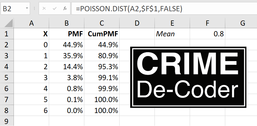
Free for CCAA members and $10 for non-members. I will be going over work I have written in various places before, such as the Poisson Z-score for CompStat reports (Wheeler, 2016). I did a recent blog post on the Crime De-Coder site on using the Poisson distribution to flag outliers for rare crime events, e.g. if you have 0.8 robberies per month, is a month with 3 robberies weird?

For other regional crime analysis groups, if you have requests like that feel free. I am thinking I want to spend more time with regional groups than worrying about the bigger IACA group going forward.

And this Poisson example segways into the final section of the blog post.

Monitoring Time in Between Events

So the above of using the Poisson distribution to say is 3 robberies in a month weird, you have to think about the nature of how a crime analyst will use and act on that information. So in that scenario, that may be an analyst has a monthly CompStat report, and it is useful to say ‘yeah 3 is high, but is consistent with chance variation that is not uncommon’. In this scenario though, if you have counts that are high, it is not the best (although better than nothing) to wait until the end of the month CompStat report.

Another common case though is the analyst is regularly reading reports, and they come in and read a new robbery, and right then and there say “I feel like there are more robberies than usual”. How would they tell then if there are more than you would expect? It does not make sense to wait for the end of the month (you technically can back-calculate in the prior month and use a scan statistic, but I think what I will suggest below is a more diagnostic approach).

Here I will outline an approach by examining the time in between events, which is motivated by a comment Rob Fornango mentioned on LinkedIn.

So there is a duality between the Poisson distribution and the exponential distribution – if you have a mean of 0.8 events per month, the inter-arrival times are exponentially distributed with a mean of 1/0.8. The typical motivation for a Poisson distribution is the inter-arrival times are independent, so you can technically just work with the inter-arrival times directly.

Here is a quick simulation in R to show that you can simulate inter-arrival times, and then turn them into counts per unit time. The counts per unit time will then be Poisson distributed. Note that R you give the lambda term directly in the R parameterization, whereas others (like in scipy) you specify 1/lambda. I know it is not documented well, but I leave as an exercise to the reader who cares enough to figure out what I am doing here and why.

set.seed(10)
pmean <- 0.8
n <- 50000

re <- rexp(n,pmean) # simulating exponential
rec <- cumsum(re)   # translating to times
frec <- floor(rec)  # will aggregate to counts per 1 unit

# factor is to include units with 0 counts
recV <- 0:max(frec)
frec <- factor(frec,levels=recV)
re_tab <- as.data.frame(table(frec))
re_tab$frec <- recV
re_tab$Freq <- factor(re_tab$Freq,levels=0:max(re_tab$Freq))

# Two tables are to aggregate to units, and then get a count
# of counts per unit
count_tab <- as.data.frame(table(re_tab$Freq))
names(count_tab) <- c("Count","ExpSim")
count_tab$Count <- as.numeric(levels(count_tab$Count))
count_tab$PoisExp <- round(dpois(count_tab$Count,pmean)*length(recV))

And this prints out a table that shows very close correspondence between the two.

> print(count_tab)
  Count ExpSim PoisExp
      0  28538   28411
      1  22959   22729
      2   8813    9092
      3   2356    2424
      4    482     485
      5     75      78
      6      5      10
      7      2       1

Ok, with that established, how do we take into account the time in between events, and use that to flag if recent events are occurring too close to each other? Going with my suggestion of using 1/100 or 1/1000 probability to flag an outlier, for a single “time between two events”, you can look at the quantiles of the exponential distribution. So for the 1/100 threshold:

qexp(0.01,0.8)

Gives 0.01256292. Note this is in months, so if we say a month is 30 days, we could then say it is 0.01256292*30, which is 0.38 days, or just over 9 hours. So this is saying basically if you had two robberies on the same shift, given a mean of 0.8 per month in your jurisdiction, that may be worth looking into if they are the same offender. Not terribly helpful as that would be something most analysts would spot without the help of analytics.

But say you had an event with a rate of 0.1 per month (so on average just over one per year). Two events in three days then would be cause for alarm, qexp(0.01,0.1)*30 is just over 3 days.

So that is examining two recent events, you could extend this to several recent events nearby in time (what I think is likely to be more useful for crime analysts). So say you had a crime on Monday, Wednesday, and then Saturday. So two times in between of 2 days and 3 days. I would say the probability of this occurring is:

prod(pexp(c(2,3),0.8/30))

Which R gives as 0.003993034, so around 4 in 1,000. This is the probability of the 2 days multiplied by the probability of 3 days. We can make a graph of the string of three events (so two times in-between) that meet our less than 0.01 chance.

library(ggplot2)

theme_cdc <- function(){
  theme_bw() %+replace% theme(
     text = element_text(size = 16),
     panel.grid.major= element_line(linetype = "longdash"),
     panel.grid.minor= element_blank()
) }

days <- 1:20
df <- expand.grid(x=days,y=days)
df$p <- pexp(df$x,pmean/30)*pexp(df$y,pmean/30)
df <- df[df$p < 0.01,]
p <- ggplot(df,aes(x=x,y=y)) + 
     geom_point(pch=21,fill='grey',size=7.5) +
     labs(x=NULL,y=NULL,title='Nearby Days < 0.01') +
     scale_y_continuous(breaks=days,limits=c(1,max(days))) +
     scale_x_continuous(breaks=days,limits=c(1,max(days))) +
     theme_cdc()

p

So this gives a chart that meets the criteria for days between in 3 nearby events for the 0.8 per month scenario. So if you have times between of 3 and 4 it meets this threshold, as well as 2 and 8, etc. This data for 1+ days it pretty much never gets to the 1/1000 threshold.

You can technically extend this to multiple crimes. We are in the cusum chart territory then. The idea behind cusum charts is if you have an expected value of say 10, in a typical process control chart if you had a bunch of values 12,14,11,13,12, they may not individually alarm. But you can see that the process is consistently above the expected value, which for random data it should fluctuate sometimes below 10 and sometimes above 10. The consistent above the expected value is itself a signal that will alarm in the cusum approach.

I debate on doing more cusum type process control charts with crime data, but they are abit of work to reset (they will always alarm eventually, and then you reset the cumulative statistics and start the process over again) – but in this scenario the reset is not too difficult.

So the approach would be something like:

probs <- pexp(days_between,mean_per_unit)
snorm <- qnorm(probs)
cumvals <- cumsum(snorm)

The cusum approach works like this here. So only start counting if the days between are less than qexp(0.5,pmean), which here is about 26 days. If you have any time in between more than 26 days, you reset the cusum chart. But if you have several events with times less than 26 days, you do the above calculations, and if the cumulative sum gets lower than -4 (so multiple events nearby less than 26 days apart), you alarm. So for example, for our mean of 0.8, if you had a string of 7,6,12,9,10 days in between for crimes:

pmean <- 0.8
days_between <- c(7,6,12,9,10)
probs <- pexp(days_between,pmean/30)
snorm <- qnorm(probs)
cumvals <- cumsum(snorm)

That would alarm on the final crime, even though those are 6 crimes spread apart 44 days.

This is because snorm will have a standard normal distribution, and so the typical alarm rate for cusum charts with mean zero and standard deviation of 1 is +/- 4. You can technically use it for events too far apart as well here, although I don’t know of situations where people would care too much about that (either in crime or other monitoring situations).

This is all more complicated than 5+ in a month example, partly why I haven’t used cusum charts (or days in between) in other examples. But hopefully someone finds that useful to monitor rare events, and not wait for their end of month stats to alert them!

References

Power for analyzing Likert items

First for some other updates of interest to folks on the blog. On CRIME De-Coder a blog post, You should be geocoding crime data locally. I give python code to create a local geocoding engine using the arcpy library.

This is a bit more techy, so would typically post this on this blog instead of the CRIME De-Coder one. But, currently the web is sorely lacking in good advice for local geocoding solutions. Vast majority of sites discuss online geocoding APIs (e.g. google or the census geocoder), which I guess are common for web-apps, but they do not make sense for crime analysis. For the few webpages that are actually relevant to describe local solutions (that do not involve calling an online web API), all the exmples use PostGIS that I am aware of. PostGIS is both very difficult to setup and has worse results compared to ESRI. So I know ESRI is a paid for service, but they have reasonable academic and small business pricing (and most police departments already have access), so to me this is a reasonable use case. If you need to geocode 100k cases, the license fee for ESRI is worth it at that point relative to using the web engines.

Definitely do not spend thousands of dollars if you need to batch geocode a few million records. That is something that is worth getting in touch with me about. And so hopefully that gets picked up by search engines and drives a bit more traffic to my consulting website.

A second example I posted some python code to help construct network experiments. So the idea here is you want to spread out the treated nodes so you have a specific allocation of treated, connected to treated (what I call spillover here), and those not connected to treated (the leftover control group). This python code constructs linear programs to accomplish certain treated/not-touched proportions. So this graph shows if you choose to treat 1 person, but have constraints on 1,2,3 leftover.

And then you can apply this to bigger networks, here the network is 311 nodes, and 90 are treated and I want a total of 150 not treated.

Idea derivative from some work Bruce Desmarais discussed on Twitter, but also have thought about this in some discussion with Barak Ariel in focused deterrence style interventions. So hopefully that comes in handy.

My linear programming formulation is not as svelte as the optimal treatment assignment with spillovers formulation, it is 3*N + 2*E decision variables and 5*N + 2*E constraints (where N is the number of nodes and E is the number of un-directed edges). I have a feeling my formulation is redundant, so if I write my constraints smarter can be more like 2N decision variables and 2N + E constraints.

But for my examples I show it solves quite fast as is (and maybe solvers get rid of the cruft in pre-solve), so not worried about that at the moment. Don’t know the typical size networks people use, but I suspect it will work just fine and dandy on typical machines for networks even as large as 10k. (Generally if I keep the model to under 100k decision variables it is only a few minutes to solve the types of problems I show on this blog.)

Power with Likert items

The other day for a grant application we needed to conduct power analysis. Our design was t-test of mean differences for a simple treated/control group randomized experiment with the outcome being a Likert score survey response. (I know, most of the time people create latent scores with Likert items, analyzing the individual items is fine IMO and simpler to specify for a pre-registration analysis.) I am sure others have needed to do similar things, but I could not find code online to help out with this. So I scripted up a simulation in R to do this, and figured sharing would be useful.

So the rub with Likert data, and why you can’t use typical power calculations, is that they have ceiling effects. If most people answer on average 4.5 out of the your scale up to 5, it is difficult to go much higher. Here I simulate data that has that skew (so ceiling effects come into play), and then go through the motions of doing the t-test. So first for some setup, I have a function that rounds and clips data to limited sets of integers, plus some plotting functions.

# power analysis of Likert data
library(ggplot2)

# custom theme
theme_cdc <- function(){
  theme_bw() %+replace% theme(
     text = element_text(size = 16),
     panel.grid.major= element_line(linetype = "longdash"),
     panel.grid.minor= element_blank()
) }

set.seed(10) # setting the random seed

# rounding/clipping data to integers 
clipint <- function(x,min=1,max=5){
    rx <- round(x)
    rx <- ifelse(rx < min,min,rx)
    rx <- ifelse(rx > max,max,rx)
    return(rx)
}

This following function generates the p-values and standard errors, what I will use later in my simulation. Here I use a t-test of mean differences, but it would be fairly easy to say swap out with an ordinal logistic regression if you prefer that. Probably the bigger deal is the simulation generates data using a normal distribution, and then post rounds/clip the data. There is probably a smarter way to generate the data according to the logistic model and ordinal intercepts (Frank Harrell discusses such things a bit on his blog). But this at least takes into account that the data will be skewed, even in the control group, to have more positive outcomes and thus take the ceiling into account.

# this uses OLS to do t-test of mean differences
# generates normal data, but then rounds/clips
sim_ols <- function(n,eff=0.5,int=4,sd=1){
    df <- data.frame(1:n)
    df$treat <- sample(c(0,1),n,replace=TRUE)
    df$latent <- int + eff*df$treat + rnorm(n,sd=sd)
    df$likert <- clipint(df$latent)
    m1 <- lm(likert ~ treat,data=df)
    cd <- coef(summary(m1))
    pval <- cd[2,4]
    se <- cd[2,2]
    return(c(pval,se))
}

Now we can move onto the simulations, this evaluates sample sizes from 100 to 2000 (in increments of 50), effect sizes of 0.1, 0.3, and 0.5, and repeats the simulations 10k times. I then see the power (how often the two-tailed p-value is less than 0.05), as well as the standard error (precision) of the estimates. Effect sizes are in terms of the original Likert scale values, what I take to be much easier to reason about. (I have seen power analyses here use Cohen’s D, which you really can’t get a very large Cohen’s D value due to ceiling effects with this data.)

# running power estimates over different
# sample sizes and effect sizes
samp_sizes <- seq(100,2000,50)
eff_sizes <- c(0.1,0.3,0.5)
rep_size <- 10000
df <- expand.grid(samps_sizes=samp_sizes,eff_sizes=eff_sizes,pow=c(NA),se=c(NA))
for (i in 1:nrow(df)){
    ss <- df[i,1]
    es <- df[i,2]
    stats <- replicate(rep_size,sim_ols(n=ss,eff=es))
    smean <- rowMeans(stats)
    df[i,3] <- mean(stats[1,] < 0.05) # alpha 0.05
    df[i,4] <- smean[2]
}

df$eff_sizes <- as.factor(df$eff_sizes)

The graph of the power shows what you would expect, so with a few hundred samples you can determine an effect size of 0.5, but with a smaller effect size (on the order of 0.1) you will need more than 2k samples.

# Graph of power
powg <- ggplot(data=df,aes(x=samps_sizes,y=pow)) + 
        geom_line(aes(color=eff_sizes)) + 
        geom_point(pch=21,color='white',size=2,aes(fill=eff_sizes)) +
        labs(x='Sample Sizes',y=NULL,title='Power Estimates') +
        scale_y_continuous(breaks=seq(0,1,0.1)) + 
        scale_x_continuous(breaks=seq(100,2000,250)) + 
        scale_color_discrete(name="Effect Sizes") +
        scale_fill_discrete(name="Effect Sizes") + 
        theme_cdc()

Unfortunately, in reality with most survey measures of police data, e.g. rate your officer 1 to 5, a 0.5 effect is a really large increase. In my mapping attitudes paper, some demographics shift global attitudes at max by 0.2, and I doubt most interventions will be that dramatic. So I like plotting the precision of the estimator, which the effect size doesn’t really make a dent here (it could with more severe ceiling effects).

# Graph of Standard Errors (for Precision)
precg <- ggplot(data=df,aes(x=samps_sizes,y=se,color=eff_sizes)) + 
         geom_line(aes(color=eff_sizes)) + 
         geom_point(pch=21,color='white',size=2,aes(fill=eff_sizes)) +
         labs(x='Sample Sizes',y=NULL,title='Precision Estimates') +
         scale_x_continuous(breaks=seq(100,2000,250)) + 
         scale_color_discrete(name="Effect Sizes") +
         scale_fill_discrete(name="Effect Sizes") + 
         theme_cdc()

With field experiments when considering post police contacts (general attitude surveys you have more wiggle room, but still they cost money to survey) you really can’t control the sample size. You are at the whims of whatever events happen in the police departments daily duties. So the best you can do is make approximate plans for “how long am I going to collect measures before I analyze the data”, and “how reasonably precise will my estimates be”.

This particular grant I make arguments we care more about a non-inferiority type test (e.g. can be sure attitudes are not worse, within a particular error level, given our treatment is more cost-effective than business as usual). But if we did an intervention specifically intended to improve attitudes, you may be talking more like 5,000+ contacts to detect an effect of 0.1 (given likely sample non-response), which is still a big effect.

You would gain power by doing a scale (e.g. summing together multiple items or conducting a factor analysis), assuming the intervention effects the underlying latent trait, and piecemeal individual items. But that will have to be for another day simulating data to do that end-to-end analysis.

Despite not being an academic anymore, I have in the hopper more grant collaborations than I did when I was a professor. The NIJ season is winding down, so probably too late to collaborate on any more of those. But if you have other ideas and need quant help with your projects, always feel free to reach out. I enjoy doing these side projects with academics when reasonable funding is available.

Poisson designs and Minimum Detectable Effects

Ian Adam’s posted a working paper the other day on power analysis for analyzing counts, Power Simulations of Rare Event Counts and Introduction to the ‘Power Lift’ Metric (Adams, 2024). I have a few notes I wanted to make in regards to Ian’s contribution. Nothing I say conflicts with what he writes, moreso just the way I have thought about this problem. It is essentially the same issue as I have written about monitoring crime trends (Wheeler, 2016), or examining quasi-experimental designs with count data (Wheeler & Ratcliffe, 2018; Wilson, 2022).

I am going to make two broader points here: point 1, power is solely a property of the aggregate counts in treated vs control, you don’t gain power by simply slicing your data into finer temporal time periods. Part 2 I show an alternative to power, called minimum detectable effect sizes. This focuses more on how wide your confidence intervals are, as opposed to power (which as Ian shows is not monotonic). I think it is easier to understand the implications of certain designs when approached this way – both from “I have this data, what can I determine from it” (a retrospective quasi-experimental design), as well as “how long do I need to let this thing cook to determine if it is effective”. Or more often “how effective can I determine this thing is in a reasonable amount of time”.

Part 1, Establishing it is all about the counts

So lets say you have a treated and control area, where the base rate is 10 per period (control), and 8 per period (treated):

##########
set.seed(10)
n <- 20 # time periods
reduction <- 0.2 # 20% reduced
base <- 10

control <- rpois(n,base)
treat <- rpois(n,base*(1-reduction))

print(cbind(control,treat))
##########

And this simulation produces 20 time periods with values below:

 [1,]      10     6
 [2,]       9     5
 [3,]       5     3
 [4,]       8     8
 [5,]       9     5
 [6,]      10    10
 [7,]      10     7
 [8,]       9    13
 [9,]       8     6
[10,]      13     8
[11,]      10     6
[12,]       8     8
[13,]      11     8
[14,]       7     8
[15,]      10     7
[16,]       6     8
[17,]      12     3
[18,]      15     5
[19,]      10     8
[20,]       7     7

Now we can fit a Poisson regression model, simply comparing treated to control:

##########
outcome <- c(control,treat)
dummy <- rep(0:1,each=n)

m1 <- glm(outcome ~ dummy,family=poisson)
summary(m1)
###########

Which produces:

Call:
glm(formula = outcome ~ dummy, family = poisson)

Deviance Residuals:
     Min        1Q    Median        3Q       Max
-1.69092  -0.45282   0.01894   0.38884   2.04485

Coefficients:
            Estimate Std. Error z value Pr(>|z|)
(Intercept)  2.23538    0.07313  30.568  < 2e-16 ***
dummy       -0.29663    0.11199  -2.649  0.00808 **
---
Signif. codes:  0 '***' 0.001 '**' 0.01 '*' 0.05 '.' 0.1 ' ' 1

(Dispersion parameter for poisson family taken to be 1)

    Null deviance: 32.604  on 39  degrees of freedom
Residual deviance: 25.511  on 38  degrees of freedom
AIC: 185.7

Number of Fisher Scoring iterations: 4

In this set of data, the total treated count is 139, and the total control count is 187. Now watch what happens when we fit a glm model on the aggregated data, where we just now have 2 rows of data?

##########
agg <- c(sum(treat),sum(control))
da <- c(1,0)
m2 <- glm(agg ~ da,family=poisson)
summary(m2)
##########

And the results are:

Call:
glm(formula = agg ~ da, family = poisson)

Deviance Residuals:
[1]  0  0

Coefficients:
            Estimate Std. Error z value Pr(>|z|)
(Intercept)  5.23111    0.07313  71.534  < 2e-16 ***
da          -0.29663    0.11199  -2.649  0.00808 **
---
Signif. codes:  0 '***' 0.001 '**' 0.01 '*' 0.05 '.' 0.1 ' ' 1

(Dispersion parameter for poisson family taken to be 1)

    Null deviance: 7.0932e+00  on 1  degrees of freedom
Residual deviance: 9.5479e-15  on 0  degrees of freedom
AIC: 17.843

Number of Fisher Scoring iterations: 2

Notice how the treatment effect coefficients and standard errors are the exact same results as they are with the micro observations. This is something people who do regression models often do not understand. Here you don’t gain power by having more observations, power in the Poisson model is determined by the total counts of things you have observed.

If this were not the case, you could just slice observations into finer time periods and gain power. Instead of counts per day, why not per hour? But that isn’t how it works when using Poisson research designs. Counter-intuitive perhaps, you get smaller standard errors when you observe higher counts.

It ends up being the treatment effect estimate in this scenario is easy to calculate in closed form. This is just riffing off of David Wilson’s work (Wilson, 2022).

treat_eff <- log(sum(control)/sum(treat))
treat_se <- sqrt(1/sum(control) + 1/sum(treat))
print(c(treat_eff,treat_se))

Which produces [1] 0.2966347 0.1119903.

For scenarios in which are slightly more complicated, such as treated/control have different number of periods, you can use weights to get the same estimates. Here for example we have 25 periods in treated and 19 periods in the control using the regression approach.

# Micro observations, different number of periods
treat2 <- rpois(25,base*(1 - reduction))
cont2 <- rpois(19,base)
val2 <- c(treat2,cont2)
dum2 <- c(rep(1,25),rep(0,19))
m3 <- glm(val2 ~ dum2,family=poisson)

# Aggregate, estimate rates
tot2 <- c(sum(treat2),sum(cont2))
weight <- c(25,19)
rate2 <- tot2/weight
tagg2 <- c(1,0)
# errors for non-integer values is fine
m4 <- glm(rate2 ~ tagg2,weights=weight,family=poisson) 
print(vcov(m3)/vcov(m4)) # can see these are the same estimates
summary(m4)

Which results in:

>print(vcov(m3)/vcov(m4)) # can see these are the same estimates
            (Intercept)      dum2
(Intercept)   0.9999999 0.9999999
dum2          0.9999999 0.9999992
>summary(m4)

Call:
glm(formula = rate2 ~ tagg2, family = poisson, weights = weight)

Deviance Residuals:
[1]  0  0

Coefficients:
            Estimate Std. Error z value Pr(>|z|)
(Intercept)  2.36877    0.07019  33.750  < 2e-16 ***
tagg2       -0.38364    0.10208  -3.758 0.000171 ***
---
Signif. codes:  0 '***' 0.001 '**' 0.01 '*' 0.05 '.' 0.1 ' ' 1

The treatment effect estimate is similar, where the variance is still dictated by the counts.

treat_rate <- log(rate2[1]/rate2[2])
treat_serate <- sqrt(sum(1/tot2))
print(c(treat_rate,treat_serate))

Which again is [1] -0.3836361 0.1020814, same as the regression results.

Part 2, MDEs

So Ian’s paper has simulation code to determine power. You can do infinite sums with the Poisson distribution to get closer to closed form estimates, like the e-test does in my ptools package. But the simulation approach is fine overall, so just use Ian’s code if you want power estimates.

The way power analysis works, you pick an effect size, then determine the study parameters to be able to detect that effect size a certain percentage of the time (the power, typically set to 0.8 for convenience). An alternative way to think about the problem is how variable will your estimates be? You can then back out the minimum detectable effect size (MDE), given those particular counts. (Another way people talk about this is plan for precision in your experiment.)

Lets do a few examples to illustrate. So say you wanted to know if training reduced conducted energy device (CED) deployments. You are randomizing different units of the city, so you have treated and control. Baseline rates are around 5% per arrest, and say you have 10 arrests per day in each treated/control arm of the study. Around 30 days, you will have ~15 CED usages. Subsequently the standard error of the logged incident rate ratio will be approximately sqrt(1/15 + 1/15) = 0.37. Thus, the smallest effect size you could detect has to be a logged incident rate ratio pretty much double that value.

Presumably we think the intervention will decrease CED uses, so we are looking at an IRR of exp(-0.37*2) = 0.48. So you pretty much need to cut CED usage in half to be able to detect if the intervention worked when only examining the outcomes for one month. (The 2 comes from using a 95% confidence interval.)

If we say we think best case the intervention had a 20% reduction in CED usage, we would then need exp(-se*2) = 0.8. log(0.8) ~ -0.22, so we need a standard error of se = 0.11 to meet this minimum detectable effect. If we have equal counts in each arm, this is approximately sqrt(1/x + 1/x) = 0.11, with rearranging we get 0.11^2 = 2*(1/x), and then 2/(0.11^2) = x = 166. So we want over 160 events in each treated/control group, to be able to detect a 20% reduction.

Now lets imagine a scenario in which one of the arms is fixed, such as retrospective analysis. (Say the control group is prior time periods before training, and 100% of the patrol officers gets the training.) So we have fixed 100 events in the control group, in that scenario, we need to monitor our treatment until we observe sqrt(1/x + 1/100) = 0.11, that 20% reduction standard. We can rearrange this to be 0.11^2 - 1/100 = 1/x, which is x = 1/0.0021 = 476.

When you have a fixed background count, in either in a treated or control arm, that pretty much puts a lower bound on the standard error. In this case with the control arm that has a fixed 100 events, the standard error can never be smaller than sqrt(1/100) = 0.1. So in that case, you can never detect an effect smaller than exp(-0.2).

Another way to think about this is that with smaller effect sizes, you can approximately translate the standard errors to percent point ranges. So if you want to say plan for precision estimates of around +/- 5% – that is a standard error of 0.05. We are going to need sqrt(z) ~ 0.05. At a minimum we need 400 events in one of the treated or control arms, since sqrt(1/400) = 0.05 (and that is only taking into account one of the arms).

For those familiar with survey stats, these are close to the same sample size recommendation for proportions – it is just instead of total sample size, it is the total counts we are interested in. E.g. if you want +/- 5% for sample proportions, you want around 1,000 observations.

And most of the examples of more complicated research designs (e.g. fixed or random effects, overdispersion estimates) will likely make the power lower, not higher, than the back of the envelope estimates here. But they should be a useful starting to know whether a particular experimental design is dead in the water to detect reasonable effect sizes of interest.

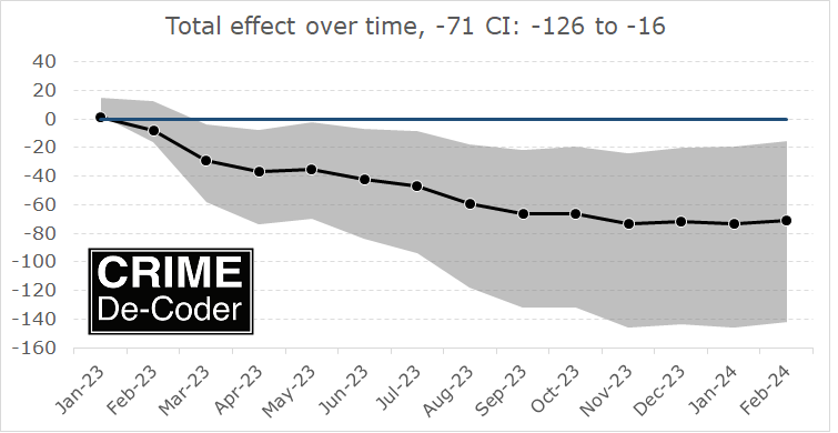
If you found this interesting, you will probably find my work on continuous monitoring of crime trends over time also interesting:

This approach relies on very similar Poisson models to what Ian is showing here, you just monitor the process over time and draw the error intervals as you go. For low powered designs, the intervals will just seem hopelessly wide over time.

References

Fitting beta binomial in python, Poisson scan stat in R

Sharing two pieces of code I worked on recently for various projects. First is fitting a beta binomial distribution in scipy. I had a need for this the other day, looking at the count of near duplicates in surveys. In that code I just used the method of moments estimator (which can often misbehave).

The top google results for this are all very bad (either code that does not work, or alternatives that are not good advice). One of the articles was even auto-generated content (ala ChatGPT type stuff), that had a few off the mark points (although was superficially what the python solution should look like, so the unwary would be led down a wrong path).

So here I show how to estimate the maximum likelihood estimate for the beta binomial distribution. First, because scipy already has a function for the pmf for the beta-binomial distribution it is pretty simple. For all of the discrete distributions, it should look like -dist.logpmf(..data..,...params...).sum(). In complicated stats speak this is “the negative of the sum of the log likelihood”. It is easier for me anyway to think in terms of the PDF/PMF though (the probability of observing your data given fixed parameters). And you find the parameters that maximize that probability over your entire sample. But to make the math easier we take the logs of the probabilities (so we can work with sums instead of multiplications), the log PMF here, and we take the negative so we find the minimum of the function.

Then you just pass the appropriate arguments to minimize and you are good to go.

import numpy as np
from scipy.optimize import minimize
from scipy.stats import betabinom
np.random.seed(10)

# simulating some random data
a = 0.8
b = 1.2

sim_size = 1000

n = 90
r = betabinom.rvs(n, a, b, size=sim_size)

# minimize negative log likelihood
def bbll(parms,k,n):
    alpha, beta = parms
    ll = betabinom.logpmf(k,n,alpha,beta)
    return -ll.sum()

result = minimize(bbll,[1,1],args=(r,90),method='Nelder-Mead')
print(result.x) # [alpha, beta]

And this returns for me:

>>> print(result.x)
[0.77065051 1.16323611]

Using simple simulations you can often get a feel for different estimators. Here n and sim_size make a decent difference for estimating beta, and beta I think tends to be biased downward in the smaller sample scenarios. (People don’t realize, for these non-normal distributions it is not un-common to need 1000+ observations to get decent un-biased estimates depending on the distribution.)

Note the nature of the data here, it is something like hits [5,8,9], and then a second either constant for every number (if the denominator is say 10 for all the observations, can just pass a constant 10). The denominator can however be variable in this set up, so you could have a set of different denominators like [6,8,10].

a = 1.5
b = 4.1

n = np.random.choice(range(30,90),size=sim_size)
r = betabinom.rvs(n, a, b, size=sim_size)

result = minimize(bbll,[1,1],args=(r,n),method='Nelder-Mead')
print(result.x)

Which returns:

>>> print(result.x)
[1.50563582 3.99837155]

I note here that some examples of beta-binomial use weighted data (the wikipedia page does this). These functions expect unweighted data. Functions that need to be repeatedly called (like the likelihood function here) I don’t like making them general with ifs and other junk, I would rewrite the bbll function for different forms of data and call that different function.

Also, as always, you need to check these to make sure the fitted parameters make sense and reasonably fit your data (plot the predicted PMF vs the observed histogram). The function here can converge, but could converge to non-sense (you probably don’t need to worry about constraints on the parameters, but better starting values are probably a good idea).

For future notes for myself, Guimaraes (2005) has examples of using fixed effects negative binomial and translating to beta-binomial (for fixed n). Also Young-Xu & Chan (2008) is a very nice reference (has Hessian, so if I wanted to estimate standard errors), as well as discussion of determining whether to use this model or a binomial with no extra dispersion.


The second thing I will post about is a scan statistic. The background is imagine someone comes to you and says “Hey, there were 10 robberies in the past week, is that normal or low?”. In the scenario where you have fixed time intervals, e.g. Monday through Sunday, and your data is approximately Poisson distributed, you can calculate the CDF. So say your mean per week over 2 years is 3.1, the probability of observing a count of 10 or more in a specific week is:

> # R code
> 1 - ppois(10-1,3.1)
> [1] 0.001400924

So alittle more than 1 in 1000. But if you ask the question “What is the probability of observing a single week of 10 or more, when I have been monitoring the series for 2 years”, with 52 weeks per year. You would adjust the probability for monitoring the trends for multiple weeks over time:

> p <- ppois(10-1,3.1)
> 1 - p^(52*2)
> [1] 0.1356679

So the probability of observing 10 or more in a single week over a 2 year period is closer to 14%. This multiple comparison issue is more extreme when you consider a sliding window – so can count events that occur in a span of a week, but not all necessarily in your pre-specified Monday to Sunday time period. So maybe you observed 10 in a week span that goes from Wednesday to Tuesday. What is the probability of observing 10 in that ad-hoc week time period over the 3 year monitoring period? This often comes up in news articles, see this post by David Spiegelhalter on pedestrian deaths for an example.

I have added in the Naus (1982) approximate statistic to calculate this in my ptools R package – scanw. If you install the latest version of ptools from github you can run for yourself:

> # R code
> library(devtools)
> install_github("apwheele/ptools") # get most recent
> library(ptools)
>
> # example given above
> scanw(52*2,1,3.1,10)

Which prints out [1] 0.5221948. So adding in the sliding window considerably ups the probability of observing a large clump of events.

I don’t think this is so useful from a crime analyst perspective, moreso from a journalistic perspective ‘oh we saw this number recently, is that anomalous’. If you are actively monitoring crime stats I would suggest you use the stats I describe in Wheeler (2016) to identify current outliers given fixed time intervals from the start. (And this approximation is for Poisson data. Overdispersed will have a higher probability.)

And for reference as well, Prieto-Curiel et al. (2023) have an approach that examines the cumulative sum. I’ve debated on doing that in a control chart style framework as well, but instead of just cumsum(counts), do cumsum(counts - expected). I don’t know how people effectively reset the cumulative charts though and effectively deal with seasonality.

I think my approach in Wheeler (2016) is better to identify anomalous trends right now, the Prieto-Curiel approach is still examining historical data and looking for breaks.

References

Age-Period-Cohort graphs for suicide and drug overdoses

When I still taught advanced research methods for PhD students, I debated on having a section on age-period-cohort (APC) analysis. Part of the reason I did not bother with that though is there were no good open source datasets (that I was aware of). A former student asking about APC analysis, as well as a recent NBER working paper on suicide rates (Marcotte & Hansen, 2023) brought it to mind again.

I initially had plans to do more modelling examples, but I decided on just showing off the graphs I generated. The graphs themselves I believe are quite informative.

So I went and downloaded mortality rates USA mortality rates for suicides and drug overdoses, spanning 1999-2022 for suicide and 1999-2021 for drug. Here is the data and R code to recreate these graphs in the post to follow along.

To follow along here in brief, we have a dataset of death and population counts, broken down by year and age:

# Age-Period-Cohort plots
library(ggplot2)

# Read in data
suicide <- read.csv('Suicides.csv')

# Calculate Rate & Cohort
suicide$Cohort <- suicide$Year - suicide$Age
suicide$Rate <- (suicide$Deaths/suicide$Population)*100000

# Suicide only 11-84
suicide <- suicide[suicide$Age >= 11,]
head(suicide)

And this produces the output:

> head(suicide)
   Age Year Deaths Population Cohort      Rate
16  11 1999     22    4036182   1988 0.5450696
17  11 2000     24    4115093   1989 0.5832189
18  11 2001     24    4344913   1990 0.5523701
19  11 2002     22    4295720   1991 0.5121377
20  11 2003     15    4254047   1992 0.3526054
21  11 2004     18    4207721   1993 0.4277850

A few notes here. 1) I limited the CDC Vital stats data to 1999, because in the Wonder dataset pre-1999 you can’t get individual year-age breakdowns, you need to do 5 year age bins. This can cause issues where you need to age-adjust within those bins (Gelman & Auerbach, 2016), that should be less of a problem with single year breakdowns. So I would go back further were it not for that. 2) When breaking down to individual years, the total count of suicides per age bracket is quite small. Initially I was skeptical of Marcotte & Hansen’s (2023) claims of LGBTQ subgroups potentially accounting for increased trends among young people (I just thought that group was too small for that to make sense), but looking at the counts I don’t think that is the case.

When I think about age-period-cohort analysis, my mind goes age effects > period effects > cohort effects. I think people often mix up cohort effects with things that are actually age effects. (And also generation labels are not real.) In criminology, the age-crime-curve was established back in the 1800’s by Quetelet.

So I focus on graphing the age curve, and look at deviations from that to try to visually identify period effects or cohort effects. Here is the plot to look at each of the age curves, broken down by year.

ap <- ggplot(data=suicide, aes(x = Age, y = Rate, color=Year, group=Year)) + 
             geom_line() +
             scale_colour_distiller(palette = "PuOr") +
             scale_x_continuous(breaks=seq(10,80,10)) +
             scale_y_continuous(breaks=seq(0,30,5)) + 
             labs(x='Age',y=NULL,title='Suicide Rate per 100,000',caption="USA Rates via CDC Wonder")
ap

When using diverging color ramps to visualize a continuous variable, you get a washed out effect in the middle. So I am not sure the best color ramp here, but it does provide a nice delineation and gradual progression from the curve in the early 2000’s compared to the suicide curve in 2022. (Also spot the one outlier year, it is age 75 for the “provisional” 2022 counts. I leave it in as it is a good showcase for how plots can help spot bad data.)

The blog the graph will be tinier, open it up in a new tab on your desktop computer to get a good look at the full size image.

Here looking at the graph you can see two things other researchers looking at similar data have discussed. In the early 2000’s, you had a gradual increase from 20’s to the peak suicide rate at mid 40’s. More recent data has shifted that peak to later ages, more like peak 55. Case & Deaton (2015) discussing deaths of despair (of which suicide is a part) focussed on this shift, and noted that females in this age category increased at a higher rate relative to males.

Marcotte & Hansen (2023) focus on the younger ages. So in the year 2000, the age-suicide curve was a gradual incline from ages early 20’s until the peak. Newer cohorts though show steeper inclines in the earlier ages, so the trend from ages 20-60 is flatter than before.

Period effects in these charts will look like the entire curve is the same shape, and it is just shifted up and down. (It may be better to graph these as log rates, but keeping on the linear scale for simplicity.) We have a bit of a shape change though, so these don’t rule out cohort effects.

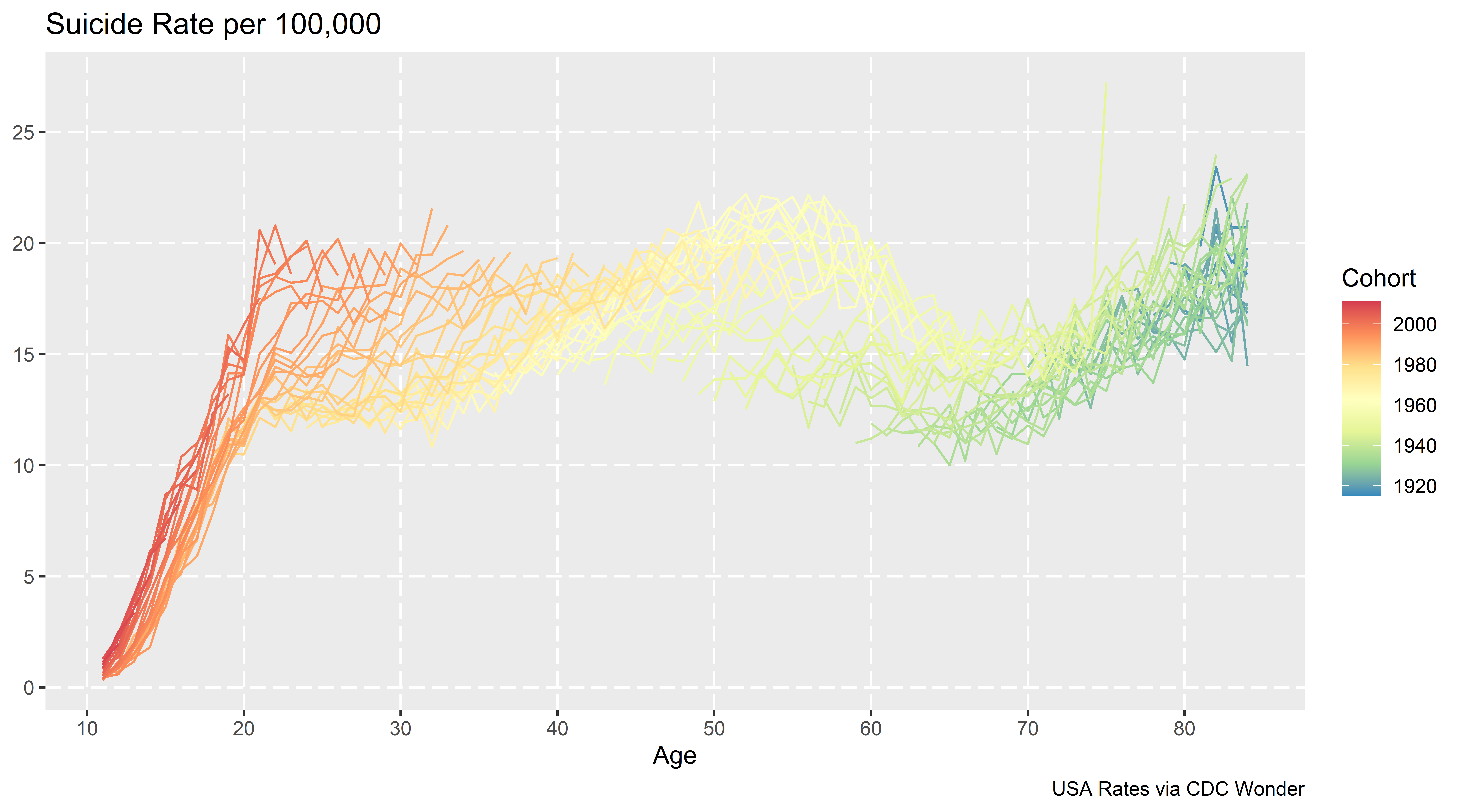
Here is the same plot, but grouping by cohorts instead of years. So the age-suicide curve is indexed to the birth year for an individual:

cp <- ggplot(data=suicide, aes(x = Age, y = Rate, color=Cohort, group=Cohort)) + 
             geom_line() +
             scale_colour_distiller(palette = "Spectral") +
             scale_x_continuous(breaks=seq(10,80,10)) +
             scale_y_continuous(breaks=seq(0,30,5)) +
             labs(x='Age',y=NULL,title='Suicide Rate per 100,000',caption="USA Rates via CDC Wonder")
cp

My initial cheeky thought (not that there aren’t enough ways to do APC models already), was to use mixture models to identify discrete cohorts. Something along the lines of this in the R flexmix package (note this does not converge):

library(flexmix)
knot_loc <- c(20,35,50,65) # for ages
model <- stepFlexmix(cbind(Deaths, Population - Deaths) ~ bs(Age, knot_loc) | Cohort, 
                     model = FLXMRglm(family = "binomial", fixed = ~Year),
                     data = suicide, k = 3)

But there is an issue with this when looking at the cohort plot, you have missing data for cohorts – to do this you would need to observe the entire age-curve for a cohort. There may be a way to estimate this using latent class models in Stata (and fixing some of the unidentified spline coefficients to a fixed value), but to me just looking at the graphs I think is all I really care about. You could maybe say the orange cohorts in the late 90’s are splitting off, but I think that is consistent with period effects. (And is also a trick of the colors I used in the plot.)

You could do mixtures for the year plots, see some of the work by Elana Erosheva (Erosheva et al., 2014), but that again just isn’t how I think about APC analysis.

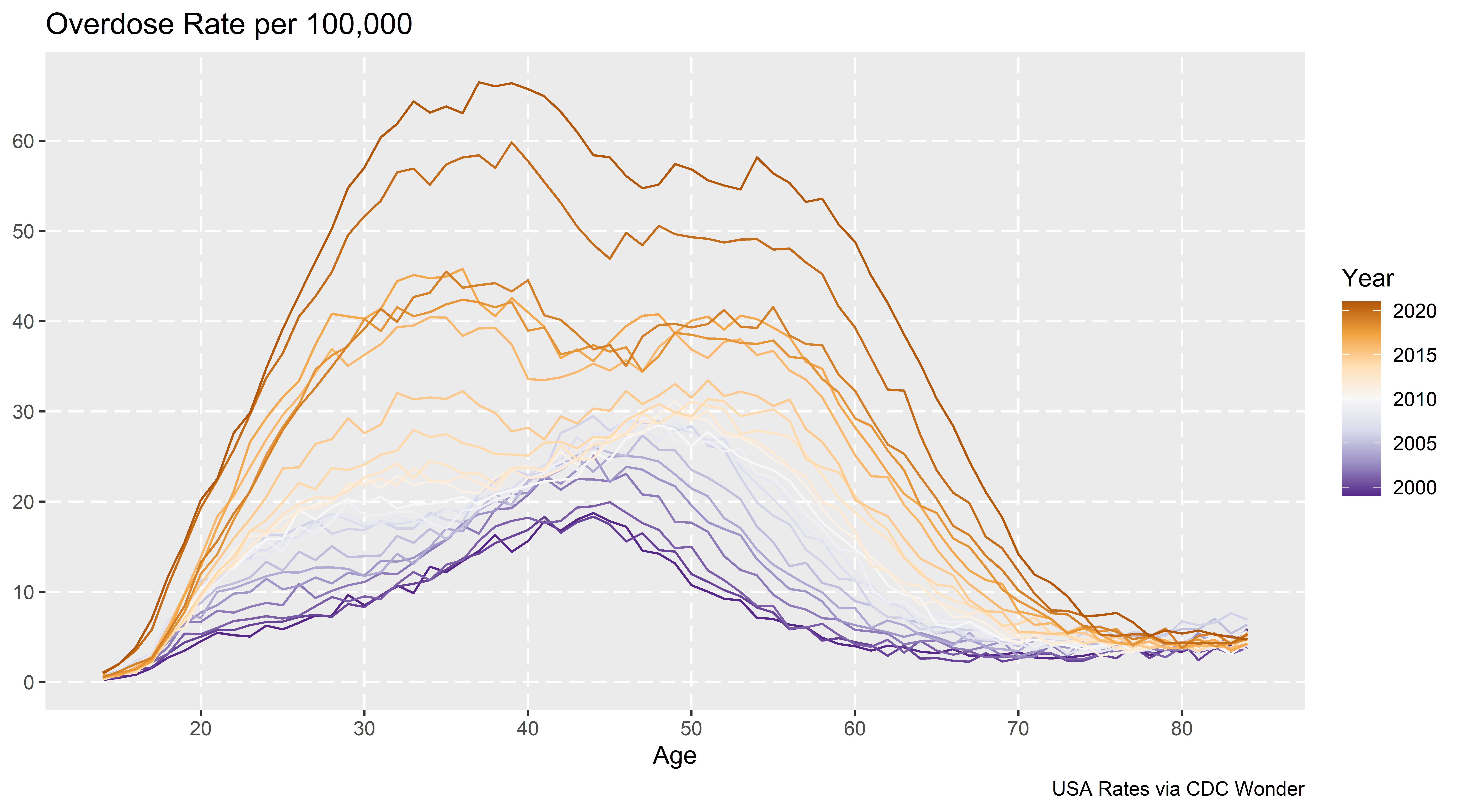
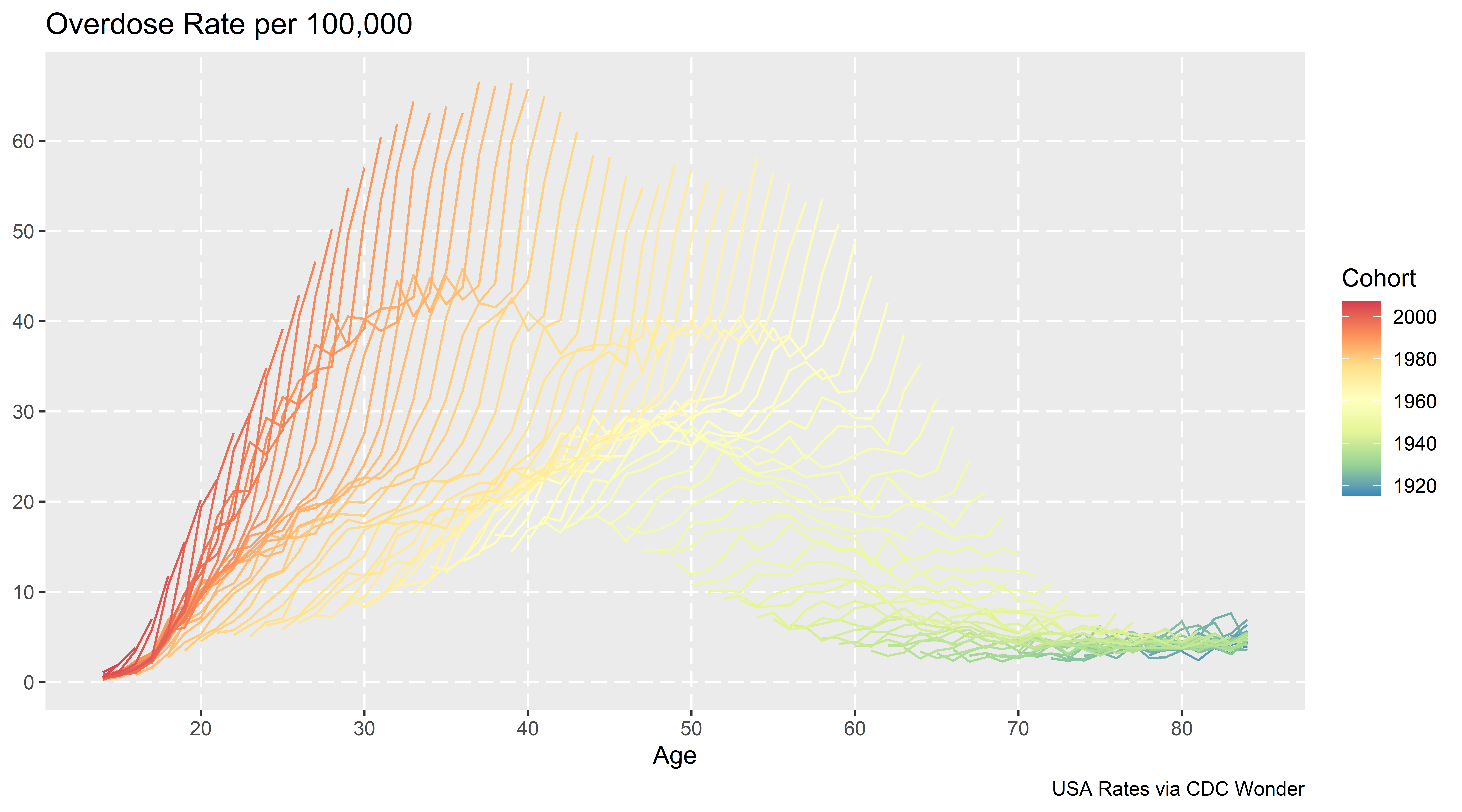
Doing this same exercise for drug overdoses rates, (which I not can overlap with suicide – you can commit suicide via intentionlly taking too many drugs) we can clearly see the dramatic rise in recent years. We can also see the same trends in earlier ages now being peak, but also increases and shifts to older ages.

The cohort plot here looks like a Spinosaurus crest:

Which I believe is more consistent with (very strong) period effects, not so much cohort effects. Drug overdoses are increasing across both younger and older cohorts.

Nerd Notes

These datasets don’t have covariates, which to use the APC method in Spelman (2022) you would need those (it uses covariates to estimate period effects). I am not so sure that is the best approach to APC decomposition, but it is horses for courses.

What I wish is that the CDC distributed the vital statistics data at the micro level (where each row is a death, with all of the covariates), along with a matching variable dataset of the micro level American Community Survey and the weights. That doesn’t solve the APC issue with identifying the different effects, but makes it easier to do more complicated modelling, e.g. I could fit models or generate graphs for age-gender differences more easily, decompose different death types, etc.

Final nerd note is about forecasting mortality trends. While I am familiar with the PCA-functional data approach advocated by Rob Hyndman (Hyndman & Ullah, 2007), I don’t think that will do very well with this data. I am wondering if doing some type of multi-level GAM model, and doing short term extrapolation of the period effect (check out Gavin Simpson’s posts on multi-level smooths, 1, 2, 3).

So maybe something like:

library(mgcv)
smooth_model <- gam(cbind(Deaths, Population - Deaths) ~ s(Year) + s(Age,by=Cohort), 
                    family = binomial("logit"),
                    data = suicide)

Or maybe just use s(Age,Year) and not worry about the cohort effect. Caveat emptor about this model, this is just my musings, I have not in-depth studied it to make sure it behaves well (although a quick check R does not complain when fitting it).

References

Some notes on synthetic control and Hogan/Kaplan

This will be a long one, but I have some notes on synthetic control and the back-and-forth between two groups. So first if you aren’t familiar, Tom Hogan published an article on how the progressive District Attorney (DA) in Philadelphia, Larry Krasner, in which Hogan estimates that Krasner’s time in office contributed to a large increase in the number of homicides. The control homicides are estimated using a statistical technique called synthetic control, in which you derive estimates of the trend in homicides to compare Philly to based on a weighted average of comparison cities.

Kaplan and colleagues (KNS from here on) then published a critique of various methods Hogan used to come up with his estimate. KNS provided estimates using different data and a different method to derive the weights, showing that Philadelphia did not have increased homicides post Krasner being elected. For reference:

Part of the reason I am writing this is if people care enough, you could probably make similar back and forths on every synth paper. There are many researcher degrees of freedom in the process, and in turn you can make reasonable choices that lead to different results.

I think it is worthwhile digging into those in more detail though. For a summary of the method notes I discuss for this particular back and forth:

  • Researchers determine the treatment estimate they want (counts vs rates) – solvers misbehaving is not a reason to change your treatment effect of interest
  • The default synth estimator when matching on counts and pop can have some likely unintended side-effects (NYC pretty much has to be one of the donor cities in this dataset)
  • Covariate balancing is probably a red-herring (so the data issues Hogan critiques in response to KNS are mostly immaterial)

In my original draft I had a note that this post would not be in favor of Hogan nor KNS, but in reviewing the sources more closely, nothing I say here conflicts with KNS (and I will bring a few more critiques of Hogan’s estimates that KNS do not mention). So I can’t argue much with KNS’s headline that Hogan’s estimates are fatally flawed.

An overview of synthetic control estimates

To back up and give an overview of what synth is for general readers, imagine we have a hypothetical city A with homicide counts 10 15 30, where the 30 is after a new DA has been elected. Is the 30 more homicides than you would have expected absent that new DA? To answer this, we need to estimate a counterfactual trend – what the homicide count would have been in a hypothetical world in which a new progressive DA was not elected. You can see the city homicides increased the prior two years, from 10 to 15, so you may say “ok, I expected it to continue to increase at the same linear trend”, in which case you would have expected it to increase to 20. So the counterfactual estimated increase in that scenario is observed - counterfactual, here 30 - 20 = 10, an estimated increase of 10 homicides that can be causally attributed to the progressive DA.

Social scientists tend to not prefer to just extrapolate prior trends from the same location into the future. There could be widespread changes that occur everywhere that caused the increase in city A. If homicide rates accelerated in every city in the country, even those without a new progressive DA, it is likely something else is causing those increases. So say we compare city A to city B, and city B had a homicide count trend during the same time period 10 15 35. Before the new DA in city A, cities A/B had the same pre-trend (both 10 15). The post time period City B increased to 35 homicides. So if using City B as the counterfactual estimate, we have the progressive DA reduced 5 homicides, again observed - counterfactual = 30 - 35 = -5. So even though city A increased, it increased less than we expected based on the comparison city B.

Note that this is not a hypothetical concern, it is pretty basic one that you should always be concerned about when examining macro level crime data. There has been national level homicide increases over the time period when Krasner has been in office (Yim et al, 2020, and see this blog post for updates. U.S. city homicide rates tend to be very correlated with each other (McDowall & Loftin, 2009).

So even though Philly has increased in homicide counts/rates when Krasner has been in office, the question is are those increases higher or lower than we would expect. That is where the synthetic control method comes in, we don’t have a perfect city B to compare to Philadelphia, so we create our own “synthetic” counter-factual, based on a weighted average of many different comparison cities.

To make the example simple, imagine we have two potential control cities and homicide trends, city C1 0 30 20, and city C2 20 0 30. Neither looks like a good comparison to city A that has trends 10 15 30. But if we do a weighted average of C1 and C2, with the weights 0.5 for each city, when combined they are a perfect match for the two pre-treatment periods:

C0  C1 Average cityA
 0  20   10     10
30   0   15     15
20  30   25     30

This is what the synthetic control estimator does, although instead of giving equal weights it determines the optimal weights to match the pre-treatment time period given many potential donors. In real data for example C0 and C1 may be given weights of 0.2 and 0.8 to give the correct balance based on the prior to treatment time periods.

The fundamental problem with synth

The rub with estimating the synth weights is that there is no one correct way to estimate the weights – you have more numbers to estimate than data points. In the Hogan paper, he has 5 pre time periods, 2010-2014, and he has 82 potential donors (99 other of the largest cities in the US minus 17 progressive prosecutors). So you need to learn 82 numbers (the weights) based on 5 data points.


Side note: you can also consider matching on covariates additional data points, although I will go into more detail on how matching on covariates is potentially a red-herring. Hogan I think uses an additional 5*3=15 time varying points (pop, cleared homicide, homicide clearance rates), and maybe 3 additional time invariant (median income, 1 prosecutor categorization, and homicides again!). So maybe has 5 + 15 + 3 = 23 data points to match on (so same fundamental problem, 23 numbers to learn 82 weights). I am just going to quote the full passage on Hogan (2022a) here where he discusses covariate matching:

The number of homicides per year is the dependent variable. The challenge with this synthetic control model is to use variables that both produce parallel trends in the pre-period and are sufficiently robust to power the post-period results. The model that ultimately delivered the best fit for the data has population, cleared homicide cases, and homicide clearance rates as regular predictors. Median household income is passed in as the first special predictor. The categorization of the prosecutors and the number of homicides are used as additional special predictors. For homicides, the raw values are passed into the model. Abadie (2021) notes that the underlying permutation distribution is designed to work with raw data; using log values, rates, or other scaling techniques may invalidate results.

This is the reason why replication code is necessary – it is very difficult for me to translate this to what Hogan actually did. “Special” predictors here are code words for the R synth package for time-invariant predictors. (I don’t know based on verbal descriptions how Hogan used time-invariant for the prosecutor categorization for example, just treats it as a dummy variable?) Also only using median income – was this the only covariate, or did he do a bunch of models and choose the one with the “best” fit (it seems maybe he did do a search, but doesn’t describe the search, only the end selected result).

I don’t know what Hogan did or did not do to fit his models. The solution isn’t to have people like me and KNS guess or have Hogan just do a better job verbally describing what he did, it is to release the code so it is transparent for everyone to see what he did.


So how do we estimate those 82 weights? Well, we typically have restrictions on the potential weights – such as the weights need to be positive numbers, and the weights should sum to 1. These are for a mix of technical and theoretical reasons (having the weights not be too large can reduce the variance of the estimator is a technical reason, we don’t want negative weights as we don’t think there are bizzaro comparison areas that have opposite world trends is a theoretical one).

These are reasonable but ultimately arbitrary – there are many different ways to accomplish this weight estimation. Hogan (2022a) uses the R synth package, KNS use a newer method also advocated by Abadie & L’Hour (2021) (very similar, but tries to match to the closest single city, instead of weights for multiple cities). Abadie (2021) lists probably over a dozen different procedures researchers have suggested over the past decade to estimate the synth weights.

The reason I bring this up is because when you have a problem with 82 parameters and 5 data points, the problem isn’t “what estimator provides good fit to in-sample data” – you should be able to figure out a estimator that accomplishes good in-sample fit. The issue is whether that estimator is any good out-of-sample.

Rates vs Counts

So besides the estimator used, you can break down 3 different arbitrary researcher data decisions that likely impact the final inferences:

  • outcome variable (homicide counts vs homicide per capita rates)
  • pre-intervention time periods (Hogan uses 2010-2014, KNS go back to 2000)
  • covariates used to match on

Lets start with the outcome variable question, counts vs rates. So first, as quoted above, Hogan cites Abadie (2021) for saying you should prefer counts to rates, “Abadie (2021) notes that the underlying permutation distribution is designed to work with raw data; using log values, rates, or other scaling techniques may invalidate results.”

This has it backwards though – the researcher chooses whether it makes sense to estimate treatment effects on the count scale vs rates. You don’t goal switch your outcome because you think the computer can’t give you a good estimate for one outcome. So imagine I show you a single city over time:

        Y0    Y1    Y2
Count   10    15    20
Pop   1000  1500  2000

You can see although the counts are increasing, the rate is consistent over the time period. There are times I think counts make more sense than rates (such as cost-benefit analysis), but probably in this scenario the researcher would want to look at rates (as the shifting denominator is a simple explanation causing the increase in the counts).

Hogan (2022b) is correct in saying that the population is not shifting over time in Philly very much, but this isn’t a reason to prefer counts. It suggests the estimator should not make a difference when using counts vs rates, which just points to the problematic findings in KNS (that making different decisions results in different inferences).

Now onto the point that Abadie (2021) says using rates is wrong for the permutation distribution – I don’t understand what Hogan is talking about here. You can read Abadie (2021) for yourself if you want. I don’t see anything about the permutation inferences and rates.

So maybe Hogan mis-cited and meant another Abadie paper – Abadie himself uses rates for various projects (he uses per-capita rates in the 2021 cited paper, Abadie et al., (2010) uses rates for another example), so I don’t think Abadie thinks rates are intrinsically problematic! Let me know if there is some other paper I am unaware of. I honestly can’t steelman any reasonable source where Hogan (2022a) came up with the idea that counts are good and rates are bad though.

Again, even if they were, it is not a reason to prefer counts vs rates, you would change your estimator to give you the treatment effect estimate you wanted.


Side note: Where I thought the idea with the problem with rates was going (before digging in and not finding any Abadie work actually saying there is issues with rates), was increased variance estimates with homicide data. So Hogan (2022a) estimates for the synth weights Detroit (0.468), New Orleans (NO) (0.334), and New York City (NYC) (0.198), here are those cities homicide rates graphed (spreadsheet with data + notes on sources).

You can see NO’s rate is very volatile, so is not a great choice for a matched estimator if using rates. (I have NO as an example in Wheeler & Kovandzic (2018), that much variance though is fairly normal for high crime not too large cities in the US, see Baltimore for example for even more volatility.) I could forsee someone wanting to make a weighted synth estimator for rates, either make the estimator a population weighted average, or penalize the variance for small rates. Maybe you can trick microsynth to do a pop weighted average out of the box (Robbins et al., 2017).


To discuss the Hogan results specifically, I suspect for example NYC being a control city with high weight in the Hogan paper, which superficially may seem good (both large cities on the east coast), actually isn’t a very good control area considering the differences in homicide trends (either rates or counts) over time. (I am also not so sure about describing NYC and New Orlean’s as “post-industrial” by Hogan (2022a) either. I mean this is true to the extent that all urban areas in the US are basically post-industrial, but they are not rust belt cities like Detroit.)

Here is for reference counts of homicides in Philly, Detroit, New Orleans, and NYC going back further in time:

NYC is such a crazy drop in the 90s, lets use the post 2000 data that KNS used to zoom in on the graph.

I think KNS are reasonable here to use 2000 as a cut point – it is more empirical based (post crime drop), in which you could argue the 90’s are a “structural break”, and that homicides settled down in most cities around 2000 (but still typically had a gradual decline). Given the strong national homicide trends though across cities (here is an example I use for class, superimposing Dallas/NYC/Chicago), I think using even back to the 60’s is easily defensible (moreso than limiting to post 2010).

It depends on how strict you want to be whether you consider these 3 cities “good” matches for the counts post 2010 in Hogan’s data. Detroit seems a good match on the levels and ok match on trends. NO is ok match on trends. NYC and NO balance each other in terms of matching levels, NYC has steeper declines though (even during the 2010-2014 period).

The last graph though shows where the estimated increases from Hogan (2022a) come from. Philly went up and those 3 other cities went down from 2015-2018 (and had small upward bumps in 2019).

Final point in this section, careful what you wish for with sparse weights and sum to 1 in the synth estimate. What this means in practice when using counts and matching on pop size, is that you need lines that are above and below Philly on those dimensions. So to get a good match on Pop, it needs to select at least one of NYC/LA/Houston (Chicago was eliminated due to having a progressive prosecutor). To get a good match on homicide counts, it also has to pick at least one city with more homicides per year as well, which limits the options to New York and Detroit (LA/Houston have lower overall homicide counts to Philly).

You can’t do the default Abadie approach for NYC for example (matching on counts and pop) – it will always have a bad fit when using comparison cities in the US as the donor pool. You either need to allow the weights to sum to larger than 1, or the lasso approach with an intercept is another option (so you only match on trend, not levels).

Because matching on trends is what matters for proper identification in this design, not levels, this is all sorts of problematic with the data at hand. (This is also a potential problem with the KNS estimator as well. KNS note though they don’t trust their estimate offhand, their reasonable point is that small changes in the design result in totally different inferences.)

Covariates and Out of Sample Estimates

For sake of argument, say I said Hogan (2022a) is bunk, because it did not match on “per-capita annual number of cheese-steaks consumed”. Even though on its face this covariate is non-sense, how do you know it is non-sense? In the synthetic control approach, there is no empirical, falsifiable way to know whether an covariate is a correct one to match on. There is no way to know that median income is better than cheese-steaks.

If you wish for more relevant examples, Philly has obviously more issues with street consumption of opioids than Detroit/NOLA/NYC, which others have shown relationships to homicide and has been getting worse over the time Krasner has been in office (Rosenfeld et al., 2023). (Or more simply social disorganization is the more common way that criminologists think about demographic trends and crime.)

This uncertainty in “what demographics to control for” is ok though, because matching on covariates is neither necessary nor sufficient to ensure you have estimated a good counter-factual trend. Abadie in his writings intended for covariates to be more like fuzzy guide-rails – they are qualitative things that you think the comparison areas should be similar on.

Because there are effectively an infinite pool of potential covariates to match on, I prefer the approach of simply limiting the donor pool apriori – Hogan limiting to large cities is on its face reasonable. Including other covariates is not necessary, and does not make the synth estimate more or less robust. Whether KNS used good or bad data for covariates is entirely a red-herring as to the quality of the final synth estimate.


Side note: I don’t doubt that Hogan got advice to not share data and code. It is certainly not normative in criminology to do this. It creates a bizarre situation though, in which someone can try to replicate Hogan by collating original sources, and then Hogan always comes back and says “no, the data you have are wrong” or “the approach you did is not exactly replicating my work”.

I get that collating data takes a long time, and people want to protect their ability to publish in the future. (Or maybe just limit their exposure to their work being criticized.) It is blatantly antithetical to verifying the scientific integrity of peoples work though.

Even if Hogan is correct though in the covariates that KNS used are wrong, it is mostly immaterial to the quality of the synth estimates. It is a waste of time for outside researchers to even bother to replicate Hogan’s covariates he used.


So I used the idea of empirical/falsifiable – can anything associated with synth be falsifiable? Why yes it can – the typical approach is to do some type of leave-one-out estimate. It may seem odd because synth estimates an underlying match to a temporal trend in the treated location, but there is nothing temporal about the synth estimate. You could jumble up the years in the pre-treatment sample and still would estimate the same weights.

Because of this, you can leave-a-year-out in the pre-treatment time period, run your synth algorithm, and then predict that left out year. A good synth estimator will be close to the observed value for the out of sample estimates in the pre-treated time period (and as a side bonus, you can use that variance estimate to estimate the error in the post-trend years).

That is a relatively simple way to determine if the Hogan 5 year vs KNS 15 year time periods are “better” synth controls (my money is on KNS for that one). Because Hogan has not released data/code, I am not going to go through that trouble. As I said in the side note earlier, I could try to do that, and Hogan could simply come back and say “you didn’t do it right”.

This also would settle the issue of “over-fit”. You actually cannot just look at the synth weights, and say that if they are sparse they are not over-fit and if not sparse are over-fit. So for reference, you have in Hogan essentially fitting 82 weights based on 5 datapoints, and he identified a fit with 3 non-zero weights. Flip this around, and say I had 5 data points and fit a model with 3 parameters, it is easily possible that the 3 parameter model in that scenario is overfit.

Simultaneously, it is not necessary to have a sparse weights matrix. Several alternative methods to estimate synth will not have sparse weights (I am pretty sure Xu (2017) will not have sparse weights, and microsynth estimates are not sparse either for just two examples). Because US cities have such clear national level trends, a good estimator in this scenario may have many tiny weights (where good here is low bias and variance out of sample). Abadie thinks sparse weights are good to make the model more interpretable (and prevent poor extrapolation), but that doesn’t mean by default a not sparse solution is bad.

To be clear, KNS admit that their alternative results are maybe not trustworthy due to not sparse weights, but this doesn’t imply Hogan’s original estimates are themselves “OK”. I think maybe a correct approach with city level homicide rate data will have non-sparse weights, due to the national level homicide trend that is common across many cities.

Wrapping Up

If Crim and Public Policy still did response pieces maybe I would go through that trouble of doing the cross validation and making a different estimator (although I would unlikely be an invited commenter). But wanted to at least do this write up, as like I said at the start I think you could do this type of critique with the majority of synth papers in criminology being published at the moment.

To just give my generic (hopefully practical) advice to future crim work:

  • don’t worry about matching on covariates, worry about having a long pre-period
  • the default methods you need to worry about if you have enough “comparable” units – this is in terms of levels, not just trends
  • the only way to know the quality of the modeling procedure in synth is to do out of sample estimates.

Bullet points 2/3 are perhaps not practical – most criminologists won’t have the capability to modify the optimization procedure to the situation at hand (I spent a few days trying without much luck to do my penalized variants suggested, sharing so others can try out themselves, I need to move onto other projects!) Also takes a bit of custom coding to do the out of sample estimates.

For many realistic situations though, I think criminologists need to go beyond just point and clicking in software, especially for this overdetermined system of equations synthetic control scenario. I did a prior blog post on how I think many state level synth designs are effectively underpowered (and suggested using lasso estimates with conformal intervals). I think that is a better default in this scenario as well compared to the typical synth estimators, although you have plenty of choices.

Again I had initially written this as trying to two side the argument, and not being for or against either set of researchers. But sitting down and really reading all the sources and arguments, KNS are correct in their critique. Hogan is essentially hiding behind not releasing data and code, and in that scenario can make an endless set of (ultimately trivial) responses of anyone who publishes a replication/critique.

Even if some of the the numbers KNS collated are wrong, it does not make Hogan’s estimates right.

References

Youtube interview with Manny San Pedro on Crime Analysis and Data Science

I recently did an interview with Manny San Pedro on his YouTube channel, All About Analysis. We discuss various data science projects I conducted while either working as an analyst, or in a researcher/collaborator capacity with different police departments:

Here is an annotated breakdown of the discussion, as well as links to various resources I discuss in the interview. This is not a replacement for listening to the video, but is an easier set of notes to link to more material on what particular item I am discussing.

0:00 – 1:40, Intro

For rundown of my career, went to do PhD in Albany (08-15). During that time period I worked as a crime analyst at Troy, NY, as well as a research analyst for my advisor (Rob Worden) at the Finn Institute. My research focused on quant projects with police departments (predictive modeling and operations research). In 2019 went to the private sector, and now work as an end-to-end data scientist in the healthcare sector working with insurance claims.

You can check out my academic and my data science CV on my about page.

I discuss the workshop I did at the IACA conference in 2017 on temporal analysis in Excel.

Long story short, don’t use percent change, use other metrics and line graphs.

7:30 – 13:10, Patrol Beat Optimization

I have the paper and code available to replicate my work with Carrollton PD on patrol beat optimization with workload equality constraints.

For analysts looking to teach themselves linear programming, I suggest Hillier’s book. I also give examples on linear programming on this blog.

It is different than statistical analysis, but I believe has as much applicability to crime analysis as your more typical statistical analysis.

13:10 – 14:15, Million Dollar Hotspots

There are hotspots of crime that are so concentrated, the expected labor cost reduction in having officers assigned full time likely offsets the position. E.g. if you spend a million dollars in labor addressing crime at that location, and having a full time officer reduces crime by 20%, the return on investment for hotspots breaks even with paying the officers salary.

I call these Million dollar hotspots.

14:15 – 28:25, Prioritizing individuals in a group violence intervention

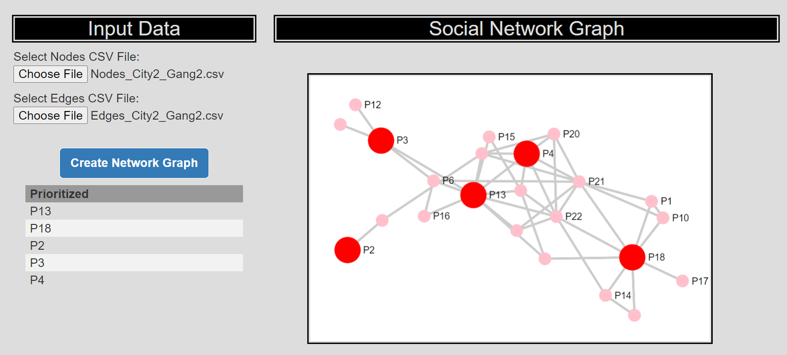
Here I discuss my work on social network algorithms to prioritize individuals to spread the message in a focussed deterrence intervention. This is opposite how many people view “spreading” in a network, I identify something good I want to spread, and seed the network in a way to optimize that spread:

I also have a primer on SNA, which discusses how crime analysts typically define nodes and edges using administrative data.

Listen to the interview as I discuss more general advice – in SNA it matters what you want to accomplish in the end as to how you would define the network. So I discuss how you may want to define edges via victimization to prevent retaliatory violence (I think that would make sense for violence interupptors to be proactive for example).

I also give an example of how detective case allocation may make sense to base on SNA – detectives have background with an individuals network (e.g. have a rapport with a family based on prior cases worked).

28:25 – 33:15, Be proactive as an analyst and learn to code

Here Manny asked the question of how do analysts prevent their role being turned into more administrative role (just get requests and run simple reports). I think the solution to this (not just in crime analysis, but also being an analyst in the private sector) is to be proactive. You shouldn’t wait for someone to ask you for specific information, you need to be defining your own role and conducting analysis on your own.

He also asked about crime analysis being under-used in policing. I think being stronger at computer coding opens up so many opportunities that learning python, R, SQL, is the area I would like to see stronger skills across the industry. And this is a good career investment as it translates to private sector roles.

33:15 – 37:00, How ChatGPT can be used by crime analysts

I discuss how ChatGPT may be used by crime analysis to summarize qualitative incident data and help inform . (Check out this example by Andreas Varotsis for an example.)

To be clear, I think this is possible, but the tech I don’t think is quite up to that standard yet. Also do not submit LEO sensitive data to OpenAI!

Also always feel free to reach out if you want to nerd out on similar crime analysis questions!

This one simple change will dramatically improve reproducibility in journals

So Eric Stewart is back in the news, and it appears a new investigation has prompted him to resign from Florida State. For a background on the story, I suggest reading Justin Pickett’s EconWatch article. In short, Justin did analysis of his own papers he co-authored with Stewart to show what is likely data fabrication. Various involved parties had superficial responses at first, but after some prodding many of Stewart’s papers were subsequently retracted.

So there is quite a bit of human messiness in the responses to accusations of error/fraud, but I just want to focus on one thing. In many of these instances, the flow goes something like:

  1. individual points out clear numeric flaws in a paper
  2. original author says “I need time to investigate”
  3. multiple months later, original author has still not responded
  4. parties move on (no resolution) OR conflict (people push for retraction)

My solution here is a step that mostly fixes the time lag in steps 2/3. Authors who submit quantitative results should be required to submit statistical software log files along with their article to the journal from the start.

So there is a push in social sciences to submit fully reproducible results, where an outside party can replicate 100% of the analysis. This is difficult – I work full time as a software engineer – it requires coding skills most scientists don’t have, as well as outside firms to devote resources to the validation. (Offhand, if you hired me to do this, I would probably charge something like $5k to $10k I am guessing given the scope of most journal articles in social sciences.)

An additional problem with this in criminology research, we are often working with sensitive data that cannot easily be shared.

I agree a fully 100% reproducible would be great – lets not make the perfect the enemy of the good though. What I am suggesting is that authors should directly submit the log files that they used to produce tables/regression results.

Many authors currently are running code interactively in Stata/R/SPSS/whatever, and copy-pasting the results into tables. So in response to 1) above (the finding of a data error), many parties assume it is a data transcription error, and allow the original authors leeway to go and “investigate”. If journals have the log files, it is trivial to see if a data error is a transcription error, and then can move into a more thorough forensic investigation stage if the logs don’t immediately resolve any discrepancies.


If you are asking “Andy, I don’t know how to save a log file from my statistical analysis”, here is how below. It is a very simple thing – a single action or line of code.

This is under the assumption people are doing interactive style analysis. (It is trivial to save a log file if you have created a script that is 100% reproducible, e.g. in R it would then just be something like Rscript Analysis.R > logfile.txt.) So is my advice to save a log file when doing interactive partly code/partly GUI type work.

In Stata, at the beginning of your session use the command:

log using "logfile.txt", text replace

In R, at the beginning of your session:

sink("logfile.txt")
...your code here...
# then before you exit the R session
sink()

In SPSS, at the end of your session:

OUTPUT EXPORT /PDF DOCUMENTFILE="local_path\logfile.pdf".

Or you can go to the output file and use the GUI to export the results.

In python, if you are doing an interactive REPL session, can do something like:

python > logfile.txt
...inside REPL here...

Or if you are using Jupyter notebooks can just save the notebook a html file.

If interested in learning how to code in more detail for regression analysis, I have PhD course notes on R/SPSS/Stata.


This solution is additional work from the authors perspective, but a very tiny amount. I am not asking for 100% reproducible code front to back, I just want a log file that shows the tables. These log files will not show sensitive data (just summaries), so can be shared.

This solution is not perfect. These log files can be edited. Requiring these files will also not prevent someone from doctoring data outside of the program and then running real analysis on faked data.

It ups the level of effort for faking results though by a large amount compared to the current status quo. Currently it just requires authors to doctor results in one location, this at a minimum requires two locations (and to keep the two sources equivalent is additional work). Often the outputs themselves have additional statistical summaries though, so it will be clearer if someone doctored the results than it would be from a simpler table in a peer reviewed article.

This does not 100% solve the reproducibility crisis in social sciences. It does however solve the problem of “I identified errors in your work” and “Well I need 15 months to go and check my work”. Initial checks for transcription vs more serious errors with the log files can be done by the journal or any reasonable outsider in at most a few hours of work.

ptools R package update

So as an update to my R package ptools, I have bumped a major version change to 2.0, which is now up on CRAN.

There is no new functionality, but I wanted to bump versions because I swapped out using rgdal/rgeos with sf (rgdal and rgeos are being deprecated). All the functions currently still take as inputs/output sp objects. If I ever get around to it, I will convert the functions to take either. They are somewhat inefficient with conversions, but if you are doing something where it matters you should likely switch data-engineering to another system entirely (such as via SQL in postgis directly). Generating hexagons should actually be faster now, as the sf version I swapped out is vectorized (whereas how I was using sp prior was a loop).

I debate every now and then just letting this go. I can see on cranlogs I have a total of just over 1k (as of 2/7/2023) downloads, and averaged 200 some last month (grand total, last month).

Time is finite, so I have debated on dropping this and just porting most of the functions over into python. Those cumulative downloads are partially bots (I may have racked up 100 of those downloads in my CICD actions). Let me know if you actually use this, as that gives me feedback whether to bother continuing to develop/update this.

Handling errors in python and R

Just some quick notes on error handling in python and R. For most of my batch processes at work (in python), error handling is necessary. Most of my code has logic that if it fails, it sends an email message about the failure. This is only possible if you capture errors and have conditional logic, if the code just fails without capturing the error (for both R and python) it will just exit the script.

I had another example recently in R that used placebo tests that could fail to converge. So a more traditional stat project, but it should just keep running the loop to collect results, not fail entirely.

Python Example

In python, for most of my batch jobs I have code that looks like this:

import traceback

try:
    # whatever function you are running
    send_success_email()
except Exception:
    er = traceback.format_exc()
    print(f'Error message is \n\n{er}')
    send_error_email(er)

So it fails gracefully, and just gives me a message either in REPL for interactive debugging or stdout for regularly run batch jobs. I can see for people running servers why they want more specific error handling and using a more formal logger, but IMO that is overkill for running batch jobs.

R Example

R to do error handling looks something like this:

# trycatch for errors
my_func <- function(){
    # try/catch if error
    out <- tryCatch(
       { # part with the potential error
         #r <- ???? #whatever code steps you want
        r
       }, error=function(cond){ 
          print("Function Failed, Error message is \n\n")
          print(Cond)
          return(-1)
          } )
    return(out)
}

So if you have inside the tryCatch something that is “fit complicated model” inside your simulations (that could fail), this will still fail gracefully (and can return the error message if you need to.