I have previously published work on identifying optimal individuals to prioritize for call-ins in Focused Deterrence interventions. The idea is we want to identify optimal people to spread the message, so you call in a small number of individuals and they should spread the message to the remaining group. There are better people than others to seed the message to to make sure it spreads throughout the network.
I knew of a direct improvement on that algorithm I published (very similar to the TURF problem I described the other day). But the bigger issue was that even when you call in individuals they do not always come to the meeting – treatment non-compliance. When working with state parole and/or local probation, the police department can ask those agencies to essentially make people come in, but otherwise it is voluntary.
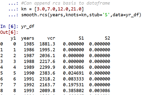
The TURF problem I did the other day gave me a bit of inspiration on how to tackle that treatment non-compliance problem though. In a nutshell when you calculate whether someone is reached (via being directly connected to someone called-in), they can be partially reached based on the probability of the selected nodes treatment compliance. I have posted the code to follow along on dropbox here. I won’t go through the whole thing, but just some highlights.
The Model
First, in some quick and dirty text math, the model is:
Maximize Sum( R_i )
Subject to:
R_i <= Sum( S_j*p_j ) for each iSum( S_j ) = kS_i element of [0,1]R_i <= 1 for each i
Here i refers to an individual node in the gang/group network.
The first constraint R_i <= Sum( S_j*p_j ), the j’s are the nodes that are connected to i (and i itself). The p_j are the estimates that an individual will comply with coming into the call-in. For one agency we worked with for that project, they guessed that those who don’t need to come in comply about 1/6th of the time, so I use that estimate here in my examples, and give people who are on probation/parole a 1 for the probability of compliance.
Second constraint is we can only call in so many people, here k. The model solves very fast, so you can generate results for various k until you get the reach you want to in the end. (You could do the model the other way, minimize S_i while constraining the minimized acceptable reach, e.g. Sum( R_i ) >= threshold, I don’t suggest this in practice though, as when dealing with compliance there may be no feasible solution that gets you the amount of reach in the network you want.)
For the third constraint, the decision variables S_i are binary 0/1’s, but the R_i are continuous. But the trick here is that the last constraint, R_i <= 1, means that the expected reach is capped at 1. Here is a way to think about this, imagine you want to know the chance that person A is reached, and they are connected to two called-in individuals, who each have a 40% chance at complying with the treatment (coming to the call-in). The expected times person A would be reached then is additive in the probabilities, 0.4 + 0.4 = 0.8. If we had 3 people connected to A again at 40% apiece, the expected number of times A would be reached is then 0.4 + 0.4 + 0.4 = 1.2. So a person can be reached multiple times. (Note this is not the probability a person is reached at least once! It is a non-linear problem to model that.)
But if we took away the last constraint, what would happen is that the algorithm would just pick the nodes that had the highest number of neighbors. Since we are maximizing expected reach, if we had a sample of two people, the expected reach values of [2.5, 0] would be preferable to [1, 1], although clearly we rather have the reach spread out. So to prevent that, I cap the expected reach variable at 1, R_i <= 1 for each i, so this spreads out the selected individuals. So in the end the expected number of times people are reached are a lower bound estimate, but those are only people who are expected to receive the message multiple times.
This is a bit of a hack, but in my tests works quite well. I attempted to model the non-linear problem of estimating the probabilities at the person level and still maximizing the expected reach (in the code I have an example of using the CVXR R package). But it was quite fickle in when it would return a solution. So I am focusing on the linear program here, which is not perfect, but is an improvement over my prior published work.
Some Python Snippets
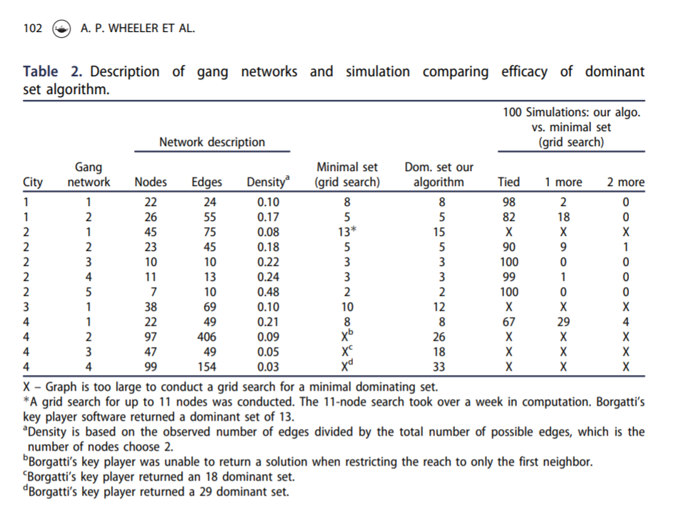
So for my example code, I am using City 4 Gang 4 from my paper. The reason is this was the largest network, and my original algorithm performed the worst. 99 nodes, and my original algorithm identified a 33 person dominant set, but Borgotti’s tool (that uses a genetic algorithm) identified a 29 dominant set.
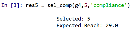
Here is an example of calling my function to select the individuals for a call-in based on the non-compliance estimates. (g4 is the networkx graph object, the second arg is the number of individuals, and compliance is the node attribute that has the probability of treated compliance.) If we call in only 5 people, we still expect a reach of 29 individuals. Here there ends up being some highly connected people on parole/probation, so they have a 1 probability of complying with the treatment.
A consequence of this algorithm is that if you pipe in 1’s for the treatment compliance, you basically get an improvement to my original algorithm. So for a test we can see if I get the same minimal dominating set as Borgotti did for his algorithm here, where const is just everybody complies 100% of the time.

And yep we get a dominating set (all 99 people are reached). What happens if we go down one, and only select 28 people?
We only reach 98 out of the 99. So it appears a 29 set is the minimal dominating set here. But like I said the treatment non-compliance is a big deal in this setting. What is our expected reach if we take that into account, but still call-in 29 people?
It is still pretty high, around 2/3s of the network, but is still much smaller. Also if you look at the overlap between the constant versus non-compliance model, they select quite a few different individuals. It makes a big difference.
Here is a graph I made of selecting 20 individuals. Red means I selected that person, pink means they are reached at least some, and the size of the reach is proportion to the node. Then grey folks I wouldn’t expect to be reached by the message (at least by first degree connections).
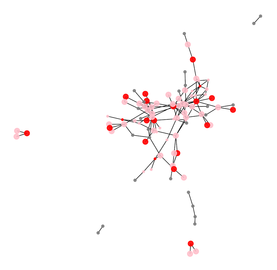
So you can see that most of the people selected have that full 1 expected reach, so the algorithm does prioritize individuals on probation/parole who have a 100% expected compliance. But you can see a few folks who have a lower compliance who are selected as they are in places in the network not covered by those on probation/parole.
I have a tough time getting network layouts to look nice in python (even with the same layout algorithms, I feel like igraph in R just looks much better out of the box).
Future Work
Out of the box, this algorithm could incorporate several different pieces of information. So here I use the non-compliance estimate as a constant, but you could have varying estimates for that based on some other model no problem (e.g. older individuals comply more often than younger, etc.). Also another interesting extension (if you could get estimates) would be the probability a called-in individual spreads the message. In the part Sum( S_j*p_j ) it would just be something like Sum( S_j*p_cj*p_sj ), where p_cj is the compliance probability for attending, and p_sj is the probability to spread the message to those they are connected to.
Getting worthwhile estimates for either of those things will be tough though. Only way I can see it is via some shoe leather qualitative or survey approach.