Open Source Criminology Related Network Datasets

So I am a big proponent of open source data analysis. There is a problem with using criminal justice data sources though – they often have private information that prevents us from sharing the data. For example, I have posted quite a few of my projects here (mostly spatial data analysis), but there are a few I cannot share. For example, I worked on a paper with chronic offender predictions, and I cannot share that data (Wheeler et al., 2019). The outcome, being a victim or perpetrator of gun violence, is so rare that by itself basically makes it impossible to publicly share the data without exposing the individuals under study.

One good resource all criminologists should be aware of is ICPSR, in particular NACJD. Many datasets on there though anymore are restricted, in that you need to get IRB permission and ICPSR permision to download the dataset to use. (Which typically takes like 2~3 months in my experience doing it a few times, which includes both your local Uni IRB and the ICPSR process.) For example here is one I went through the motions to get to (in the end) validate different survival prediction methods.

ICPSR is a great resource to be able to handle sharing potentially sensitive data. But this falls short in two areas. One is in teaching – you cannot go through the IRB ritual in a timely enough fashion to be able to use those datasets in a course environment. The other is in terms of methods, so for example if you wanted to say your model provides better predictions than some other model, they should be established on the same datasets. Current state of affairs in criminology in this regard is pretty bad to be curt – most everybody uses their own data they have access to. So much of the research on different risk assessment instruments for bail/probation/parole are pretty much impossible to say one is better than another.

One example type of data source that is almost entirely missing from NACJD (that I am aware of) is social network datasets relevant for criminology/criminal justice. So I have started a spreadsheet to collate different open source network datasets relevant for criminologists. So I have some from my work and a few other random examples I have come across on the internet.

SPREADSHEET OF NETWORK DATASETS

I have made that spreadsheet open, so anyone should be able to edit in more sources. (Feel free to include links to ICPSR as well, but if you do edit a note to say whether it is restricted access or not.) For here I would be interested in really large networks, for example would love to try to replicate Marie’s work on gang network transitions (Oullet et al., 2019a).

And also while I am here, Jacob Young has created a very nice introductory course to social network analysis. I have a brief lecture in my advanced research design class, but Jacob’s is much more thorough (and he is more of an expert in this area than I am for sure).

I will add to that spreadsheet over time as well. I have made a separate sheet for survival analysis datasets. I would be particularly keen for example criminal justice examples. So for network analysis we have examples of looking at use-of-force networks (Oullet et al., 2019b), and for survival analysis I would be interested in a time to solve example dataset. Unfortunately for the solved cases, NIBRS is a good resource but has a large confound in they don’t measure whether a case was ever assigned to a detective.

Feel free to add whatever in that spreadsheet, but what I was thinking was oriented towards different methods (again as a main motivation is for teaching). So for example if you knew of datasets for age-period-cohort modelling, or for estimating group-based-trajectory models, I think those would be good examples to start new sheets and collate different data sources.

References

  • Ouellet, M., Bouchard, M., & Charette, Y. (2019a). One gang dies, another gains? The network dynamics of criminal group persistence. Criminology, 57(1), 5-33.
  • Ouellet, M., Hashimi, S., Gravel, J., & Papachristos, A. V. (2019b). Network exposure and excessive use of force: Investigating the social transmission of police misconduct. Criminology & Public Policy, 18(3), 675-704.
  • Wheeler, A. P., Worden, R. E., & Silver, J. R. (2019). The accuracy of the violent offender identification directive tool to predict future gun violence. Criminal Justice and Behavior, 46(5), 770-788.

Using the Google Vision and Streetview API to Explore Hotspots

So previously I have shown how to automate the process of downloading google street view imagery (for individual addresses & running down a street). One interesting application is to then code those streetview images. There are many applications in criminology of coding these images for disorder. So Rob Sampson initially had the idea of ecometrics, in which he used systematic social observations via taking a video going down various streets to code physical disorder, such as garbage on the street (Raudenbush & Sampson, 1999). Others than leveraged Google streetview imagery to do those same audits instead of collecting their own footage (Bader et al., 2017).

Those are all someone looks at the images and a human says, there is XYZ in this photo and ABC in this photo. I was interested in testing out the Google Vision API to automate identifying parts of the images. So instead of a human manually reviewing, you build a score automatically. See for example work on identifying the percieved safety of streets (Naik et al., 2014).

Here I was motivated by some recent work of a colleague, Nate Connealy, in which he used this imagery to identify the differences in hot spots vs not hot spots (Connealy, 2020). Also I am pretty sure I saw George Mohler present on this at some ASC before I had the idea (it was similar to this paper, Khorshidi et al., 2019, not 100% sure it was the same one though). For an overview of crim applications using streetview and google maps, which also span CPTED type analyses, check out Vandeviver (2014).

So with Google’s automated vision API, if I submit this photo of a parking garage (this is actually the image I get if I submit the address Bad Address, Dallas, TX to the streetview API, so take in mind errors like that in my subsequent analysis).

You get back these labels, where the first item is the description and the second is the ‘score’ for whether the item is in the image:

('Architecture', 0.817379355430603),
('Floor', 0.7577666640281677),
('Room', 0.7444316148757935),
('Building', 0.7440816164016724),
('Parking', 0.7051371335983276),
('Ceiling', 0.6624311208724976),
('Flooring', 0.6004095673561096),
('Wood', 0.5958532094955444),
('House', 0.5928719639778137),
('Metal', 0.5114516019821167)

So I don’t tell Google what to look for, it just gives me back a ton of different labels depending on what it detects in the image. So what I do here is based on my hotspot work (Wheeler & Reuter, 2020), I grab a sample of 300 addresses inside my Dallas based hot spot areas, and 300 addresses outside of hot spots. (These addresses are based on crime data themselves, so similar to Nate’s work I only sample locations that at least have 1 crime).

So this isn’t a way to do predictions, but I think it is potentially interesting application of exploratory data analysis for hot spots or high crime areas.

Python Code Snippet

I am just going to paste the python code-snippet in its entirety.

'''
Grabbing streetview images and detecting
labels using the google vision API
'''

from google.cloud import vision
import pandas as pd
import io
import os
import urllib
import time

os.chdir(r'D:\Dropbox\Dropbox\Documents\BLOG\GoogleLabels_hotspots\analysis')

add_dat = pd.read_csv('Sampled_Adds.csv')
add_dat['FullAdd'] = add_dat['IncidentAddress'] + ", DALLAS, TX"

# Code to download image based on address 
# https://andrewpwheeler.com/2015/12/28/using-python-to-grab-google-street-view-imagery/

myloc = r"./Images" #replace with your own location
key = "&key=????YourKeyHere????" 

def GetStreet(Add,SaveLoc,Name):
  base = "https://maps.googleapis.com/maps/api/streetview?size=1200x800&location="
  MyUrl = base + urllib.parse.quote_plus(Add) + key #added url encoding
  fi = Name + ".jpg"
  loc_tosav = os.path.join(SaveLoc,fi)
  urllib.request.urlretrieve(MyUrl, loc_tosav)

# Code to get the google vision API labels
# for the image

client = vision.ImageAnnotatorClient.from_service_account_json('Geo Dallas-b5543ff0bb6d.json')

def LabelImage(ImageLoc):
    # Loads the image into memory
    with io.open(ImageLoc, 'rb') as image_file:
        content = image_file.read()
    image = vision.types.Image(content=content)
    response = client.label_detection(image=image)
    labels = response.label_annotations
    res = []
    if response.error.message:
        print(f'Error for image {ImageLoc}')
        print(f'Error Message {response.error.message}')
        res.append( ('Error', 1.0 ) )
    else:
        res = []
        for l in labels:
            res.append( (l.description , l.score) )
    return res

#A random parking garage!
GetStreet('Bad Address, Dallas, TX',myloc,'Bad_Address')    
LabelImage(os.path.join(myloc,'Bad_Address.jpg'))
            
long_tup = []
for index, row in add_dat.iterrows():
    #Name of the image
    nm = str(index) + "_" + str(row['Inside'])
    #Download the image    
    GetStreet(row['FullAdd'],myloc,nm)
    #Get the labels
    labs = LabelImage(os.path.join(myloc,nm + '.jpg'))
    #Build the new data tuples
    for l in labs:
        long_dat = (index, nm +'.jpg', row['Inside'], row['FullAdd'], l[0], l[1])
        long_tup.append(long_dat)
    #Sleep for a second to not spam the servers
    time.sleep(1)
    print(f'Done with index {index}')

long_dat = pd.DataFrame(long_tup, 
                        columns=['Index','Image','Inside','Address','Description','Score'])
            
long_dat.to_csv('LabeledData.csv',index=False)

To get this to work you need a few things. First, you need to enable both the Vision API and the Streetview API in your Google API console. The streetview API has a key you can get directly from the API console (as described in my prior posts). But the vision API is different, and you can download a json file with all the necessary info and feed it into the client call. Once that is all done, you have it set up to query both API’s to get the images and then get the labels. But this is quick and dirty, it does not check for errors in either.

Here is a screenshot of some of the images downloaded, you can see that the streetview API doesn’t fail when their is no image available, it just does a mostly blank gray screenshot.

Analyzing the Results

I am not above just piping the results into an Excel document and doing some quick pivot tables. (I like doing that when there are many categories I want to explore quickly.) So here is a pivot table of the sum of the scores across the 300 outside hotspot (column 0) and 300 inside (column 1) images. So you can see the label of property is in more than half of the images for each (since the score value is never above 1). But property is more common outside hot spots than it is inside hot spots.

Here are contrast coded sums, so these identify the different labels that are more common in either hotspots or outside of hotspots. So outside of hotspots trees and plants appear more common (see Kondo et al., 2017 and Kondo’s other work on the topic). Inside hotspots we have more cars & asphault for examples.

This is just a quick and dirty analysis though. I do not take into account here missing images. The Screenshot label shows missing images are more common inside hotspots. And here since I use the addresses sometimes it gives me a shot of the street instead of the view perpendicular to the street. (I am not 100% sure the best way to do it, if you geocode and then use the lat/lon, you may not have the right view of the property either depending on the geocoding engine, so maybe going with the address directly is better?)

Future Work

In terms of predictive applications, I think using the streetview imagery is not likely to improve crime forecasts, that it is really only worthwhile for EDA or theory testing. In terms of predictive analysis, I actually think using the satellite imagery has more potential (see Jay, 2020 for an example, although that isn’t predictive but causal analysis).

So prior work has used 311 calls for service to identify high disorder areas (Magee, 2020; O’Brien & Winship, 2017; Wheeler, 2018), so I wonder if you can specifically build an image detector to identify particular disorder aspects that are not redundant with 311 calls. And also perhaps scales directly relevant to CPTED. The Google Vision labels are a bit superficial to really use for many theory crim applications I am afraid, but is an interesting exploratory data analysis to check them out.

References

Incorporating treatment non-compliance into call-ins

I have previously published work on identifying optimal individuals to prioritize for call-ins in Focused Deterrence interventions. The idea is we want to identify optimal people to spread the message, so you call in a small number of individuals and they should spread the message to the remaining group. There are better people than others to seed the message to to make sure it spreads throughout the network.

I knew of a direct improvement on that algorithm I published (very similar to the TURF problem I described the other day). But the bigger issue was that even when you call in individuals they do not always come to the meeting – treatment non-compliance. When working with state parole and/or local probation, the police department can ask those agencies to essentially make people come in, but otherwise it is voluntary.

The TURF problem I did the other day gave me a bit of inspiration on how to tackle that treatment non-compliance problem though. In a nutshell when you calculate whether someone is reached (via being directly connected to someone called-in), they can be partially reached based on the probability of the selected nodes treatment compliance. I have posted the code to follow along on dropbox here. I won’t go through the whole thing, but just some highlights.

The Model

First, in some quick and dirty text math, the model is:

Maximize Sum( R_i )

Subject to:

  • R_i <= Sum( S_j*p_j ) for each i
  • Sum( S_j ) = k
  • S_i element of [0,1]
  • R_i <= 1 for each i

Here i refers to an individual node in the gang/group network.

The first constraint R_i <= Sum( S_j*p_j ), the j’s are the nodes that are connected to i (and i itself). The p_j are the estimates that an individual will comply with coming into the call-in. For one agency we worked with for that project, they guessed that those who don’t need to come in comply about 1/6th of the time, so I use that estimate here in my examples, and give people who are on probation/parole a 1 for the probability of compliance.

Second constraint is we can only call in so many people, here k. The model solves very fast, so you can generate results for various k until you get the reach you want to in the end. (You could do the model the other way, minimize S_i while constraining the minimized acceptable reach, e.g. Sum( R_i ) >= threshold, I don’t suggest this in practice though, as when dealing with compliance there may be no feasible solution that gets you the amount of reach in the network you want.)

For the third constraint, the decision variables S_i are binary 0/1’s, but the R_i are continuous. But the trick here is that the last constraint, R_i <= 1, means that the expected reach is capped at 1. Here is a way to think about this, imagine you want to know the chance that person A is reached, and they are connected to two called-in individuals, who each have a 40% chance at complying with the treatment (coming to the call-in). The expected times person A would be reached then is additive in the probabilities, 0.4 + 0.4 = 0.8. If we had 3 people connected to A again at 40% apiece, the expected number of times A would be reached is then 0.4 + 0.4 + 0.4 = 1.2. So a person can be reached multiple times. (Note this is not the probability a person is reached at least once! It is a non-linear problem to model that.)

But if we took away the last constraint, what would happen is that the algorithm would just pick the nodes that had the highest number of neighbors. Since we are maximizing expected reach, if we had a sample of two people, the expected reach values of [2.5, 0] would be preferable to [1, 1], although clearly we rather have the reach spread out. So to prevent that, I cap the expected reach variable at 1, R_i <= 1 for each i, so this spreads out the selected individuals. So in the end the expected number of times people are reached are a lower bound estimate, but those are only people who are expected to receive the message multiple times.

This is a bit of a hack, but in my tests works quite well. I attempted to model the non-linear problem of estimating the probabilities at the person level and still maximizing the expected reach (in the code I have an example of using the CVXR R package). But it was quite fickle in when it would return a solution. So I am focusing on the linear program here, which is not perfect, but is an improvement over my prior published work.

Some Python Snippets

So for my example code, I am using City 4 Gang 4 from my paper. The reason is this was the largest network, and my original algorithm performed the worst. 99 nodes, and my original algorithm identified a 33 person dominant set, but Borgotti’s tool (that uses a genetic algorithm) identified a 29 dominant set.

Here is an example of calling my function to select the individuals for a call-in based on the non-compliance estimates. (g4 is the networkx graph object, the second arg is the number of individuals, and compliance is the node attribute that has the probability of treated compliance.) If we call in only 5 people, we still expect a reach of 29 individuals. Here there ends up being some highly connected people on parole/probation, so they have a 1 probability of complying with the treatment.

A consequence of this algorithm is that if you pipe in 1’s for the treatment compliance, you basically get an improvement to my original algorithm. So for a test we can see if I get the same minimal dominating set as Borgotti did for his algorithm here, where const is just everybody complies 100% of the time.

And yep we get a dominating set (all 99 people are reached). What happens if we go down one, and only select 28 people?

We only reach 98 out of the 99. So it appears a 29 set is the minimal dominating set here. But like I said the treatment non-compliance is a big deal in this setting. What is our expected reach if we take that into account, but still call-in 29 people?

It is still pretty high, around 2/3s of the network, but is still much smaller. Also if you look at the overlap between the constant versus non-compliance model, they select quite a few different individuals. It makes a big difference.

Here is a graph I made of selecting 20 individuals. Red means I selected that person, pink means they are reached at least some, and the size of the reach is proportion to the node. Then grey folks I wouldn’t expect to be reached by the message (at least by first degree connections).

So you can see that most of the people selected have that full 1 expected reach, so the algorithm does prioritize individuals on probation/parole who have a 100% expected compliance. But you can see a few folks who have a lower compliance who are selected as they are in places in the network not covered by those on probation/parole.

I have a tough time getting network layouts to look nice in python (even with the same layout algorithms, I feel like igraph in R just looks much better out of the box).

Future Work

Out of the box, this algorithm could incorporate several different pieces of information. So here I use the non-compliance estimate as a constant, but you could have varying estimates for that based on some other model no problem (e.g. older individuals comply more often than younger, etc.). Also another interesting extension (if you could get estimates) would be the probability a called-in individual spreads the message. In the part Sum( S_j*p_j ) it would just be something like Sum( S_j*p_cj*p_sj ), where p_cj is the compliance probability for attending, and p_sj is the probability to spread the message to those they are connected to.

Getting worthwhile estimates for either of those things will be tough though. Only way I can see it is via some shoe leather qualitative or survey approach.

Street Network Distances and Correlations

Wouter Steenbeek (a friend and co-author for a few articles) has a few recent blog posts replicating some of my prior work replicating some of my work on street network vs Euclidean distances in Albany, NY (Wouters, 1, 2) and my posts (1,2).

In Wouter’s second post, he was particularly interested in checking out shorter distances (as that is what we are often interested in in criminology, checking crime clustering). When doing that, the relationship between network and Euclidean distances sometimes appear less strong, so my initial statement that they tend to be highly correlated is incorrect.

But this is an artifact for the correlation between any two measures – worth pointing out in general for analysis. If you artificially restrict the domain of one variable the correlation always goes down. See some examples on the cross-validated site (1, 2) that illustrate this with nicer graphs than I can whip up in a short time.

But for a quick idea about the issue, imagine a scenario where you slice out Euclidean distances in some X bin width, and check the scatterplot between Euclidean and network distances. So you will get less variation on the X axis, and more variation on the Y axis. Now take this to the extreme, and slice on Euclidean distances at only one value, say 100 meters exactly. In this scatterplot, there is no X variation, it is just a vertical line of points. So in that scenario the correlation is 0.

So I should not say the correlation between the two measures is high, as this is not always true – you can construct an artificial sample in which that statement is false. So a more accurate statement is that you can use the Euclidean distance to predict the network distance fairly accurately, or that the linear relationship between Euclidean and network distances is quite regular – no matter what the Euclidean distance is.

My analysis I have posted the python code here. But for a quick rundown, I grab the street networks for a buffer around Albany, NY using the osmnx library (so it is open street map network data). I convert this street network to an undirected graph (so no worrying about one-way streets) in a local projection. Then using all of the intersections in Albany (a few over 4000), I calculate all of the pairwise distances (around 8.7 million pairs, takes my computer alittle over a day to crunch it out in the background).

So again, the overall correlation is quite high:

But if you chunk the data up into tinier intervals, here 200 meter intervals, the correlations are smaller (an index of 100 means [0-200), 300 means [200-400), etc.).

But this does not mean the linear relationship between the two change. Here is a comparison of the linear regression line for the whole sample (orange), vs a broken-stick type model (the blue line). Imagine you take a slice of data, e.g. all Euclidean distances in the bin [100-200) and fit a regression line. And then do the same for the Euclidean distances [200-300) etc. The blue line here are those regression fits for each of those individual binned estimates. You can see that the two estimates are almost indistinguishable, so the relationship doesn’t change if you subset the data to shorter distances.

Technically the way I have drawn the blue line is misleading, I should have breaks in the line (it is not forced to be connected between bins, like my post on restricted cubic splines is). But I am too lazy to write code to do those splits at the moment.

Now, what does this mean exactly? So for research designs that may want to use network distances and an independent variable, e.g. look at prison visitation as a function of distance, or in my work on patrol redistricting I had to impute some missing travel time distances, these are likely OK to use typical Euclidean distances. Even my paper on survivability for gun shot fatality shows improved accuracy estimates using network distances, but very similar overall effects compared to using Euclidean distances.

So while here I have my computer crunch out the network distances for a day, where the Euclidean distances with the same data only takes a second, e.g. using scipy.spatial.distance. So it depends on the nature of the analysis whether that extra effort is worth it. (It helps to have good libraries ease the work, like here I used osmnx for python, and Wouter showed R code using sf to deal with the street networks, hardest part is the networks are often not stored in a way that makes doing the routing very easy. Neither of those libraries were available back in 2014.) Also note you only need to do the network calculations once and then can cache them (and I could have made these network computations go faster if I parallelized the lookup). So it is slightly onerous to do the network computations, but not impossible.

So where might it make a difference? One common use of these network distances in criminology is for analyses like Ripley’s K or near-repeat patterns. I don’t believe using network distances makes a big deal here, but I cannot say for sure. What I believe happens is that using network distances will dilate the distances, e.g. if you conclude two point patterns are clustered starting at 100 meters using Euclidean distances, then if using network it may spread out further and not show clustering until 200 meters. I do not think it would change overall inferences, such as where you make an inference whether two point patterns are clustered or not. (One point is does make a difference is doing spatial permutations in Ripley’s K, you should definitely restrict the simulations to generating hypothetical distributions on the street network and not anywhere in the study area.)

Also Stijn Ruiter makes the point (noted in Wouter’s second post), that street networks may be preferable for prediction purposes. Stijn’s point is related to spatial units of analyses, not to Euclidean vs Network distances. You could have a raster spatial unit of analysis but incorporate street network statistics, and vice-versa could have a vector street unit spatial unit of analysis and use Euclidean distance measures for different measures related to those vector units.

Wouter’s post also brought up another idea I’ve had for awhile, that when using spatial buffers around areas they can be bad control areas, as even if you normalize the area they have a very tiny sliver of network distance attributable to them. I will need to show that for another blog post though. (This was mostly my excuse to learn osmnx to do the routing!)

Recent Papers on Hot Spots of Crime in Dallas

So I have two different papers that were published recently. Both are on hot spots in Dallas, so might as well discuss them together.

For each I have posted the code to replicate the results (and that spreadsheet has links to preprints as well).

For each as a bit of a background as to the motivation for the projects, Dallas has had official hot spots, named TAAG (Target Area Action Grid). These were clearly larger than what would be considered best practice in identifying hot spots (they were more like entire neighborhoods). I realize ‘best practices’ is a bit wishy-washy, but the TAAG areas ended up covering around 20% of the city (a smidge over 65 square miles). Here is a map of the 2017 areas. There were 54 TAAG areas that covered, so on average each is alittle over 1 square mile.

Additionally I knew the Dallas police department was interested in purchasing the RTM software to do hot spots. And a separate group, the Dallas Crime Task Force was interested in using the software as well for non-police related interventions.

So I did these projects on my own (with my colleagues Wouter and Sydney of course). It wasn’t paid work for any of these groups (I asked DPD if they were interested, and had shared my results with folks from CPAL before that task force report came out, but nothing much came of it unfortunately). But my results for Dallas data are very likely to generalize to other places, so hopefully they will be helpful to others.

Machine Learning to Predict and Understand Hot Spots

So I see the appeal for folks who want to use RTM. It is well validated in both theory and practice, and Joel has made a nice software as a service app. But I knew going in that I could likely improve upon the predictions compared to RTM.

RTM tries to find a middle ground between prediction and causality (which isn’t a critique, it is sort of what we are all doing). RTM in the end spits out predictions that are like “Within 800 feet of a Subway Entrances is Risk Factor 1” and “The Density of Bars within 500 Feet is Risk Factor 2”. So it prefers simple models, that have prognostic value for PDS (or other agencies) to identify potential causal reasons for why that location is high crime. And subsequently helps to not only identify where hot spots are, but frame the potential interventions an agency may be interested it.

But this simplicity has a few drawbacks. One is that it is a global model, e.g. “800 feet within a subway entrance” applies to all subway entrances in the city. Most crime generators have a distribution that makes it so most subway entrances are relatively safe, only a few end up being high crime (for an example). Another is that it forces the way that different crime generators predict crime to be a series of step functions, e.g. “within 600 ft” or “a high density within 1000 ft”. In reality, most geographic processes follow a distance decay function. E.g. if you are looking at the relationship between check-cashing stores and street robbery, there are likely to be more very nearby the store, and it tails off in a gradual process the further away you get.

So I fit a more complicated random forest model that has neither of those limitations and can learn much more complicated functions, both in terms of distance to crime generators as well as spatially varying over the city. But because of that you don’t get the simple model interpretation – they are fundamentally conflicting goals. In terms of predictions either my machine learning model or a simpler comparison of using prior crime = future crime greatly outperforms RTM for several different predictive metrics.

So this shows the predictions are better for RTM no matter how you slice the hot spot areas, but again you lose out the prognostic value of RTM. To replace that, I show local interpretability scores for hot spots. I have an online map here for an example. If you click on one of the high crime predicted areas, it gives you a local breakdown of the different variables that contributes to the risk score.

So it is still more complicated than RTM, but gets you a local set of factors that potentially contribute to why places are hot spots. (It is still superficial in terms of causality, but PDs aren’t going to be able to get really well identified causal relationships for these types of predictions.)

Return on Investment for Hot Spots Policing

The second part of this is that Dallas is no doubt in a tight economic bind. And this was even before all the stuff about reforming police budgets. So policing academics have been saying PDs should shift many more resources from reactive to proactive policing for years. But how to make the argument that it is in police departments best interest to shift resources or invest in additional resources?

To do this I aimed to calculate a return on investment on investing in hot spots policing. Priscilla Hunt (from RAND) recently came up with labor cost estimates for crime specifically relevant for police departments. So if an aggravated assault happens PDs (in Texas) typically spend around $8k in labor costs to respond to the crime and investigate (it is $125k for a homicide). So based on this, you can say, if I can prevent 10 agg assaults, I then save $80k in labor costs. I use this logic to estimate a return on investment for PDs to do hot spots policing.

So first I generate hot spots, weighting for the costs of those crimes. Here is an interactive map to check them out, and below is a screenshot of the map.

I have an example of then calculating a return on investment for the hot spot area that captured the most crime. I get this estimate by transforming meta-analysis estimates of hot spots policing, estimating an average crime reduction, and then backing out how much labor costs that would save a police department. So in this hot spot, an ROI for hot spots policing (for 1.5 years) is $350k.

That return would justify at least one (probably more like two) full time officers just to be assigned to that specific hot spot. So if you actually hire more officers, it will be around net-zero in terms of labor costs. If you shift around current officers it should be a net gain in labor resources for the PD.

So most of the hot spots I identify in the study if you do this ROI calculation likely aren’t hot enough to justify hot spots policing from this ROI perspective (these would probably never justify intensive overtime that is typical of crackdown like interventions). But a few clearly are, and definitely should be the targets of some type of hot spot intervention.

New paper out: Trauma Center Drive Time Distances and Fatal Outcomes among Gunshot Wound Victims

A recent paper with Gio Circo, Trauma Center Drive Time Distances and Fatal Outcomes among Gunshot Wound Victims, was published in Applied Spatial Analysis and Policy. In this work, me and Gio estimate the marginal effect that drive time distances to the nearest Level 1 trauma center have on the probability a victim dies of a gun shot wound, using open Philadelphia data.

If you do not have access to that published version, here is a pre-print version. (And you can always email me or Gio and ask for a copy.) Also because we use open data, we have posted the data and code used for the analysis. (Gio did most of the work!)

For a bit of the background on the project, Gio had another paper estimating a similar model using Detroit data. But Gio estimated those models with aggregate data. I was familiar with more detailed Philly shooting data, as I used it for an example hot spot cluster map in my GIS crime mapping class.

There are two benefits to leveraging micro data instead of the aggregated data. One is that you can incorporate micro level incident characteristics into the model. The other is that you can get the exact XY coordinates where the incident occurred. And using those exact coordinates we calculate drive time distances to the hospital, which offer a slight benefit in terms of leave-one-out cross-validated accuracy compared to Euclidean distances.

So in terms of incident level characteristics, the biggest factor in determining your probability of death is not the distance to the nearest hospital, but where you physically get shot on your body. Here is a marginal effect plot from our models, showing how the joint effect of injury location (as different colors) and the drive time distance impact the probability of death. So if you get shot in the head vs the torso, you have around a 30% jump in the probability of death from that gun shot wound. Or if you get shot in an extremity you have a very low probability of death as well.

But you can see from that the margins for drive times are not negligible. So if you are nearby a hospital and shot in the torso your probability of dying is around 20%, whereas if you are 30 minutes away your probability rises to around 30%. You can then use this to map out isochrone type survivability estimates over the city. This example map is if you get shot in the torso, and the probability of death based on the drive time distance to the nearest Level 1 trauma location.

Fortunately many shootings do not occur in the northern most parts of Philadelphia, here is a map of the number of shootings over the city for our sample.

You can subsequently use these models to either do hypothetical take a trauma center away or add a trauma center. So given the density of shootings and drive time distances, it might make sense for Philly to invest in a trauma center in the shooting hot spot in the Kensington area (northeast of Temple). (You could technically figure out an ‘optimal’ location given the distribution of shootings, but since you can’t just plop down a hospital wherever it would make more sense to do hypothetical investments in current hospitals.)

For a simplified example, imagine you had 100 shootings in the torso that were an average 20 minutes away. The average probability of death in that case is around 25% (so ~25 homicides). If you hypothetically have a location that is only 5 minutes away, the probability goes down to more like 20% (so ~20 homicides). So in that hypothetical, the distance margin would have prevented 5 deaths.

One future piece of research I would be interested in examining is pre-post Shotspotter. So in that article Jen Doleac is right in that the emipirical evidence for Shotspotter reducing shootings is pretty flimsy, but preventing mortality by getting to the scene faster may be one mechanism that ShotSpotter can justify its cost.

Discrete time survival models in python

Sorry in the advance for the long post! I’ve wanted to tackle a project on estimating discrete time survival models for awhile now, and may have a relevant project at work where I can use this. So have been crunching out some of this code I am going to share for the last two weeks.

I personally only have one example in my career of estimating discrete time models, I used discrete time models to estimate propensity scores in my demolitions and crime reduction paper (Wheeler et al., 2018), since the demolitions did not occur at all once, but happened over several years. (In that paper I estimated the discrete time models, and then did matches in random cohorts.)

But I was interested in discrete time survival models for one reason – they allow you to estimate very non-linear hazard functions that you cannot with traditional survival models. For Cox models, to do predictions you need to rely on a estimate of the baseline hazard function, and for parametric models (e.g. Weibull) they often can only have monotonic or flat functions (so can’t be low risk and then high risk in a short period). For a good reference about evaluating predictions for survival models, I suggest Haider et al. (2020), and for a general reference for discrete time survival models I suggest the little Sage green book by Paul Allison (Allison, 2014).

For traditional recidivism studies in criminology (e.g. after someone is paroled), I don’t believe the function to be too bumpy like this, so I don’t think prior studies are misleading (e.g. Denver, 2019). But I do think they are worth examining to see if that is the case. For another use case, for chronic offender based police predictions, I think individuals may have more bumpy risk profiles, e.g. you commit a crime and then lay low (so lower risk), or get victimized and may want retaliation (so high risk). A prior work I looked at a year horizon for offender predictions (Wheeler et al., 2019), so I wanted to extend that to shorter time intervals, but never quite got the chance. (Another benefit of discrete time models is that they can incorporate time varying factors no problem the way the model is set up.)

I have code illustrating discrete time models saved on github here. The data I use to illustrate the analysis is taken from Ruderman et al. (2015). This is recidivism for a fairly large cohort. (I don’t think discrete time makes much sense for small samples, you probably need 1000+ to even really consider it I would guess.)

The code ends up being too long to walk though in a blog post. So here are some quick notes/tables/plots, and I encourage you to go check out the github page to dive deeper if you want.

The Discrete Time Model Setup

The main thing to realize about the discrete time modeling set up is that you just turn your survival data problem into a format you can leverage logistic regression (or whatever binary prediction machine learning model you want). So if we have an original set of survival data that looks like:

ID Time Outcome
 A   4    1
 B   3    0

We then explode this dataset into a long format that looks like this:

ID Time Outcome
 A   1     0
 A   2     0
 A   3     0
 A   4     1
 B   1     0
 B   2     0
 B   3     0

So you can see ID A was exploded to 4 observations, and the Outcome variable is only set to 1 at the final time period. For person B, they are exploded 3 observations, but the outcome variable is always set to 0.

Then you model Outcome as a function of time and other covariates, which can be either constant per person or time varying. This then gets you a model that estimates the instant probability of death (or failure) in a particular time sliver. The way I think about it is like this – we can predict whether you will commit a crime sometime within the next week (the cumulative probability over the entire week), or within a particular sliver of time (the probability of committing a crime Friday at 10 pm). Discrete time models pick a sliver of time, e.g. Friday, and calculate the instant probability within that bin.

But then we don’t want to rely on the traditional binary metrics to evaluate this model – we will often want to go from the instant probabilities in a time sliver to the cumulative probabilities. You can take those model estimates though at aggregate them back up to examine over the weekly time horizon example though. So if we have predictions for a new person C that looked like this:

ID Time InstantProb
 A   1     0.2
 A   2     0.1
 A   3     0.3
 A   4     0.05

We could then calculate the cumulative probability of failure over these four time periods. So the failure in time period 1 is just 0.2. For time period 2 it is 1 - [(1-0.2)*(1-0.1)] = 0.28. You just then accumulate those individual specific probabilities into cumulative failure probabilities over particular time horizons, which you can then incorporate into cost-benefit analysis for how you will use those predictions in practice. For various metrics we will then examine not just the instant probability our model spits out, but also the cumulative probability of failure.

The main issue with these models is that when exploding the dataset it can result in large samples. So my initial sample of just over 13k observations, when I expand to observed weeks ends up being over 1 million observations. That is not a big deal though, I can still easily do whatever models I want with that data on my personal machine. Probably don’t need to worry about it for most statistical computing projects until maybe you are dealing with over 20 million observations I would bet for most out of the box desktop computers anymore.

Modeling Notes

In the github page the script 00_PrepData.py prepares the dataset (transforming to the long format). The original Ruderman data has repeated events, but for simplicity I only take out the first events for individuals, which ends up being just over 13k observations. I then split this into a training dataset and a test dataset, and a set the test dataset to 3k cases.

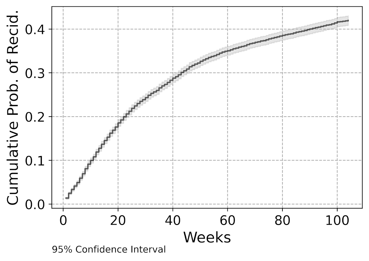
My temporal unit of analysis I transform into weeks since release, and only examine the discrete time models up to 104 weeks (so two years). Here is a traditional KM plot based on the exploded discrete time training dataset.

But really what we are modeling in this set up is the instant hazard, not the cumulative hazard. So here is a plot of the instant probability of recidivism.

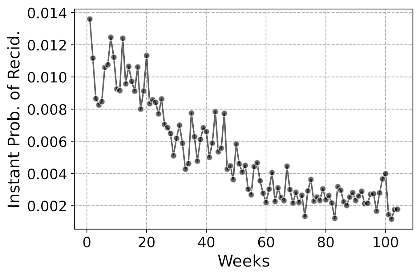
You can see that in the first week out, almost 1.4% of the individuals recidivate. There are ups and downs, but the instant probability continues to decrease and slightly flatten out out to 100 weeks. So you can see how over those two years we go from an original dataset of over 10k to around 3k due to censoring.

Part of the reason I was interested in examining discrete time models is that I was wondering if the instant hazard was bumpy and had some ups and downs when people are first exposed.

But this data appears fairly smooth, so in the end I end up fitting a logistic regression model with restricted cubic splines for time with knot locations at [4,10,20,40,60,80]. I also incorporate various interactions with the some of the time invariant covariates in the original Ruderman data (age at first arrest, male, overcrowding, concentrated disadvantage index, and offense category dummies).

I initially tried my GoTo machine learning models of random forests and XGBoost, but they performed quite poorly. Tree based models aren’t very well suited to estimate very tiny probabilities I am afraid. So that will need some more tinkering to see if I can use those machine learning models more effectively in this circumstance. I’m wondering if doing a different loss function makes sense (so do the loss based on the cumulative hazard instead of the instant). Here also I did not regularize the logit model, but with time varying factors that may make sense.

The Haider paper looks at the R MLTR package, which is similar to here but slightly different, in that they are modeling the cumulative hazard directly instead of the instant hazard. (So instead of chopping off the 1’s and the end of the vector, you keep padding them on for observations.) So in that case you want to enforce monotonic constraints on the time effect.

Checking Out Individual Predictions

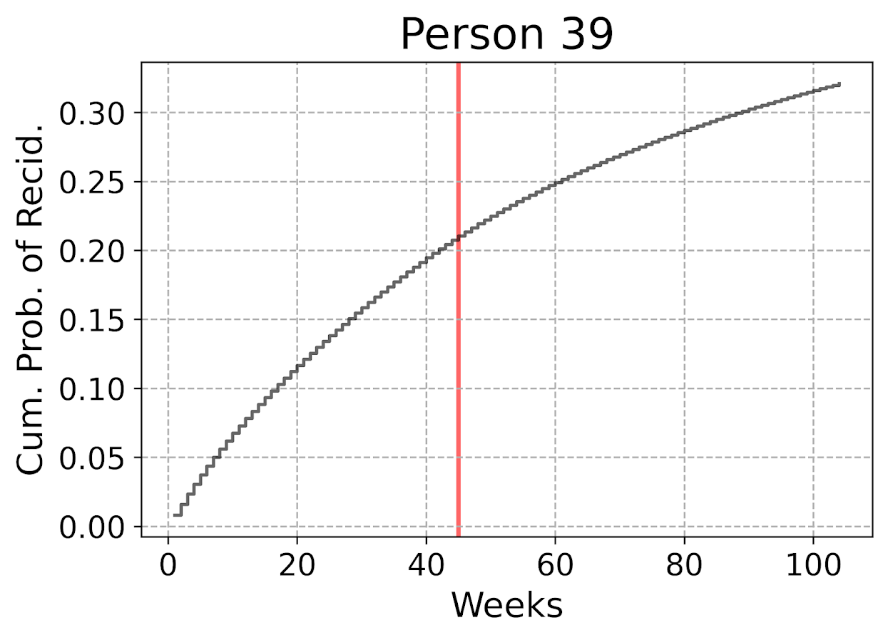
The remaining sections in the blog post are all taken from the second 01_EvalTime.py script. So first, after you generate your predictions on the training data, you can then pull out a particular individual and check out our predictions for their cumulative survival probability based on our predictive model. The red line shows that this individual actually recidivated at 45 weeks, in which their cumulative risk was just above 20%.

The cumulative probability will never be super interesting though – in that even if you had a very wiggly instant hazard the cumulative hazard is always monotonically increasing. So if you check out the instant hazard this will show how a persons risk level varies over time.

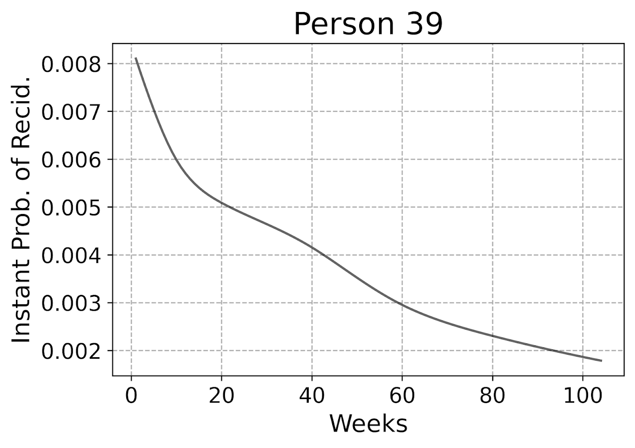
So we can see here that person 39 had a predicted high risk when they are first released, but gradual decreases in a few steps over time. The way I have modeled this using restricted cubic splines it has to be smooth, but you could say incorporate dummy variables for the first 10 weeks, in which case this prediction could be quite bumpy.

Given this always shows monotonically decreasing hazard, you wouldn’t be able to exactly fit that function using parametric models, but they would be not too far off. So this dataset doesn’t appear to be a real great showcase of the utility of discrete time models!

But doing some plots of the instant hazards may be interesting to try to identify particular different risk profiles, or maybe even use some clustering (like group based trajectory models) to identify particular latent risk profiles. (It may be most people are smoothly decreasing, but some people have bumpier profiles.)

Evaluating Model Calibration

Haider et al. (2020) break down predictive metrics to evaluate survival models into two types: calibration is that the model predictions match actual cases, e.g. if my model says the probability of failure is 20%, does the data actually show failure in 20% of the cases. The other is discrimination, can I rank individuals as high risk to low risk, and do the high risk ones have the negative outcome more frequently.

While the Haider paper has various metrics, I am kind of confused how to do them in practice. My confusion mostly stems from the test dataset will ultimately have censoring in it as well, so the calibration metrics need to take this into account. Here are my attempts at a few plots that take on the task of checking model calibration.

First, I’ve previously discussed what I call a lift calibration chart. I adjust it here though to account for the fact that we have interval censoring, and I create ignorance bounds for the actual proportion of failures in the dataset.

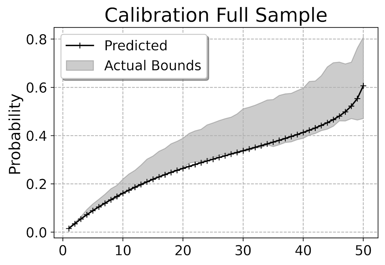
This is for the full sample, which I expanded out and did calculations for up to 104 weeks for everyone. You can do a slice of the data though for a particular time period and check the same calibration. So here is an example checking calibration at one year out.

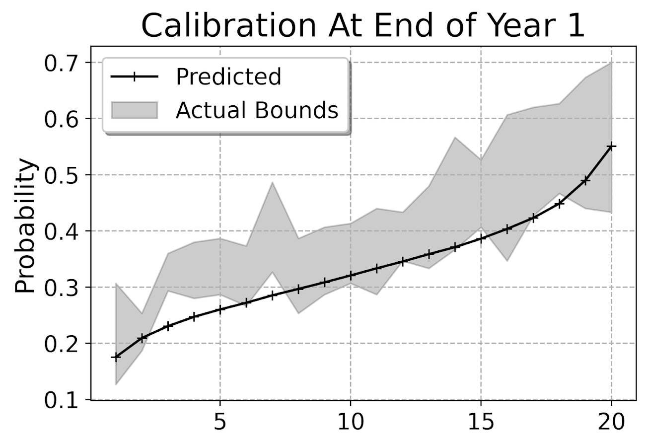
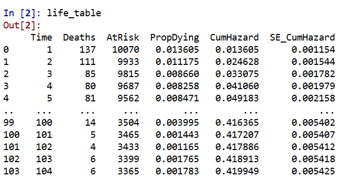
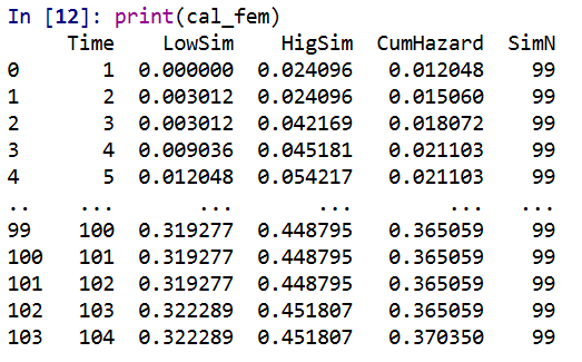
The earlier in time the smaller the ignorance bands will be (as there will be less censoring in sample). Here is what the created dataset looks like to illustrate how the ignorance bands are calculated.

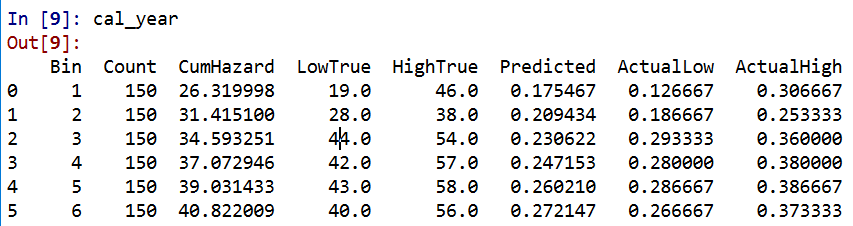
The CumHazard column is my predicted line, which I break down into 20 bins for that yearly plot (so with 3000 training dataset observations, results in bins of 150 observations). Then you can see the LowTrue column (in Bin 1) signifies I observed 19 failures in that set of observations, but there ending up being a total of 27 observations censored in that bin, 46 - 19. So the actual proportion in the data could either be 19/150 (all censored never recidivate) or 46/150 (all of those who were censored would end up recidivating). I would suggest for notes on ignorance bounds like these (which also apply to ECDF type functions), Ferson et al. (2007).

I’d note that this is the same way you generate data for a Hosmer-Lemeshow test for logit models, but I don’t bother with the Chi-Square test. For large samples it will always reject, and small samples it may mean you just have low power, not that your model is well calibrated. So doing that stat test is a lose-lose IMO. But you can just make the plot to see whether your predictions are on the mark, or if they are low or high on average. Here we can see that they hug the lower ignorance band, so are not too bad. But may be a shade too low (more people recidivate than predicted).

This calibration is examining the probability, but another way to think about calibration here is calibrated in terms of time, e.g. I say something will happen in 30 weeks, does it actually happen in 30 weeks? Here is my attempt at a plot to check that out. Using the test dataset, I generate the usual KM estimate. Then based on the predicted probabilites, I generate simulated outcomes for individuals (here 99), and then plot the range of those outcomes on the same chart.

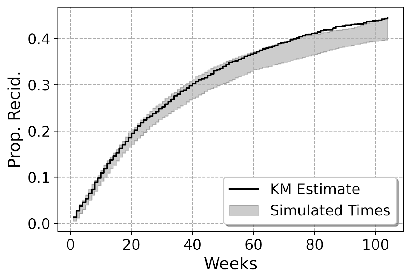
So here you can see that my predicted failure times are somewhat longer than observed in the data (simulation bands slightly below observed for the later time periods). These two charts are likely not in contradiction, the error bands in each show somewhat observe patterns, so they both hint at my model is conservative in assigning risk. But it is not too shabby in terms of calibration (you should have seen some of these plots when I was trying random forest and XGBoost models!).

I’m wondering offhand if I have some edge effects going on. So maybe even if I am only interested in examining a time horizon of two years, I should still tack on longer time periods for the initial models.

Both of these charts you can subset the data and look at the same chart, so here is an example table generated for simulations based on 332 test dataset females. Because the sample is smaller, the simulated bands are wider, so the observed KM cumulative hazard estimate appears well inside the bands here for the female subsample. (Probably because of less diagnostic ability to identify tiny bits off in the calibration.)

Evaluating Model Discrimination

The second way you might evaluate survival predictions is in terms of rankings, can I discriminate in my model between individuals who are high risk and who are low risk. One of the crazy things about these individual level survival curves is that they can cross! So imagine we had a set of two individuals and are looking at a horizon of four periods:

ID Time InstProb CumProb
A   1      0.1     0.1
A   2      0.1     0.19
A   3      0.1     0.271
A   4      0.1     0.3439

B   1      0.2     0.2
B   2      0.1     0.28
B   3      0.05    0.316
B   4      0.01    0.32284

So person B is at higher risk right away. So if we ranked these individuals for who was more likely to recidivate, ID B will be ranked higher for periods 1, 2 and 3. But by period 4, ID A is at higher risk in terms of their cumulative probability of recidivating.

The simplest metric to evaluate discrimination IMO is AUC (which is related to the concordance metric). And to do that you just do slices of particular weeks, and then calculate the AUC based on the cumulative failure probability estimate at that time period.

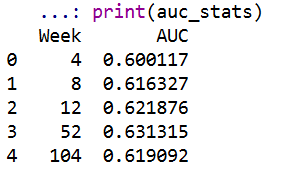
So you can see here that it is pretty meh – only AUC stats around 0.6 for my logit model. So better than the random 0.5, but not by much. Even though my model appears to be reasonably calibrated, it is nothing to brag to grandma about being able to identify people at different risk levels for recidivism, not matter the time horizon I am interested in.

For this estimate I just dropped censored observations, so I am not sure how to deal with them in this case. If you have suggestions or references let me know! But offhand I don’t think they are too off, the earlier time periods should have less censoring, but they are all pretty close in terms of the overall metric.

Future Stuff?

Besides seeing how others have dealt with censoring in their prediction metrics, another metric introduced in the Haider et al. (2020) paper is a Brier Score that is both a calibration and discrimination metric.

Also for folks interested in survival analysis in python, I suggest to check out statsmodel or the lifelines packages.

Citations

Making aoristic density maps in R

I saw Jerry the other day made/updated an R package to do aoristic analysis. A nice part of this is that it returns the weights breakdown for individual cases, which you can then make maps of. My goto hot spot map for data visualization, kernel density maps, are a bit tough to work with weighted data though in R (tough is maybe not the right word, to use ggplot it takes a bit of work leveraging other packages). So here are some notes on that.

I have provided the data/code here. It is burglaries in Dallas, specifically I filter out just for business burglaries.

R Code Snippet

First, for my front end I load the libraries I will be using, and change the working directory to where my data is located.

############################
library(aoristic) #aoristic analysis 
library(rgdal)    #importing spatial data
library(spatstat) #weighted kde
library(raster)   #manipulate raster object
library(ggplot2)  #for contour graphs
library(sf)       #easier to plot sf objects

my_dir <- "D:\\Dropbox\\Dropbox\\Documents\\BLOG\\aoristic_maps_R\\data_analysis"
setwd(my_dir)
############################

Next I just have one user defined function, this takes an input polygon (the polygon that defines the borders of Dallas here), and returns a raster grid covering the bounding box. It also have an extra data field, to say whether the grid cell is inside/outside of the boundary. (This is mostly convenient when creating an RTM style dataset to make all the features conform to the same grid cells.)

###########################
#Data Manipulation Functions

#B is border, g is size of grid cell on one side
BaseRaster <- function(b,g){
    base_raster <- raster(ext = extent(b), res=g)
    projection(base_raster) <- crs(b)
    mask_raster <- rasterize(b, base_raster, getCover=TRUE) #percentage of cover, 0 is outside
    return(mask_raster)
}
###########################

The next part I grab the datasets I will be using, a boundary file for Dallas (in which I chopped off the Lochs, so will not be doing an analysis of boat house burglaries today), and then the crime data. R I believe you always have to convert date-times when reading from a CSV (it never smartly infers that a column is date/time). And then I do some other data fiddling – Jerry has a nice function to check and make sure the date/times are all in order, and then I get rid of points outside of Dallas using the sp over function. Finally the dataset is for both residential/commercial, but I just look at the commercial burglaries here.

###########################
#Get the datasets

#Geo data
boundary <- readOGR(dsn="Dallas_MainArea_Proj.shp",layer="Dallas_MainArea_Proj")
base_Dallas <- BaseRaster(b=boundary,g=200) 
base_df <- as.data.frame(base_Dallas,long=TRUE,xy=TRUE)

#Crime Data
crime_dat <- read.csv('Burglary_Dallas.csv', stringsAsFactors=FALSE)
#prepping time fields
crime_dat$Beg <- as.POSIXct(crime_dat$StartingDateTime, format="%m/%d/%Y %H:%M:%OS")
crime_dat$End <- as.POSIXct(crime_dat$EndingDateTime, format="%m/%d/%Y %H:%M:%OS")

#cleaning up data
aor_check <- aoristic.datacheck(crime_dat, 'XCoordinate', 'YCoordinate', 'Beg', 'End')
coordinates(crime_dat) <- crime_dat[,c('XCoordinate', 'YCoordinate')]
crs(crime_dat) <- crs(boundary)
over_check <- over(crime_dat, boundary)
keep_rows <- (aor_check$aoristic_datacheck == 0) & (!is.na(over_check$city))
crime_dat_clean <- crime_dat[keep_rows,]

#only look at business burgs to make it go abit faster
busi_burgs <- crime_dat_clean[ crime_dat_clean$UCROffense == 'BURGLARY-BUSINESS', ]
###########################

The next part preps the aoristic weights. First, the aoristic.df function is from Jerry’s aoristic package. It returns the weights broken down by 168 hours per day of the week. Here I then just collapse across the weekdays into the same hour, which to do that is simple, just add up the weights.

After that it is some more geographic data munging using the spatstat package to do the heavy lifting for the weighted kernel density estimate, and then stuffing the result back into another data frame. My bandwidth here, 3000 feet, is a bit large but makes nicer looking maps. If you do this smaller you will have a more bumpy and localized hot spots in the kernel density estimate.

###########################
#aoristic weights

#This takes like a minute
res_weights <- aoristic.df(busi_burgs@data, 'XCoordinate', 'YCoordinate', 'Beg', 'End')

#Binning into same hourly bins
for (i in 1:24){
    cols <- (0:6*24)+i+5
    lab <- paste0("Hour",i)
    res_weights[,c(lab)] <- rowSums(res_weights[,cols])
}

#Prepping the spatstat junk I need
peval <- rasterToPoints(base_Dallas)[,1:2]
spWin <- as.owin(as.data.frame(peval))
sp_ppp <- as.ppp(res_weights[,c('x_lon','y_lat')],W=spWin) #spp point pattern object

#Creating a dataframe with all of the weighted KDE
Hour_Labs <- paste0("Hour",1:24)

for (h in Hour_Labs){
  sp_den <- density.ppp(sp_ppp,weights=res_weights[,c(h)],
                        sigma=3000,
                        edge=FALSE,warnings=FALSE)
  sp_dat <- as.data.frame(sp_den)
  kd_raster <- rasterFromXYZ(sp_dat,res=res(base_Dallas),crs=crs(base_Dallas))
  base_df[,c(h)] <- as.data.frame(kd_raster,long=TRUE)$value
}
###########################

If you are following along, you may be wondering why all the hassle? It is partly because I want to use ggplot to make maps, but for its geom_contour it does not except weights, so I need to do the data manipulation myself to supply ggplot the weighted data in the proper format.

First I turn my Dallas boundary into a simple feature sf object, then I create my filled contour graph, supplying the regular grid X/Y and the Z values for the first Hour of the day (so between midnight and 1 am).

###########################
#now making contour graphs

dallas_sf <- st_as_sf(boundary)

#A plot for one hour of the day
hour1 <- ggplot() + 
  geom_contour_filled(data=base_df, aes(x, y, z = Hour1), bins=9) +
  geom_sf(data=dallas_sf, fill=NA, color='black') +
  scale_fill_brewer(palette="Greens") +
  ggtitle('       Hour [0-1)') + 
  theme_void() + theme(legend.position = "none")
hour1

png('Hour1.png', height=5, width=5, units="in", res=1000, type="cairo") 
hour1
dev.off()
###########################

Nice right! I have in the code my attempt to make a super snazzy small multiple plot, but that was not working out so well for me. But you can then go ahead and make up other slices if you want. Here is an example of taking an extended lunchtime time period.

###########################
#Plot for the afternoon time period
base_df$Afternoon <- rowSums(base_df[,paste0("Hour",10:17)])

afternoon <- ggplot() + 
  geom_contour_filled(data=base_df, aes(x, y, z = Afternoon), bins=9) +
  geom_sf(data=dallas_sf, fill=NA, color='black') +
  scale_fill_brewer(palette="Greens") +
  ggtitle('       Hour [9:00-17:00)') + 
  theme_void() + theme(legend.position = "none")
afternoon
###########################

So you can see that the patterns only slightly changed compared to the midnight prior graph.

Note that these plots will have different breaks, but you could set them to be equal by simply specifying a breaks argument in the geom_contour_filled call.

I will leave it up so someone who is more adept at R code than me to make a cool animated viz over time from this. But that is a way to mash up the temporal weights in a map.

RTM Deep Learning Style

In my quest to better understand deep learning, I have attempted to replicate some basic models I am familiar with in criminology, just typical OLS and the more complicated group based trajectory models. Another example I will illustrate is doing a variant of Risk Terrain Modeling.

The typical way RTM is done is:

Data Prep Part:

  1. create a set of independent variables for crime generators (e.g. bars, subway stops, liquor stores, etc.) that are either the distance to the nearest or the kernel density estimate
  2. Turn these continuous estimates into dummy variables, e.g. if within 100 meters = 1, else = 0. For kernel density they typically z-score and if a z-score > 2 the dummy variable equals 1.
  3. Do 2 for varying distance/bandwidth selections, e.g. 100 meters, 200 meters, etc. So you end up with a collection of distance variables, e.g. Bars_100, Bars_200, Bars_400, etc.

Modeling Part

  1. Fit a Lasso regression predicting your crime outcome constraining all of the variables to be positive. (So RTM will never say a crime generator has a negative effect.)
  2. For the variables that passed this Lasso stage, then do a variable selection routine. So instead of the final model having Bars_100 and Bars_400, it will only choose one of those variables.

For the modeling part, we can replicate various parts of these in a deep learning environment. For the constrain the coefficients to be positive, when you see folks refer to a “RelU” or the rectified linear unit function, all this means is that the coefficients are constrained to be positive. For the variable selection part, I needed to hack my own – it ends up being a combo of a custom dropout scheme and then pruning in deep learning lingo.

Although RTM is typically done on raster grid cells for the spatial unit of analysis, this is not a requirement. You can do all these steps on vector (e.g. street segments) or other areal spatial units of analysis.

Here I illustrate using street units (intersections and street segments) from DC. The crime generator data I take from my dissertation (and I have a few pubs in Crime & Delinquency based on that work). The crime data I illustrate using 2011 violent Part 1 UCR (homicide, agg assault, robbery, no rape in the public data).

The crime dataset is over time, and I describe in an analysis (with Billy Zakrzewski) on examining pre/post crime around DC medical marijuana dispensaries.

The data and code to replicate can be downloaded here. It is python, and for the deep learning model I used pytorch.

RTM Example in Python

So I will walk through briefly my second script, 01_DeepLearningRTM.py. The first script, 00_DataPrep.py, does the data prep, so this data file already has the crime generator variables prepared in the manner RTM typically creates them. (The rtm_dl_funcs.py has the functions to do the feature extraction and create the deep learning model, to do distance/density in sci-kit is very slick, only a few lines of code.)

So first I just define the libraries I will be using, and import my custom rtm functions I created.

######################################################
import numpy as np
import pandas as pd
import torch
device = torch.device("cuda:0")
import os
import sys

my_dir = r'C:\Users\andre\OneDrive\Desktop\RTM_DeepLearning'
os.chdir(my_dir)
sys.path.append(my_dir)
import rtm_dl_funcs
######################################################

The next set of code grabs the crime data, and then defines my variable sets. I have plenty more crime generator data from my dissertation, but to make it easier on myself I just focus on distance to metro entrances, the density of 311 calls (a measure of disorder), and the distance and density of alcohol outlets (this includes bars/liquor stores/gas stations that sell beer, etc.).

Among these variable sets, the final selected model will only choose one within each set. But I have also included the ability for the model to incorporate other variables that will just enter in no-matter what (and are not constrained to be positive). This is mostly to incorporate an intercept into the regression equation, but here I also include the percent of sidewalk encompassing one of my street units (based on the Voronoi tessellation), and a dummy variable for whether the street unit is an intersection. (I also planned on included the area of the tessalation, but it ended up being an explosive effect, my dissertation shows its effect is highly non-linear, so didn’t want to worry about splines here for simplicity.)

######################################################
#Get the Prepped Data
crime_data = pd.read_csv('Prepped_Crime.csv')

#Variable sets for each
db = [50, 100, 200, 300, 400, 500, 600, 700, 800]
metro_set = ['met_dis_' + str(i) for i in db]
alc_set = ['alc_dis_' + str(i) for i in db]
alc_set += ['alc_kde_' + str(i) for i in db]
c311_set = ['c31_kde_' + str(i) for i in db]

#Creating a few other generic variables
crime_data['PercSidewalk'] = crime_data['SidewalkArea'] / crime_data['AreaMinWat']
crime_data['Const'] = 1
const_li = ['Const','Intersection','PercSidewalk']
full_set = const_li + alc_set + metro_set + c311_set
######################################################

The next set of code turns my data into a set of torch tensors, then I grab the size of my independent variable sets, which I will end up needing when initializing my pytorch model.

Then I set the seed (to be able to reproduce the results), create the model, and set the loss function and optimizer. I use a Poisson loss function (will need to figure out negative binomial another day).

######################################################
#Now creating the torch tensors
x_ten = torch.tensor(crime_data[full_set].to_numpy(), dtype=float)
y_ten = torch.tensor(crime_data['Viol_2011'].to_numpy(), dtype=float)
out_ten = torch.tensor(crime_data['Viol_2012'].to_numpy(), dtype=float)

#These I need to initialize the deep learning model
gen_lens = [len(alc_set), len(metro_set), len(c311_set)]
    
#Creating the model 
torch.manual_seed(10)

model = rtm_dl_funcs.RTM_torch(const=len(const_li), 
                               gen_list=gen_lens)
criterion = torch.nn.PoissonNLLLoss(log_input=True, reduction='mean')
optimizer = torch.optim.Adam(model.parameters(), lr=0.001) #1e-4
print( model )
######################################################

If you look at the printed out model, it gives a nice summary of the different layers. We have our one layer for the fixed coefficients, and another three sets for our alcohol outlets, 311 calls, and metro entrances. We then have a final cancel layer. The idea behind the final cancel layer is that the variable selection routine in RTM can still end up not selecting any variables for a set. I ended up not using it here though, as it was too aggressive in this example. (So will need to tinker with that some more!)

The variable selection routine is very volatile – so if you have very correlated inputs, you can essentially swap one for the other and get near equivalent predictions. I often see folks who do RTM analyses say something along the lines of, “OK this RTM selected A, and this RTM selected B, so they are different effects in these two samples” (sometimes pre/post, other times comparing different areas, and other times different crime outcomes). I think this is probably wrong though to make that inference, as there is quite a bit of noise in the variable selection process (and the variable selection process itself precludes making inferences on the coefficients themselves).

My deep learning example inherited the same problems. So if you change the initialized weights, it may end up selecting totally different inputs in the end. To get the variable selection routine to at least select the same crime generator variables in my tests, I do a burn in period in which I implement a random dropout scheme. So instead of the typical dropout, for every forward pass it does a random dropout to only select one variable randomly out of each crime generator set. After that converges, I then use a pruning layer to only pick the coefficient that has the largest effect, and again do a large set of iterations to make sure the results converged. So different means but same ends to the typical RTM steps 4 and 5 above. I also have like I said a ReLU transformation after each layer, so the crime generator variables are always positive, any negative effects will be pruned out.

One thing that is nice about deep learning is that it can be quite fast. Here each of these 10,000 iteration sets take less than a minute on my desktop with a GPU. (I’ve been prototyping models with more parameters and more observations at work on my laptop with just a CPU that only take like 10 to 20 minutes).

######################################################
#Burn in part, random dropout
for t in range(10000):
    #Forward pass
    y_pred = model(x=x_ten)
    #Loss
    loss_insample = criterion(y_pred, y_ten)
    optimizer.zero_grad()
    loss_insample.backward(retain_graph=True)
    optimizer.step()
    if t % 1000 == 0:
        print(f'loss: {loss_insample.item()}' )

#Switching to pruning all but the largest effects
model.l1_prune()

for t in range(10000):
    #Forward pass
    y_pred = model(x=x_ten, mask_type=None, cancel=False)
    #Loss
    loss_insample = criterion(y_pred, y_ten)
    optimizer.zero_grad()
    loss_insample.backward(retain_graph=True)
    optimizer.step()
    if t % 1000 == 0:
        print(f'loss: {loss_insample.item()}' )

print( model.coef_df(nm_li=full_set, cancel=False) )
######################################################

And this prints out the results (as incident rate ratios), so you can see it selected 50 meters alcohol kernel density, 50 meters distance to the nearest metro station, and kernel density for 311 calls with an 800 meter bandwidth.

I have in the code another example model when using a different seed. So testing out on around 5 different seeds it always selected these same distance/density variables, but the coefficients are slightly different each time. Here is an example from setting the seed to 12.

These models are nothing to brag about, using the typical z-score the predictions and set the threshold to above 2, the PAI is only around 3 (both for in-sample 2011 and out of sample 2012 is slightly lower). It is a tough prediction task – the mean number of violent crimes per street unit per year is only 0.3. Violent crime is fortunately very rare!

But with only three different risk variables, we can do a quick conjunctive analysis, and look at the areas of overlap.

######################################################
#Adding model 1 predictions back into the dataset
pred_mod1 = pd.Series(model(x=x_ten, mask_type=None, cancel=False).exp().detach().numpy())
crime_data['Pred_M1'] = pred_mod1

#Check out the areas of overlapping risk
mod1_coef = model.coef_df(nm_li=full_set, cancel=False)
risk_vars = list(set(mod1_coef['Variable']) - set(const_li))
conj_set = crime_data.groupby(risk_vars, as_index=False)['Const','Pred_M1','Viol_2012'].sum()
print(conj_set)
######################################################

In this table Const is the total number of street units selected, Pred_M1 is the expected number of crimes via Model 1, and then I show how well it conforms to the predictions out of sample 2012. So you can see in the aggregate the predictions are not too far off. There only ends up being one street unit that overlaps for all three risk factors in the study area.

I believe the predictions would be better if I included more crime generator variables. But ultimately the nature of how RTM works it trades off accuracy for simple models. Which is fair – it helps to ease the nature of how a police department (or some other entity) responds to the predictions.

But this trade off results in predictions that don’t fare as well compared with more complicated models. For example I show (with Wouter Steenbeek) that random forests do much better than RTM. To make those models more interpretable we did local decompositions for hot spots, so say this hot spot is 30% alcohol outlets, 20% nearby apartments, etc.

So there is no doubt more extensions for RTM you could do in a deep learning framework, but they will likely always result in more complicated and less interpretable models. Also here I don’t think this code will be better than the traditional RTM folks, the only major benefit of this code is it will run faster – minutes instead of overnight for most jobs.

Creating high crime sub-tours

I was nerdsniped a bit by this paper, Targeting Knife-Enabled Homicides For Preventive Policing: A Stratified Resource Allocation Model by Vincent Hariman and Larry Sherman (HS from here on).

It in, HS attempt to define a touring schedule based on knife crime risk at the lower super output area in London. So here are the identified high risk areas:

And here are HS’s suggested hot spot tours schedule.

This is ad-hoc, but an admirable attempt to figure out a reasonable schedule. As you can see in their tables, the ‘high’ knife crime risk areas still only have a handful of homicides, so if reducing homicides is the objective, this program is a bit dead in the water (I’ve written about the lack of predictive ability of the model here).

I don’t think defining tours to visit everywhere makes sense, but I do think a somewhat smaller in scope question, how to figure out geographically informed tours for hot spot areas does. So instead of the single grid cell target ala PredPol, pick out multiple areas to visit for hot spots. (I don’t imagine the 41 LSOA areas are geographically contiguous either, e.g. it would make more sense to pick a tour for areas connected than for areas very far apart.)

Officers don’t tend to like single tiny areas either really, and I think it makes more sense to widen the scope a bit. So here is my attempt to figure those reasonable tours out.

Defining the Problem

The way I think about that problem is like this, look at the hypothetical diagram below. We have two choices for the hot spot location we are targeting, where the crime counts for locations are noted in the text label.

In the select the top hot spot (e.g. PredPol) approach, you would select the singlet grid cell in the top left, it is the highest intensity. We have another choice though, the more spread out hot spot in the lower right. Even though it is a lower density, it ends up capturing more crime overall.

I subsequently formulated an integer linear program to try to tackle the problem of finding good sub-tours through the graph that cumulatively capture more crime. So with the above graph, if I select two subtours, I get the results as (where nodes are identified by their (x,y) position):

  • ['Begin', (1, 4), 'End']
  • ['Begin', (4, 0), (4, 1), (3, 1), (3, 0), (2, 0), 'End']

So it can select singlet areas if they are islands (the (1,4) area in the top left), but will grow to wind through areas. Also note that the way I have programmed this network, it doesn’t skip the zero area (4,1) (it needs to go through at least one in the bottom right unless it doubles back on itself).

I will explain the meaning of the begin and end nodes below in my description of the linear program. It ends up being sort of a mash-up of traveling salesman type vehicle routing and min cost max flow type problems.

The Linear Program

The way I think about this problem formulation is like this: we have a directed graph, in which you can say, OK I start from location A, then can go to B, than go to C. In my set of decision variables, I have choices that look like this, where the first subscript denotes the from node, and the second subscript denotes the to node.

D_ab := node a -> node b
D_bc := node b -> node c

etc. In our subsequent linear program, the destination node is the node that we calculate our cumulative crime density statistics. So if node B had 10 crimes and 0.1 square kilometers, we would have a density of 100 crimes per square kilometer.

Now to make this formulation work, we need to add in a set of special nodes into our usual location network. These nodes I call ‘Begin’ and ‘End’ nodes (you may also call them source/sink nodes though). The begin nodes all look like this:

D_{begin},a
D_{begin},b
D_{begin},c

So you do that for every node in your network. Then you have End nodes as well, e.g.

D_a,{end}
D_b,{end}
D_c,{end}

In this formulation, since we are only concerned about the crime stats for the to node, not the from node, the Begin nodes just inherit the crime density stats from the original node data. For the end nodes though, you just set their objective value stats to zero (they are only relevant to define the constraints).

Now here is my linear program formulation:

Maximize 
  Sum [ D_ij ( CrimeDensity_j - DensityPenalty_j ) ]

Subject To:

 1. Sum( D_in for each neighbor of n ) <= 1, 
      for each original node n
 2. Sum( D_in for each neighbor of n ) =  Sum( D_ni for each neighbor of n ), 
      for each original node n
 3. Sum( D_bi for each begin node ) = k routes
 4. Sum( D_ie for each end node ) = k routes
 5. Sum( D_ij + D_ji ) <= 1, for each unique i,j pair
 6. D_ij is an element of {0,1}

Constraint 1 is a flow constraint. If a node has an incoming edge set to one, it cannot have any other incoming edge set to one (so a location can only be chosen once).

Constraint 2 is a constraint that says if an incoming node is selected, one of the outgoing edges needs to be selected.

Constraints 3 & 4 determine the number of k tours/routes to choose in the end. Since the begin/end nodes are special we have k routes going out of the begin nodes, and k routes going into the end nodes.

With just these constraints, you can still get micro-cycles I found. So something like, X -> Z -> X. Constraint 5 (for only the undirected edges) prevents this from happening.

Constraint 6 is just setting the decision variables to binary 0/1. So it is a mixed integer linear program.

The final thing to note is the objective function, I have CrimeDensity_j - DensityPenalty_j, so what exactly is DensityPenalty? This is a value that penalizes visiting areas that are below this threshold. Basically the way that this works is that, the density penalty sets an approximate threshold for the minimum density a tour should contain.

I suggest a default of a predictive accuracy index of 10. Where do I get 10 you ask? Weisburd’s law of crime concentration suggests 5% of the areas should contain 50% of the crime, which is a PAI of 0.5/0.05 = 10. In my example with DC data then I just calculate the actual density of crime per unit area that corresponds to a PAI of 10.

You can adjust this though, if you prefer smaller tours of higher crime density you would up the value. If you prefer longer tours decrease it.

This is the best way I could figure out how to trade off the idea of spreading out the targeted hot spot vs selecting the best areas. If you spread out you will ultimately have a lower density. This turns it into a soft objective penalty to try to keep the selected tours at a particular density threshold (and will scoop up better tours if they are available). For awhile I tried to figure out if I could maximize the PAI metric, but it is the case with larger areas the PAI will always go down, so you need to define the objective some other way.

This formulation I only consider linked nodes (unlike the usual traveling salesman in which it is a completely linked distance graph). That makes it much more manageable. In this formulation, if you have N as the number of nodes/areas, and E is the number of directed edges between those areas, we will then have:

  • 2*N + E decision variables
  • 2 + 2*N + E/2 constraints

Generally if you are doing directly connected areas in geographic networks (i.e. contiguity connections), you will have less than 8 (typically more like an average of 6) neighbors per each area. So in the case of the 4k London lower super output areas, if I chose tours I would guess it would end up being fewer than 2*4,000 + 8*4,000 = 40,000 decision variables, and then fewer than that constraints.

Since that is puny (and I would suggest doing this at a smaller geographic resolution) I tested it out on a harder network. I used the data from my dissertation, a network of 21,506 street units (both street segments and intersections) in Washington, D.C. The contiguity I use for these micro units is based on the Voronoi tessellation, so tends to have more neighbors than you would with a strictly road based network connectivity. Still in the end it ends up being a shade fewer than 200k decision variables and 110k constraints. So is a better test for in the wild whether the problem can be feasibly solved I think.

Example with DC Data

Here I have posted the python code and data used for this analysis, I end up having a nice function that you just submit your network with the appropriate attributes and out pops the different tours.

So I end up doing examples of 4 and 8 subtours based on 2011 violent UCR crime data (agg assaults, robberies, and homicides, no rapes in the public data). I use for the penalty that PAI = 10 threshold, so it should limit tours to approximately that value. It only ends up taking 2 minutes for the model to converge for the 4 tours and less than 2.5 minutes for the 8 tours on my desktop. So it should be not a big problem to up the decision variables to more sub-areas and still be solvable in real life applications.

The area estimates are in square meters, hence the high numbers. But on the right you can see that each sub-tour has a PAI above 10.

Here is an interactive map for you to zoom into each 4 subtour example. Below is a screenshot of one of the subtours. You can see that since I have defined my connected areas in terms of Voronoi tessalations, they don’t exactly follow the street network.

For the 8 tour example, it ends up returning several zero tours, so it is not possible in this data to generate 8 sub-tours that meet that PAI >= 10 threshold.

You can see that it ends up being the tours have higher PAI values, but lower overall crime counts.

You may think, why does it not pick at least singlet areas with at least one crime? It ends up being that I weight areas here by their area (this formulation would be better with grid cells of equal area, so my objective function is technically Sum [ D_ij * w_j *( CrimeDensity_j - DensityPenalty_j ) ], where w_j is the percent of the total area (so the denominator in the PAI calculation). So it ends up picking areas that are the tiniest areas, as they result in the smallest penalty to the objective function (w_j is tiny). I think this is OK though in the end – I rather know that some of the tours are worthless.

You can also see I get one subtour that is just under the PAI 10 threshold. Again possible here, but should be only slightly below in the worst case scenario. The way the objective function works is that it is pretty tricky to pick out subtours below that PAI value but still have a positive contribution to the overall objective function.

Future Directions

The main thing I wish I could do with the current algorithm (but can’t the way the linear program is set up), is to have minimum and maximum tour area/length constraints. I think I can maybe do this by adapting this code (I’m not sure how to do the penalties/objectives though). So if others have ideas let me know!

I admit that this may be overkill, and maybe just doing more typical crime clustering algorithms may be sufficient. E.g. doing DBSCAN hot spots like I did here.

But this is my best attempt shake at the problem for now!