Recent Papers on Hot Spots of Crime in Dallas

So I have two different papers that were published recently. Both are on hot spots in Dallas, so might as well discuss them together.

For each I have posted the code to replicate the results (and that spreadsheet has links to preprints as well).

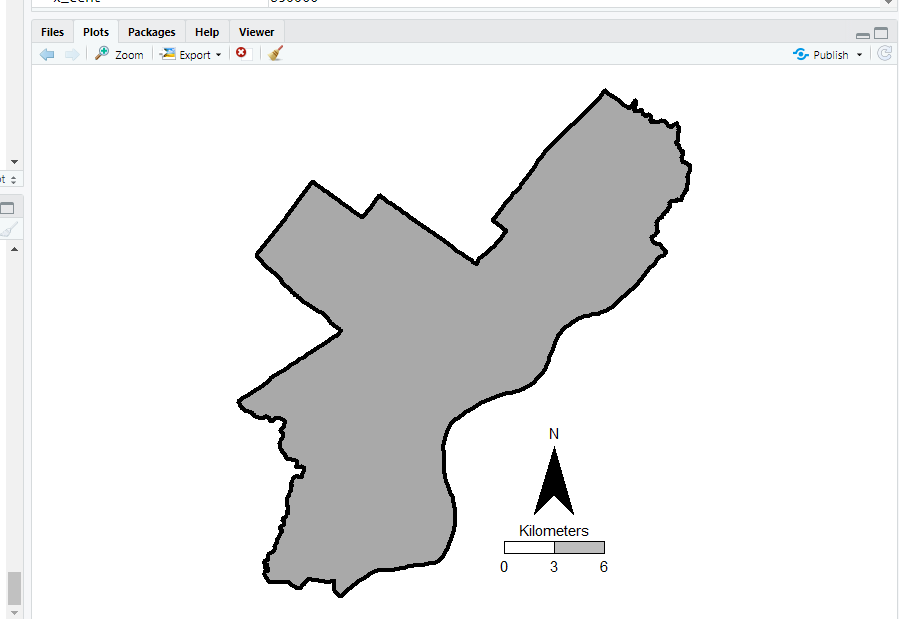
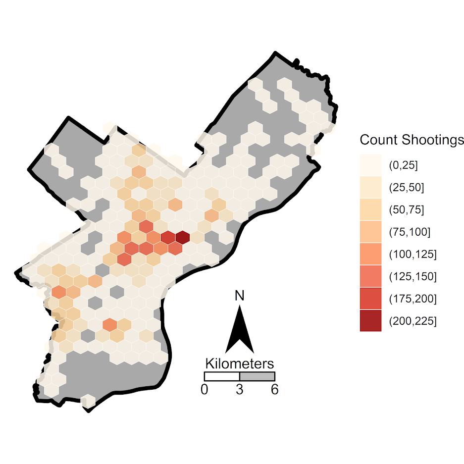
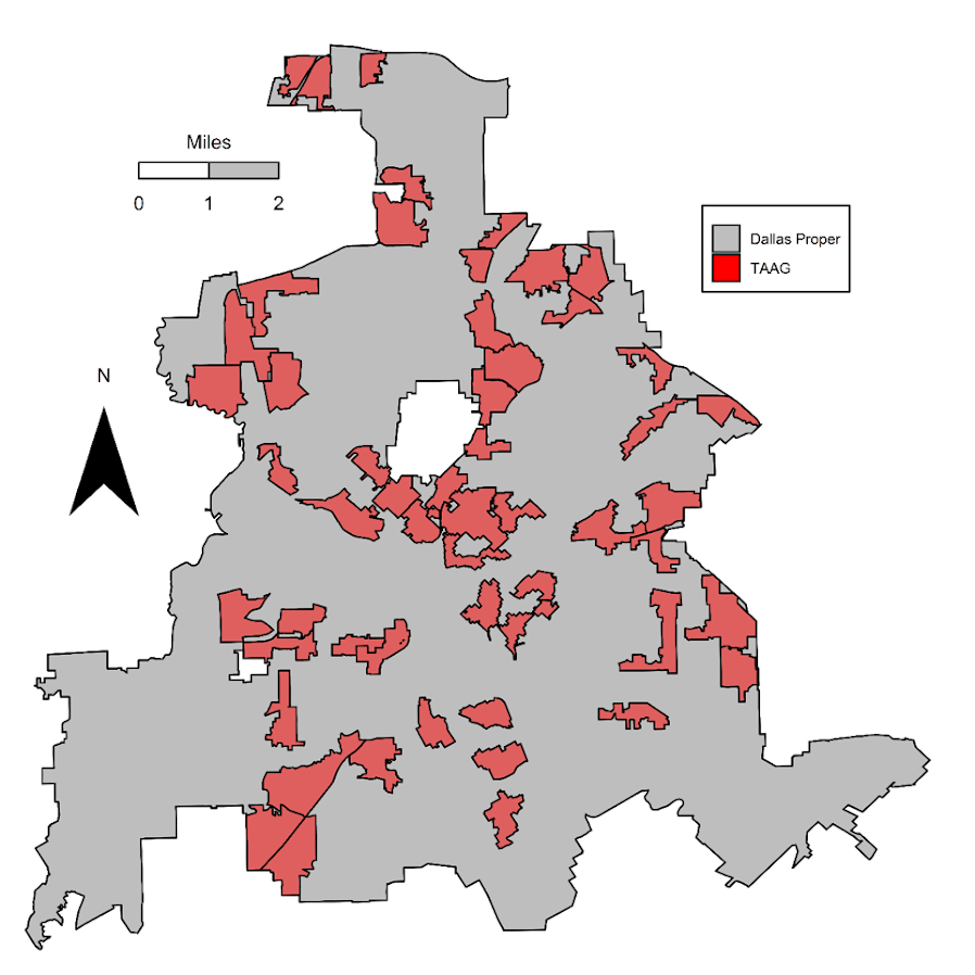
For each as a bit of a background as to the motivation for the projects, Dallas has had official hot spots, named TAAG (Target Area Action Grid). These were clearly larger than what would be considered best practice in identifying hot spots (they were more like entire neighborhoods). I realize ‘best practices’ is a bit wishy-washy, but the TAAG areas ended up covering around 20% of the city (a smidge over 65 square miles). Here is a map of the 2017 areas. There were 54 TAAG areas that covered, so on average each is alittle over 1 square mile.

Additionally I knew the Dallas police department was interested in purchasing the RTM software to do hot spots. And a separate group, the Dallas Crime Task Force was interested in using the software as well for non-police related interventions.

So I did these projects on my own (with my colleagues Wouter and Sydney of course). It wasn’t paid work for any of these groups (I asked DPD if they were interested, and had shared my results with folks from CPAL before that task force report came out, but nothing much came of it unfortunately). But my results for Dallas data are very likely to generalize to other places, so hopefully they will be helpful to others.

Machine Learning to Predict and Understand Hot Spots

So I see the appeal for folks who want to use RTM. It is well validated in both theory and practice, and Joel has made a nice software as a service app. But I knew going in that I could likely improve upon the predictions compared to RTM.

RTM tries to find a middle ground between prediction and causality (which isn’t a critique, it is sort of what we are all doing). RTM in the end spits out predictions that are like “Within 800 feet of a Subway Entrances is Risk Factor 1” and “The Density of Bars within 500 Feet is Risk Factor 2”. So it prefers simple models, that have prognostic value for PDS (or other agencies) to identify potential causal reasons for why that location is high crime. And subsequently helps to not only identify where hot spots are, but frame the potential interventions an agency may be interested it.

But this simplicity has a few drawbacks. One is that it is a global model, e.g. “800 feet within a subway entrance” applies to all subway entrances in the city. Most crime generators have a distribution that makes it so most subway entrances are relatively safe, only a few end up being high crime (for an example). Another is that it forces the way that different crime generators predict crime to be a series of step functions, e.g. “within 600 ft” or “a high density within 1000 ft”. In reality, most geographic processes follow a distance decay function. E.g. if you are looking at the relationship between check-cashing stores and street robbery, there are likely to be more very nearby the store, and it tails off in a gradual process the further away you get.

So I fit a more complicated random forest model that has neither of those limitations and can learn much more complicated functions, both in terms of distance to crime generators as well as spatially varying over the city. But because of that you don’t get the simple model interpretation – they are fundamentally conflicting goals. In terms of predictions either my machine learning model or a simpler comparison of using prior crime = future crime greatly outperforms RTM for several different predictive metrics.

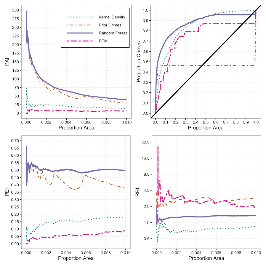
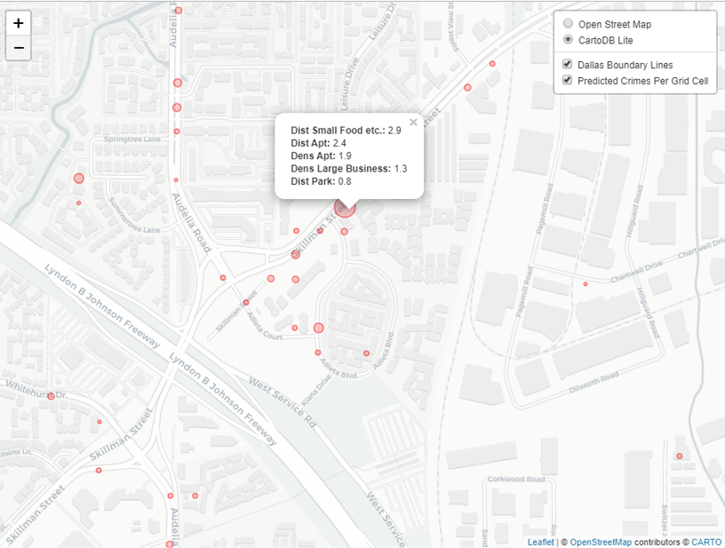
So this shows the predictions are better for RTM no matter how you slice the hot spot areas, but again you lose out the prognostic value of RTM. To replace that, I show local interpretability scores for hot spots. I have an online map here for an example. If you click on one of the high crime predicted areas, it gives you a local breakdown of the different variables that contributes to the risk score.

So it is still more complicated than RTM, but gets you a local set of factors that potentially contribute to why places are hot spots. (It is still superficial in terms of causality, but PDs aren’t going to be able to get really well identified causal relationships for these types of predictions.)

Return on Investment for Hot Spots Policing

The second part of this is that Dallas is no doubt in a tight economic bind. And this was even before all the stuff about reforming police budgets. So policing academics have been saying PDs should shift many more resources from reactive to proactive policing for years. But how to make the argument that it is in police departments best interest to shift resources or invest in additional resources?

To do this I aimed to calculate a return on investment on investing in hot spots policing. Priscilla Hunt (from RAND) recently came up with labor cost estimates for crime specifically relevant for police departments. So if an aggravated assault happens PDs (in Texas) typically spend around $8k in labor costs to respond to the crime and investigate (it is $125k for a homicide). So based on this, you can say, if I can prevent 10 agg assaults, I then save $80k in labor costs. I use this logic to estimate a return on investment for PDs to do hot spots policing.

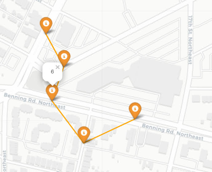
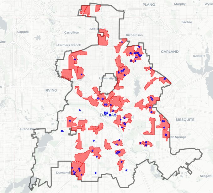
So first I generate hot spots, weighting for the costs of those crimes. Here is an interactive map to check them out, and below is a screenshot of the map.

I have an example of then calculating a return on investment for the hot spot area that captured the most crime. I get this estimate by transforming meta-analysis estimates of hot spots policing, estimating an average crime reduction, and then backing out how much labor costs that would save a police department. So in this hot spot, an ROI for hot spots policing (for 1.5 years) is $350k.

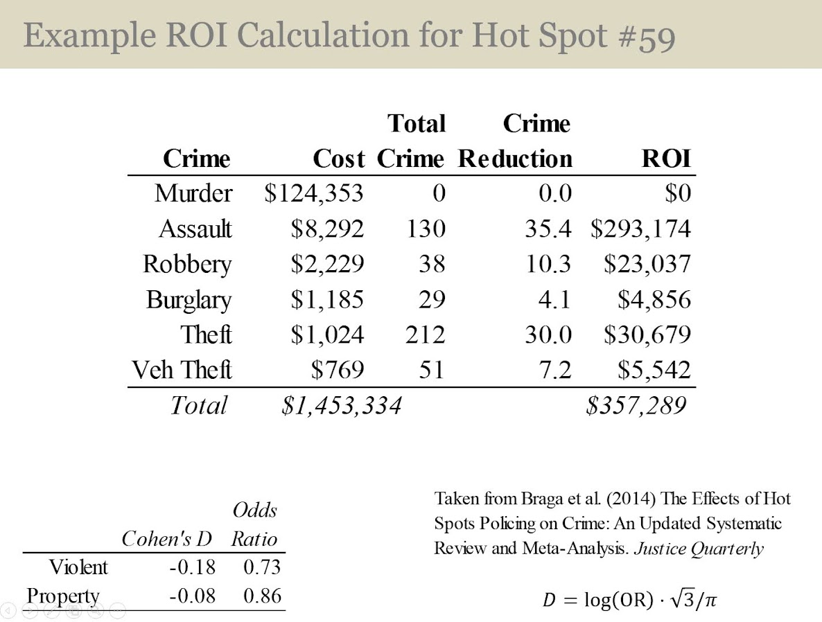
That return would justify at least one (probably more like two) full time officers just to be assigned to that specific hot spot. So if you actually hire more officers, it will be around net-zero in terms of labor costs. If you shift around current officers it should be a net gain in labor resources for the PD.

So most of the hot spots I identify in the study if you do this ROI calculation likely aren’t hot enough to justify hot spots policing from this ROI perspective (these would probably never justify intensive overtime that is typical of crackdown like interventions). But a few clearly are, and definitely should be the targets of some type of hot spot intervention.

New paper out: Trauma Center Drive Time Distances and Fatal Outcomes among Gunshot Wound Victims

A recent paper with Gio Circo, Trauma Center Drive Time Distances and Fatal Outcomes among Gunshot Wound Victims, was published in Applied Spatial Analysis and Policy. In this work, me and Gio estimate the marginal effect that drive time distances to the nearest Level 1 trauma center have on the probability a victim dies of a gun shot wound, using open Philadelphia data.

If you do not have access to that published version, here is a pre-print version. (And you can always email me or Gio and ask for a copy.) Also because we use open data, we have posted the data and code used for the analysis. (Gio did most of the work!)

For a bit of the background on the project, Gio had another paper estimating a similar model using Detroit data. But Gio estimated those models with aggregate data. I was familiar with more detailed Philly shooting data, as I used it for an example hot spot cluster map in my GIS crime mapping class.

There are two benefits to leveraging micro data instead of the aggregated data. One is that you can incorporate micro level incident characteristics into the model. The other is that you can get the exact XY coordinates where the incident occurred. And using those exact coordinates we calculate drive time distances to the hospital, which offer a slight benefit in terms of leave-one-out cross-validated accuracy compared to Euclidean distances.

So in terms of incident level characteristics, the biggest factor in determining your probability of death is not the distance to the nearest hospital, but where you physically get shot on your body. Here is a marginal effect plot from our models, showing how the joint effect of injury location (as different colors) and the drive time distance impact the probability of death. So if you get shot in the head vs the torso, you have around a 30% jump in the probability of death from that gun shot wound. Or if you get shot in an extremity you have a very low probability of death as well.

But you can see from that the margins for drive times are not negligible. So if you are nearby a hospital and shot in the torso your probability of dying is around 20%, whereas if you are 30 minutes away your probability rises to around 30%. You can then use this to map out isochrone type survivability estimates over the city. This example map is if you get shot in the torso, and the probability of death based on the drive time distance to the nearest Level 1 trauma location.

Fortunately many shootings do not occur in the northern most parts of Philadelphia, here is a map of the number of shootings over the city for our sample.

You can subsequently use these models to either do hypothetical take a trauma center away or add a trauma center. So given the density of shootings and drive time distances, it might make sense for Philly to invest in a trauma center in the shooting hot spot in the Kensington area (northeast of Temple). (You could technically figure out an ‘optimal’ location given the distribution of shootings, but since you can’t just plop down a hospital wherever it would make more sense to do hypothetical investments in current hospitals.)

For a simplified example, imagine you had 100 shootings in the torso that were an average 20 minutes away. The average probability of death in that case is around 25% (so ~25 homicides). If you hypothetically have a location that is only 5 minutes away, the probability goes down to more like 20% (so ~20 homicides). So in that hypothetical, the distance margin would have prevented 5 deaths.

One future piece of research I would be interested in examining is pre-post Shotspotter. So in that article Jen Doleac is right in that the emipirical evidence for Shotspotter reducing shootings is pretty flimsy, but preventing mortality by getting to the scene faster may be one mechanism that ShotSpotter can justify its cost.

Making aoristic density maps in R

I saw Jerry the other day made/updated an R package to do aoristic analysis. A nice part of this is that it returns the weights breakdown for individual cases, which you can then make maps of. My goto hot spot map for data visualization, kernel density maps, are a bit tough to work with weighted data though in R (tough is maybe not the right word, to use ggplot it takes a bit of work leveraging other packages). So here are some notes on that.

I have provided the data/code here. It is burglaries in Dallas, specifically I filter out just for business burglaries.

R Code Snippet

First, for my front end I load the libraries I will be using, and change the working directory to where my data is located.

############################
library(aoristic) #aoristic analysis 
library(rgdal)    #importing spatial data
library(spatstat) #weighted kde
library(raster)   #manipulate raster object
library(ggplot2)  #for contour graphs
library(sf)       #easier to plot sf objects

my_dir <- "D:\\Dropbox\\Dropbox\\Documents\\BLOG\\aoristic_maps_R\\data_analysis"
setwd(my_dir)
############################

Next I just have one user defined function, this takes an input polygon (the polygon that defines the borders of Dallas here), and returns a raster grid covering the bounding box. It also have an extra data field, to say whether the grid cell is inside/outside of the boundary. (This is mostly convenient when creating an RTM style dataset to make all the features conform to the same grid cells.)

###########################
#Data Manipulation Functions

#B is border, g is size of grid cell on one side
BaseRaster <- function(b,g){
    base_raster <- raster(ext = extent(b), res=g)
    projection(base_raster) <- crs(b)
    mask_raster <- rasterize(b, base_raster, getCover=TRUE) #percentage of cover, 0 is outside
    return(mask_raster)
}
###########################

The next part I grab the datasets I will be using, a boundary file for Dallas (in which I chopped off the Lochs, so will not be doing an analysis of boat house burglaries today), and then the crime data. R I believe you always have to convert date-times when reading from a CSV (it never smartly infers that a column is date/time). And then I do some other data fiddling – Jerry has a nice function to check and make sure the date/times are all in order, and then I get rid of points outside of Dallas using the sp over function. Finally the dataset is for both residential/commercial, but I just look at the commercial burglaries here.

###########################
#Get the datasets

#Geo data
boundary <- readOGR(dsn="Dallas_MainArea_Proj.shp",layer="Dallas_MainArea_Proj")
base_Dallas <- BaseRaster(b=boundary,g=200) 
base_df <- as.data.frame(base_Dallas,long=TRUE,xy=TRUE)

#Crime Data
crime_dat <- read.csv('Burglary_Dallas.csv', stringsAsFactors=FALSE)
#prepping time fields
crime_dat$Beg <- as.POSIXct(crime_dat$StartingDateTime, format="%m/%d/%Y %H:%M:%OS")
crime_dat$End <- as.POSIXct(crime_dat$EndingDateTime, format="%m/%d/%Y %H:%M:%OS")

#cleaning up data
aor_check <- aoristic.datacheck(crime_dat, 'XCoordinate', 'YCoordinate', 'Beg', 'End')
coordinates(crime_dat) <- crime_dat[,c('XCoordinate', 'YCoordinate')]
crs(crime_dat) <- crs(boundary)
over_check <- over(crime_dat, boundary)
keep_rows <- (aor_check$aoristic_datacheck == 0) & (!is.na(over_check$city))
crime_dat_clean <- crime_dat[keep_rows,]

#only look at business burgs to make it go abit faster
busi_burgs <- crime_dat_clean[ crime_dat_clean$UCROffense == 'BURGLARY-BUSINESS', ]
###########################

The next part preps the aoristic weights. First, the aoristic.df function is from Jerry’s aoristic package. It returns the weights broken down by 168 hours per day of the week. Here I then just collapse across the weekdays into the same hour, which to do that is simple, just add up the weights.

After that it is some more geographic data munging using the spatstat package to do the heavy lifting for the weighted kernel density estimate, and then stuffing the result back into another data frame. My bandwidth here, 3000 feet, is a bit large but makes nicer looking maps. If you do this smaller you will have a more bumpy and localized hot spots in the kernel density estimate.

###########################
#aoristic weights

#This takes like a minute
res_weights <- aoristic.df(busi_burgs@data, 'XCoordinate', 'YCoordinate', 'Beg', 'End')

#Binning into same hourly bins
for (i in 1:24){
    cols <- (0:6*24)+i+5
    lab <- paste0("Hour",i)
    res_weights[,c(lab)] <- rowSums(res_weights[,cols])
}

#Prepping the spatstat junk I need
peval <- rasterToPoints(base_Dallas)[,1:2]
spWin <- as.owin(as.data.frame(peval))
sp_ppp <- as.ppp(res_weights[,c('x_lon','y_lat')],W=spWin) #spp point pattern object

#Creating a dataframe with all of the weighted KDE
Hour_Labs <- paste0("Hour",1:24)

for (h in Hour_Labs){
  sp_den <- density.ppp(sp_ppp,weights=res_weights[,c(h)],
                        sigma=3000,
                        edge=FALSE,warnings=FALSE)
  sp_dat <- as.data.frame(sp_den)
  kd_raster <- rasterFromXYZ(sp_dat,res=res(base_Dallas),crs=crs(base_Dallas))
  base_df[,c(h)] <- as.data.frame(kd_raster,long=TRUE)$value
}
###########################

If you are following along, you may be wondering why all the hassle? It is partly because I want to use ggplot to make maps, but for its geom_contour it does not except weights, so I need to do the data manipulation myself to supply ggplot the weighted data in the proper format.

First I turn my Dallas boundary into a simple feature sf object, then I create my filled contour graph, supplying the regular grid X/Y and the Z values for the first Hour of the day (so between midnight and 1 am).

###########################
#now making contour graphs

dallas_sf <- st_as_sf(boundary)

#A plot for one hour of the day
hour1 <- ggplot() + 
  geom_contour_filled(data=base_df, aes(x, y, z = Hour1), bins=9) +
  geom_sf(data=dallas_sf, fill=NA, color='black') +
  scale_fill_brewer(palette="Greens") +
  ggtitle('       Hour [0-1)') + 
  theme_void() + theme(legend.position = "none")
hour1

png('Hour1.png', height=5, width=5, units="in", res=1000, type="cairo") 
hour1
dev.off()
###########################

Nice right! I have in the code my attempt to make a super snazzy small multiple plot, but that was not working out so well for me. But you can then go ahead and make up other slices if you want. Here is an example of taking an extended lunchtime time period.

###########################
#Plot for the afternoon time period
base_df$Afternoon <- rowSums(base_df[,paste0("Hour",10:17)])

afternoon <- ggplot() + 
  geom_contour_filled(data=base_df, aes(x, y, z = Afternoon), bins=9) +
  geom_sf(data=dallas_sf, fill=NA, color='black') +
  scale_fill_brewer(palette="Greens") +
  ggtitle('       Hour [9:00-17:00)') + 
  theme_void() + theme(legend.position = "none")
afternoon
###########################

So you can see that the patterns only slightly changed compared to the midnight prior graph.

Note that these plots will have different breaks, but you could set them to be equal by simply specifying a breaks argument in the geom_contour_filled call.

I will leave it up so someone who is more adept at R code than me to make a cool animated viz over time from this. But that is a way to mash up the temporal weights in a map.

Notes on making Leaflet maps in R

The other day I wrote a blog post for crimrxiv about posting interactive graphics on their pre-print sharing service. I figured it would be good to share my notes on making interactive maps, and to date I’ve mostly created these using the R leaflet library.

The reason I like these interactive maps is they allow you to zoom in and look at hot spots of crime. With the slippy base maps you can then see, oh OK this hot spot is by a train station, or an apartment complex, etc. It also allows you to check out specific data labels via pop-ups as I will show.

I’m using data from my paper on creating cost of crime weighted hot spots in Dallas (that will be forthcoming in Police Quarterly soonish). But I have posted a more direct set of replicating code for the blog post here.

R Code

So first for the R libraries I am using, I also change the working directory to where I have my data located on my Windows machine.

##########################################################
#This code creates a nice leaflet map of my DBSCAN areas

library(rgdal)       #read in shapefiles
library(sp)          #spatial objects
library(leaflet)     #for creating interactive maps
library(htmlwidgets) #for exporting interactive maps

#will need to change baseLoc if replicating on your machine
baseLoc <- "D:\\Dropbox\\Dropbox\\Documents\\BLOG\\leaflet_R_examples\\Analysis"
setwd(baseLoc)
##########################################################

Second, I read in my shapefiles using the rgdal library. This is important, as it includes the projection information. To plot the spatial objects on a slippy map they need to be in the Web Mercator projection (or technically no projection, just a coordinate reference system for the globe). As another trick I like with these basemaps, for the outlined area (the Dallas boundary here), it is easier to plot as a line spatial object, as opposed to an empty filled polygon. You don’t need to worry about the order of the layers as much that way.

##########################################################
#Get the boundary data and DBSCAN data
boundary <- readOGR(dsn="Dallas_MainArea_Proj.shp",layer="Dallas_MainArea_Proj")
dbscan_areas <- readOGR(dsn="db_scan.shp",layer="db_scan")

#Now convert to WGS
DalLatLon <- spTransform(boundary,CRS("+init=epsg:4326"))
DallLine <- as(DalLatLon, 'SpatialLines') #Leaflet useful for boundaries to be lines instead of areas
dbscan_LatLon <- spTransform(dbscan_areas,CRS("+init=epsg:4326") )

#Quick and Dirty plot to check projections are OK
plot(DallLine)
plot(dbscan_LatLon,add=TRUE,col='blue')
##########################################################

Next part, I have a custom function I have made to make pop-up labels for these leaflet maps. First I need to read in a table with the data info for the hot spot areas and merge that into the spatial object. Then the way my custom function works is I pass it the dataset, then I have arguments for the variables I want, and the way I want them labeled. The function does the work of making the labels bolded and putting in line breaks into the HTML. (No doubt others have created nice libraries to do HTML tables/graphs inside the pop-ups that I am unaware of.) If you check out the final print statement, it shows the HTML it built for one of the labels, <strong>ID: </strong>1<br><strong>$ (Thousands): </strong>116.9<br><strong>PAI: </strong>10.3<br><strong>Street Length (Miles): </strong>0.4

##########################################################
#Function for labels

#read in data
crime_stats <- read.csv('ClusterStats_wlen.csv', stringsAsFactors=FALSE)
dbscan_stats <- crime_stats[crime_stats$type == 'DBSCAN',]
dbscan_stats$clus_id <- as.numeric(dbscan_stats$AreaStr) #because factors=False!

#merge into the dbscan areas
dbscan_LL <- merge(dbscan_LatLon,dbscan_stats)

LabFunct <- function(data,vars,labs){
  n <- length(labs)
  add_lab <- paste0("<strong>",labs[1],"</strong>",data[,vars[1]])
  for (i in 2:n){
    add_lab <- paste0(add_lab,"<br><strong>",labs[i],"</strong>",data[,vars[i]])
  }
  return(add_lab)
}

#create labels
vs <- c('AreaStr', 'val_th', 'PAI_valth_len', 'LenMile')
#Lazy, so just going to round these values
for (v in vs[-1]){
  dbscan_LL@data[,v] <- round(dbscan_LL@data[,v],1)
}  
lb <- c('ID: ','$ (Thousands): ','PAI: ','Street Length (Miles): ')
diss_lab <- LabFunct(dbscan_LL@data, vs, lb)

print(diss_lab[1]) #showing off just one
##########################################################

Now finally onto the hotspot map. This is a bit to chew over, so I will go through bit-by-bit.

##########################################################
HotSpotMap <- leaflet() %>%
  addProviderTiles(providers$OpenStreetMap, group = "Open Street Map") %>%
  addProviderTiles(providers$CartoDB.Positron, group = "CartoDB Lite") %>%
  addPolylines(data=DallLine, color='black', weight=4, group="Dallas Boundary") %>%
  addPolygons(data=dbscan_LL,color = "blue", weight = 2, opacity = 1.0, 
              fillOpacity = 0.5, group="DBSCAN Areas",popup=diss_lab, 
              highlight = highlightOptions(weight = 5,bringToFront = TRUE)) %>%
  addLayersControl(baseGroups = c("Open Street Map","CartoDB Lite"),
                   overlayGroups = c("Dallas Boundary","DBSCAN Areas"),
                   options = layersControlOptions(collapsed = FALSE))  %>%
  addScaleBar(position = "bottomleft", options = scaleBarOptions(maxWidth = 100, 
              imperial = TRUE, updateWhenIdle = TRUE))
                      
HotSpotMap #this lets you view interactively

#or save to a HTML file to embed in webpage
saveWidget(HotSpotMap,"HotSpotMap.html", selfcontained = TRUE)
##########################################################

First I create the empty leaflet() object. Because I am superimposing multiple spatial layers, I don’t worry about setting the default spatial layer. Second, I add in two basemap providers, OpenStreetMap and the grey scale CartoDB positron. Positron is better IMO for visualizing global data patterns, but the open street map is better for when you zoom in and want to see exactly what is around a hot spot area. Note when adding in a layer, I give it a group name. This allows you to later toggle which provider you want via a basegroup in the layers control.

Next I add in the two spatial layers, the Dallas Boundary lines and then the hot spots. For the DBSCAN hot spots, I include a pop-up diss_lab for the dbscan hot spot layer. This allows you to click on the polygon, and you get the info I stuffed into that label vector earlier. The HTML is to make it print nicely.

Finally then I add in a layers control, so you can toggle layers on/off. Basegroups mean that only one of the options can be selected, it doesn’t make sense to have multiple basemaps selected. Overlay you can toggle on/off as needed. Here the overlay doesn’t matter much due to the nature of the map, but if you have many layers (e.g. a hot spot map and a choropleth map of demographics) being able to toggle the layers on/off helps a bit more.

Then as a final touch I add in a scale bar (that automatically updates depending on the zoom level). These aren’t my favorite with slippy maps, as I’m not even 100% sure what location the scale bar refers to offhand (the center of the map? Or literally where the scale bar is located?) But when zoomed into smaller areas like a city I guess it is not misleading.

Here is a screenshot of this created map zoomed out to the whole city using the Positron grey scale base map. So it is tough to visualize the distribution of hot spots from this. If I wanted to do that in a static map I would likely just plot the hot spot centroids, and then make the circles bigger for areas that capture more crime.

But since we can zoom in, here is another screenshot zoomed in using the OpenStreetMap basemap, and also illustrating what my pop-up labels look like.

I’m too lazy to post this exact map, but it is very similar to one I posted for my actual hot spots paper if you want to check it out directly. I host it on GitHub for free.

Here I did not show how to make a choropleth map, but Jacob Kaplan in his R book has a nice example of that. And in the future I will have to update this to show how to do the same thing in python using the Folium library. I used Folium in this blog post if you want to dig into an example though for now.

Some more examples

For some other examples of what is possible in Leaflet maps in R, here are some examples I made for my undergrad Communities and Crime class. I had students submit prediction assignments (e.g. predict the neighborhood with the most crime in Dallas, predict the street segment in Oak Cliff with the most violent crime, predict the bar with the most crimes nearby, etc.) I would then show the class the results, as well as where other students predicted. So here are some screen shots of those maps.

Choropleth

Graduated Points

Street Segment Viz

Creating high crime sub-tours

I was nerdsniped a bit by this paper, Targeting Knife-Enabled Homicides For Preventive Policing: A Stratified Resource Allocation Model by Vincent Hariman and Larry Sherman (HS from here on).

It in, HS attempt to define a touring schedule based on knife crime risk at the lower super output area in London. So here are the identified high risk areas:

And here are HS’s suggested hot spot tours schedule.

This is ad-hoc, but an admirable attempt to figure out a reasonable schedule. As you can see in their tables, the ‘high’ knife crime risk areas still only have a handful of homicides, so if reducing homicides is the objective, this program is a bit dead in the water (I’ve written about the lack of predictive ability of the model here).

I don’t think defining tours to visit everywhere makes sense, but I do think a somewhat smaller in scope question, how to figure out geographically informed tours for hot spot areas does. So instead of the single grid cell target ala PredPol, pick out multiple areas to visit for hot spots. (I don’t imagine the 41 LSOA areas are geographically contiguous either, e.g. it would make more sense to pick a tour for areas connected than for areas very far apart.)

Officers don’t tend to like single tiny areas either really, and I think it makes more sense to widen the scope a bit. So here is my attempt to figure those reasonable tours out.

Defining the Problem

The way I think about that problem is like this, look at the hypothetical diagram below. We have two choices for the hot spot location we are targeting, where the crime counts for locations are noted in the text label.

In the select the top hot spot (e.g. PredPol) approach, you would select the singlet grid cell in the top left, it is the highest intensity. We have another choice though, the more spread out hot spot in the lower right. Even though it is a lower density, it ends up capturing more crime overall.

I subsequently formulated an integer linear program to try to tackle the problem of finding good sub-tours through the graph that cumulatively capture more crime. So with the above graph, if I select two subtours, I get the results as (where nodes are identified by their (x,y) position):

  • ['Begin', (1, 4), 'End']
  • ['Begin', (4, 0), (4, 1), (3, 1), (3, 0), (2, 0), 'End']

So it can select singlet areas if they are islands (the (1,4) area in the top left), but will grow to wind through areas. Also note that the way I have programmed this network, it doesn’t skip the zero area (4,1) (it needs to go through at least one in the bottom right unless it doubles back on itself).

I will explain the meaning of the begin and end nodes below in my description of the linear program. It ends up being sort of a mash-up of traveling salesman type vehicle routing and min cost max flow type problems.

The Linear Program

The way I think about this problem formulation is like this: we have a directed graph, in which you can say, OK I start from location A, then can go to B, than go to C. In my set of decision variables, I have choices that look like this, where the first subscript denotes the from node, and the second subscript denotes the to node.

D_ab := node a -> node b
D_bc := node b -> node c

etc. In our subsequent linear program, the destination node is the node that we calculate our cumulative crime density statistics. So if node B had 10 crimes and 0.1 square kilometers, we would have a density of 100 crimes per square kilometer.

Now to make this formulation work, we need to add in a set of special nodes into our usual location network. These nodes I call ‘Begin’ and ‘End’ nodes (you may also call them source/sink nodes though). The begin nodes all look like this:

D_{begin},a
D_{begin},b
D_{begin},c

So you do that for every node in your network. Then you have End nodes as well, e.g.

D_a,{end}
D_b,{end}
D_c,{end}

In this formulation, since we are only concerned about the crime stats for the to node, not the from node, the Begin nodes just inherit the crime density stats from the original node data. For the end nodes though, you just set their objective value stats to zero (they are only relevant to define the constraints).

Now here is my linear program formulation:

Maximize 
  Sum [ D_ij ( CrimeDensity_j - DensityPenalty_j ) ]

Subject To:

 1. Sum( D_in for each neighbor of n ) <= 1, 
      for each original node n
 2. Sum( D_in for each neighbor of n ) =  Sum( D_ni for each neighbor of n ), 
      for each original node n
 3. Sum( D_bi for each begin node ) = k routes
 4. Sum( D_ie for each end node ) = k routes
 5. Sum( D_ij + D_ji ) <= 1, for each unique i,j pair
 6. D_ij is an element of {0,1}

Constraint 1 is a flow constraint. If a node has an incoming edge set to one, it cannot have any other incoming edge set to one (so a location can only be chosen once).

Constraint 2 is a constraint that says if an incoming node is selected, one of the outgoing edges needs to be selected.

Constraints 3 & 4 determine the number of k tours/routes to choose in the end. Since the begin/end nodes are special we have k routes going out of the begin nodes, and k routes going into the end nodes.

With just these constraints, you can still get micro-cycles I found. So something like, X -> Z -> X. Constraint 5 (for only the undirected edges) prevents this from happening.

Constraint 6 is just setting the decision variables to binary 0/1. So it is a mixed integer linear program.

The final thing to note is the objective function, I have CrimeDensity_j - DensityPenalty_j, so what exactly is DensityPenalty? This is a value that penalizes visiting areas that are below this threshold. Basically the way that this works is that, the density penalty sets an approximate threshold for the minimum density a tour should contain.

I suggest a default of a predictive accuracy index of 10. Where do I get 10 you ask? Weisburd’s law of crime concentration suggests 5% of the areas should contain 50% of the crime, which is a PAI of 0.5/0.05 = 10. In my example with DC data then I just calculate the actual density of crime per unit area that corresponds to a PAI of 10.

You can adjust this though, if you prefer smaller tours of higher crime density you would up the value. If you prefer longer tours decrease it.

This is the best way I could figure out how to trade off the idea of spreading out the targeted hot spot vs selecting the best areas. If you spread out you will ultimately have a lower density. This turns it into a soft objective penalty to try to keep the selected tours at a particular density threshold (and will scoop up better tours if they are available). For awhile I tried to figure out if I could maximize the PAI metric, but it is the case with larger areas the PAI will always go down, so you need to define the objective some other way.

This formulation I only consider linked nodes (unlike the usual traveling salesman in which it is a completely linked distance graph). That makes it much more manageable. In this formulation, if you have N as the number of nodes/areas, and E is the number of directed edges between those areas, we will then have:

  • 2*N + E decision variables
  • 2 + 2*N + E/2 constraints

Generally if you are doing directly connected areas in geographic networks (i.e. contiguity connections), you will have less than 8 (typically more like an average of 6) neighbors per each area. So in the case of the 4k London lower super output areas, if I chose tours I would guess it would end up being fewer than 2*4,000 + 8*4,000 = 40,000 decision variables, and then fewer than that constraints.

Since that is puny (and I would suggest doing this at a smaller geographic resolution) I tested it out on a harder network. I used the data from my dissertation, a network of 21,506 street units (both street segments and intersections) in Washington, D.C. The contiguity I use for these micro units is based on the Voronoi tessellation, so tends to have more neighbors than you would with a strictly road based network connectivity. Still in the end it ends up being a shade fewer than 200k decision variables and 110k constraints. So is a better test for in the wild whether the problem can be feasibly solved I think.

Example with DC Data

Here I have posted the python code and data used for this analysis, I end up having a nice function that you just submit your network with the appropriate attributes and out pops the different tours.

So I end up doing examples of 4 and 8 subtours based on 2011 violent UCR crime data (agg assaults, robberies, and homicides, no rapes in the public data). I use for the penalty that PAI = 10 threshold, so it should limit tours to approximately that value. It only ends up taking 2 minutes for the model to converge for the 4 tours and less than 2.5 minutes for the 8 tours on my desktop. So it should be not a big problem to up the decision variables to more sub-areas and still be solvable in real life applications.

The area estimates are in square meters, hence the high numbers. But on the right you can see that each sub-tour has a PAI above 10.

Here is an interactive map for you to zoom into each 4 subtour example. Below is a screenshot of one of the subtours. You can see that since I have defined my connected areas in terms of Voronoi tessalations, they don’t exactly follow the street network.

For the 8 tour example, it ends up returning several zero tours, so it is not possible in this data to generate 8 sub-tours that meet that PAI >= 10 threshold.

You can see that it ends up being the tours have higher PAI values, but lower overall crime counts.

You may think, why does it not pick at least singlet areas with at least one crime? It ends up being that I weight areas here by their area (this formulation would be better with grid cells of equal area, so my objective function is technically Sum [ D_ij * w_j *( CrimeDensity_j - DensityPenalty_j ) ], where w_j is the percent of the total area (so the denominator in the PAI calculation). So it ends up picking areas that are the tiniest areas, as they result in the smallest penalty to the objective function (w_j is tiny). I think this is OK though in the end – I rather know that some of the tours are worthless.

You can also see I get one subtour that is just under the PAI 10 threshold. Again possible here, but should be only slightly below in the worst case scenario. The way the objective function works is that it is pretty tricky to pick out subtours below that PAI value but still have a positive contribution to the overall objective function.

Future Directions

The main thing I wish I could do with the current algorithm (but can’t the way the linear program is set up), is to have minimum and maximum tour area/length constraints. I think I can maybe do this by adapting this code (I’m not sure how to do the penalties/objectives though). So if others have ideas let me know!

I admit that this may be overkill, and maybe just doing more typical crime clustering algorithms may be sufficient. E.g. doing DBSCAN hot spots like I did here.

But this is my best attempt shake at the problem for now!

Resources of interest for criminologists and crime analysts

I tend to get about one email per week asking for help. Majority of folks are either students asking for general research advice, or individuals who came across my webpage asking for advice about code.

This is great, and everyone should always feel open to send me an email. The utility of me answering these questions (for everyone) are likely greater than spending time working on a paper, so I do not mind at all. I can currently keep up with the questions given the volume (but not by much, and is dependent on how busy I am with other work/family things). Worst case I will send an email response that says sorry I cannot respond to this anytime soon.

Many times there are other forums though for people to post questions that are ultimately better. One, I participate in many of these, so it is not like sending an email just to me, it is like sending an email to me + 40 other people who can answer your question. Also from my perspective it is better to answer a question once in one of these forums, than repeat the same answer a dozen different times. (Many times I write a blog post if I get the same question multiple times.)

While the two groups overlap a bit, I separate out resources aimed at criminologists (as typically more interested in research and are current master/PhD students), whereas crime analysts are embedded in a criminal justice agency.

For Criminologists

For resources on where to ask questions, Jacob Kaplan recently created a slack channel, crimhelp.slack.com. It has been joined by a variety of criminologists, folks in think tanks/research institutes, current graduate students, and some working crime analysts. It is new, but you can go and peruse the topics so far, they are pretty wide in scope.

So that forum you can really ask about anything crim related, the remaining resources are more devoted towards programming/statistical analysis.

If you are interested in statistical or programming questions, I used to participate in StackOverflow, Cross Validated (the stats site), and the GIS site. They are good places to check out prior answers, and are worth a shot asking a question on occasion. For tricky python or R coding questions that are small in scope, StackOverflow is excellent. Anything more complicated it is more hit or miss.

Many programming languages have their own question boards. Stata and SPSS are ones I am familiar with and tend to receive good responses (I still actively participate in the SPSS board). If I’m interested in learning some new command/library in Stata, I often just search the forum for posts related to it to check it out in the wild.

For programming questions, it is often useful to create a minimal reproducible example to describe the problem, show what the input data looks like and how you want the output data to look like. (In fact on the forums I link to you will almost always be asked explicitly to do that.)

For Crime Analysts

In similar spirit to the crim slack channel, Police Rewired has a Discord group for crime analysts (not 100% sure who started it, Andreas Varotsis is one of the people involved though). So that was founded by some UK analysts, but there are US analysts participating as well (and the problems folks deal with are very similar, so no real point in making a distinction between US/UK).

For crime analysts in the US, you should likely join either the IACA or a local crime analyst network. Many of the local ones come bundled, so if you join the Texas analyst network TXLEAN you also automatically get an IACA membership. To join is cheap (especially for current students). IACA has also started a user question forum as well.

For folks looking to get an entry level gig, the IACA has a job board that is really good. So it is worth the $10 just for that. They have various other intro resources though as well. For current BA/Masters students who are looking to get a job, I also suggest applying to private sector analyst jobs as well. They are mostly exchangeable with a crime analyst role. (Think more excel jockey than writing detailed statistic programming.)

How I learn to code

What prompted this blog post is that I’ve gotten asked by maybe 5 different people in the past month or so asking for resources to learn about statistical programming. And honestly I do not have a good answer, I’ve never really sat down with a book and learned a statistical software (tried on a few occasions and failed). I’m always just project focused.

So I wanted to do an example conjunctive analysis, or deep learning with pytorch, or using conformal prediction intervals to generate synthetic control estimates, etc. So I just sat down and figured out how to do those specific projects using various resources around the internet. One of my next personal projects is going to estimate prediction intervals for logistic multilevel models using Julia (based on this very nice set of intros to the language). I also need to get a working familiarity with Tableau. (Both are related to projects I am doing at work.) So expect to see a Tableau dashboard on the blog sometime in the near future!

Also many statistical programming languages are pretty much exchangeable for the vast majority of tasks people do. You can see that I have example blog posts for Excel, Access/SQL, R, SPSS, Stata, python, and ArcGIS. Just pick one and figure it for a particular project.

For criminologists, I have posted my Phd research course materials, and for Crime Analysts I have posted my GIS Class and my Crime Analysis course materials (although the GIS course is already out of date, it uses Arc Desktop instead of ArcPro). I don’t suggest you sit down and go through the courses though page-by-page. What I more suggest is look at the table of contents, see if anything strikes your fancy, read that particular lecture/code, and if you want to apply it to your own projects try to work it out. (At least that is how I go about learning coding.)

If you want more traditional learning materials for learning how to do code (e.g. textbooks or online courses), I suggest you ask folks on those forums I mentioned. They will likely be able to provide much better advice than I would.

To end it is totally normal to want to ask questions, get advice, or get feedback. Both my experience in Academia and in Crime Analysis it can be very lonely (I was in a small department, so was the only analyst). Folks on these forums are happy to help and connect.

Nearby Analysis Example (Excel)

The other day on Twitter I made a comment to Joel Caplan about how I would solve analysis with multiple buffers and not counting overlaps. A typical GIS workflow would go:

  • take your points of interest and create buffers
  • join the points to the buffer polygons, and get a count of the crimes of interest

I often do the analysis in different way though – I do a spatial join of the location of interest to the point features, in which you get a field that is the distance to the nearest feature, and then subsequently do analysis on that distance field. In that workflow, it makes it much easier to change the size of the buffer for sensitivity analysis, or conduct analysis on different subsets of data.

To start I am going to be working with a set of robberies in Dallas (from the open data, not quite 16k), and DART stations (n = 74). (DART is the Dallas above ground train.) You can access the Excel file I am doing analysis with here. Using excel as I often suggest it for undergrads/masters for projects who aren’t up to speed with programming – so this is a good illustration of that buffer analysis workflow.

Distance to Nearest

To start, I would typically use a GIS system (or R/python/SQL) to calculate the distance to a nearest object. But I don’t have access to Arc anymore, so I am going to show you a way to do this right in Excel. This only works for projected data (not latitude/longitude), and calculating distance from point-to-point.

So first, to figure out the distance between two points in Euclidean space, we can just use the Pythagorean theorem that you learned in grade school, Distance = sqrt( (x1 - x2)^2 + (y1 - y2)^2 ). Because we are doing this in an Excel spreadsheet and want to find the nearest Dart station to the robbery, we will use a little array formula magic. I named my table of Dart locations Dart, and so the array formula to find the nearest distance in Excel is:

=MIN( SQRT( (B2 - Dart[X])^2  + (C2 - Dart[Y])^2))

When you enter this formula, hit Ctrl + Shift + Enter, else it just returns the distance to the first Dart station. If you did this right, you will see the formula have {} brackets around it in the formula bar.

Distance will be defined in whatever the projected units are in – here they are in feet. But by using MIN with the array, it returns the distance to the nearest station. To get the ID of the associated station, we need to do a similar formula (and this only works with numeric ID fields). You can basically do an array IF formula, and the only station this is true for will be the MAX of that array. (Again hit Ctrl + Shift + Enter when finishing off this cell calculation instead of just Enter.)

=MAX(IF(F2=SQRT((B2 - Dart[X])^2  + (C2 - Dart[Y])^2), Dart[DartID],0))

User beware – this runs super fast on my machine (surprisingly) but it is quite a few computations under the hood. For much larger data again use a GIS/database/Stat program to do these calculations.

Using Pivot Tables to do Buffer Analysis

So now that we have those distance fields, it is easy to do a formula along the lines of you want to count up the robberies within 1000 feet. You can do another IF formula that is something like IF([@Distance] < 1000, 1, 0).

And then go ahead and make a pivot table, and put the DartID as the rows, and the Within distance field you just made as the values (to sum in the pivot table).

Then bam, you have your buffer analysis. Here I sorted the pivot table so you can see the highest crime Dart is 12. (I haven’t looked up which one this is, you can use Excel though to map them out).

So say you wanted to change the buffer size? It is as simple as changing out the 1000 in the prior formula to a different value. One thing I like to do though is to make a lookup table to define different bins. You can see I named that table BuffTable (naming the tables makes it easier to refer to them later in array formulas, also I shifted down the pivot table to not accidently overwrite it later).

And now I use a combination of MATCH to find what row it falls into for this table, and INDEX to return the row label I want. So first I have =MATCH([@Distance],BuffTable[Within Bounds],1). This is very similar to VLOOKUP, and will match to the row that the distance is less than.

This just returns the row number of the match though – I want to pipe in those nicer labels I made. To do that, I nest the match results within index, =INDEX(BuffTable, MATCH([@Distance],BuffTable[Within Bounds],1)+1, 2). And voila, I get my binned data.

Now we can do our pivot table so the columns are the new field we just made (make sure to refresh the pivot table).

And we can do our buffer analysis and varying buffers. Just update the tables to however you want the buffers, hit refresh, and everything will be updated. (I should have done the labels so they are ordered a bit more nicely in the pivot table.)

I like this approach for students, as it is easy to pivot/filter on other characteristics as well. Want to get arrest rates around areas? Want to see changes in crimes nearby different DART stations over time? It is just a few formulas/filters and a pivot table away in this format.

Distance to Nearest Analysis for DART stations

Another analysis I think is useful is to look at the cumulative distance analysis. I got this idea from a paper of Jerry Ratcliffe’s.

So what you can do is to round the distance data, e.g. using a formula like this will round the data to every 300 feet.

=ROUND([@Distance]/300,0)*300

And then you can make a pivot table of the rounded counts. Here I also did additional stats to calculate the spatial density of the points, and show the distance decay curve.

Jerry’s paper I linked to looks for change points – I think that idea is somewhat misleading though. It does look like a change point in Jerry’s graphs, but that is a function of the binning I think (see this Xu/Griffiths paper, same method, finer bins, and shows a more smooth decay).

So here I tied the round function to a cell, and again I can just update the value to a different bin size, and everything get auto-updated in the spreadsheet. Here is a bin size of 100 feet, which introduces some volatility in the very nearby locations, but you can see still pretty much follows that smooth distance decay effect.

Actually the Xu/Griffiths paper looks at the street network distance, which I think makes more sense. (And again need a GIS to do that analysis.) The buffer areas can behave funny, and won’t have a direct relationship to the street length exposure, so I think the typical Euclidean analysis can be misleading in some cases. I will need to save that for another blog post though!

Some additional plots to go with Crime Increase Dispersion

So Jerry nerdsniped me again with his Crime Increase Dispersion statistic (Ratcliffe, 2010). Main motivation for this post is that I don’t find that stat very intuitive to be frank. So here are some alternate plots, based on how counts of crime approximately follow a Poisson distribution. These get at the same question though as Jerry’s work, is a crime increase (or decrease) uniform across the city or specific to a few particular sub-areas.

First, in R I am going to simulate some data. This creates a set of data that has a constant increase over 50 areas of 20%, but does the post crime counts as Poisson distributed (so it isn’t always exactly a 20% increase). I then create 3 outliers (two low places and one high place).

###########################################
#Setting up the simulation
set.seed(10)
n <- 50
low <- 10
hig <- 400
inc <- 0.2
c1 <- trunc(runif(n,low,hig))
c2 <- rpois(n,(1+inc)*c1)
#Putting in 2 low outliers and 1 high outlier
c2[5] <- c1[5]*0.5
c2[10] <- c1[10]*0.5
c2[40] <- c1[40]*2
#data frame for ggplot
my_dat <- data.frame(pre=c1,post=c2)
###########################################

The first plot I suggest is a simple scatterplot of the pre-crime counts on the X axis vs the post-crime counts on the Y axis. My make_cont function takes those pre and post crime counts as arguments and creates a set of contour lines to put as a backdrop to the plot. Points within those lines support the hypothesis that the area increased in crime at the same rate as the overall crime increase, taking into account the usual ups and downs you would expect with Poisson data. This is very similar to mine and Jerry’s weighted displacement difference test (Wheeler & Ratcliffe, 2018), and uses a normal based approximation to examine the differences in Poisson data. I default to plus/minus three because crime data tends to be slightly over-dispersed (Wheeler, 2016), so coverage with real data should be alittle better (although here is not necessary).

###########################################
#Scatterplot of pre vs post with uniform 
#increase contours

make_cont <- function(pre_crime,post_crime,levels=c(-3,0,3),lr=10,hr=max(pre_crime)*1.05,steps=1000){
    #calculating the overall crime increase
    ov_inc <- sum(post_crime)/sum(pre_crime)
    #Making the sequence on the square root scale
    gr <- seq(sqrt(lr),sqrt(hr),length.out=steps)^2
    cont_data <- expand.grid(gr,levels)
    names(cont_data) <- c('x','levels')
    cont_data$inc <- cont_data$x*ov_inc
    cont_data$lines <- cont_data$inc + cont_data$levels*sqrt(cont_data$inc)
    return(as.data.frame(cont_data))
}

contours <- make_cont(c1,c2)

library(ggplot2)
eq_plot <- ggplot() + 
           geom_line(data=contours, color="darkgrey", linetype=2, 
                     aes(x=x,y=lines,group=levels)) +
           geom_point(data=my_dat, shape = 21, colour = "black", fill = "grey", size=2.5, 
                      alpha=0.8, aes(x=pre,y=post)) +
           scale_y_continuous(breaks=seq(0,500,by=100)) +
           coord_fixed() +
           xlab("Pre Crime Counts") + ylab("Post Crime Counts")
           #scale_y_sqrt() + scale_x_sqrt() #not crazy to want square root scale here
eq_plot

#weighted correlation to view the overall change
cov.wt(my_dat[,c('pre','post')], wt = 1/sqrt(my_dat$pre), cor = TRUE)$cor[1,2]
########################################### 

So places that are way outside the norm here should pop out, either for increases or decreases. This will be better than Jerry’s stats for identifying outliers in lower baseline crime places.

I also show how to get an overall index based on a weighted correlation coefficient on the last line (as is can technically return a value within (-1,1), so might square it for a value within (0,1)). But I don’t think the overall metric is very useful – it has no operational utility for a crime department deciding on a strategy. You always need to look at the individual locations, no matter what the overall index metric says. So I think you should just cut out the middle man and go straight to these plots. I’ve had functionally similar discussions with folks about Martin Andresen’s S index metric (Wheeler, Steenbeek, Andresen, 2018), just make your graphs and maps!

An additional plot that basically takes the above scatterplot and turns it on its side is a Poisson version of a Bland-Altman plot. Traditionally this plot is the differences of two measures on the Y axis, and the average of the two measures on the X axis. Here to make the measures have the same variance, I divide the post-pre crime count differences by sqrt(post+pre). This is then like a Poison Z-score, taking into account the null of an equal increase (or decrease) in crime stats among all of the sub-areas. (Here you might also use the Poisson e-test to calculate p-values of the differences, but the normal based approximation works really well for say crime counts of 5+.)

###########################################
#A take on the Bland-Altman plot for Poisson data

ov_total <- sum(my_dat$post)/sum(my_dat$pre)
my_dat$dif <- (my_dat$post - ov_total*my_dat$pre)/sqrt(my_dat$post + my_dat$pre)
my_dat$ave <- (my_dat$post + my_dat$pre)/2

ba_plot <- ggplot(data=my_dat, aes(x=ave, y=dif)) + 
           geom_point(shape = 21, colour = "black", fill = "grey", size=2.5, alpha=0.8) +
           scale_y_continuous(breaks=seq(-8,6,by=2)) +
           xlab("Average Crime") + ylab("Z-score (Equal Increase)")

ba_plot

#false discovery rate correction
my_dat$p_val <- pnorm(-abs(my_dat$dif))*2 #two-tailed p-value
my_dat$p_adj <- p.adjust(my_dat$p_val,method="BY") #BY correction since can be correlated
my_dat <- my_dat[order(my_dat$p_adj),]
my_dat #picks out the 3 cases I adjusted
###########################################

So again places with large changes that do not follow the overall trend will pop out here, both for small and large crime count places. I also show here how to do a false-discovery rate correction (same as in Wheeler, Steenbeek, & Andresen, 2018) if you want to actually flag specific locations for further investigation. And if you run this code you will see it picks out my three outliers in the simulation, and all other adjusted p-values are 1.

One thing to note about these tests are they are conditional on the observed overall citywide crime increase. If it does happen that only one area increased by alot, it may make more sense to set these hypothesis tests to a null of equal over time. If you see that one area is way above the line and a ton are below the line, this would indicate that scenario. To set the null to no change in these graphs, for the first one just pass in the same pre estimates for both the pre and post arguments in the make_cont function. For the second graph, change ov_total <- 1 would do it.

References

  • Ratcliffe, J. H. (2010). The spatial dependency of crime increase dispersion. Security Journal, 23(1), 18-36.
  • Wheeler, A. P. (2016). Tables and graphs for monitoring temporal crime trends: Translating theory into practical crime analysis advice. International Journal of Police Science & Management, 18(3), 159-172.
  • Wheeler, A. P., & Ratcliffe, J. H. (2018). A simple weighted displacement difference test to evaluate place based crime interventions. Crime Science, 7(1), 11.
  • Wheeler, A. P., Steenbeek, W., & Andresen, M. A. (2018). Testing for similarity in area‐based spatial patterns: Alternative methods to Andresen’s spatial point pattern test. Transactions in GIS, 22(3), 760-774.

Making a hexbin map in ggplot

In a recent working paper I made a hexbin map all in R. (Gio did most of the hard work of data munging and modeling though!) Figured I would detail the process here for some notes. Hexagon binning is purportedly better than regular squares (to avoid artifacts of runs in discretized data). But the reason I use them in this circumstance is mostly just an aesthetic preference.

Two tricky parts to this: 1) making the north arrow and scale bar, and 2) figuring out the dimensions to make regular hexagons. As an illustration I use the shooting victim data from Philly (see the working paper for all the details) full data and code to replicate here. I will walk through a bit of it though.

Data Prep

First to start out, I just use these three libraries, and set the working directory to where my data is.

library(ggplot2)
library(rgdal)
library(proj4)
setwd('C:\\Users\\axw161530\\Dropbox\\Documents\\BLOG\\HexagonMap_ggplot\\Analysis')

Now I read in the Philly shooting data, and then an outline of the city that is projected. Note I read in the shapefile data using rgdal, which imports the projection info. I need that to be able to convert the latitude/longitude spherical coordinates in the shooting data to a local projection. (Unless you are making a webmap, you pretty much always want to use some type of local projection, and not spherical coordinates.)

#Read in the shooting data
shoot <- read.csv('shootings.csv')
#Get rid of missing
shoot <- shoot[!is.na(shoot$lng),c('lng','lat')]
#Read in the Philly outline
PhilBound <- readOGR(dsn="City_Limits_Proj.shp",layer="City_Limits_Proj")
#Project the Shooting data
phill_pj <- proj4string(PhilBound)
XYMeters <- proj4::project(as.matrix(shoot[,c('lng','lat')]), proj=phill_pj)
shoot$x <- XYMeters[,1]
shoot$y <- XYMeters[,2]

Making a Basemap

It is a bit of work to make a nice basemap in R and ggplot, but once that upfront work is done then it is really easy to make more maps. To start, the GISTools package has a set of functions to get a north arrow and scale bar, but I have had trouble with them. The ggsn package imports the north arrow as a bitmap instead of vector, and I also had a difficult time with its scale bar function. (I have not figured out the cartography package either, I can’t keep up with all the mapping stuff in R!) So long story short, this is my solution to adding a north arrow and scale bar, but I admit better solutions probably exist.

So basically I just build my own polygons and labels to add into the map where I want. Code is motivated based on the functions in GISTools.

#creating north arrow and scale bar, motivation from GISTools package
arrow_data <- function(xb, yb, len) {
  s <- len
  arrow.x = c(0,0.5,1,0.5,0) - 0.5
  arrow.y = c(0,1.7  ,0,0.5,0)
  adata <- data.frame(aX = xb + arrow.x * s, aY = yb + arrow.y * s)
  return(adata)
}

scale_data <- function(llx,lly,len,height){
  box1 <- data.frame(x = c(llx,llx+len,llx+len,llx,llx),
                     y = c(lly,lly,lly+height,lly+height,lly))
  box2 <- data.frame(x = c(llx-len,llx,llx,llx-len,llx-len),
                     y = c(lly,lly,lly+height,lly+height,lly))
  return(list(box1,box2))
}

x_cent <- 830000
len_bar <- 3000
offset_scaleNum <- 64300
arrow <- arrow_data(xb=x_cent,yb=67300,len=2500)
scale_bxs <- scale_data(llx=x_cent,lly=65000,len=len_bar,height=750)

lab_data <- data.frame(x=c(x_cent, x_cent-len_bar, x_cent, x_cent+len_bar, x_cent),
                       y=c( 72300, offset_scaleNum, offset_scaleNum, offset_scaleNum, 66500),
                       lab=c("N","0","3","6","Kilometers"))

This is about the best I have been able to automate the creation of the north arrow and scale bar polygons, while still having flexibility where to place the labels. But now we have all of the ingredients necessary to make our basemap. Make sure to use coord_fixed() for maps! Also for background maps I typically like making the outline thicker, and then have borders for smaller polygons lighter and thinner to create a hierarchy. (If you don’t want the background map to have any color, use fill=NA.)

base_map <- ggplot() + 
            geom_polygon(data=PhilBound,size=1.5,color='black', fill='darkgrey', aes(x=long,y=lat)) +
            geom_polygon(data=arrow, fill='black', aes(x=aX, y=aY)) +
            geom_polygon(data=scale_bxs[[1]], fill='grey', color='black', aes(x=x, y = y)) + 
            geom_polygon(data=scale_bxs[[2]], fill='white', color='black', aes(x=x, y = y)) + 
            geom_text(data=lab_data, size=4, aes(x=x,y=y,label=lab)) +
            coord_fixed() + theme_void()

#Check it out           
base_map

This is what it looks like on my windows machine in RStudio — it ends up looking alittle different when I export the figure straight to PNG though. Will get to that in a minute.

Making a hexagon map

Now you have your basemap you can superimpose whatever other data you want. Here I wanted to visualize the spatial distribution of shootings in Philly. One option is a kernel density map. I tend to like aggregated count maps though better for an overview, since I don’t care so much for drilling down and identifying very specific hot spots. And the counts are easier to understand than densities.

In geom_hex you can supply a vertical and horizontal parameter to control the size of the hexagon — supplying the same for each does not create a regular hexagon though. The way the hexagon is oriented in geom_hex the vertical parameter is vertex to vertex, whereas the horizontal parameter is side to side.

Here are three helper functions. First, wd_hex gives you a horizontal width length given the vertical parameter. So if you wanted your hexagon to be vertex to vertex to be 1000 meters (so a side is 500 meters), wd_hex(1000) returns just over 866. Second, if for your map you wanted to convert the numbers to densities per unit area, you can use hex_area to figure out the size of your hexagon. Going again with our 1000 meters vertex to vertex hexagon, we have a total of hex_area(1000/2) is just under 650,000 square meters (or about 0.65 square kilometers).

For maps though, I think it makes the most sense to set the hexagon to a particular area. So hex_dim does that. If you want to set your hexagons to a square kilometer, given our projected data is in meters, we would then just do hex_dim(1000^2), which with rounding gives us vert/horz measures of about (1241,1075) to supply to geom_hex.

#ggplot geom_hex you need to supply height and width
#if you want a regular hexagon though, these
#are not equal given the default way geom_hex draws them
#https://www.varsitytutors.com/high_school_math-help/how-to-find-the-area-of-a-hexagon

#get width given height
wd_hex <- function(height){
  tri_side <- height/2
  sma_side <- height/4
  width <- 2*sqrt(tri_side^2 - sma_side^2)
  return(width)
}

#now to figure out the area if you want
#side is simply height/2 in geom_hex
hex_area <- function(side){
  area <- 6 * (  (sqrt(3)*side^2)/4 )
  return(area)
}

#So if you want your hexagon to have a regular area need the inverse function
#Gives height and width if you want a specific area
hex_dim <- function(area){
  num <- 4*area
  den <- 6*sqrt(3)
  vert <- 2*sqrt(num/den)
  horz <- wd_hex(height)
  return(c(vert,horz))
}

my_dims <- hex_dim(1000^2)   #making it a square kilometer
sqrt(hex_area(my_dims[1]/2)) #check to make sure it is square km
#my_dims also checks out with https://hexagoncalculator.apphb.com/

Now onto the good stuff. I tend to think discrete bins make nicer looking maps than continuous fills. So through some trial/error you can figure out the best way to make those via cut. Also I make the outlines for the hexagons thin and white, and make the hexagons semi-transparent. So you can see the outline for the city. I like how by default areas with no shootings are not given any hexagon.

lev_cnt <- seq(0,225,25)
shoot_count <- base_map + 
               geom_hex(data=shoot, color='white', alpha=0.85, size=0.1, binwidth=my_dims, 
                        aes(x=x,y=y,fill=cut(..count..,lev_cnt))) + 
               scale_fill_brewer(name="Count Shootings", palette="OrRd")

We have come so far, now to automate exporting the figure to a PNG file. I’ve had trouble getting journals recently to not bungle vector figures that I forward them, so I am just like going with high res PNG to avoid that hassle. If you render the figure and use the GUI to export to PNG, it won’t be as high resolution, so you can often easily see aliasing pixels (e.g. the pixels in the North Arrow for the earlier base map image).

png('Philly_ShootCount.png', height=5, width=5, units="in", res=1000, type="cairo") 
shoot_count
dev.off()

Note the font size/location in the exported PNG are often not quite exactly as they are when rendered in the RGUI window or RStudio on my windows machine. So make sure to check the PNG file.

Weighted buffers in R

Had a request not so recently about implementing weighted buffer counts. The idea behind a weighted buffer is that instead of say counting the number of crimes that happen within 1,000 meters of a school, you want to give events that are closer to the school more weight.

There are two reasons you might want to do this for crime analysis:

  • You want to measure the amount of crime around a location, but you rather have a weighted crime count, where crimes closer to the location have a greater weight than those further away.
  • You want to measure attributes nearby a location (so things that predict crime), but give a higher weight to those closer to a location.

The second is actually more common in academic literature — see John Hipp’s Egohoods, or Liz Groff’s work on measuring nearby to bars, or Joel Caplan and using kernel density to estimate the effect of crime generators. Jerry Ratcliffe and colleagues work on the buffer intensity calculator is actually the motivation for the original request. So here are some quick code snippets in R to accomplish either. Here is the complete code and original data to replicate.

Here I use over 250,000 reported Part 1 crimes in DC from 08 through 2015, 173 school locations, and 21,506 street units (street segment midpoints and intersections) I constructed for various analyses in DC (all from open data sources) as examples.

Example 1: Crime Buffer Intensities Around Schools

First, lets define where our data is located and read in the CSV files (don’t judge me setting the directory, I do not use RStudio!)

MyDir <- 'C:\\Users\\axw161530\\Dropbox\\Documents\\BLOG\\buffer_stuff_R\\Code' #Change to location on your machine!
setwd(MyDir)

CrimeData <- read.csv('DC_Crime_08_15.csv')
SchoolLoc <- read.csv('DC_Schools.csv')

Now there are several ways to do this, but here is the way I think will be most useful in general for folks in the crime analysis realm. Basically the workflow is this:

  • For a given school, calculate the distance between all of the crime points and that school
  • Apply whatever function to that distance to get your weight
  • Sum up your weights

For the function to the distance there are a bunch of choices (see Jerry’s buffer intensity I linked to previously for some example discussion). I’ve written previously about using the bi-square kernel. So I will illustrate with that.

Here is an example for the first school record in the dataset.

#Example for crimes around school, weighted by Bisquare kernel
BiSq_Fun <- function(dist,b){
    ifelse(dist < b, ( 1 - (dist/b)^2 )^2, 0)
    }

S1 <- t(SchoolLoc[1,2:3])
Dis <- sqrt( (CrimeData$BLOCKXCOORD - S1[1])^2 + (CrimeData$BLOCKYCOORD - S1[2])^2 )
Wgh <- sum( BiSq_Fun(Dis,b=2000) )

Then repeat that for all of the locations that you want the buffer intensities, and stuff it in the original SchoolLoc data frame. (Takes less than 30 seconds on my machine.)

SchoolLoc$BufWeight <- -1 #Initialize field

#Takes about 30 seconds on my machine
for (i in 1:nrow(SchoolLoc)){
  S <- t(SchoolLoc[i,2:3])
  Dis <- sqrt( (CrimeData$BLOCKXCOORD - S[1])^2 + (CrimeData$BLOCKYCOORD - S[2])^2 )
  SchoolLoc[i,'BufWeight'] <- sum( BiSq_Fun(Dis,b=2000) )
}

In this example there are 173 schools and 276,621 crimes. It is too big to create all of the pairwise comparisons at once (which will generate nearly 50 million records), but the looping isn’t too cumbersome and slow to worry about building a KDTree.

One thing to note about this technique is that if the buffers are large (or you have locations nearby one another), one crime can contribute to weighted crimes for multiple places.

Example 2: Weighted School Counts for Street Units

To extend this idea to estimating attributes at places just essentially swaps out the crime locations with whatever you want to calculate, ala Liz Groff and her inverse distance weighted bars paper. I will show something alittle different though, in using the weights to create a weighted sum, which is related to John Hipp and Adam Boessen’s idea about Egohoods.

So here for every street unit I’ve created in DC, I want an estimate of the number of students nearby. I not only want to count the number of kids in attendance in schools nearby, but I also want to weight schools that are closer to the street unit by a higher amount.

So here I read in the street unit data. Also I do not have school attendance counts in this dataset, so I just simulate some numbers to illustrate.

StreetUnits <- read.csv('DC_StreetUnits.csv')
StreetUnits$SchoolWeight <- -1 #Initialize school weight field

#Adding in random school attendance
SchoolLoc$StudentNum <- round(runif(nrow(SchoolLoc),100,2000)) 

Now it is very similar to the previous example, you just do a weighted sum of the attribute, instead of just counting up the weights. Here for illustration purposes I use a different weighting function, inverse distance weighting with a distance cut-off. (I figured this would need a better data management strategy to be timely, but this loop works quite fast as well, again under a minute on my machine.)

#Will use inverse distance weighting with cut-off instead of bi-square
Inv_CutOff <- function(dist,cut){
    ifelse(dist < cut, 1/dist, 0)
}

for (i in 1:nrow(StreetUnits)){
    SU <- t(StreetUnits[i,2:3])
    Dis <- sqrt( (SchoolLoc$XMeters - SU[1])^2 + (SchoolLoc$YMeters - SU[2])^2 )
    Weights <- Inv_CutOff(Dis,cut=8000)
    StreetUnits[i,'SchoolWeight'] <- sum( Weights*SchoolLoc$StudentNum )
}   

The same idea could be used for other attributes, like sales volume for restaurants to get a measure of the business of the location (I think more recent work of John Hipp’s uses the number of employees).

Some attributes you may want to do the weighted mean instead of a weighted sum. For example, if you were using estimates of the proportion of residents in poverty, it makes more sense for this measure to be a spatially smoothed mean estimate than a sum. In this case it works exactly the same but you would replace sum( Weights*SchoolLoc$StudentNum ) with sum( Weights*SchoolLoc$StudentNum )/sum(Weights). (You could use the centroid of census block groups in place of the polygon data.)

Some Wrap-Up

Using these buffer weights really just swaps out one arbitrary decision for data analysis (the buffer distance) with another (the distance weighting function). Although the weighting function is more complicated, I think it is probably closer to reality for quite a few applications.

Many of these different types of spatial estimates are all related to another (kernel density estimation, geographically weighted regression, kriging). So there are many different ways that you could go about making similar estimates. Not letting the perfect be the enemy of the good, I think what I show here will work quite well for many crime analysis applications.